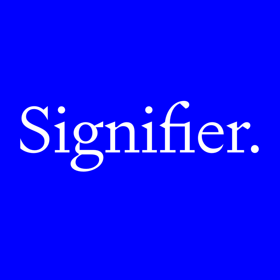
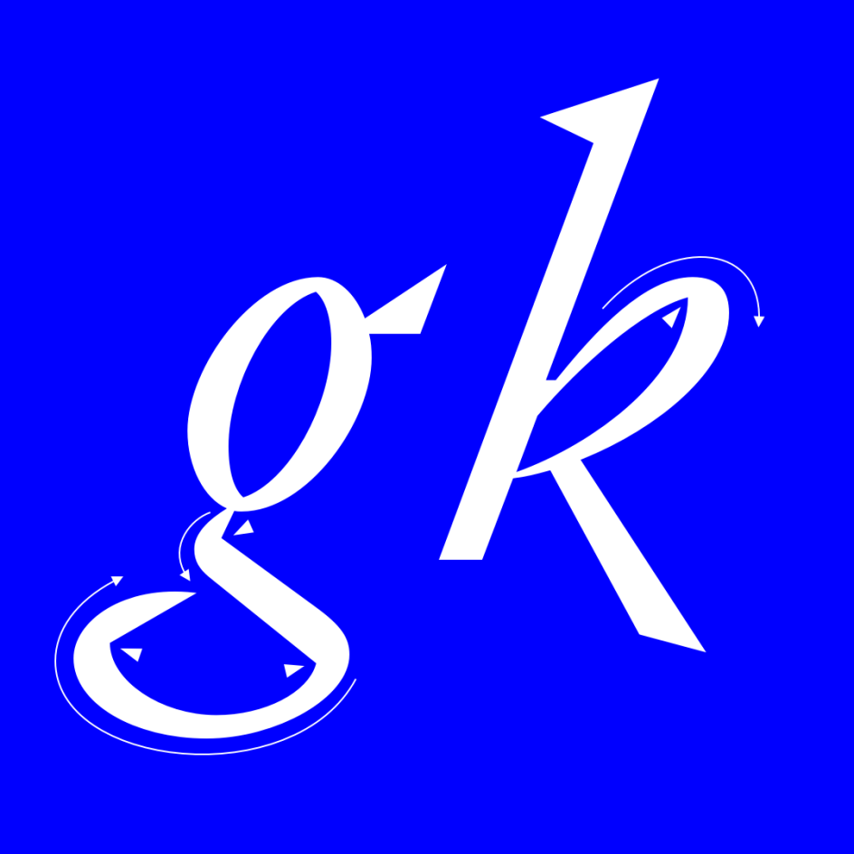
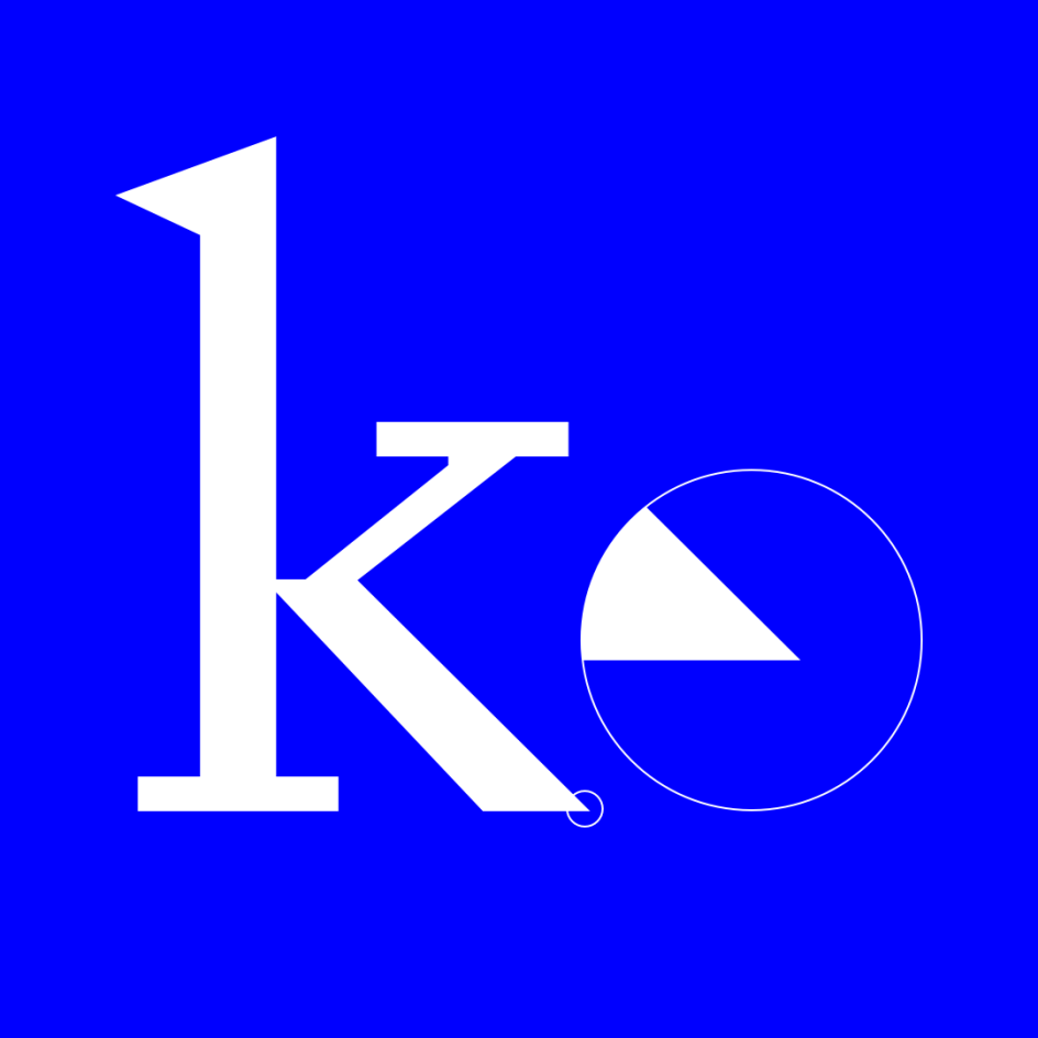
New font Signifier brings a sense of Brutalism to 17th-century type
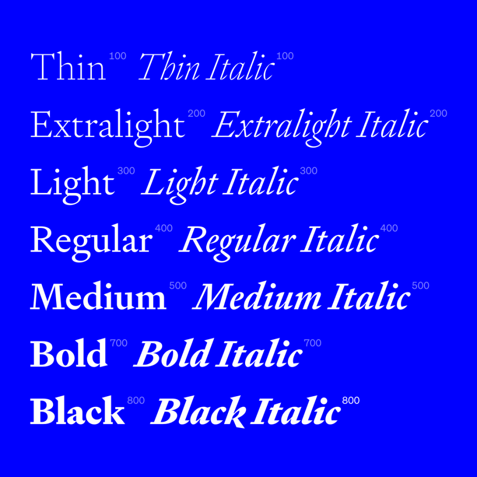
Signifier is a new font from Klim Type Foundry that combines the essence of 17th-century typefaces with a Brutalist ethos, to startling effect.
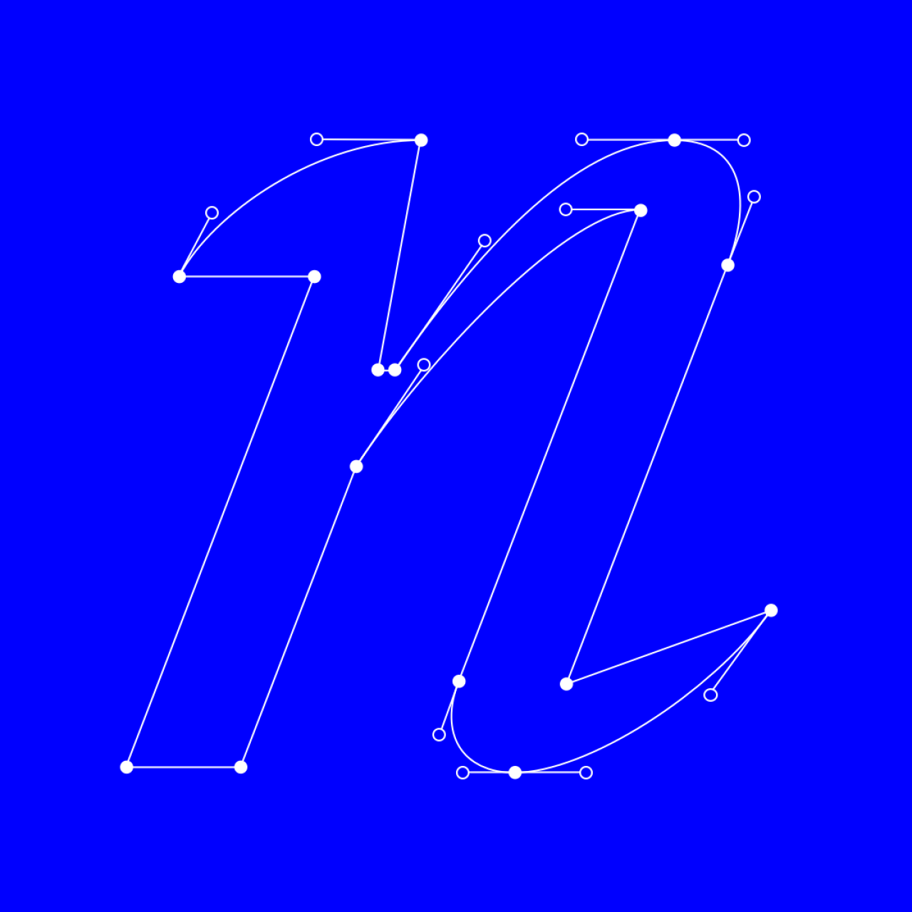
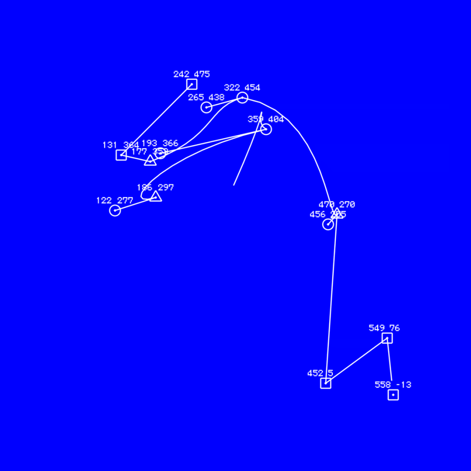
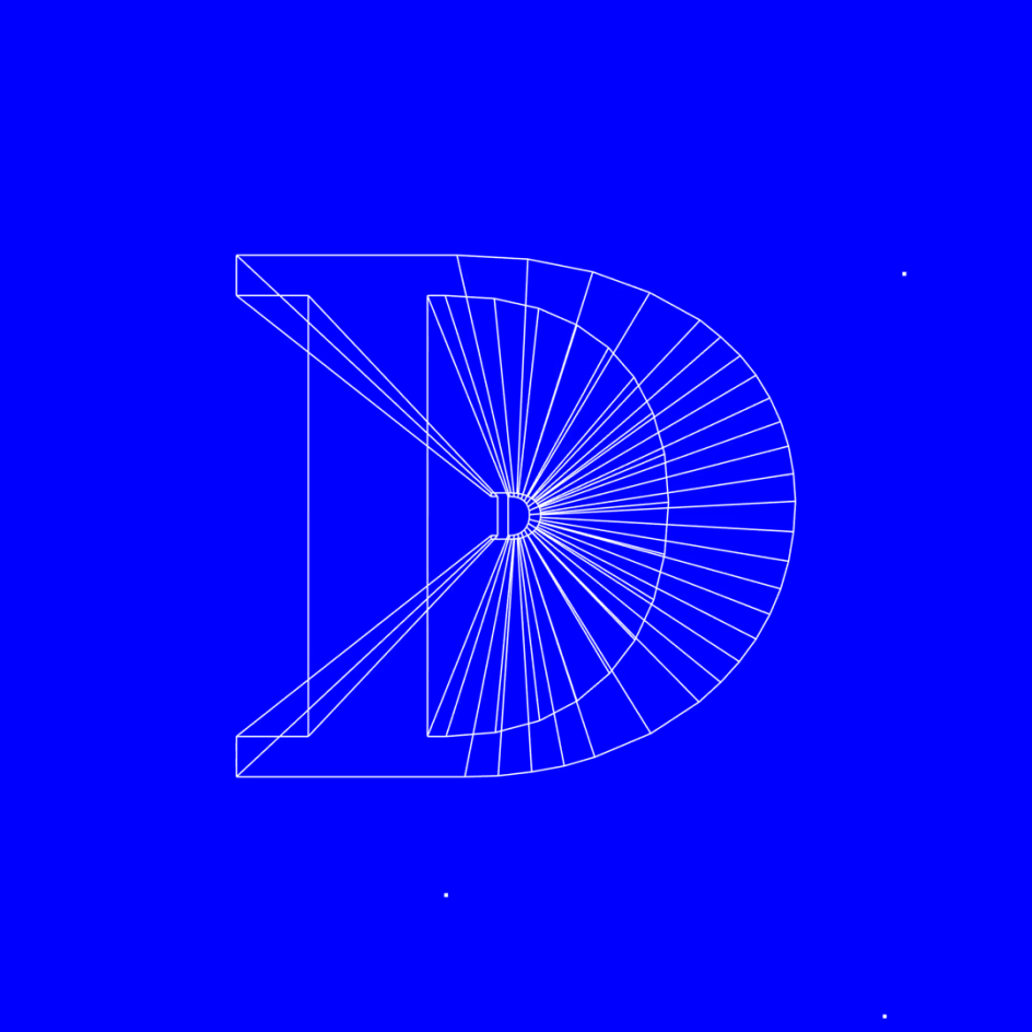
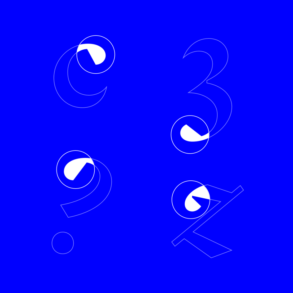
Designer Kris Sowersby worked consciously with the computer to recast the lead, antimony, and tin of the 17th century Fell Types into ones and zeros. Signifier emerged from this alchemy with Bézier curves and sharp vectors determined by machine logic.
The creation process proved something of an epiphany, Sowersby reveals. "I finally realised that searching for the essential materiality of digital fonts was misguided," he explains. "Their essential nature, like all things digital, is immaterial. Form is the void and void is the form."
Just as impressive as the font itself is the campaign behind it. Sowersby's perception that 'void is the form' finds resonance in the work of the mid-20-century French artist, Yves Klein. And so the launch campaign uses Signifier to transcribe Klein's musings on Immateriality, The Void, and the metaphysics of absence.
Directed by Kelvin Soh from DDMMYY studio, in collaboration with Klim, the campaign video reimagines Klein's signature colour, International Klein Blue, in the retinal vibrato of pure RGB screen blue, irreverently conflating Klein's infinite void with Microsoft Windows' 'Blue Screen of Death'. The video features sound by Sines and Cymbals and animations by Seskamol.


. In use by [Garbett](https://garbett.com.au/) for Career Trackers](https://www.creativeboom.com/upload/articles/0f/0f4e193ba9164073646e67421eb37b4b26986c67_732.png)