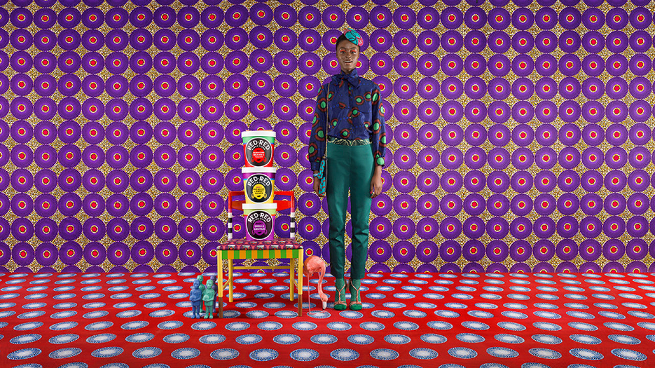
Beautifully bold Red Red stew pots campaign, 'inspired by Africa, remixed by London'
A raft of creative talent has created work for new lunch pot brand Red Red, combining forces to build a "design campaign" for its launch. Red Red pots are vegan, gluten-free meals inspired by African flavours with recipes developed with Zoe Adjonyoh of pop-up Zoe’s Ghana Kitchen, and as such, the many of the creatives working on the visual side of the brand have an African or African diaspora background.
Silas Amos is a London-based creative strategist, who worked on pulling together the team of creatives and setting the design direction, inspired by the idea of “a lunch less ordinary.” He says that the idea of creating a design campaign means that the design work itself “acts as media” much like a traditional, bigger-budget, larger scale advertising campaign might.
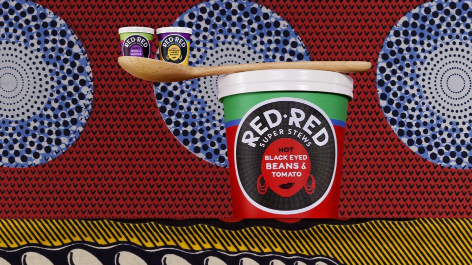
“The design has to work harder,” he says. “As the recipes are influenced by Africa, we wanted to work with people from Africa and the diaspora and use people we find inspiring, each making work that connects the dots through being a little bit less ordinary, and even slightly surreal.” The typefaces used on the pots are Wildfire for the most part, with the main "Red Red" lettering created from an African-inspired hand-drawn set of letters.
He adds: “The sensibility throughout is quite graphical and abstract. It was a learning curve in terms of the graphical language, which is quite maximal and ‘more is more’ rather than minimalist. It’s literally a colour clash, which is quite unusual for Western eyes, where we’re more used to colour harmony. Instead, we’ve got this sizzle with the clashes, inspired by the flavour of the pots.”

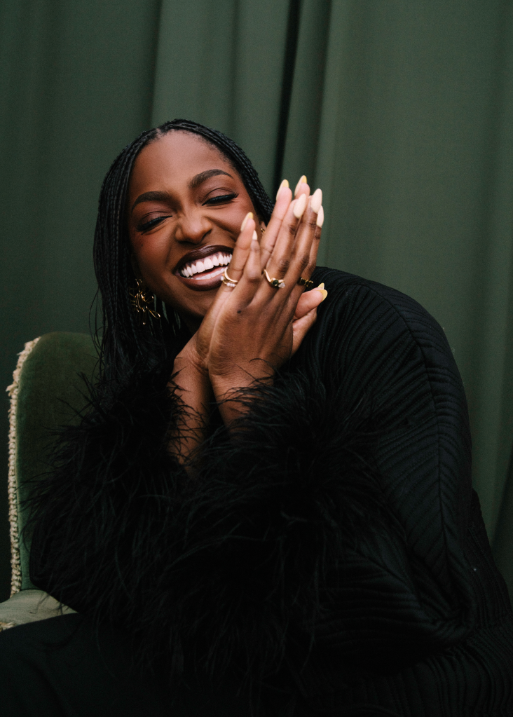
Zoe Adjonyoh
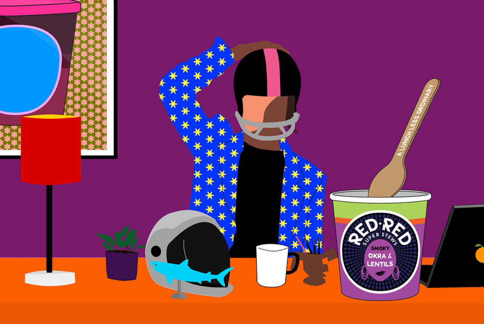
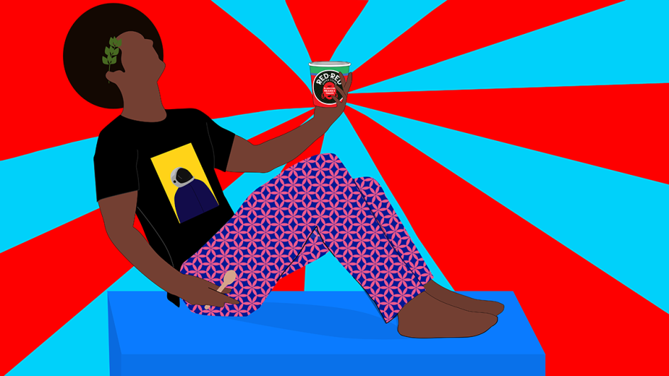
Dennis Osadebe is a Nigerian mixed-media artist best known for his contemporary, vibrant post-pop style. It’s his punchy illustration that peppers the Red Red website with popping hues and bold, lively characters; mixing humour and nuance through deft character design and subtle use of African patterns. “The second part of the strategy came from Dennis,” says Amos.
“We gave him the brief to do his work in the mildly surreal way he does, but then we let him loose and let him go mental. He came back with an astronaut lady, a Caesar character… the proposition of Red Red is that anyone can go out and get a sandwich from Pret any day of the week, but this food is something different – it’s just as accessible and conventional, but it’s definitely different and a bit spicy. What he was doing was off the wall, it was definitely ‘a lunch less ordinary.’”
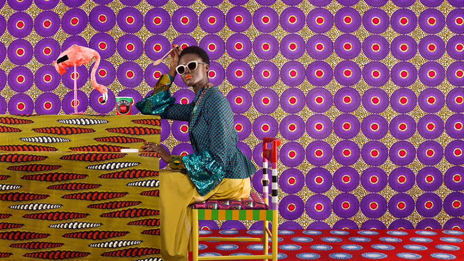
From that idea, it was decided that all elements of the brand and its visual assets should to similarly “less ordinary,” and so Red Red collaborated with Yinka Ilori, a London-based designer specialising in up-cycling to bring a bold African flair to vintage furniture. His playful, provocative designs are inspired by the Nigerian parables and African fabrics of his childhood; meaning each of his creations tells its own story. Ilori created a chair for a Red Red pop-up in London, which are typical of his bold colour epaulettes and unapologetic use of pattern.

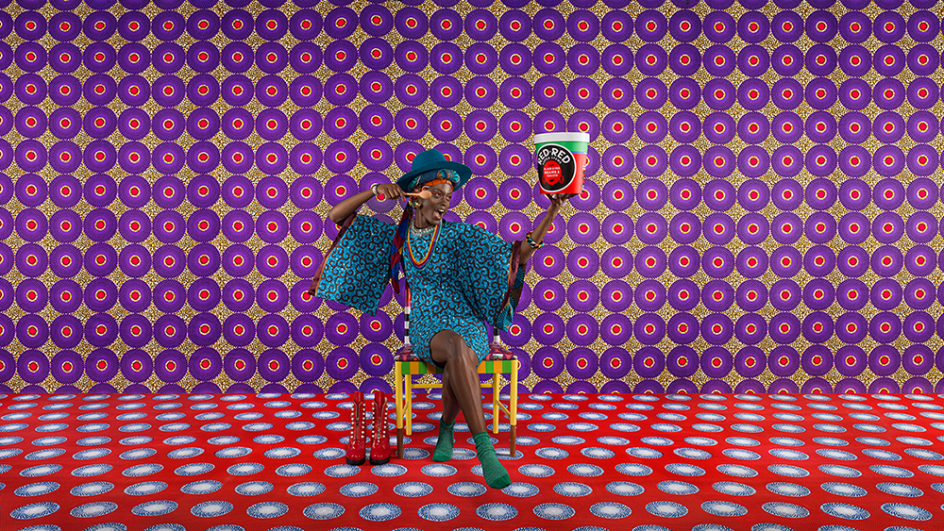
The campaign photography was created by photographer and director Patrice de Villiers, whose sublime food shots are as delicious as they are detailed, packed with her passion for both the edible and the eye-catching.
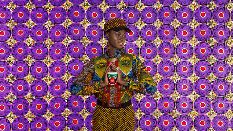
Red Red also worked with fashion designer, stylist and creative entrepreneur Samson Soboye on its campaign imagery; working together to hone an aesthetic much like that championed by his east London-based, African-inspired boutique SOBOYE; reflecting his passion for colour, pattern, texture and infusing his Nigerian heritage into contemporary LDN style.

"The conventional way of launching a brand was to split resources between the ‘branding’ and the ‘advertising campaign’," says Amos. "With time and budget both tight we aimed to make the most of every asset for Red Red. This meant taking everything we were working on, and framing it within a ‘design campaign’ where the sum of the iconography we have created is greater than its parts - it's created a mini universe for the brand, with everything joining up, not as matching luggage but as a strong set of assets.
"Who knows, the chair we created, or the fashion styling for the first shoot might turn out to be as useful for building the brand as the pack in due course. Thinking about everything joining up has given us focus, but also allowed us to have a bit of fun seeing how all the elements play off one another."
Finally, London-based collage artist, film maker and art director Mat Maitland has created some gorgeously strange brand films; typical of his playful yet decadent-looking work, which layers rich textures and colours to beguilingly surreal effect.
Red Red pots are now available in Wholefoods stores, and much of the designers’ work can be seen on the Red Red Instagram @redredstews.
Editor's Picks


Trending


Podcasts


Editor's Picks
Further Reading