Porto Rocha's 'motion-first, artist-centric' new identity for the world's leading music network
New York-based design and branding agency, Porto Rocha is behind this identity refresh for Vevo, deemed the world's largest music video network with more than 26 billion views per month and a library of over 500,000 videos.
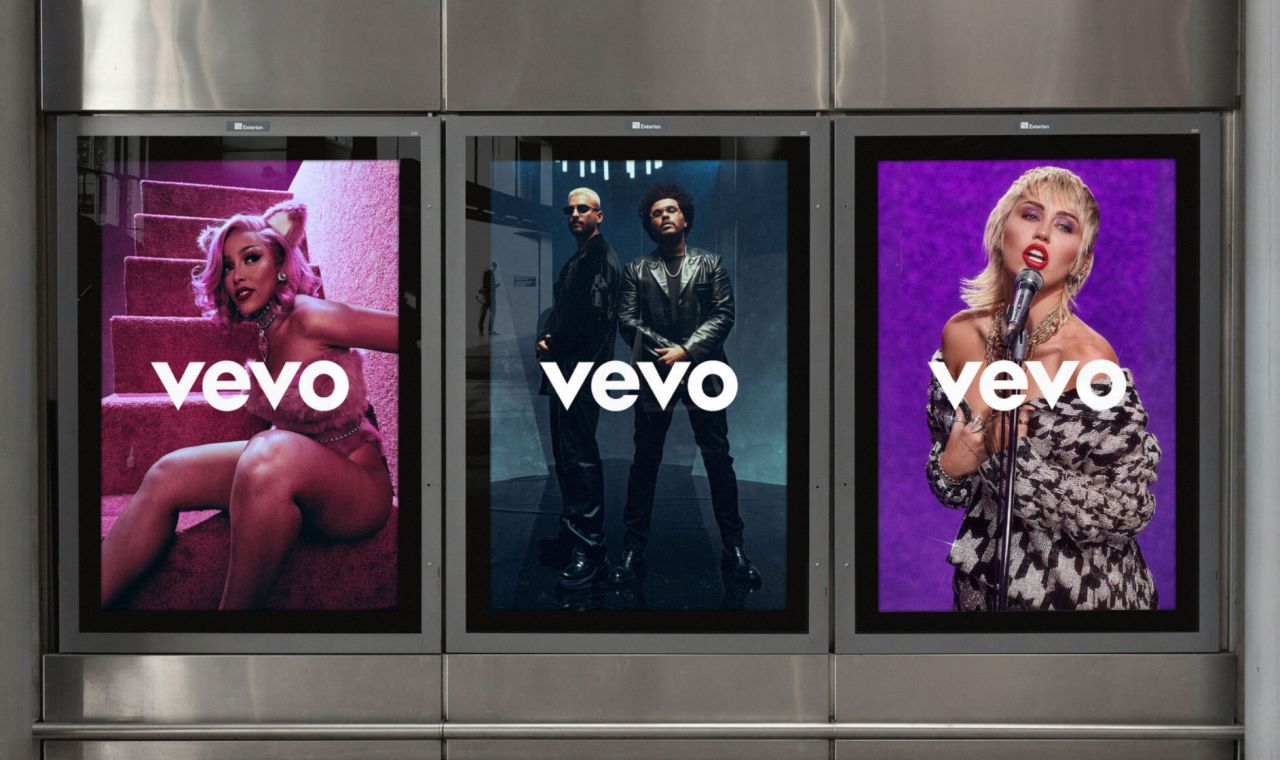
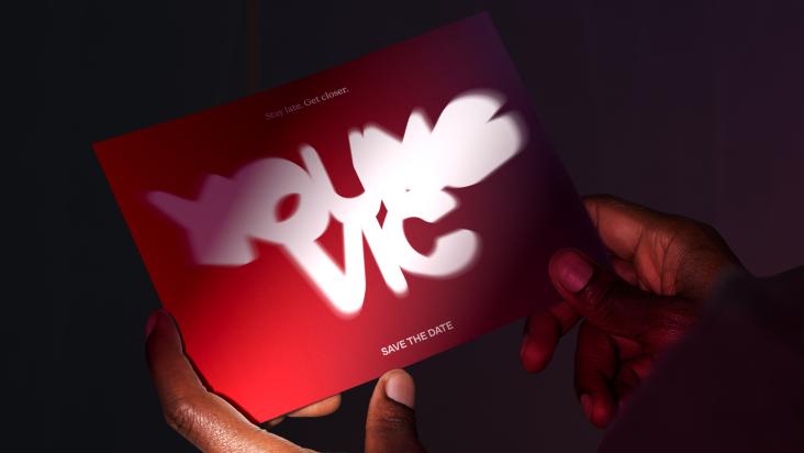
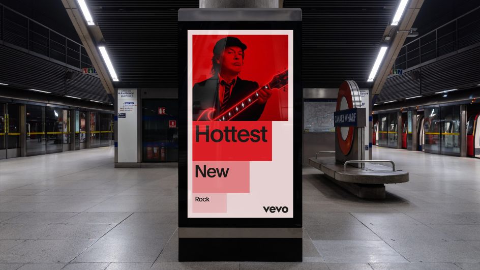
It's an overhaul that puts animation and musicians at the heart of the brand to reinforce Vevo's position as both an expert in music video culture and a champion of the artists involved. Elements have been introduced that allow Vevo to expand beyond its classic watermark and into a more editorial, culture-driven space. It's an identity that spotlights artist content and invites us, the viewer, into the dynamic universe of the platform's ever-growing catalogue.
"Although Vevo has over a decade of industry expertise working with almost every major artist, our research revealed a clear challenge and opportunity," says Porto Rocha. "While Vevo's wordmark is highly recognisable, there was less awareness around the breadth of Vevo as a brand." Another challenge was acknowledging Vevo talks to both consumers and businesses, so Porto Rocha had to help it communicate different messages across multiple audiences – from music fans to ad drivers and the music industry as a whole.
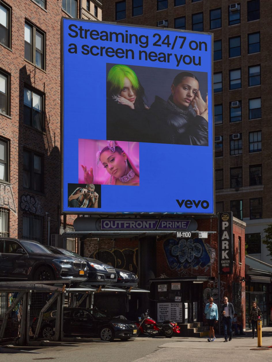
The layout system builds dynamic compositions that frame and champion an ever-expanding roster of content. Mostly animated, the "motion-first" identity even looks good when things are static. While the whole platform is complemented by secondary tones: tints and shades of a flexible colour palette that at times serve as a shorthand for the many music genres and sub-genres within Vevo's catalogue.
In addition, there's a utilitarian sans serif typeface, Plain, which brings the whole identity together. Designed by François Rappo for the Swiss type foundry Optimo, it complements the geometry of the Vevo logo and provides a warmth associated with revivalist Grotesque typeface design.
"When creating the visual identity for Vevo, we were fascinated by the idea of scale – not only in terms of the vast amount of content across the platform but also Vevo's reach and ability to drive rapid growth for the artists and musicians they represent," says Joseph Lebus, design lead at Porto Rocha.
"We combined sizing and opacity to create a system that behaves in an almost musical manner, where elements shift in scale to create energetic, ever-changing compositions that amplify the content they are showcasing. The result is a dynamic system that is bursting with energy; one that celebrates Vevo's wide library of content in a way that connects with both the artists they represent and the audiences they reach."
Editor's Picks


Trending


](https://www.creativeboom.com/upload/articles/90/908fdb6378db1e95d12595416f54e6336d5e80b8_732.jpg)
Podcasts


Editor's Picks
Further Reading