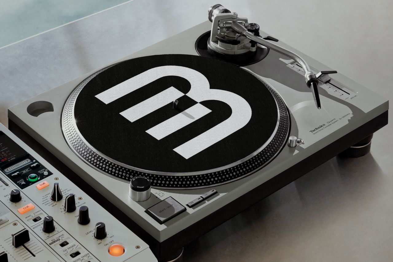
Porto Rocha's rebrand for BPM Music takes inspiration from the keys of a keyboard or drum pad
Taking cues from the art of mixing, musical instruments and rhythmic beats, Porto Rocha has given a fresh identity to BPM Music, which houses the largest catalogue of DJ-ready tracks in the world. The Brooklyn studio tells us more about the new look.
BPM Music offers a vast library of songs and sounds from nearly every genre out there, from electronic and hip-hop to R&B and Latin. But it wanted to be seen as more of a leader in both music tech and music culture. As such, Porto Rocha was tasked with developing its new identity system and website to help it stand out and feel more confident in an increasingly competitive marketplace.
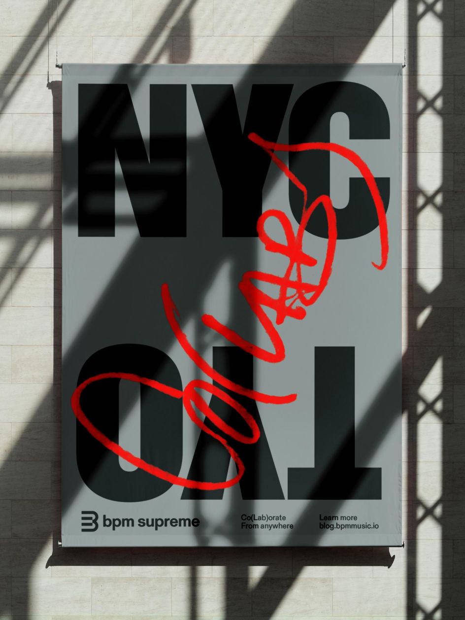
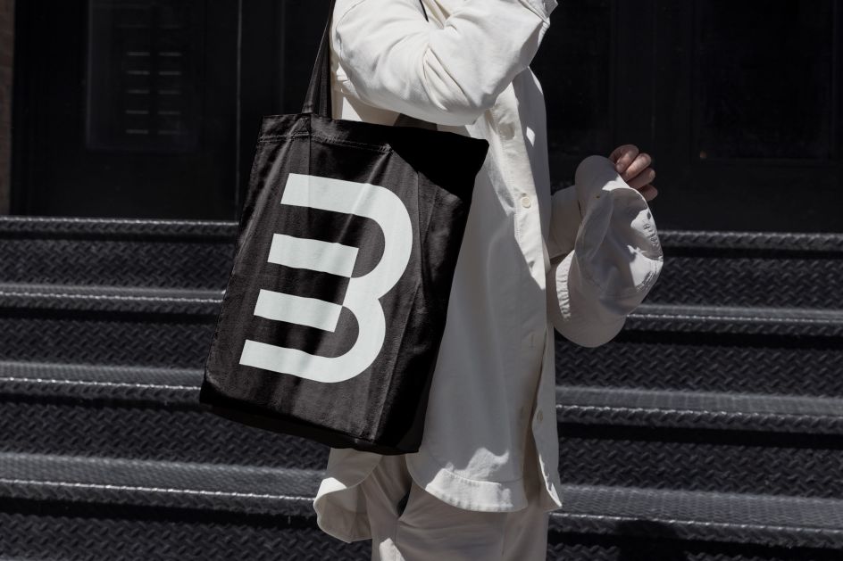
The Brooklyn studio began by creating a system inspired by the visual cues of track mixing with certain elements becoming subtle gestures that hint at BPM's product without being too literal. For example, in layouts there are vertical dividing lines reminiscent of beat intervals while the new logo is a symbol referencing keys of a keyboard, drum pad or laptop to play on the brand's musical and technical sides. Motion brings the system to life thanks to Thales Muniz and Duncan Brazzil.
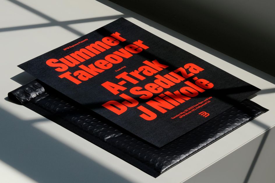
At its heart, is BPM's bold, condensed headline typeface – BPM Gravity Extra Condensed by ABC Dinamo, for those who need to know – inspired by nightlife event posters, seen plastered on billboards and buildings around any vibrant city.
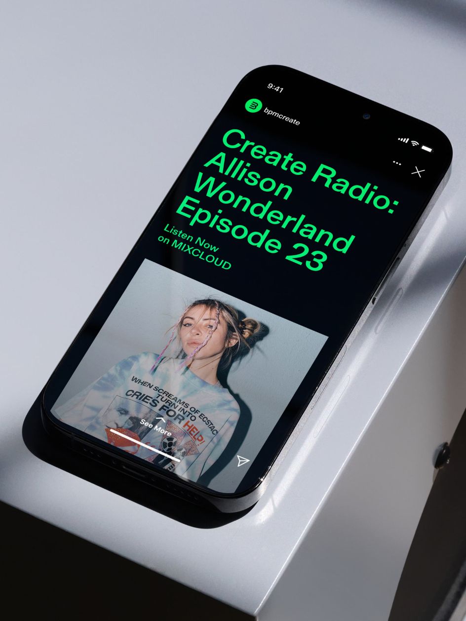
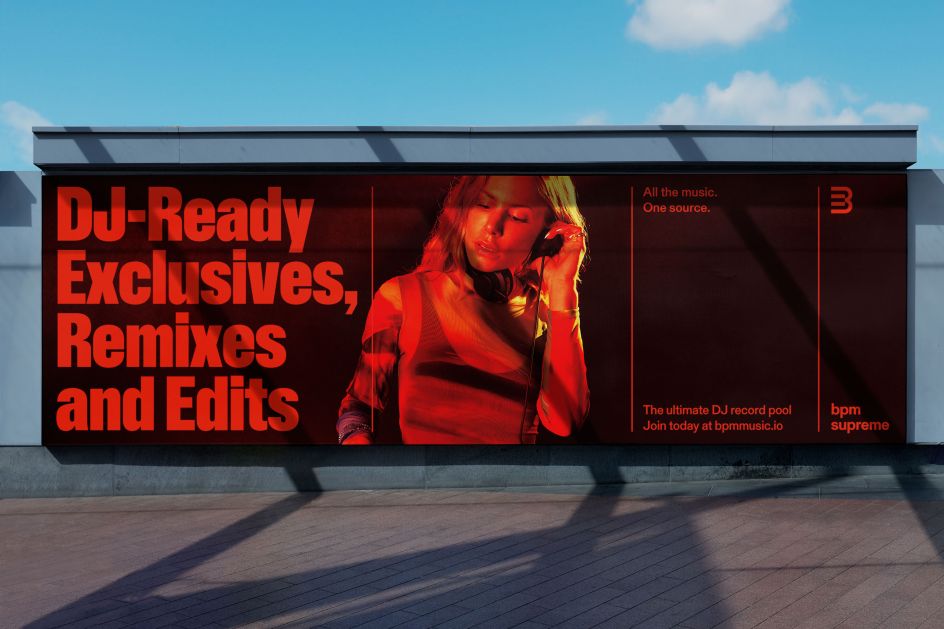
This sits nicely alongside sub-headers and body copy in Gerstner Program Medium. "It allows the brand to feature artist names more prominently in communications," explains Porto Rocha. The clean type works well with a fresh tone of voice that delivers simple yet impactful messages throughout, thanks to the input of Rebecca Demmellash. Our personal favourite line? 'All the music, one source'.
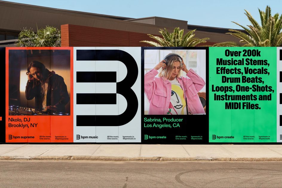
A previously-limited colour palette was then expanded to "match the energy of the music community", combining electric pink, red, blue, yellow and green hues that one might see from buttons on DJ controllers. Neutrals sit beside this vibrant palette to add trust and confidence. And the fresh colours help bring clarity to BPM's wider brand architecture, as products and sub-brands each get their own colour within the system.
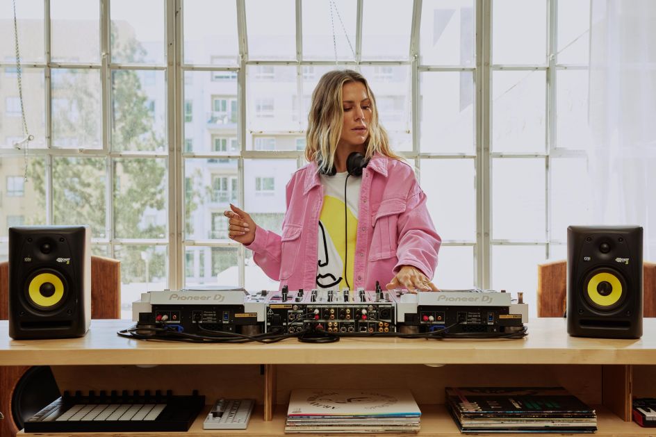
Highly stylised campaign photography by FYM rolls with these new colours, even in the choice of models' clothing. (We'll take the pink denim jacket, please.)
For BPM's website, built by BYND, a complete overhaul was in order. The brief outlined that it needed to offer an intuitive experience, above anything else. Featuring editorial modules, engaging interactions, and a dark mode reflective of a nightlife setting familiar to its DJ audience, the new site certainly makes the music discovery process even more effortless and enjoyable.
"With all elements of the identity in sync, BPM Music's visual language finally reflects both the precision of their product and the culture of their community," adds the studio.

Editor's Picks


Trending


Podcasts


Editor's Picks
Further Reading