Pentagram's identity for The Moholy-Nagy Foundation uses the Bauhaus leader's own processes
Marina Willer's team at Pentagram's London studio has worked on the new design system and visual identity and system for The Moholy-Nagy Foundation.
The private family foundation aiming to continue the legacy of László Moholy-Nagy – the artist, photographer, filmmaker and writer who became well-known as a professor at the Bauhaus school – was formed in 2003 by his daughter Hattula Moholy-Nagyin. It strives to promote, research and preserve the Hungarian-born Renaissance life and work.
The designs looked to be stroking and sympathetic to the artist, referencing Moholy-Nagy's processes; but without veering into mimicry or pastiche.
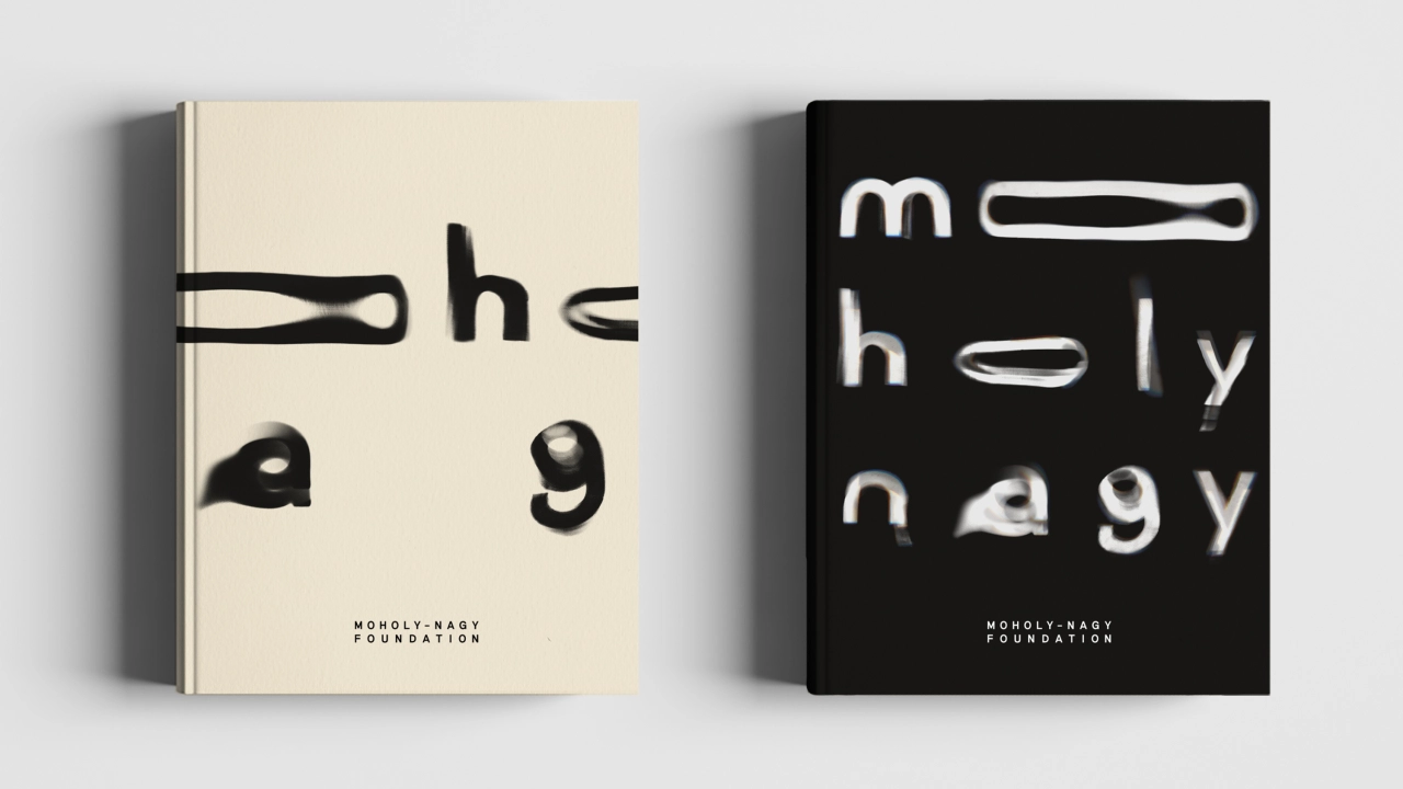
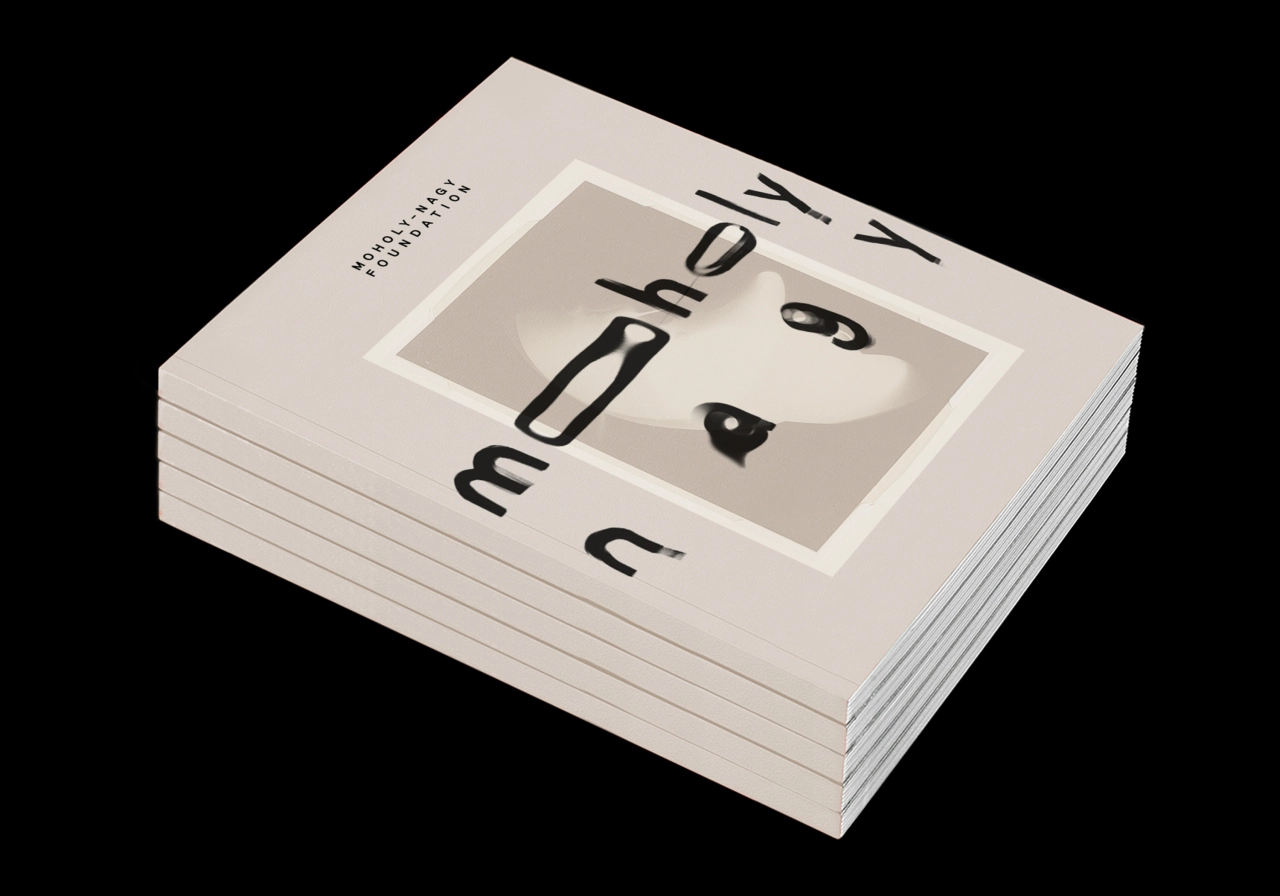
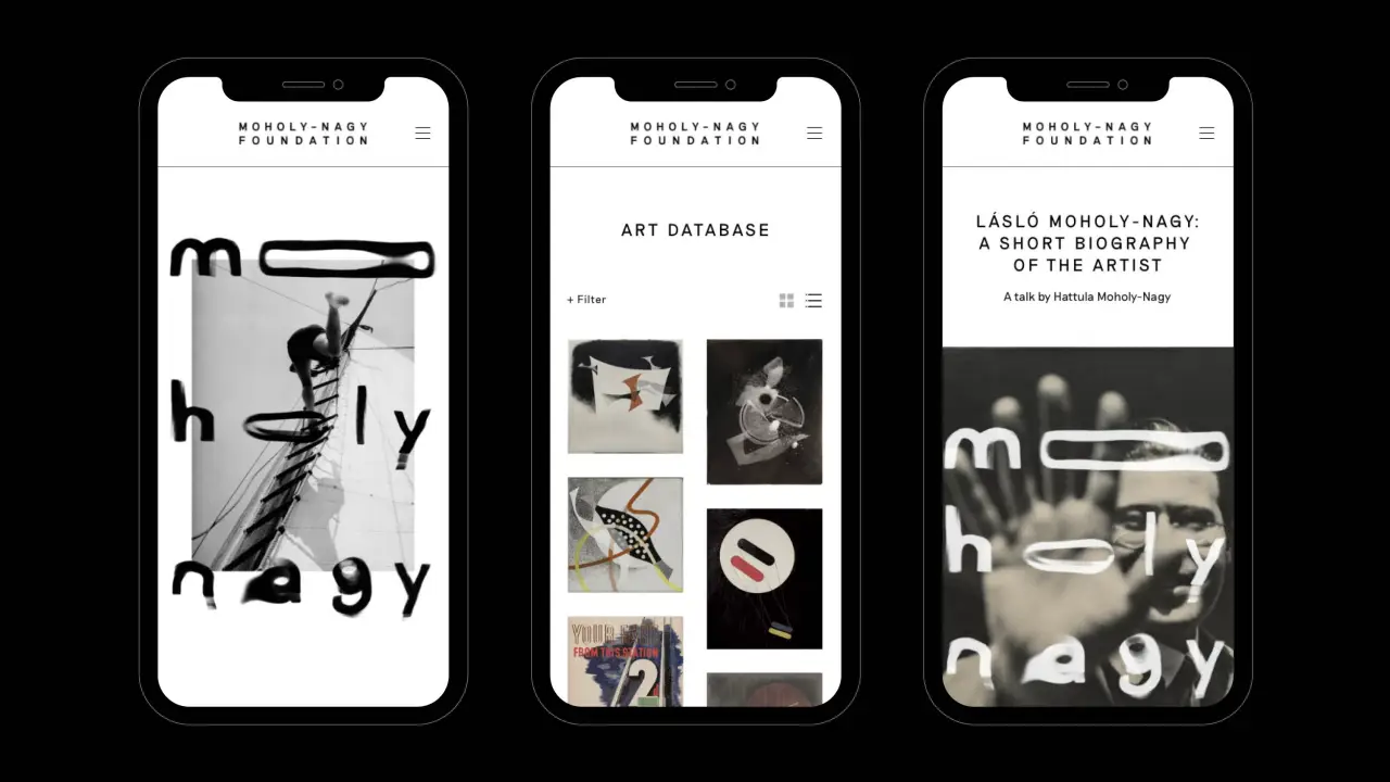
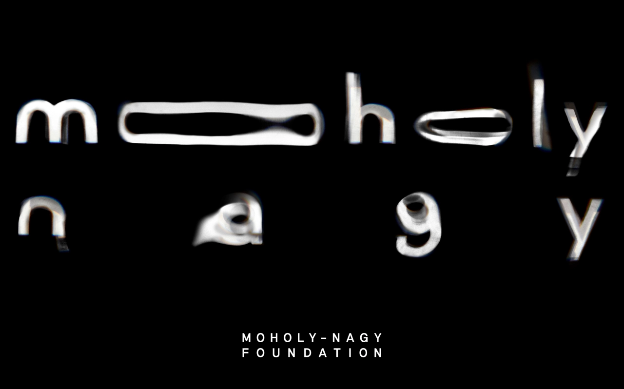
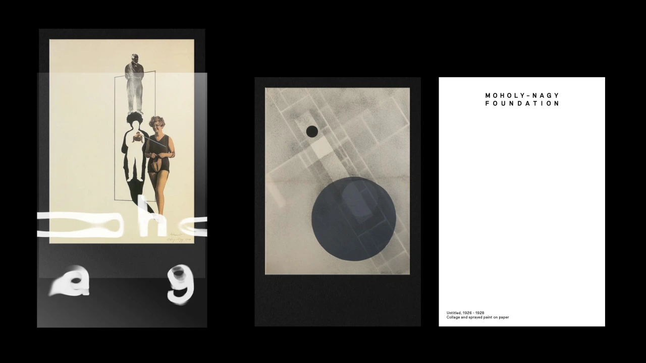
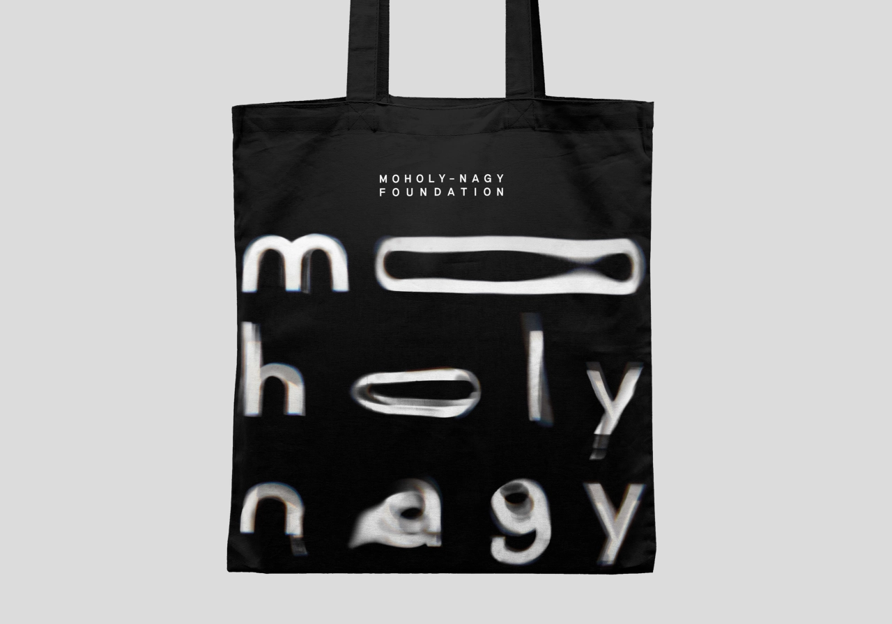
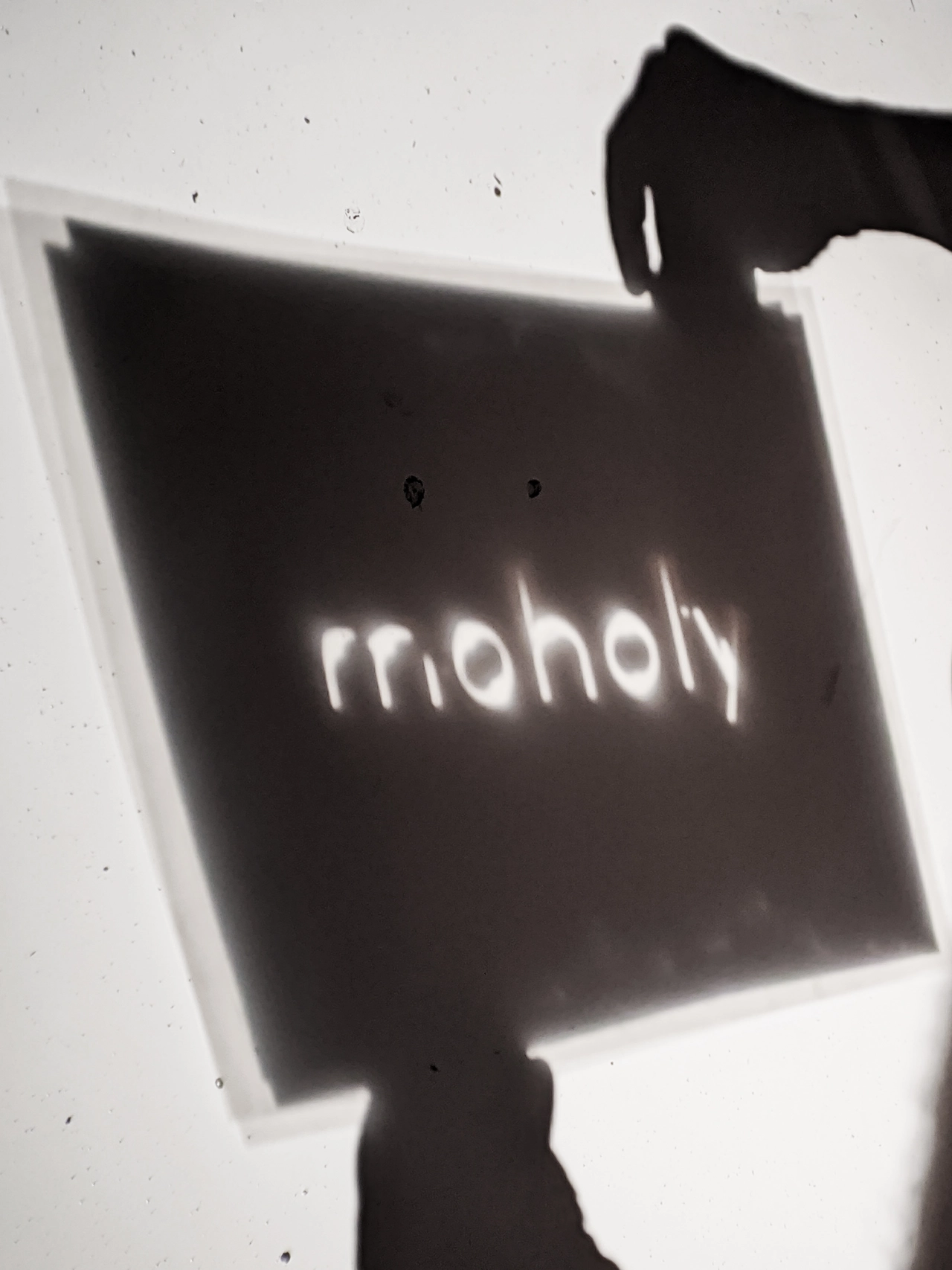
The new brand identity was informed by the methods that Moholy-Nagy used in his own work. As such, a key aspect of the designs is the use of photograms, which appear in typography and other graphic elements across the branding's various applications.
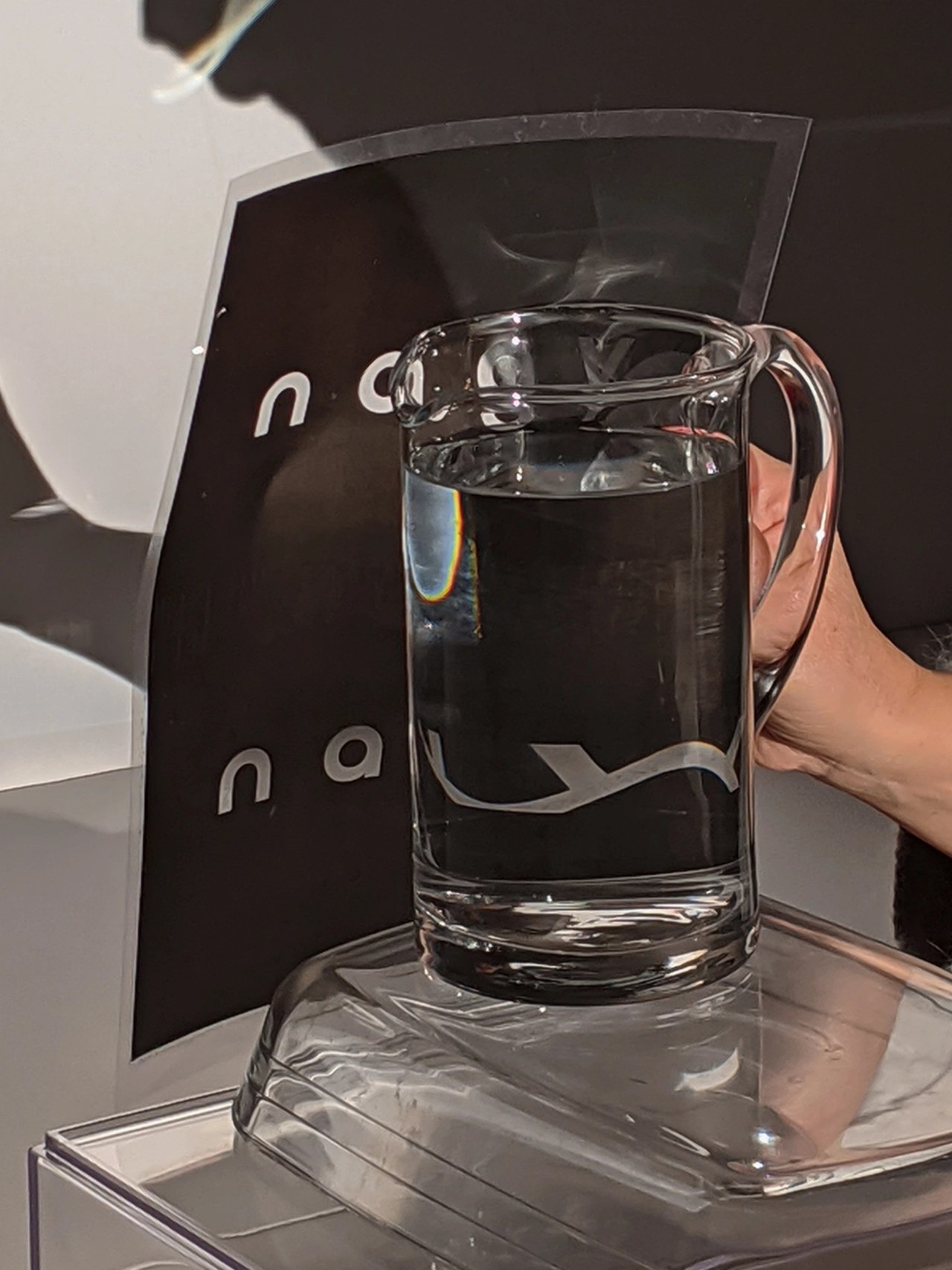
The Pentagram team used this mode of experimental photography to inform the series of typographic shapes created by hand in their studio using light and water projections, including a typographic wordmark that appears across all of the Foundation's printed and digital touchpoints including letterheads, business cards and online applications. The process gives the identity a fluid feel for which Pentagram also describes as using a "craft-based approach".
A new website was created which bears this branding alongside the identity typeface Riposte by Good Type Foundry a neo-grotesque inspired by mid-century fonts, "with contemporary features that bring a sense of modernity to the brand identity while allowing for a clear archival language," says Pentagram. The site acts as a comprehensive resource on the artist’s work and an extensive archive of his creations.
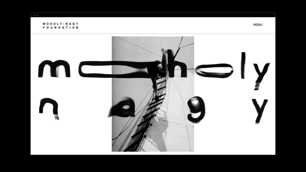
The colour palette of black, white and sand is deliberately minimal, taking influence from Moholy-Nagy's work and light-based media. "The neutral colours allow for use across all applications and alongside any artwork," says Pentagram.
Following his departure from the Bauhaus school, Moholy-Nagy started his own studio in Berlin and took on various roles including the photography editorship of Dutch magazines avant-garde magazine International Revue i10. Moholy-Nagy moved with his family to London in 1935, living for a time with Walter Gropius in the Isokon building and hanging out with other Bauhaus émigrés Walter Gropius and Marcel Breuer in North London. After the war, Moholy-Nagy was invited to move to Chicago to establish the radical Chicago School of Design, known as the 'New Bauhaus'.
Editor's Picks





Trending






Latest Jobs
Frontend Developer at Northern Artillery
Full-time·Leeds·£35k–£45k
Digital and Marketing Manager at Manchester Art Gallery
Contract·Manchester·£38,126 pro rata
Brand Designer at Adfin
Full-time·London·£30k–£50k
Art Director at The New York Times
Full-time·New York·$120k–$130k
Senior 3D Motion Designer at Art&Graft
Full-time·London·£50k-£65k
Digital Marketing Executive at Arise
Full-time·Sheffield·From £23,750