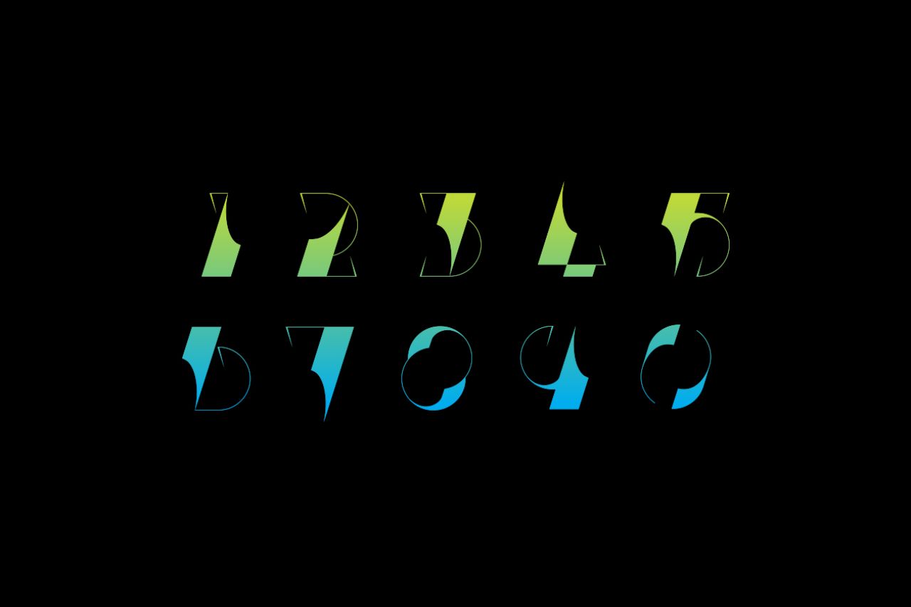
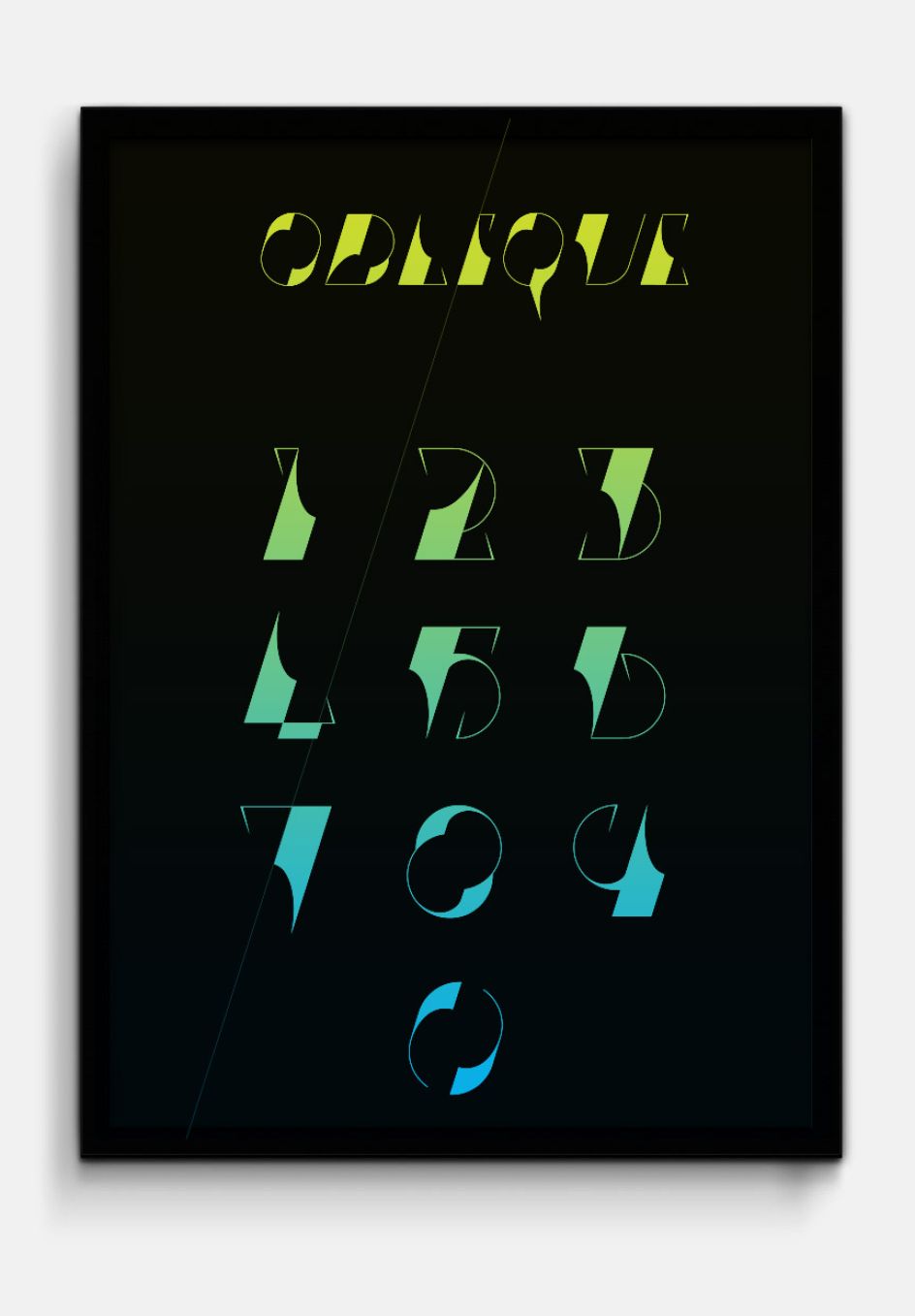
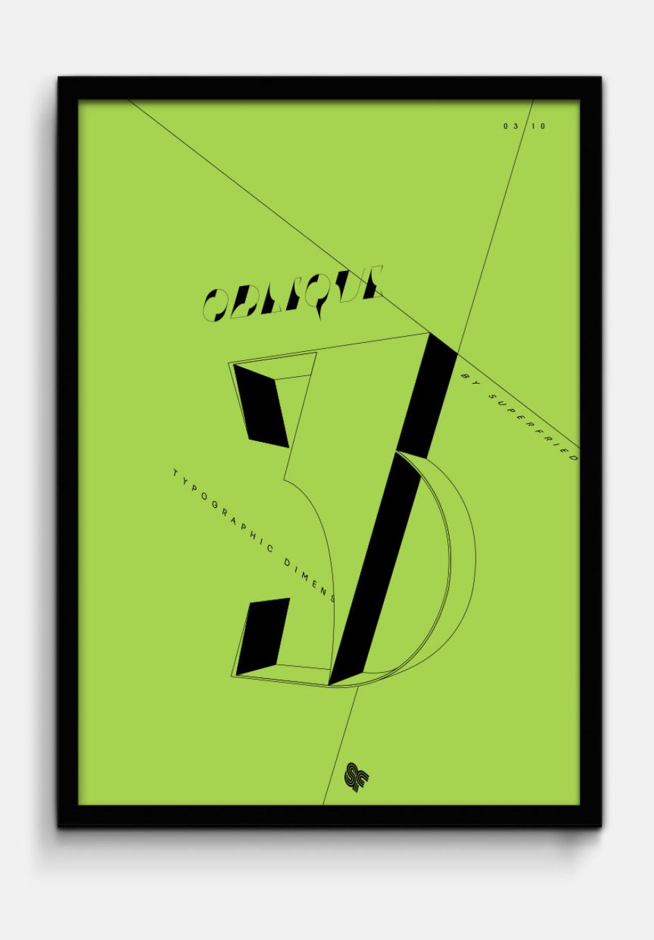
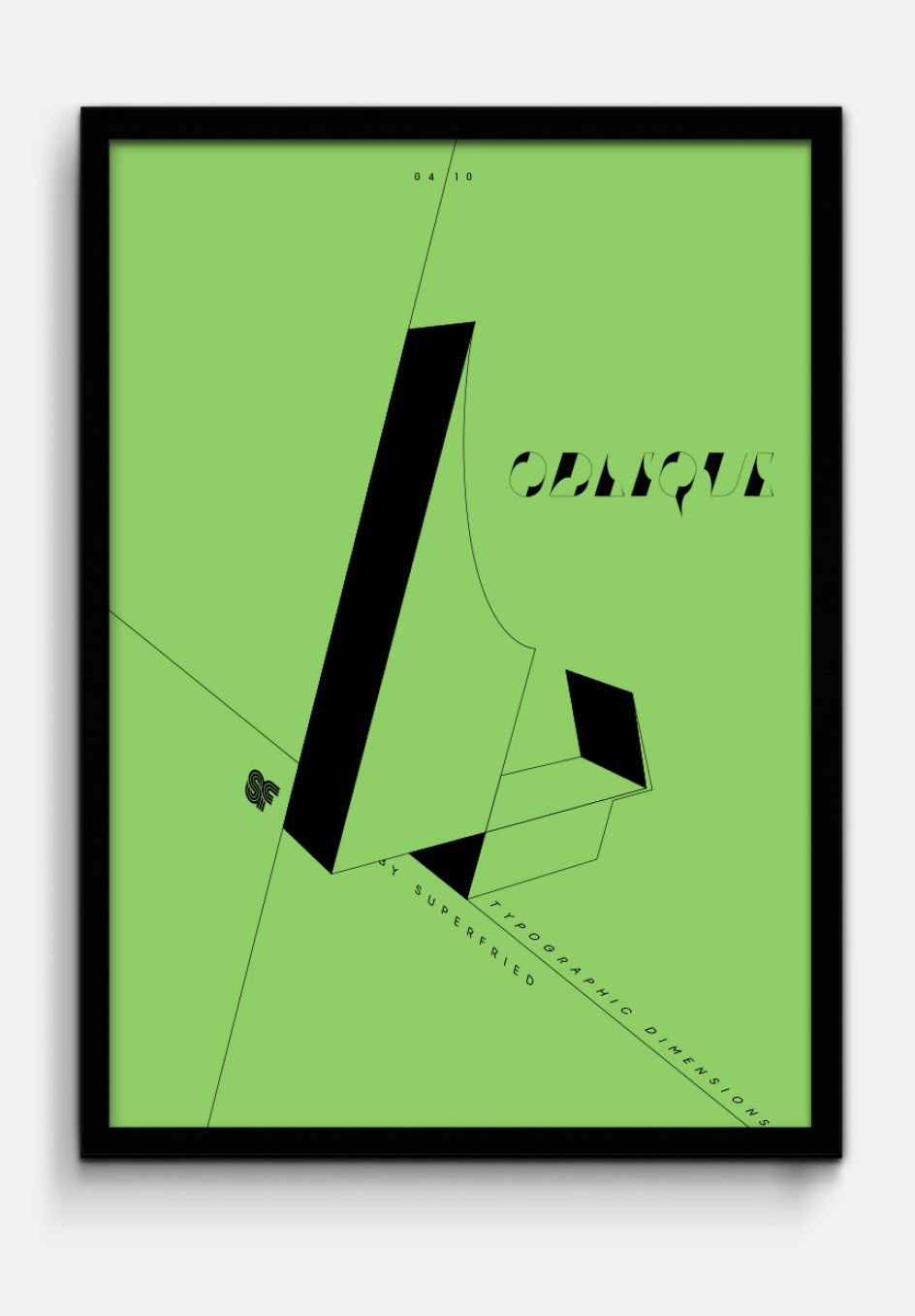
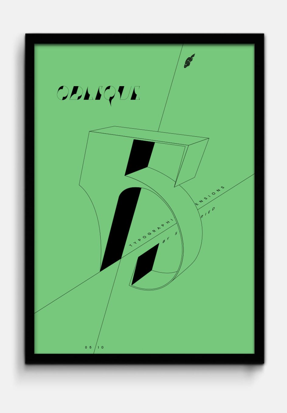
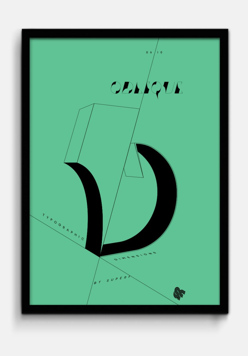
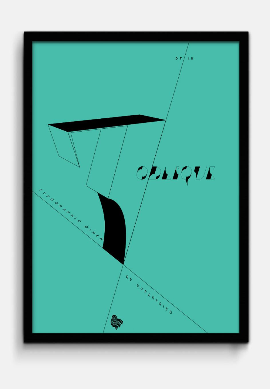
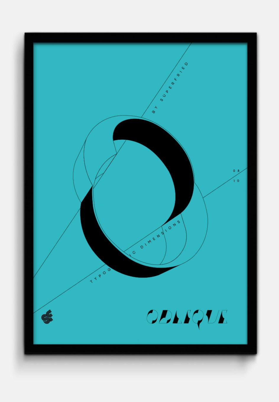
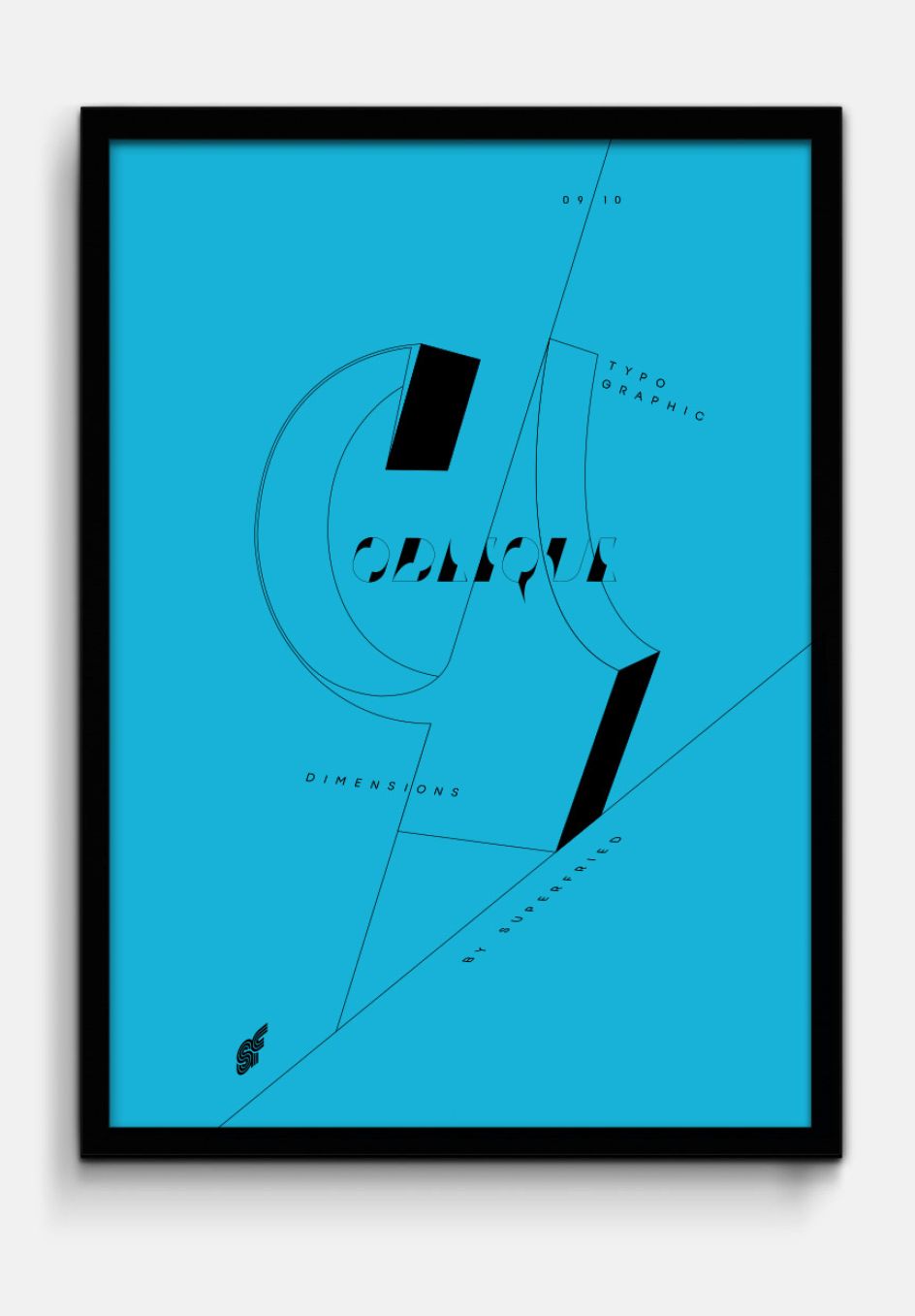
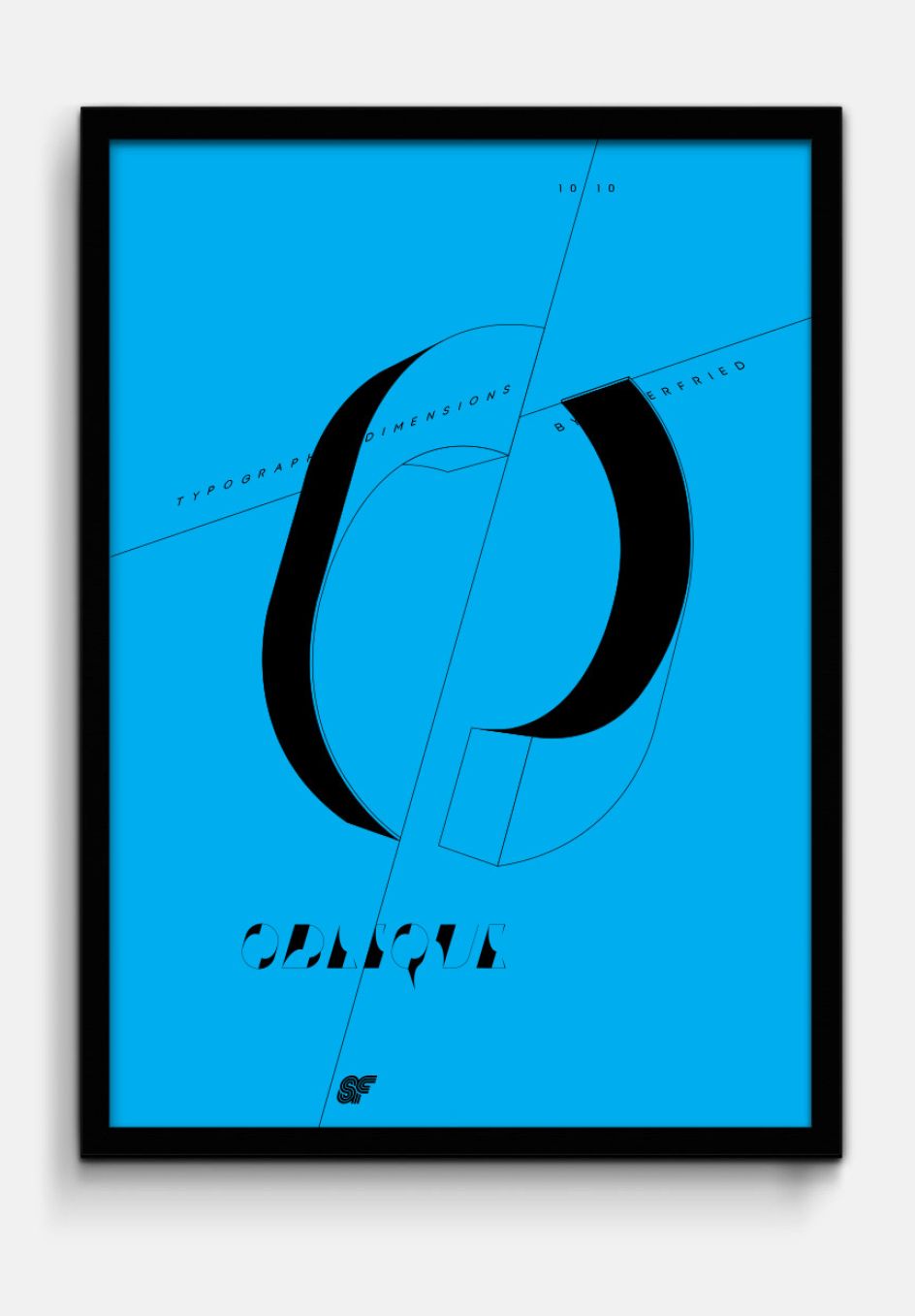
Oblique: A typographic experiment of freshly sliced numbers by Superfried
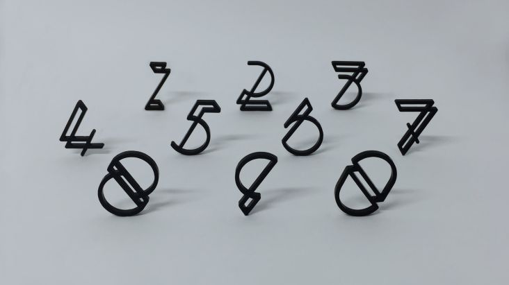
Whilst developing his last numeral set, Klaws, an experimental number two emerged that Mark Richardson of Superfried was rather fond of. Unfortunately it did not fit with the Klaws style (think graffiti themed), but was strong enough to become the basis of a new personal project. Ironically, the number two in question did not make the cut for his new series either.
All images courtesy of Superfried
Titled Oblique, the numbers slice off the page, creating fresh and interesting shapes that take a new direction for Mark, the Manchester-based designer who moved his studio up from London last summer.
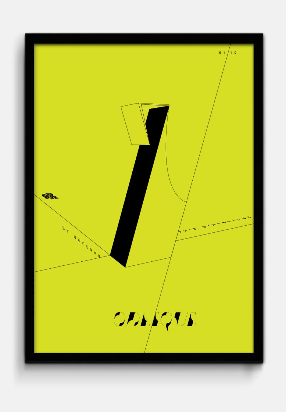
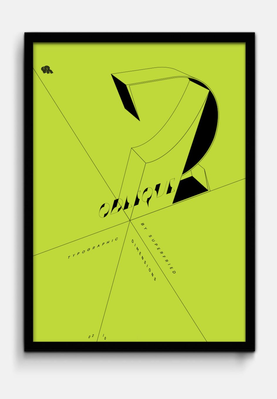
"Once the 2D letterforms were complete, I was intrigued to see how they would work in 3D. However, this time I wanted to go for a completely different, lo-fi aesthetic," Mark explained. "I quickly extruded the numerals by the same value in C4D and screen grabbed each at their best angle. I then re-traced the 3D versions using the screen shots in Illustrator. Continuing the Oblique theme, use of simple lines combined with plane orientated type led to challenging 3D ambiguities."
Check out more of Mark's typographic experimentations at superfried.com. We hope these designs can be bought and framed.
Editor's Picks


Trending


](https://www.creativeboom.com/upload/articles/90/908fdb6378db1e95d12595416f54e6336d5e80b8_732.jpg)
Podcasts


Editor's Picks
Further Reading