Postcards from Antwerp: Cross-border artists collaborate on unique designs
The Belgian city of Antwerp is fast becoming a thriving hub for all kinds of design, fashion and creativity. But not everyone, everywhere, knows that yet.
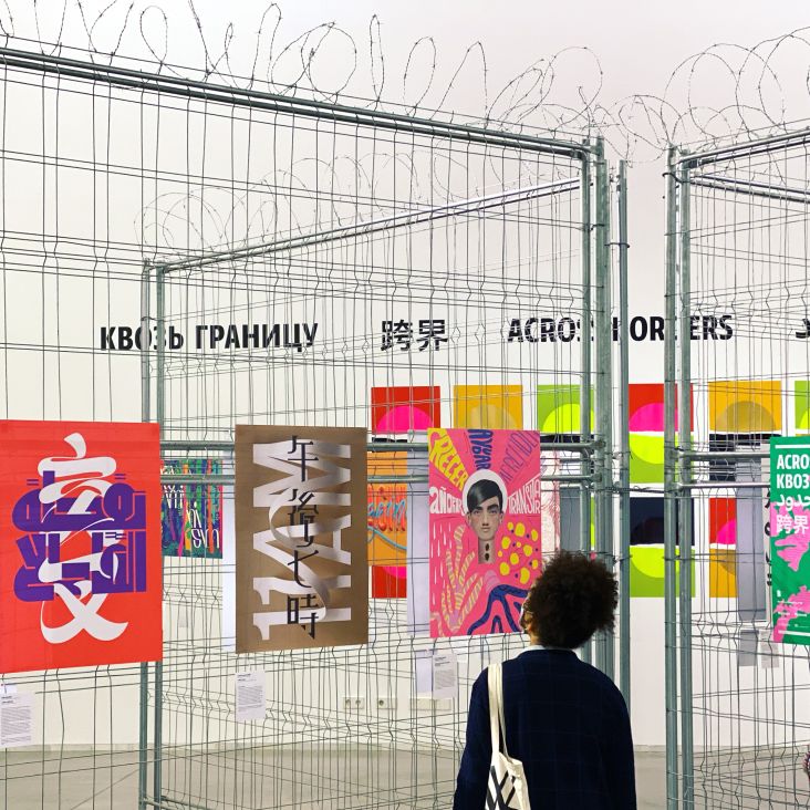
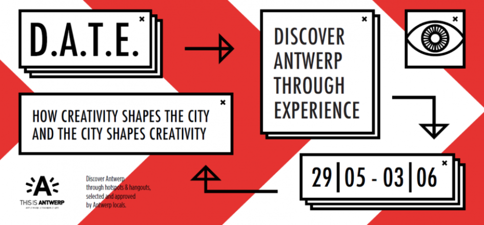
So to get the message across, Antwerp's creative community, in partnership with its city council, has been inviting creatives from across Europe to come and learn, network and collaborate with their Belgian counterparts. It's all part of a unique initiative called D.A.T.E (Discover Antwerp Through Experience).
This year, D.A.T.E has stepped things up a notch, by getting six of the visiting artists and designers to collaborate with their local equivalents and create unique artworks, inspired by each other's creations.
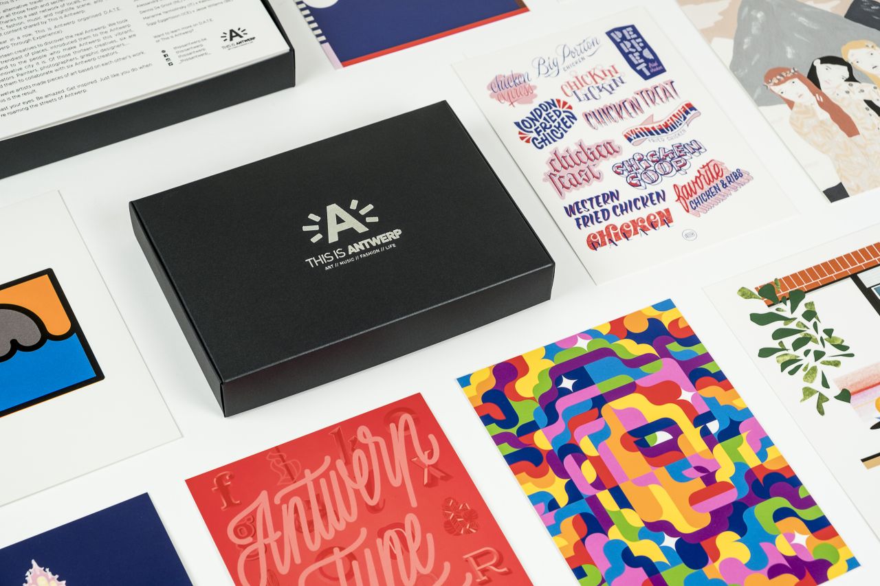
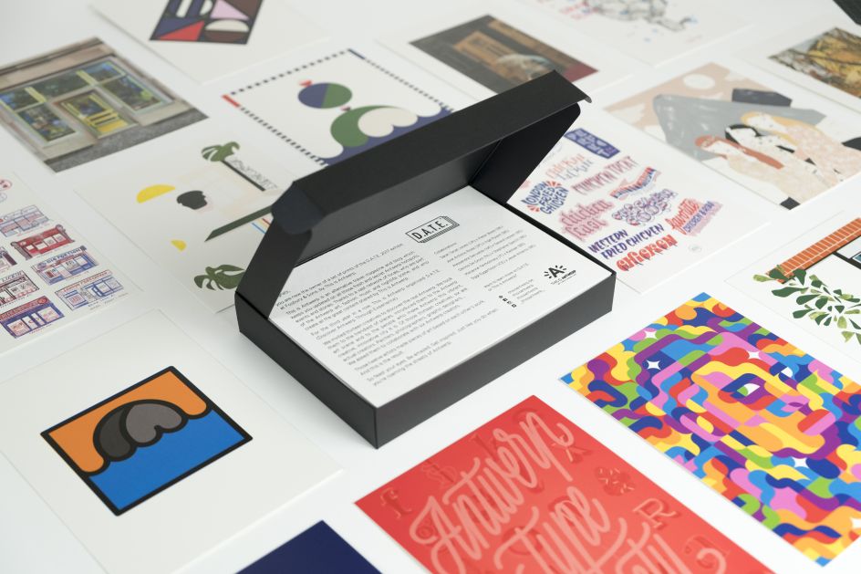
The 24 artworks have been turned into large-scale prints, which will be exhibited to the public, as well as 100 limited-edition postcard sets, which are being given away to fans of art and design everywhere. Beautifully produced and compiled in a chic collector box, they're available on a first-come, first-served basis here.
Sarah Tanat Jones and Pieter Boels
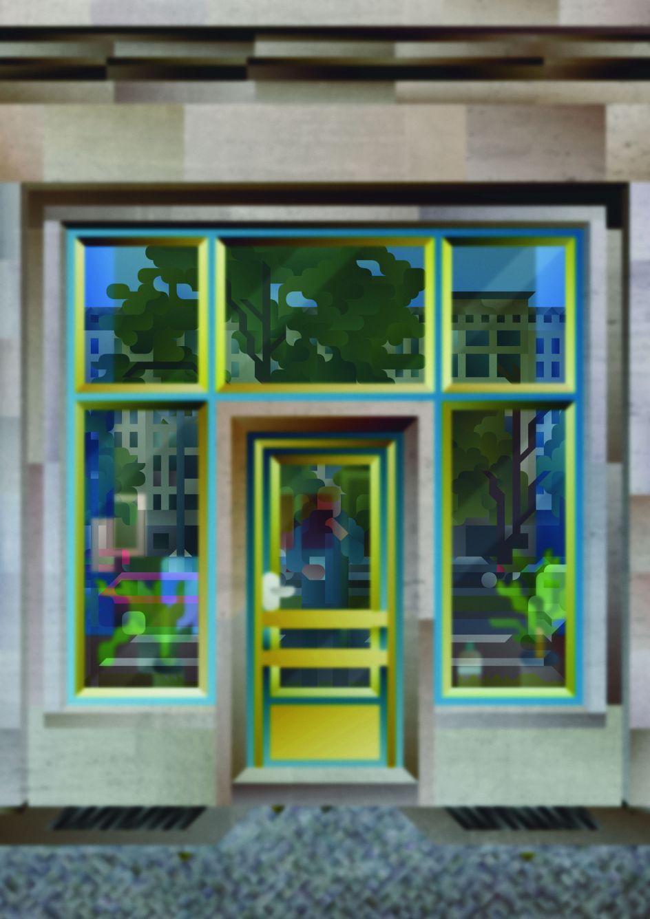
 represents the city of London, where she lives and works](https://www.creativeboom.com/upload/articles/10/10f9a6babc1bd736c28f3291b7f474cdb44c451a_944.jpg)
The opening image by illustrator Sarah Tanat Jones represents the city of London, where she lives and works
 showcases his love for hand-lettering and typography](https://www.creativeboom.com/upload/articles/d6/d6b5ac2427ccae38b22ee669fc8270f54d2f0582_944.jpg)
The opening image by Belgian graphic designer Pieter Boels showcases his love for hand-lettering and typography
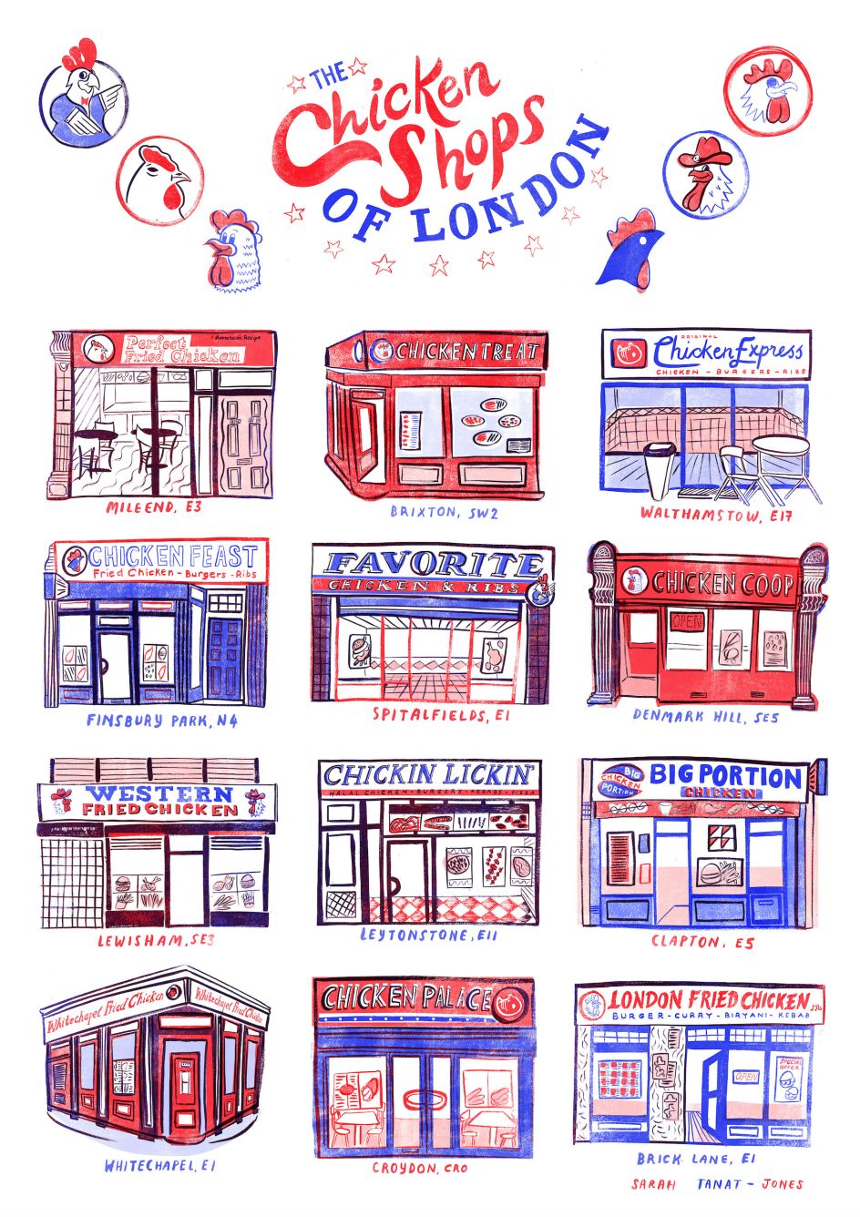
The final image by Sarah Tanat-Jones, depicting a range of real-life chicken takeaways across the UK capital
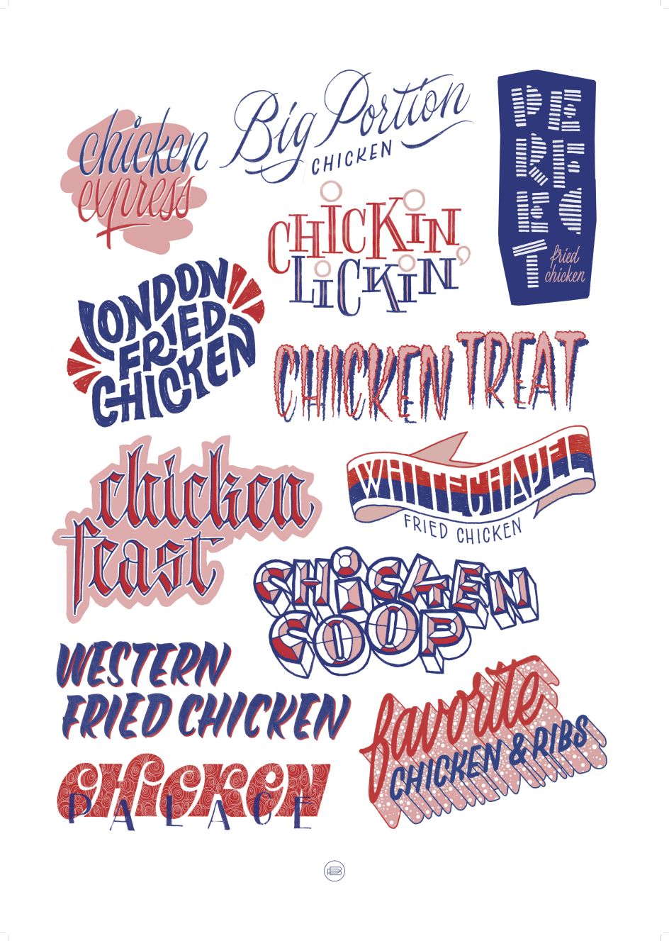
The final image by Pieter Boels interprets the same concept through the prism of his love for lettering
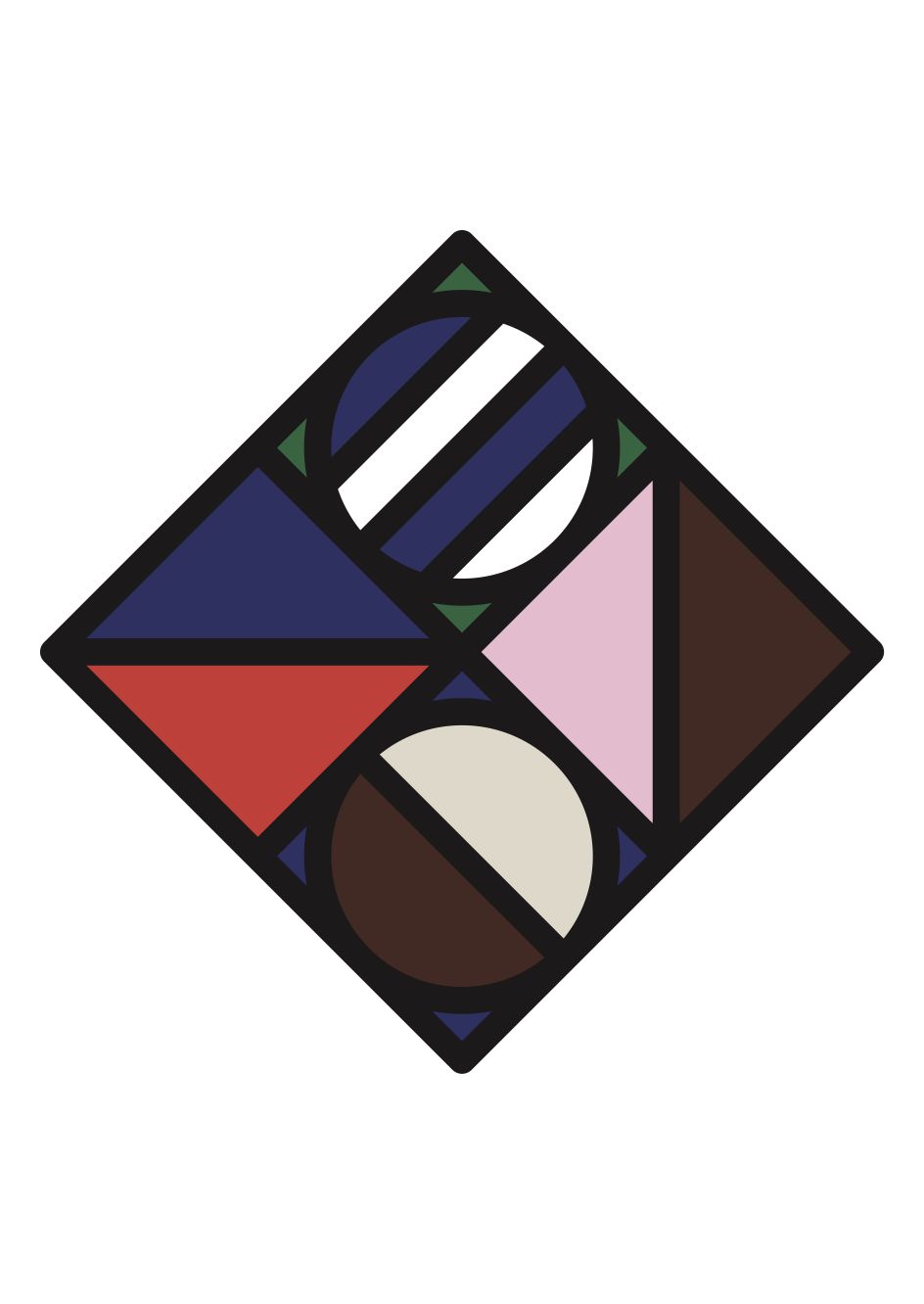
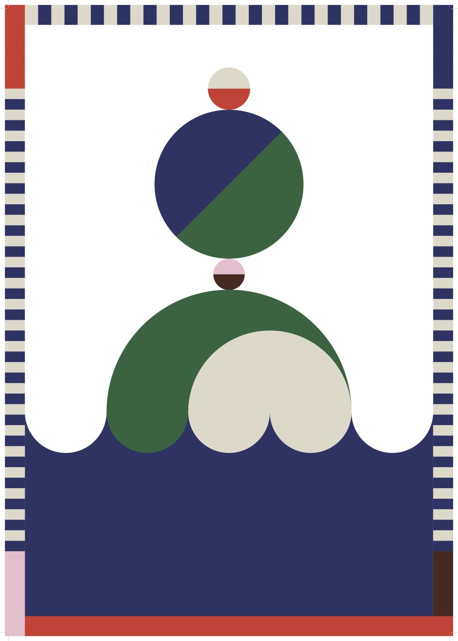
Jose Antonio Roda and Inge Rylant
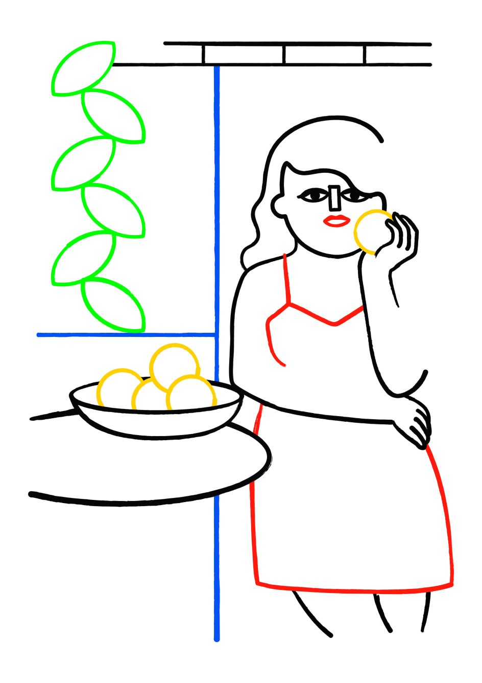
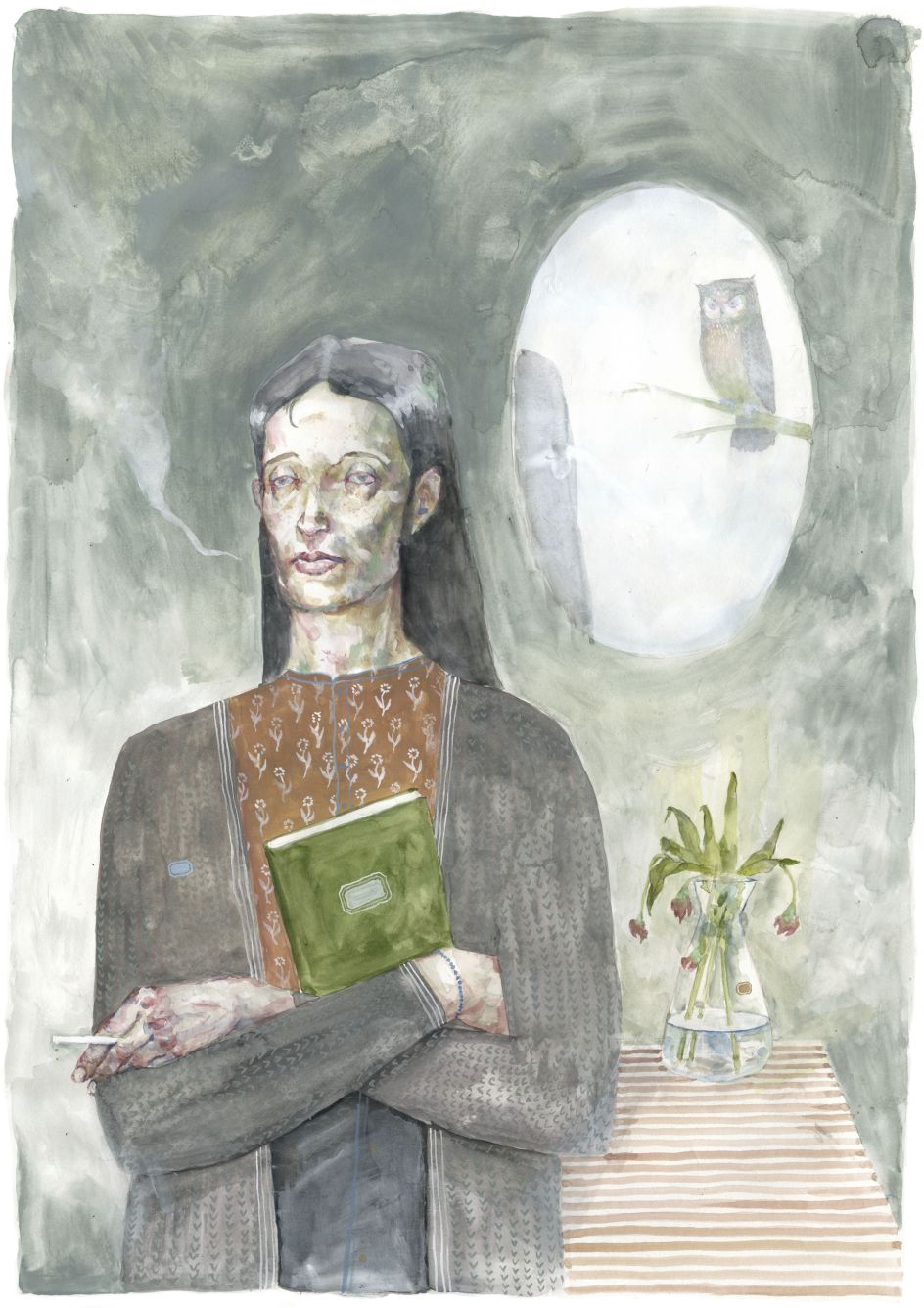
's opening image symbolises Madrid, where he lives and works](https://www.creativeboom.com/upload/articles/4c/4c791a27f217d65d28b53a7b6d014c69a3d236b9_944.jpg)
Spanish artist Jose Antonio Roda's opening image symbolises Madrid, where he lives and works
](https://www.creativeboom.com/upload/articles/37/375fdda934a3fd15d47c0fbc8e8b70df2c6bf6f6_944.jpg)
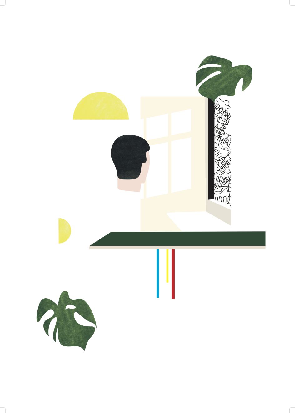
The opening image by Belgian designer and illustrator Inge Rylant
The final image by Roda, reinterpeting Rylant's scene in his typical style (including a trademark large woman)
The final piece by Inge Rylant, following Roda's approach to shape, colour and deconstruction
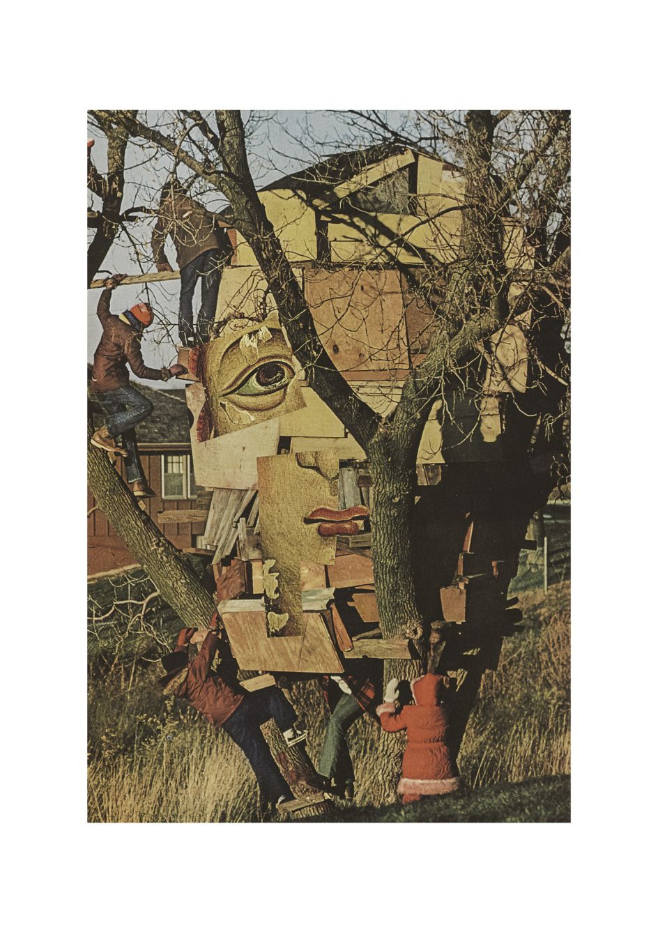
Alessandra Genualdo and Gerard Leysen
, characteristically centred around a strong female figure](https://www.creativeboom.com/upload/articles/e3/e363fbae05e5ca340d578138ffaaec0ba034a64f_944.jpg)
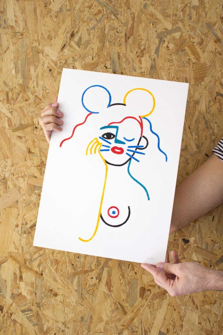
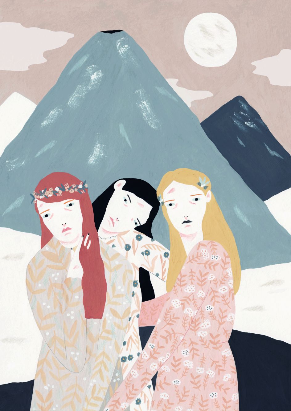
The opening image by Italian illustrator Alessandra Genualdo, characteristically centred around a strong female figure
](https://www.creativeboom.com/upload/articles/15/1547bb32a0482b21cd067adb89e37b0ea4ac58ad_944.jpg)
The apocalyptic opening image by Gerard Leyson of Belgian agency Afreux
Genualdo's final image reinterprets Leyson's volcanic scene in a calmer, more uplifting way
Leyson's final image, giving his own darker take on Genualdo's opener
Dennis De Groot and Stephanie Specht
's opening image was inspired by a bridge over an Amsterdam canal](https://www.creativeboom.com/upload/articles/00/00790871078f8c71bf32b9ef838921ff414237b3_944.jpg)
Dutch illustrator Dennis De Groot's opening image was inspired by a bridge over an Amsterdam canal
's opener highlights the similarities between the two creatives' approaches](https://www.creativeboom.com/upload/articles/ee/eed835c496c685766814e9e07c1f882f99b986b2_944.jpg)
Belgian graphic designer Stephanie Specht's opener highlights the similarities between the two creatives' approaches
In his final image, De Groot disassembles and recombines the main elements of Specht's opener
In her final image, Specht combines the elementary shapes and overall feel of the two opening visuals
Siggi Eggertson and Jesse Willems
](https://www.creativeboom.com/upload/articles/b7/b79fdc57400bfbe086d97bc8abdc24ae204a8189_944.jpg)
The opening image of Berlin-based Icelandic visual artist Siggi Eggertson
](https://www.creativeboom.com/upload/articles/56/566a777e63f4829f9063e57cceb390274d53597e_944.jpg)
The opening image of Belgian art photographer Jesse Willems
Willems' final image is an imaginative reinterpretation of Eggertson's geometric stylings
In his final image, Eggertson recreates Willems' photograph in his own striking and thought-provoking way
Marianne Yarmolinksy and Kastaar
, who collaborated with Antwerp print specialists [Kastaar](http://www.kastaar.com/)](https://www.creativeboom.com/upload/articles/d0/d02444a82340ade5e405f7e2df733d276ecb95f6_944.jpg)
The opening image of Israeli illustrator Marianne Yarmolinksy, who collaborated with Antwerp print specialists Kastaar
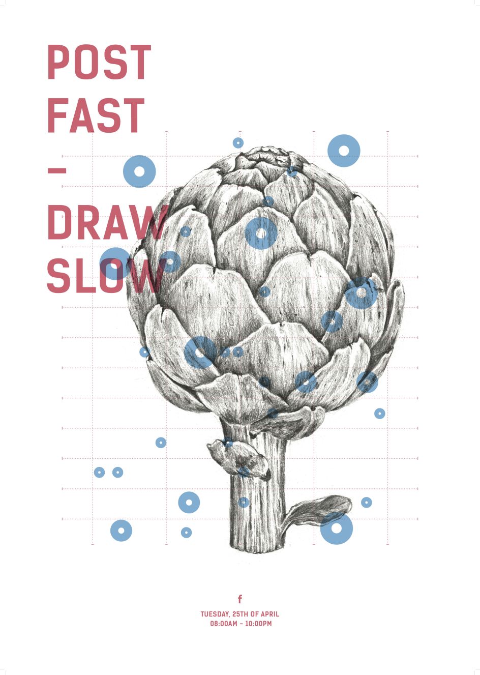
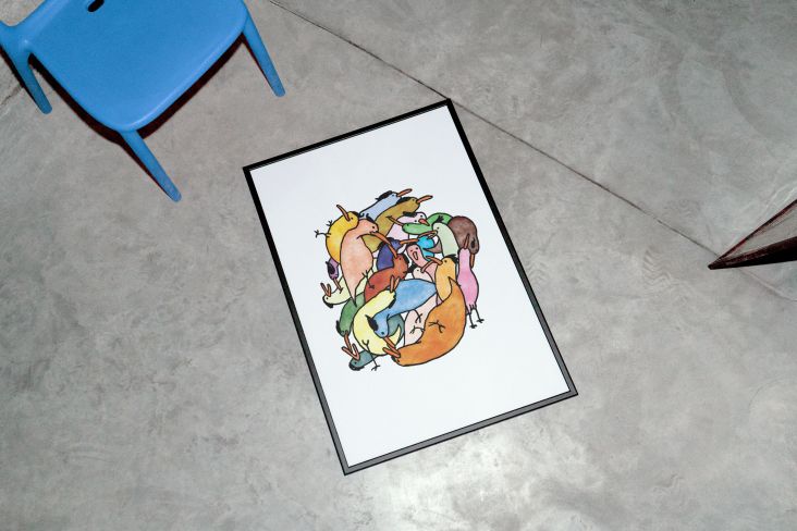
Yarmolinksy's final image visualises the spikes in inspiration she experiences over the course of a working day


](https://www.creativeboom.com/upload/articles/90/908fdb6378db1e95d12595416f54e6336d5e80b8_732.jpg)


](https://www.creativeboom.com/upload/articles/4d/4d608e74a5bff06863fe509d41b31bb2be8d93a8_732.jpeg)