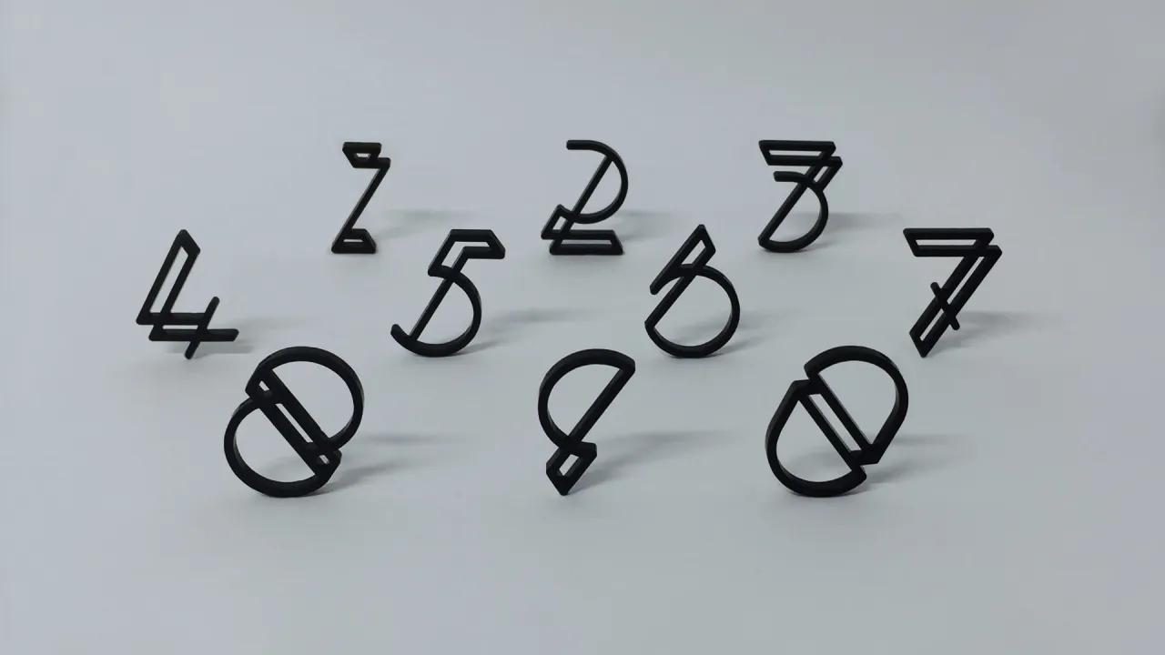
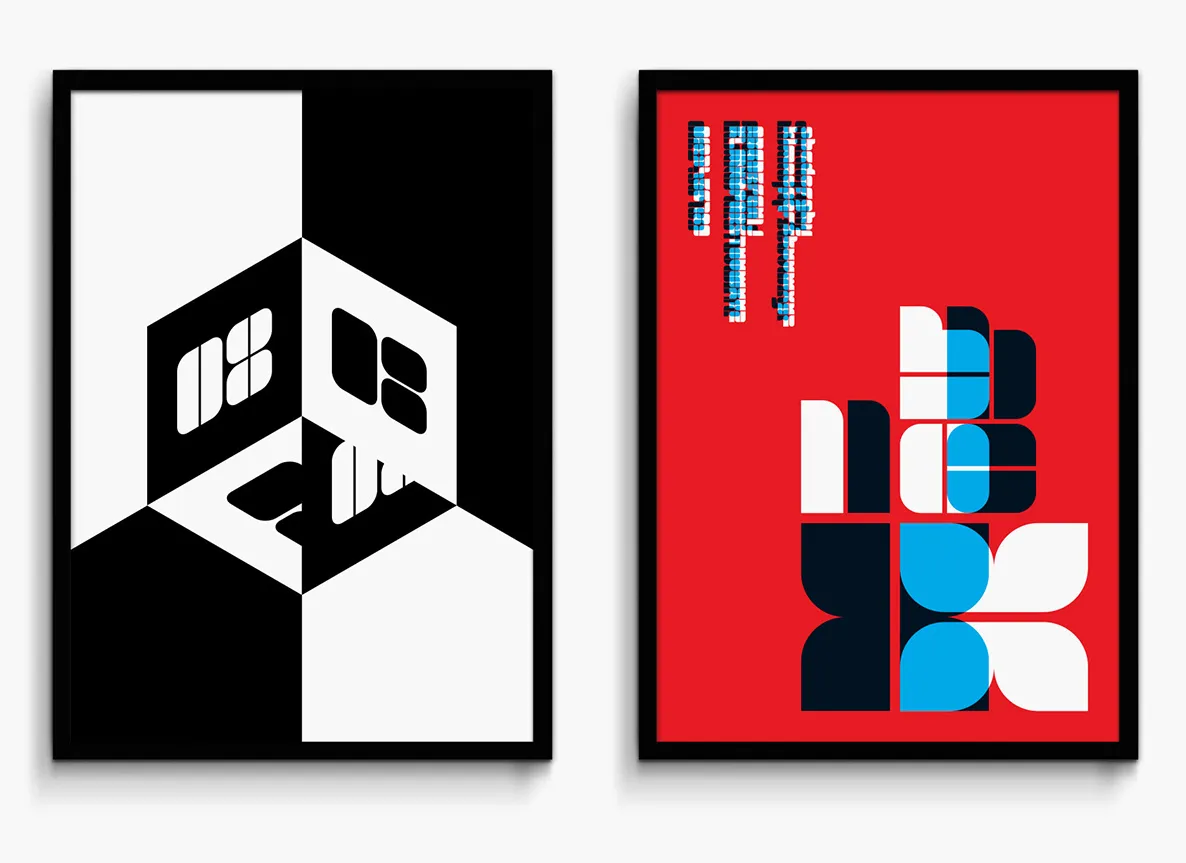
Superfried design studio celebrates its move to Manchester with a mini campaign
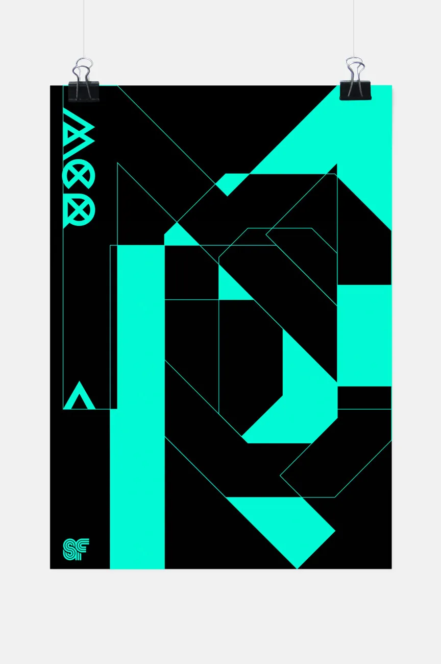
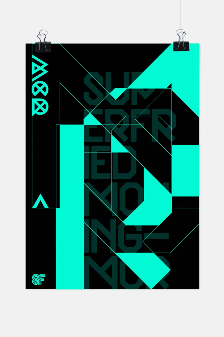
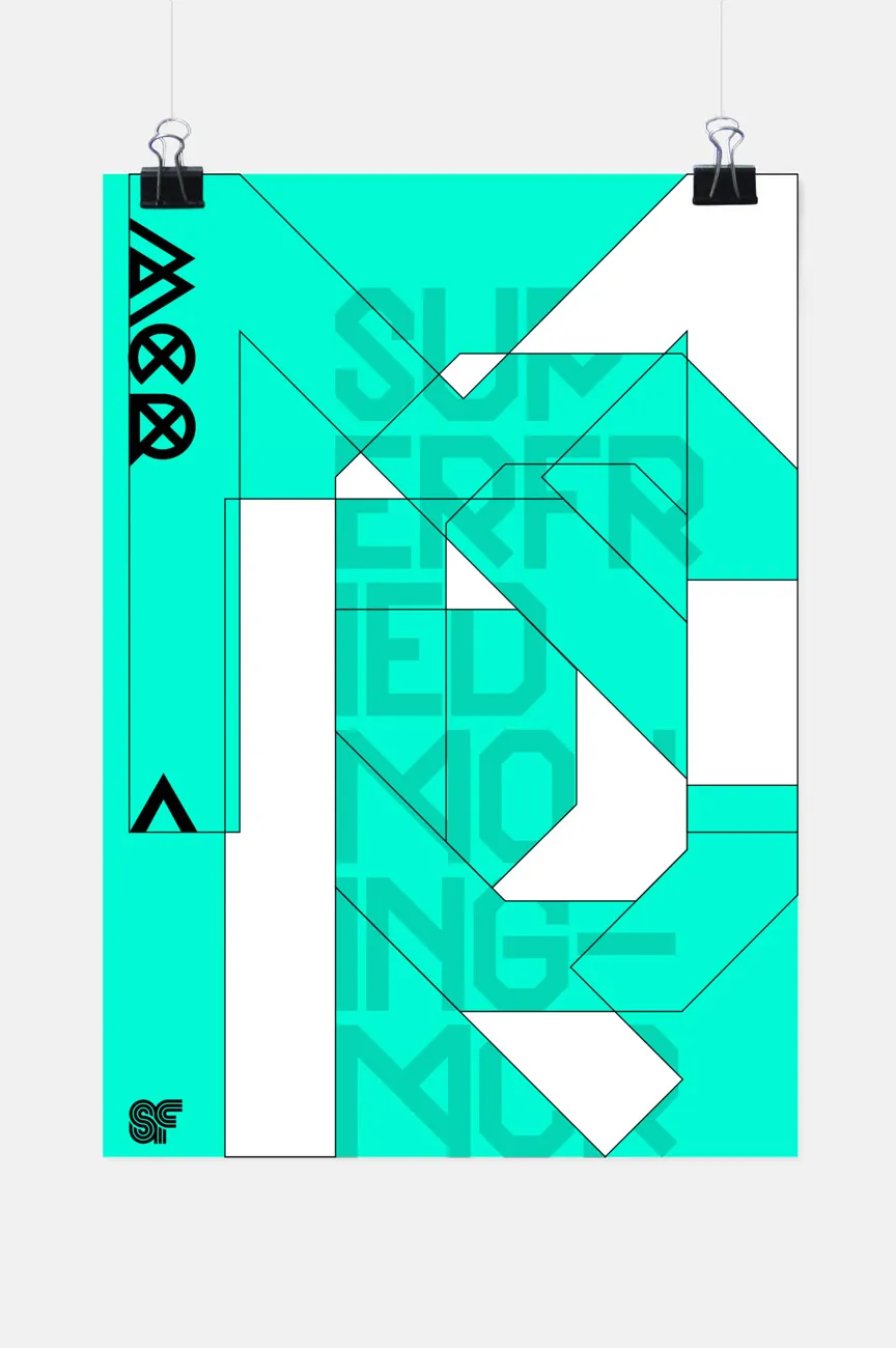
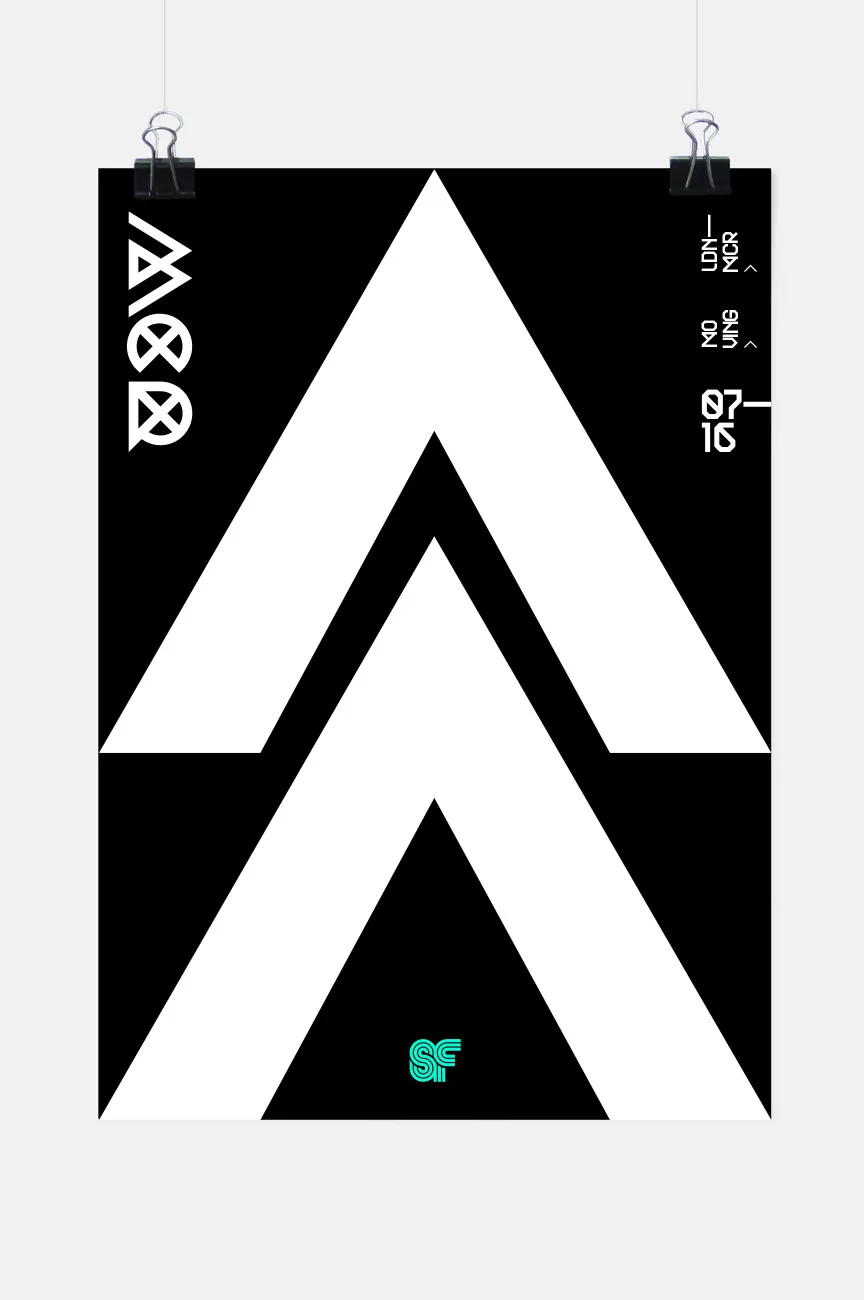
Superfried – the studio alias of graphic designer Mark Richardson – is leaving London for Manchester, and is celebrating the move with a mini graphical campaign, featuring a series of three teaser clips and accompanying visuals.
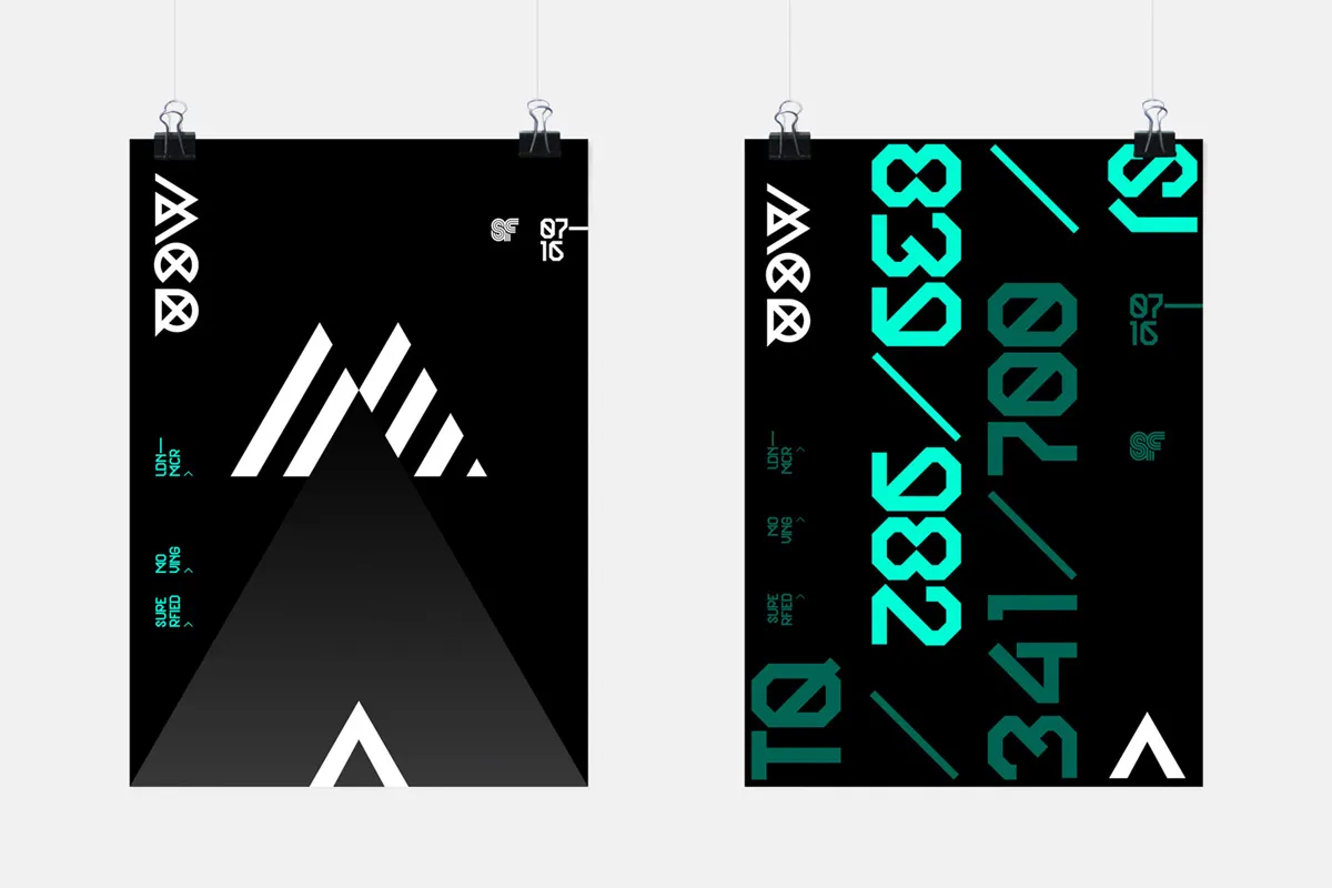
All images courtesy of Superfried
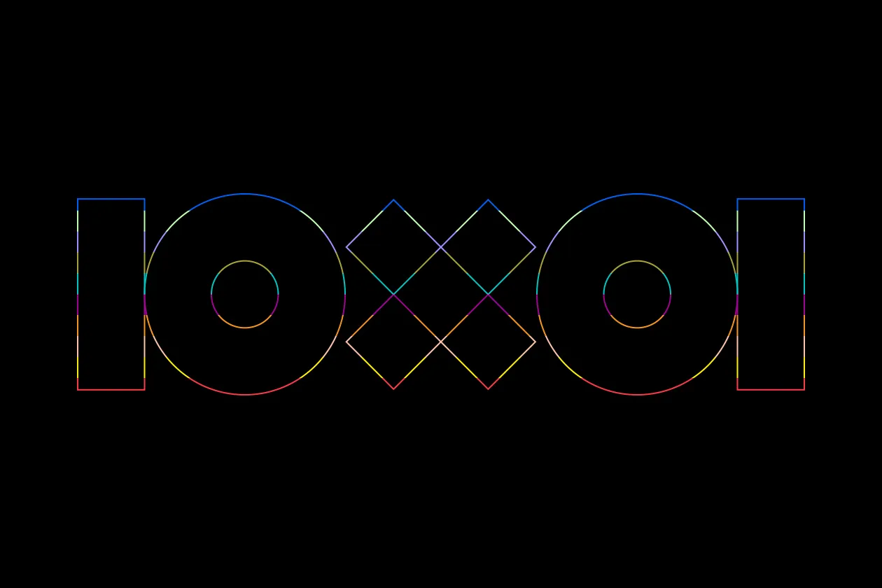
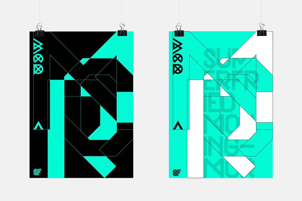
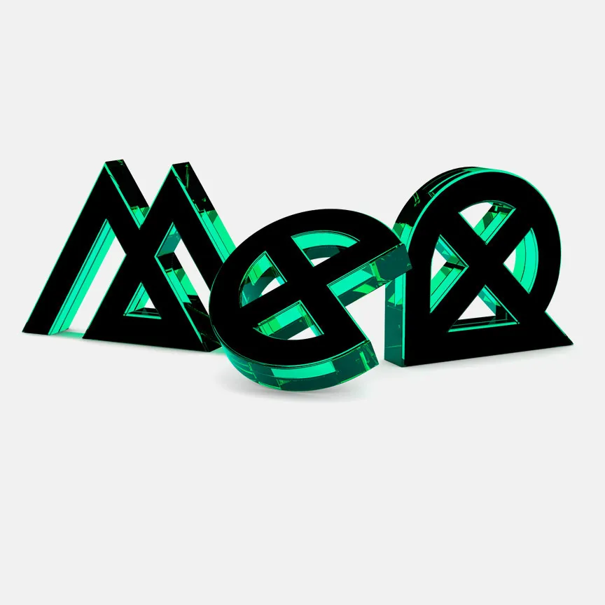
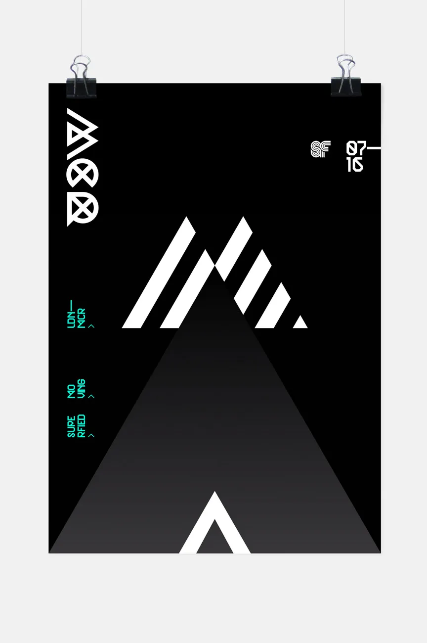
Mark explains: "The initial idea was to base everything on a triangle to represent the direction of travel, North. In the initial animation combination of two triangles form an apt 'M' for the destination. Removal of the overlap develops into the chevron and motorway upon which the journey will be made. Using the triangle based 'M' as a starting point, an MCR acronym marque was developed continuing with the triangular style to sign off the clip.
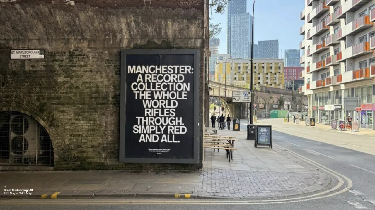
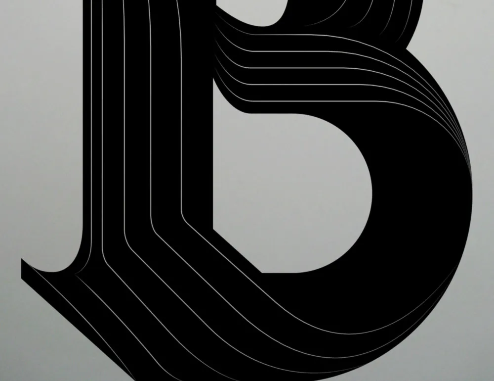
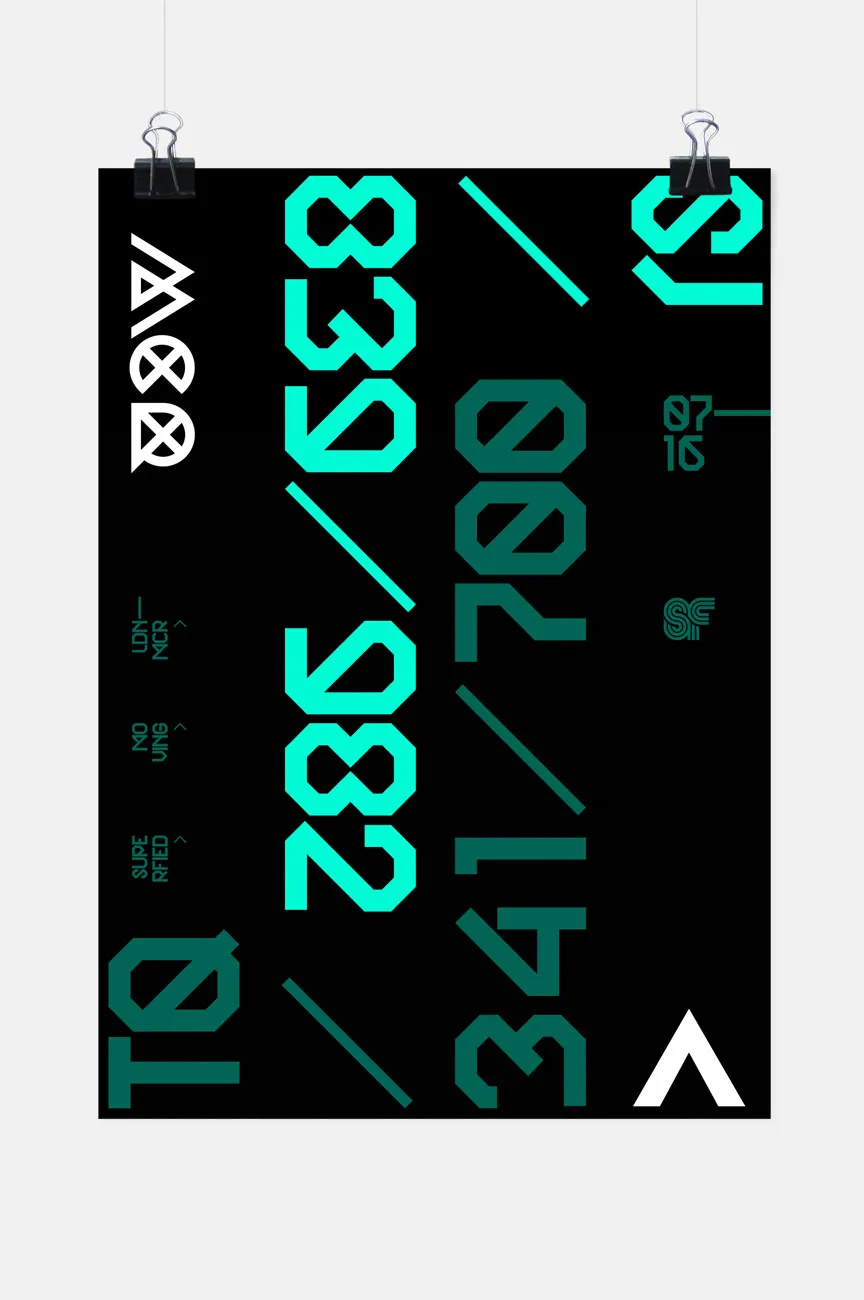
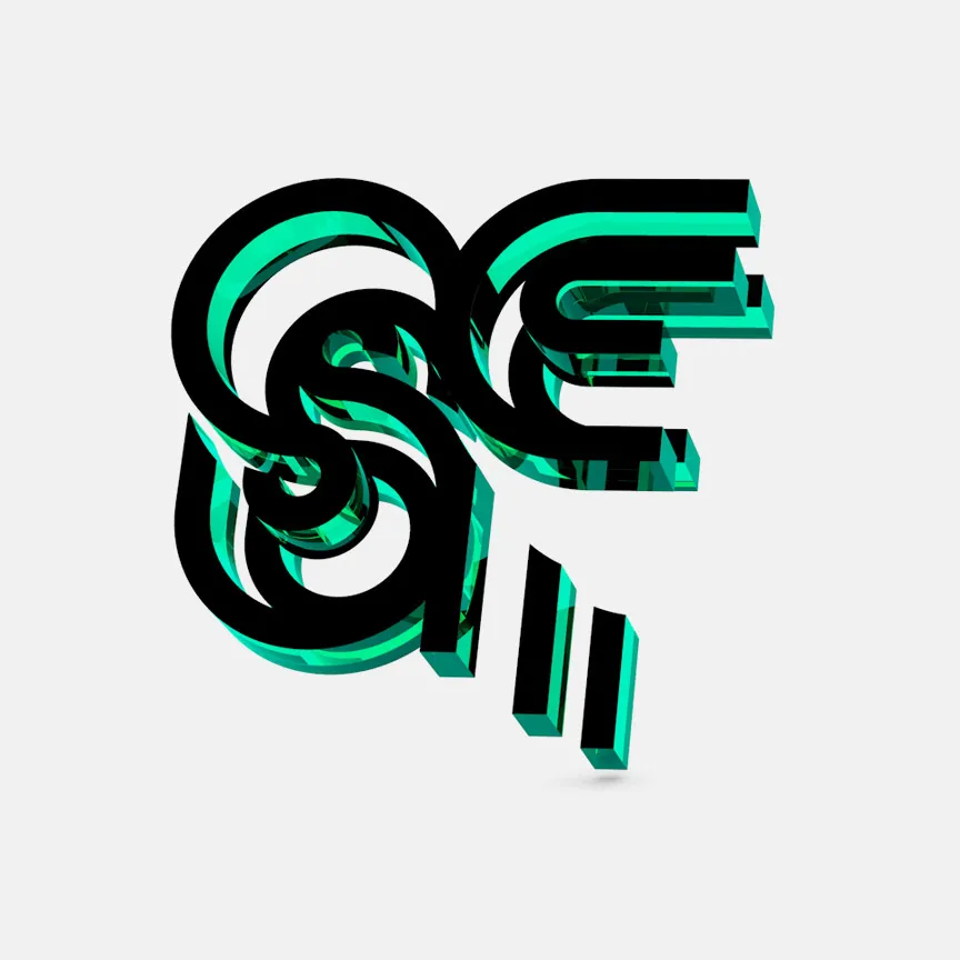
"The initial teaser was aptly ambiguous, so for the second the introduction of the two geographical locations, as six digit grid references, gave a hint to the meaning behind it. In the last teaser the clues become more obvious with the statement 'SF ^ MCR'. Based on the teaser visuals various poster styles were then developed in addition to 3D renders of the Superfried and MCR logotypes."
If you love Mark's work, you can get your hands on one of his own typefaces. To date he has released 15 families featuring 29 fonts. They are available through Hype for Type, MyFonts and You Work for Them. For more background on Mark, visit www.superfried.com.
Via direct submission | All images courtesy of Mark Richardson
Editor's Picks





Trending






Latest Jobs
Account Manager at BUILDHOLLYWOOD
Full-time·London·£34k–£38k
Design Director at Human After All
Full-time·London·£66k–£88k
Account Manager at Moxie and Mettle
Full-time·Cheltenham·Up to £35k
Brand Copywriter at Origin
Full-time·Porthleven, Cornwall·£35k–£40k
Creative Content Executive at Cognition
Full-time·Birmingham·£28k–£35k
Midweight Graphic Designer at We Are Your Friends
Full-time·London·£36k–£44k