New Upperhand Gin identity looks to Tarot for a look that champions the underdog
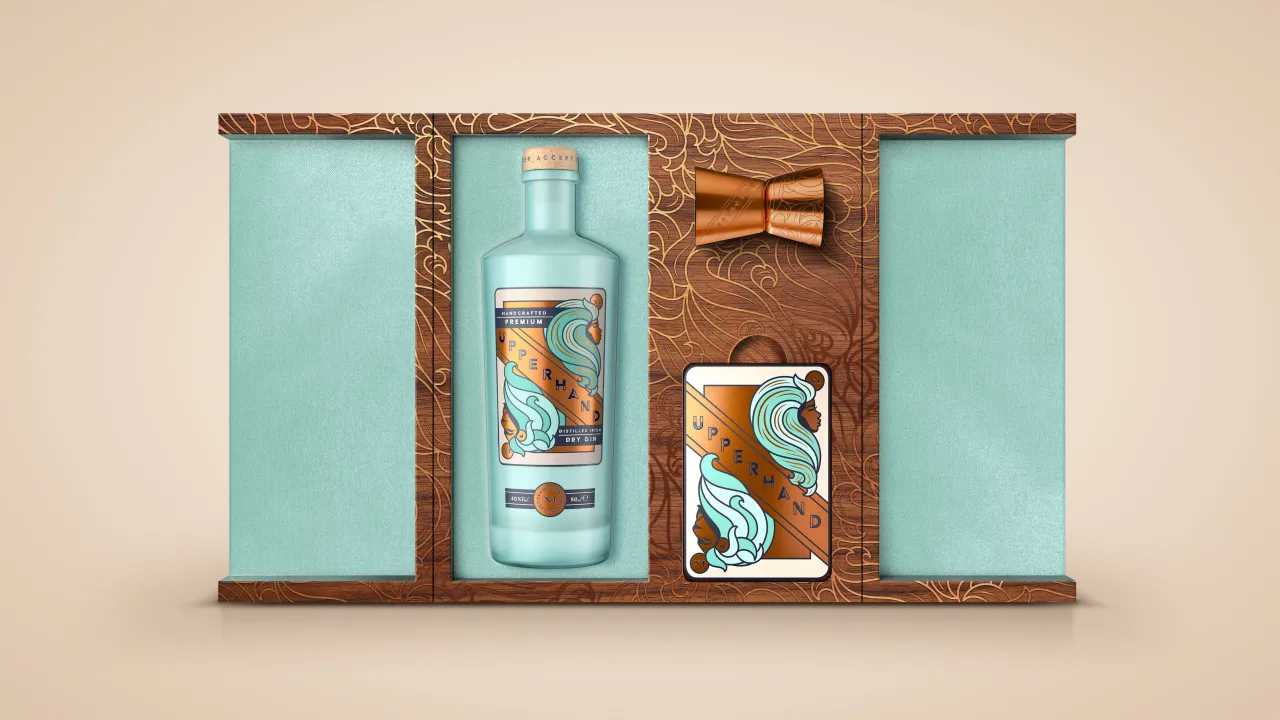
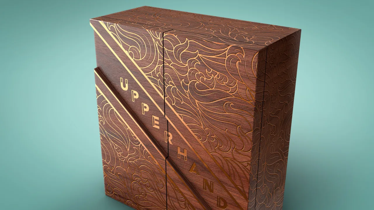
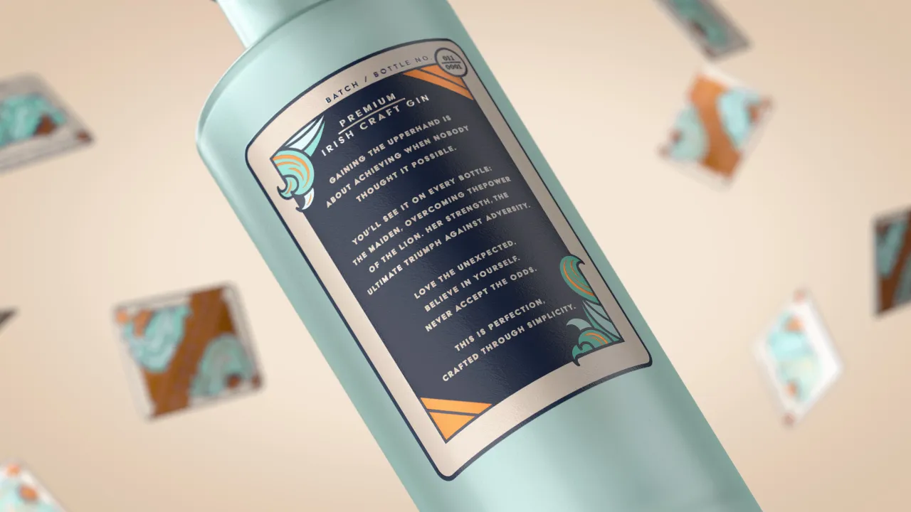
Design agency BrandOpus has created a new strategy, visual identity and “brand world” for gin brand Upperhand.
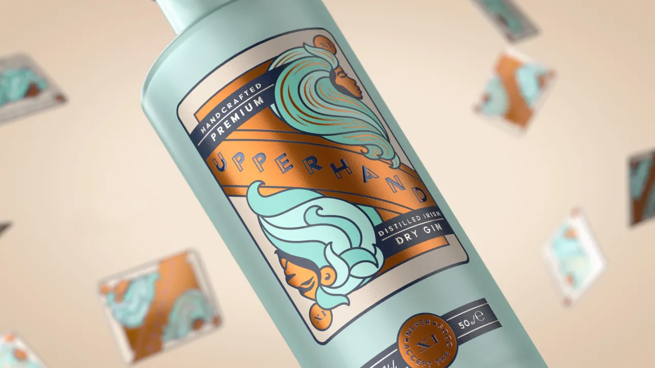
The gin was founded by Alberto Borin, who according to BrandOpus was “looking to build a brand that represented his approach to life…. Someone who has always had courage in his convictions and as a passionate sportsman he often considered himself an underdog who sought to exceed the expected.
“We wanted our work to encapsulate this strength and desire to take on life from an alternative perspective.”
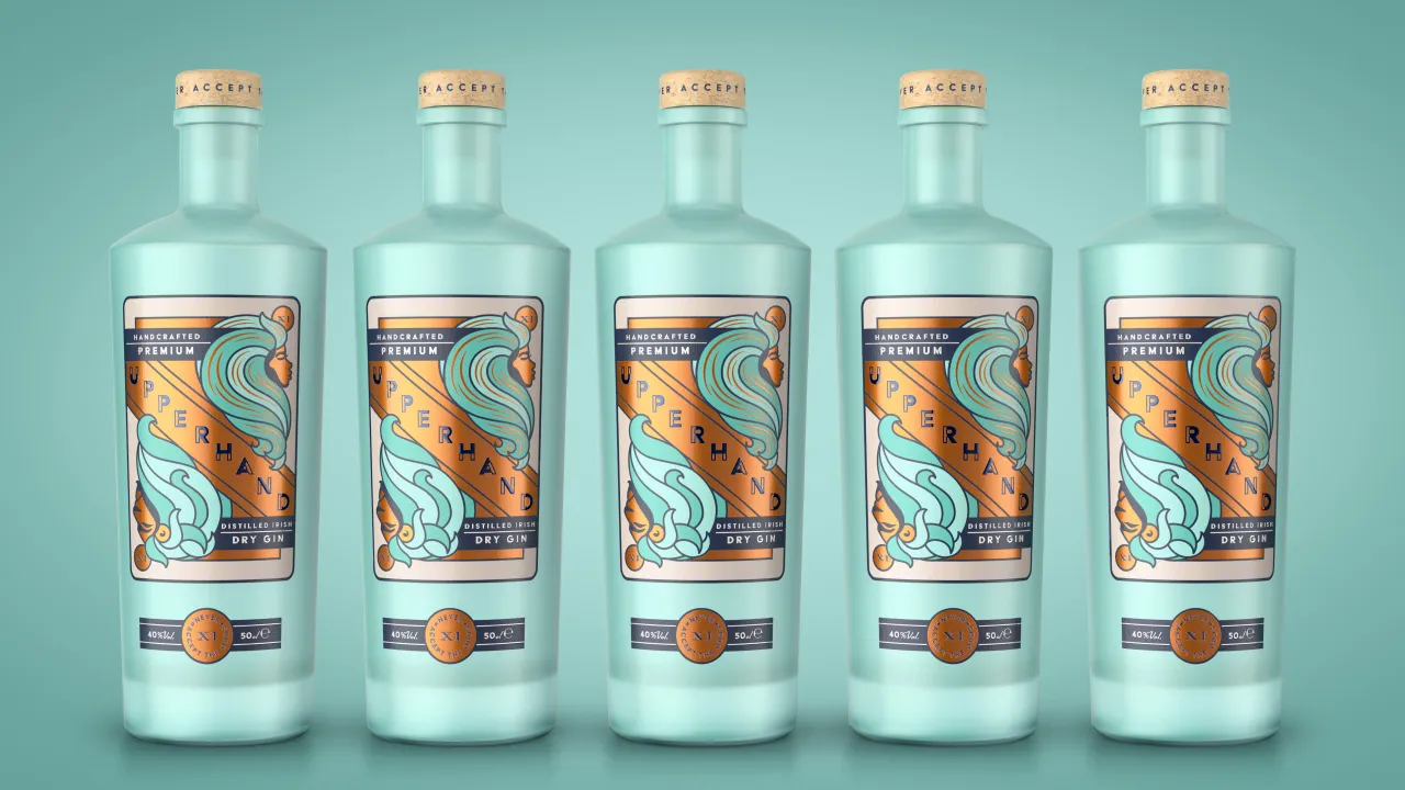
The designs use a number 11 as a central device. The number has been significant to Borin throughout his life, and so BrandOpus looked to the 11th tarot card for inspiration. In some tarot decks, this card represents strength, depicting a woman who against all the odds managed to tame a lion.
The Upperhand Gin identity was illustrated in-house at BrandOpus “to embrace the principles of fearlessness, courage and defying conventions,” says the agency.
Editor's Picks





Trending






Latest Jobs
Creative Project Manager at Analogue
Full-time·Leeds·£28k–£35k
Senior Digital Designer at 3800
Full-time·Sheffield·£40k-60k
Paid Media Executive at Munro Agency
Full-time·Glasgow·From £27,000
Senior Brand Designer at Analogue
Full-time·Leeds·£38k-£45k
Client Partner at Halo
Full-time·Bristol·£30k–£36k
Growth and Client Development Director at 3800
Part-time·Sheffield·£60k-80k




](https://media.creativeboom.com/7a1e2857-b4fe-4532-b27a-44aad620d310/conversions/1534a8a570312292c43f74da9968eac42becfa65-medium.webp)