Montenegro Studio's pared-back designs for 'mind health clinic' Equilibrium
Montenegro Creative Studio, confusingly based in Barcelona, works across branding, print and UX/UI design.
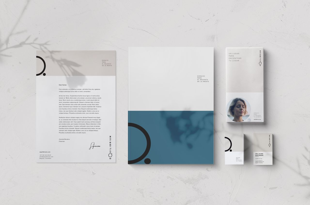
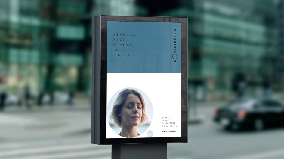
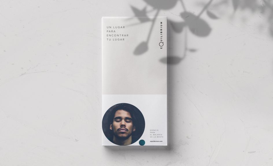
A recent project saw the studio create new branding for Equilibrium, a "mind health clinic" comprising a centre and hospital "with innovative methodologies and techniques to help people achieving a mind balance," says Montenegro Creative Studio. "Everything can achieve balance, but for everyone, it is different—here, [all people] can find it."
It can't be easy creating a brand design that has to communicate so many things: mind-based difficulties, an openness that shows the service is open to all, something eye-catching but with boasts an aesthetic rooted in professional, clinical confidence.
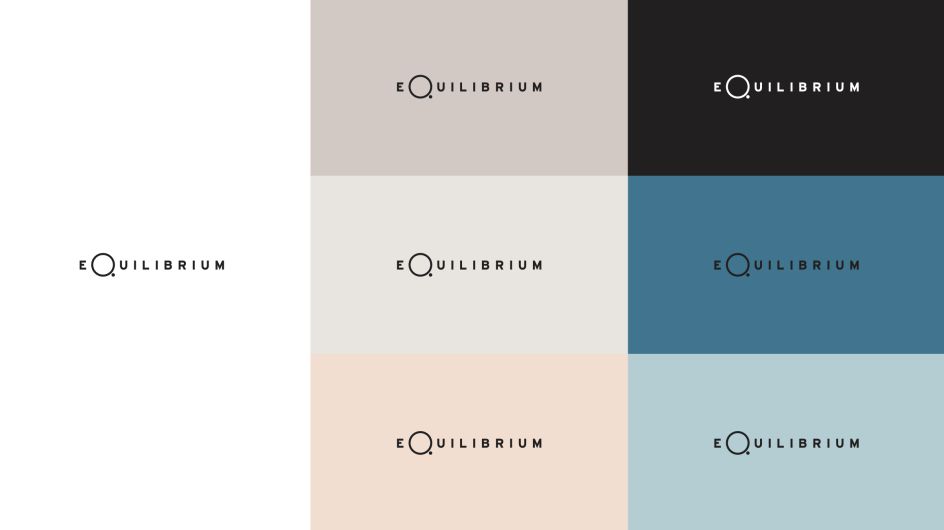
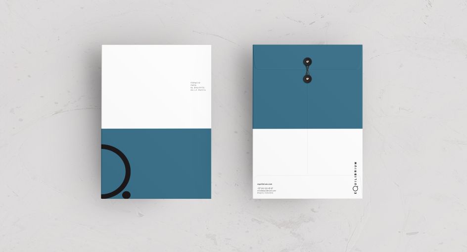
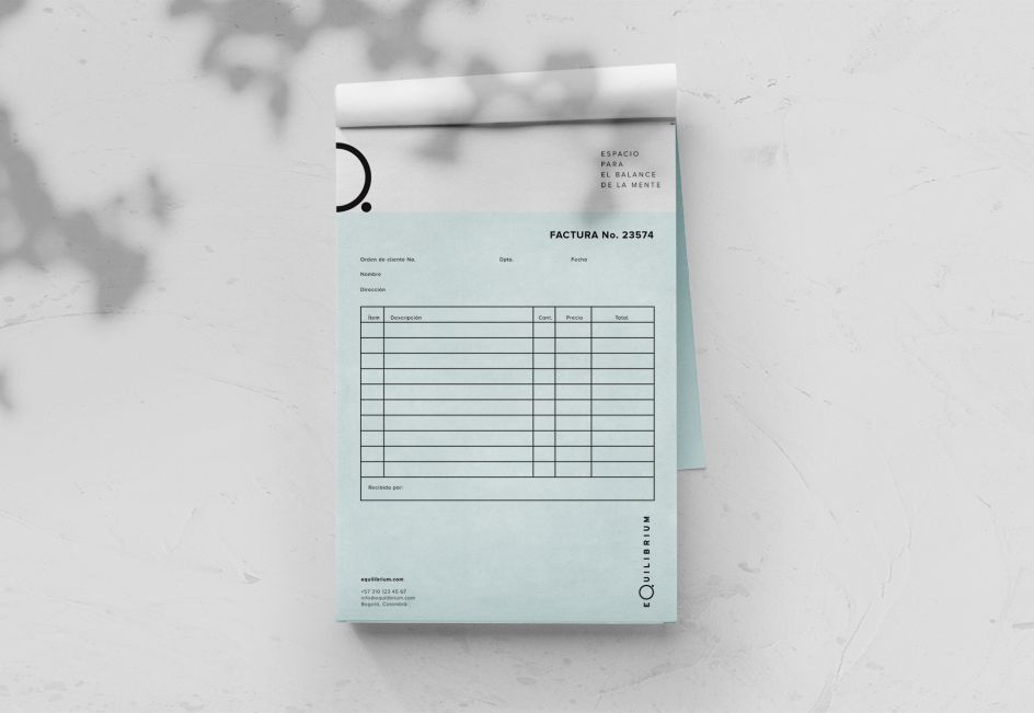
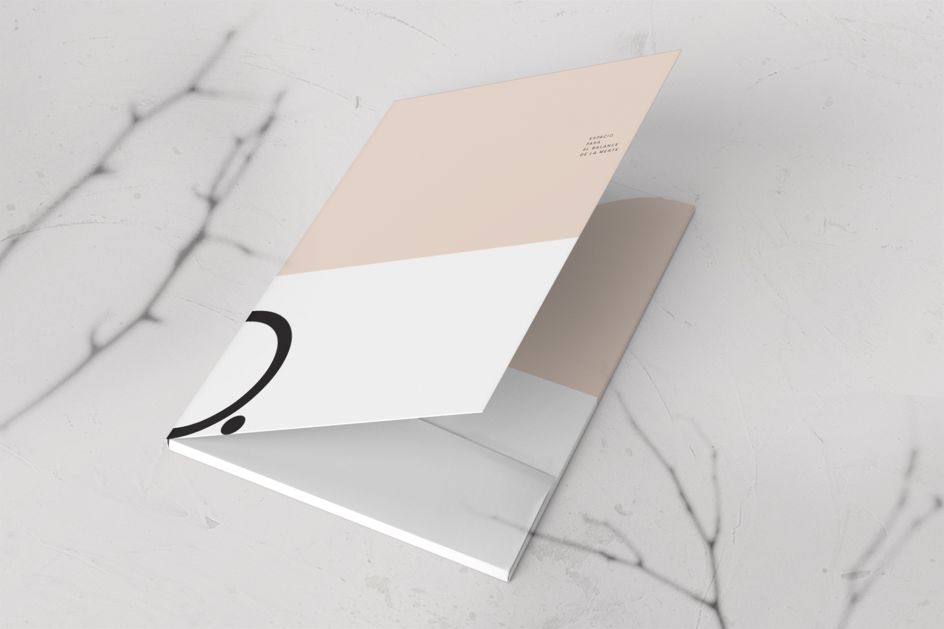
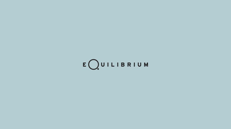
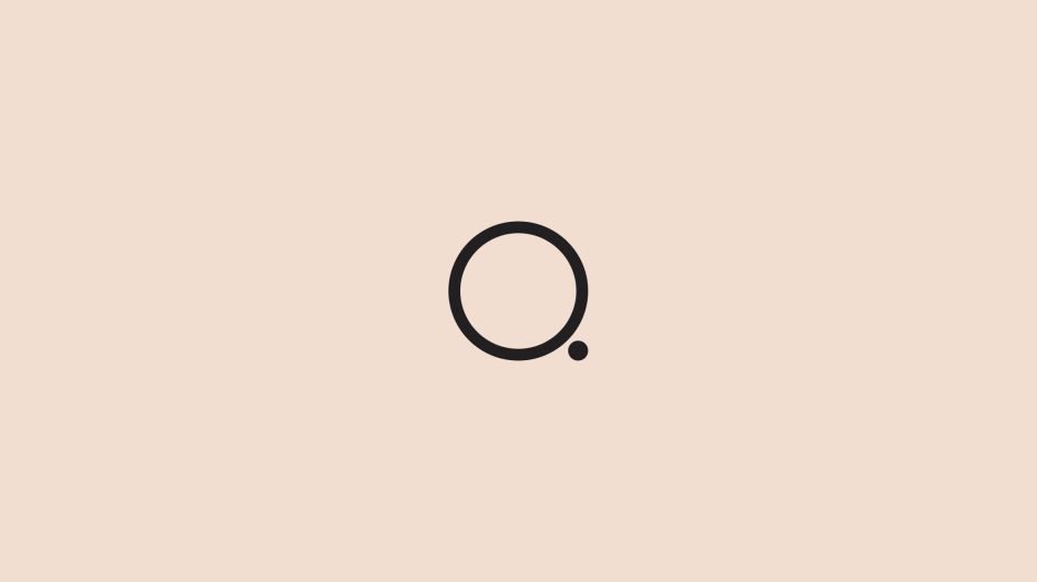
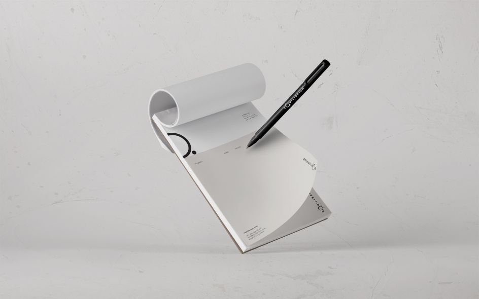
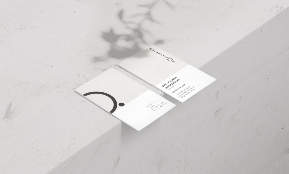
Throughout the branding, art direction and graphic design, the studio opted for a minimal approach, based around a central circle and dot device devised from the capital "Q" of the company's name.
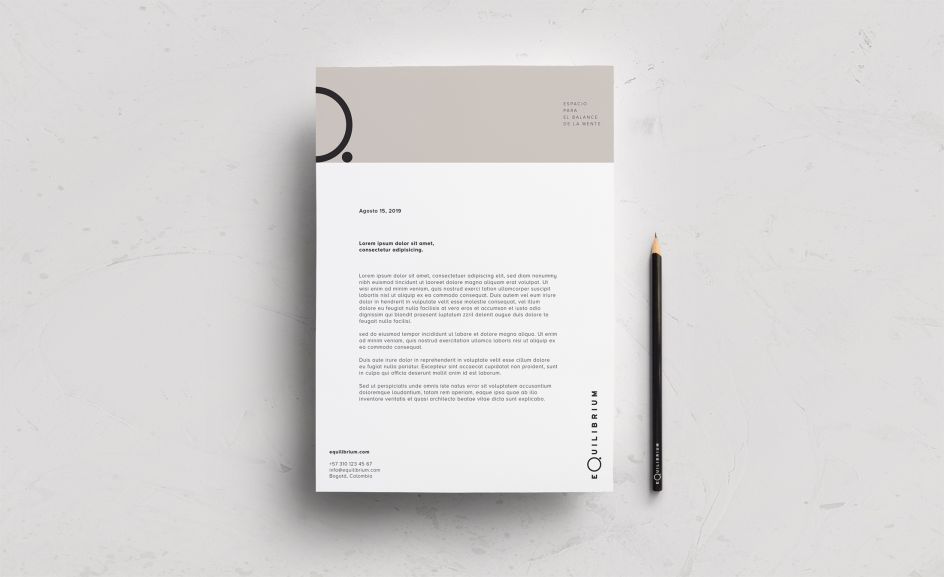
This is used in various applications from part of a wider text to a standalone graphic device that can be used as a logo of sorts across printed materials, letterheads, business cards, embroidered on lab-coat-like uniforms and as large-scale interior wall graphics and signage. It even becomes a bespoke shaped light in some treatment rooms.
The designs use a serene, simple colour palette of a darker take on duck egg blue and a biscuity tone; these range from darker teal to lighter turquoise, and serious-looking beige to a friendly peach colour.
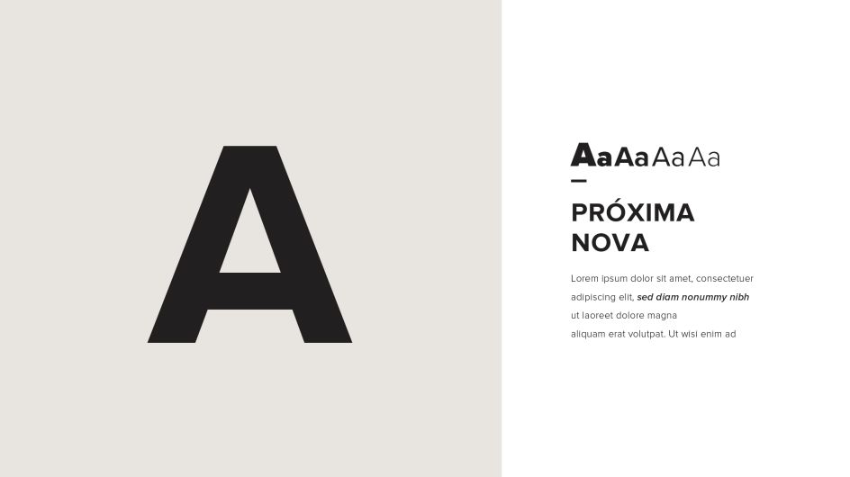
Proxima Nova is used throughout the branding—a classic sans serif somewhere between Futura and Akzidenz Grotesk. Its geometric qualities give it certain professionalism that other more cutesy sans serifs might lack, making it a great workhorse font for a complex visual identity brief.
Editor's Picks


Trending


Podcasts


Editor's Picks
Further Reading