Universal Favourite brands 'millennial-focused' contact lens brand, Dimple
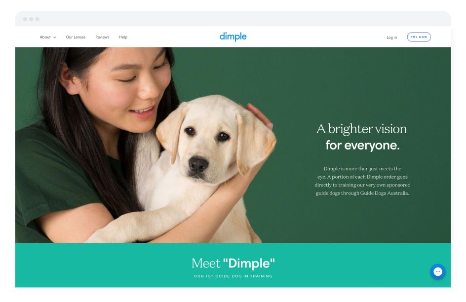
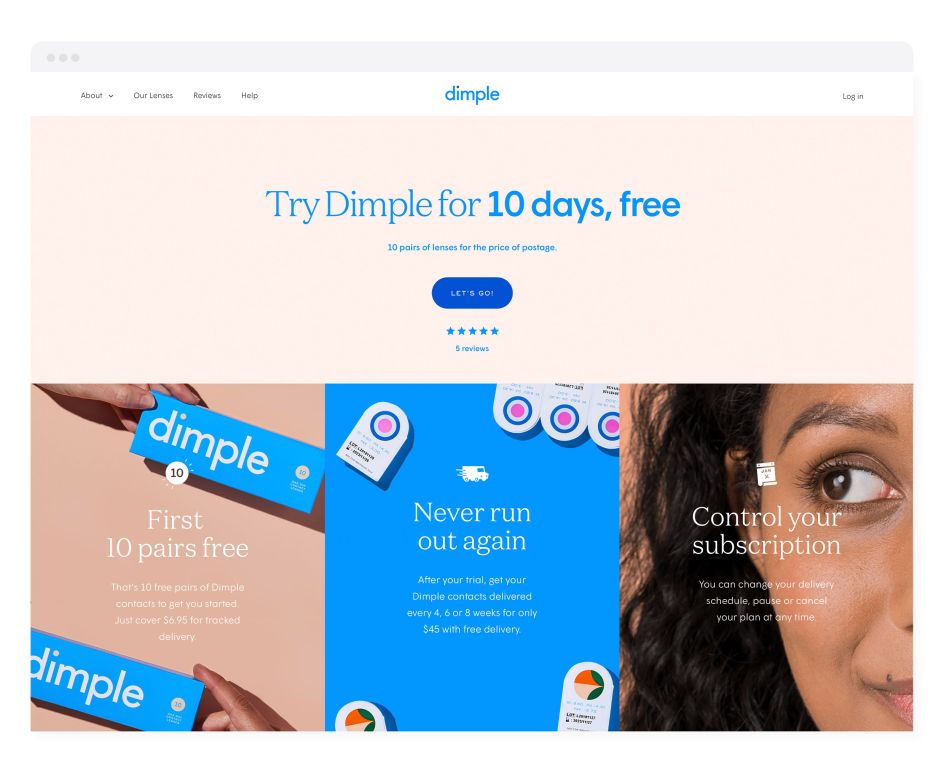
Australian design studio Universal Favourite has just unveiled its brand identity work for Dimple, the first direct-to-consumer contact lens subscription service in Australia.
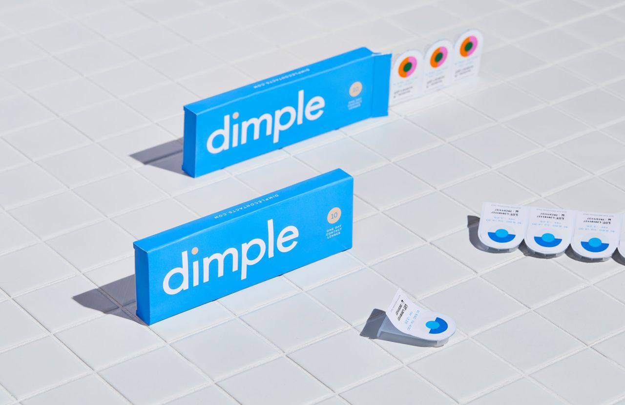
The designs aimed to position the company more as a "lifestyle brand" than its more "sterile" competitors, according to Universal Favourite: "Packaging has always been designed with the optometrist in mind — storable, stackable — leaving a sea of white, clinical branding that lacks any connection with its consumers."
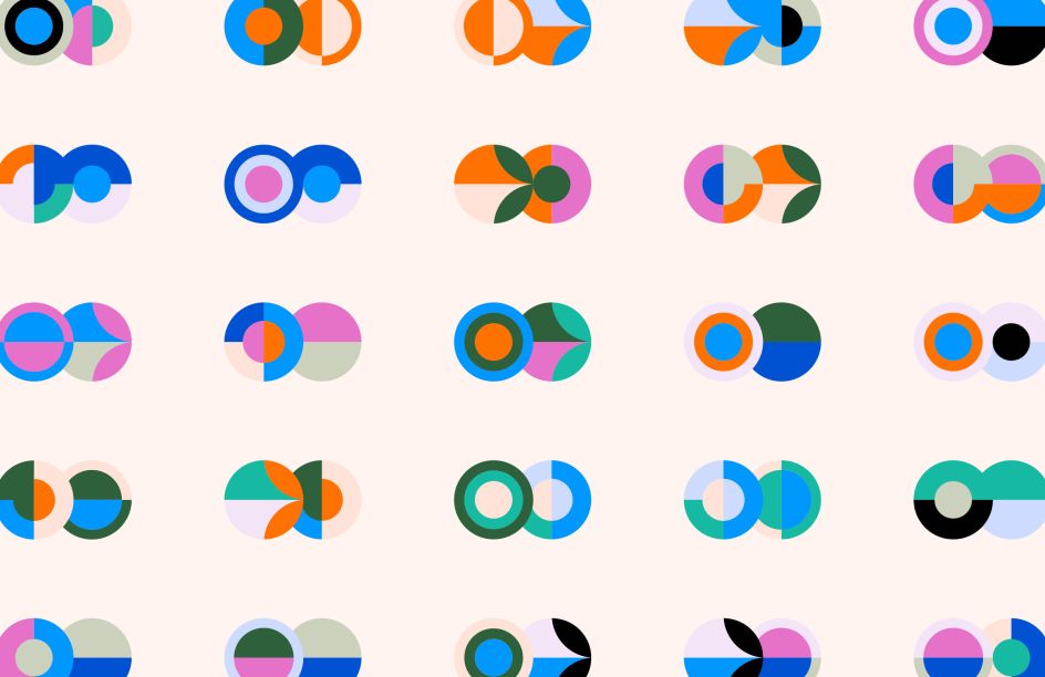
Consequently, the identity was deliberately bright, using a design system built around the fact that, for the most part, everyone’s left and right eye prescription is different.
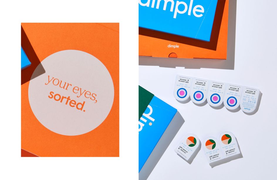
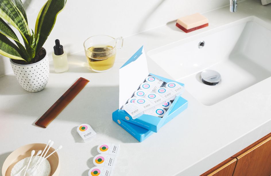
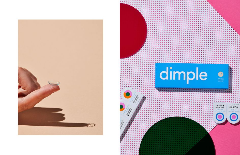
The studio created an illustrative suite of 60 colourful, complementary circles that correspond to each power number (from -12.00 to +6.00) to show the vast number of combinations of individual prescriptions. These are displayed on packs to make it easy for users to identify the pack they need for each eye.
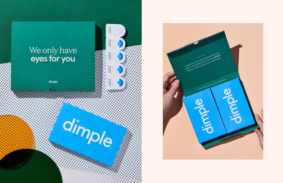
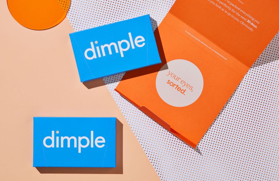
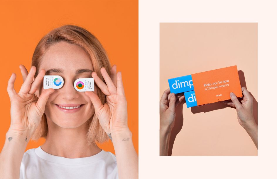
"As a direct-to-consumer company, we wanted the unboxing experience to be an utterly unexpected delight," says the studio. "From the blister packs coated in our custom pattern IDs to the boxes, mailers, sleeves and monthly information cards, we designed the entire packaging suite with our millennial market at the forefront of our minds."
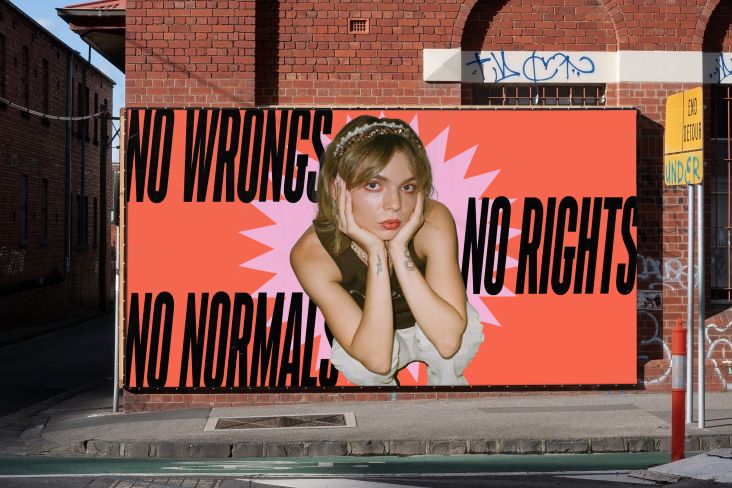
The launch campaign's art direction centred on showcasing "a vibrant community of contact lens wearers", it adds. Using images shot by Jonathan May, the bright, playful imagery looks to celebrate wearers' individuality and "the freedom to have fun that contact lenses provide them."
Universal Favourite partnered with Benito Martin and Jessica Johnson for the product shoot and Lyndon Foss for the lifestyle shoot to create a comprehensive and flexible suite of brand assets that could be used across web, communications, social and advertising in the year following the launch.
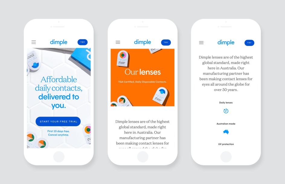
The designs for the website across desktop and mobile is deliberately bold and simple to use in its interface, with visual "easter eggs" throughout the process of users signing up.
