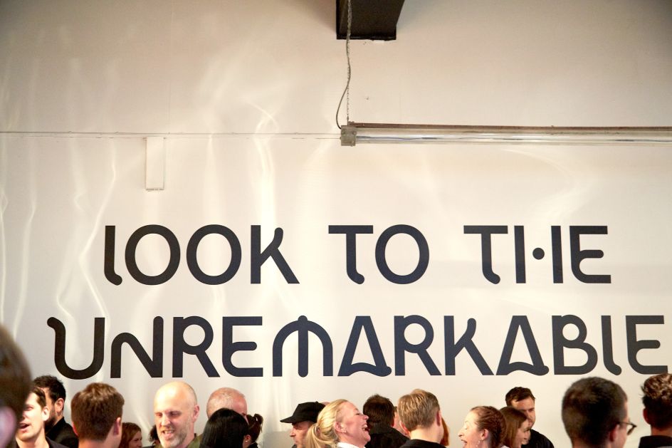
'Looking at the unremarkable', Public creates its own custom display typeface
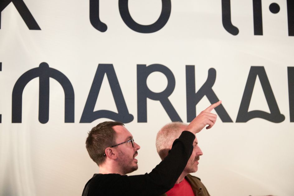
London creative studio Public has produced a custom display typeface, Public Slab Sans. And you might be surprised to learn how its inspiration came from the "unremarkable".
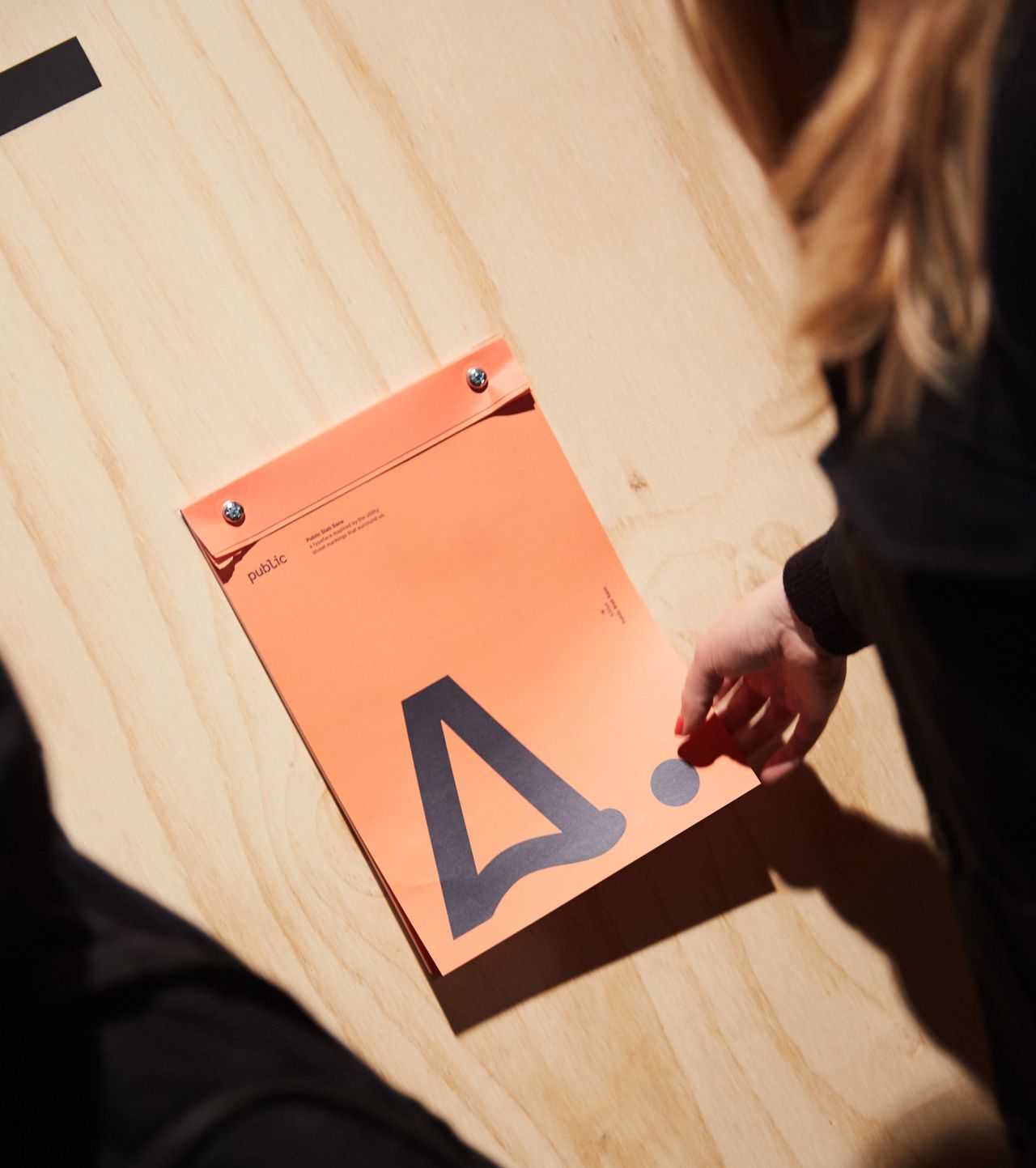
All images courtesy of Public
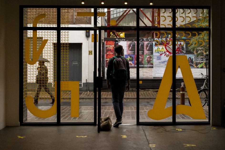
Looking to the often-unnoticed utility street markings that exist on roads and pavements everywhere, Public explored various different forms and found a complex language of marks and symbols that – while discernible to the numerous utility contractors at work on our streets – is almost totally ambiguous to the untrained eye.
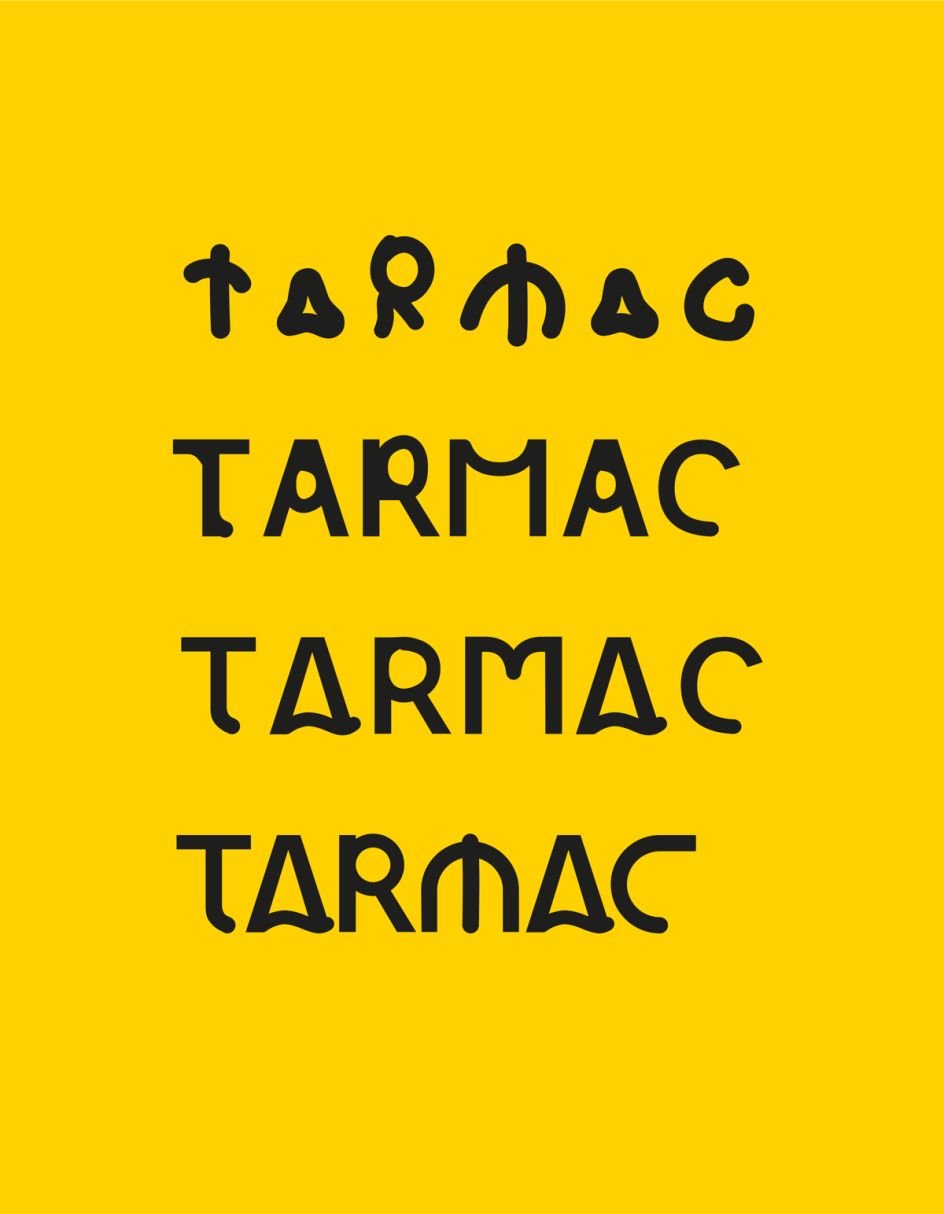
Experimenting with the markings eventually led to the creation of Public Slab Sans, a typeface which seeks to balance the spontaneity of the marks with the exacting structure of a digital typeface. "The resulting design is a distinctive combination of round curves and sharp corners, which reflects the fluid nature of the markings and aims to retain some of the ambiguity of the original forms," explains Public. The typeface, in fact, includes various arrows, which are a common symbol used in road traffic repair communications.
The project’s creative lead and graphic designer Joe Powderham said: "We were drawn to the coded graphic language of the temporary marks spray painted on the streets around our studio, finding a compelling beauty in them which ultimately inspired Public Slab Sans."
Public Slab Sans is available to download at public.london.