Bureau David Voss shows how it's done when it comes to student/studio collaboration
Many graphic designers have spoken about how valuable it is to teach others for their own practice, and few have manifested that relationship so beautifully as Bureau David Voss.
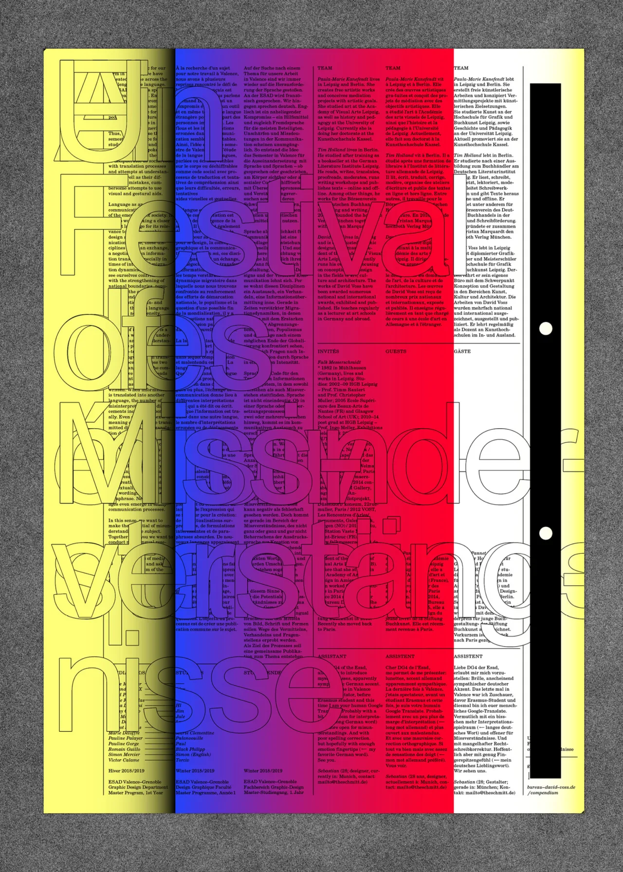
Based across Paris and Leipzig, Germany, the studio prides itself on making conceptual design work across the cultural field. “The basis of our work is a strong collaboration with our project partners and to share competencies for good and fitting results,” says the studio.
The eponymous Voss first opened the studio in 2008 in Leipzig and was joined in 2014 by his first studio partner Ondine Pannet. Two became four when Lisa Pflästerer joined in 207, and Lisa Petersen a year later. In 2018 Pannet moved back to Paris, and in doing so opened the Bureau David Voss satellite studio.
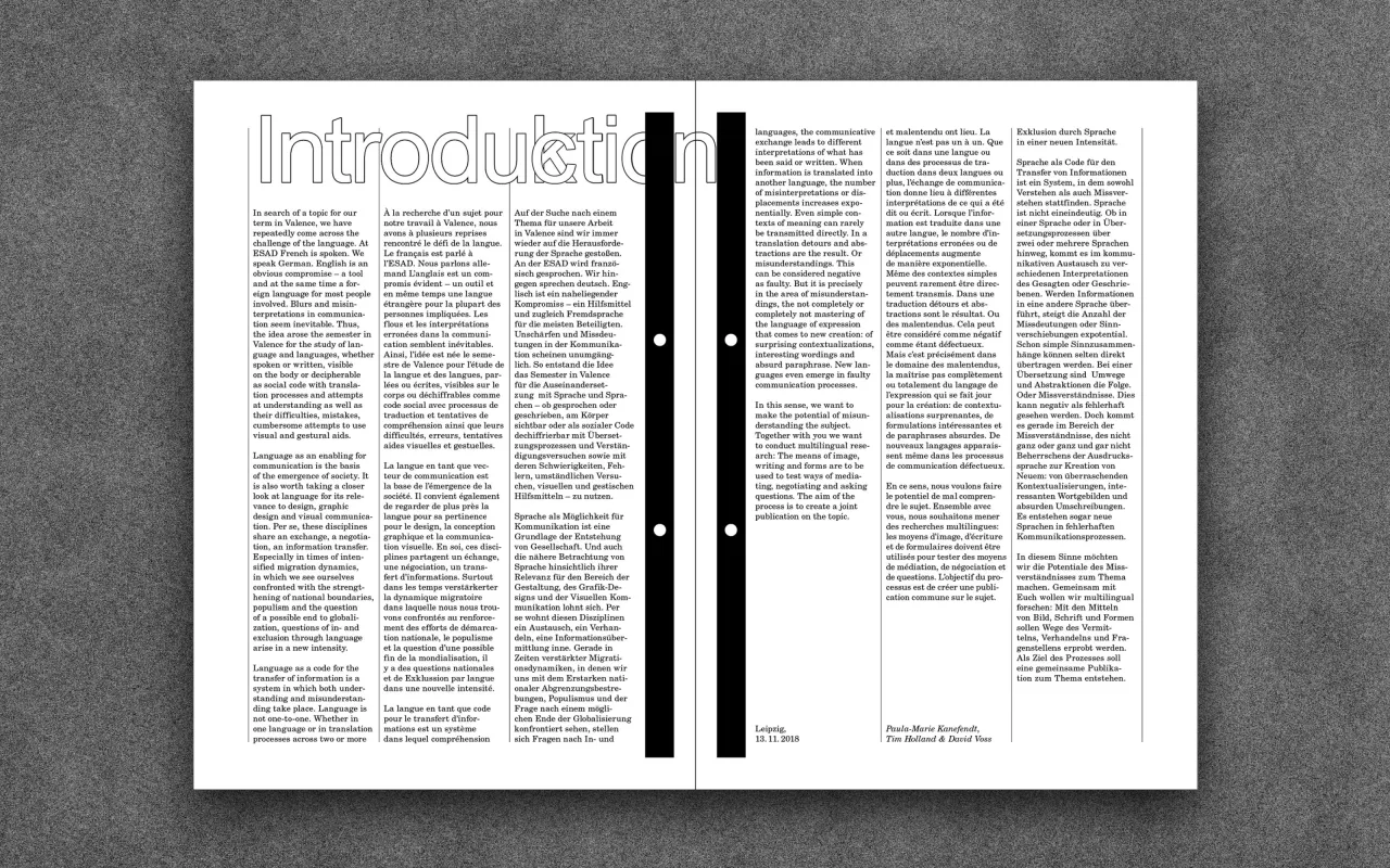
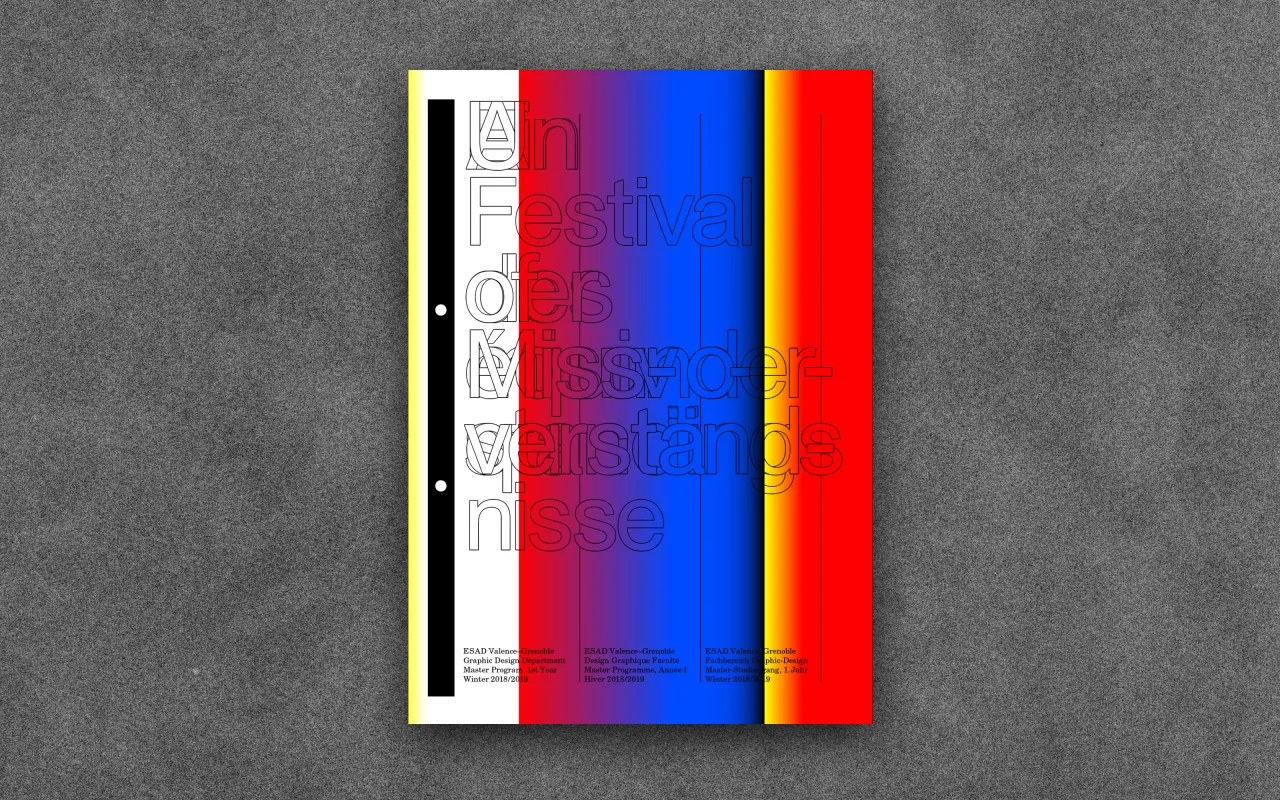
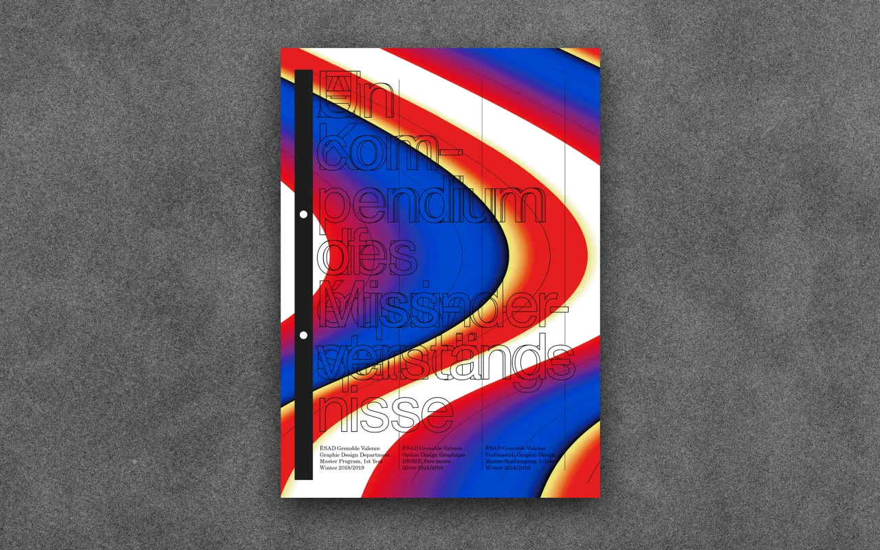
It was in France that a wonderful recent project emerged, in the shape of a workshop and resulting publication from Un Festival of Missverständnisse at ESAD Valence-Grenoble last winter. The studio was invited by the art school there to run a project during the first semester of the master's programme in design.
Working with the artist and art mediator Paula Kanefendt and the poet and editor Tim Holland, the team decided to work with the students around the theme “misunderstandings”.
“A broad associative approach to the topic was provided by a reader to help the students preparing the semester,” says Studio David Voss. “The reader outlined the possible potentials of the leitmotiv from different perspectives, and was the starting point for the discussion.”
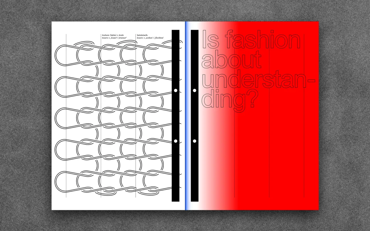
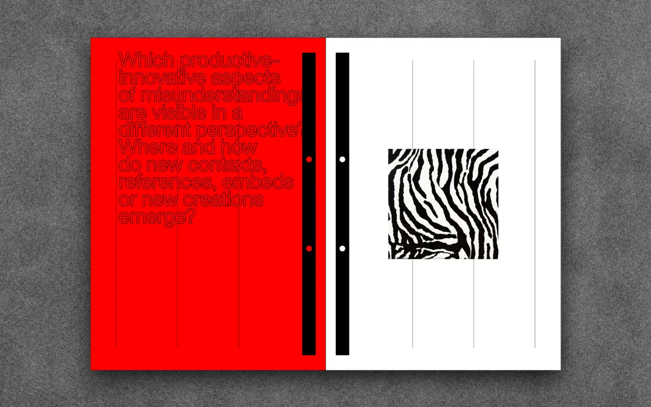
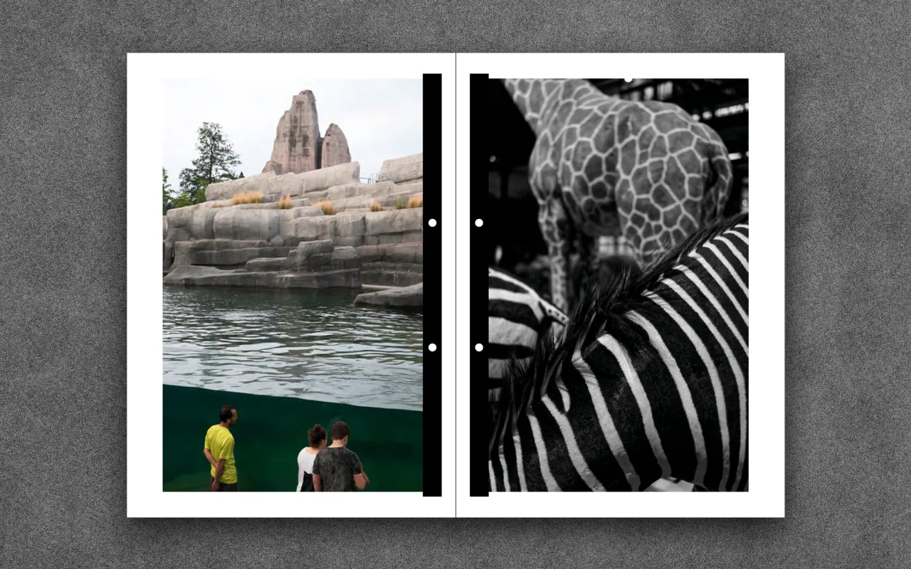
Throughout the semester, students undertook collective and individual research using the reader as a starting point, working towards the creation of a collective publication based on the subject “misunderstandings”. The studio says: “This gathers the analogue and digital results of the various research and design process within a final publication.
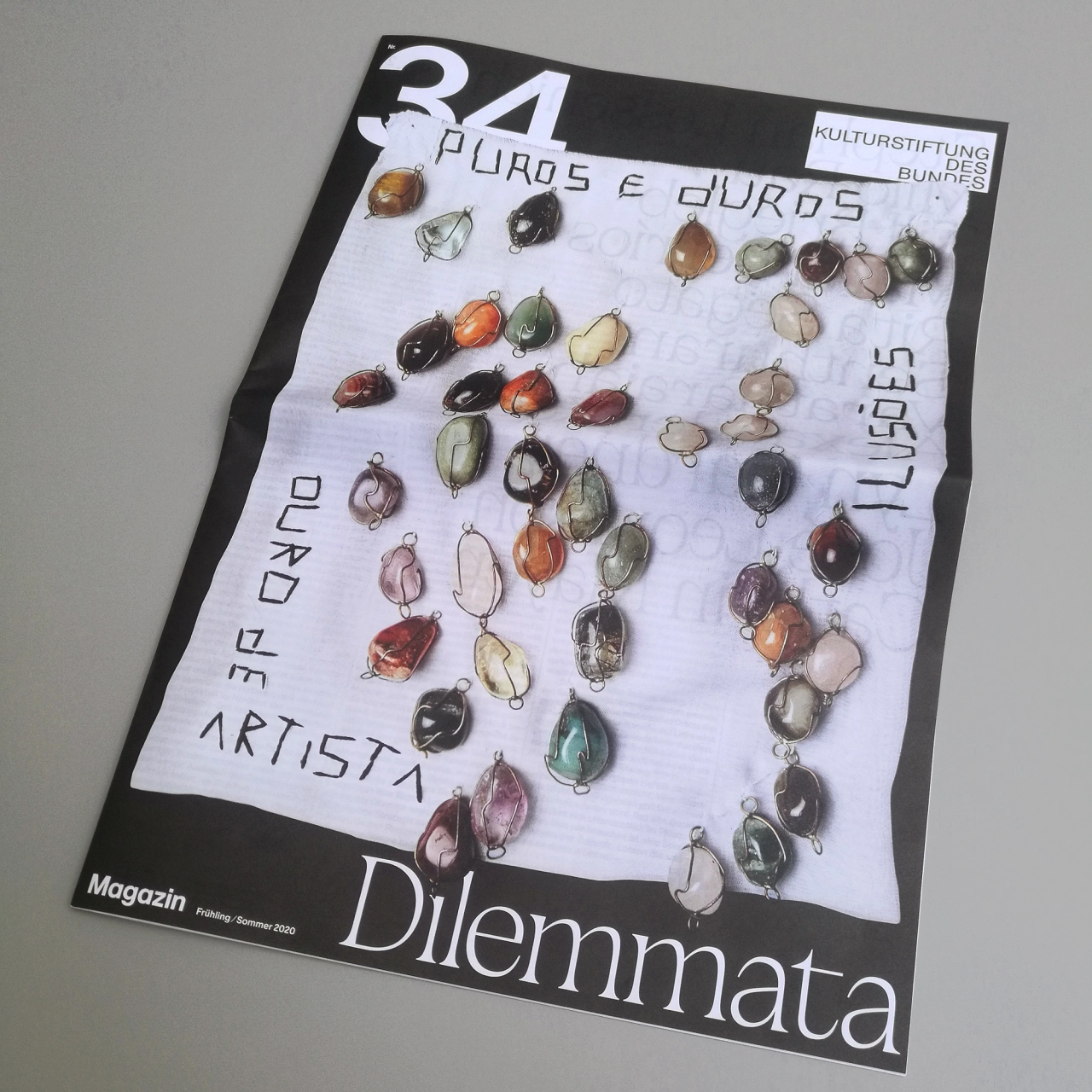
“Thus, the two printed matters are framing this collective work on the subject of misunderstandings: the reader was its starting point and the compendium its goal and conclusion.”
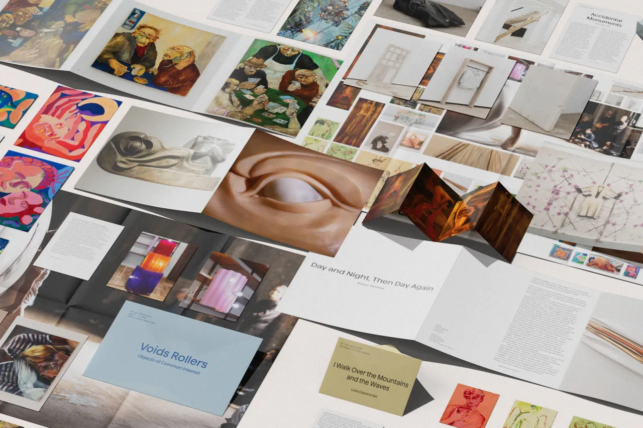
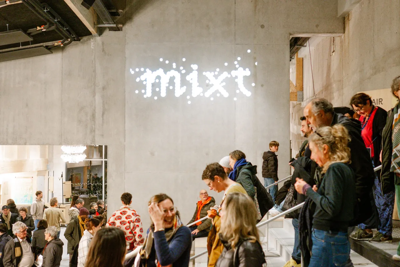
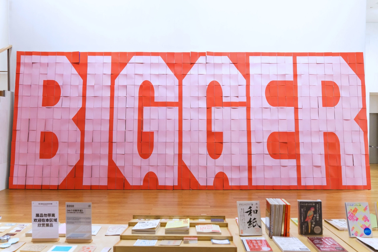
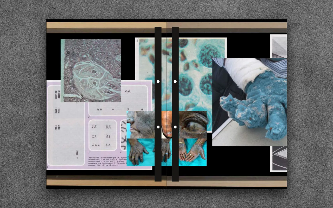
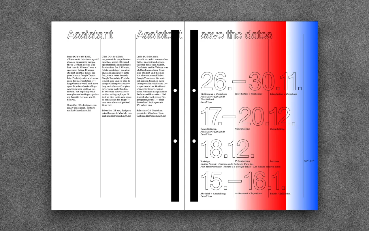
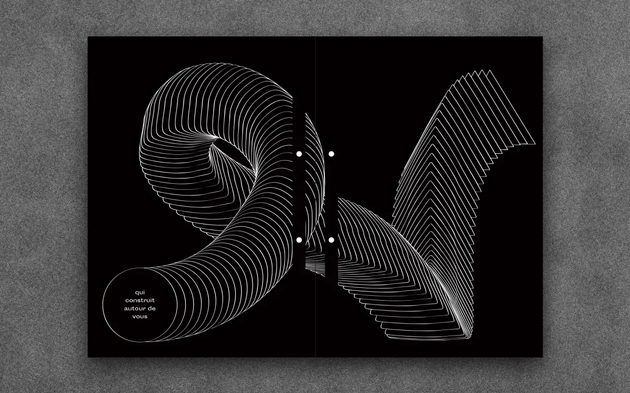
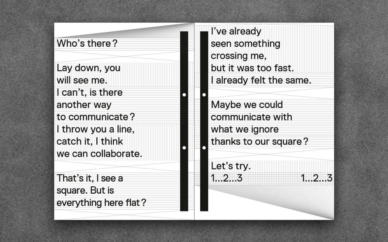
A poster was also designed, and the results of the workshop were displayed in an exhibition. The resulting publication shows fascinatingly experimental approaches to typography, layout and colour; with a mixture of page styles—some just text presenting in storage, directed columns; others with collaged post-internet pictorial snippets, others with stark black and white futuristic CG images.
Beautiful work, and an example of the very best things about intergenerational collaboration.
Editor's Picks





Trending




Latest Jobs
Midweight Full Stack Developer at Bureau for Visual Affairs
Full-time·London (Open to remote)·£35k–£50k
Brand Strategist at DNCO
Full-time·London·£45k-£60k
Junior Project Coordinator at Colorido Studios
Full-time·Twickenham·£28k–£32k
Senior Digital Designer at 3800
Full-time·Sheffield·£40k-60k
Account Manager at BUILDHOLLYWOOD
Full-time·London·£34k–£38k
Frontend Developer at Northern Artillery
Full-time·Leeds·£35k–£45k