me&dave brings London's Royal Mint Court back to life with a refreshing branding strategy
me&dave, in collaboration with real estate developer Delancey, has brought London institution Royal Mint Court back to life with a refreshing and unique branding strategy.
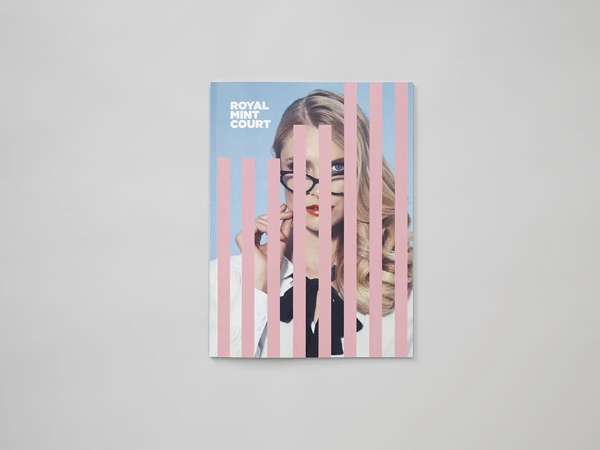
Since Barclays’ departure in 2000, the historic British site had been left dormant, so the agency was appointed to turn its fortunes around and create a brand that would respect the heritage – there are listed buildings and it’s opposite the Tower of London – and "shout out" about its forward-looking potential.
London is famous for its old-world architecture and history, but it’s also an international powerhouse that never lets the past hold it back. me&dave reflected that energy with a "pop" colour palette and strong, disruptive imagery to shift perceptions and revitalise the iconic development.
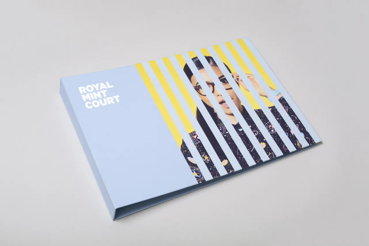
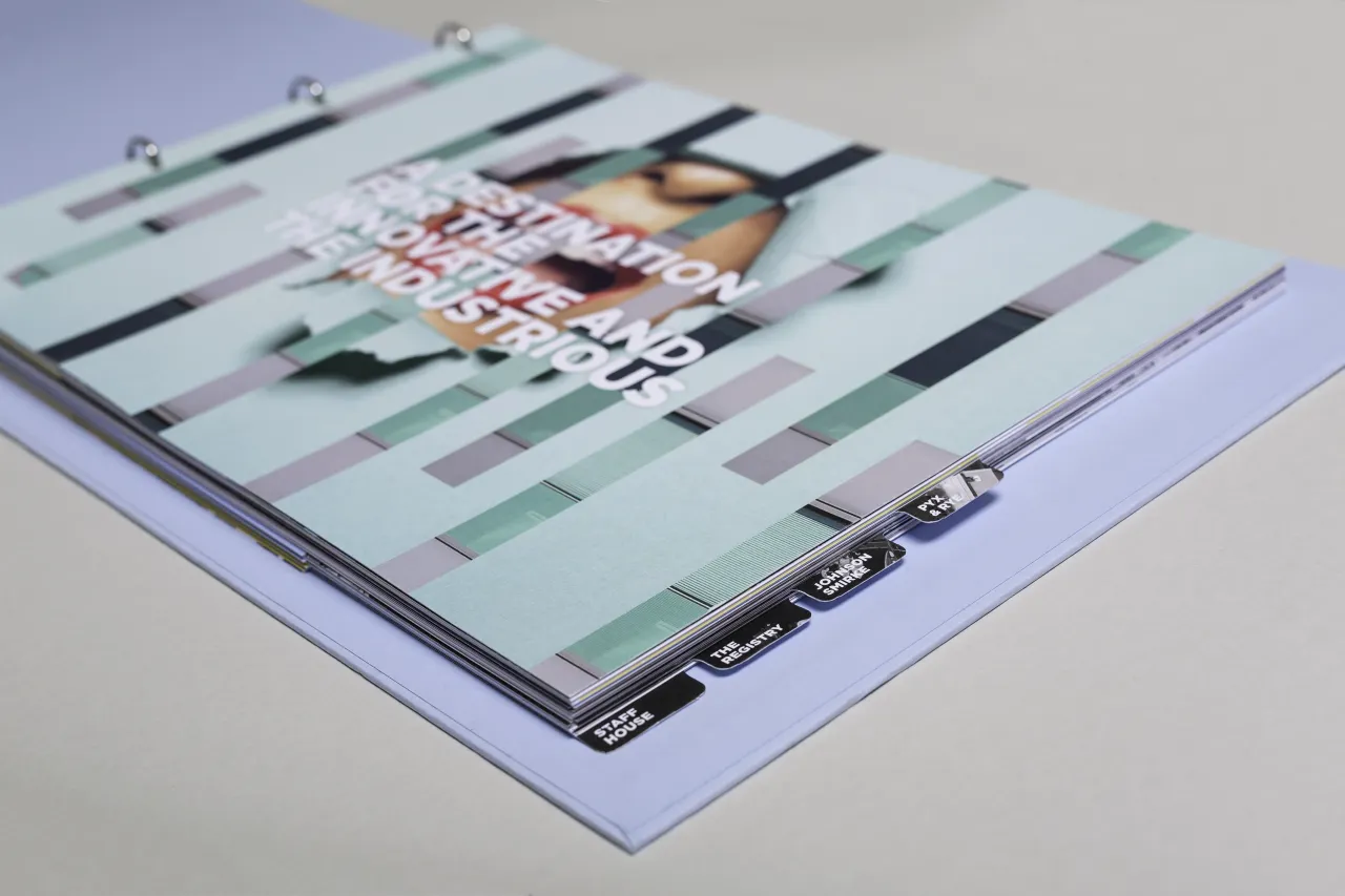
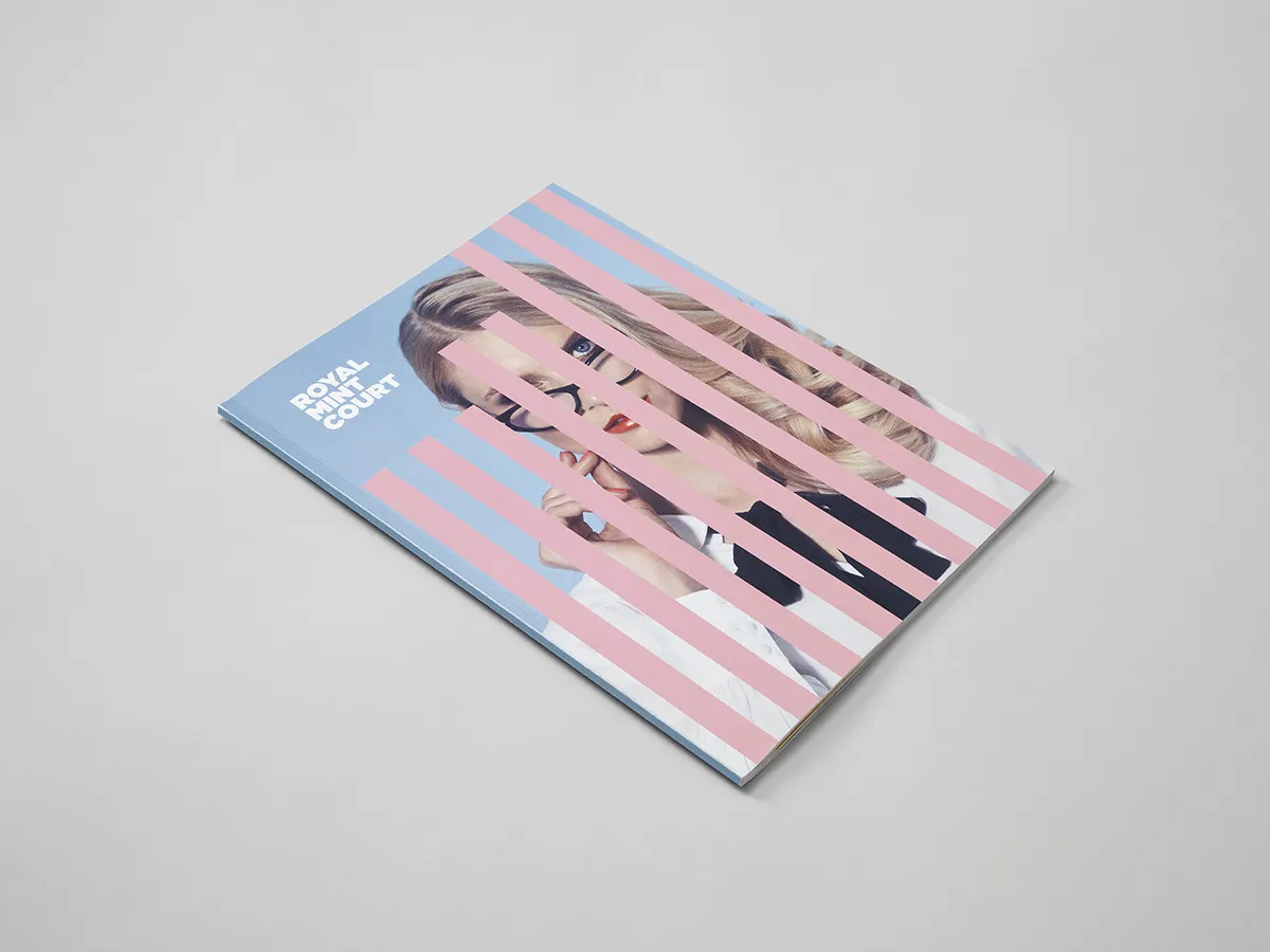
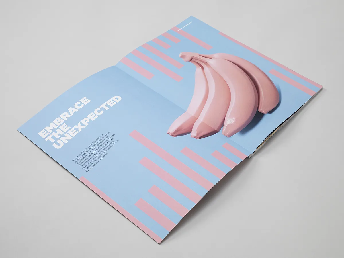
"The obvious strategy would have been to play up the past," says Creative Director Mark Davis, "but we believed the brand had to be almost at odds with history to reflect Royal Mint Court’s unique old-meets-new juxtaposition. And because it’s on the City fringes, we knew we were appealing to those who were prepared to break City codes."
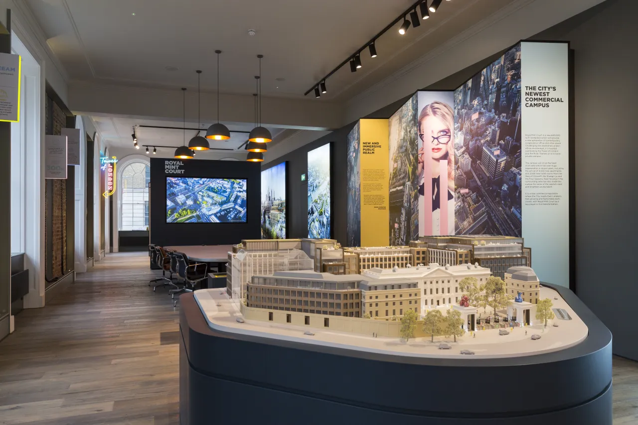
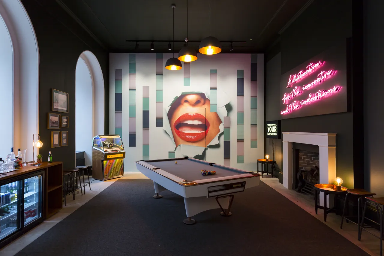
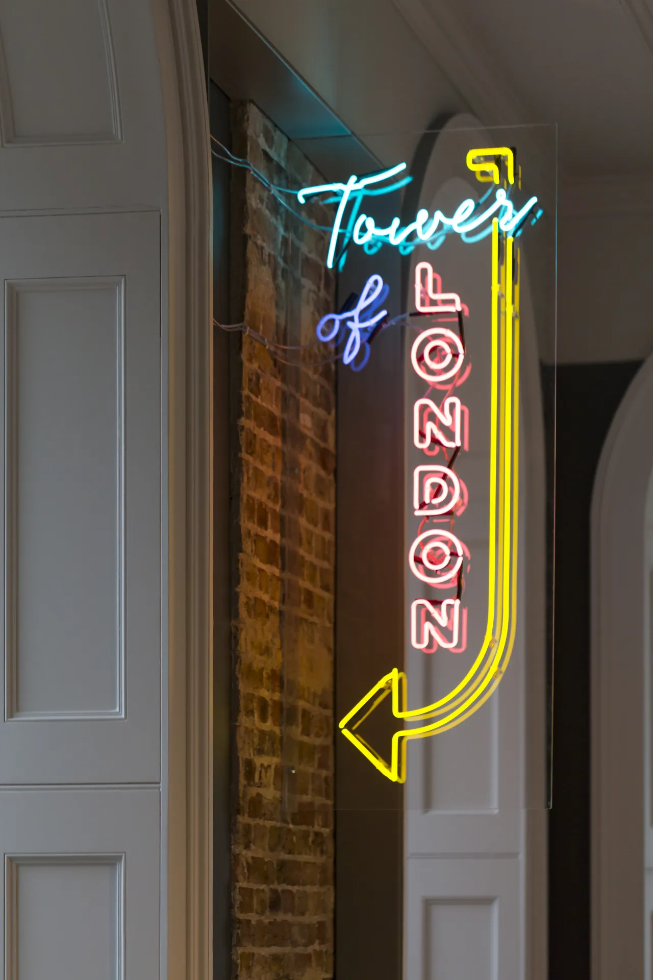
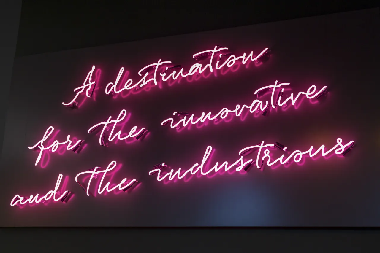
An on-site marketing suite transported potential occupiers through heavy, traditional wooden doors into an unexpected, brightly lit space, with glossy red lips dominating a wall, a jukebox, pool table, drinks fridge and neon signs.
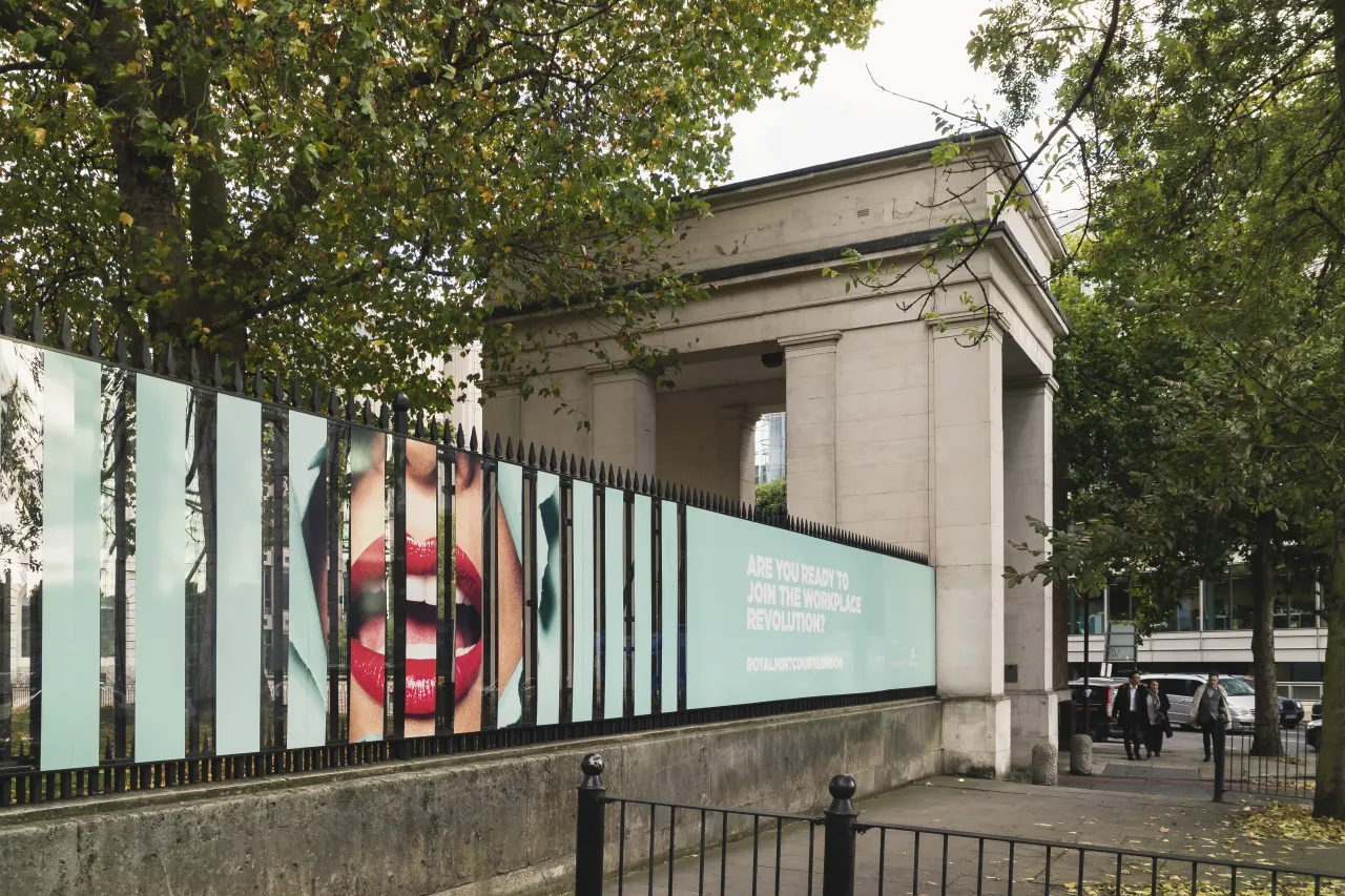
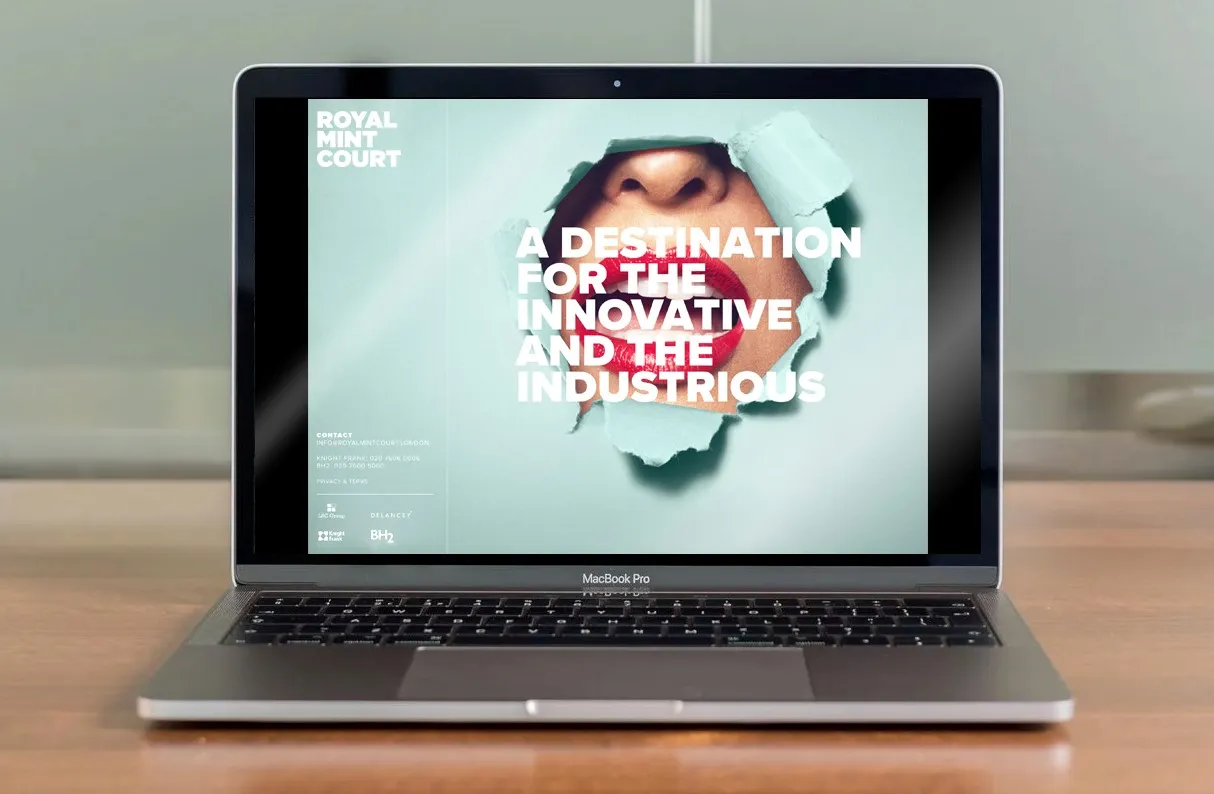
The lipsticked mouth made its way onto eye-catching hoardings, which have apertures so that people can peer into the historic site. Other marketing collateral consists of a website, a teaser brochure and a beautifully presented A3 box with plans, details about the development and CGI imagery.
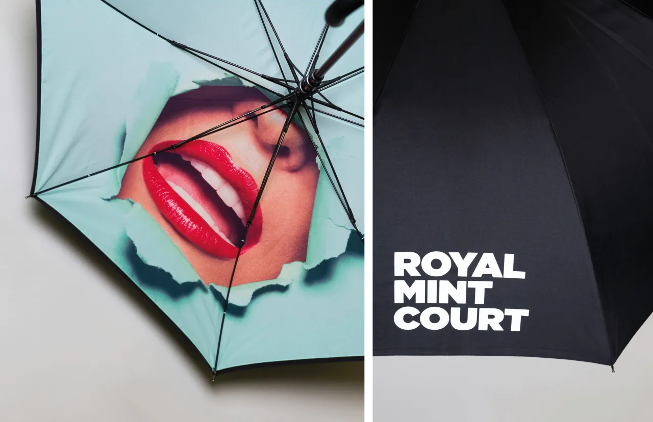
Last but not least, me&dave produced a series of merchandise, including a jet-black umbrella. A classic City-gent accessory, except that when opened, that bright signature smile is looking right back at you. Perhaps the perfect metaphor for the whole campaign.
Editor's Picks





Trending






Latest Jobs
Midweight Designer at Catalyst Creative
Full-time·London·£32k-£36k
Midweight Graphic Designer at We Are Your Friends
Full-time·London·£36k–£44k
Brand Copywriter at Origin
Full-time·Porthleven, Cornwall·£35k–£40k
Senior Creative Lead at Random Studio
Full-time·Amsterdam / Paris·€90k-€110k
Brand Strategist at DNCO
Full-time·London·£45k-£60k
Account Manager at Moxie and Mettle
Full-time·Cheltenham·Up to £35k