DixonBaxi celebrates the heritage and history of Paddington Central in dynamic placemaking brand
London-based design agency DixonBaxi has worked with British Land to shine a light on Paddington Central's transformation into an ever-changing placemaking brand that celebrates the vibrancy of the canalside community.

Paddington Central doesn't stand still for long. The London community is always finding ways to change and innovate, and even in the course of a day, radical changes can occur. To capture this constantly-shifting character, DixonBaxi has created a new placemaking brand as fluid as the area's canal.
Centred around the slogan "launching into a different every day", the new Paddington Central identity features a bespoke logo, colour palette and typographic elements which adapt to the time of day, whether that's dawn or dusk.

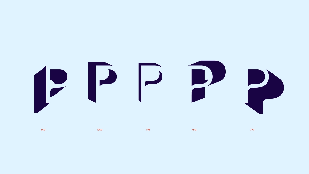
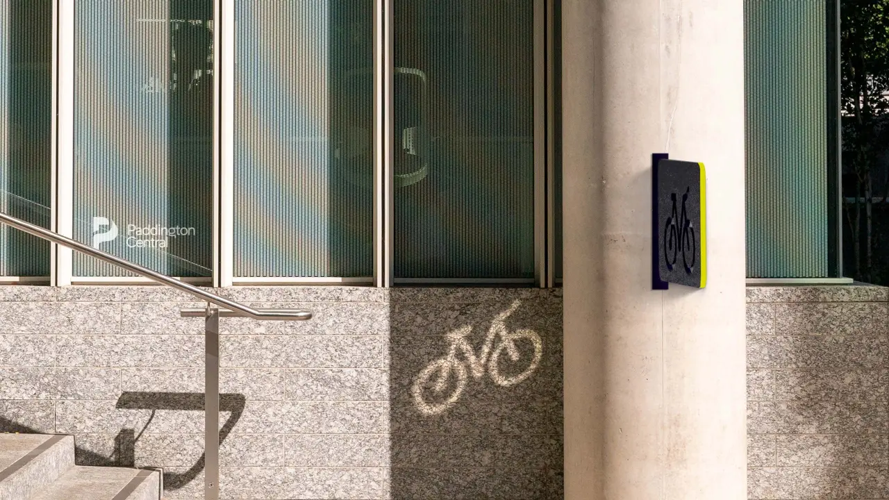
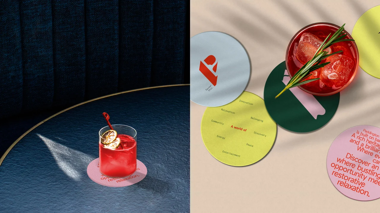
The best example of this time-dependent branding can be found in the P-shaped logomark. Acting as a living sundial, the curved flourishes of this logo only reveal themselves when illuminated from a suitable angle. At this point, it casts a 'shadow' that shows off the identity's graphical glory.
That's because the shadow actually reveals other branding elements, including the changing day-to-night colour palette, bespoke photography, and live-action footage of the canal's water itself. It's a clever integration of various elements with enough flexibility to suit any time of the day.
"We made different layered forms of the P from cardboard inspired by sundials and the amphitheatre at the heart of Paddington Central, and with the lights off, torches on, tried to capture the movement of light and shadow from all angles," says Jasmine Welsh, designer at DixonBaxi.
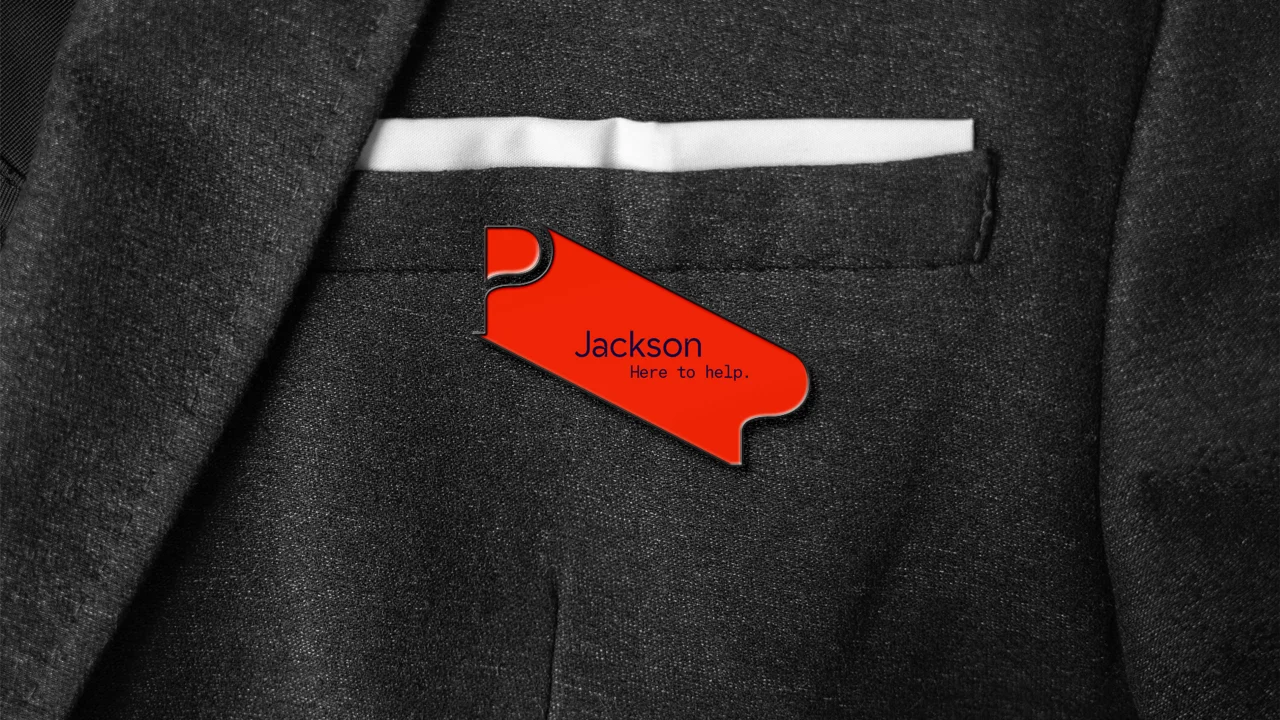
"In motion, the form comes alive as a reflection, with its edges rippling as if seen on the water," the studio adds. "The P symbol is used flexibly across the brand, while the logo lock-up provides a sophisticated signature in its vibrant red."
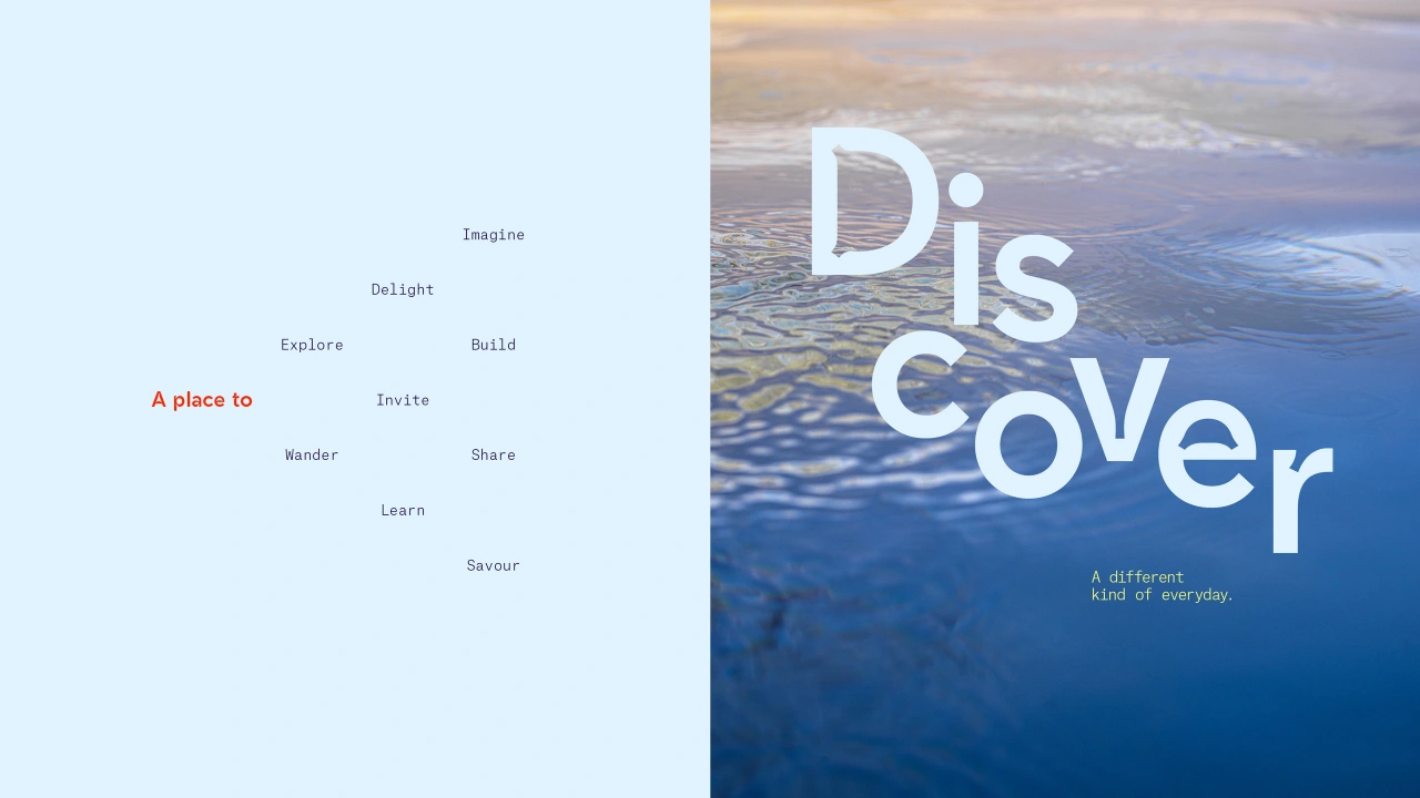
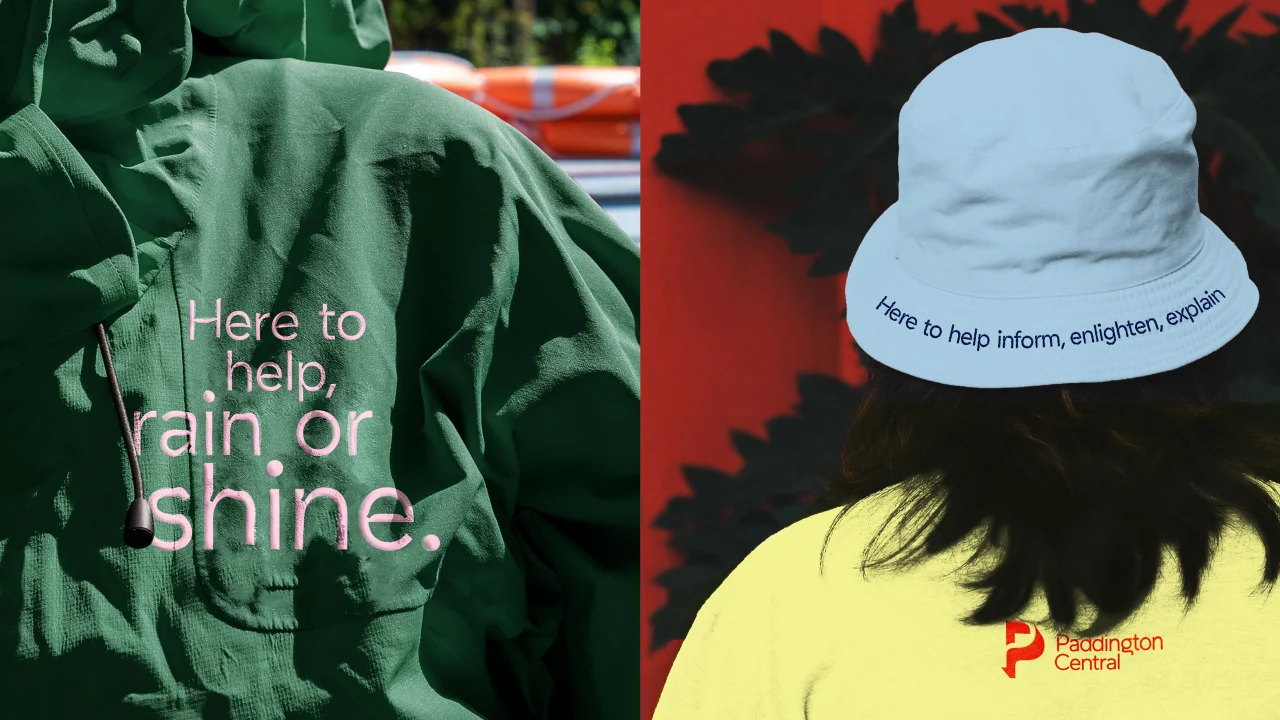
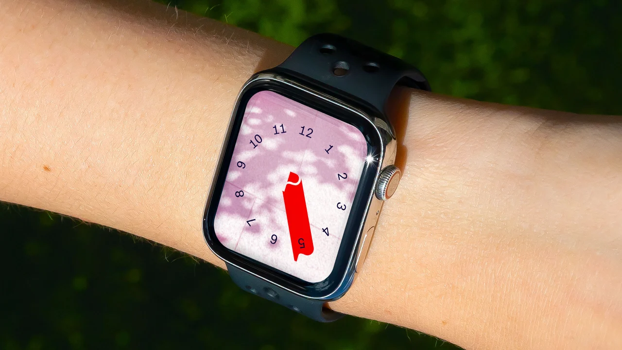
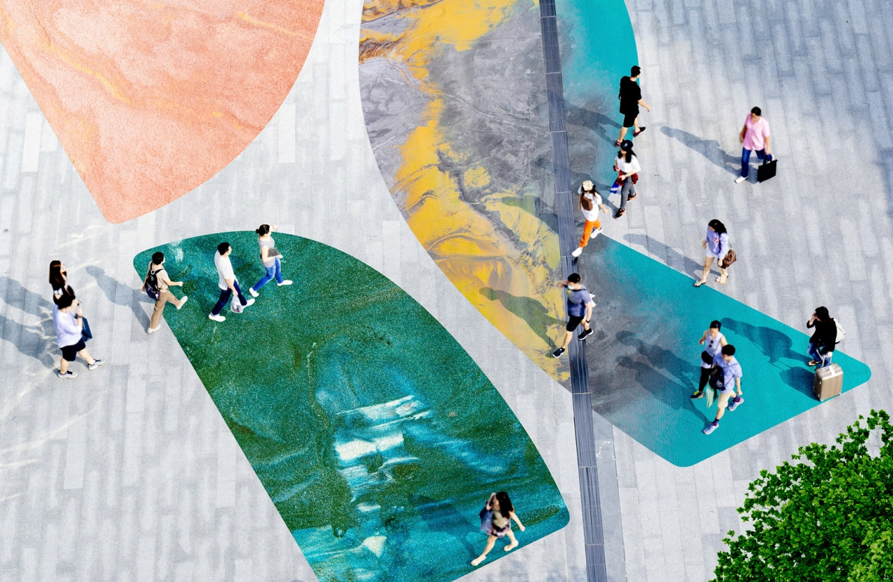
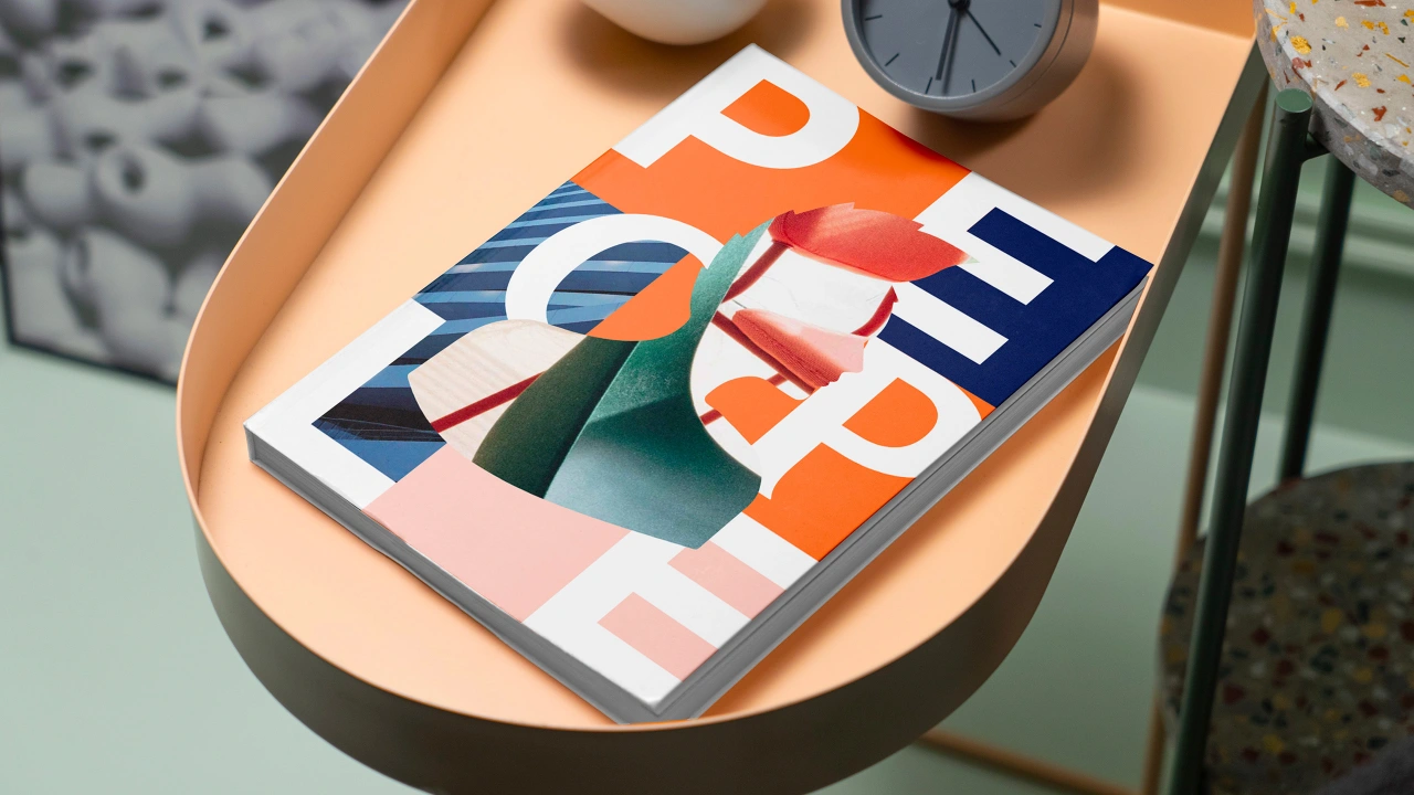
As well as being a visual delight, this time-sensitive branding has a practical application. Physical wayfinding systems are revealed when shadows move across walls and surfaces, while digital signage updates throughout the day. It includes striking hoardings that feature the P symbol. and messages that appear to ripple across posters, merchandise, clothing and more.
It's not just the shade that interacts with the branding, though. Typographic installations react to both the sunlight and passers-by. When illuminated, these installations reveal poetic stories and emotive words connected to the Paddington Central community. DixonBaxi hopes this helps create an immersive experience juxtaposing the area's vibrancy with calm.
"With the team spending days and nights at Paddington Central, we felt the energy, vibrancy and pace shifts," explains Leah Surynt, design director at DixonBaxi. "Sitting by the canal, watching the light glint off the canal and the sweeping shadows framing moments, people, and buildings led us to create a brand that captured this layered, always changing feeling with the new P symbol and sundial expression."
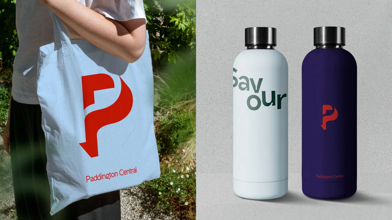
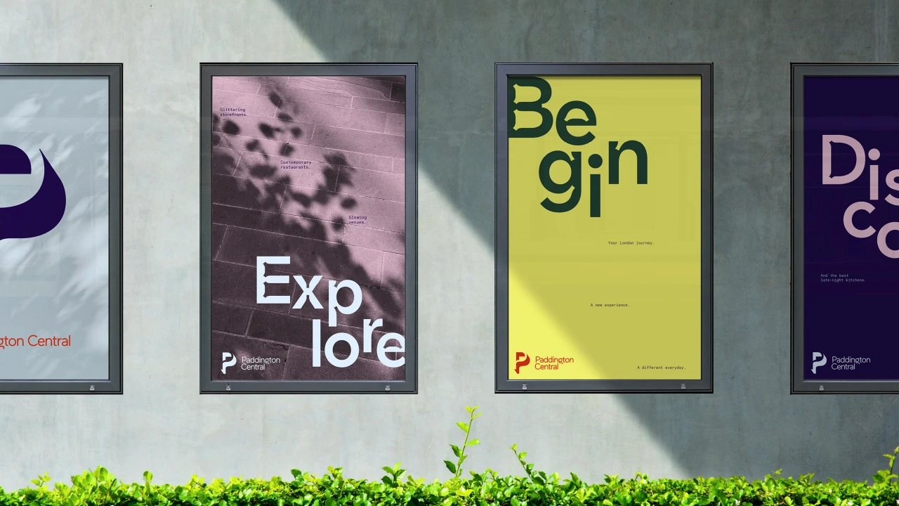
The creative team have certainly been imbued by the charm and character of Paddington Central as the community seeps itself into every facet of the brand. Take the headline typeface, Maax Micro, which boasts exaggerated, curved ink traps that echo the shape and nature of water. Then there's Atlas Typewriter, used for the details, which appears to shimmer and glint like sunlight playing across the water.
The combination of these two typefaces captures the spirit of the campus and its fluid nature, which is also expressed via three suitably-named layout approaches. Flow is a simple and layered approach, Ripple feels more poetic as it resembles splashes of water on the canal, and then there's Current, which is more vibrant and active. Each letter in this layout looks like it is bobbing on the water and could drift off naturally.
As for the distinctive colour palette, this has been specially designed to appeal to the senses. Calm pastels of the day give way to rich, deep night tones to create a striking contrast. "Red conveys a flash of energy as an accent," the studio adds. "Together, the palette shifts from engaging and invigorating to bright and light."
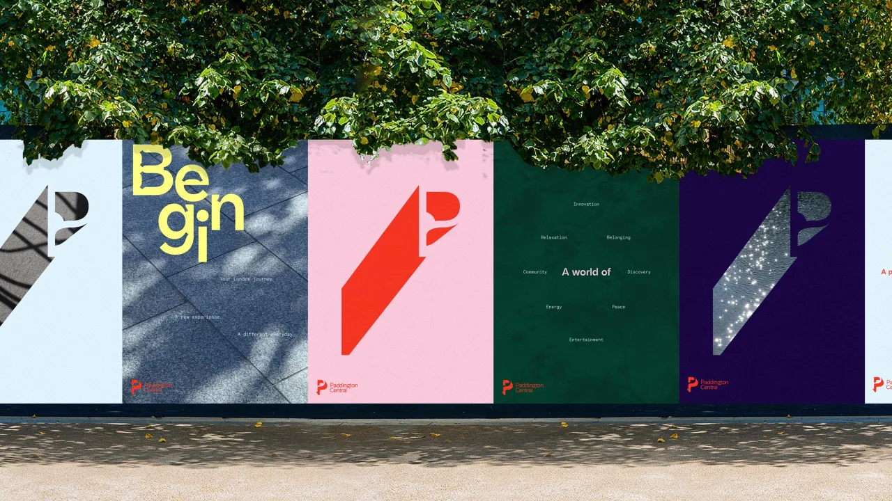
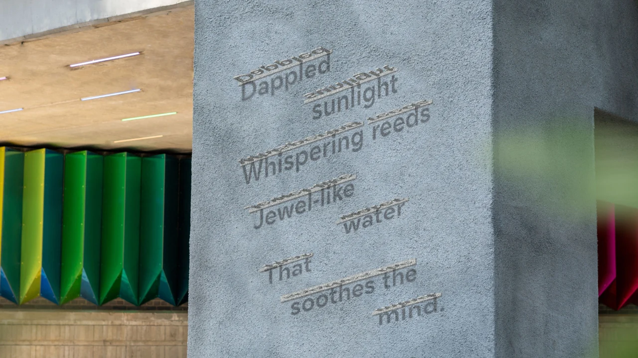
Ultimately, DixonBaxi's art direction is a graphic and immersive experience that portrays the architecture with light and shadow depending on the time of day. Gaze upon it with the help of the sun, and you'll notice hidden details glittering at you like sunlight on water or thrown into relief by shadows; experience the area at night, and previously obscure illuminations will be there to guide you.
Accompanied by inviting and inclusive photographs or people with morning glows on their faces or the vibrancy of nighttime electric lights, this fluid rebrand is a torrent of delights that are both sensory and tactile to help the area feel human and warm.

Editor's Picks





Trending






Latest Jobs
Senior Designer at Definition
Contract·London·£45k–£50k
Senior Copywriter at Human After All
Full-time·London·£48k–£66k
Head of design at Cog Design
Full-time·London·£55K
Paid Media Executive at Munro Agency
Full-time·Glasgow·From £27,000
Midweight Editor at Earworm
Full-time·Bristol·£28k-£32k
Midweight Full Stack Developer at Bureau for Visual Affairs
Full-time·London (Open to remote)·£35k–£50k