LMNOP designs hotel brand reminiscent of classic American summers
A strong sense of nostalgia and authentic enjoyment comes through in the Beachside Hotel's identity, reinforced by an eclectic mix of typefaces and imperfect patterns.
Brooklyn-based design studio LMNOP has crafted a new identity inspired by classic American summers for the Beachside Hotel in Nantucket, using a "blue sky thinking" approach to encourage guests to fully immerse themselves in the hospitality experience.
This unique strategy fused recreation and relaxation, encouraging guests to enjoy every moment in the hotel without feeling the need to leave. It positions the hotel as more than a place to sleep and eat breakfast before heading out for the rest of the day – why not explore the whole environment and take time to engage with the different spaces and experiences on offer?
LMNOP principal and creative director Leigh Nelson says the aim was "to break away from Nantucket's traditional mould by creating a laid-back yet high-touch self-service environment". This, along with the rest of the brief, really resonated with the studio's ethos,, and it offered the team creative freedom where they could embrace analogue methods and curate holistic and immersive experiences.
"The brief encouraged us to explore the uncharted territories of free time and creativity, with no rigid agenda, only boundless possibility," says Nelson, adding that they were also able to collaborate with Parts and Labor, an architectural firm that they have "a seamless working relationship".
"Familiar, casual nostalgia"
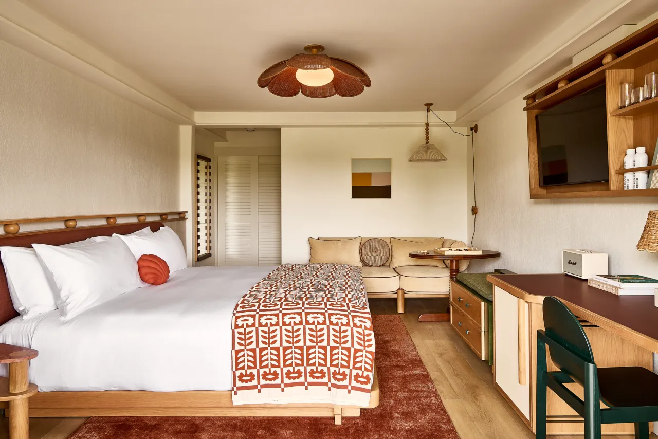
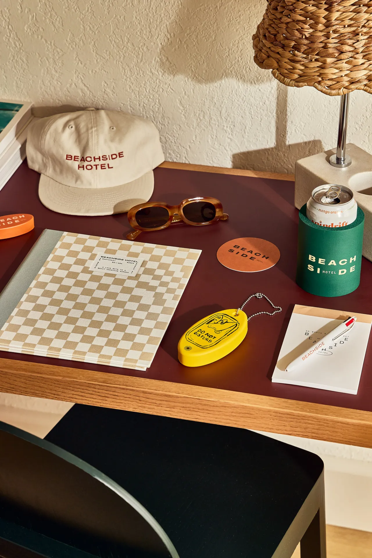
Even in the UK, it's not hard to imagine a 'classic American summer'. Think casual nostalgia, open-air experiences, and timeless fun. This image and the wider brand idea were underpinned by four core pillars: understated, unexpected, comfortable and fun.
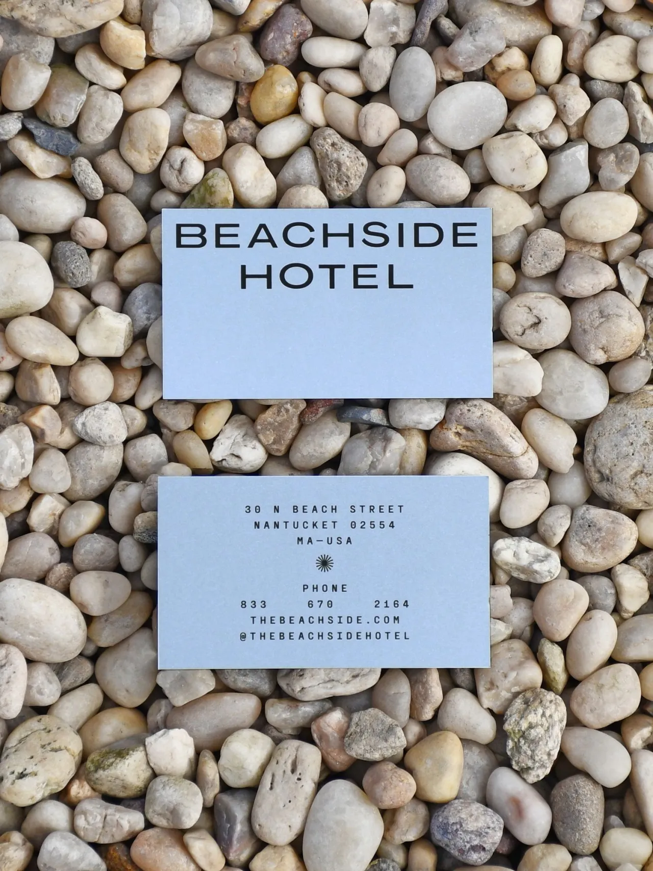
The studio's "Less is More" philosophy drove them towards simplicity and elegance, with typefaces and layouts that lean towards a utilitarian style. Nelson notes that "this effort to avoid being overdesigned and instead present a familiar, casual nostalgia sets the tone for the experience".
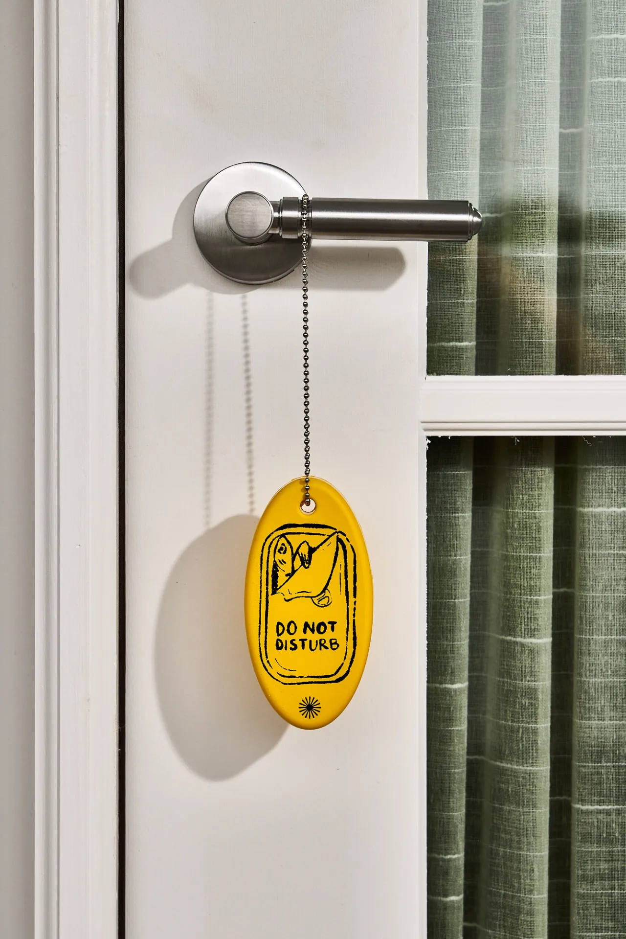
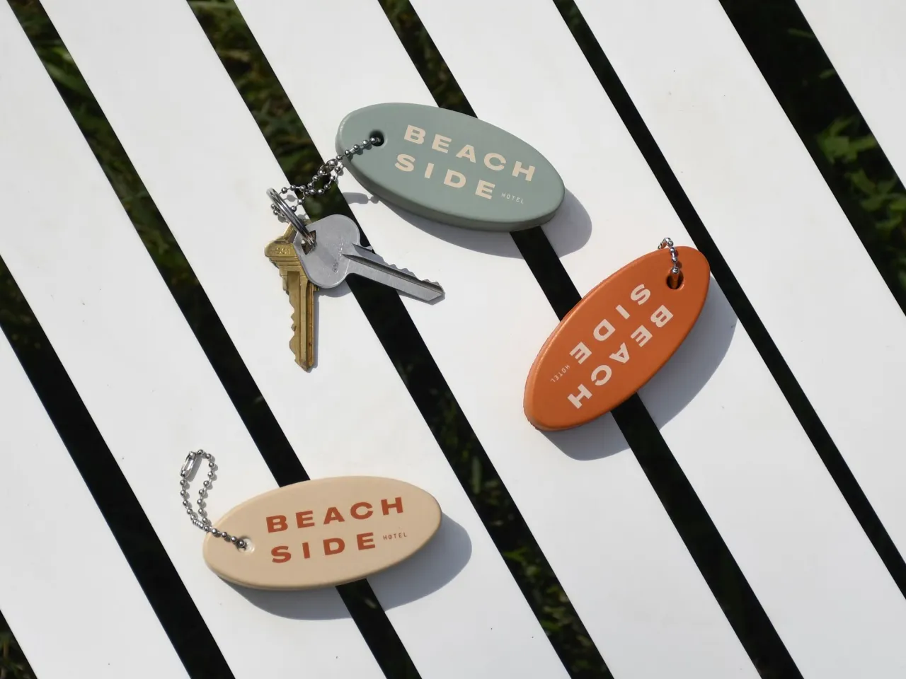
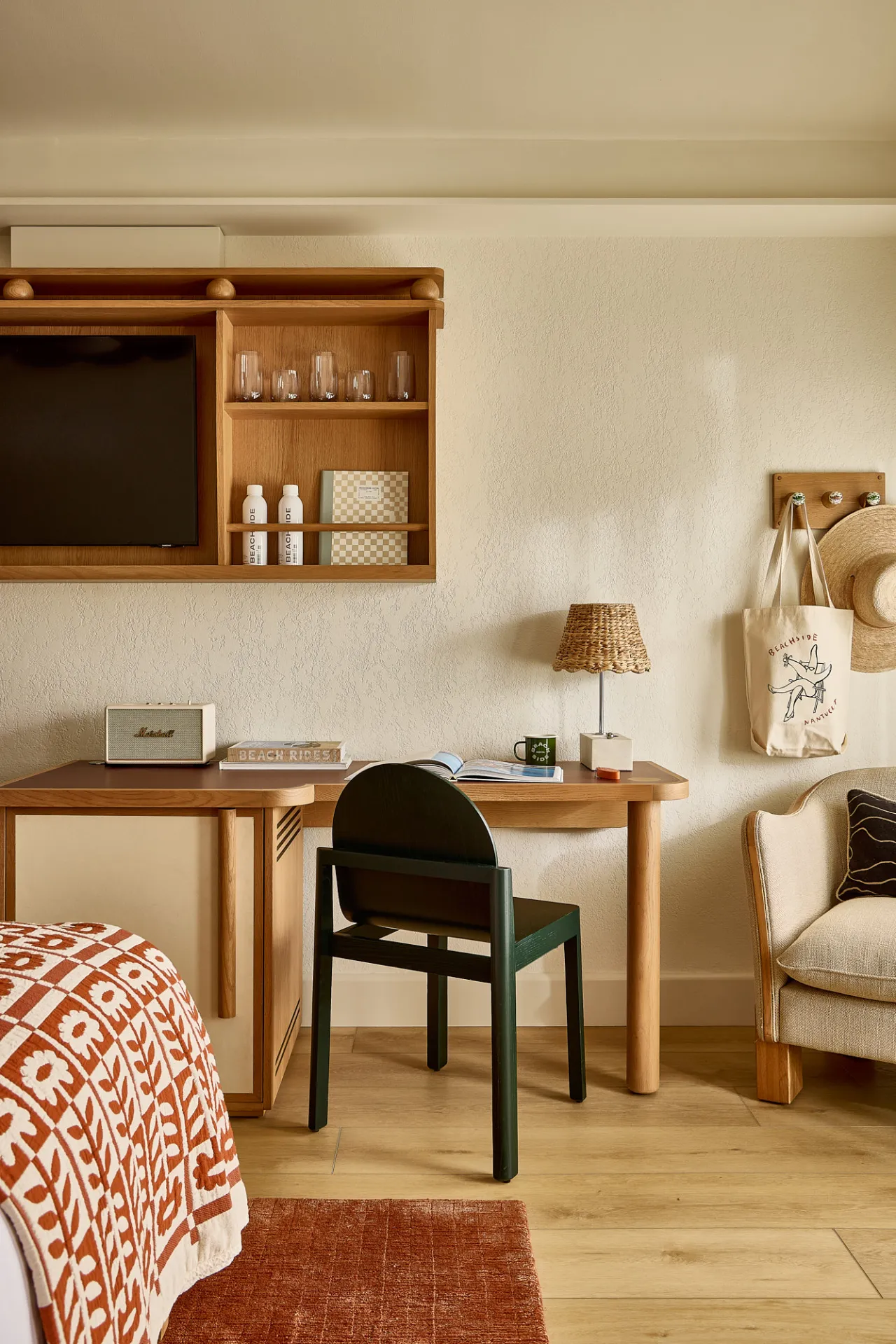
Inventive design elements make for unexpected moments in the brand, with its layered visual system creating new touchpoints and experiences for guests so they don't feel like they are encountering the same thing over and over again. "Materiality is important here," says Nelson, "so choosing unexpected materials for things like wayfinding signage or the guestroom compendium provides that extra layer of discovery."
"An approachable sophisatication"
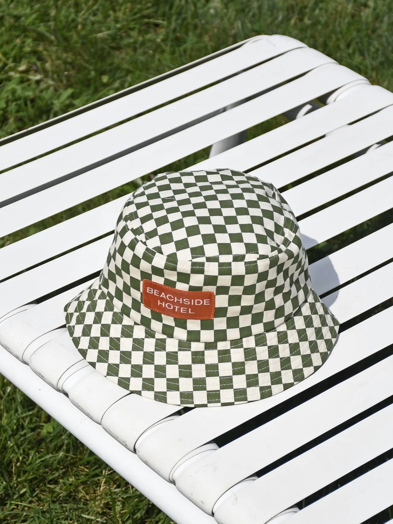
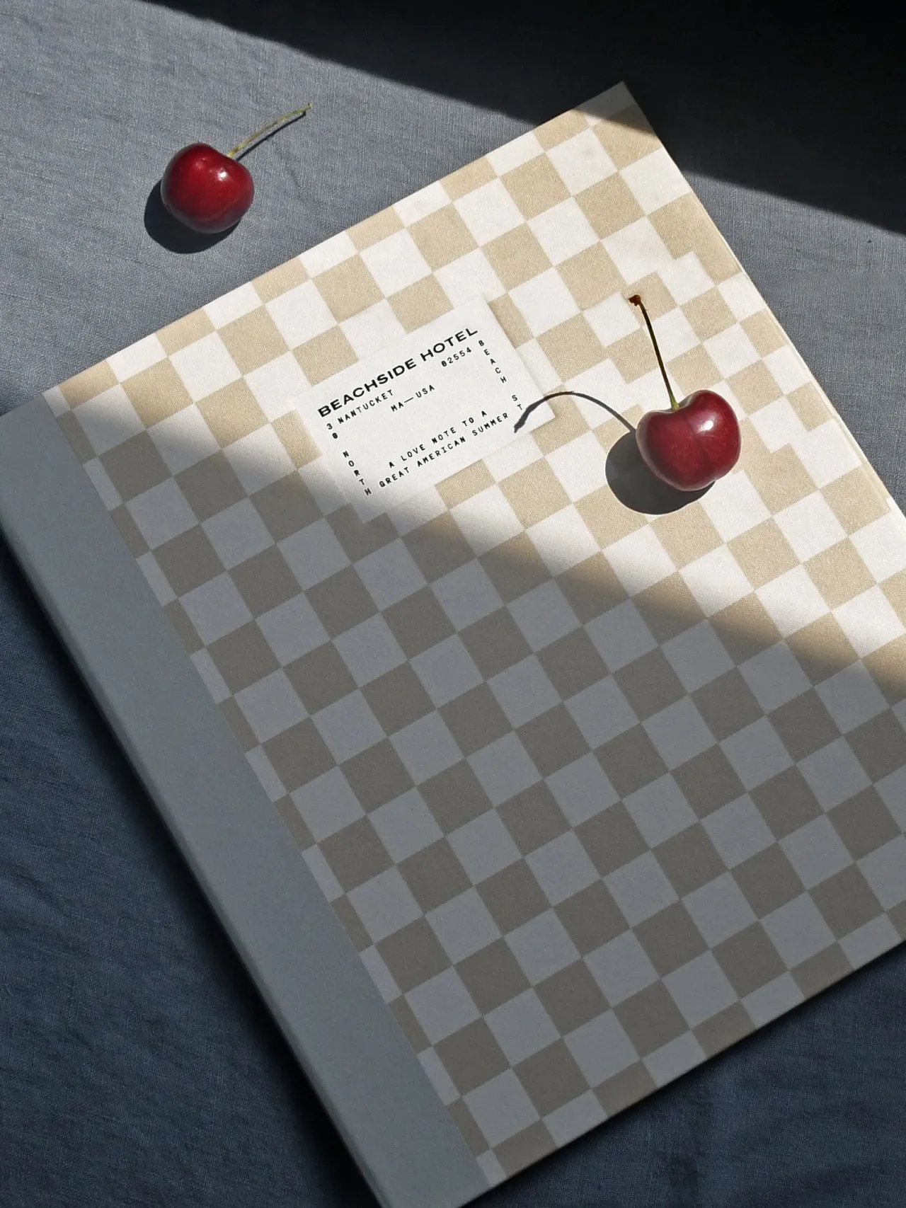
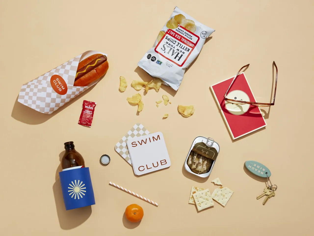
To ensure all guests felt comfortable in the hotel, LMNOP geared the design towards "an approachable sophistication". This comes through in features like the checkerboard patterning, which Nelson describes as an "intentionally imperfect pattern that echoes nostalgic picnic imagery, blending refined aesthetics with a sense of casual comfort, creating an inviting and warm environment".
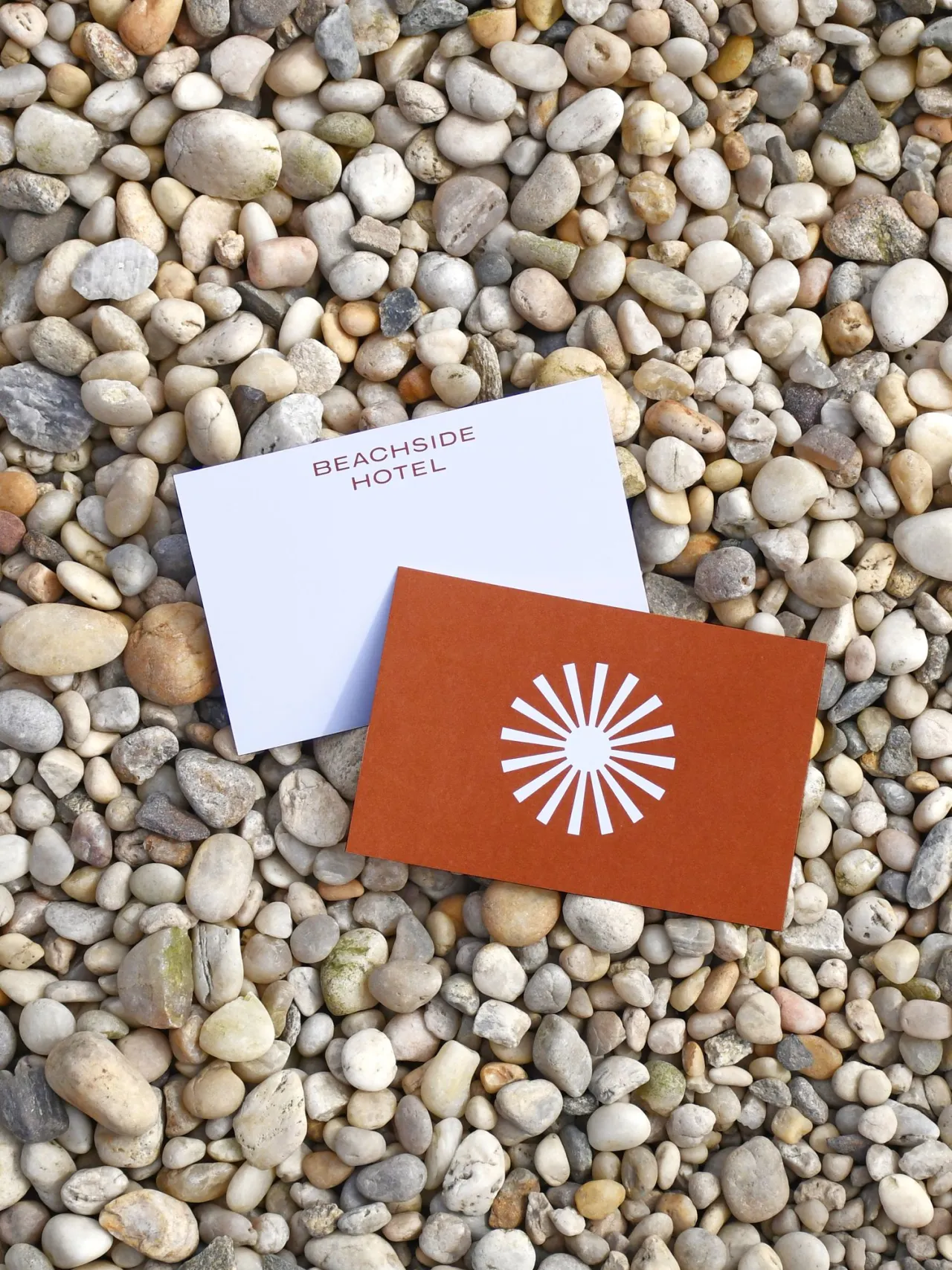
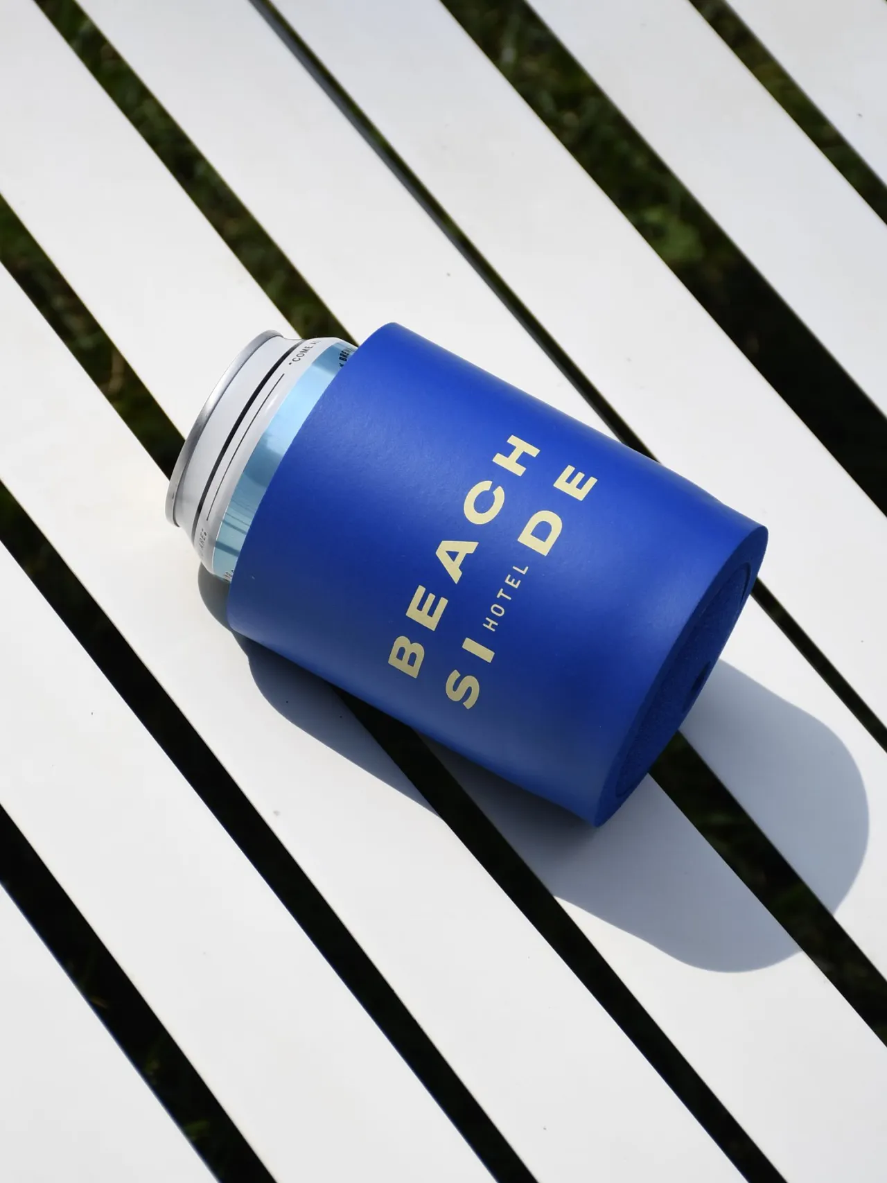
Finally, the 'fun' pillar ultimately comes through in the Beachside Hotel's sunburst brand mark. "Designed for use in merchandise and digital platforms, this mark encapsulates the joy and vibrancy of the season, bringing an element of fun and excitement to all touchpoints, Nelson explains.
This was paired with the typographic logo, which used the PP Agrandir font. Pangram Pangram describes it as "a contemporary serifless type family that celebrates the beauty of being imperfect". It was designed to be a brave antipode to neutral modernist fonts. It is defined by unaligned, quirky and funky shapes, adding an element of humanity to it. Other fonts used across the identity are Garaje Condensed, PP Right Serif Mono, and PPFraktionMono.
"The joy and silliness of all ages"
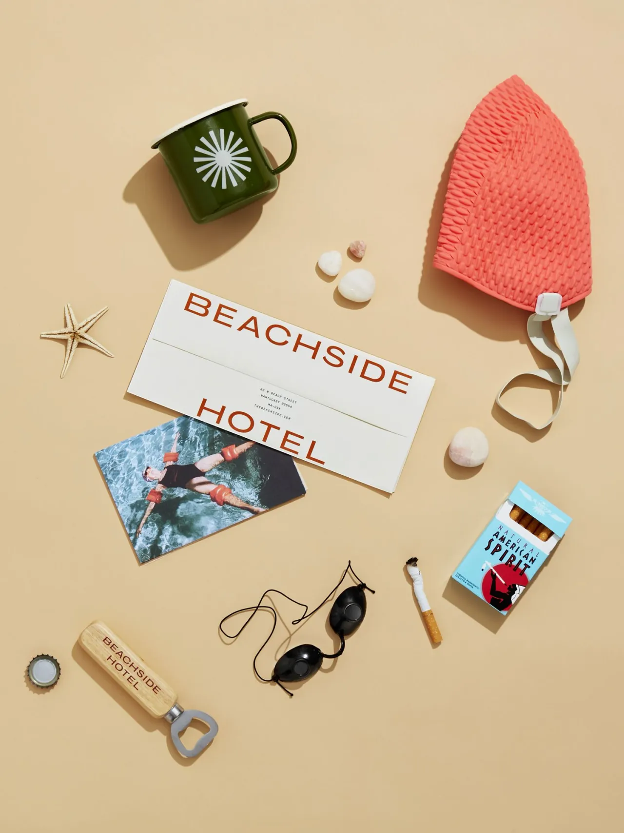
Beachside Hotel's colour palette features tweaked primary colours to add to the vintage vibe. Red became more of a burnt orange, blue was made softer and dustier, and the yellow is close to a cream shade.
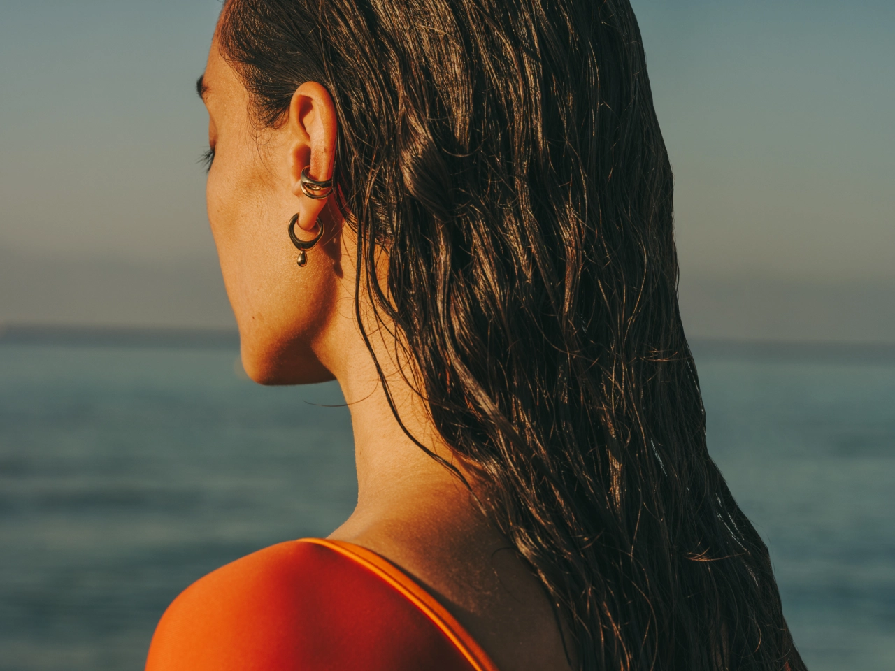
When it came to brand photography, LMNOP planned a lifestyle and interior photoshoot, which they were unable to do due to construction delays. This meant that they initially had to rely on stock photography, which they meticulously combed through to find images that were cohesive and truly representative of The Beachside Hotel's unique look and feel.
Luckily, they were able to conduct their own photoshoot later on in the project, which Nelson says "undoubtedly enhanced the brand's authenticity and visual appeal".
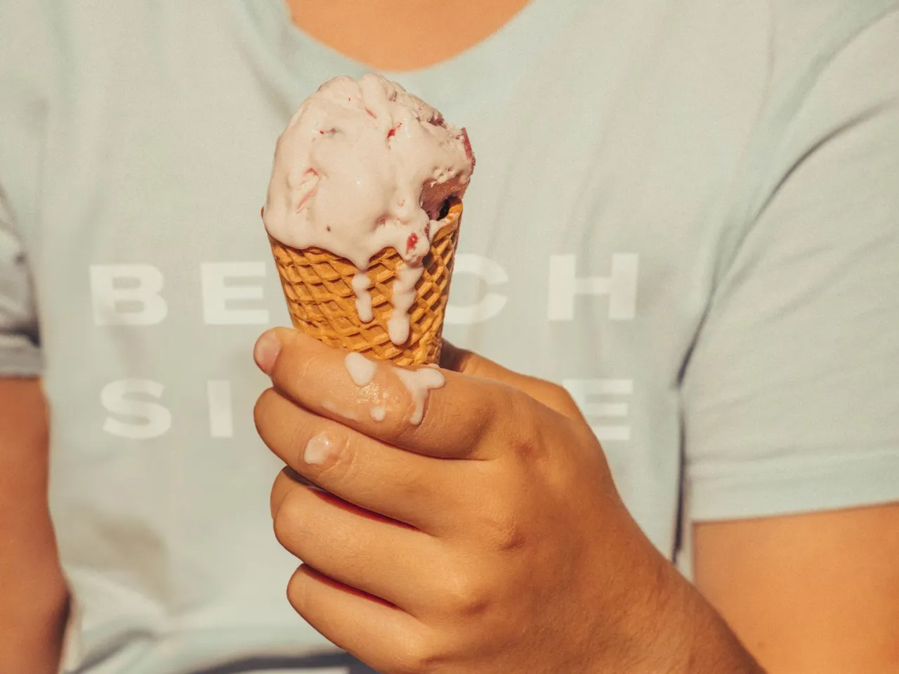
She explains how it captures "the joy and silliness of all ages, celebrating the idea that summer is a time for everyone to have fun".
"Light-hearted and engaging"
Though the studio didn't change the hotel's name – since it was the original name of the property and had strong equity – the team did get to name the outdoor-indoor restaurant. LMNOP decided to call it Swim Club, reflecting "a playful blend of high and low elements, capturing a nostalgic, Caddy Shack-inspired charm", according to Nelson.
"It's designed to be a lively, social hub where guests can enjoy both casual swimming and vibrant social interactions, encapsulating a fun and inviting atmosphere."
For the brand voice, the studio sought to develop something timeless and evocative of a sense of -coming-of-age. The result is a selection of copy that signals friendship, camaraderie, and childhood innocence and focuses on the joy of shared experiences made in a welcoming and memorable environment.
Nelson says: "In every communication, from signage to digital content, our voice remains light-hearted and engaging, encouraging guests to embrace the spontaneous and delightful moments of their stay.
"This approach ensures that the hotel's atmosphere is always inviting, vibrant, and infused with a sense of adventure and play."
"Small, cherished moments"
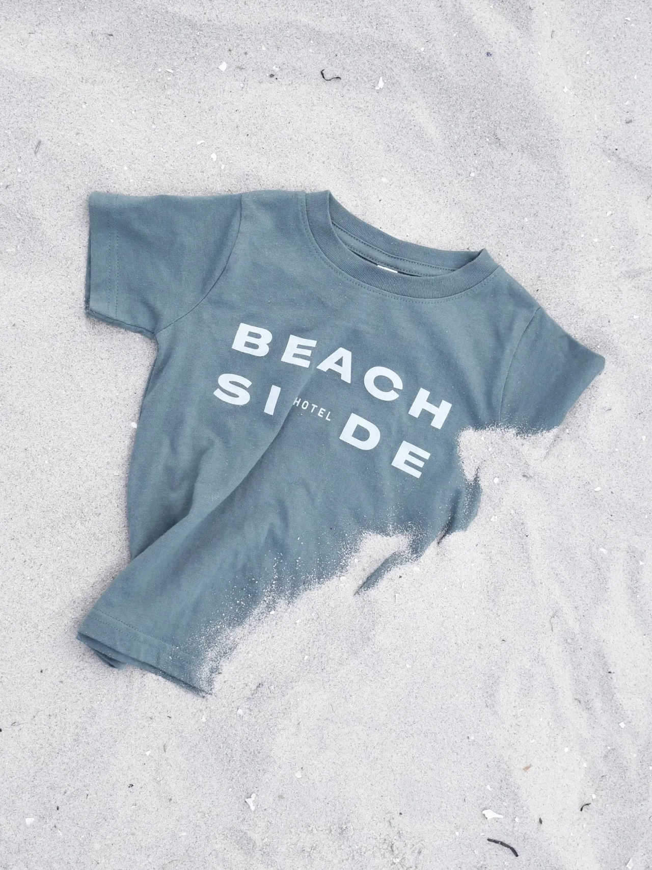
LMNOP also created the digital experience for the Beachside Hotel, which includes high-spirited lifestyle photography with vignettes that showcase real-life moments. "Vintage photos set a nostalgic tone, while new assets will gradually take precedence," says Nelson.
She notes that the focus of digital photography is on "small, cherished moments and branded touches", like hotel keys and signage, with vibrant lighting and colour.
People are prioritised in the images and are captured having fun in the surrounding environments, such as the pool, beach, and grassy areas.
"The brand language and utilitarian design provide a blank slate that allows the property and its merchandise to be infused with vibrant, personal touches," Nelson adds.
"This approach not only honours the spirit of classic summer but also ensures that every interaction with the brand feels fresh and engaging."

Editor's Picks





Trending




Latest Jobs
Brand Strategist at DNCO
Full-time·London·£45,000 – £60,000
Senior 2D Motion Designer at Art&Graft
Full-time·London·£50,000 – £65,000
Senior Consultant, Strategy at Interbrand
Full-time·New York·$100,000 – $125,000
Senior Creative Editor at Project Slingshot
Full-time·Remote·£45,000 – £55,000
Content Creator at GREY (New York)
Full-time·New York·US$60,000 – US$140,000
Creative Artworker at Magpie Studio
Full-time·London·£34,000 – £40,000