This floating sauna's brand uses a simple typographic trick to stunning effect
DutchScot's identity for Fjord, a sauna and cold plunge on San Francisco Bay, makes hot and cold its defining idea.
Personally, I really don't like saunas. The idea of baking your body in a small, suffocating oven, then shocking it by plunging into ice-cold water, appeals to me neither in theory nor in practice. But I imagine I'm in the minority. Most of my friends, young and old, across multiple continents, seem to enjoy what I consider torture. So who am I to disagree?
And my friends, it seems, are not alone. In recent years, saunas, both portable and permanent, have been popping up pretty much everywhere I've visited, as the practice has emerged from something only weird Scandinavians do to a worldwide wellness craze.
Yet when it comes to crafting a visual identity for these experiences, popularity can be somewhat of a double-edged sword. As more and more entrepreneurs enter the space, the more everything starts to look the same. Soft neutrals. Flowing serifs. Imagery of faces with eyes closed in contemplation. So I was pleased when I saw a new venue take a radically different approach.
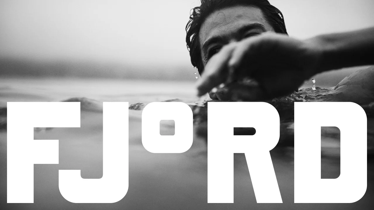

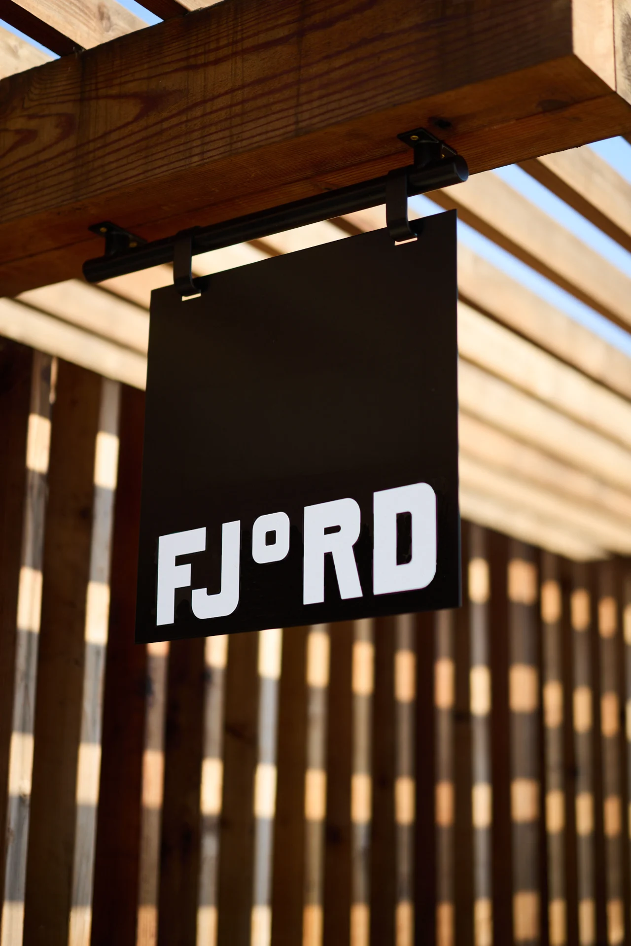
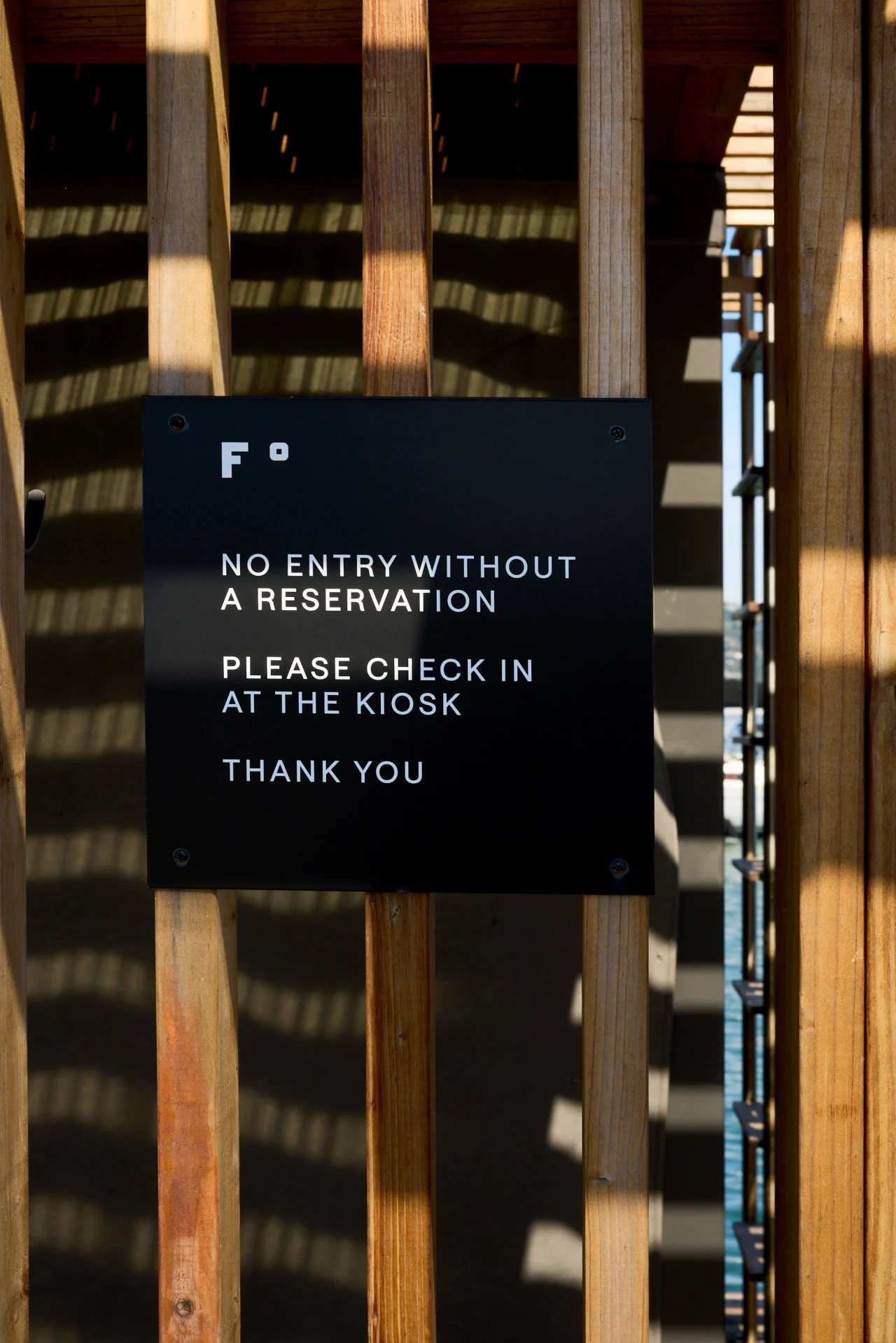
Fjord is a new floating sauna and cold water plunge in Sausalito, on San Francisco Bay. And its identity, created by London-based studio DutchScot, is swimming far, far away from the usual clichés you'd expect.
Clever to a degree
That's partly because the venue itself is defiantly different. As DutchScot puts it in its case study: "Fjord is not a spa. It does not sell spa services. Instead it provides a communal, outdoors, self-guided opportunity to enjoy the huge mental and physical benefits of hot and cold — and to enjoy a beverage afterwards with friends."
Seeking to sidestep sauna tropes, the studio worked with Fjord's founders, Alex and Gabe, to create a bold identity that inspired not by nature or wellness but by the area's industrial past. It's a stark black-and-white system that feels closer to a shipyard than a day spa.
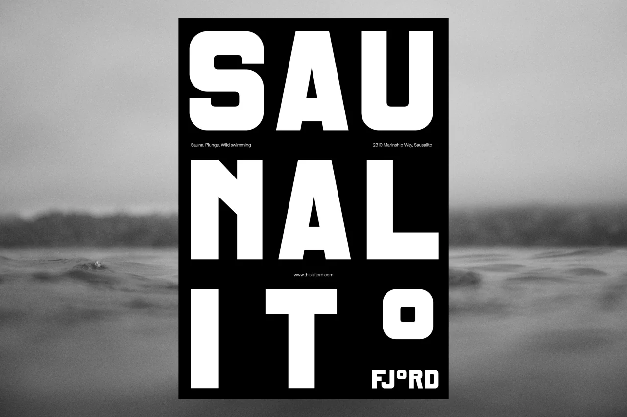
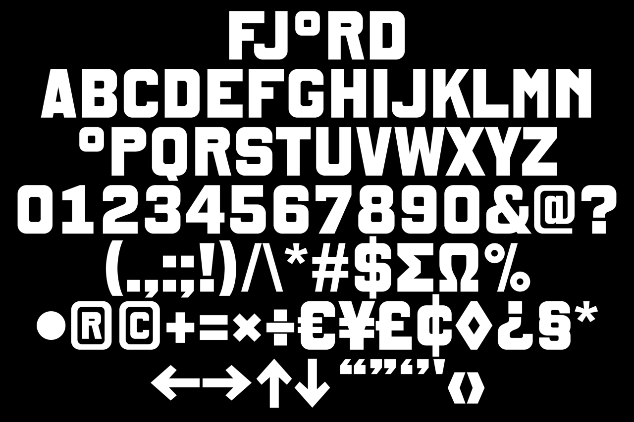
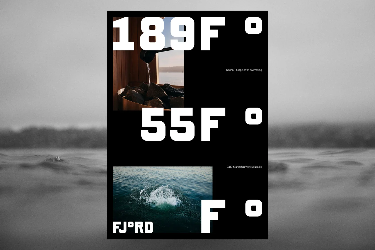
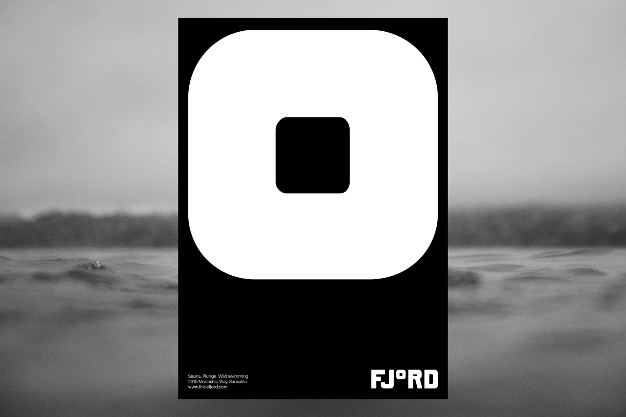
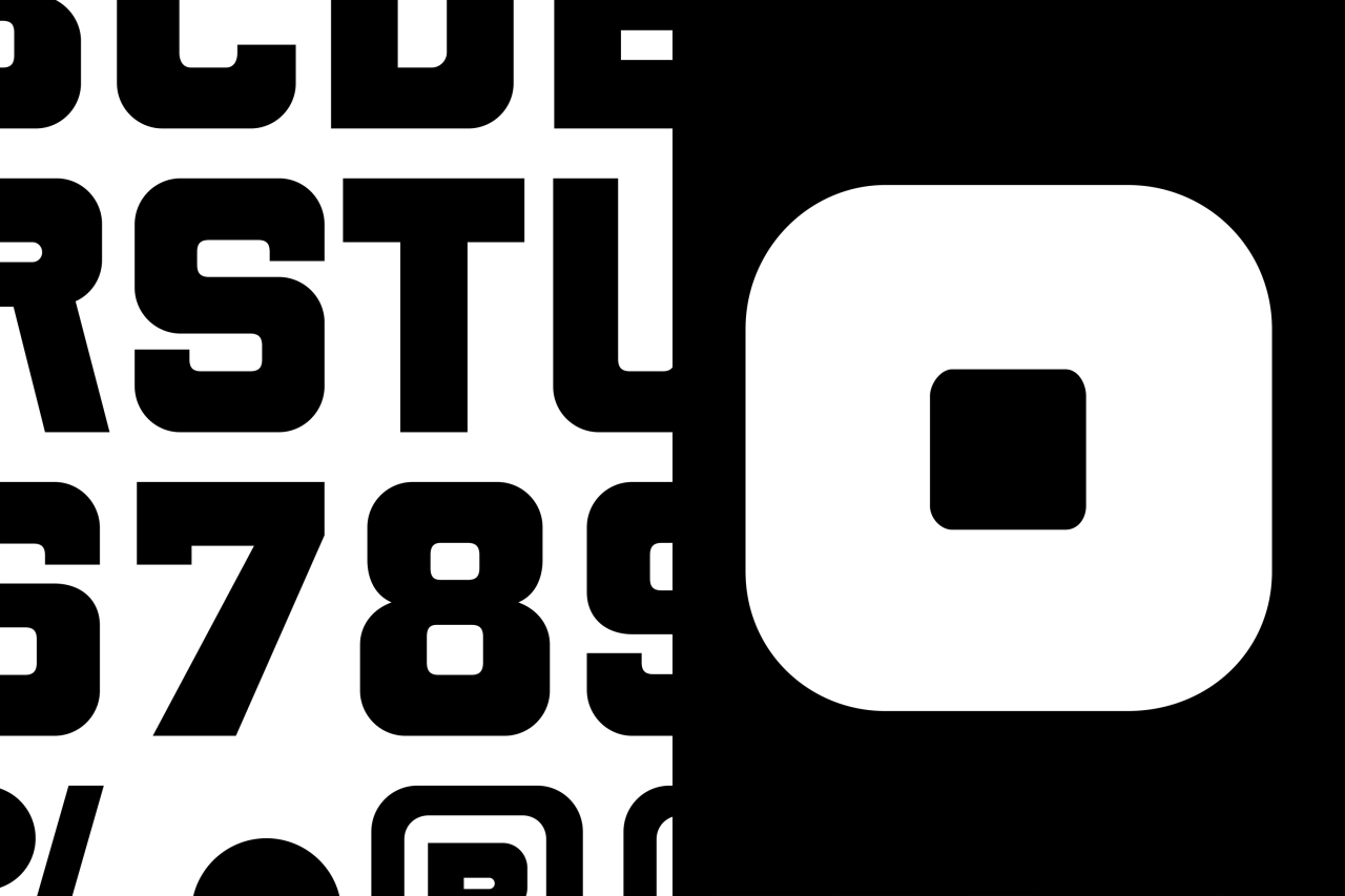
At the centre of the new designs is a bespoke typeface, created in collaboration with Danish type foundry Playtype. Its chunky, rounded-square letterforms have a sturdy, utilitarian feel, but the real star is the wordmark, which replaces the 'o' in Fjord with a degree symbol. It's a simple idea, but brilliantly effective: a sauna is, after all, defined by temperature if it's defined by anything.
Better still, the degree symbol works well across the whole system. It pops up on its own as a graphic element, and when paired with the F to create a compact F° monogram for signage.
One poster pairs the sauna's 189°F heat with the bay's chilly 55°F waters, set in huge numerals alongside photos of steaming sauna stones and a splash in the bay. Another breaks the word 'Saunalito' over three lines, ending with a supersized degree symbol.
Marvellously moody
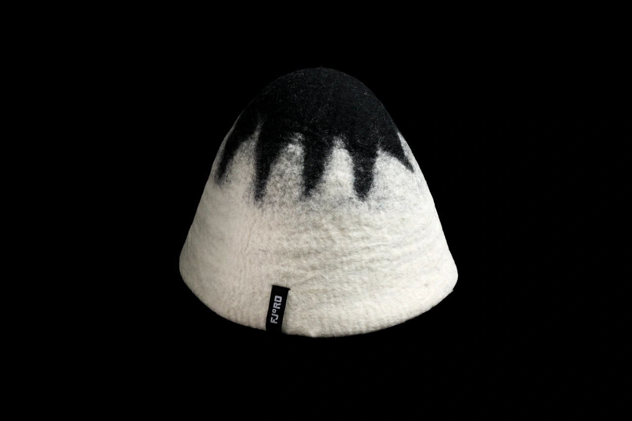
The concept carries through to digital as well. On Fjord's website, a 'temperature gauge' moves up and down as you scroll, while the navigation on the left echoes the markings on a thermometer. Wayfinding signage in black metal sits against the venue's timber slats, while merch includes a felted sauna hat in black and white, finished off with a small FJ°RD label.
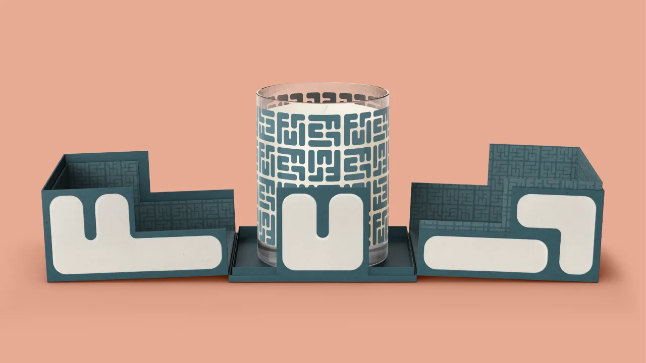
DutchScot have even done something original with the gift tokens. Rather than providing them on a plastic card or an emailed voucher, they've designed them as a handmade soap in bespoke packaging. A thoughtful, tactile gift that fits the brand perfectly.
Photography by Alex Farnum, much of it in black and white, is suitably moody. Shots of swimmers bobbing in the bay at sunset, and close-ups taken at water level, capture the atmosphere without resorting to the usual spa imagery.
This all adds up to a confident identity that's packed with personality and proves wellness branding doesn't have to be soft and beige to work. Sometimes a single, smart idea, executed consistently, is all you need.
Fjord says it wants visitors to feel something. And hey, I can't stand saunas, and even I'm feeling it... so they must be doing something right.

Editor's Picks





Trending

Latest Jobs
Senior 2D Motion Designer at Art&Graft
Full-time·London·£50,000 – £65,000
Director, Head of Creative at Twitch
Full-time·San Francisco·$203,000 – $274,600
Design Director at Koto
Full-time·London·£72,000 – £90,000
Senior Brand Designer at DNCO
Full-time·London·£50,000 – £60,000
Senior Creative Editor at Project Slingshot
Full-time·Remote·£45,000 – £55,000
Motion Designer at Figma
Full-time·New York·US$105,000 – US$183,000