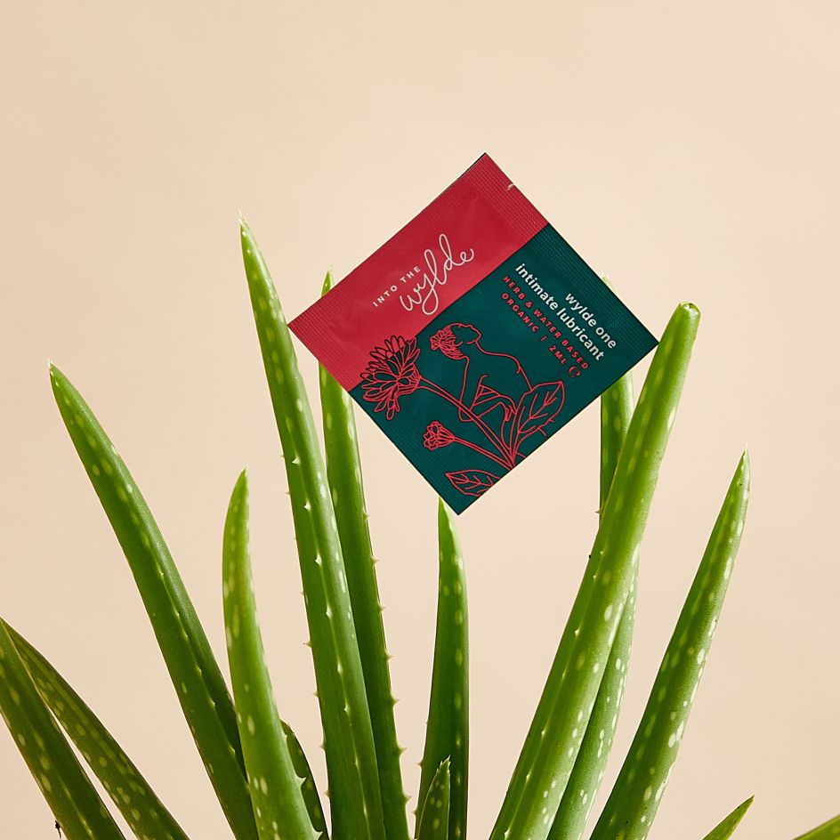
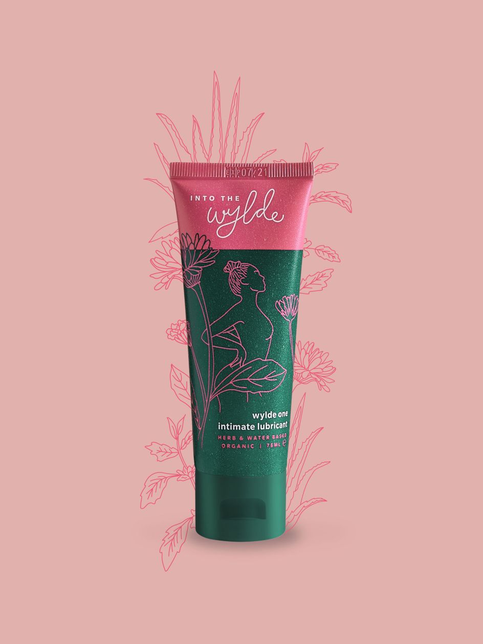
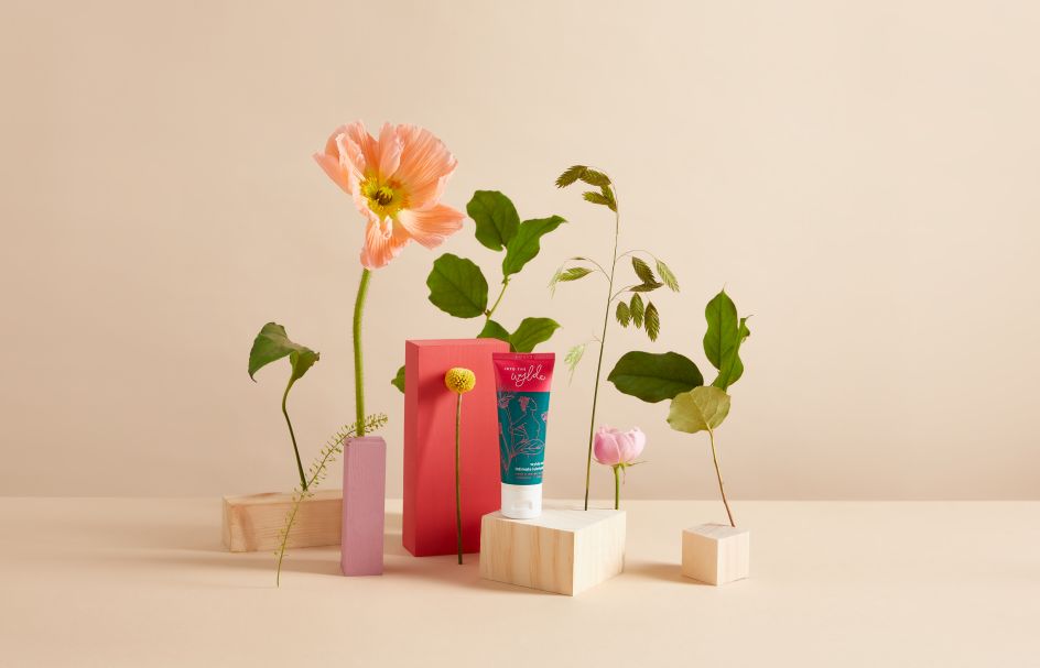
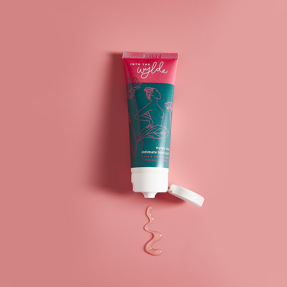
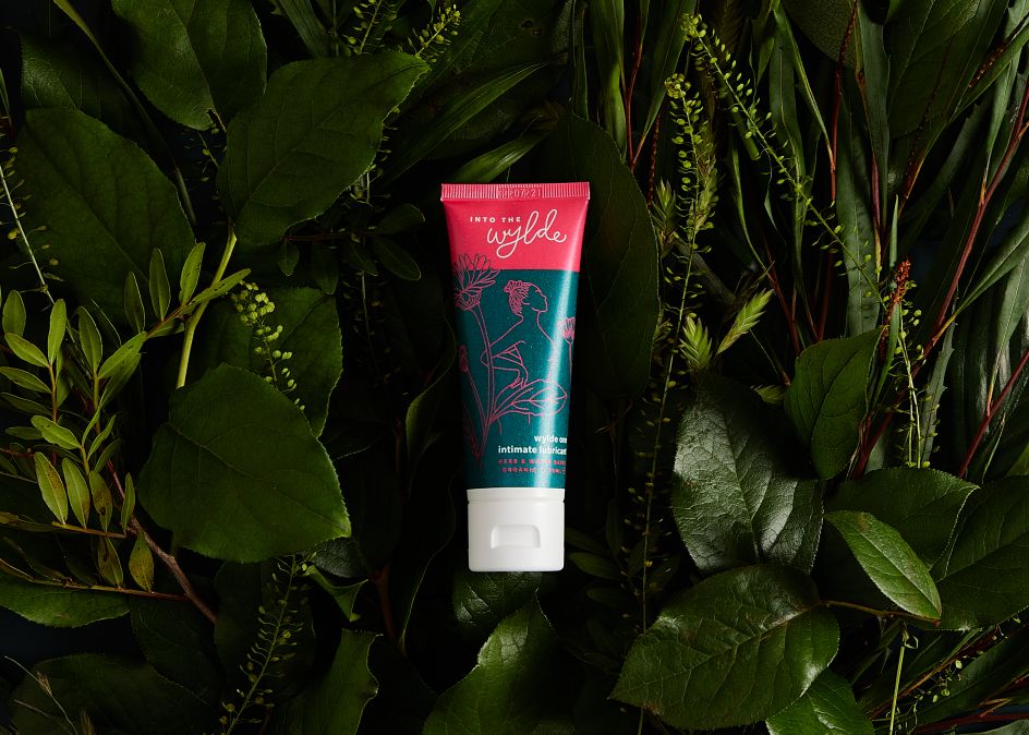
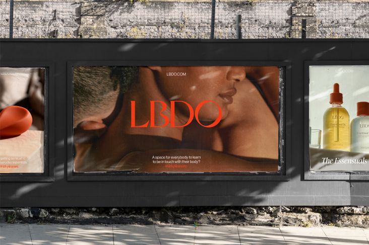
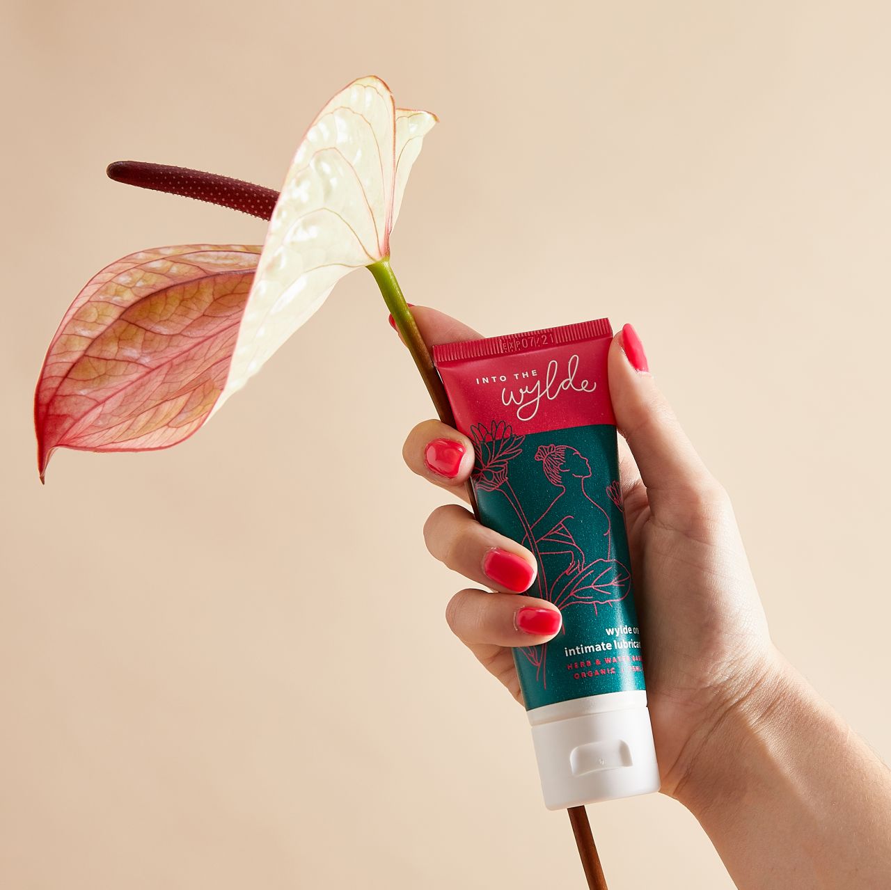
Into the Wylde vegan lube branding is based around 'nurturing'
Vegan lube brand Into the Wylde aimed to set itself apart from its peers in what the brand describes as the "sexy aisle": instead of more clinical, seemingly male-marketed designs, it went for something very different.
The creative team was picked by the brand's founder; comprising, she chose Siena Dexter for the verbal identity, tagline and pack copy; Claire Hartley for the visual identity and illustration; and Tara Liondaris for photography. Each of the creatives has their own studios but came together as a team for the brand, and Dexter says she hopes they'll collaborate again in future.
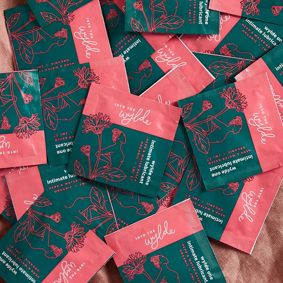
The design of the branding and packaging looked to counter what the team saw as "the stigma of women using lubricants", despite 25% of women using them to help with sensitivity and discomfort. As such, the packaging design look and feel is "about nurturing," says Dexter.
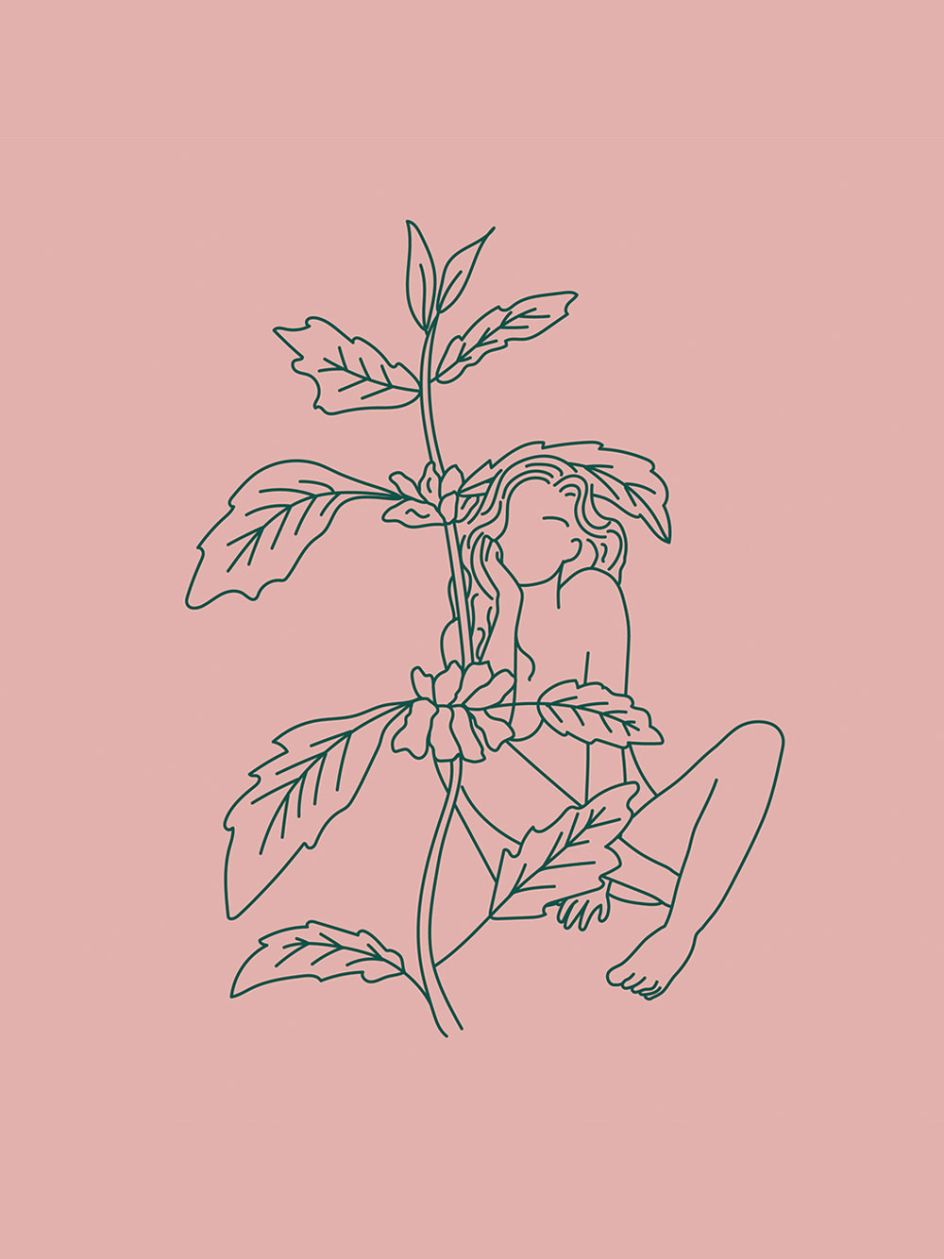
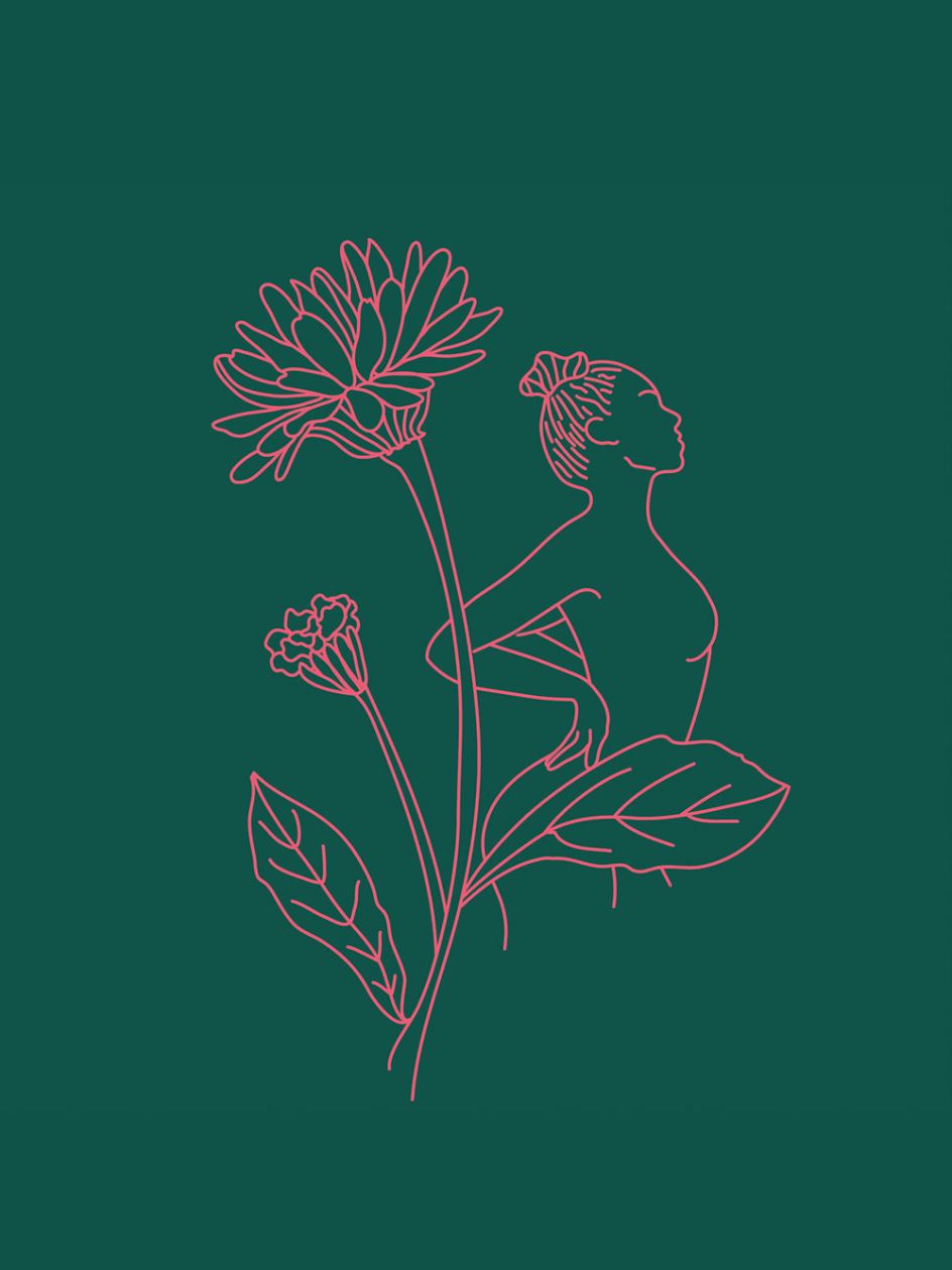
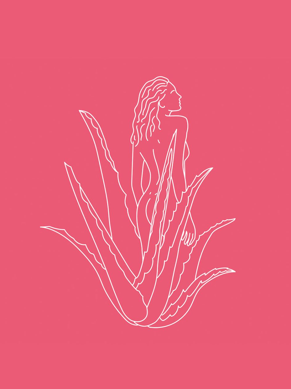
That caring concept is articulated through the colour palette's mix of nudes and vibrant tones, hand-drawn illustrations and the images of the plant botanicals which nestle the brand figure, 'Freida'.
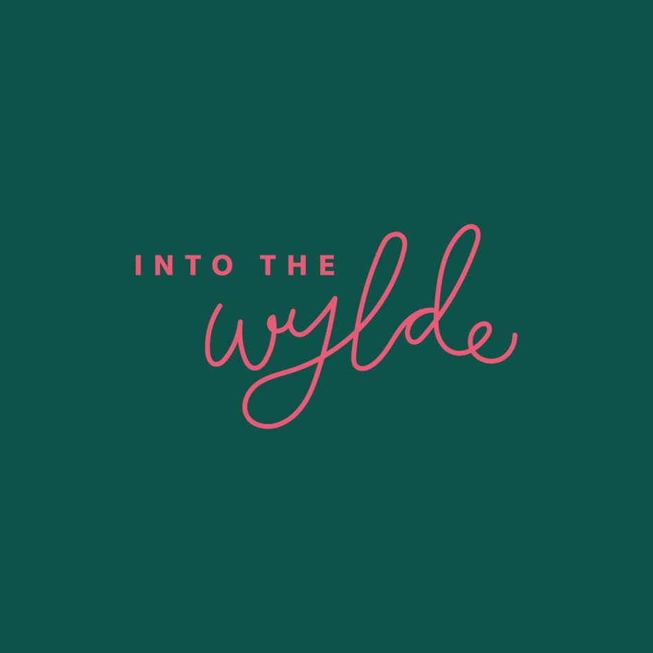
A sophisticated sans-serif font, Slate, was chosen for its clean, elegant look; while the logotype uses a hand-drawn aesthetic. According to Dexter, the "loopy, liberated logo lettering connects the element of 'play' to the everyday."
She adds, "While steering clear of obvious and cliche feminine design cues (you know, how brands simply chuck pink on the usual brand style and make it 'for women') - we wanted show femininity through fluidity, and rosy hues were used as a nod to the flush of excitement rather than an indicator of a product for women."
In keeping with its vegan ingredients, Into the Wylde's packaging is as sustainable as possible – made from 85% plastic and 15% wood pulp, meaning it can be recycled as wood or plastic.