Fiasco Design creates radical new visual identity for Hereford College of Arts
Bristol-based Fiasco Design has created a new visual identity and brand toolkit for a specialist college dedicated to the creative arts. Hereford College of Arts (HCA) is a rarity; a college dedicated to arts courses, in a vibrant community that encourages collaboration and creative exploration.
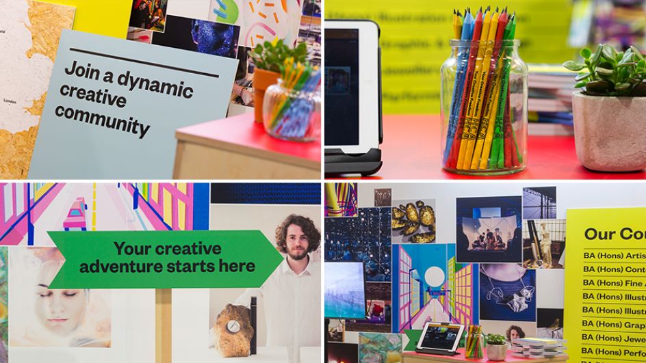
Students are given the luxury of their own desk space to personalise, which turns the whole college into a living, breathing mood board of ideas, textures and collages. A truly interdisciplinary approach also means that HCA students can enrol in any workshop across the college when needed.
When it came to their recent brand refresh, Jennie Hermolle, Head of Marketing at HCA, said: "At Hereford College of Arts we were looking for an agile agency that shared our creative ambition for a rebrand of our specialist arts college.
"Given the breadth and diversity of creative work that our branding needs to integrate with and visually articulate stakeholders, it was a challenging brief which Fiasco embraced wholeheartedly. In interpreting and challenging the project brief, Fiasco demonstrated a natural affinity for our key audiences and how they could and should be involved in the journey with us."
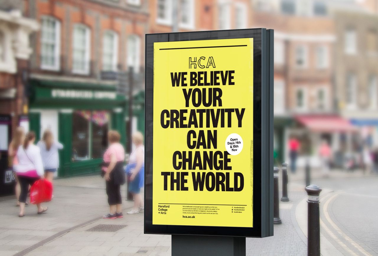
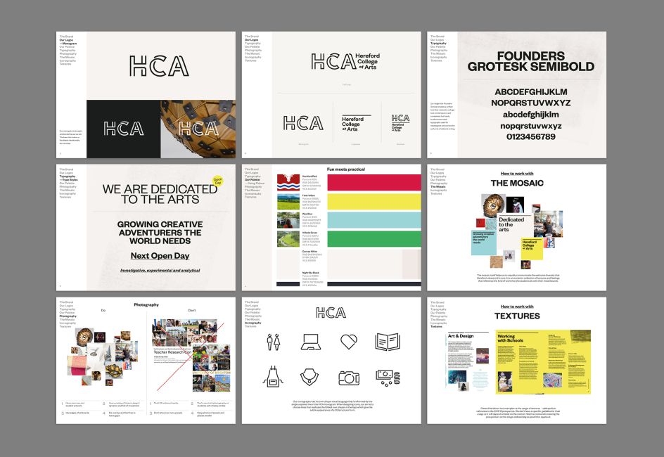
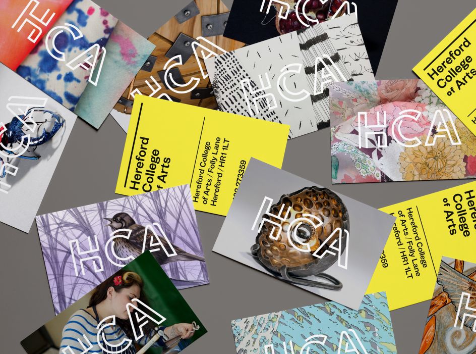
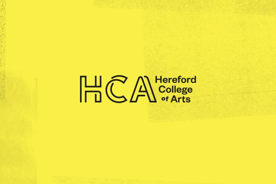
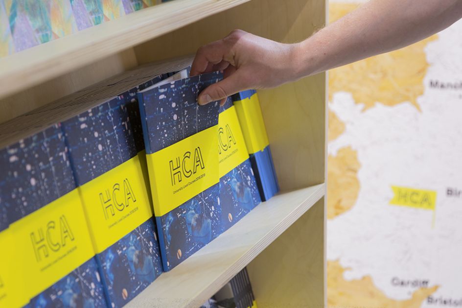
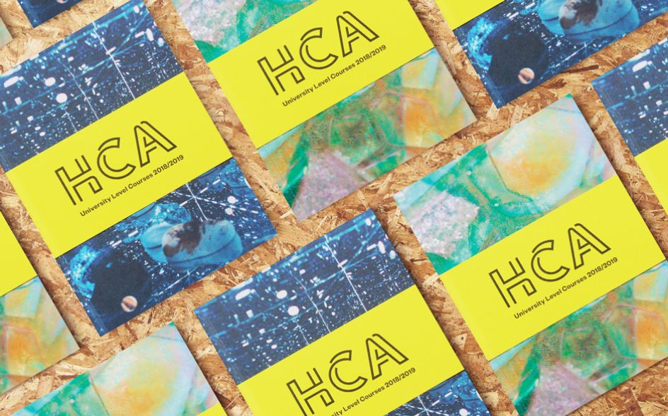
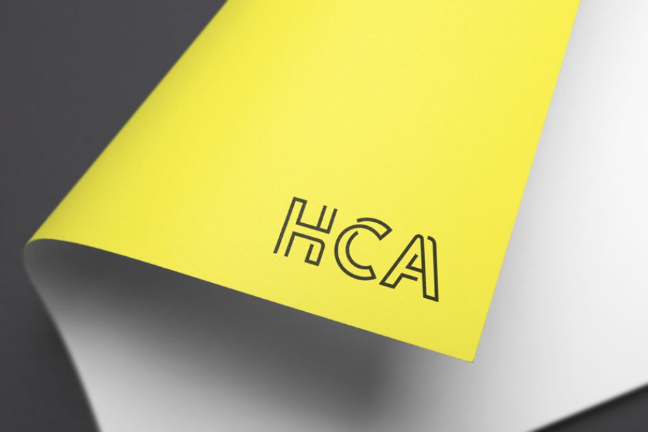
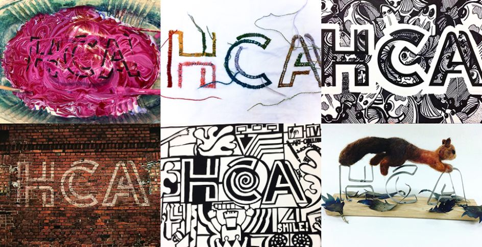
Having spent time researching the college, speaking with key stakeholders, students and tutors, Fiasco Design developed a central theme based on the core characteristics of the college; "customise your creative space". With this in mind, the cornerstone of the brand is the HCA monogram; a badge of honour that is both easily recognisable and perfect for the whole HCA community to make their own.
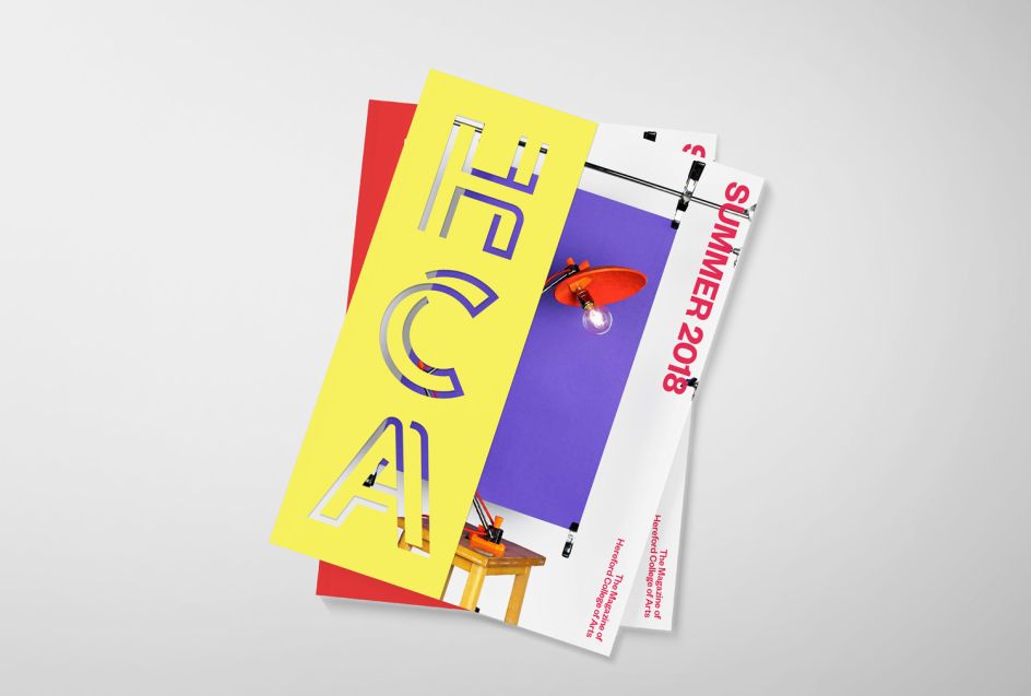
The three bespoke letters 'HCA' form an incomplete outline in reference to the brand idea of "limitless creativity" and care was made to ensure they can be stencilled and easily built to stand up on their own. The letters resemble solid structural forms, which suit the 'hands-on', pragmatic nature of the creative courses at HCA.
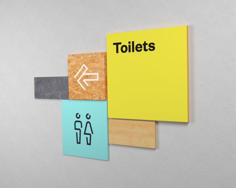
The brand toolkit is designed to reflect more of the craft-focused, practical teaching and the eclectic atmosphere that is prevalent throughout the small campuses. A single unifying font – chosen to reference letterpress processes – unites the core of the brand and creates consistency, which frees up the rest of the identity to show off the students’ work in vibrant, overlapping image mosaics.
Tom Morris, Head of Creative at Fiasco Design, said: "It was clear that this was going to be a big change for the college and in a very short time-frame, which made it particularly crucial that we found a direction that everyone could rally around right from the start. There is a lot of love for the monogram, and we’re excited to watch it develop and find new interpretations."
All images courtesy of Fiasco Design
Editor's Picks


Trending


Podcasts


Editor's Picks
Further Reading