Honest and Local: Packaging designs for hip East London beer
With rents in Shoreditch exceeding those of ultra-swanky Mayfair, the locus of East London hipsterdom is shifting to Walthamstow, and the trendiest postcode to have is now E17. Hence the punny name of innovative grocery-store/restaurant concept Eat 17, which is launching its first craft beer.
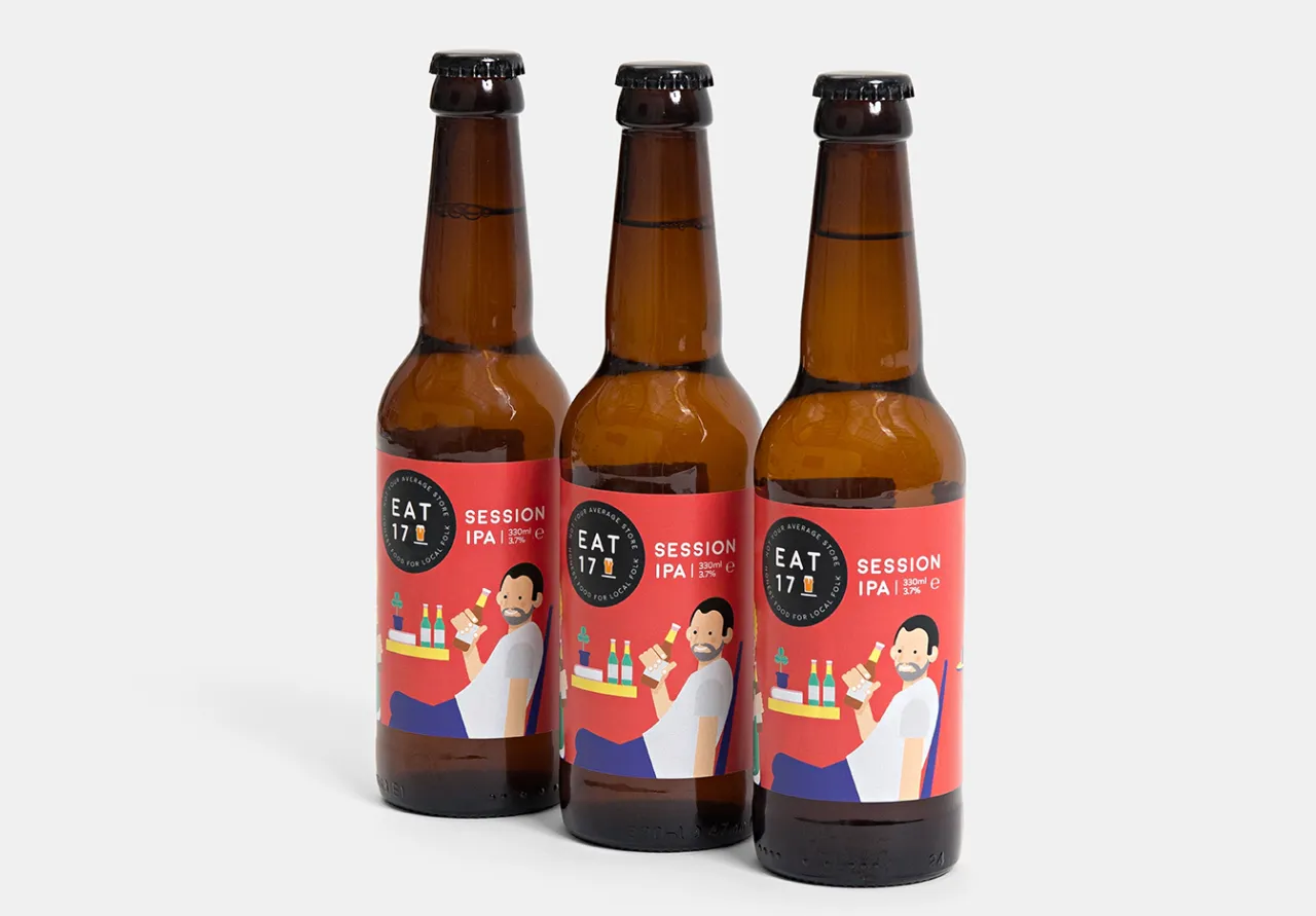
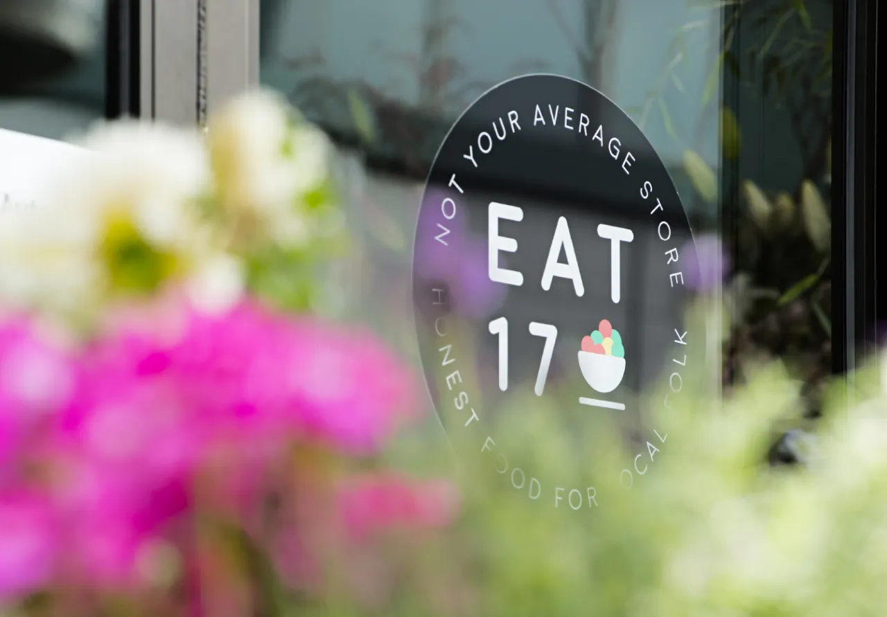
Tasked with creating the branding and packaging were Together Design, who've been working since 2012 to brand Eat 17’s commitment to local produce and diverse communities, summed up by the tagline ‘Honest food for local people’.
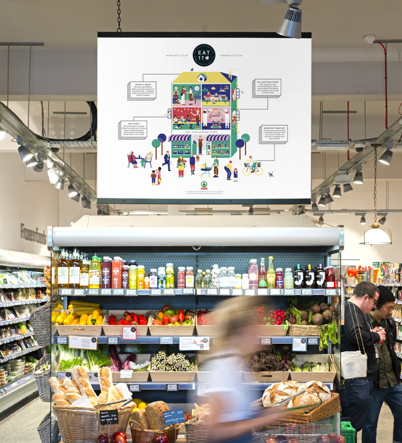
Creative director Katja Thielen gives some background. “When we started working with Eat 17, we created a dynamic illustration called 'The House of Eat 17’, where each room depicts a different part of their many food offers: shelves filled with juicy fruit and veg, busy chefs making mouth-watering burgers, a cosy lounge area and restaurant where people can chat and catch-up. Meanwhile, the bustling activity outside shows Eat 17 at the heart of a thriving local community."
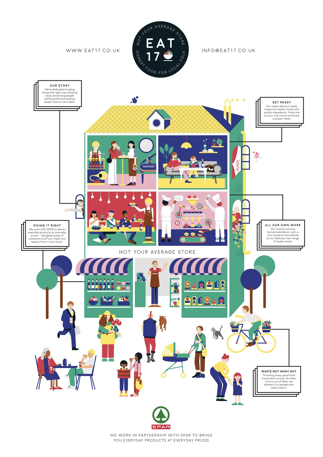
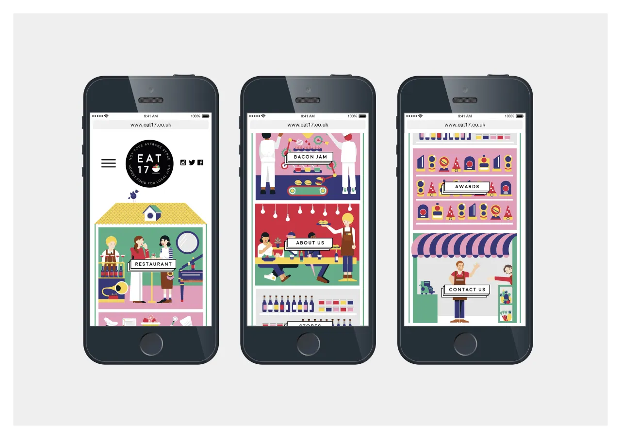
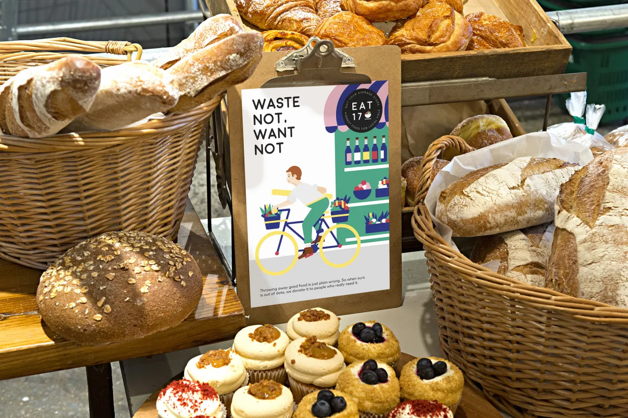
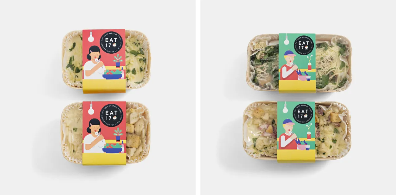
Together Design went on to hand-pick small, individual details from this illustration to create everything from the store signage and food packaging to uniforms and the website. And when it came to the new craft beer, the same principle applied.
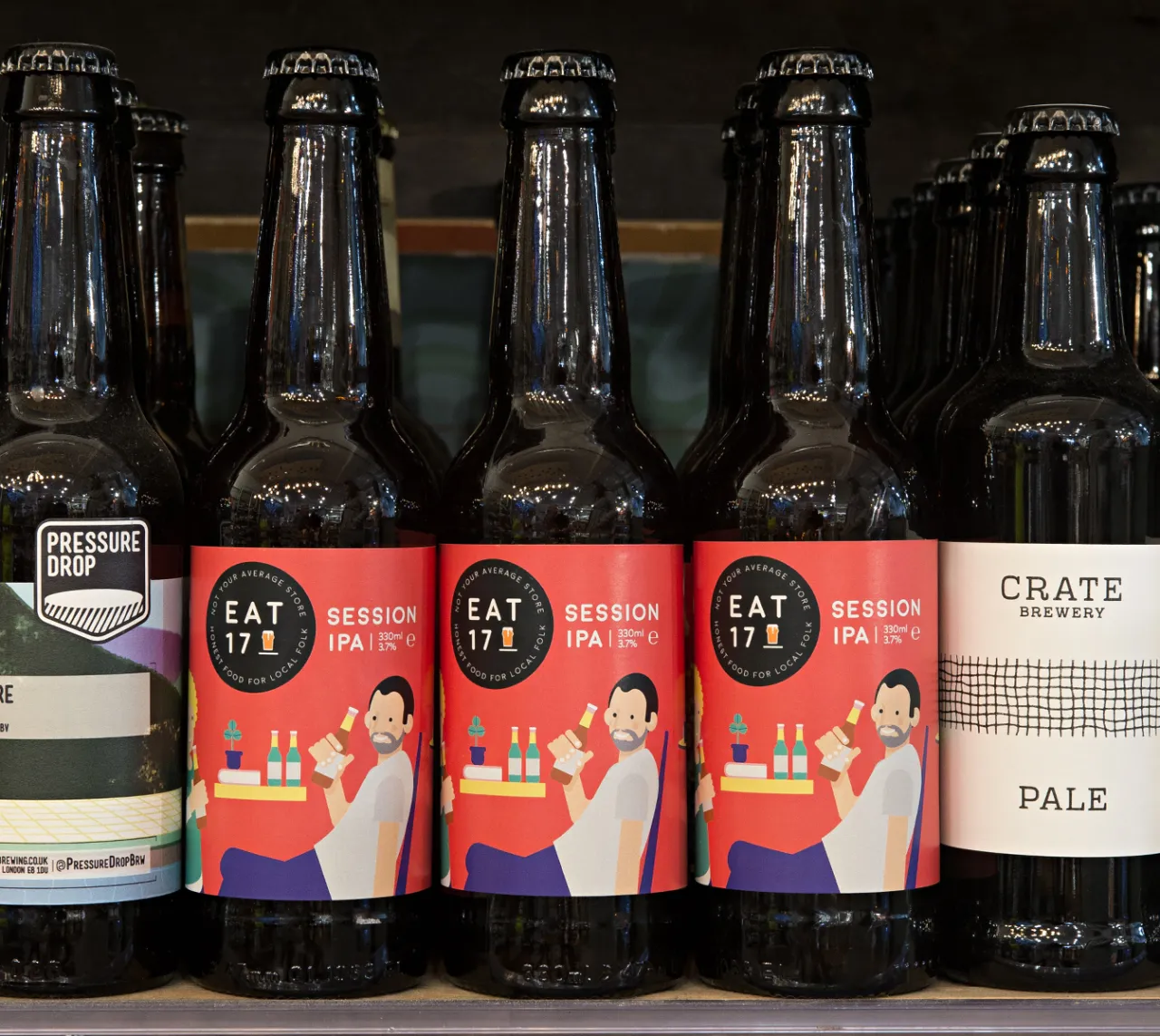
The design for Eat 17 Session IPA depicts two people effortlessly enjoying a beer in relaxing surroundings. The aim was to communicate the feeling of ‘sharing good beer with good people’ and reflect the welcoming, relaxed atmosphere that Eat 17 - which also has stores in Hackney and Whitstable - is known for.
A bold, graphic colour palette helps the packaging stand out on the shelf, and the illustration style has a strong, independent feel. Adapting and developing ideas from the original ‘House of Eat 17’ illustration provides consistent identity through both the digital and physical brand experience.
Editor's Picks





Trending






Latest Jobs
Client Partner at Halo
Full-time·Bristol·£30k–£36k
Midweight Editor at Earworm
Full-time·Bristol·£28k-£32k
Digital Marketing Executive at Arise
Full-time·Sheffield·From £23,750
Client Director at Koto
Full-time·Berlin·€70k-€85k
Design Lead at Madeo
Full-time·New York City·$85k–$120k
Creative Social Content Producer at Bompas & Parr
Contract·London·£32k–£40k