Dutchscot's identity for The Workroom, a new app that curates drop-in workspaces in restaurants
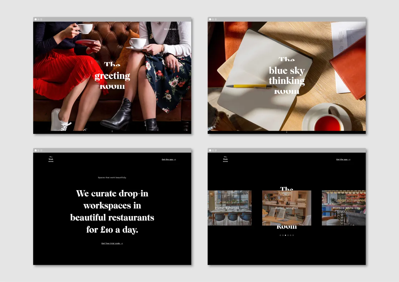
Dutchscot has created the identity for The Workroom, a new app that curates drop-in workspaces in restaurants where people can think, meet, work and get things done.
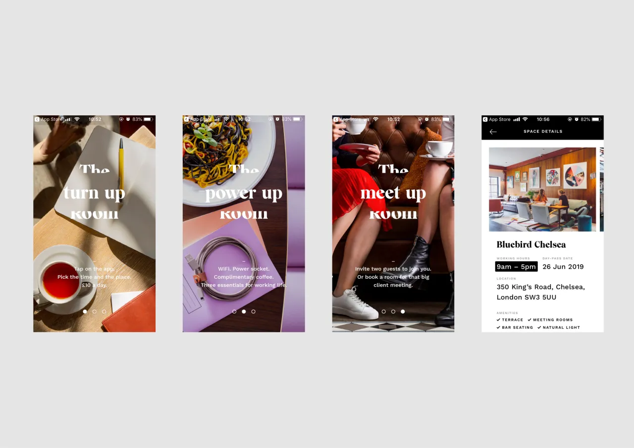
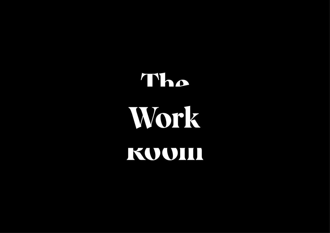
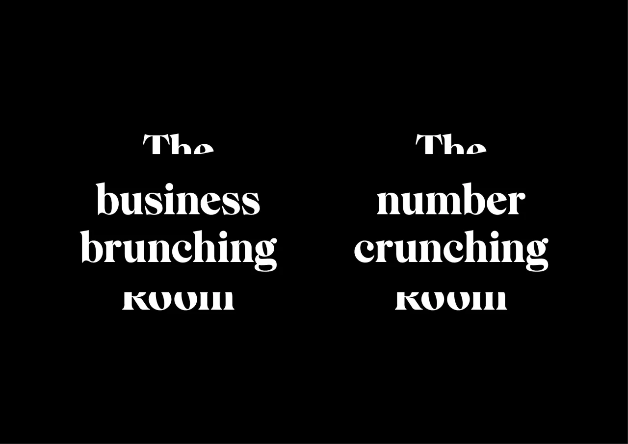
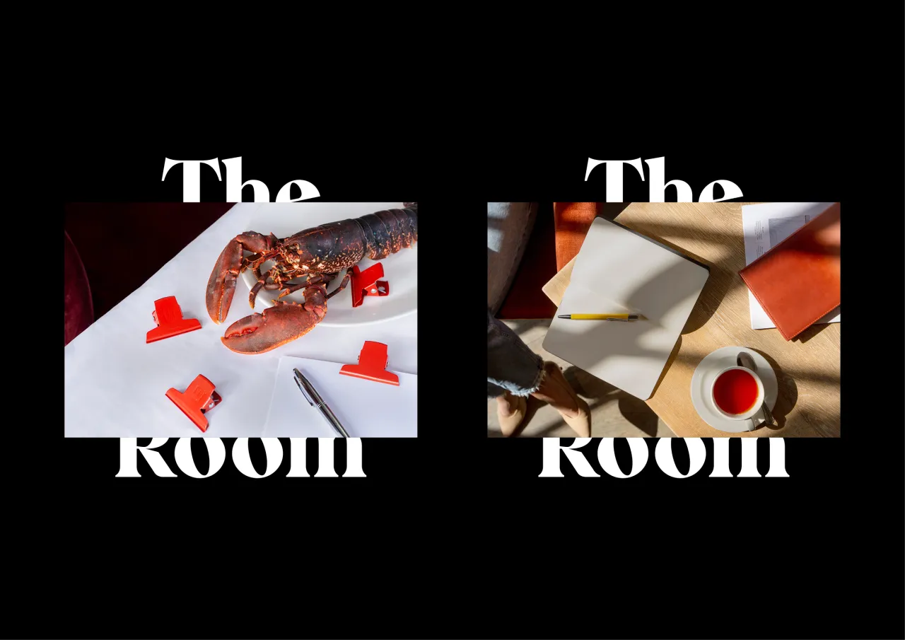
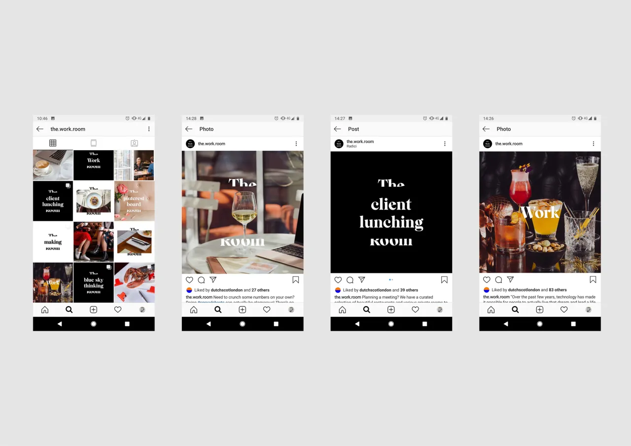
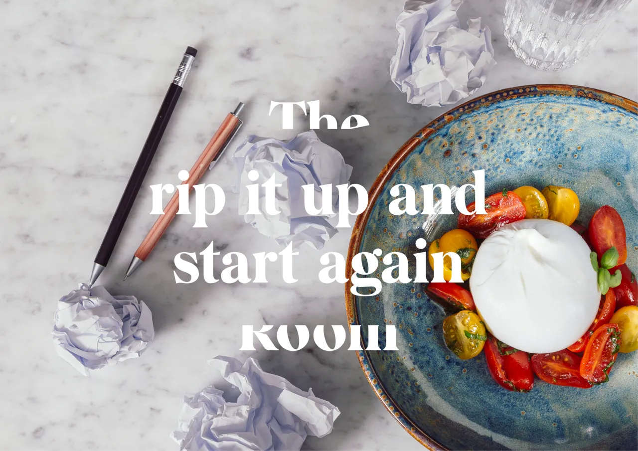
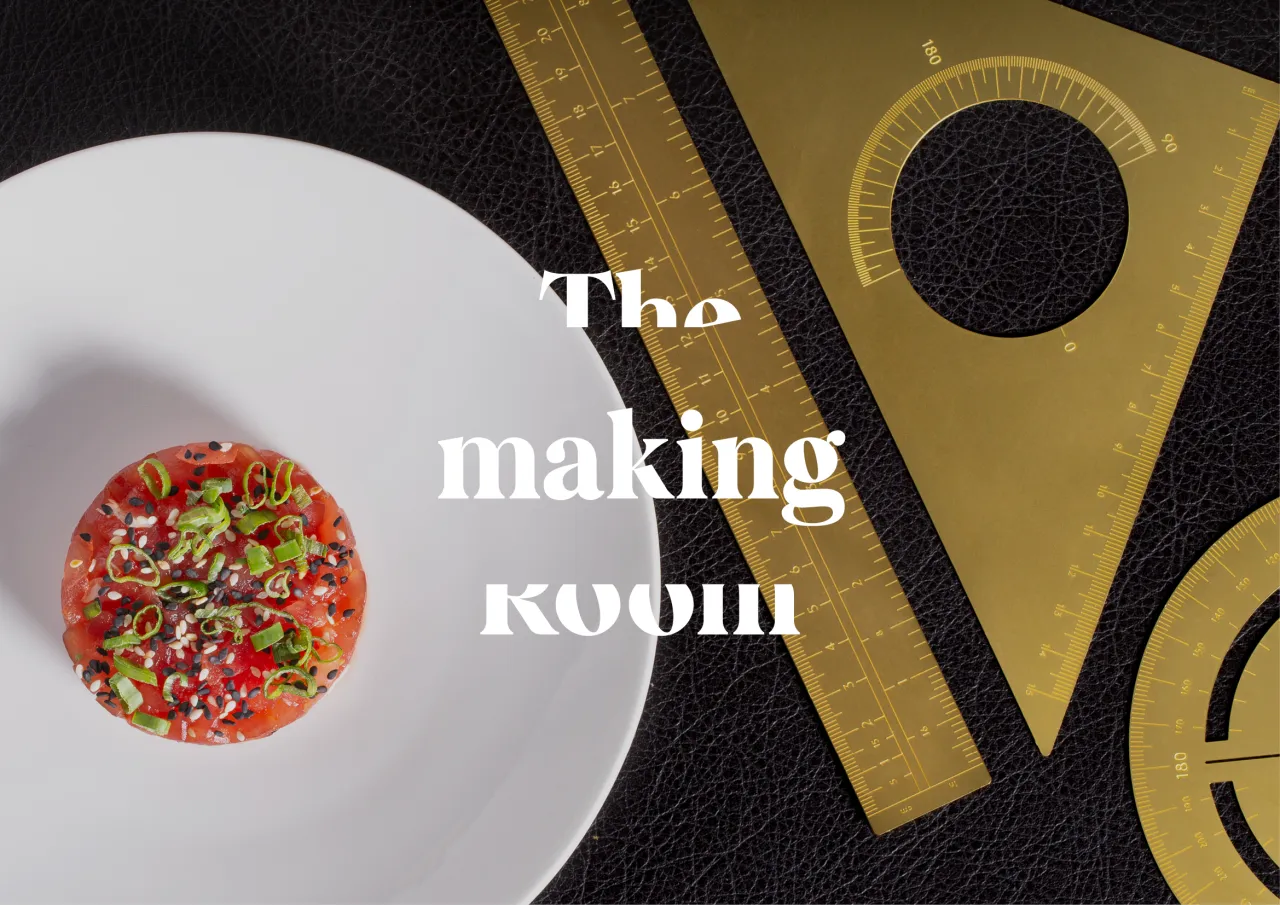
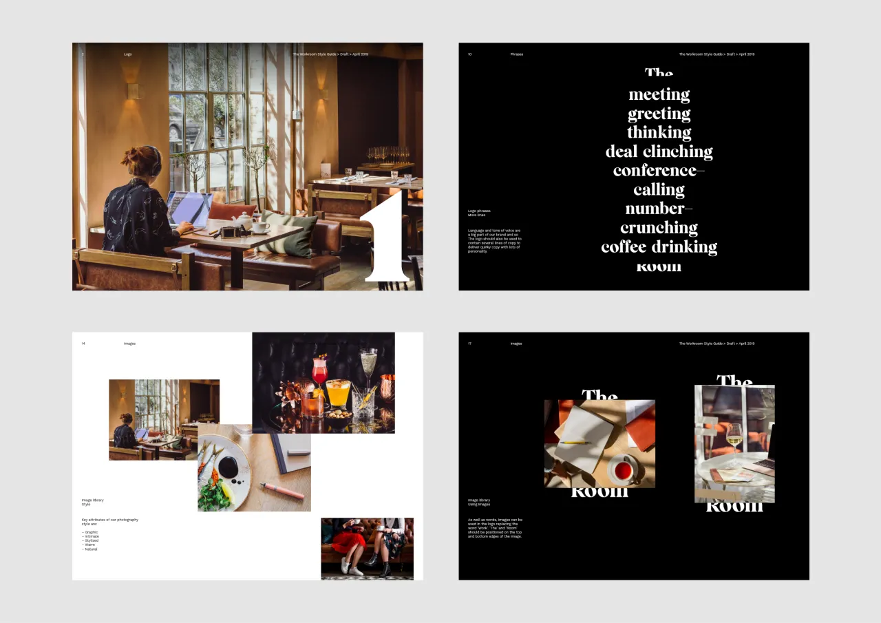
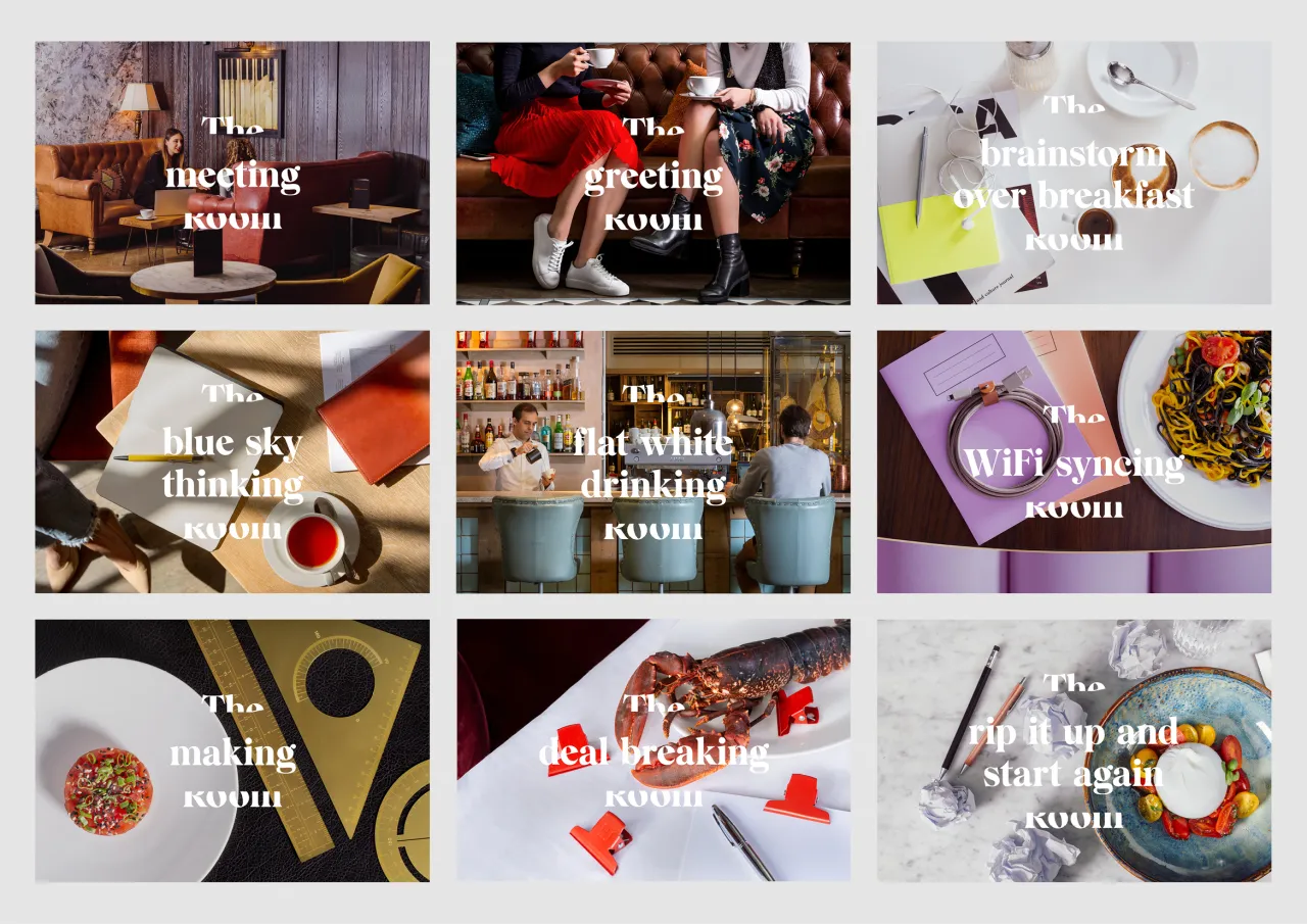
"With ‘The Workroom’ being quite a utilitarian name, we created a logo where the word ‘work’ can be replaced with a series of messages and imagery," says Jacob Vanderkar, one of the founders of the London studio. "This ’space’ in the logo is used to showcase the variety of beautiful restaurant interiors, the metaphorical space they provide people to think and work, whilst also showcasing the diverse range of activities that people can use them for."
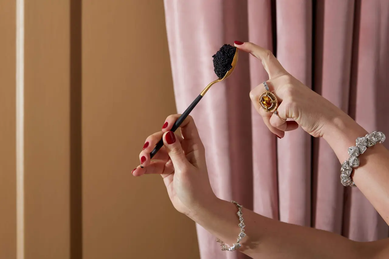
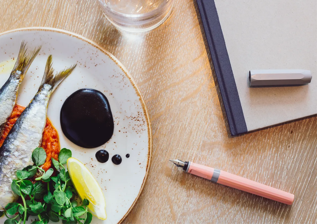
A series of images was also commissioned, in collaboration with Kalen Armstrong, that combines the world of restaurants, food and works in a tongue-in-cheek way. These pics go nicely with the typeface ‘Wulkan’ which is used for the logo and messaging. The aptly named ‘Work Sans’ is used for body copy.
The Workroom app is available on the App Store with an Android release planned for later in the year. Discover more: theworkroom.io.

Editor's Picks





Trending






Latest Jobs
Paid Media Executive at Munro Agency
Full-time·Glasgow·From £27,000
Growth and Client Development Director at 3800
Part-time·Sheffield·£60k-80k
Creative Project Manager at Analogue
Full-time·Leeds·£28k–£35k
Senior Graphic Designer at MoMA Retail
Full-time·New York·$72k-$80k
Design Director at Koto
Full-time·London·£72k-£90k
Designer at New Genre
Full-time·London·£36k–£48k