Cool, minimalist and iconic brand identity for BDG by San Francisco's Manual
BDG architecture + design is an international consultancy focusing on strategy, architecture and design for corporate, public sector and education clients. As a WPP company, BDG has designed creative workspaces for various advertising, PR, and media agencies including Grey London, Ogilvy, The Brand Union, and Mindshare.
The practice had evolved over a 30 year period so San Francisco's Manual was commissioned to help reposition the firm as a leading creative organisation, starting with a redesign of its brand identity.
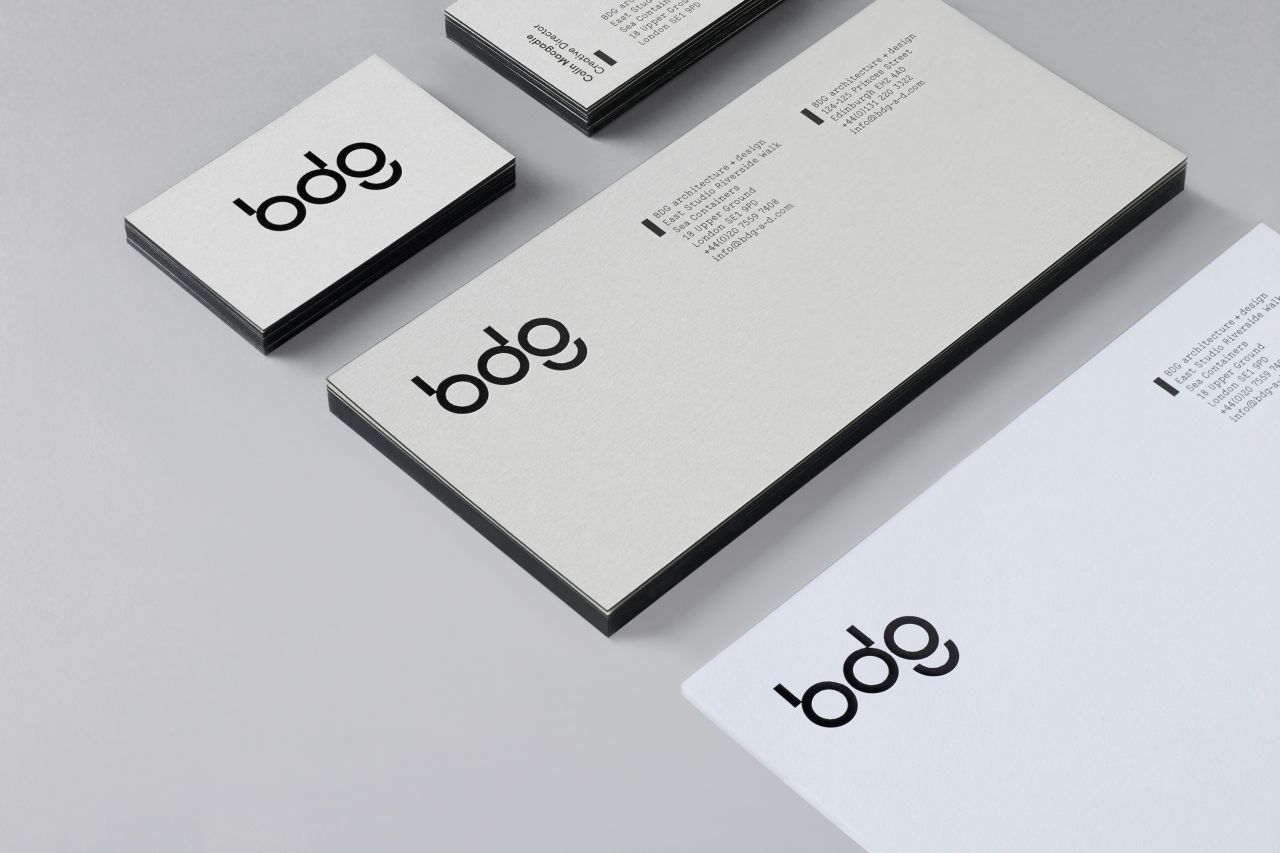
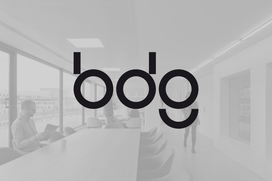
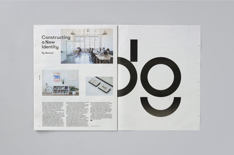
Speaking of the project, Manual said: "It was clear that a new, bold, confident design language had emerged in BDG’s recent work and the consultancy wanted an identity to reflect this shift. Our solution was to turn their three-letter acronym into an iconic logotype with a unique personality. We abstracted the letterforms into reductive geometric shapes. This consolidation of forms subtly references the nature of architecture and the constructed environment—and aims to suggest ways in which parts work together to form a whole.
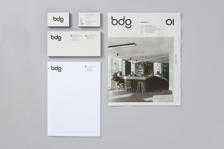
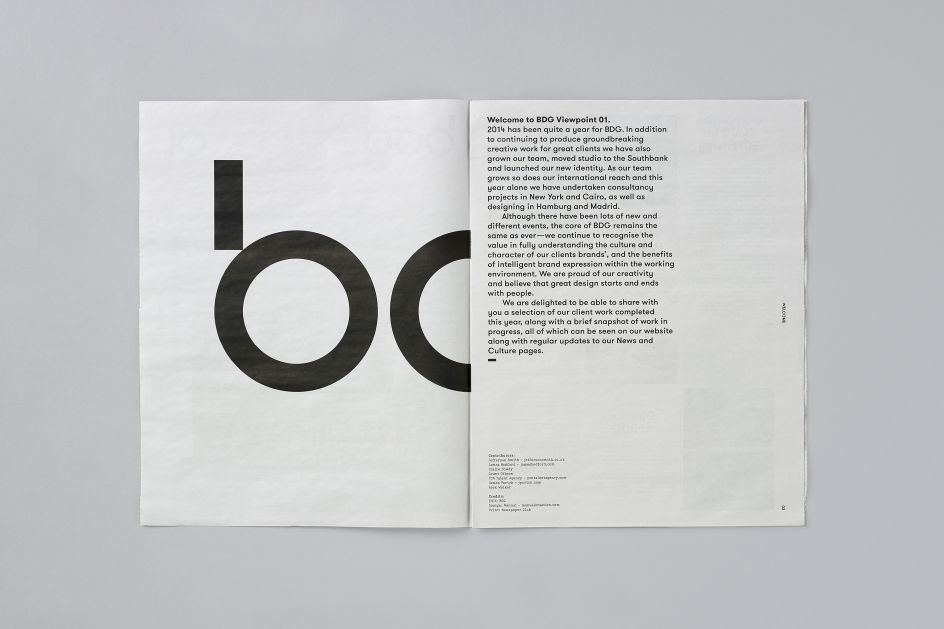
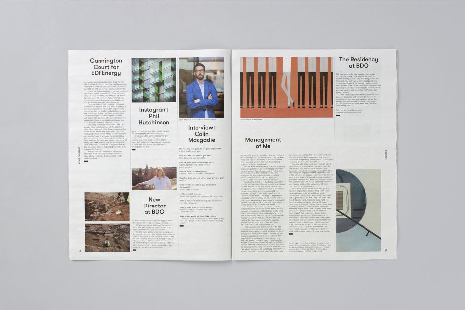
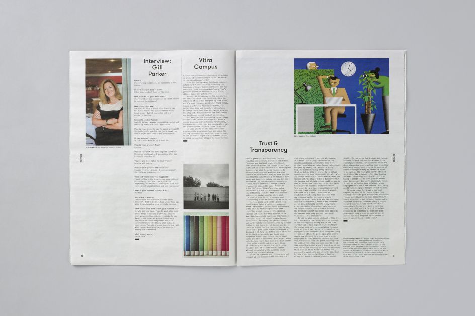
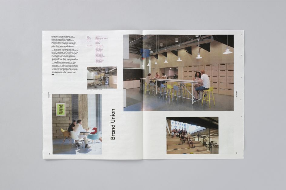
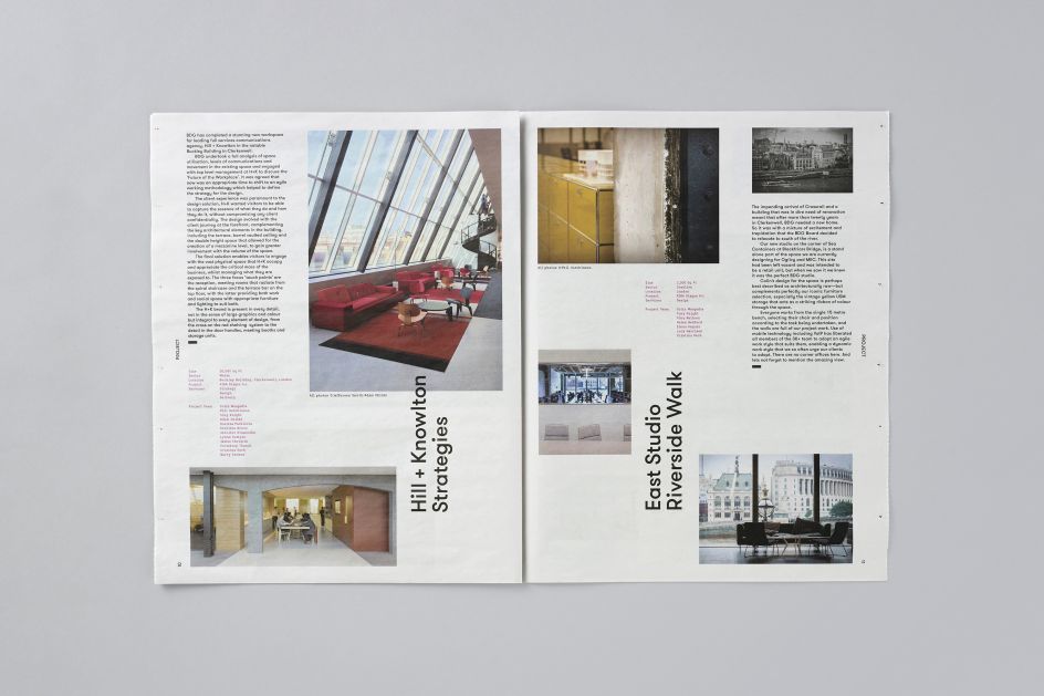
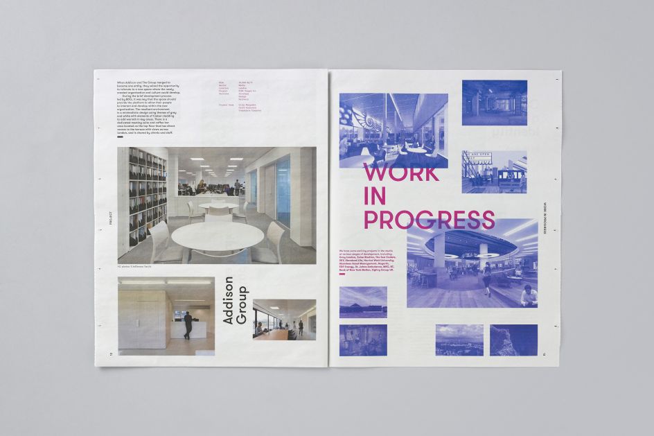
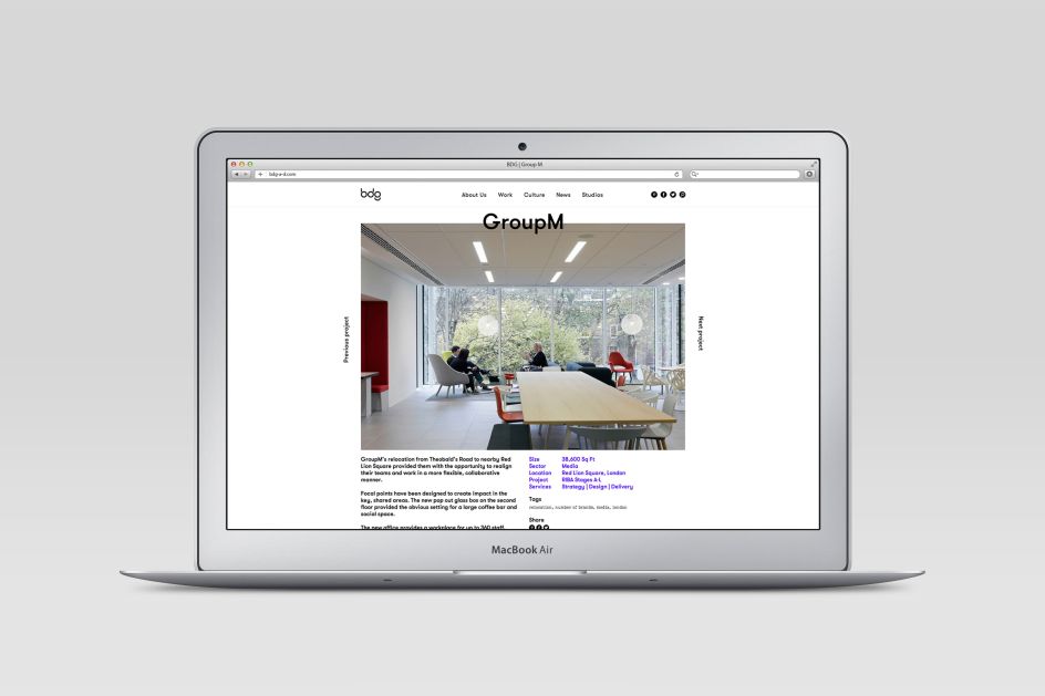
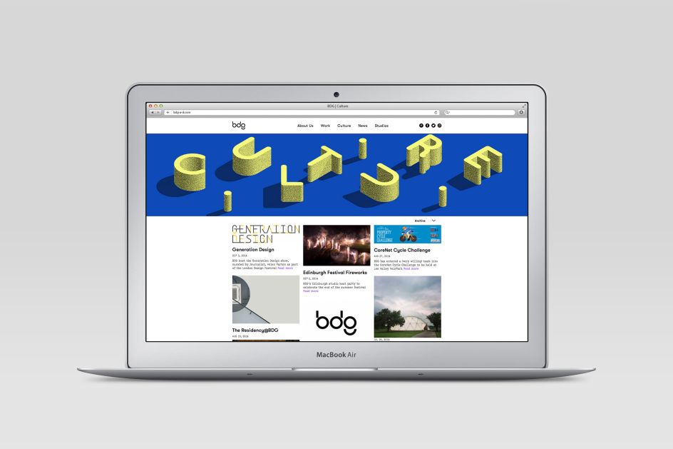
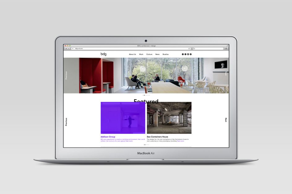
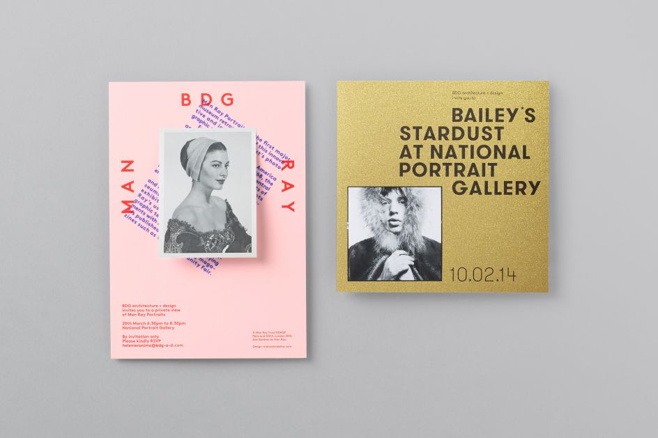
"In tandem with the new logo design, we created a new website design with large scale imagery and bold typographic layouts, and brought news and culture more to the the foreground of the user experience. In print, we designed a bi-annual newsprint paper, with news and commissioned articles presented alongside recent projects. The newspaper is distributed at hosted events such as London Design Week and serves as an opportunity for BDG to share their insights and company culture. We also created special invitations for private views at the National Portrait Gallery for BDG’s clients and partners."
Via Manual | All images courtesy of Manual
Editor's Picks


Trending


](https://www.creativeboom.com/upload/articles/90/908fdb6378db1e95d12595416f54e6336d5e80b8_732.jpg)
Podcasts


Editor's Picks
Further Reading