Clout's visual identity for new publishing imprint cleverly combines wildlife with literature
Welsh publisher Atebol planned to expand its operations and needed to revitalise its branding accordingly. Cardiff agency Clout explains how it took two disparate inspirations and made them work together beautifully.
Publishing is an ever-changing industry, and in the digital age, the level of change and disruption has gone into overdrive. Consequently, all publishers, large and small, must be flexible, adaptable and open to change if they want to survive. Welsh publisher Atebol realises this and has recently taken steps to expand its operations.
More commonly known for children's books and educational resources, Atebol wanted to expand its reach to adults through unique fiction, non-fiction and informative titles.
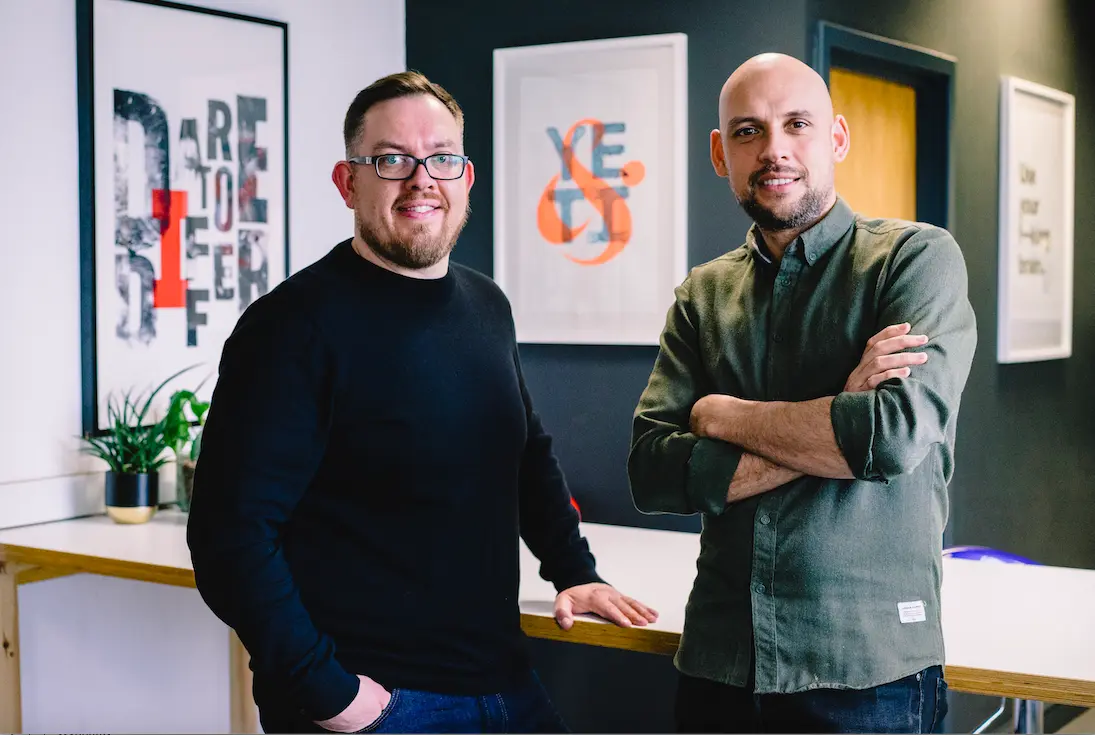
Award-winning Carfiff-based agency Clout was tasked with helping them launch the imprint at the recent National Eisteddfod of Wales, the largest music and literary festival in Europe.
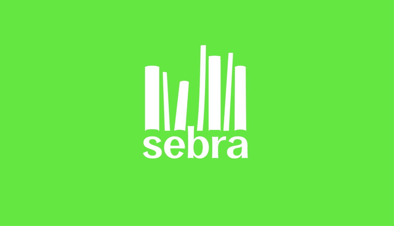
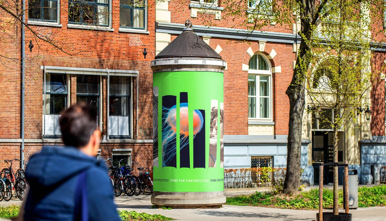
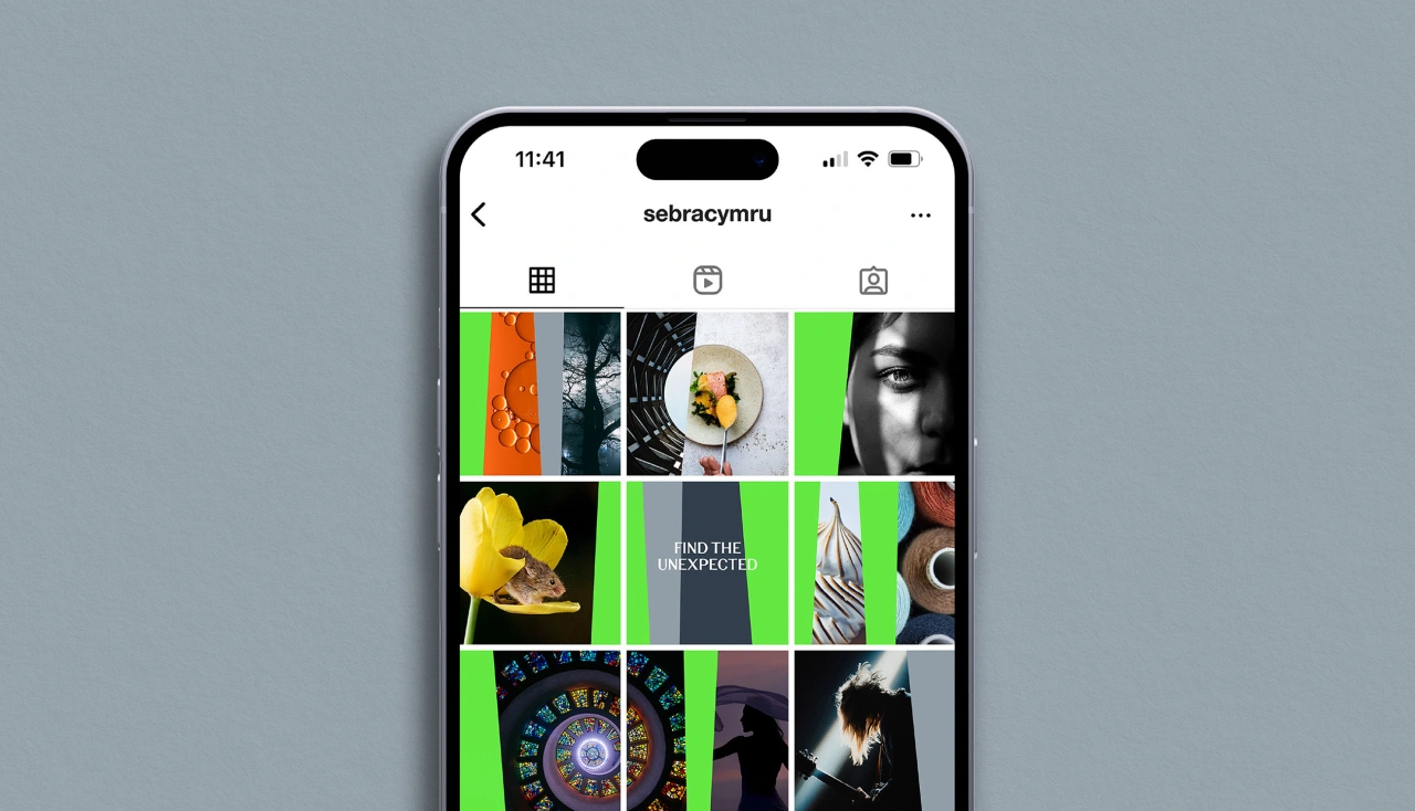
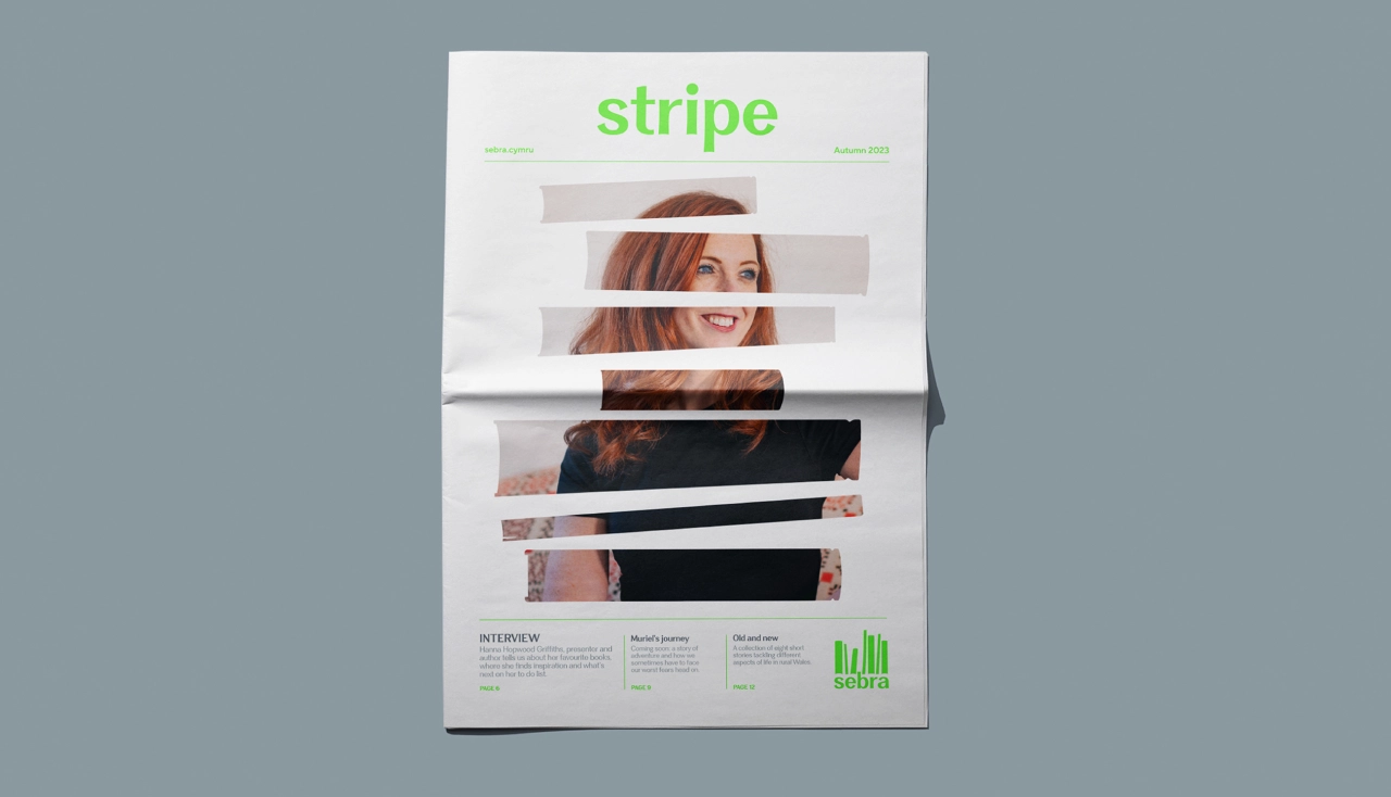
Atebol's managing director, Owain Saunders-Jones, explains that their commercial strategy is based on curating and promoting unique content from Welsh writing talent. "The name Sebra, which is Welsh for Zebra, was chosen for its bilingual quality and how it reflects our bold, original offering of unusual content," he says.
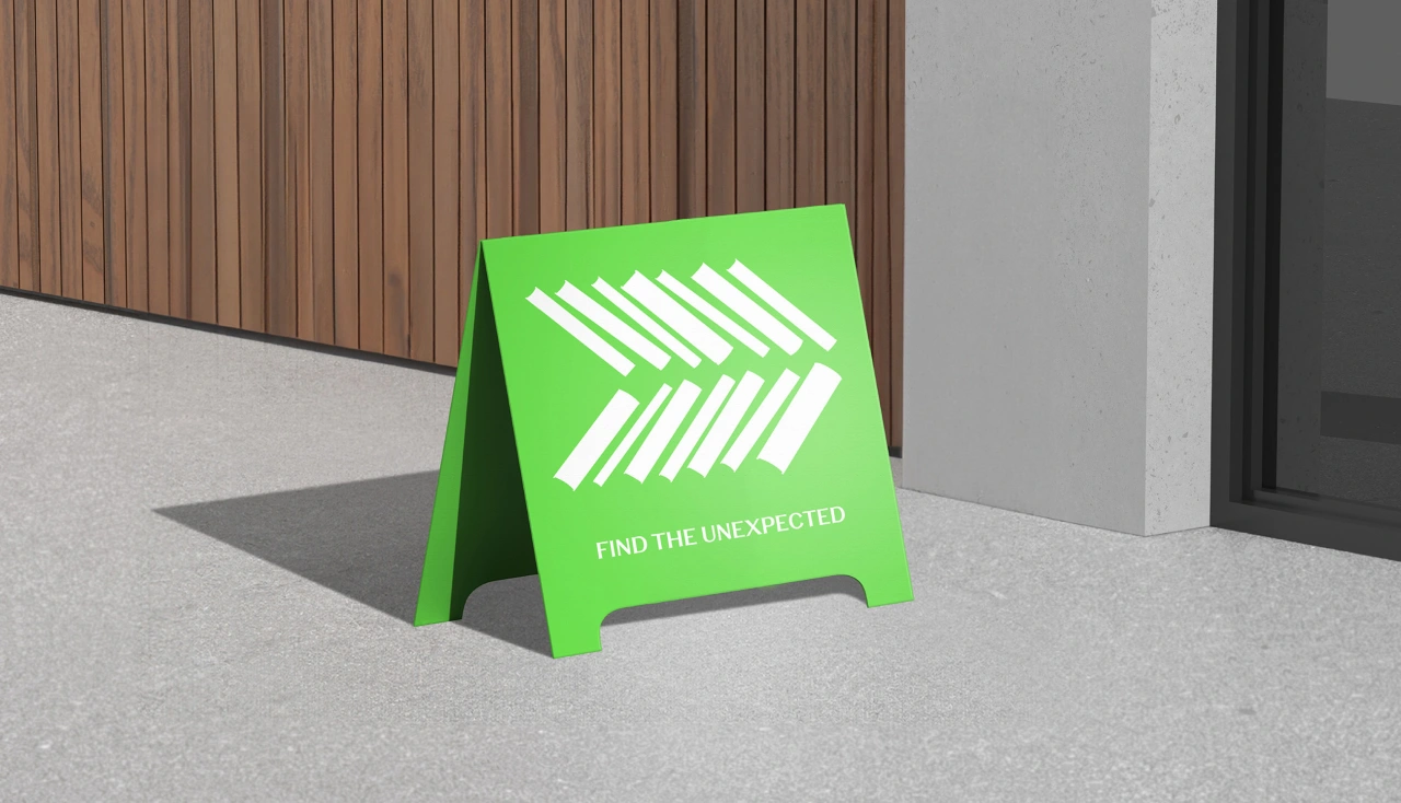
To link the idea to literature, Clout designed a logotype out of books arranged in a striped formation. "The concept was carried into the wider visual identity," says creative director Michael Smith. "Here, images appear within book 'apertures' to reinforce the diverse mix of subject matter and the overarching brand narrative 'Find the unexpected'".
A bright green and white colour palette underpinned by neutral greys was also introduced to complement the language and enhance standout.
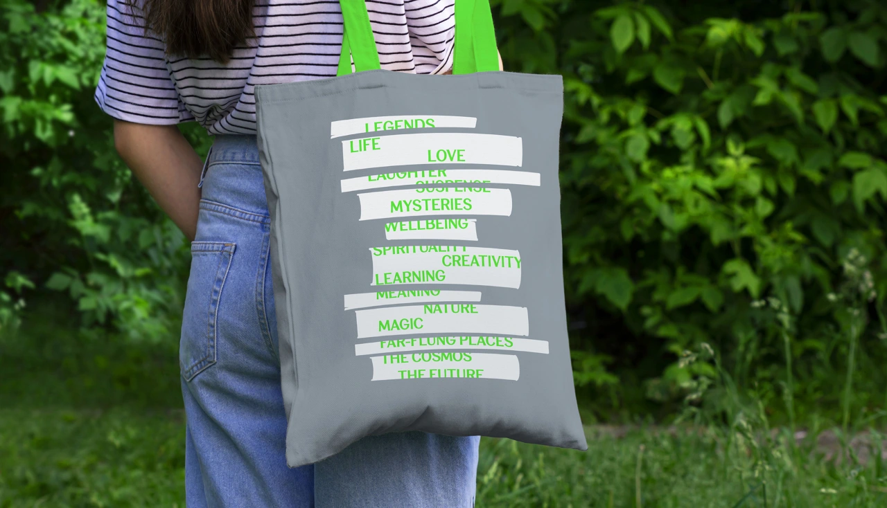
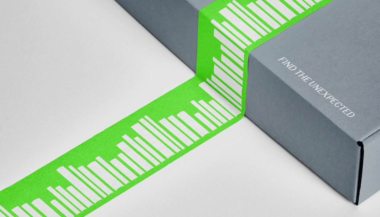
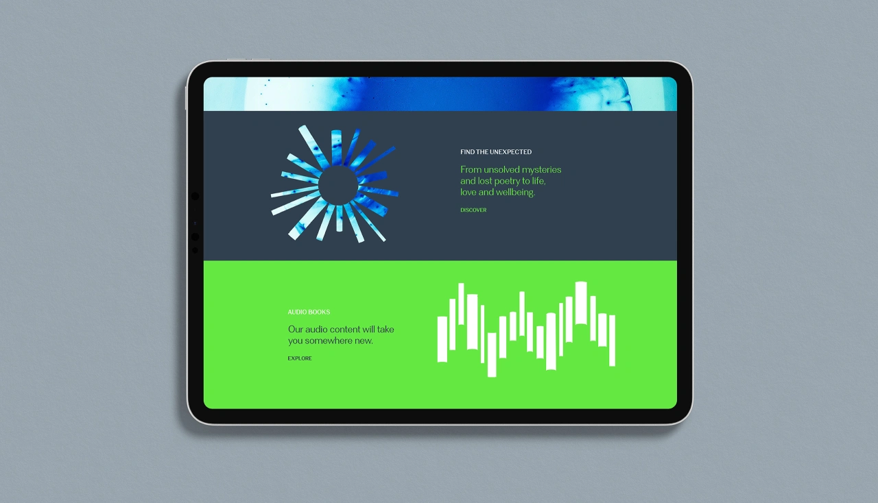
During the launch, feedback was overwhelmingly positive, with many people commenting on the logo and how it both implies the 'Sebra' name but also suggests books. Several published authors made approaches to register their interest.
"The new brand will give us a great foundation to develop and promote writing talent in Wales," says Atebol's head of publishing, Rachel Lloyd, "along with our wider ambition to raise the profile of Welsh writers globally."
Editor's Picks





Trending






Latest Jobs
Senior Designer at Definition
Contract·London·£45k–£50k
Creative Content Executive at Cognition
Full-time·Birmingham·£28k–£35k
Digital and Marketing Manager at Manchester Art Gallery
Contract·Manchester·£38,126 pro rata
Midweight Designer at Catalyst Creative
Full-time·London·£32k-£36k
Account Director at How&How
Full-time·London·£73k-£79k
Senior 3D Motion Designer at Art&Graft
Full-time·London·£50k-£65k