Studio Herrström designs the visual identity for Sound.xyz, a new service for music fans
A new kind of music platform requires a new kind of visual branding. Studio Herrström leaned into what's unique and different about Sound.xyz, and delivered the goods.
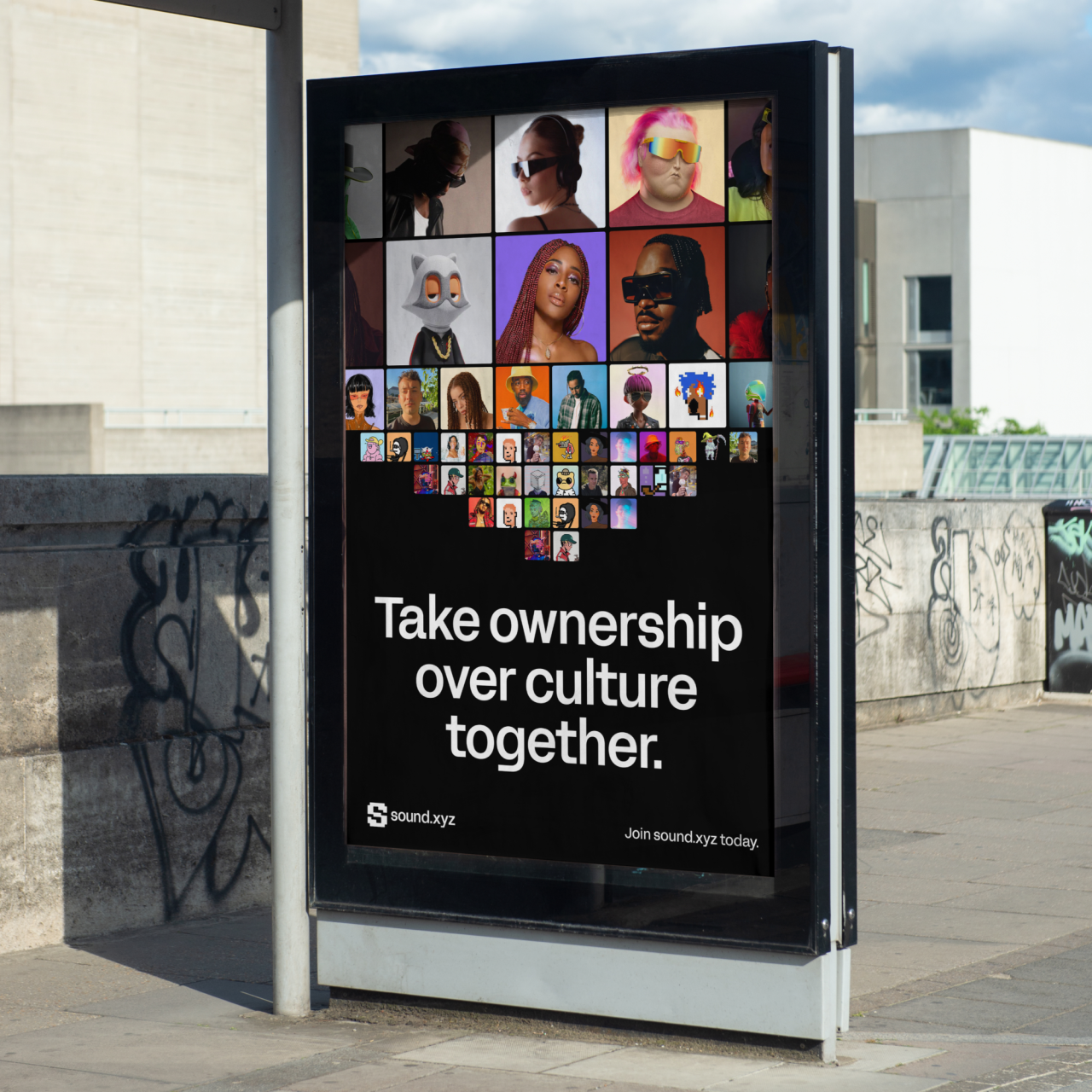
Into music? Then all you need is Spotify and maybe YouTube Music, right? Well, Sound.xyz would beg to differ. Under the tagline "Discover new music and prove you were the first," is a social and music platform championing a future where artists and fans can reap the rewards of music creation and appreciation.
So what does that mean exactly? Well, through listening parties and countdown releases, Sound.xyz builds hype around new releases and allows listeners to own parts of a track. This creates a new type of fanbase for musicians and a close tie to their fans that they've never seen before.
Accordingly, Vienna-based creative agency Studio Herrström worked with Sound. xyz's core team to rethink their brand identity. The team, which included David Greenstein, Kevin Teng and Jessica Pham, developed a design system that emphasises the power of connections between artists and listeners through a variety of visual expressions such as building blocks and conceptual patterns.
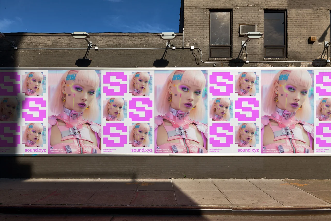
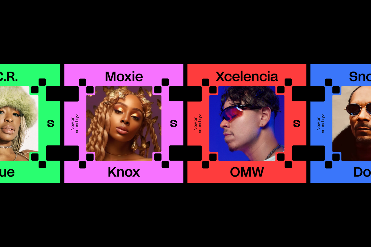
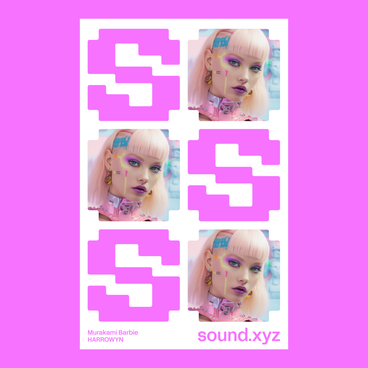
Artists and listeners are the building blocks of Sound.xyz, and its symbol is built up with these building blocks, which can transform into different constellations. The constellations can also be the shape of the community of the platform or the audience of a specific release from an artist.
Importantly, there's an element of gamification to the way Sound.xyz works. If you are the biggest fan, who showed up the first, you'll have a chance to be in the very front – just as you would at a concert. This way, artists and listeners can connect, just as they might in the real world.
When a connection is made, it's forever lasting, as you are part-owner of the track. Studio Herrström took this concept and harnessed the visualisation of the audience to create graphic soundwaves. This helped to graphically emphasise the concept of users owning parts of a track.
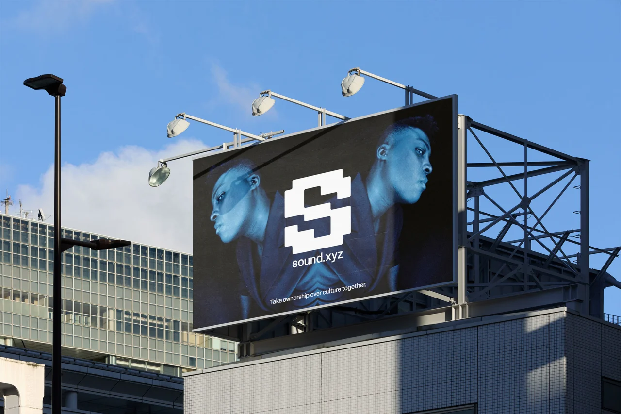
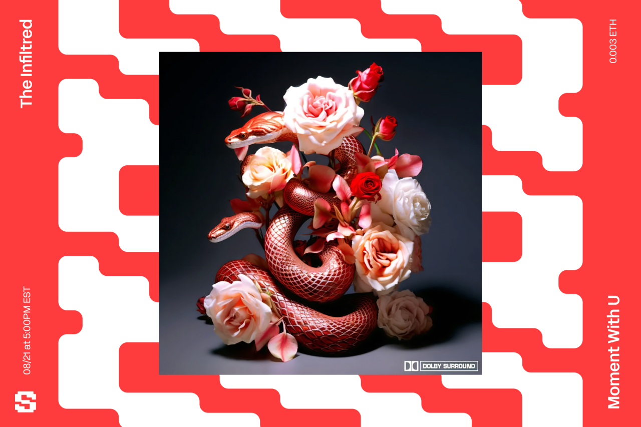

In this new visual world of Sound.xyz, the symbol plays a key role in building connections and holding information. The team developed additional growth patterns out of the symbol to help show how releases are constantly able to be discovered by more and more listeners in the feeds. The idea was to emphasise how at Sound.xyz there is always a new release around the corner waiting to be found.
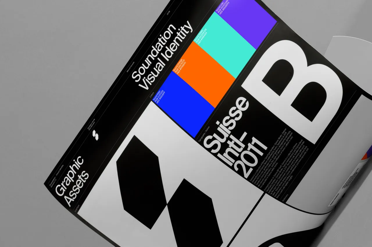
Along with a variety of graphic expressions via the core shapes, the brand uses Acid Grotesk, designed by Folch Studio, and a full spectrum of colours, to help marketing and promotions appear consistent, engaging and eye-catching.
Editor's Picks





Trending






Latest Jobs
Client Success & Growth Director at Revolution Growth
Full-time·Manchester·£60k-£70k
Designer at New Genre
Full-time·London·£36k–£48k
Digital Marketing Executive at Arise
Full-time·Sheffield·From £23,750
Midweight Designer at Catalyst Creative
Full-time·London·£32k-£36k
Head of Technical & Facilities at Midlands Arts Centre
Full-time·Birmingham·£40,210
Midweight Graphic Designer at We Are Your Friends
Full-time·London·£36k–£44k







 for Creative Boom](https://media.creativeboom.com/8e6af190-ea56-4a54-a38b-38c865a276e3/conversions/f65e6d282b0c41ab2f6b45b5676f0c600c4105d5-medium.webp)
 for Creative Boom](https://media.creativeboom.com/f640ef84-d175-460f-af80-44f4319340c4/conversions/5f8719cb570a223e030fdef4e449150eb733a8d5-medium.webp)