Endless Studio create standout branding for Northern street food vendors Hoi Polloi
How do you lure in hungry people to your food stall? With eye-catching branding, of course. And this new work by Endless Studio for Hoi Polloi is a great example.
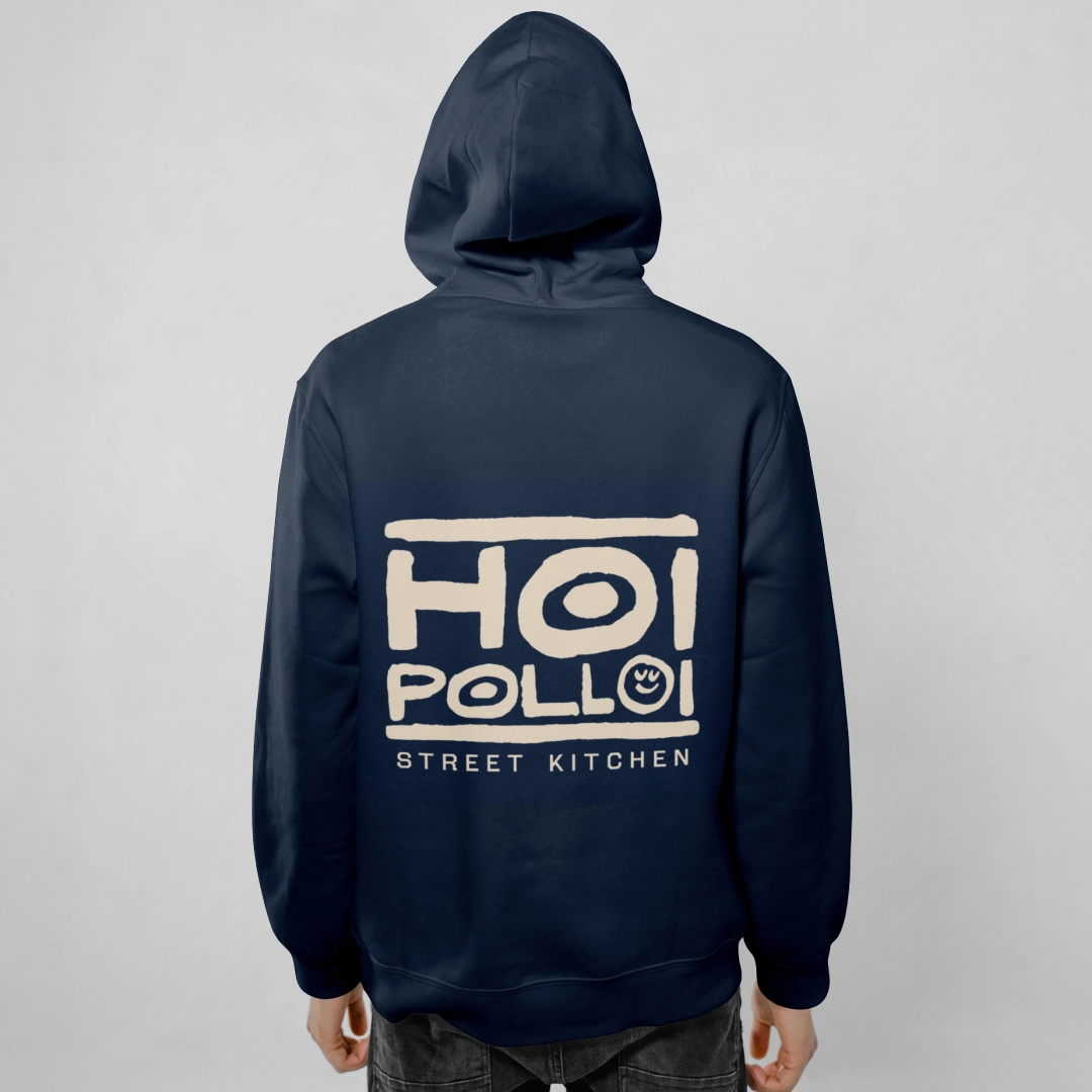
When it comes to food, the saying goes, ' The first bite is with the eye'. Similarly, when you encounter a contemporary street kitchen, it's the branding that often has to do the most work to grab your attention.
With this business being so super-competitive, it's a good place to look for inspired visual identities we can all learn from, whatever sector you're working in. And here's a prime example.
Hoi Polloi, meaning 'the masses' (or literally 'the many') in Greek, is a street kitchen calling at bars, food festivals, pop-ups and events across the north of England. They came to Leeds-based creative collective Endless Studio seeking a complete rebrand, one to stand out against the massive plethora of street vendors currently on the scene.
The brief
Collective members Aaron Whitaker and Joe Songhurst took up the challenge, and Aaron outlined the brief they received.
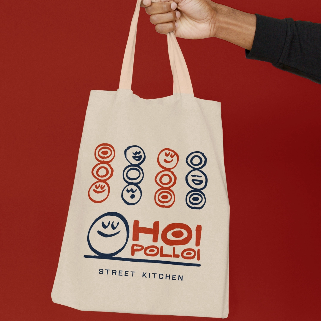
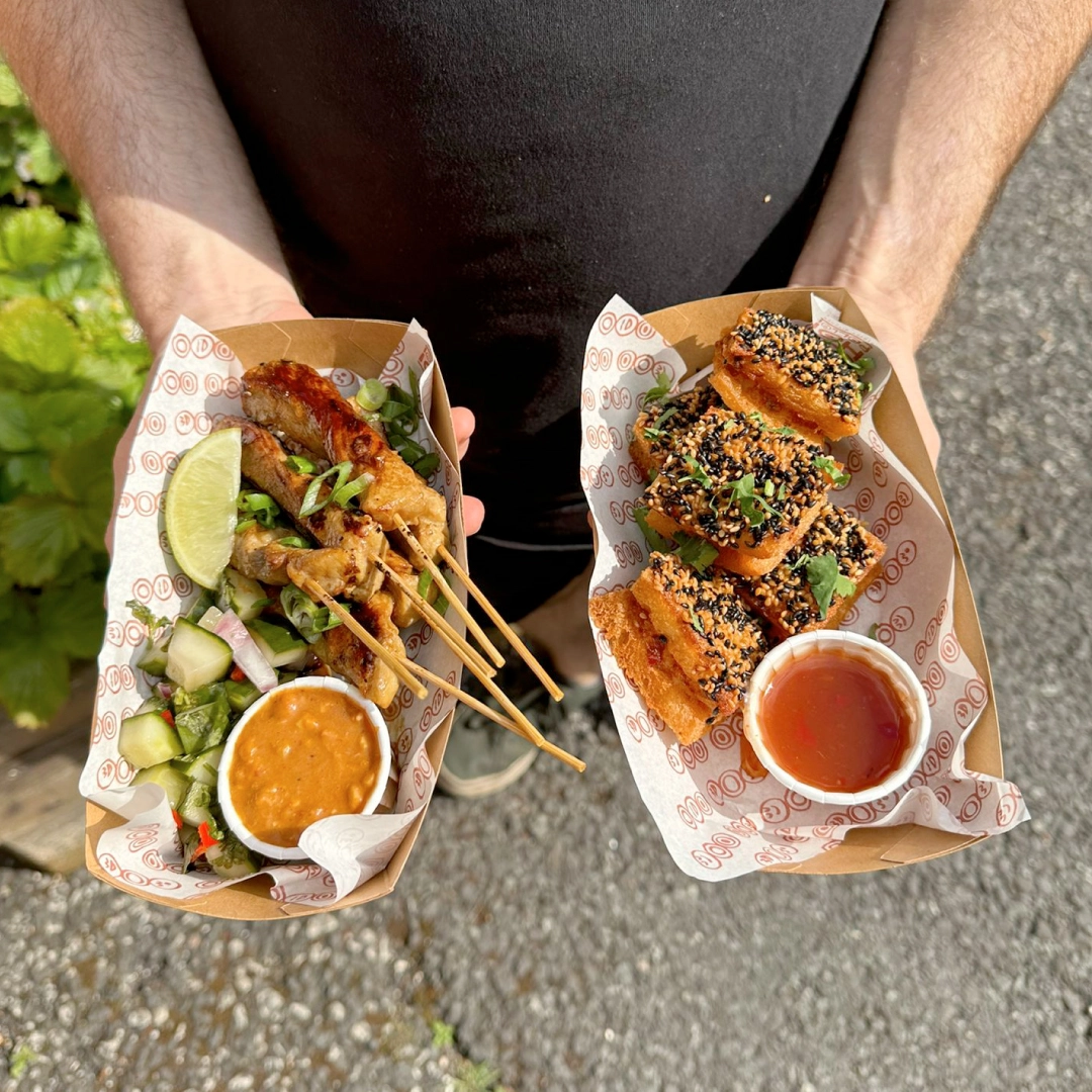
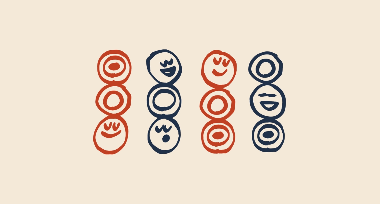
"Hoi Polloi wanted the branding to reflect their namesake, bringing everyone together to have a great time under a colourful, energetic and friendly banner," he explains.
"Before the rebrand, the Hoi Polloi team had visited Asia for a food and visual research trip. They returned with a wealth of visual resources: the colourful, the cute, the excessive and the downright bizarre. And these were great in bringing together a big picture for us to delve into."
Sauce and splodges
Early in the development process, Aaron and Joe came up with the idea of creating characters out of sauce and food splodges.
"Many of the initial character drawings started with a bottle of sauce," he recalls. "And the rough edges, plus the stroke variation of those initial drawings, can still be seen in the final logos."
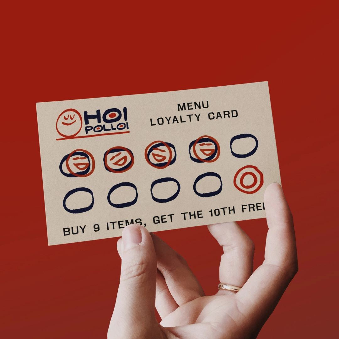
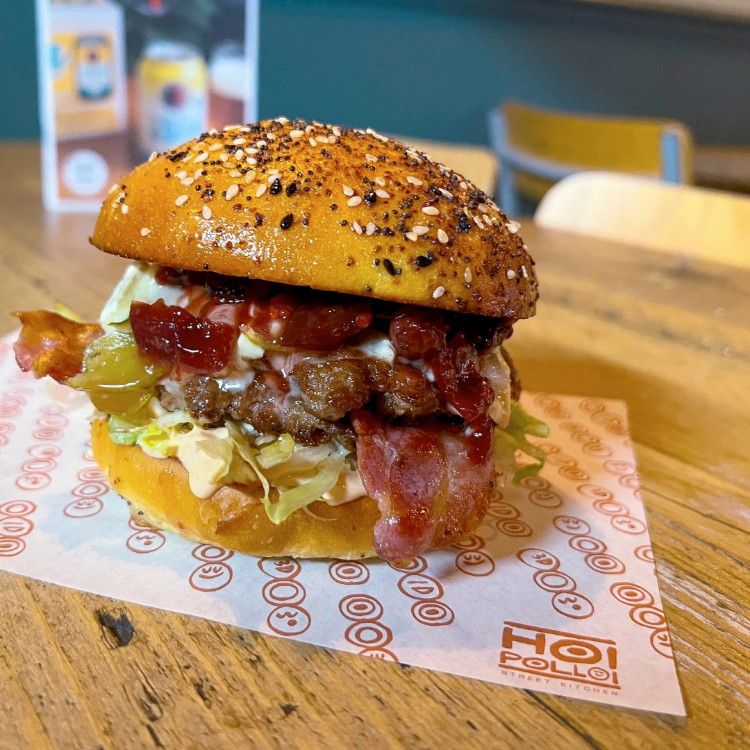
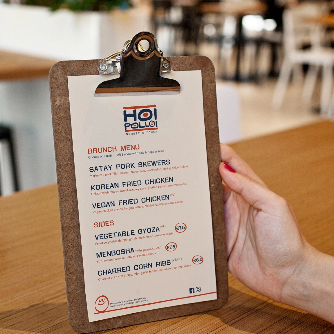
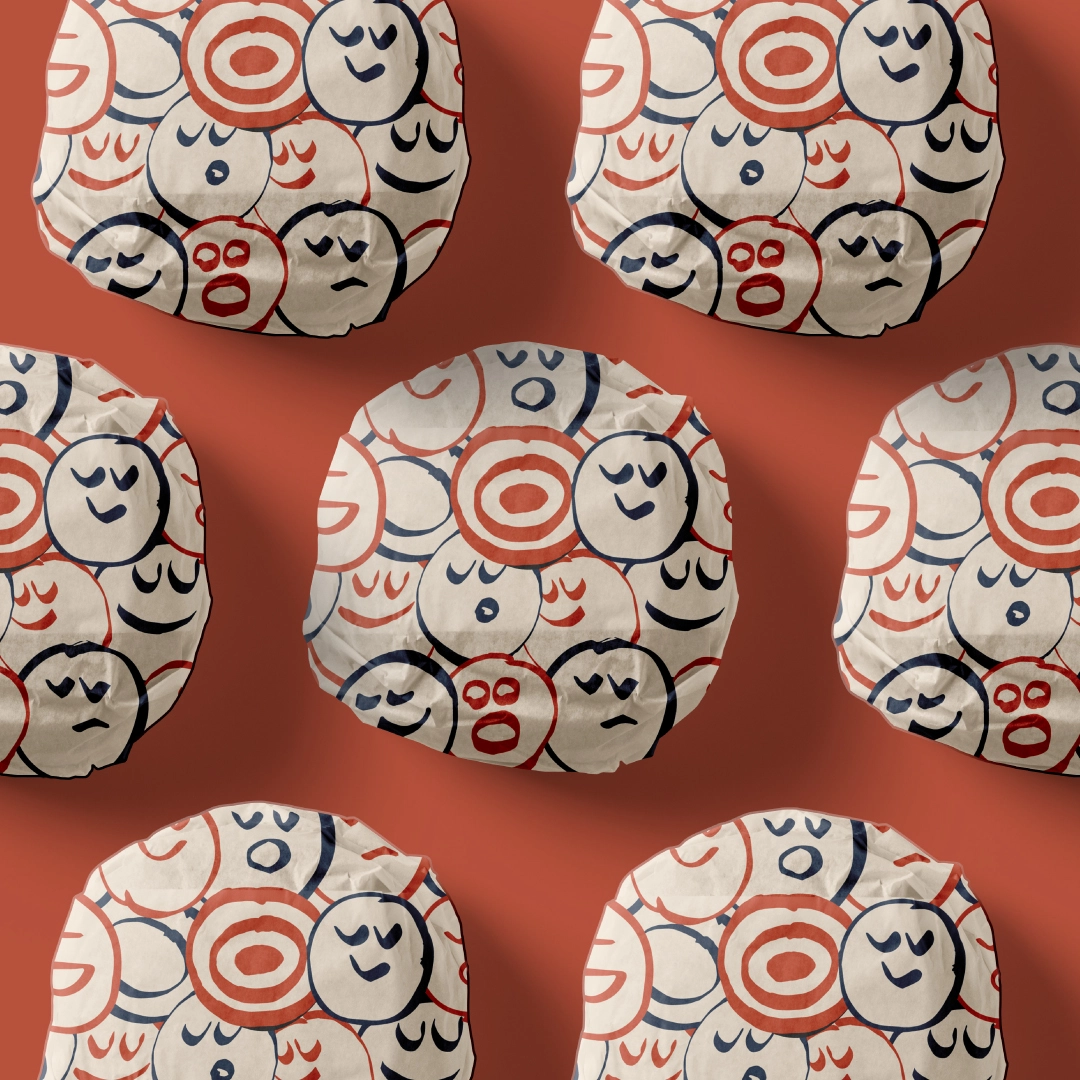
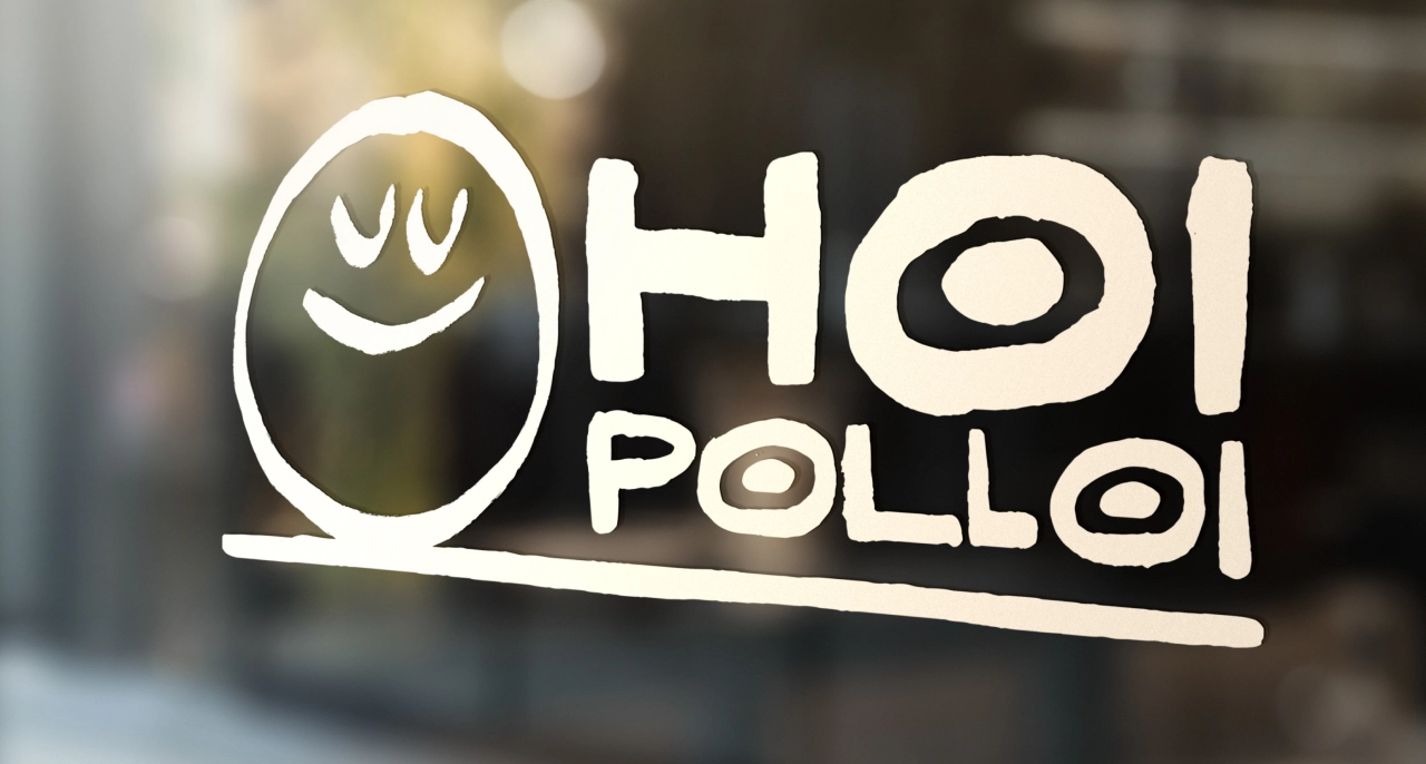
After a few iterations of standalone logotypes with a range of mascots, they opted to combine the hand-drawn, splodgy lettering with friendly content and a smiley face blob.
The main lettering is inspired by hand-drawn signage found all over the world and is paired with a clear, bold and modern type.
It's a simple idea, but the doodle-like style of the characters is quite distinct and marks the brand out from a multitude of rivals. All in all, you won't mistake Hoi Polloi's branding for any other's, and that helps to form an instant emotional connection in the mind of customers, ready for reactivation next time they're feeling peckish and passing by.
Editor's Picks





Trending






Latest Jobs
Midweight Full Stack Developer at Bureau for Visual Affairs
Full-time·London (Open to remote)·£35k–£50k
Marketing Copywriter at ustwo
Full-time·London·£40k-£50k
Brand Designer at Adfin
Full-time·London·£30k–£50k
Client Partner at Halo
Full-time·Bristol·£30k–£36k
Design Director at Koto
Full-time·London·£72k-£90k
Senior Designer at Definition
Contract·London·£45k–£50k