Brewery branding by Studio MPLS subtly evokes farm life
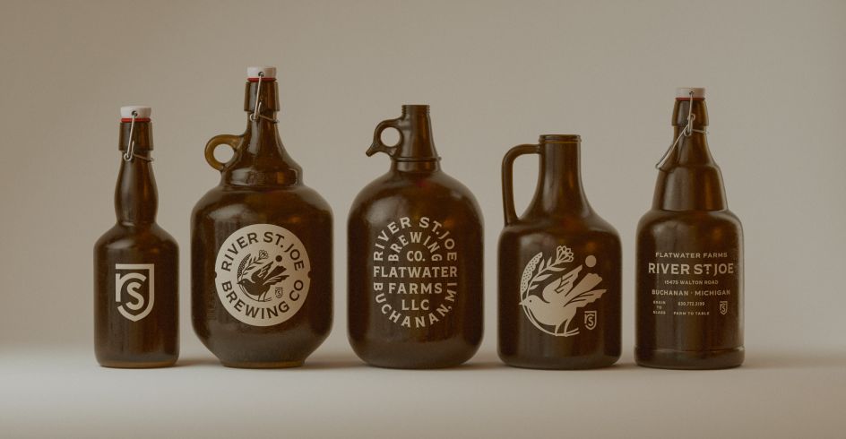
You've heard of farm-to-table, but how about grain-to-glass? River St. Joe is a Michigan-based farmstead brewery that's doing it all, and needed branding that was similarly multifunctional.
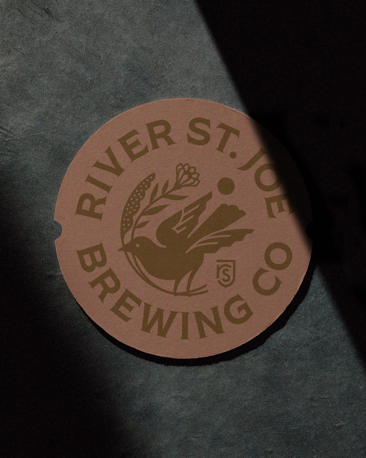
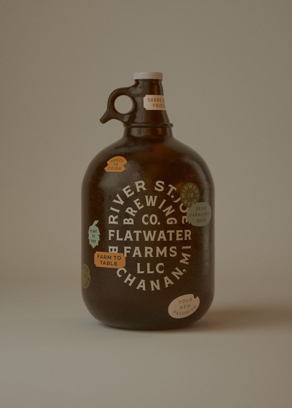
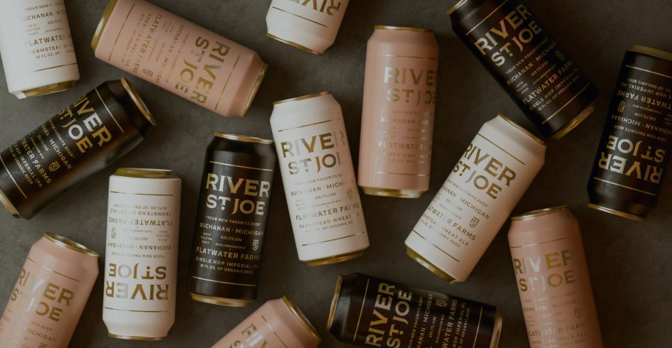
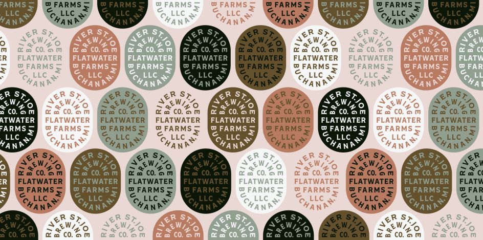
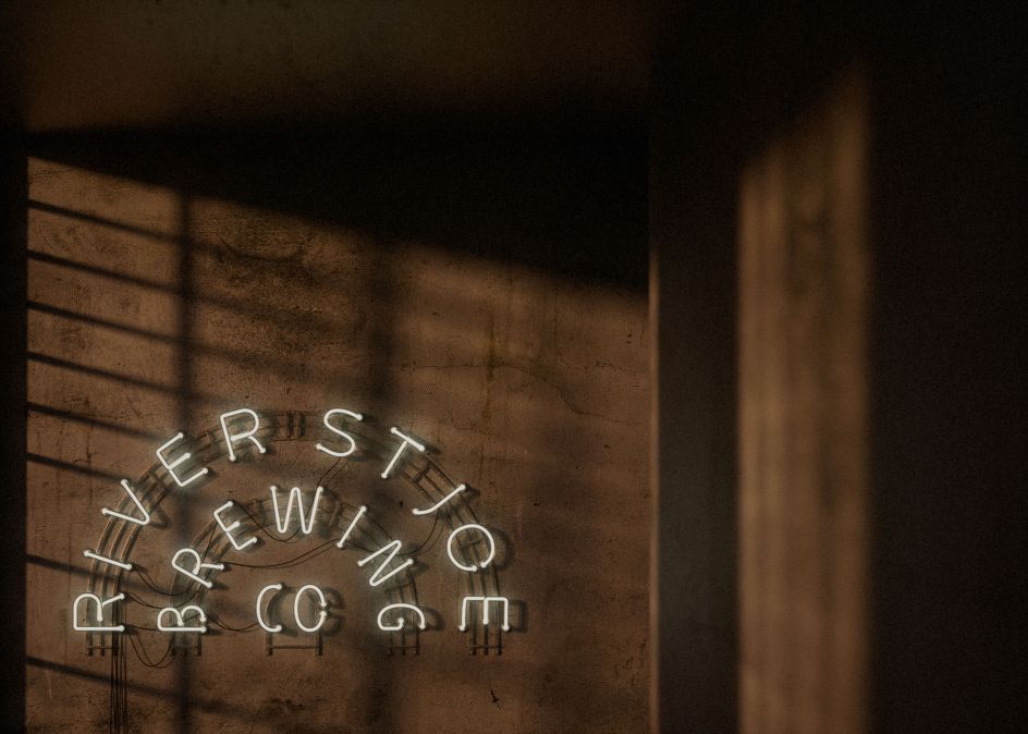
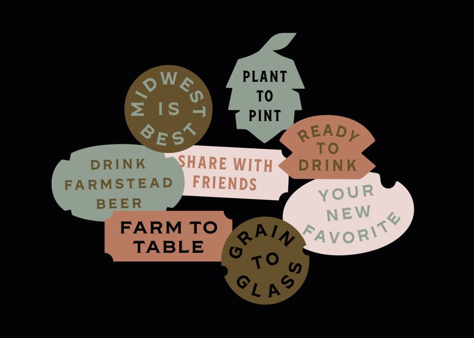
Ian Gerstl of Minneapolis design agency Studio MPLS was tasked with unifying the look and feel of River St. Joe's many endeavours. He responded to the brief by creating a kit-of-parts that could be used seamlessly across a wide range of applications.
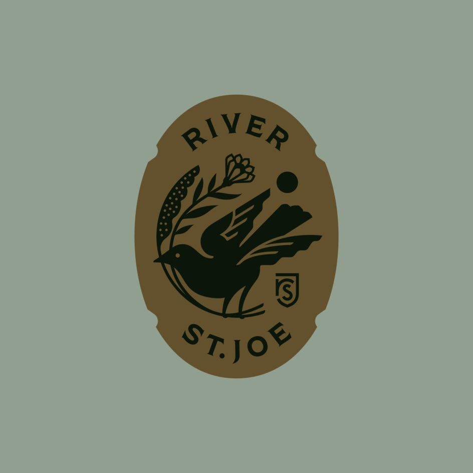
We love the central illustrated emblem and original use of earthy colours, which work together to convey a farmstead feel while remaining several miles away from cliche or over-sentimentality.
For a little more background on Studio MPLS, it was founded Dan Olson who's created award-winning work for the likes of Coca-Cola, BMW, and Sony. Today, the company focuses on brand identity, packaging design and illustration with what it calls an "artful, elevated approach". Discover more at studiompls.com.


Editor's Picks


Trending


Podcasts


Editor's Picks
Further Reading