Chicago studio Knoed goes under the microscope to create an identity for a 'craft yeast for craft brewers'
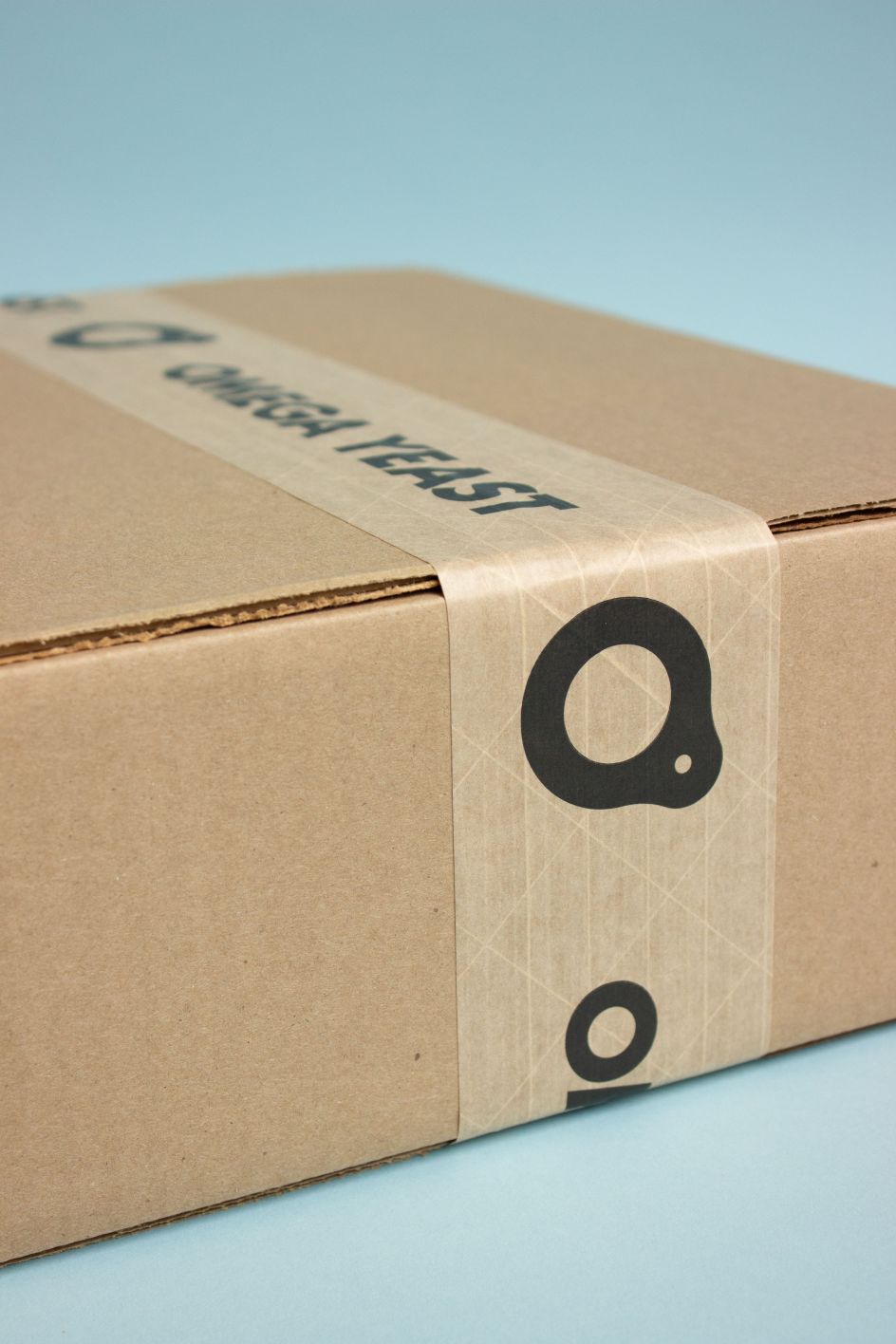
Chicago design studio Knoed has come up with a fresh identity for Omega Yeast, a company that grows over 75 strains of liquid yeast for professional and homebrewers.
All images courtesy of the studio. Via submission
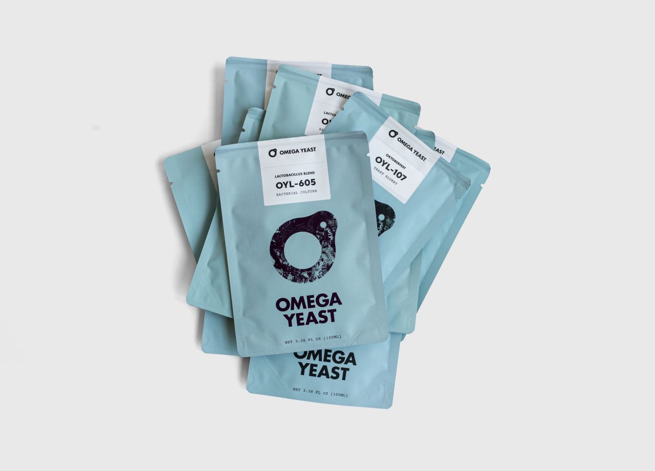
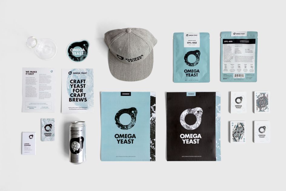
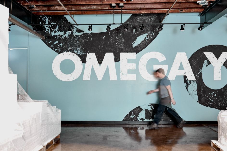
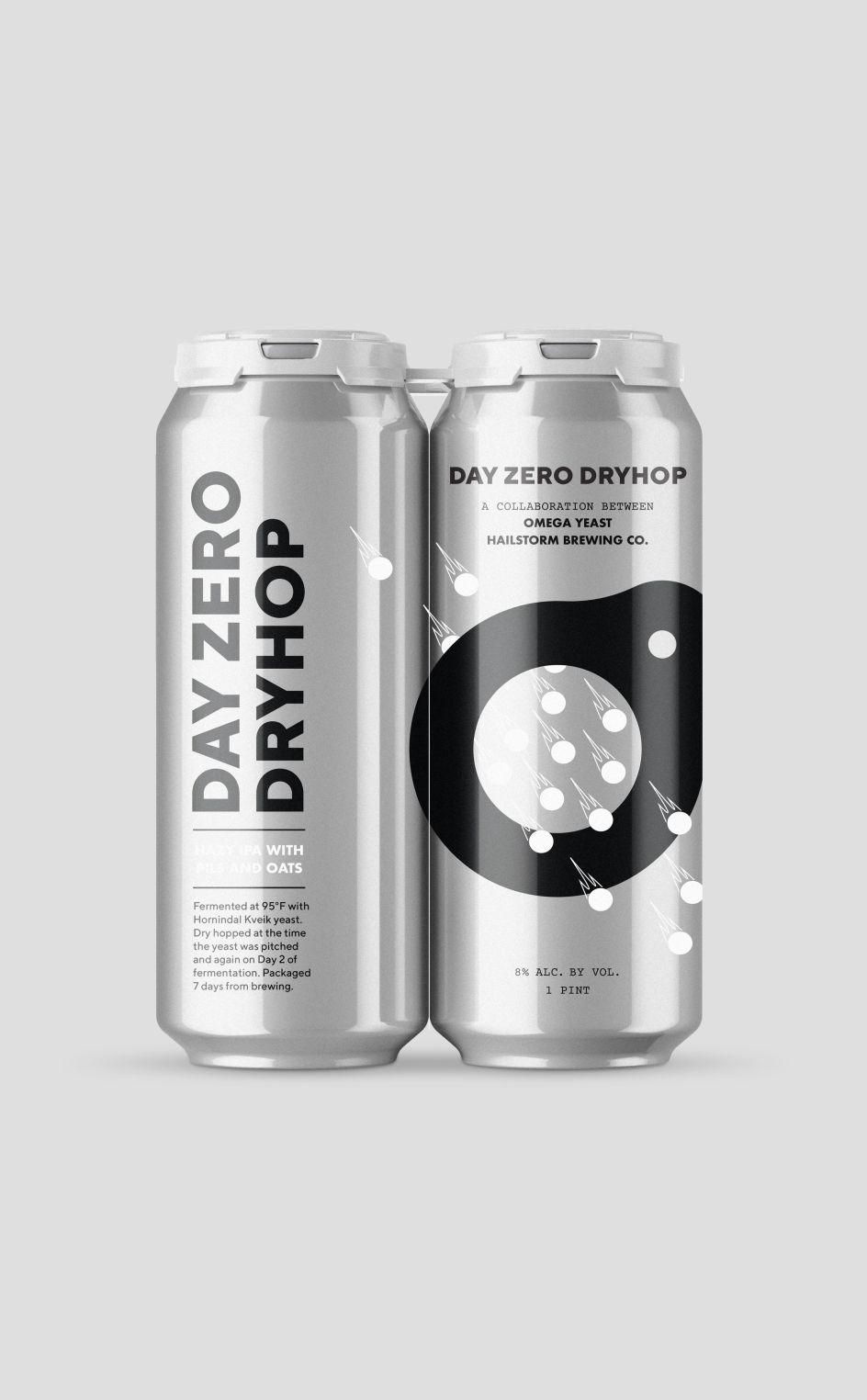
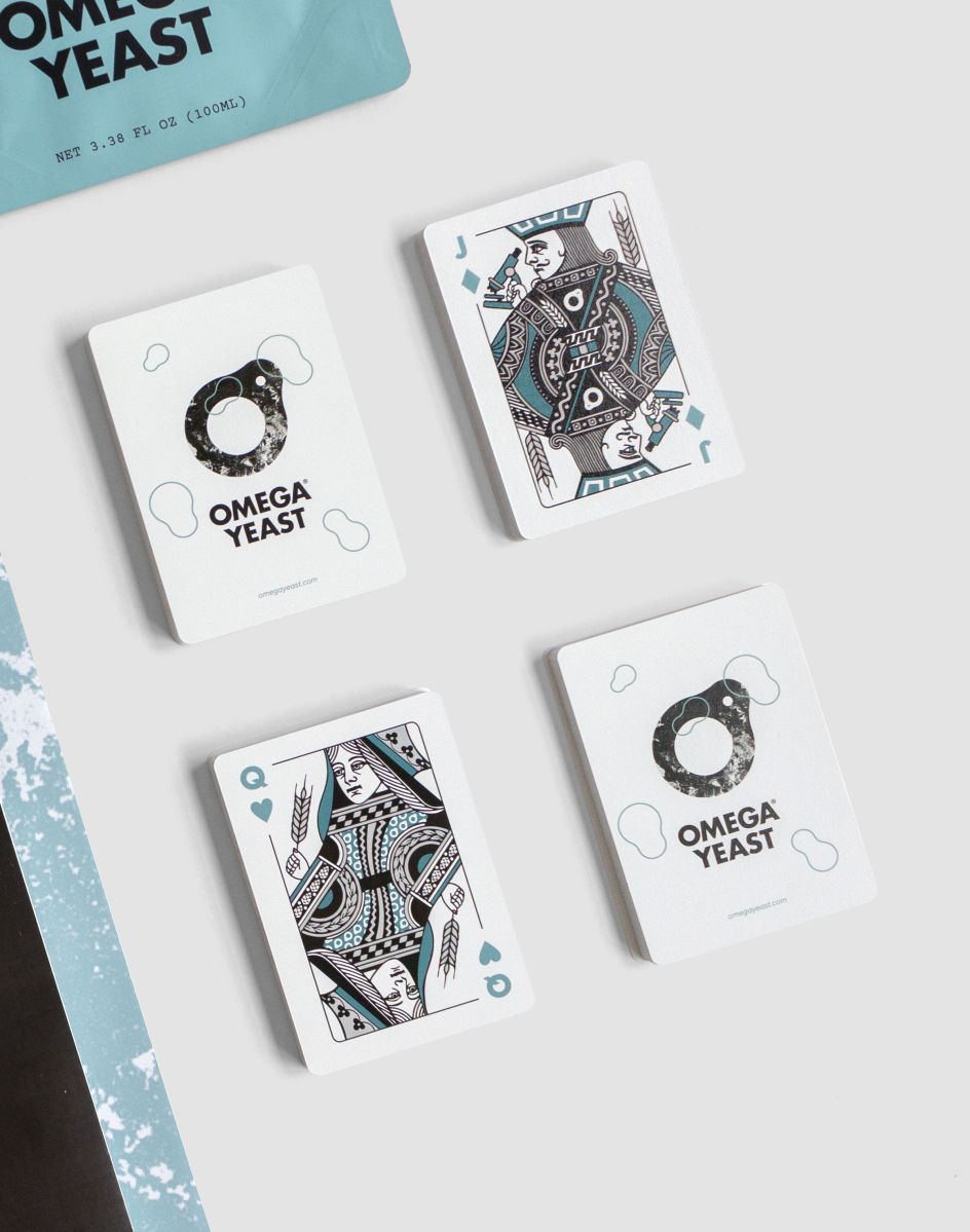
The new logo and visual identity system feels progressive and resonates with the craft brewer, and has been rolled out to packaging, stationery, brochures, stickers, posters, clothing, tags, website, ads and signage as part of branding its new image.
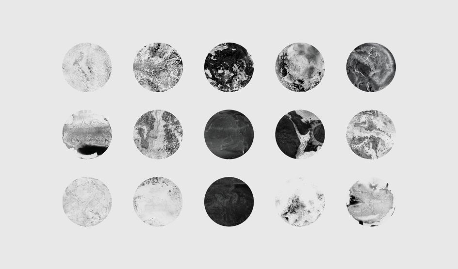
Rather than focusing on the science behind the process, Knoed came up with the tagline, 'Craft Yeast for Craft Brews' and took a more artful approach. During the research phase, Knoed was inspired by an idea to use Omega's yeast to create textures and graphics which ultimately became the foundation of the brand image.
In fact, Knoed activated the yeast by mixing a warm sugar water solution with India ink to create 15 'yeast paintings'. It contrasted the paintings with clean backgrounds and bold type to "balance professionalism with the raw nature of the craft beer world".
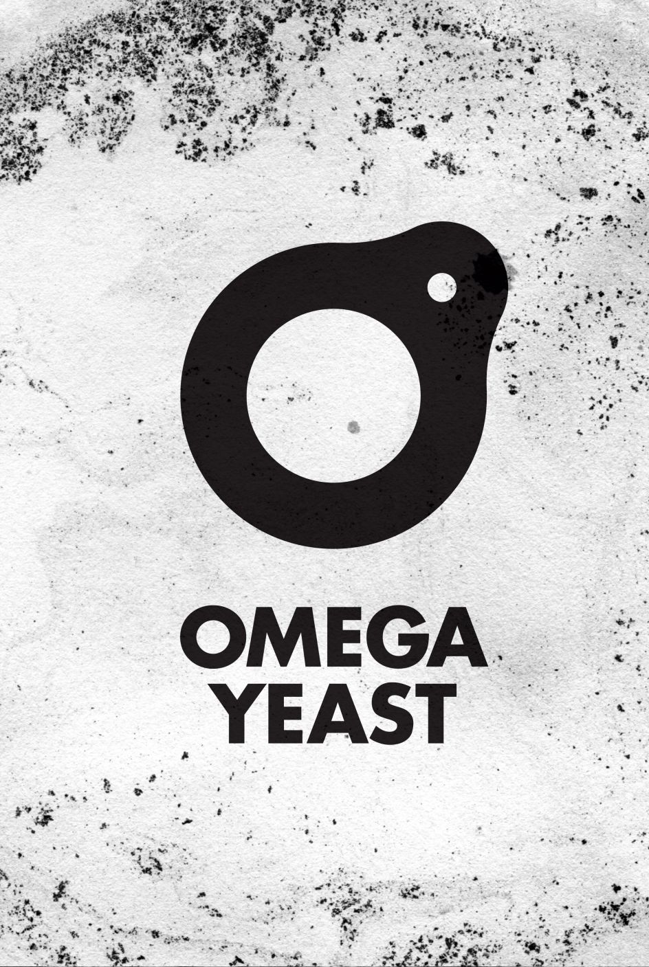
For the new logo, Knoed designed a letter 'O' (for Omega) with a budding yeast cell. It also created a set of 'budding' graphics that are used throughout the identity on things like posters, interior graphics and clothing. When they’re all put together, they form a graphic take on what scientists see under the microscope.


Editor's Picks


Trending


Podcasts


Editor's Picks
Further Reading