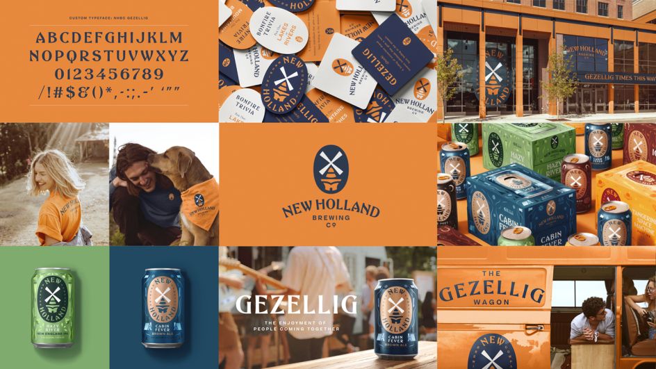
Design Bridge helps New Holland Brewing Co. to reconnect with its Dutch roots
When Design Bridge New York was tasked with the rebranding of the New Holland Brewing Co., helping to reaffirm its place in the American craft beer market, it took inspiration from the firm's unique Midwestern-Dutch heritage, including everything from the classic windmills to the iconic orange that evokes national pride.
The company "was once a category trailblazer," Mike Perry, creative director at Design Bridge, explains. "As craft beer became an increasingly competitive market, the core brand's distinct qualities and its notoriety had gotten lost in the crowd. Our challenge was to restore confidence in New Holland Brewing Co. to set it apart from the competition, revitalising its unique Dutch and Midwestern heritage to build emotional connections with discerning beer drinkers once again."
Before the pandemic, the Design Bridge team travelled to the brewery's home in Holland – the small Michigan city founded by Dutch Americans, not the actual European country – to explore the area and get to know its people. During that trip, they discovered that the company "hadn’t just built a brewery"; it had entirely transformed the area and as such, people even referred to the city as 'New Holland'. Taking inspiration from this historical influence, Design Bridge decided to re-establish a strong sense of pride in the brand.
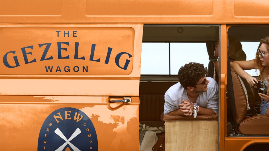
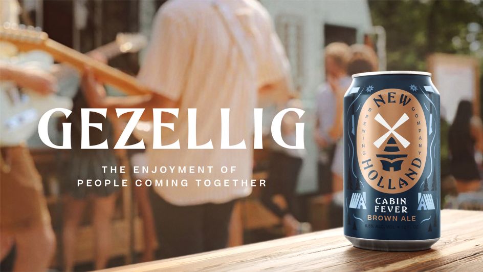
Mike says of the trip: "We were reminded of the concept of 'gezellig', an all-encompassing feeling at the heart of Dutch culture that spans comfortable to relaxing, enjoyable to gregarious. Embodying the brand's spirit of togetherness, we combined this idea with the Midwest's traditional yet progressively pioneering attitude to breathe new life into the brand."
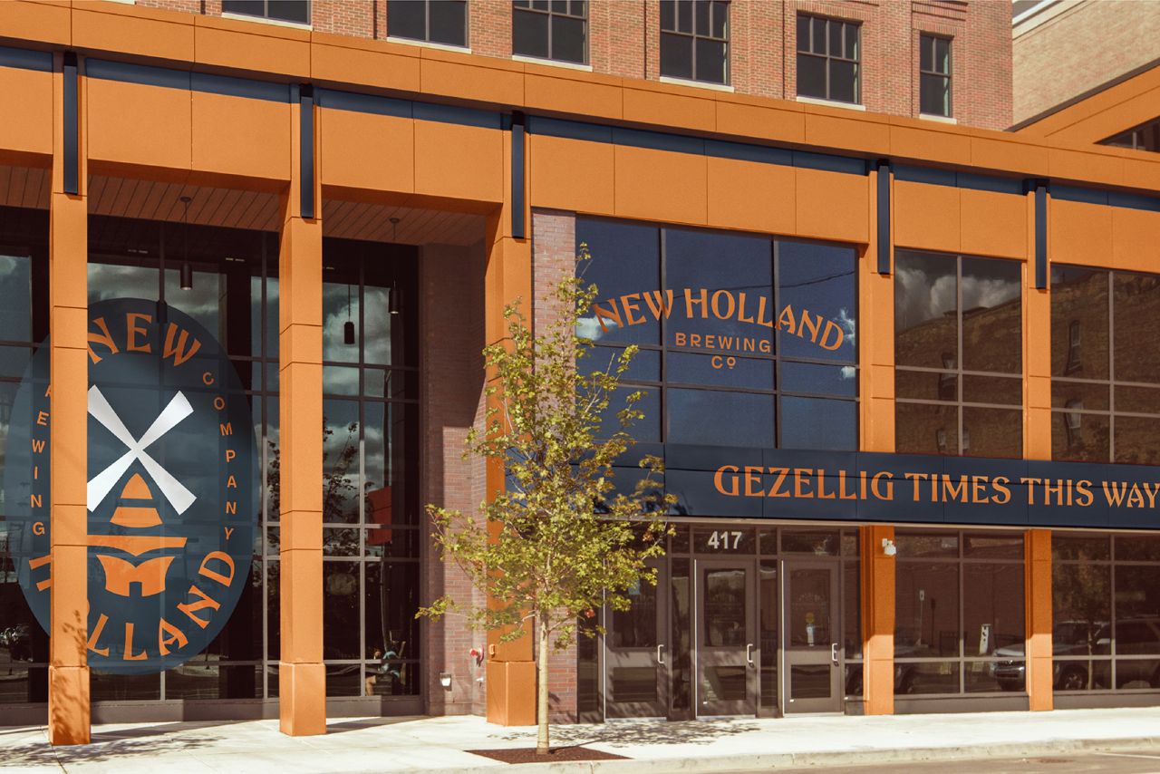
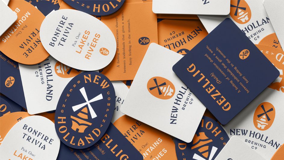
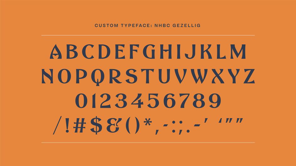
The new visual identity centres around a striking interpretation of the brand's unique, existing windmill. Design Bridge retained the brand's core orange but introduced a contemporary navy blue to a refreshed colour palette. The team also collaborated on a custom typeface and new illustration style, which were inspired by Dutch delft pottery and vintage 'welcome' signs uncovered on their trip to the city, giving it a modern twist.
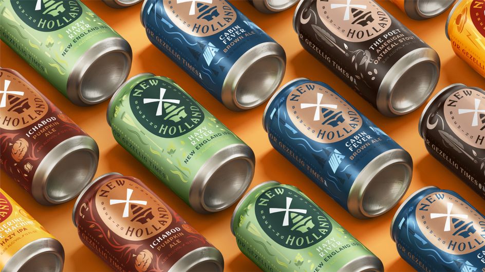
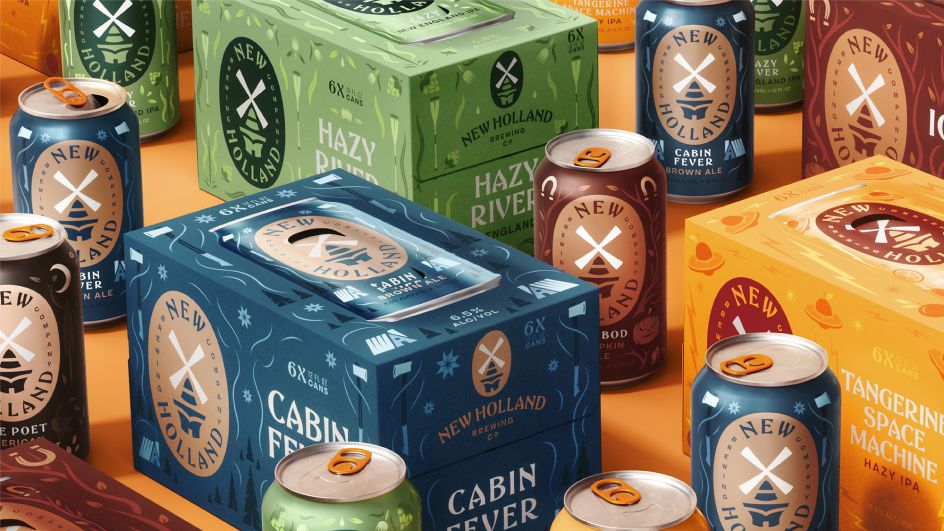
In terms of packaging, the New York agency created a vibrant, new design system that features a large primary rendered on a simple colour background to highlight each product and flavour.
The result is a cohesive brand for the New Holland Brewing Co. which is now "reflective of its roots as well as representative of who it is today", as Design Bridge puts it. The new identity extends across all brand touchpoints including glassware, posters, signage, beer taps, mats, online and beyond.
Editor's Picks


Trending


Podcasts


Editor's Picks
Further Reading