Horse designs branding and packaging for 'world's most sustainable brewery'
Design studio Horse has created the identity and packaging for Good Things Brewing, a new Sussex-based firm with a goal to build the world's most sustainable brewery.
That apparently means to be completely energy-efficient, off-grid with everything recycled and reused from water to grain.
"The way beer is brewed is really inefficient," said Sam Robinson from Good Things Brewing. "And in the UK, we brew a lot of beer. A lot. Raw ingredients are shipped in from all over the world, the leftover grain is recycled inefficiently and huge amounts of energy and water are wasted. Our planet simply can’t sustain it."
Robinson, who is also a photographer, was inspired to create the brand after learning about the environmental impact of the beer-making process and the lack of public knowledge of this outside of the brewing industry.
Having worked together with Horse on numerous projects, Robinson says: "It was, therefore, important our branding break the traditional craft beer aesthetic. We crucially wanted to move away from the 'skater' graphics and boys' club feeling, and create something more closely linked to the natural world, appealing importantly to both men and women."
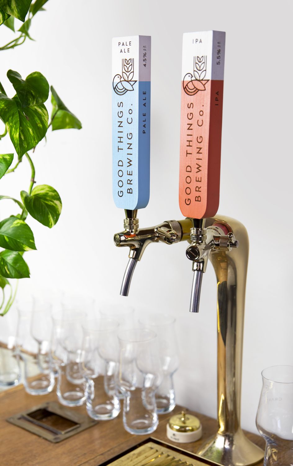
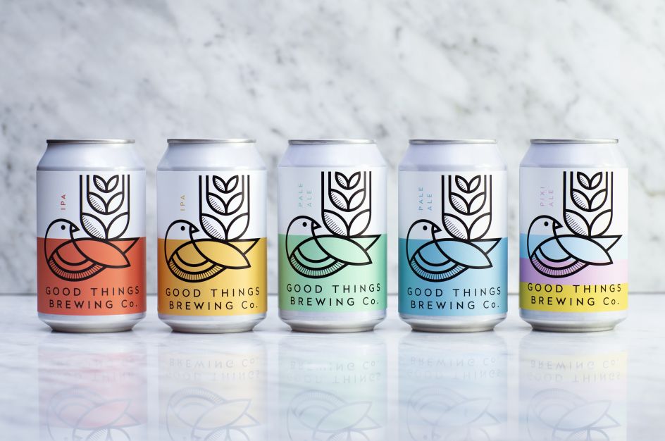
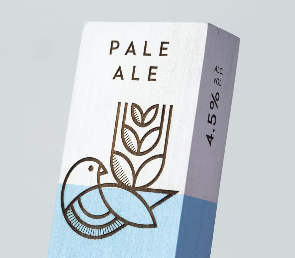
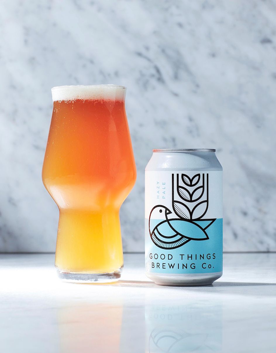
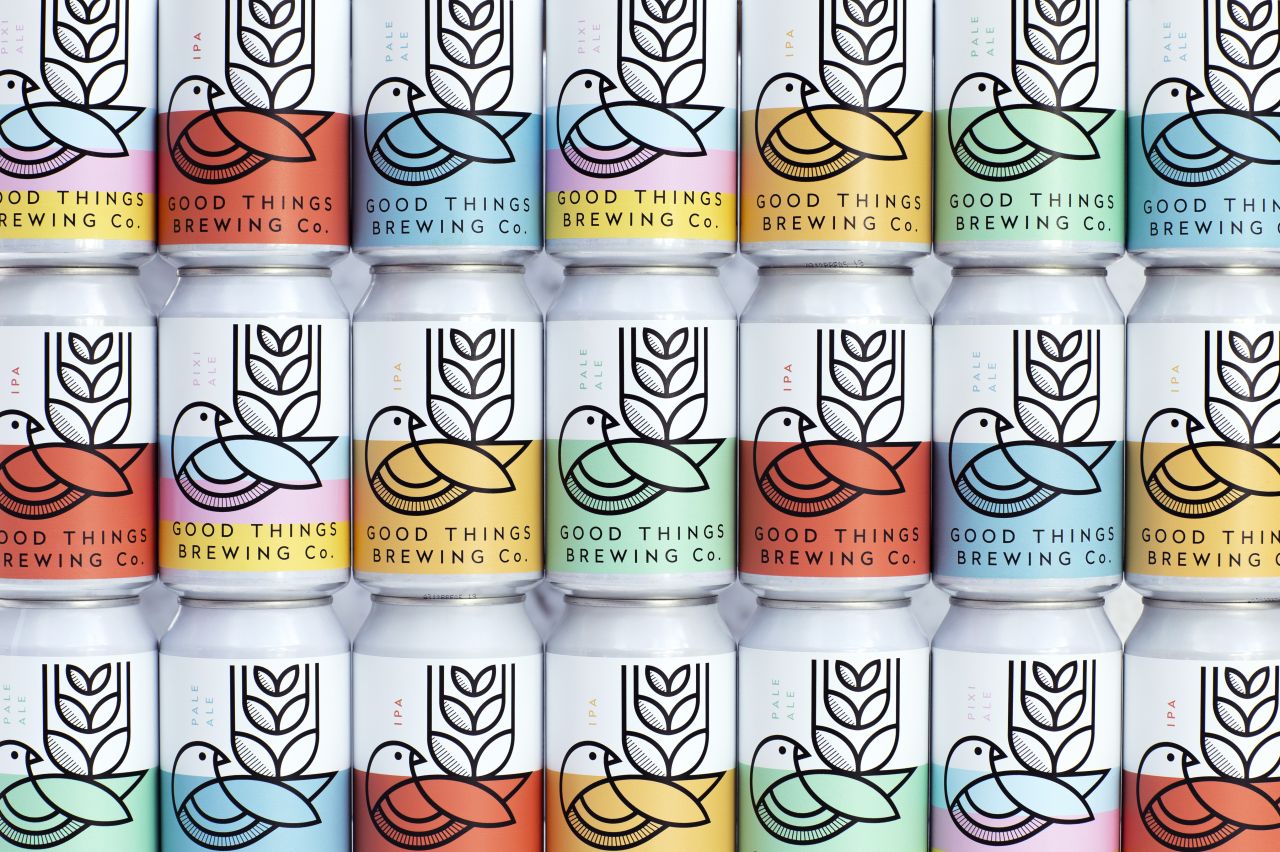
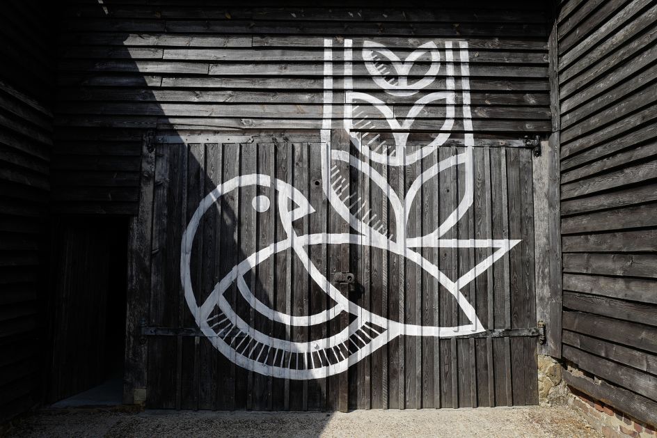
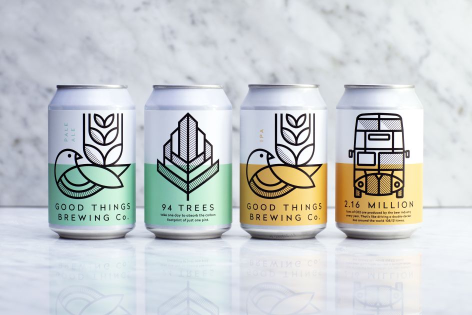
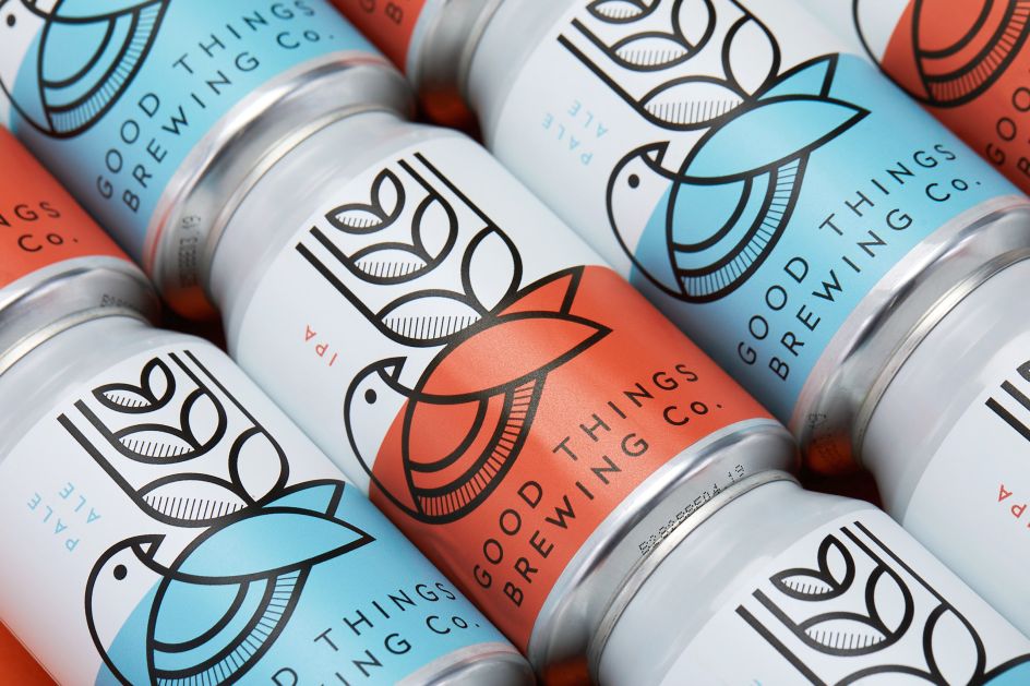
In answer to the brief, Horse created a core icon which conveys the brand’s products, combined with a feeling of nature and peace. A linear, graphically styled bird, whose tail feathers mimic an ear of barley, is used boldly across each of the variants. This is paired with a soft colour palette on a textured matt paper label for a natural and tactile feeling in the hand.
"As part of the brand's offer to spread the good word, Good Things Brewing also creates bespoke brews for other brands or events," says Ian Firth, creative partner at Horse. “So an important part of our task when considering the packaging and branding, was how to give the collaborative edition cans their own personality, whilst still clearly identifiable as part of the Good Things brand."
The solution is a double-faced can, one side of which is dedicated to an icon which represents the brand or event. Firth adds: "each illustration being executed in the same distinctive linear style so it remains a clear part of the brand’s portfolio."
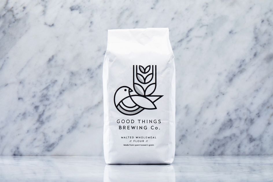
Even the brewery’s spent grain is dried and milled so that it can be reused to make flour. "We've designed the world’s first low-energy, large-scale, solar-powered dehydrator to dry and mill our spent grain. We then mill it using a traditional stone mill to produce incredible wholemeal flour, putting this otherwise wasted ingredient to deliciously good use," says Robinson.
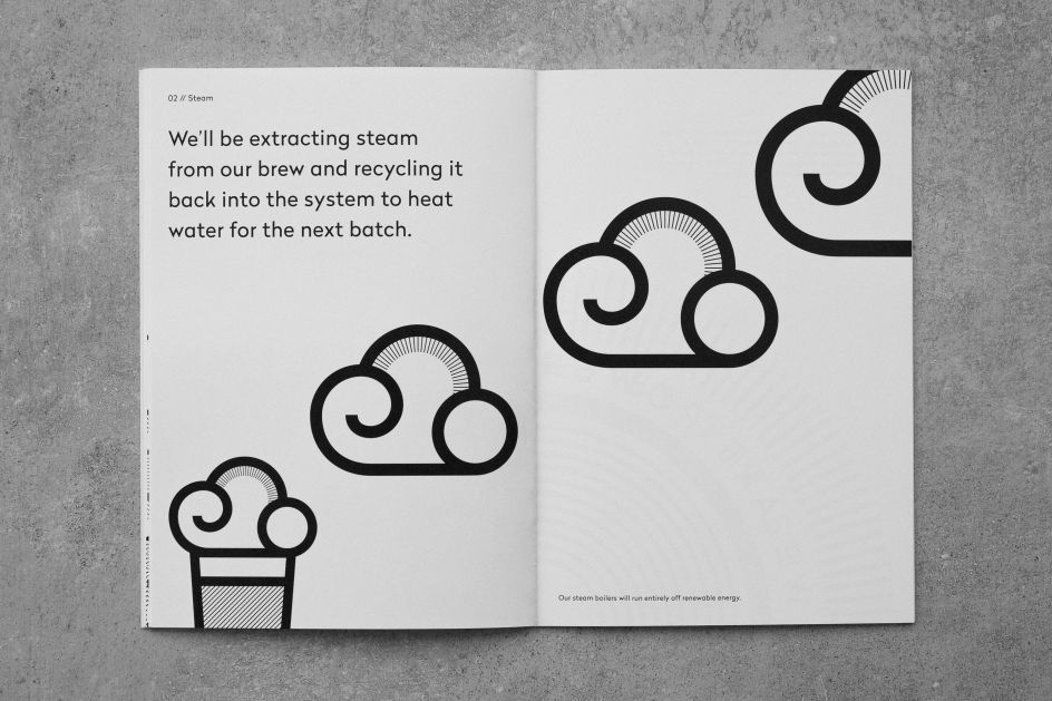
Horse has considered the brand holistically, ensuring they tell their story in as sustainably as possible. Wooden bar pump badges give a unique and natural look in bars, and the brand book is in a single colour, printed on recycled paper using vegetable-based ink and an eco-printing press.
Editor's Picks


Trending


Podcasts


Editor's Picks
Further Reading