Ben Clark Design combines summer and winter in clever travel identity
Branding Best Workplaces in Travel required balancing several themes. Manchester-based designer Ben Clark explains how he went about it.
Founded in 2022, Best Workplaces in Travel is a yearly survey and award ceremony gathering critical insight into the factors employees in the travel industry value most in their employers. Every year, the best-performing organisations across various categories are awarded along with a top 30 list of best employers, helping to drive best practices across the industry.
For branding, they turned to Ben Clark Design, an independent design practice based in Manchester, specialising in branding and visual identity.
Gaining respect
"The survey and awards attract entries from a broad spectrum of organisations, from family holidays to corporate travel," explains Ben. "It was important for us to create something that could gain respect from all these sectors and that they would feel proud to be associated with. This meant striking a balance between the bright and bold and the professional."
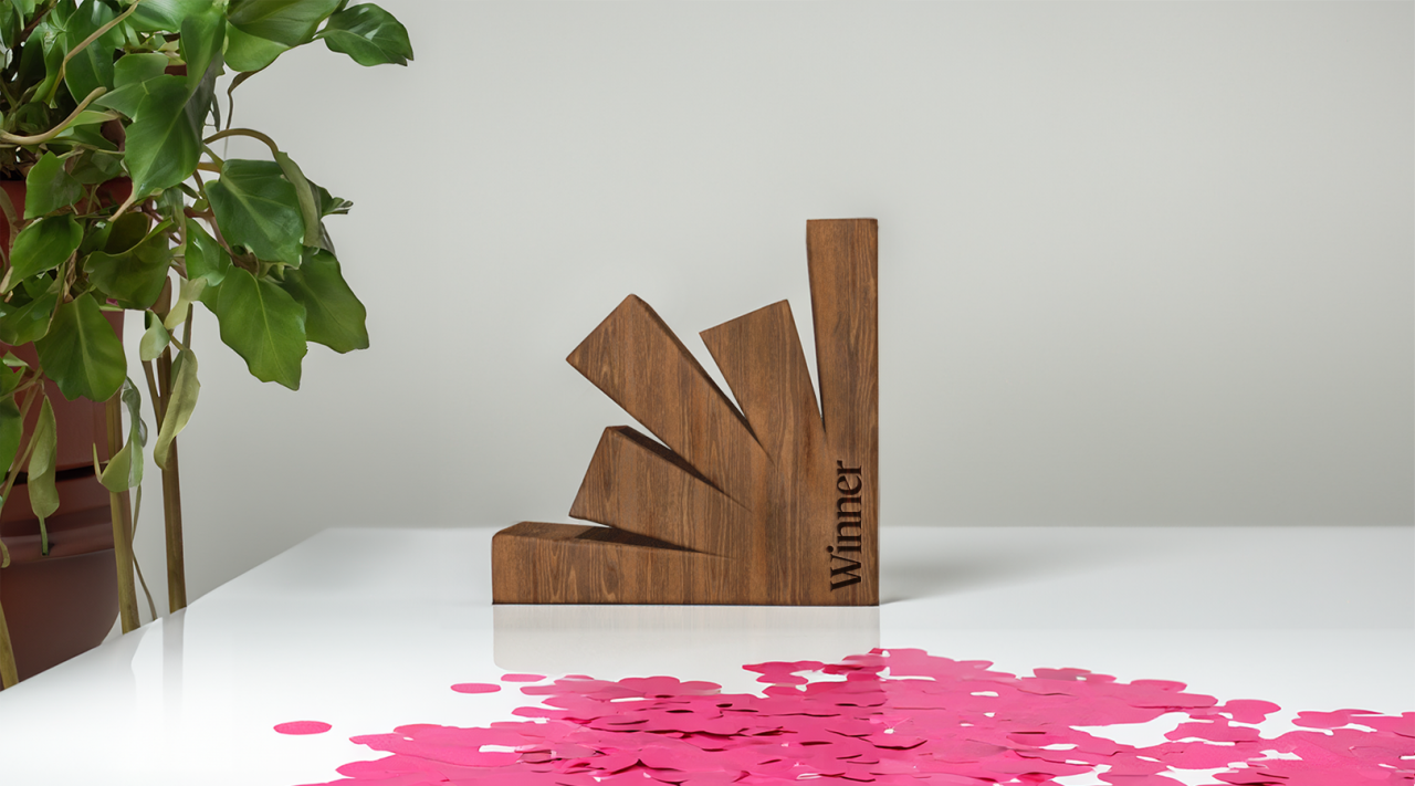
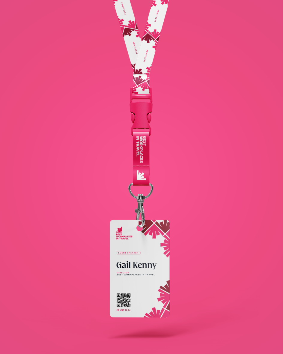
The new brand revolves around a flexible mark that can be repeated in patterns, sit over images, act as a container, and even take the form of the awards themselves. "I was keen from the start that the brand be something we can play with and evolve," says Ben, "with the potential for new colour schemes and looks for each year's edition, all branching out from the central logo."
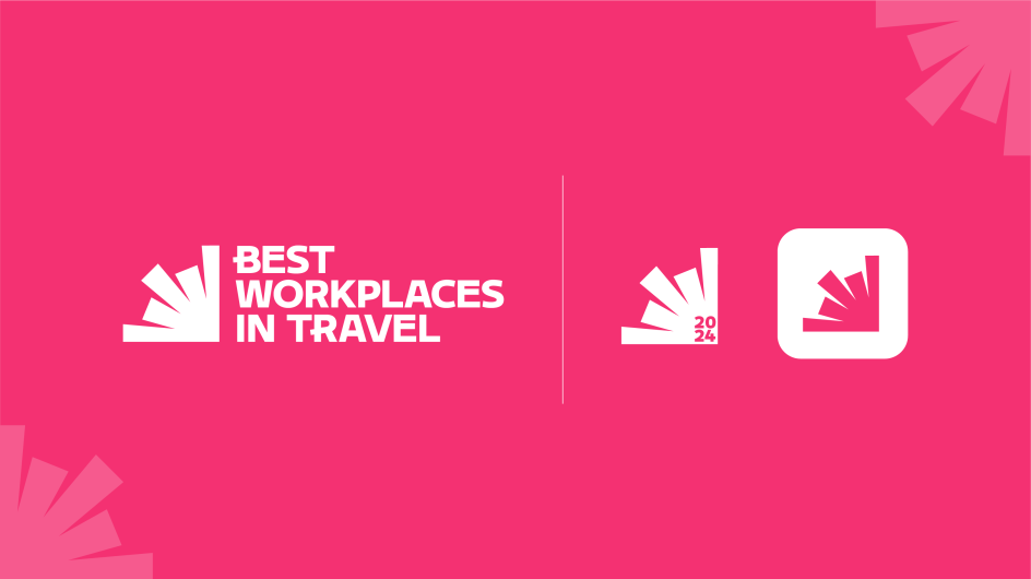
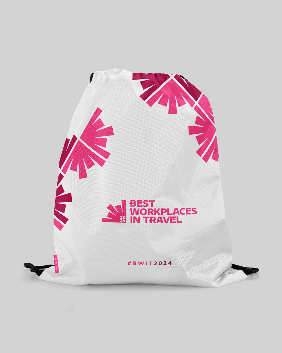
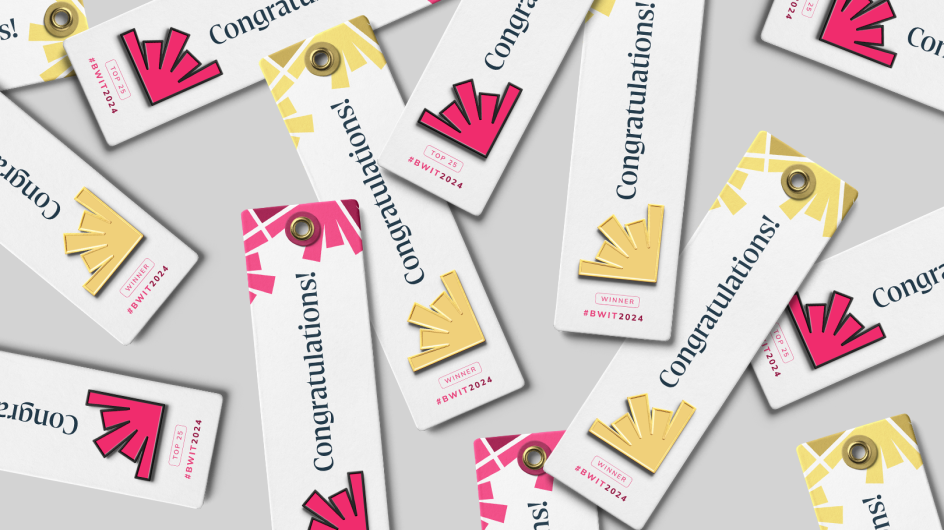
The logo was partly inspired by the fact that organisations of all shapes and sizes take part in the survey every year. It also draws influence from the rays of sunshine from summer getaways and from the symmetrical patterns of a snowflake representing winter holidays.
"In this way, the design conjures the general idea of expansion and travelling, but also people being drawn to the best places to work," explains Ben. "Meanwhile, the expanding bars also represent the survey data, which provides valuable insight to every organisation that takes part."
Typography and colours
For typography, Ben used Delvard Serif, which is professional yet modern, while Mulish complements this nicely for body copy.
"The chosen typography, along with the use of a simple colour palette, ensures the brand is capable of being fun, exciting and celebratory," adds Ben, "while still able to deliver critical insight into the industry in a professional and trustworthy way."
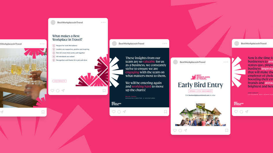
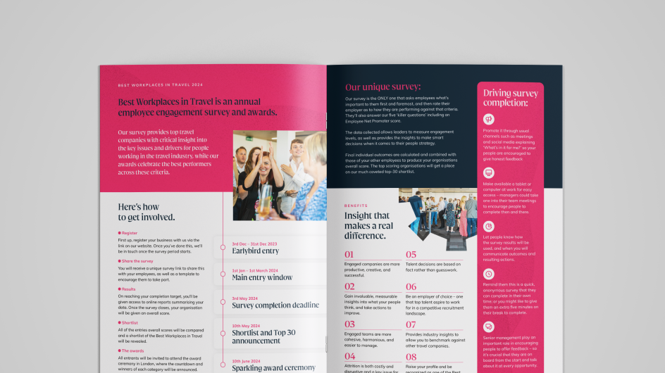

As for colours, "sticking to a main palette of a single neon, with a deep navy blue helped strike the balance we were after and ensure the brand was capable of speaking in all the different tones the audience would require."
"I'm really happy with the results," he concludes. "We look forward to working with it for this year's awards ceremony. The individual elements are flexible and fun to play around with. I can see us creating different patterns using the logo for each edition of the awards or even swapping out the neon colour each year to give a different feel."
Editor's Picks


Trending

Podcasts


Editor's Picks
Further Reading