Clerkenwell Design Week unveils new identity by Cai Taylor
The event's refreshed identity reimagines its iconic festival map with bold geometric shapes, vibrant colours, and layered graphic patterns that celebrate the area's architectural and creative heritage.
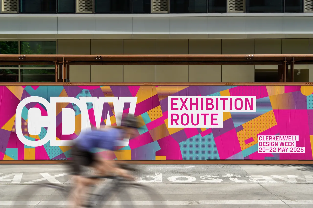
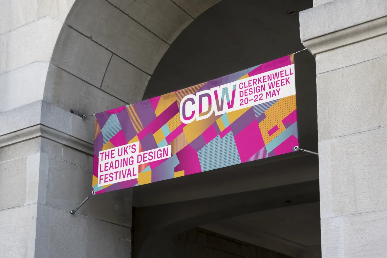
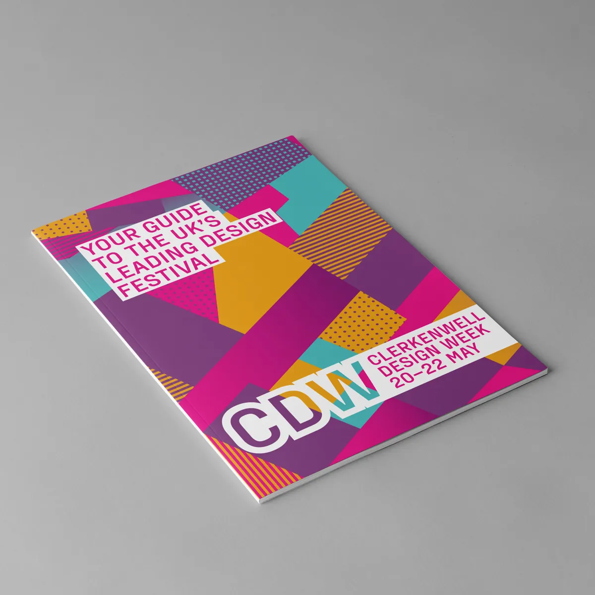
Clerkenwell Design Week (CDW) has unveiled a striking new identity for 2025, marking an exciting evolution for the renowned festival. Designed by Cai Taylor—who originally created the festival's branding 15 years ago—the refreshed campaign pays homage to Clerkenwell's rich architectural landscape while embracing a bold, contemporary visual language.
For Taylor, this project represents a full-circle moment. As the former art director of The Clerkenwell Post and a graphic design graduate from Central Saint Martins, he has long been immersed in the area's creative DNA.
"It was obvious from my first meeting with the organisers that it is the neighbourhood itself which makes CDW so unique and sets it apart from all the other design festivals around the world," he explains.
The result is a refined yet dynamic identity that balances the festival's deep-rooted heritage with its growing global reputation. Featuring geometric shapes, vibrant colours, and a reimagined version of CDW's iconic festival map, the new design is both an evolution and a celebration of the event's enduring connection to Clerkenwell's design community.
Revisiting the festival's foundations
When Taylor first worked on CDW's identity fifteen years ago, the festival was a fledgling event with an experimental spirit. "I have fond memories of working on the original branding and campaign designs," he says. I remember setting up photoshoots on street corners with high-end office furniture. The image of a modern ergonomic task chair in front of a gothic cathedral made for a striking contrast."
Back then, the festival's future was uncertain. Today, it has grown into one of the UK's largest design festivals, attracting visitors and exhibitors from around the world. This growth inspired Taylor to revisit the Clerkenwell area before beginning his new designs.
"I made a point to revisit the area soon after receiving the brief to see how it had changed," he says. "While businesses have come and gone, the area continues to hold onto its vibrant creative energy. I wanted to capture and reflect that through the campaign designs."
Mapping the future
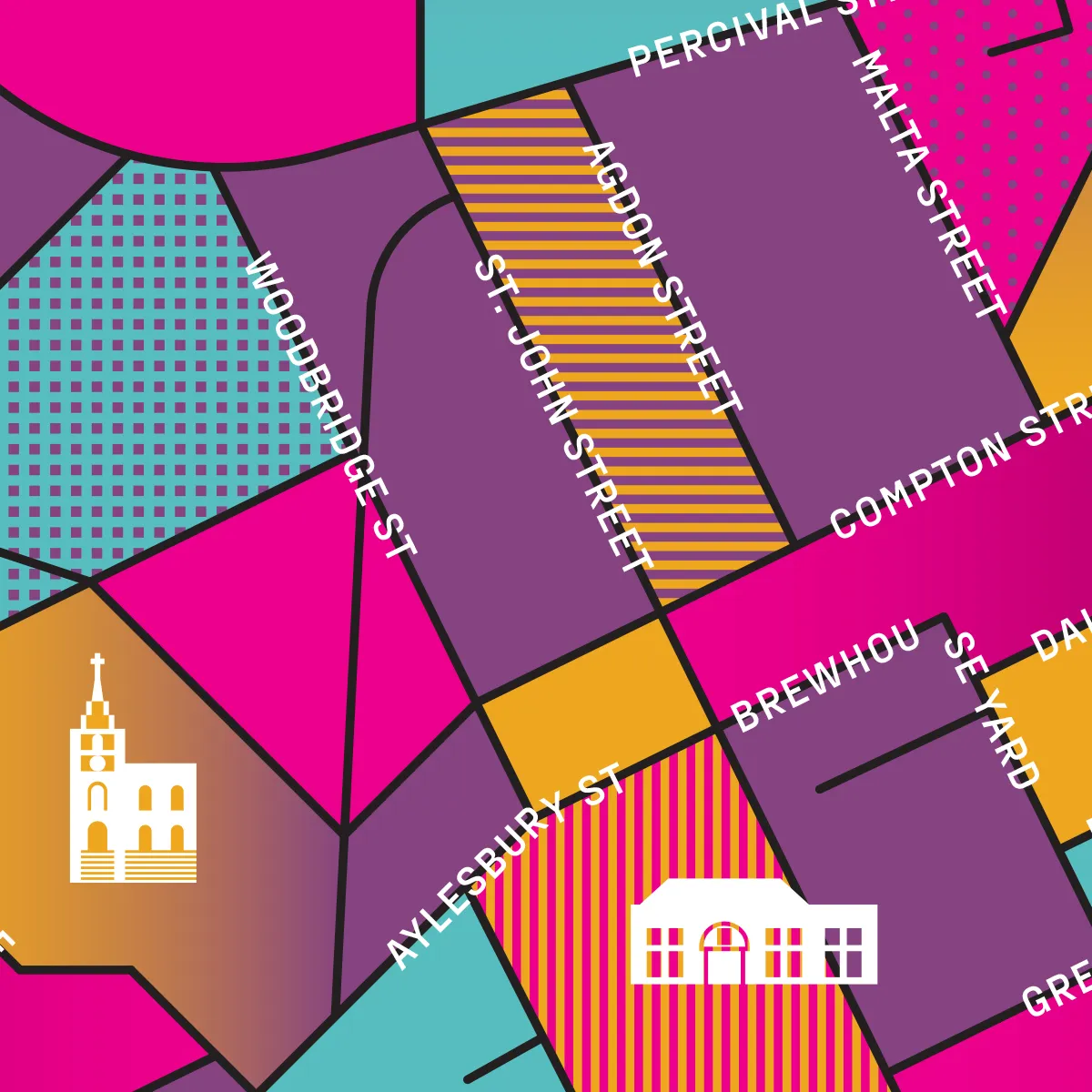
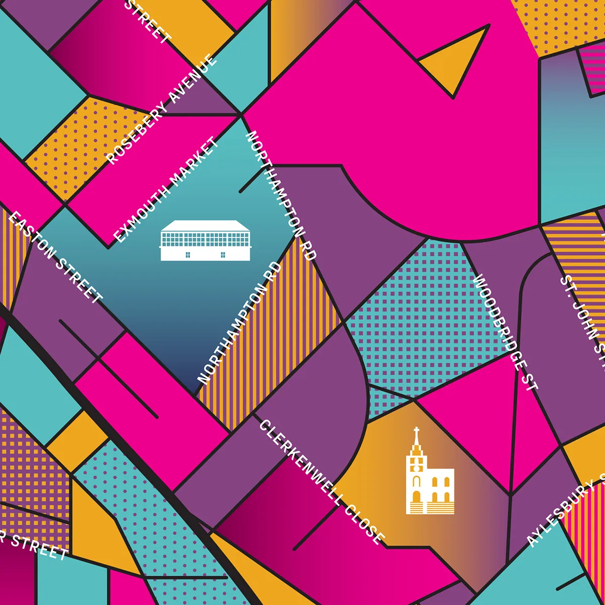
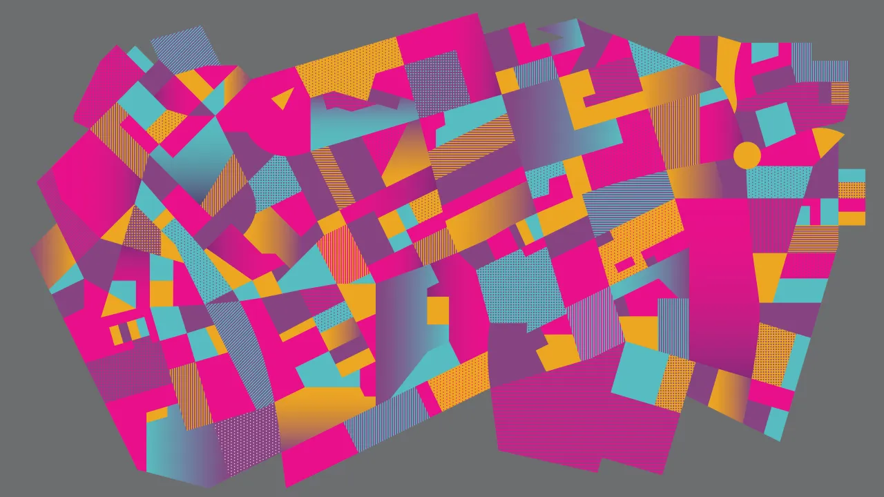
At the heart of the refreshed identity is a bold reimagining of the festival's signature map. Historically a crucial part of CDW's visual language, the map has now been transformed into a striking graphic element that threads through the entire campaign.
"Over the years, the map has become increasingly detailed, now featuring most street names and listing all the participating showrooms and exhibition venues," Taylor explains. "As I worked on redrawing it, I began to notice intriguing patterns emerging from the shapes formed by the road network."
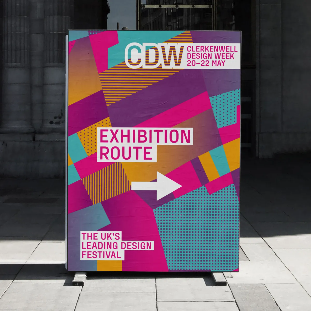
These patterns have been developed into a system of geometric forms, shading, and textures that reference the designs, interiors, and products found throughout the festival. The map also functions as a versatile graphic element that is adaptable across various applications while maintaining a clear connection to CDW's core identity.
Clerkenwell Design Week's head of marketing, Jedd Barry, describes the rebrand as a reflection of the festival's growth: "This fresh, modern look mirrors our festival's evolution, celebrating its expansion while cementing its global reputation."
Balancing tradition with a modern edge
While the new identity embraces change, Taylor has ensured that certain elements remain familiar, most notably CDW's signature pink.
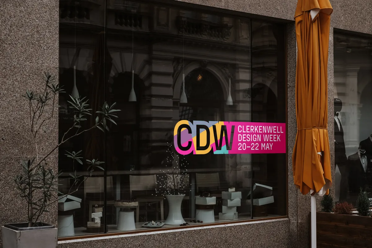
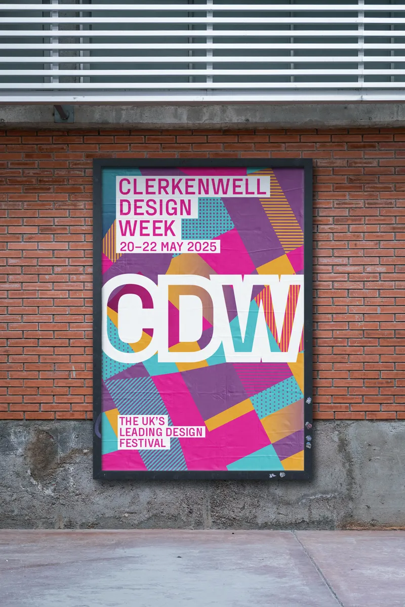
"When we created the identity 15 years ago, we chose pink as the primary colour. We wanted something bold and eye-catching that would stand out on signage in the busy streets of EC1," he says. "While the pink still feels fresh, I saw an opportunity to enhance it by adding a few complementary colours to better highlight the map's pattern."
Beyond colour, the identity integrates bold geometric patterns inspired by the local architecture and design community. "CDW is a celebration of new design ideas and creativity, and colour alone wasn't enough to capture that spirit," Taylor explains. "So, I incorporated basic shapes to form patterns inspired by the local architecture. I overlaid these patterns and added shading to create a sense of layering and depth, giving the map a more dynamic and textured feel."
A personal and professional evolution
For Taylor, returning to this project after 15 years has been both an honour and an opportunity to reflect on how the design industry has evolved. "Design has changed significantly since the launch of CDW," he notes.
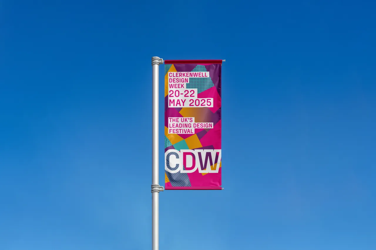
"The focus has shifted from print ads and billboards to creating numerous smaller assets for digital platforms. This was something I had to keep in mind throughout the design process."
His long-standing connection to Clerkenwell has also played a major role in shaping his work. "I got to know Clerkenwell during my second year studying graphic design at Central Saint Martins," he says. "Admittedly, I became more familiar with the pubs and nightlife than the furniture showrooms, but I quickly recognised the area's rich creative history. Clerkenwell is a blend of old and new designs, and that's something I try to capture in my work."
The impact of the new identity
With the new branding now rolled out across CDW's platforms—including its website, advertising, and social media—the response has been overwhelmingly positive. Beyond aesthetics, Taylor hopes the refreshed identity will enhance visitors' engagement with the festival and sees this as more than just a visual update.
"I hope this refreshed look resonates with designers, architects, and festival goers while reflecting the evolving nature of the event," he says. "More than just a new identity, it's a way to celebrate how the festival continues to push boundaries, foster creativity, and bring the global design community together."
As Clerkenwell Design Week continues to evolve, Taylor's work ensures that its identity remains as vibrant, innovative, and deeply connected to its surroundings as the festival itself.
Editor's Picks





Trending





Latest Jobs
Design Director, Opinion at The New York Times
Full-time·New York·$160k–$180k
Creative Social Content Producer at Bompas & Parr
Contract·London·£32k–£40k
Art Director at SPOKE
Full-time·London·£55k-65k
Digital Marketing Executive at Arise
Full-time·Sheffield·From £23,750
Design Director at Human After All
Full-time·London·£66k–£88k
Midweight Designer at Catalyst Creative
Full-time·London·£32k-£36k