Be inspired by these award-winning branding projects by leading designers
Ever wondered what it takes to be an "award-winning" designer? Well, check out these branding projects, and you'll soon have a good idea. They're all winners in the third Indigo Design Award, which rewards projects that are unique in the fields of graphic design, digital, mobile, and branding.
Critical Mass
Held annually on a global scale, the Indigo Design Award seeks designers with a passion for the extraordinary. It's open to conceptual and completed designs that are five years old or less, and anyone can enter their work in five categories: graphic design, digital design: UX and UI, mobile design, branding, and design for social change.
Branding is, in fact, a new separate category for 2021 as the event organisers received so many submissions on branding projects last year that they decided to give it its own dedicated field. There's also a chance for designers to enter their branding projects in a total of 37 subcategories, including food, banking, education, hotels, and much more.
This year's 'early-bird' deadline, where you get 10% off the entry fee, has just been extended until 30 November. (Otherwise, you have until 28 February 2021 to get yourself organised.) Open to agencies, freelancers and students. You can find a full list of categories, and details of how to enter at the Indigo Design Award website. Meanwhile, to inspire your own entries, we've selected our pick of this year's winners. Read on for a serious dose of visual design inspiration.
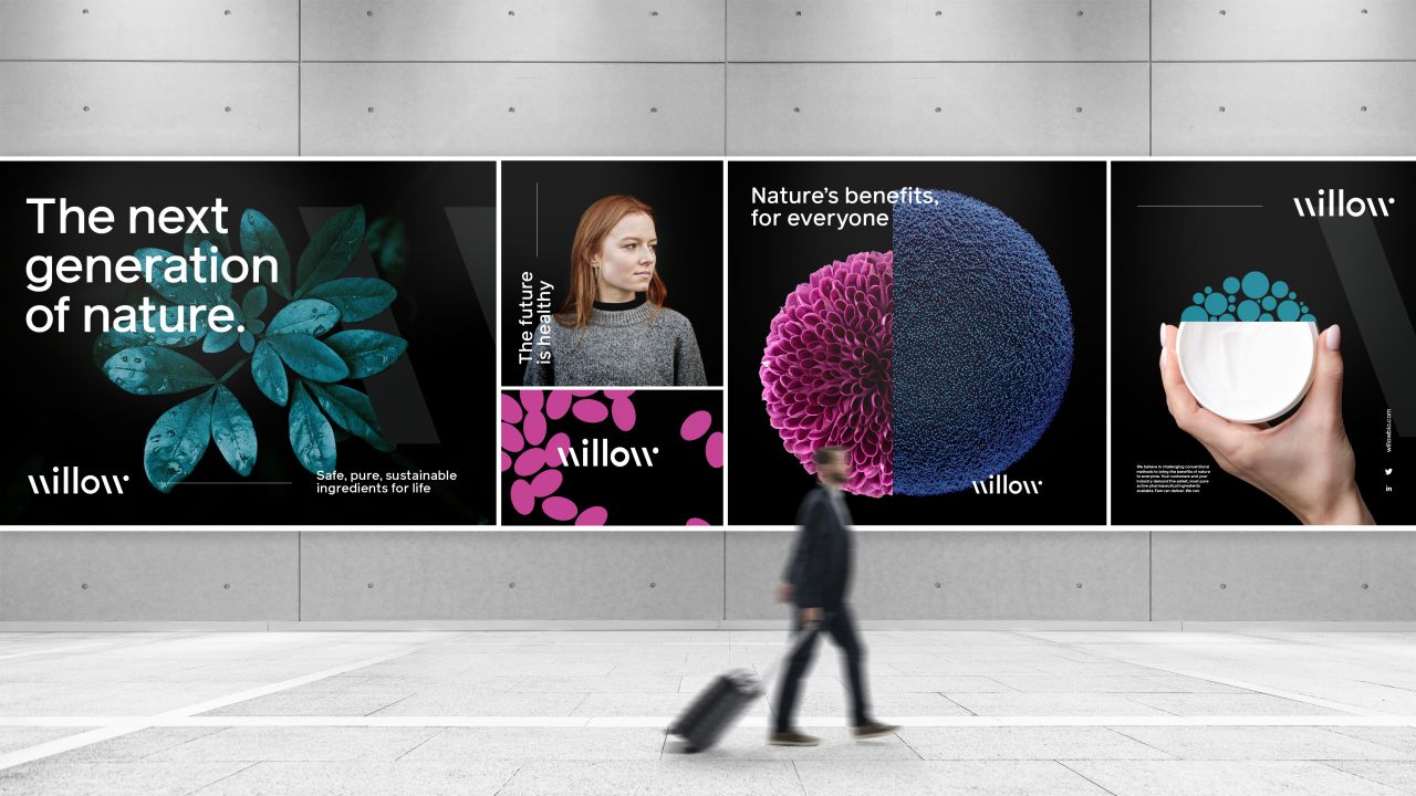
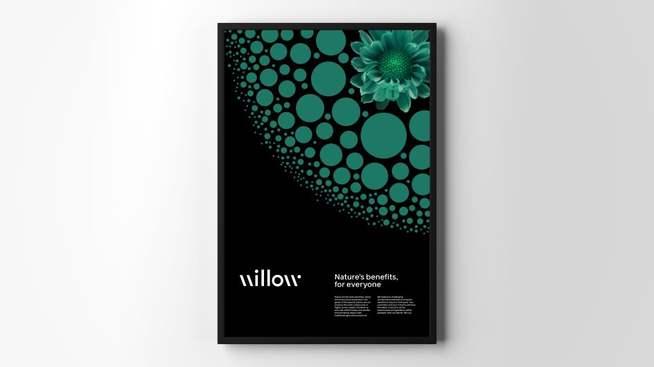
1. Willow Biosciences 2020 Rebrand by Critical Mass
Critical Mass
Created by Design Director Joel Harding at Critical Mass, this award-winning project for Willow Biosciences helped the company to reimagine the way its branding conveys its story, persona, values and mission. A modern refresh, entirely digital-first and authentic, Joel and his team delivered an identity that smashes the usual design cliches of the science world.
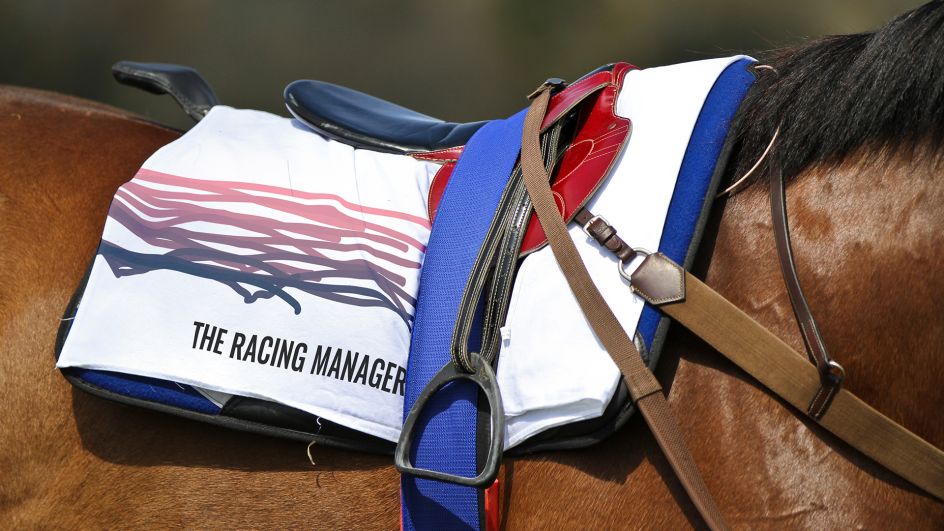
2. The Racing Manager by Vitamin London
Vitamin London
Vitamin London crafted the new identity for The Racing Manager with Robert Lloyd being the art director. The brand wanted to bring new life to the horse racing industry, moving it into the digital, modern era. Having spoken to syndicate owners, trainers and others within the sector Vitamin realised this it's not just a game to them; it's a way of life. In response, the London studio looked at how horses have been depicted over time, beginning with cave paintings, through different mediums and phases of art style to the modern-day, ultra-high-resolution photography.
"Sourcing slow motion and tracked footage of a horse galloping, the most notable areas were tracked to become an abstracted movement," Vitamin explains. "Trailing behind, these lines hinted at the legacies of the sport while the perpetually galloping logo demonstrated the unwavering progressive attitude The Racing Manager embodies." This informed the logo while the colour scheme offered a "respectable sunrise aesthetic", and paired the logotype's Oswald (as a hint to traditional race-ticket letterpress production) with Gill Sans; arguably the UK's most recognisable typeface of authority.
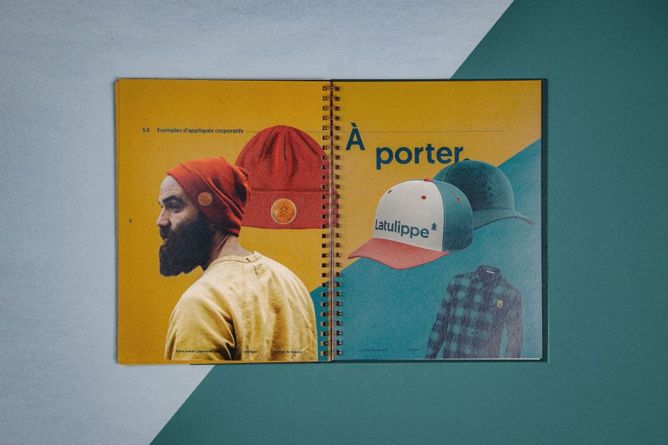
3. Latulippe by Agence Masse
Agence Masse
As Latulippe was about to open its third store, the outdoors clothing brand called on Agence Masse to give its identity a refresh. Designed in close collaboration with the staff at Latulippe, this completely new brand image is strong and flexible, and highlights the diverse range of outdoor clothing and equipment available at its stores. We especially love how the new logo nods to alpine trees as well as the three generations of the family behind the company. The colour palette of forest green and burnt orange reminds us of happy camping trips. It only enhances the entire identity, which has been rolled out across signage, clothing labels, other marketing materials and a fresh website.
4. Burj Boutique by Linnikov.agency
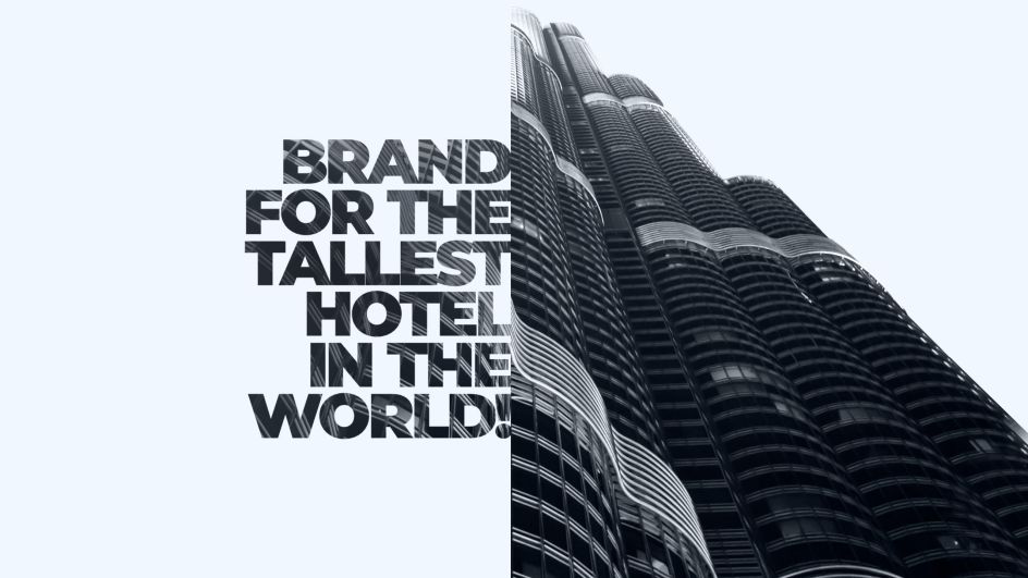
Linnikov.agency
If you're going to create the branding for the world's tallest hotel, located on the 112th floor of the Burj Khalifa Tower in Dubai, you're going to be inspired by its epic height. That's what Linnikov.agency did for Burj Boutique. The logomark is of the huge tower, made up of hundreds of dots, as though lit up at night. There's a Middle Eastern mosaic charm, too, along with an elegant monochrome palette hinting heavily at the exotic and expensive appeal of the unique hotel.
5. Chef's Farm by Opera Concept & Design
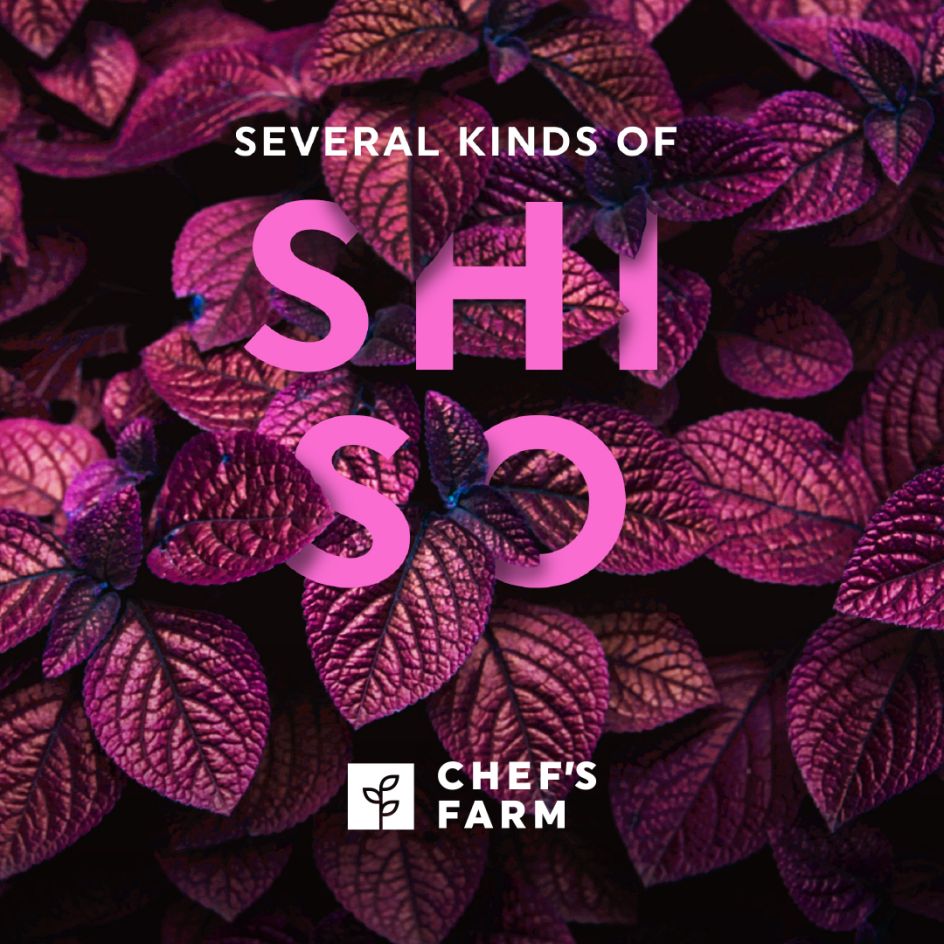
Opera Concept & Design
Netherlands studio Opera Concept & Design crafted this stunning identity and communication concept for Chef's Farm, a supplier of garnished herbs, special micro-leaves, flowers and herbs that it produces itself. Opera brought this micro-life into the picture, intertwining the imagery with gorgeous typography. Simple but highly effective.
6. Ding Li Feng gift box by K9 Design
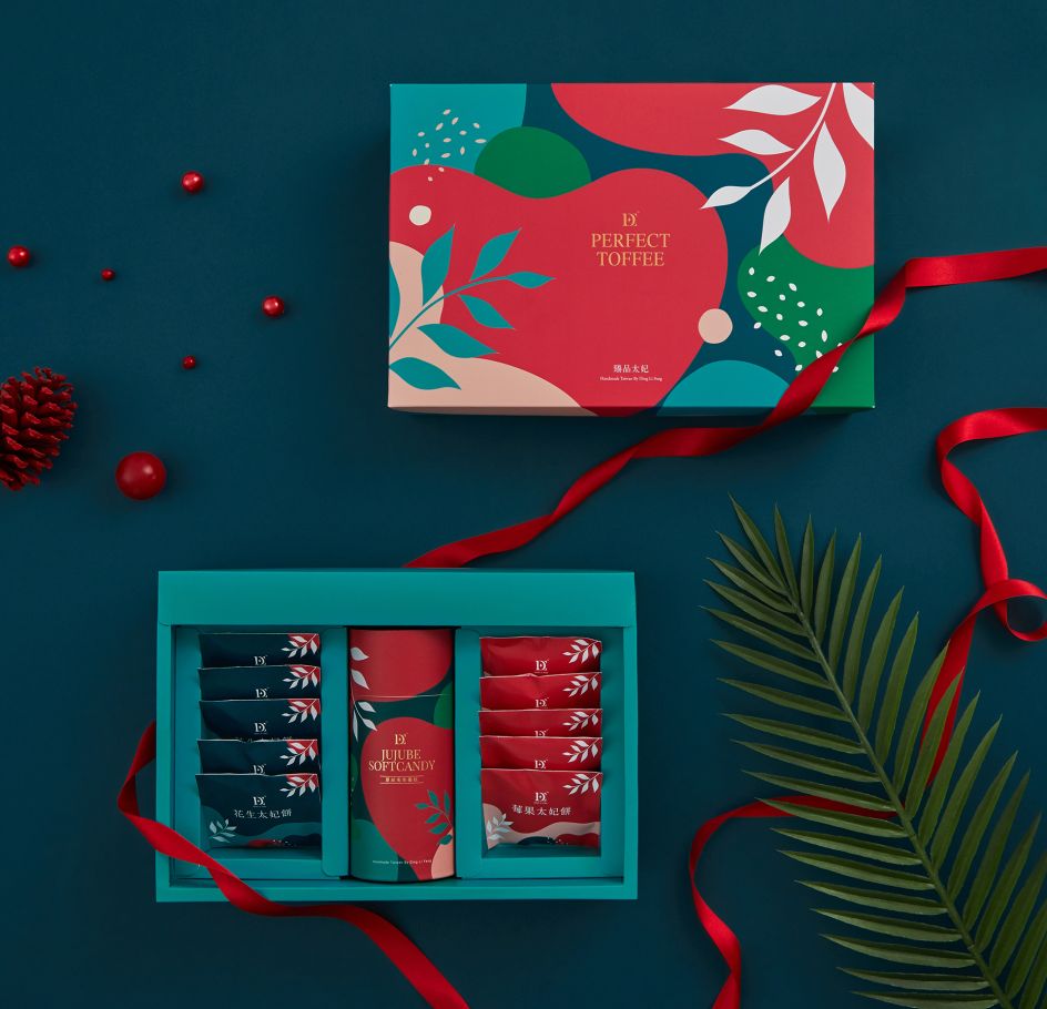
K9 Design
For its food and beverage client, Ding Fi Leng, K9 Design created this beautiful packaging inspired by the natural ingredients of its products. With a bold and brave colour palette, combined with decorative gold stamping, it's a unique but artistic packaging design full of character and charm.
7. Hillside Re-branding by EME Design Studio
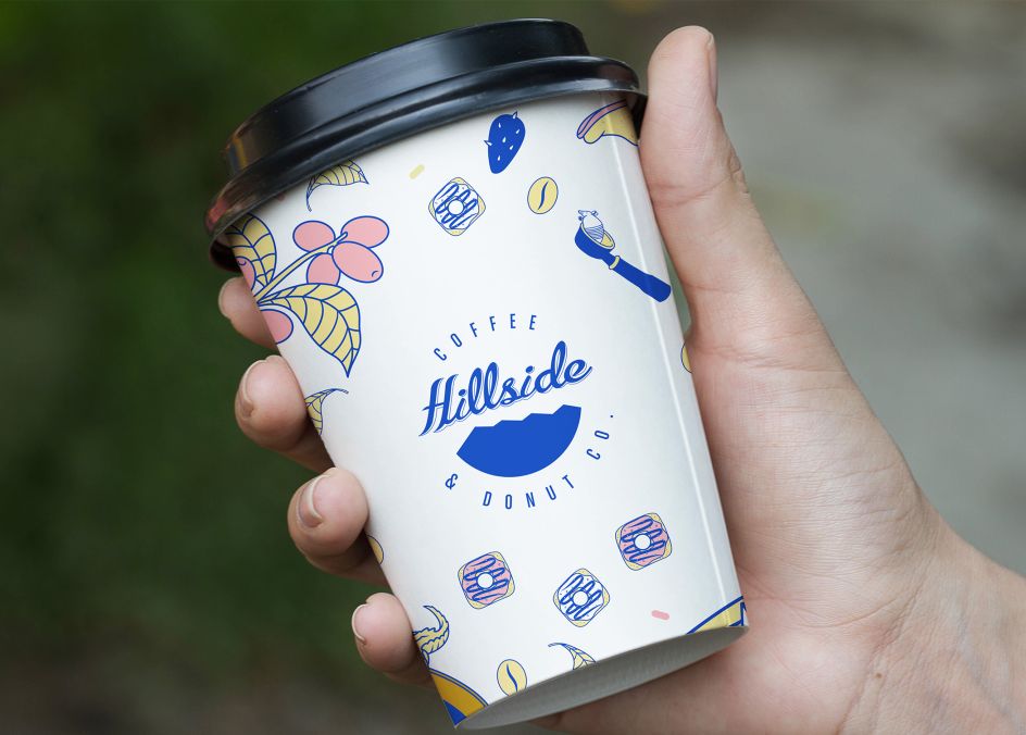
EME Design Studio
EME Design Studio in El Paso, Texas, is behind this brand refresh for Hillside Coffee and Donut Co, which was already established and "easy to recognise". But as it expanded, it realised it needed an update, so EME added new colours and visual elements to jazz things up.
"The creative inspiration comes from the area were Hillside was born," says Design Director Francisco Arrieta. "It was very natural to create a world of hip southwest elements and fresh colours that reflect the personality of the customers who enjoy having a cup of coffee at this trendy local coffee shop. The final result, a very fun and exciting brand that feels more alive than ever before."
8. Maré Seafood by Navorsky Studio
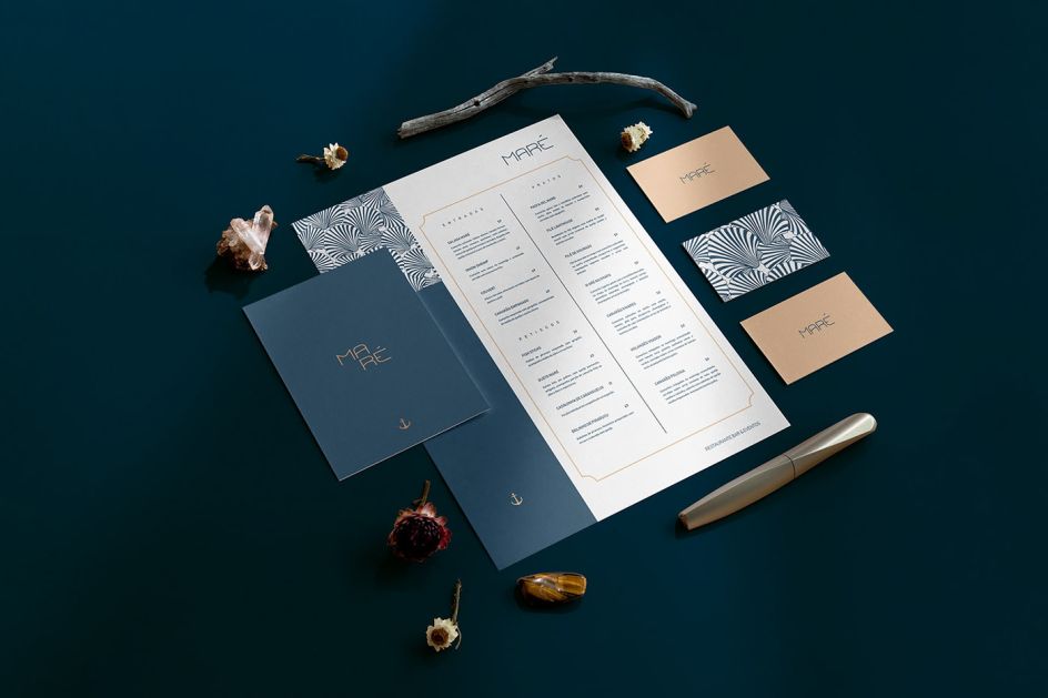
Navorsky Studio
Maré is a restaurant specialising in 7-sea cuisine, with "sophisticated yet affordable" options. Navorsky Studio crafted a brand that conveys sophistication, refinement and at the same time escapes the traditional fish restaurants of the region. "Maré is an undeniable invitation to the beauties of the sea," says Viktor Navorsky, design director and studio founder. "Maré is an invitation to discover, a momentary escape to the coast, in the midst of our Amazonian environment."
9. OBA Eatery by Creative Carbon Studio
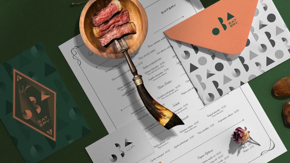
Creative Carbon Studio
Creative Carbon Studio in Portugal is behind this minimalist, timeless identity for OBA Eatery, a new contemporary gastronomy restaurant from Saudi Arabia, operating from a central kitchen, and led by a brilliant head chef and an enthusiastic team. Inspired by the phrase "less is more" from the poem of Andrea del Sarto, written by Robert Browning, in 1855, the brand points to the art of gastronomy, stating that all you need is the best ingredients and someone who knows what to do with them.
Using the most primitive geometric forms, the identity has also been created in an upward movement, symbolising the "growing top-notch gastronomic experience offered to clients, and implicitly represents the natural to the company's expected growth and market share," as Design Director Rafael Pinto Maia puts it.
10. Deer's Hotpot Bistro by Triangler Co., Ltd.
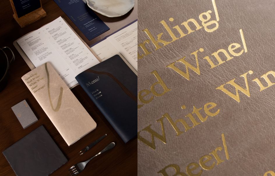
Triangler Co., Ltd
Deer's Hotpot Bistro is a fine dining restaurant in Taipei, specialising in French cuisine, that called upon the talents of local design studio, Triangler, to refresh its identity. "Detail" informed the design, something that the eatery is passionate about – everything from its use of materials, its cuisine, and its space.
This sentiment is depicted with the image of a deer, forming the central logomark of the identity. Lots of natural elements like plants, leather, wood, and cast iron are used as interior and printing materials. "It echoes the core value of the brand and presents the exquisite brand atmosphere more," says the studio. "Compared with the original, fresh identity, a maturer deer image is designed to internalise the years of past experience."
11. Linked Graduation Exhibition Identity by Shanti Sparrow
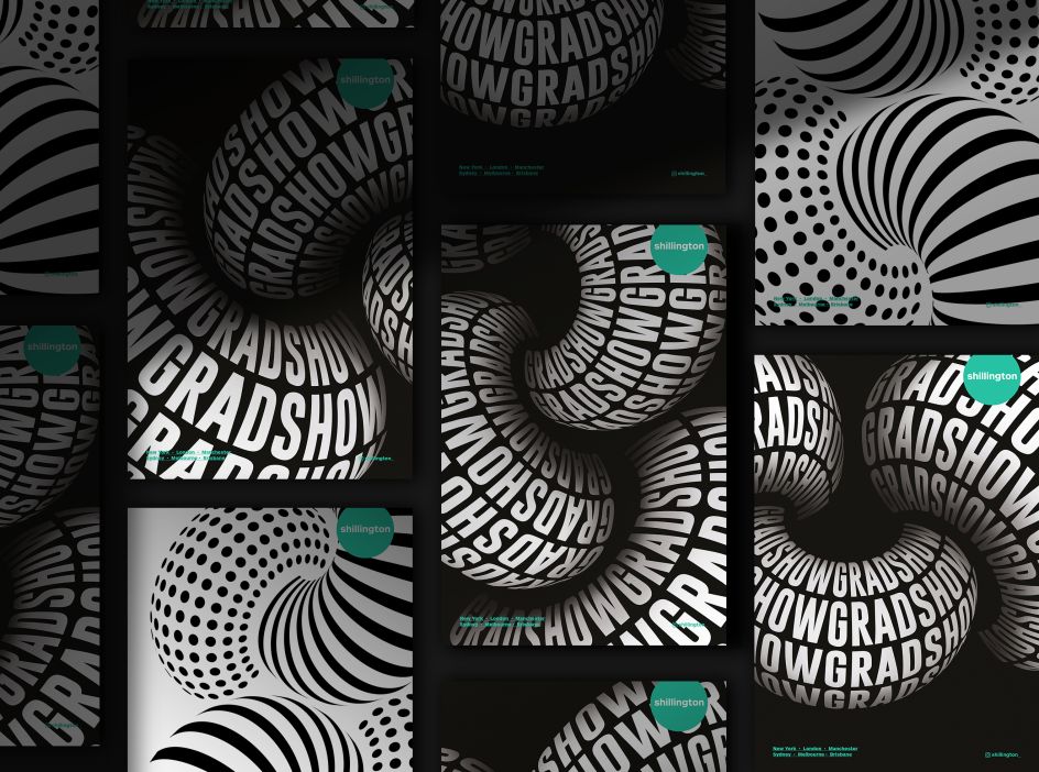
Shanti Sparrow
New York-based designer and illustrator Shanti Sparrow was inspired by the Henry Ford quote, "Coming together is a beginning. Keeping together is progress. Working together is success" for her identity for the Linked graduation exhibition at Shillington last year.
The visuals are inspired by teamwork and the "extraordinary force of passionate people working toward a common vision," as she puts it. It is also representative of the strong bonds formed between teachers and students at Shillington throughout the course. The 'Linked' exhibition identity was rolled out internationally in New York, London, Sydney, Manchester, Brisbane and Melbourne campuses.
12. Hardwired by Grandvity Visual Integration Co.
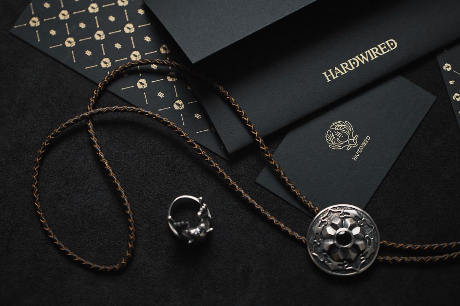
Grandvity Visual Integration Co.,Ltd.
Hardwired is a Taiwan jewellery brand renowned for its baroque style and series of meticulous and exquisite designs. Grandvity crafted its identity based on one of its products, a blending ring called 'Origin', which combines a laurel wreath and antlers. A noble golden colour decorates the low-profile black tone to create a continuous pattern. The pattern has been applied to name cards, invitation cards, and envelopes to develop the image of understated luxury. "It is elegant like a gentleman with the charisma you can't ignore," says Tzu-Hao,Wang, design director.
13. Tip Top Men's skincare by Cascara Creatives
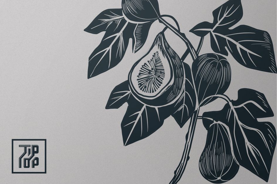
Cascara Creatives
Tip Top is a Chinese bath and body brand for men. Cascara Creatives in Vancouver was asked to create a new identity and packaging that would "visually represent" its retro and strong masculine feel. "We designed labels inspired by retro Chinese apothecary and timeless whiskey labels for Tip Top's line of bath products," says Design Director Sisia Du.
The main identity consists of lithography-styled illustration, bold typography, and wood-textured elements. "We worked closely with Tip Top to develop a packaging system that could be utilised for future scents as well," she adds.
14. Luna Atelier Skin by Huck Yeah Studio
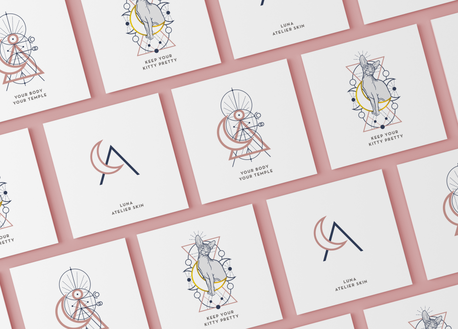
Huck Yeah Studio
The founder of Luna Atelier Skin, Helen Al-Jureidini, helps her clients to look and feel their best by providing a welcoming studio where clients can wax away hairs and insecurities. When discussing the personality and vision of her first studio with Huck Yeah, conversations were centred on how she wanted to stand apart from the glossy world of traditional spa culture. "Yes, she would keep the same standards of care and hygiene, but she didn't want it to feel clinical or plastic," explains Jackie Huck, founder of Huck Yeah Studio. "The answer we were looking for was right in the name: connecting directly to the power, mysticism and rituals of La Luna, the moon."
15. Paradise Mills by Bridge PHX
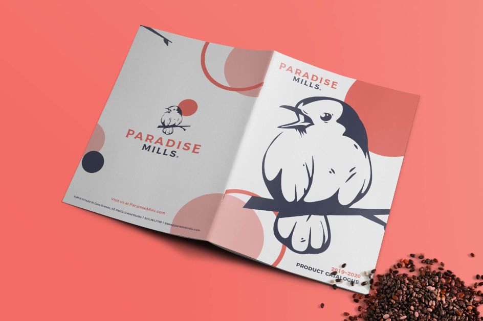
Bridge PHX
Having been around since the early 1970s, Paradise Mills has mastered the art and science of seed production so pet parents, bird lovers, and nature enthusiasts can focus on their love of birdwatching. Its mission is to become the household brand for those who embrace nature and are passionate about giving their birds the very best.
Arizona Grain approached Phoenix-based studio, Bridge PHX, to rebrand its legacy birdseed company, Sahuaro Seed, to have a more modern touch in order to "better connect with its audience and stand out in the industry".
"They wanted their rebrand to soar above all other bird seed products and companies on the market," says Design Director Steffan Stewart. "This required that we sit down and have a team discovery session, discuss a new name and dive into a visual identity that hit the brand message home. After extensive brainstorming and collaborating with the Arizona Grain team, we pulled the trigger on the name Paradise Mills."
From there, the primary message the team wanted to convey was that of a "personal paradise" – the feeling of nostalgia and being at peace with nature when feeding birds. With this in mind, Bridge PHX chose softer and more serene colours, along with an illustrative style that elicited a more natural tone. The identity was rolled out to a new website, labels, menus, and many other brand assets.
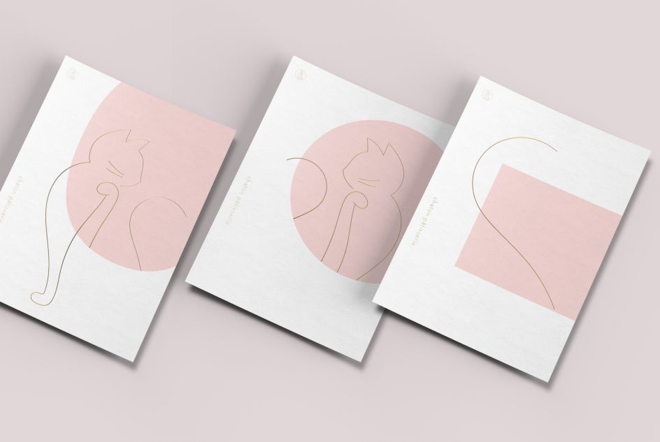
16. Chaton Pâtisserie by Triangler Co., Ltd.
Triangler Co., Ltd
Another award-winning project courtesy of Triangler, this charming identity for Chaton Pâtisserie, a French dessert brand, is based on the company's name, which translates simply as 'kitten'. The owner, a cat lover, apparently wants to make delicate desserts for everyone and hopes that whoever tastes the desserts will be "totally relieved from stress".
The original brand was rustic and country-like before. By illustrating the posture of a cat licking its paws after tasting a pastry, and pairing the logo with a slim sans-serif typeface, the new identity becomes neater and more elegant. The gift boxes, cards and the website only add to the relaxing and soothing image.
17. New Roads School by DISTINC_
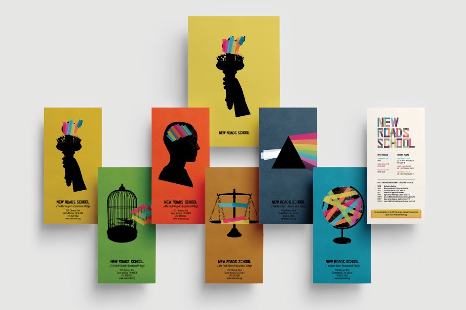
DISTINC_
As a K-12 independent school in Santa Monica, CA, New Roads School inhabits a robust education market in west Los Angeles. DISTINC_ considered its unique legacy for a recent brand refresh. "New Roads was founded as a social necessity, addressing inequity by spending more than double what their competitors spend on financial aid to ensure an authentically diverse community," says Design Director Jean-Marc Durviaux. "Given a marketplace in which their competitors made specious claims about diversity – plus a bland brand that lacked inspiration – we reimagined an evocative, proprietary visual language that boldly asserts New Roads' core purpose.
"Culturally and socially, we understood that the school's dedication to social activism resonated in a moment when free expression matters more than ever. We leveraged this culture of activism for our brand messaging. Additionally, the diversity of voices gave our work richness and authenticity."
The resulting visual language uses striking silhouettes highlighted by strips of colour to establish memorable, radical imagery. The accompanying messaging employs pithy, unflinching statements to deliver New Roads' values in a voice that DISTINC_ says "few schools would have the guts to use". The studio even crafted a bespoke typeface, Liberation.
18. Bloody Funny by A Studio of Our Own
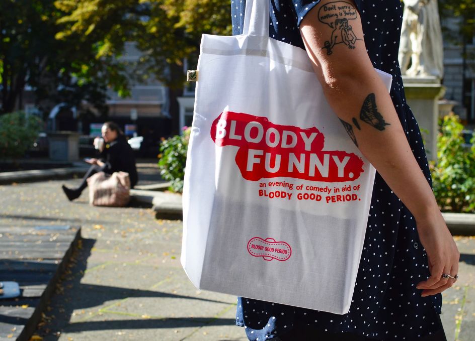
A Studio of Our Own
When asylum seekers reach the UK, they are given just £37.50 per week to live on, with no provision for menstrual supplies, which are classed as "luxury" products. Bloody Good Period is a non-profit organisation set up to provide period products for free to asylum seekers, refugees and those who can't otherwise afford them.
A Studio of Our Own started working with the organisation in late 2018, updating the logo and creating various graphic assets and social posts to help build a more consistent brand across digital and printed applications. It launched 'Festive Period', a Christmas campaign, using the power of social influencers, that encouraged people to donate stockings filled with period pads.
Following the success of that campaign, the London studio was approached by Bloody Good Period to brand, promote and produce the charity's annual fundraiser, 'Bloody Funny'. Conceived as a riposte to the accusation that women "only make jokes about periods", the event is the biggest in the charity's calendar, featuring some of the biggest names on the UK comedy scene uniting to raise money to fight period poverty.
"Bloody Good Period refuses to shy away from imagery and messages that others may consider taboo, says Design Director Tom Cornfoot. "Periods should not be associated with shame or embarrassment, and as an agency that strives to approach all projects with a sense of honesty and bravery, we felt compelled to meet this challenge head-on. Our immediate reaction to the brief was to find a way to graphically embrace and celebrate periods in all their human, biological (and gory) glory."
The event logo is based on smears of blood, which works in parallel with Bloody Good Period's core logo, in the shape of a pad. To complement this, A Studio of Our Own developed a lo-res, deliberately cut-and-paste approach to typography in reference to the campaign's activist credentials. This approach was extended to the treatment of photography for the comedians, reproduced in halftone patterns over bespoke painted gloopy, blood-drenched backgrounds.
Posters, flyers and a suite of social media posts were also created to promote the event and generate ticket sales, as well as an animated version of the logo which ran on a projector behind the comedians on stage.
The event identity flowed (pun intended) seamlessly across a range of merchandise including ethically produced canvas tote bags, stickers and enamel badges which were available for sale on the night, some featuring yet more period-based humour, such as the 'So funny you'll LEAK OUT LOUD' t-shirts.
19. Colourgrind by Dan Buchan Design
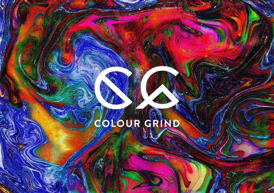
Dan Buchan Design
Colourgrind is an annual multidisciplinary Adelaide art exhibition which exhibits and auctions inspiring artworks from emerging and established artists, raising money for a South Australian not-for-profit charity, The Royal Society for the Blind. Using the art technique marbling, Dan Buchan ground colours together to form different patterns which became the basis of the design, mixed with experimental typography.
20. March of Dimes by Purpose
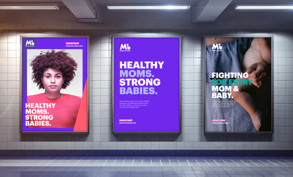
Purpose
Purpose is behind the new brand for March of Dimes, which had a well-known name with a mission that was not clear: "People thought the organisation focused solely on premature birth, rather than pregnancy, and infant and maternal health more broadly," explains the global agency. "This limited the perception of the organisation's work at a time when pregnancy, infant, and maternal health, especially among women of colour, were in decline. March of Dimes had an obligation to use its brand to highlight the breadth of these issues and the work it does to combat them."
March of Dimes tasked Purpose with creating an "accessible and appealing" brand that champions moms and babies, leading to a healthy pregnancy movement that highlights March of Dimes' work. This was accomplished through a complete brand redesign which included campaign strategy, messaging, website support, and much more.

Editor's Picks


Trending


Podcasts


Editor's Picks
Further Reading