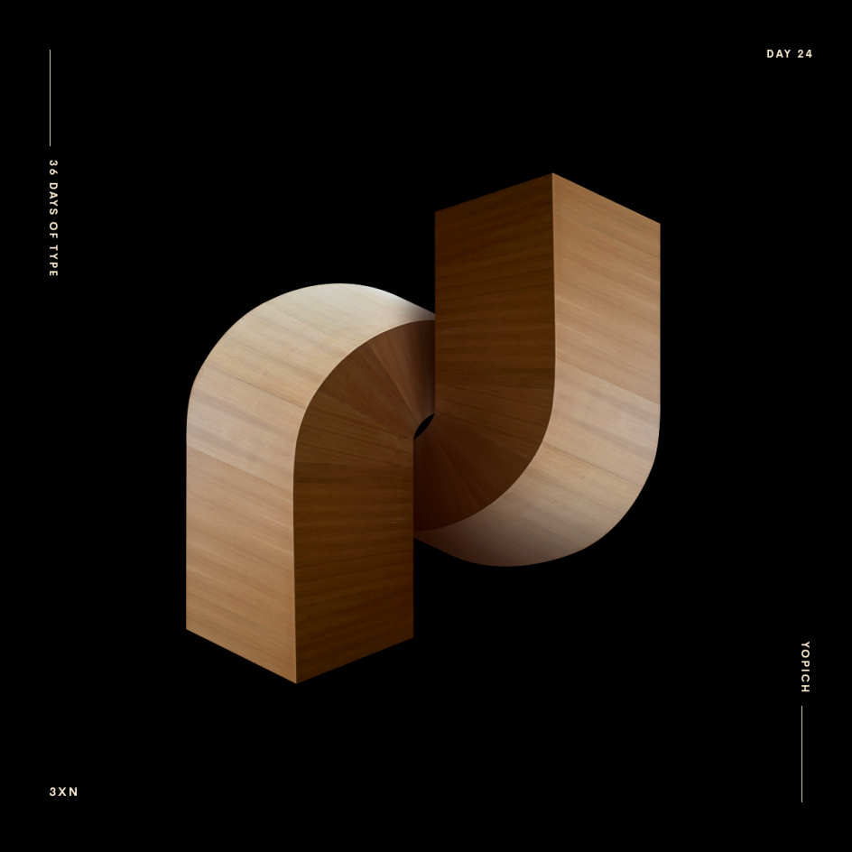
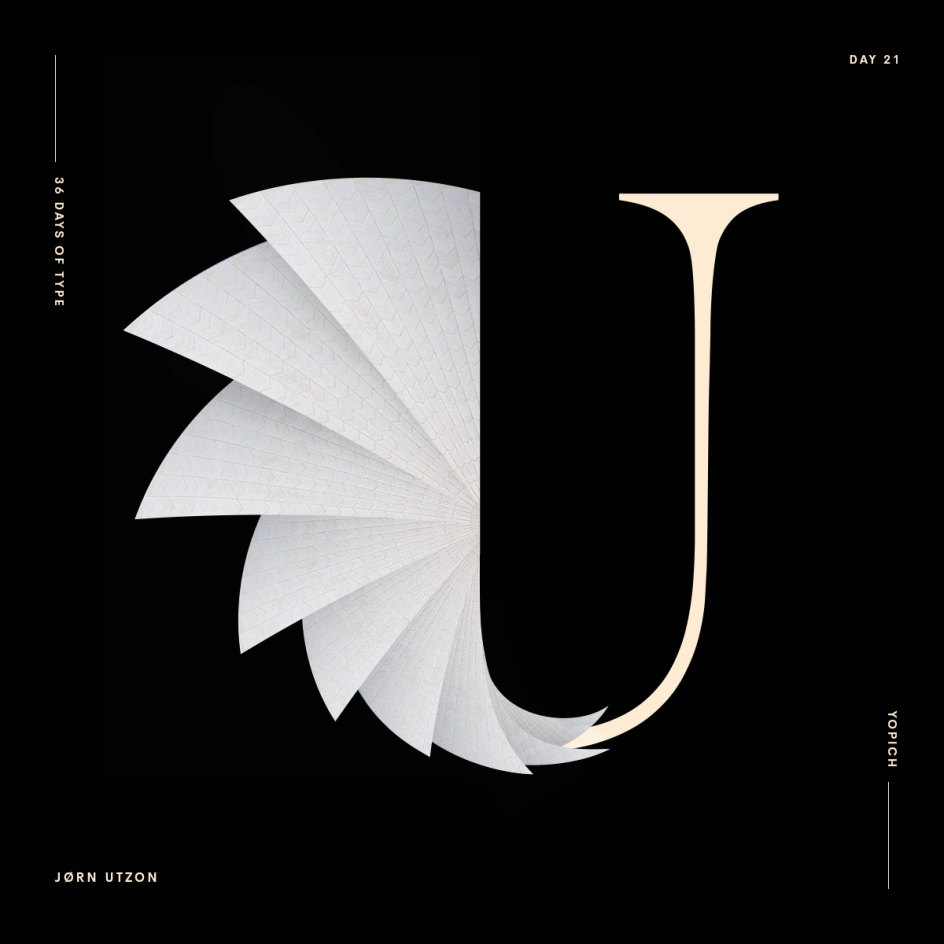
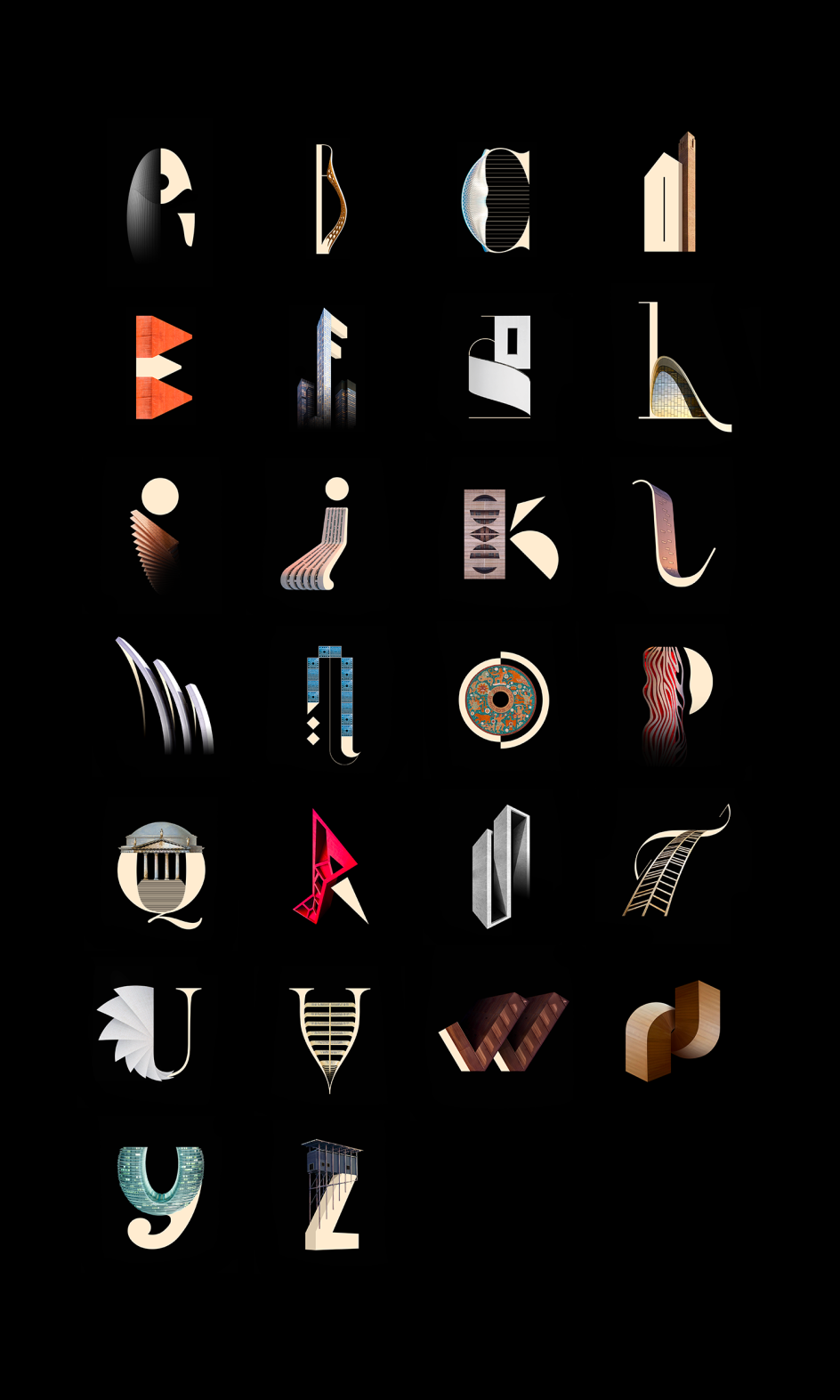
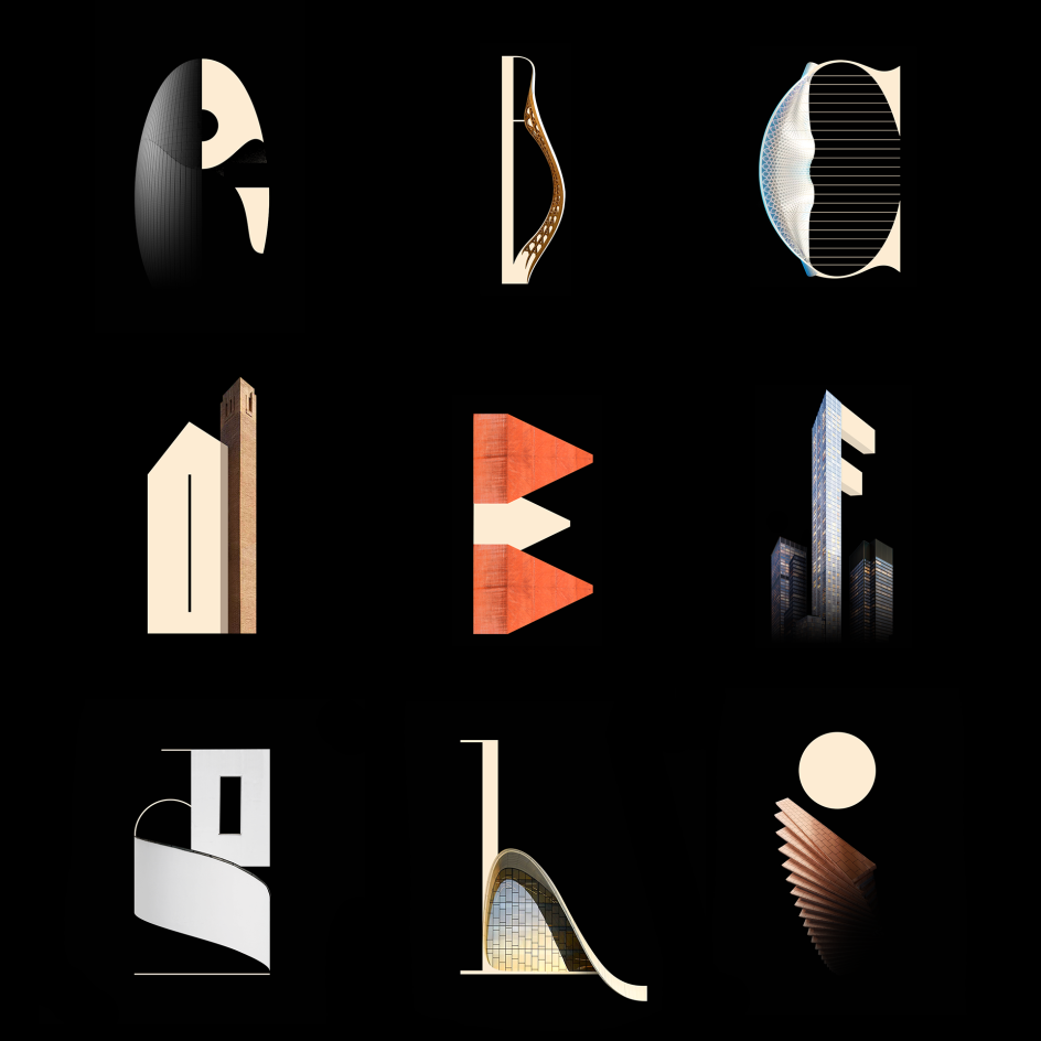
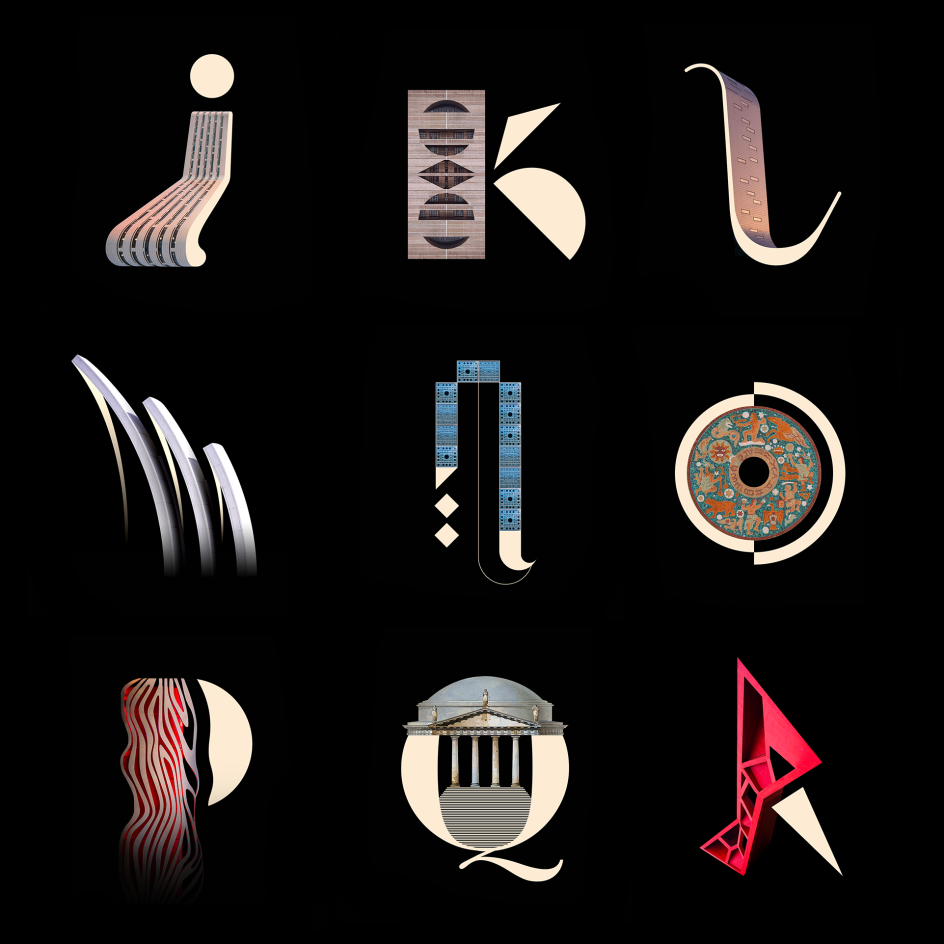
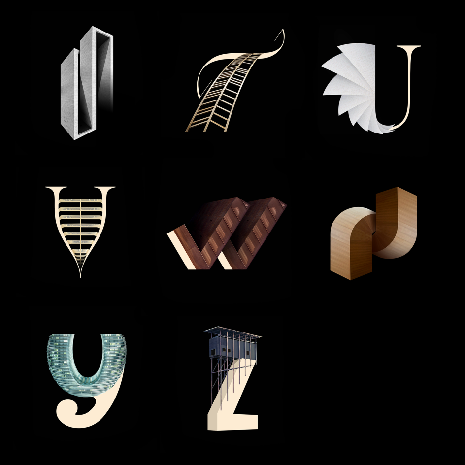
Architype fuses typography and architecture to forge expressive new alphabet
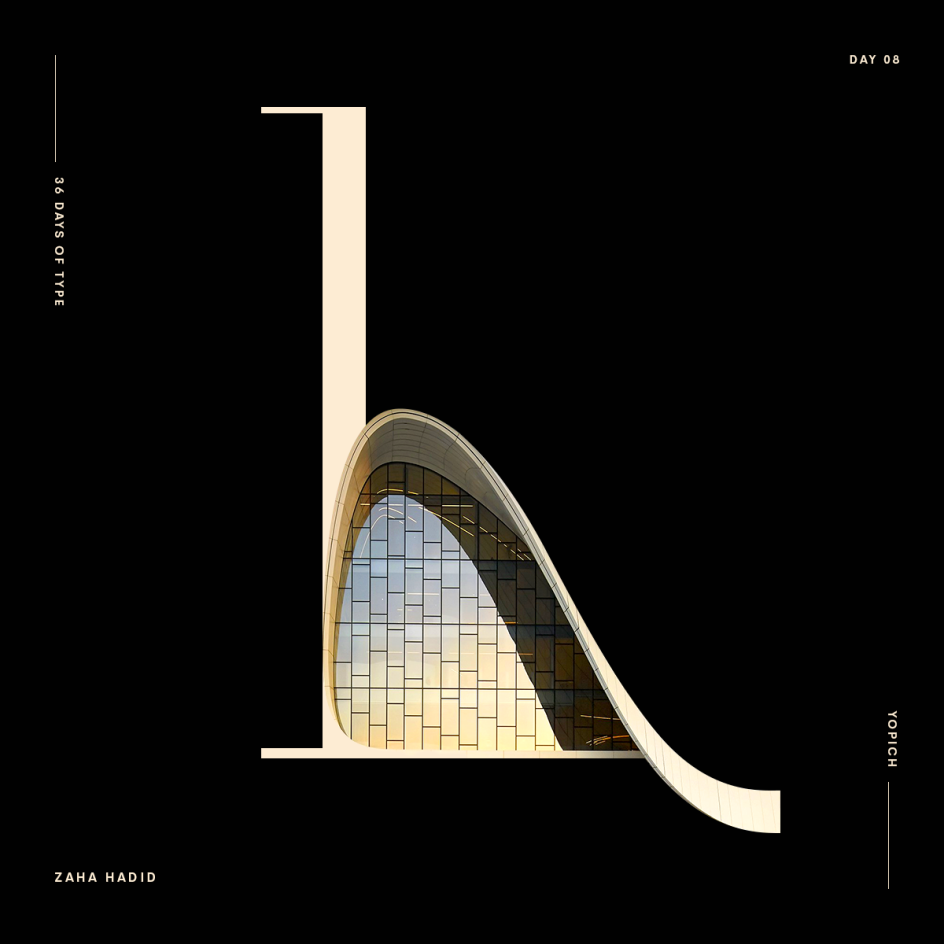
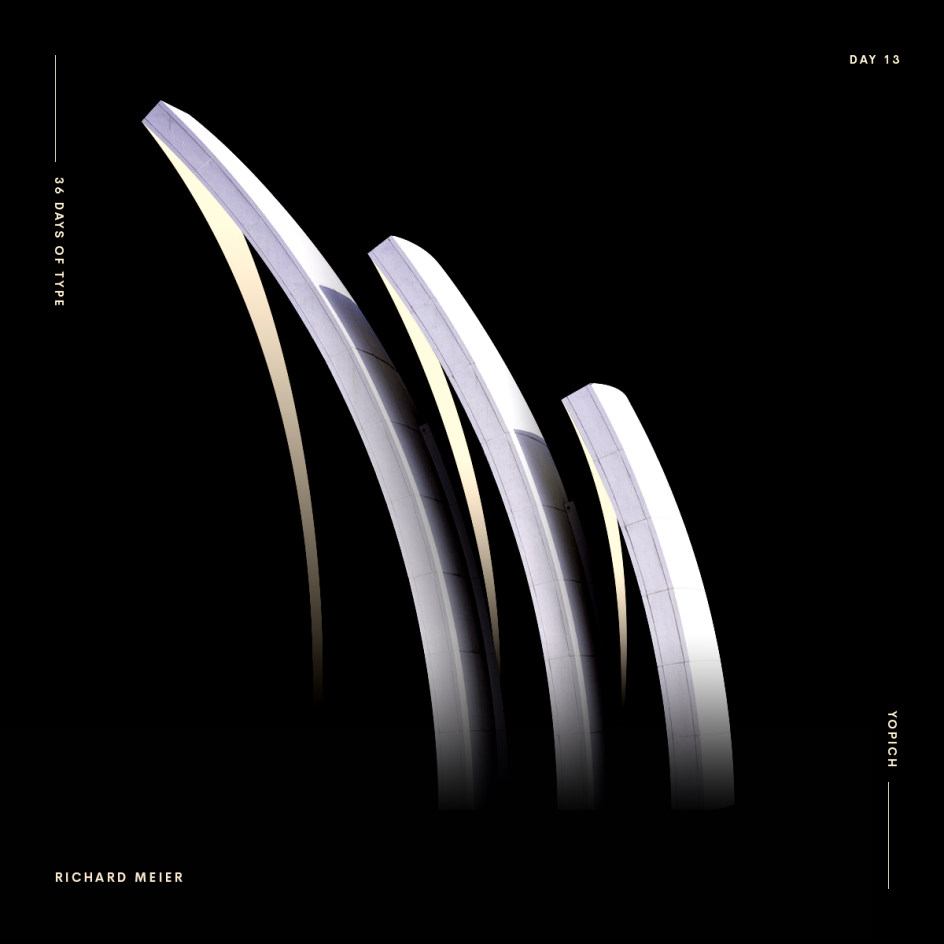
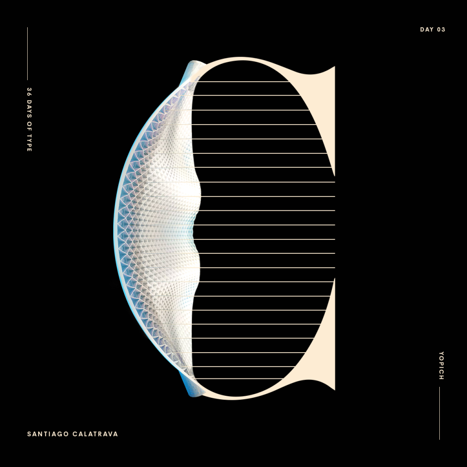
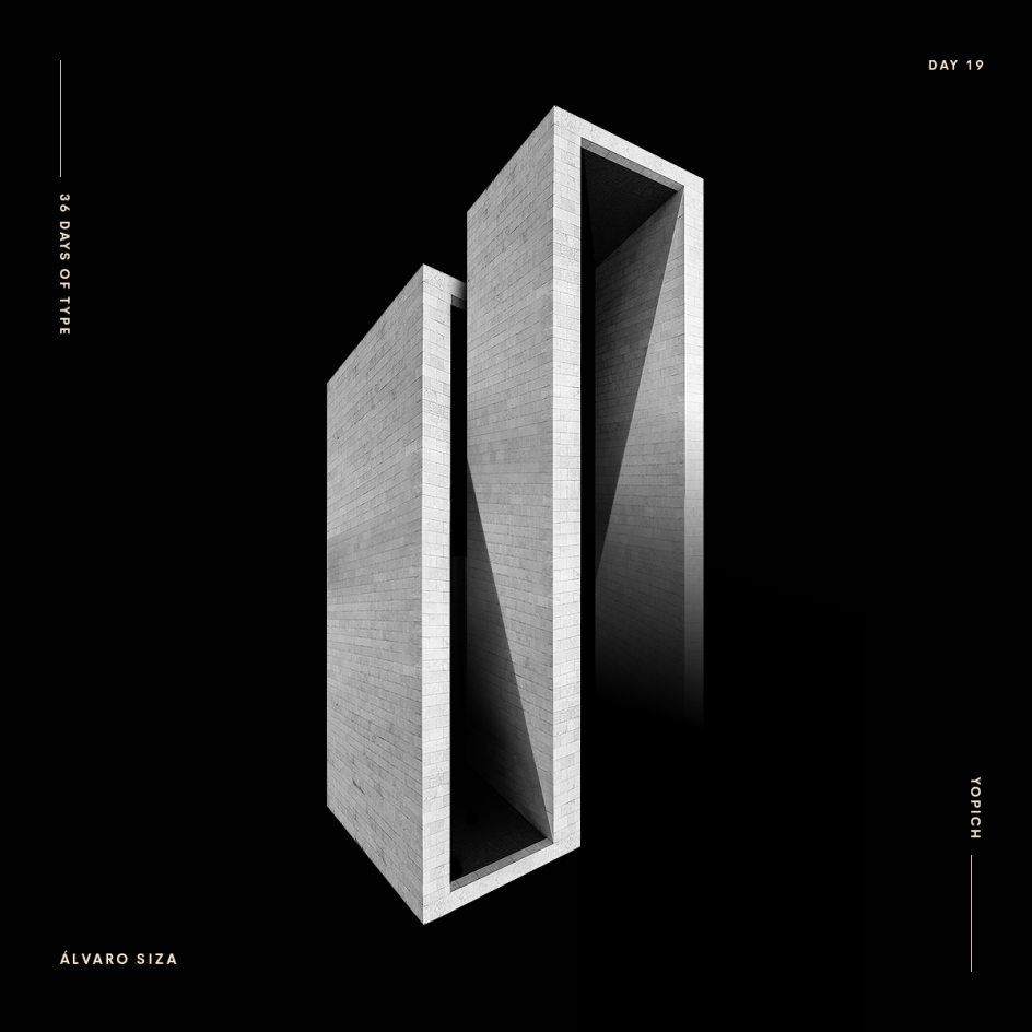
Typography and architecture are two disciplines often covered on Creative Boom, but it's rare that we include them in one article. Here's an intriguing exception, though, in the form of the Architype Alphabet, created by Johann Lucchini, an artistic director and illustrator based in Paris.
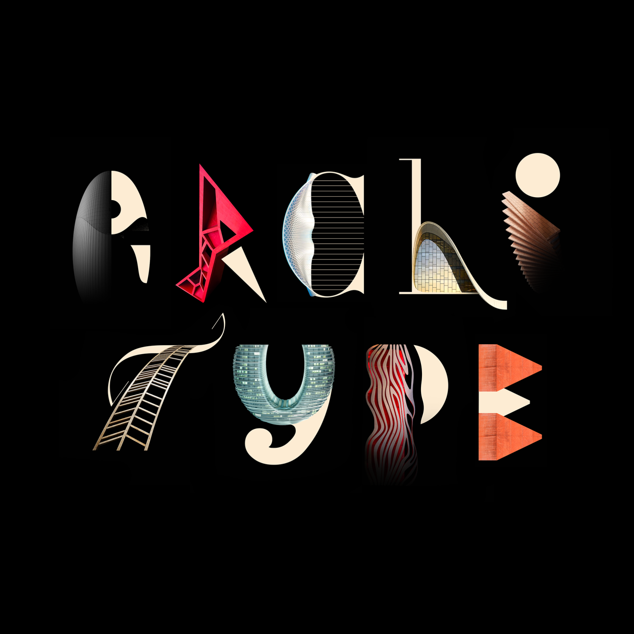
Johann had a simple concept for his project: to combine typography and architecture to create a new custom typeface. "For each letter of the alphabet, I was inspired by a famous architect and one of its buildings," he explains.
The link between the construction of a typeface and the construction of a building has always amused and fascinated him, he says. "Mixing curves, angles and lines to find the perfect balance and the right degree of abstraction is a long and difficult exercise," Johann notes. "And that's just as true for a huge building or an airport as it is for every little character within a typeface design."
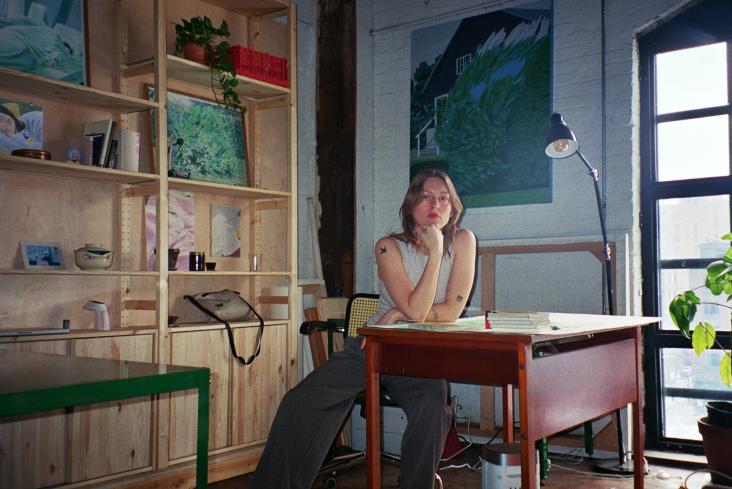
Johann is currently an art director at BlackPizza, a creative agency based in Paris founded by Kitzia Aguilar Conde and Olivier Derouette with clients including Monoprix, SeLoger and Dakar. Find out more about Johann via johannlucchini.com.
