Agency Livity rebrand inspired by editorial platforms and youthful energy
Livity is something of an unusual agency, combining client work with an open doors policy that sees young people from around its base in Brixton, South London, come into the space to be mentored, use its facilities, and in turn help with some coveted youthful perspective for their seniors.
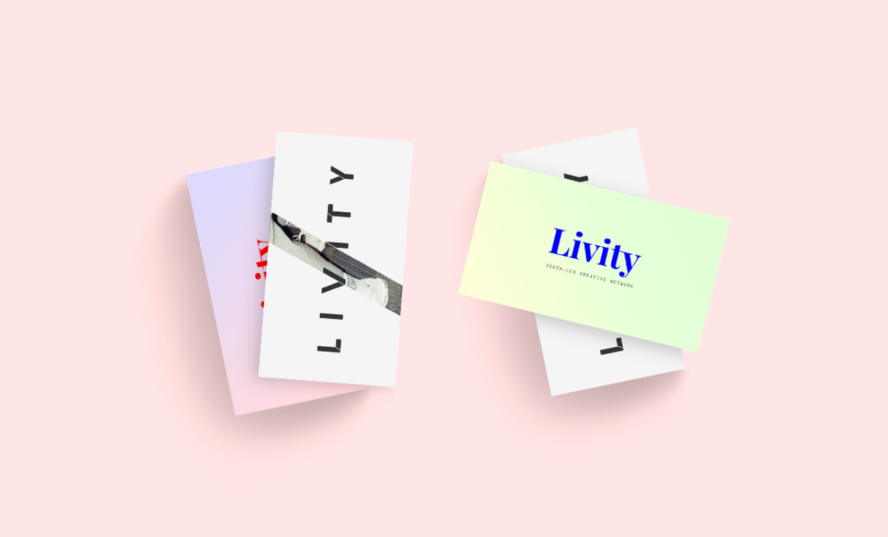
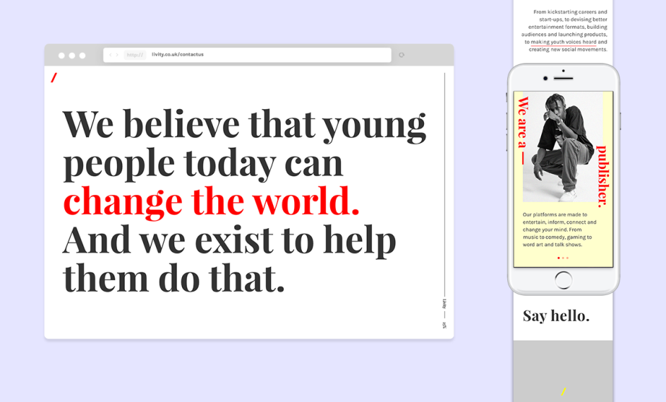
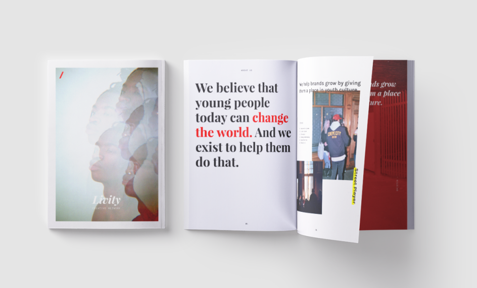
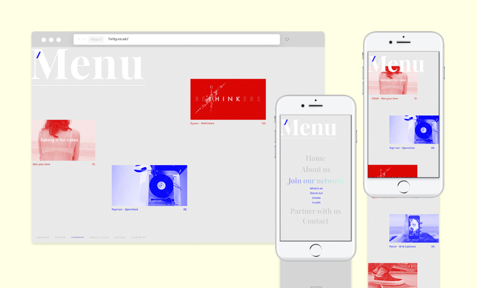
The agency’s rebrand is a reflection of this busyness and energy, launched to coincide with its sweet 16th birthday and repositioning as a youth-led creative network. The new designs were created by Livity creative director James Hogwood, designer Sian Spicer and creative lead Vinny K-Maddage, and are inspired by editorial platforms. "It’s quite a noisy new look but it definitely has a point of view," says Hogwood. "Young people are defiant, noisy, hopeful, and positive by nature. We wanted to embody some of that creative energy and ever-changing style."
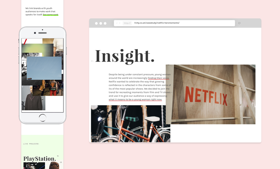
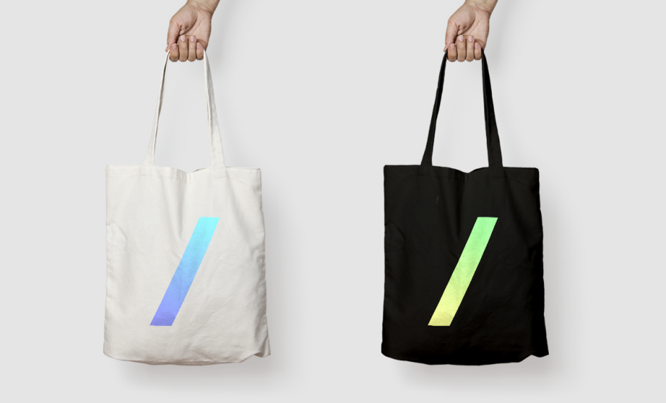
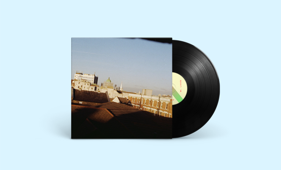
The designs introduce two new typefaces, a bold sans serif for the main logotype alongside Google font Karla. The ever-changing logo centres on a slash device which acts as a window showcasing submitted design, photography, and artwork from the young people in Livity’s network. According to Hogwood, this "frames youth culture through the eyes of young creative talents from around the UK".
He adds, "You don't rebrand for the sake of it. But our point of view is exciting and the work we do is very ambitious. We're passionate about communicating the fact that we are a youth-led creative network, and that we believe that young people can change the world. Our role is to help them make it happen, whether it's about helping them to express themselves and celebrate their passions, or realising their potential."
Editor's Picks


Trending


](https://www.creativeboom.com/upload/articles/90/908fdb6378db1e95d12595416f54e6336d5e80b8_732.jpg)
Podcasts


Editor's Picks
Further Reading