Parker crafts modern new identity for historic mattress brand Ostermoor
Consumers like the idea of established brands, but "old" and "mattress" aren't words that go together well. Ostermoor teamed up with Parker to help square that circle.
In general, we like companies with decades of experience and expertise. They're far more likely to know what they're doing and provide good value. However, when we think about mattresses, we tend to gravitate to new, flashy brands with access to the latest supportive technologies.
So Ostermoor, a historic mattress brand with roots dating back to 1853, needed to steer a careful balance between positioning itself as a standout player in the modern direct-to-consumer (DTC) mattress market while honouring its rich history.
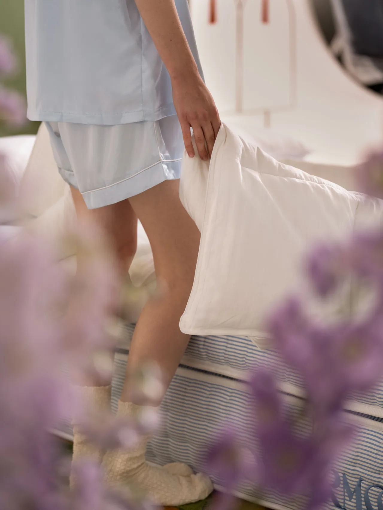
As one of the most innovative American mattress makers of the mid-1800s, Ostermoor provided modern amenities like order-by-mail, doorstep delivery, and a satisfaction guarantee long before these offerings were in vogue.
Seeing an opportunity to reclaim that history of innovation, they turned to Parker, a holistic design studio based in Seattle.
The brief
The brief was a rebrand that was steeped in heritage and craft but with the ambition to chart a new path for the DTC mattress industry.
Ostermoor & Company was founded in 1853 in the bustling Manhattan neighbourhood known today as Nolita. At a time when mattresses were made with horsehair or straw, their mattresses were "built not stuffed" by hand, meticulously designed with layers of innovative and comfortable materials that could stand the test of time.
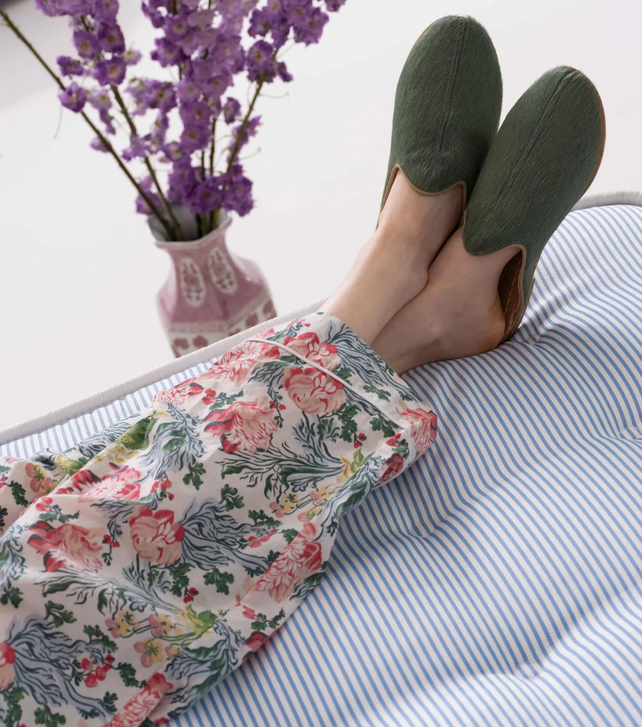
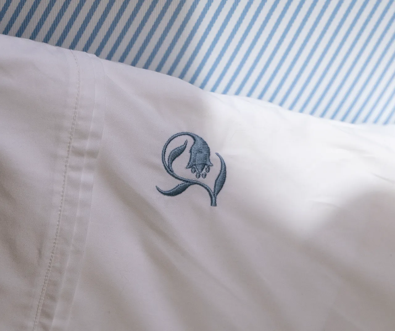
Even now, Ostermoor remains the sole manufacturer of its mattresses, eschewing white-label production and instead designing and building them at their Massachusetts factory.
"Their commitment to technical and practical innovation provides a higher quality product that utilises toppers and hand-quilted tufting not found in other bed-in-a-box businesses," explains Tyler Eide, founder and creative director of Parker. "And they have a rich history – one with the potential to fuel a powerful brand in a market in need of new ideas."
In building the new brand, Parker worked to maintain Ostermoor's equity and differentiate it from the existing market.
Visual direction
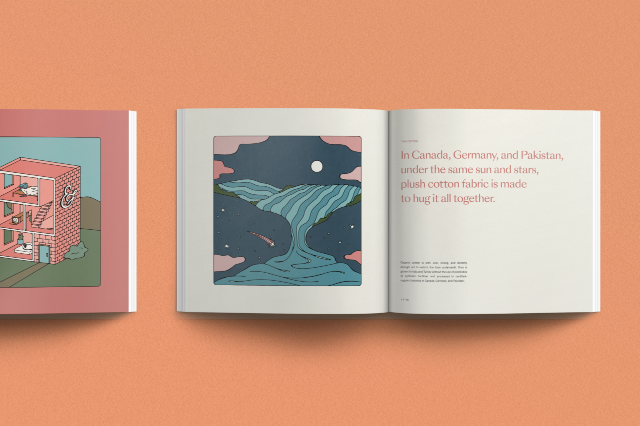
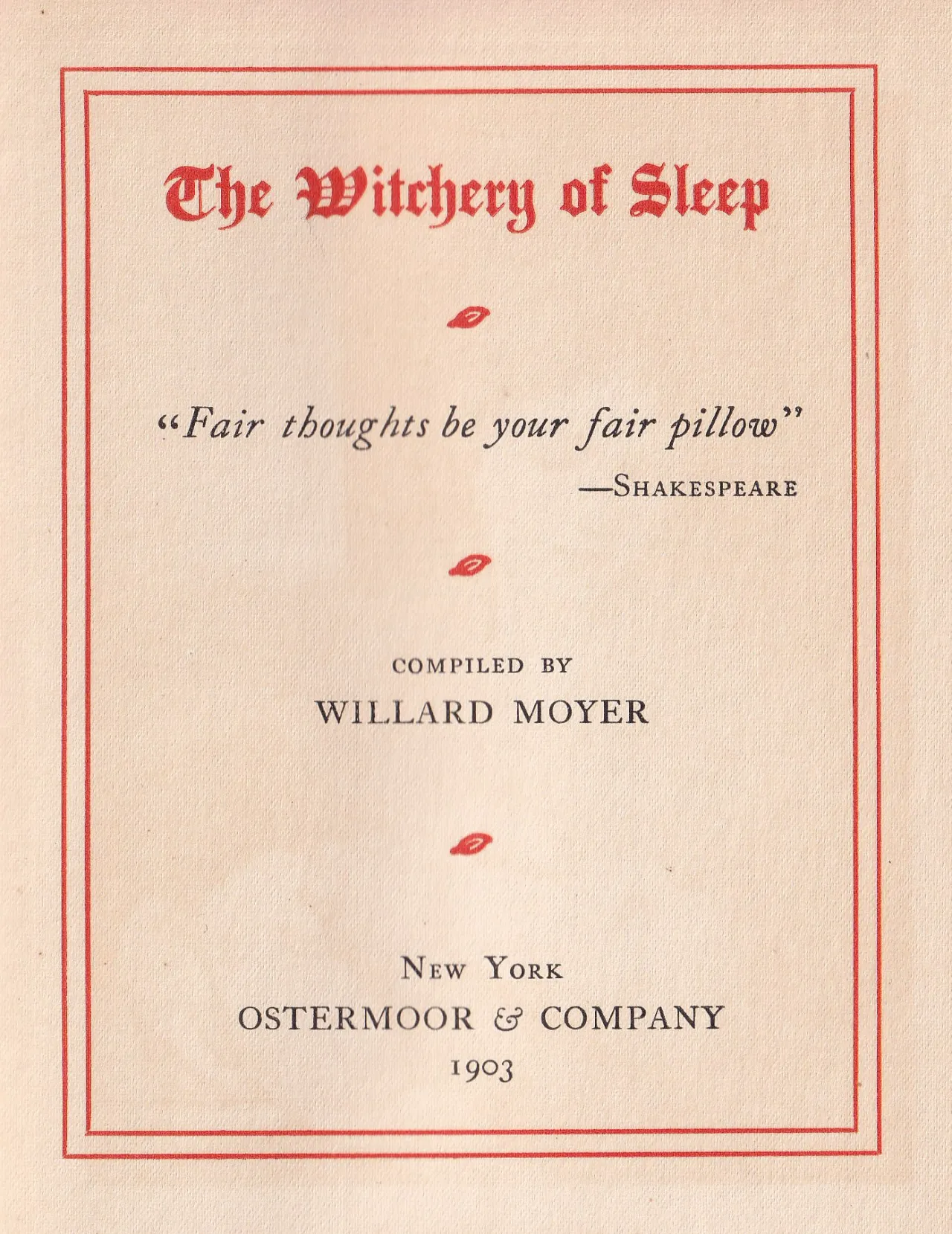
Taking inspiration directly from the company's original customer-facing literature – featuring drop-caps, ornate typography, illustrations and timeless colours – Parker aimed to reference the brand's while making something fresh and interesting.
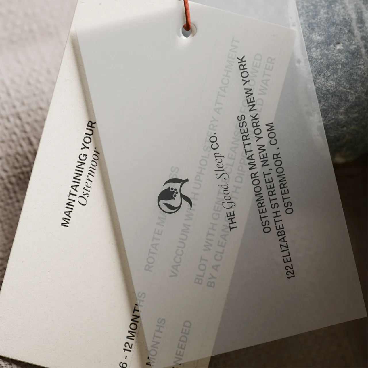
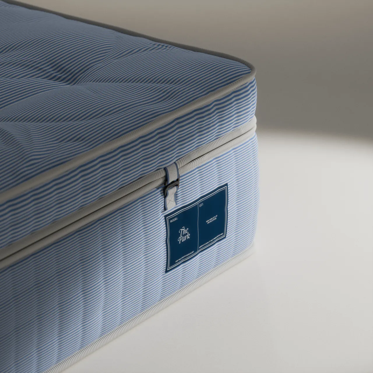
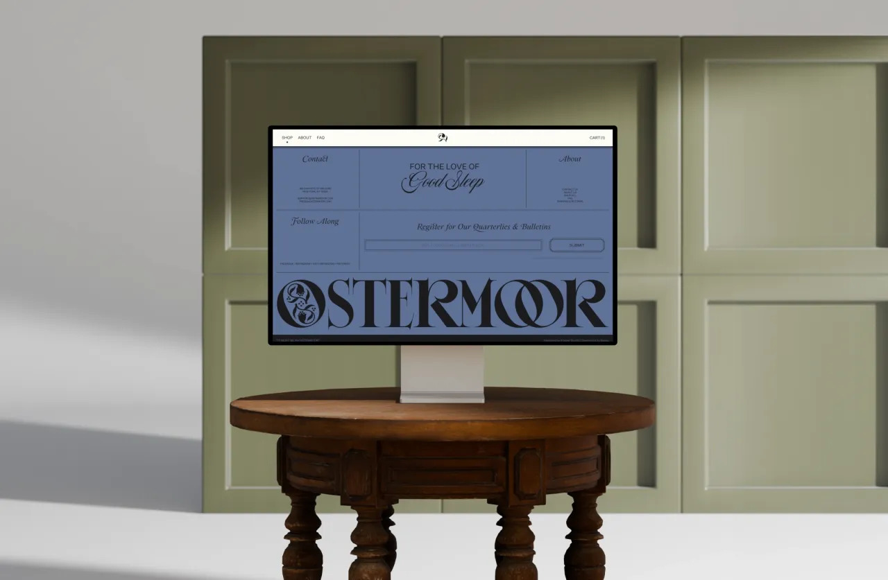
This resulted in a new brand identity, verbal identity, art direction, photography, and content, as well as an all-new e-commerce website, which was created alongside development partner Baggy.
Logo design
The overall visual direction references Willard Moyer's The Witchery of Sleep – originally published by Ostermoor in 1903 as a study on the importance and value of sleep and rest. Parker found this inspiration rich with an allegory about the phenomenon of sleep and the significance of dreams – lending the brand a subtle mystical quality.
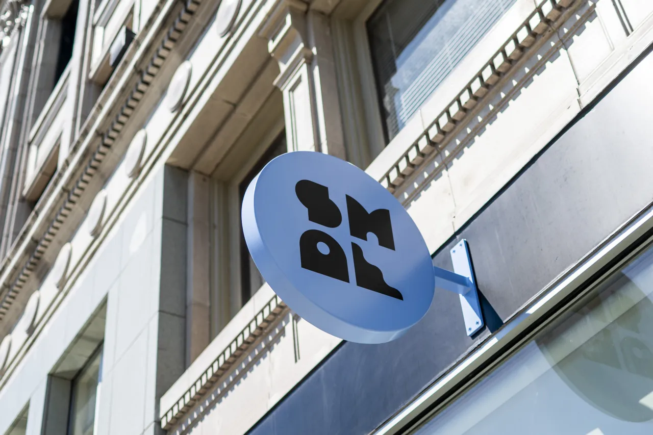
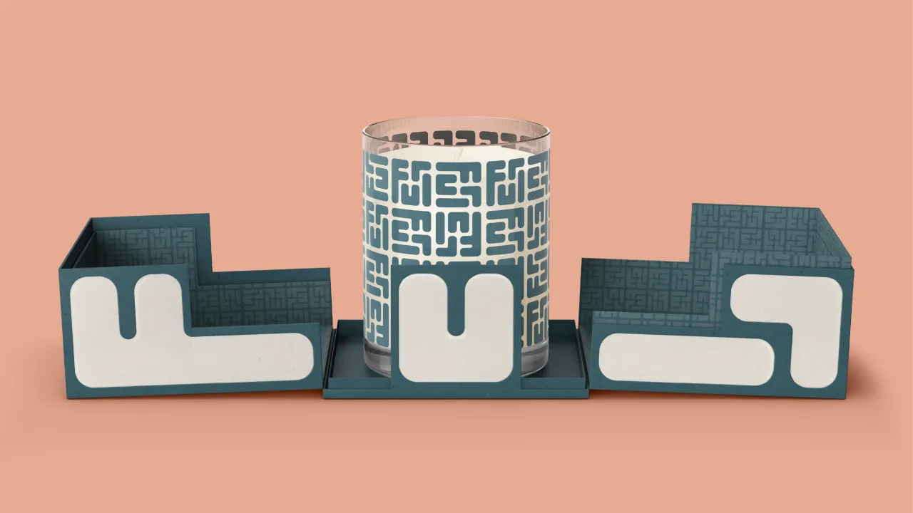
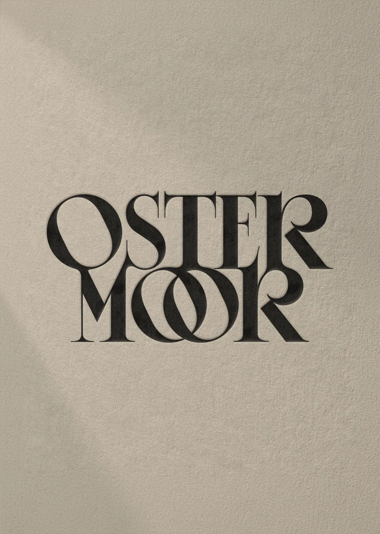
The wordmark is a classically refined and enchanting custom serif featuring interlocking Os and brimming with personality. The shapely letterforms are also abstracted and used throughout the visual identity, including in an assortment of graphics used across product packaging and beyond.
The monogram, similarly inspired by the ornate filigrees found in The Witchery of Sleep, is a fittingly sleepy flower. The brand colours include various earth tones, ranging from warm creams and pale greens to rich reds. Ornate frames and a classic drop cap punctuate the overall identity.
Verbal identity
Parker also created a verbal identity that balanced tradition and modernity. By updating original brand taglines, their team developed an engaging, charismatic, and charmingly self-assured voice.
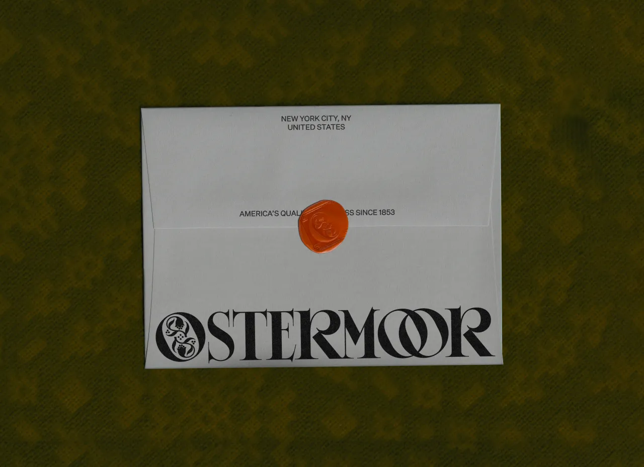
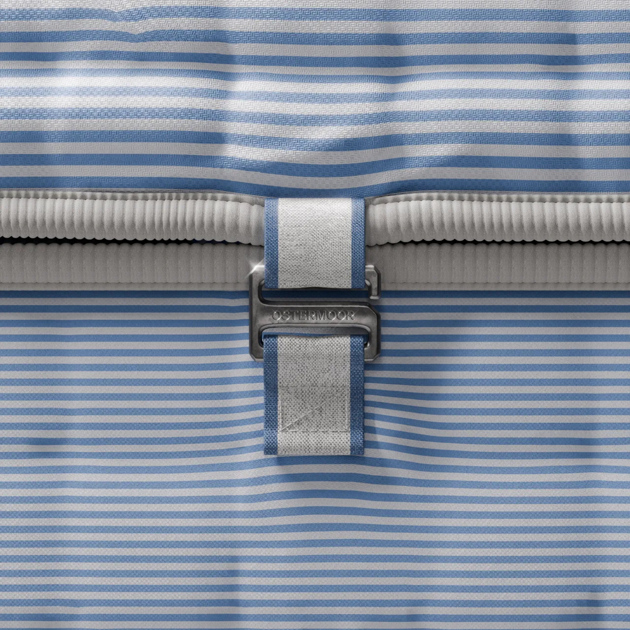
"It Must Be an Ostermoor," "For the Love of Good Sleep," and other brand messages powerfully encapsulate Ostermoor's promise of high-quality products and customer satisfaction—one that has helped the brand stand apart for more than a century.
"Modern customers demand brand worlds that authentically reflect their business values, with substantial visual depth and compelling storytelling," adds Tyler. "With Ostermoor, we've created a brand that has this in spades, leveraging a unique history that's perfectly positioned to engage those wary of the current homogeneous and uninspired DTC mattress market.
"We knew we could hit this nail on the head – and then some – and we're proud that we've been able to help introduce this venerable brand to a new audience."
Editor's Picks





Trending






Latest Jobs
Designer at New Genre
Full-time·London·£36k–£48k
Art Director at SPOKE
Full-time·London·£55k-65k
Design Director at Human After All
Full-time·London·£66k–£88k
Client Partner at Halo
Full-time·Bristol·£30k–£36k
Paid Media Executive at Munro Agency
Full-time·Glasgow·From £27,000
Agent & Producer at The Jacky Winter Group
Full-time·London·£35k–£40k