Fay uses 'chopped-and-screwed 3D data bars' to refresh startups' platform Harmonic
Brooklyn-based graphic design and creative technology studio Fay has an impressive client list, including the likes of MIT and Yale, which stood it in good stead when it came to rebranding startups platform Harmonic.
Harmonic is a platform that connects startups with the capital and resources they need to grow. It counts teams from Bloomberg, workspace app Notion, finance platform Brex and venture capital firm a16z among those it's worked with already. The Harmonic software works by indexing information about startups, acting as a database for venture capitalists, partners, investors and influential firms.
These platform users get instant alerts when target companies hit key industry milestones, such as raising a round of funding or appointing a chief technology officer. It also offers tools such as a Chrome extension that quickly reveals a company's funding history, team growth and more. Ultimately, Harmonic aims to make "information around the startup universe more transparent and equitable".
The new logo
The previous logo
Fay was brought in by Harmonic last year to help the platform transition into a new stage of growth, crafting a new identity that reflects the site's precision in its startups search experience.
The studio worked across Harmonic's strategy and positioning, identity, website design, social media, messaging and other collateral, creating an overall branding system that aimed to "usher the platform into a new stage of growth, beyond the realm of venture capital," says Fay.
The new branding reflects Harmonic's functionality and "constantly evolving and updated data sets"; and so is based on precision, dynamism, and a bold visual language that works seamlessly across static and motion applications.
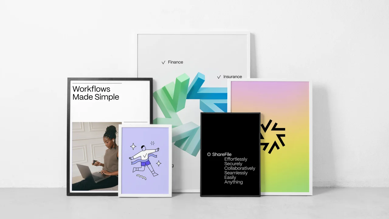
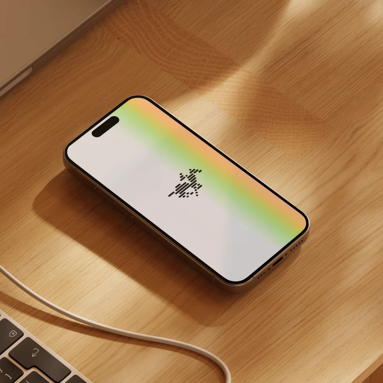
The new Harmonic icon is formed from three 3D bars of data, representing the company's three key product differentiators. The way the sides of these bars sides touch one another looks to reference Harmonic's interconnected data sets.
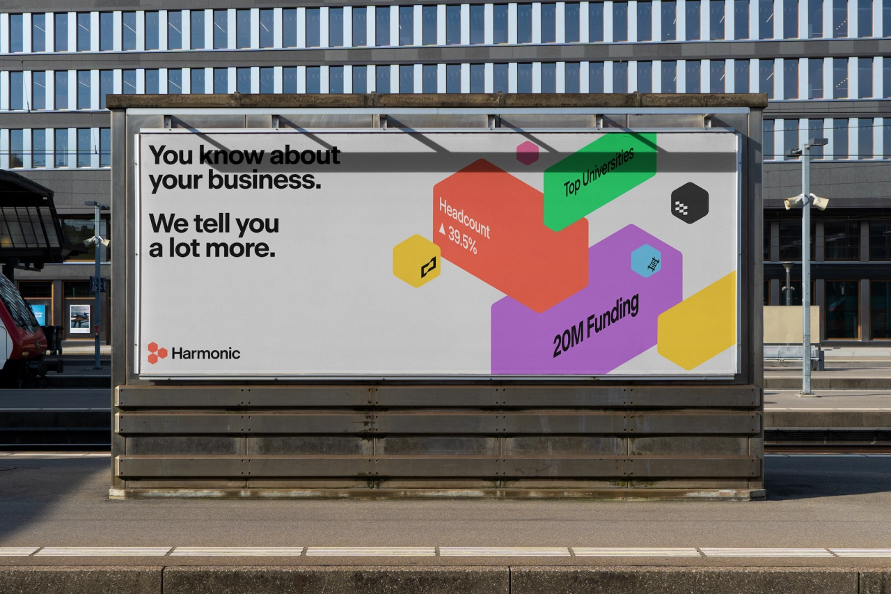
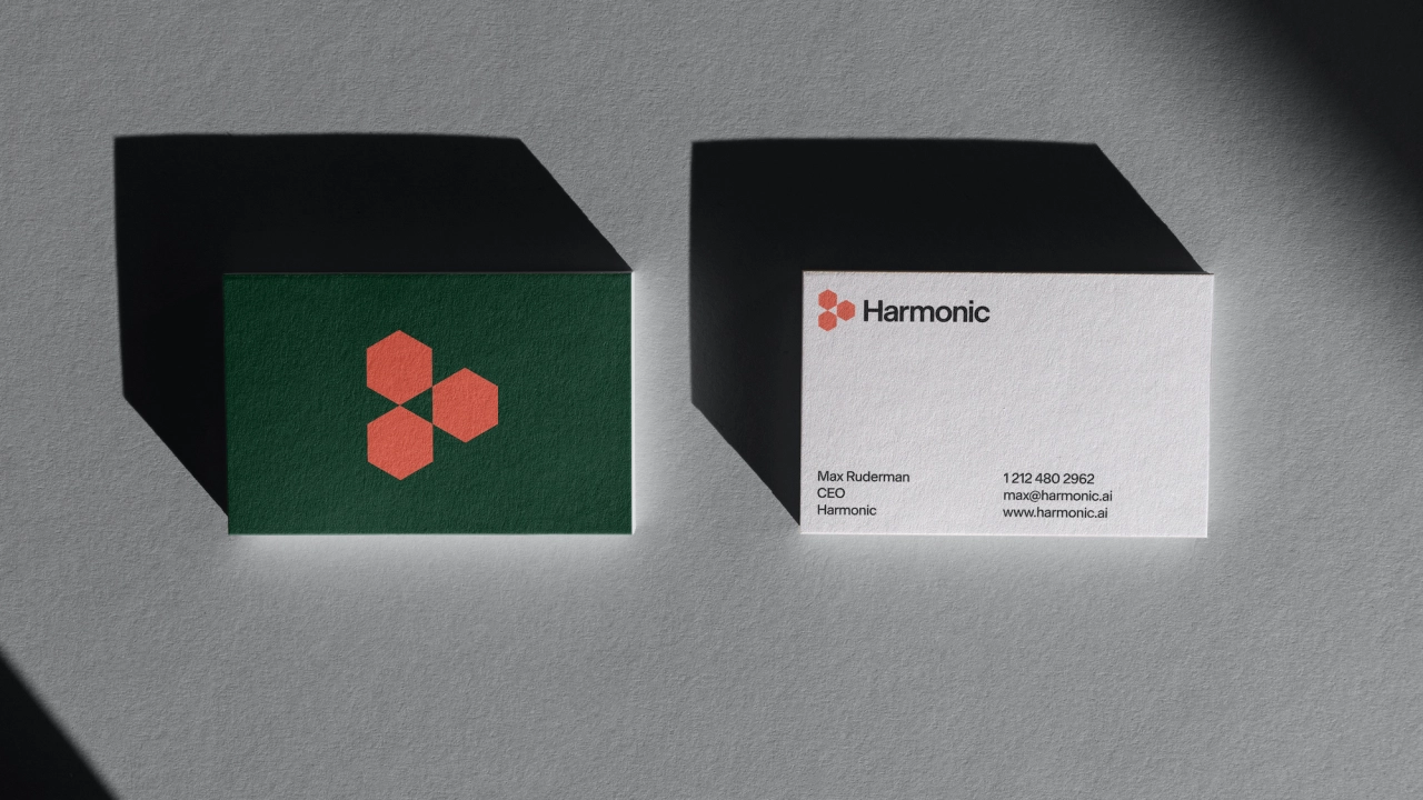
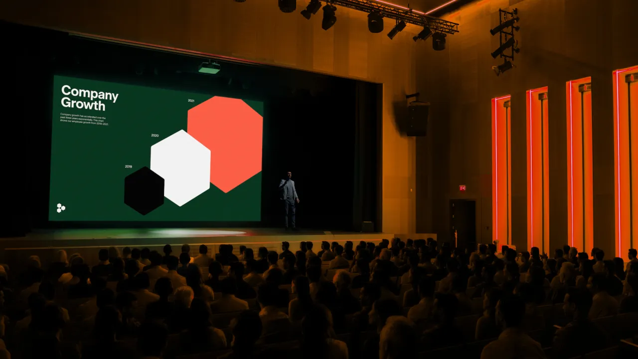
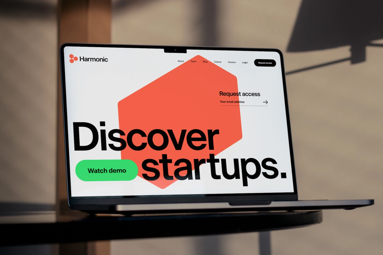
Fay chose to use Beausite Classic by digital type foundry Fatype as the core brand font. A geometric neo-grotesque font, Fay says it felt like "a perfect match for the startup sector".
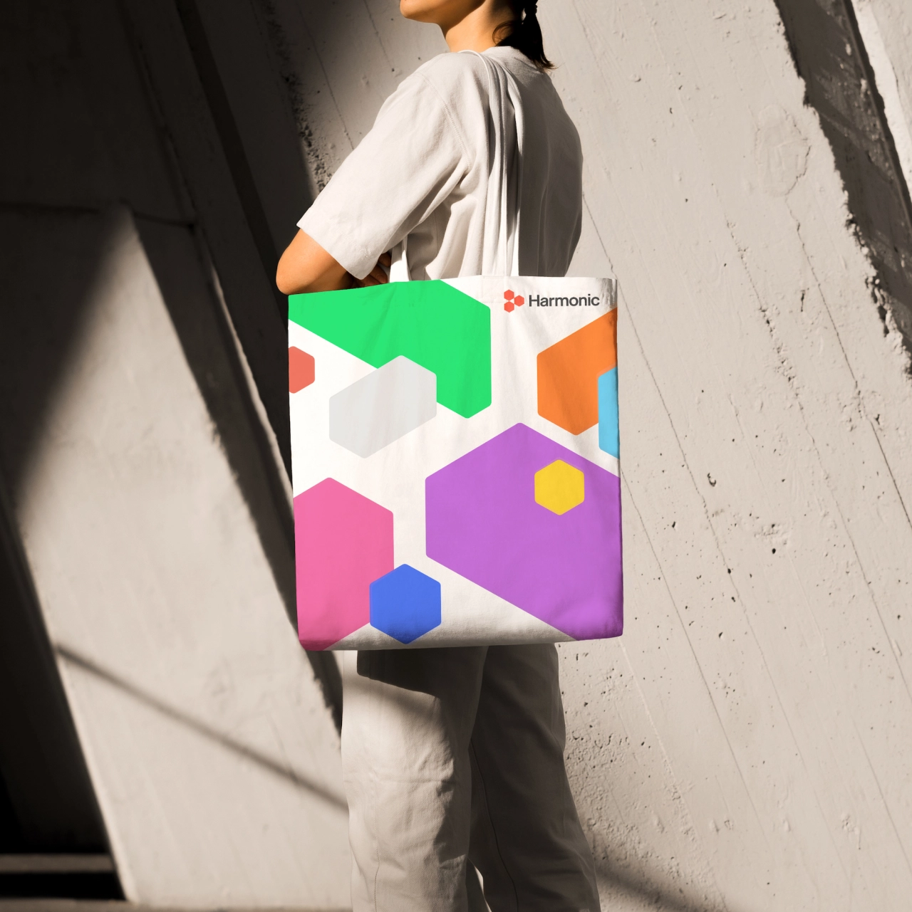
The new vibrant, neon brand colours were used to demonstrate Harmonic's "assertive manner" in the tech world. The Harmonic website redesign and motion graphics look to embody the product's "flexibility and depth," says Fay.
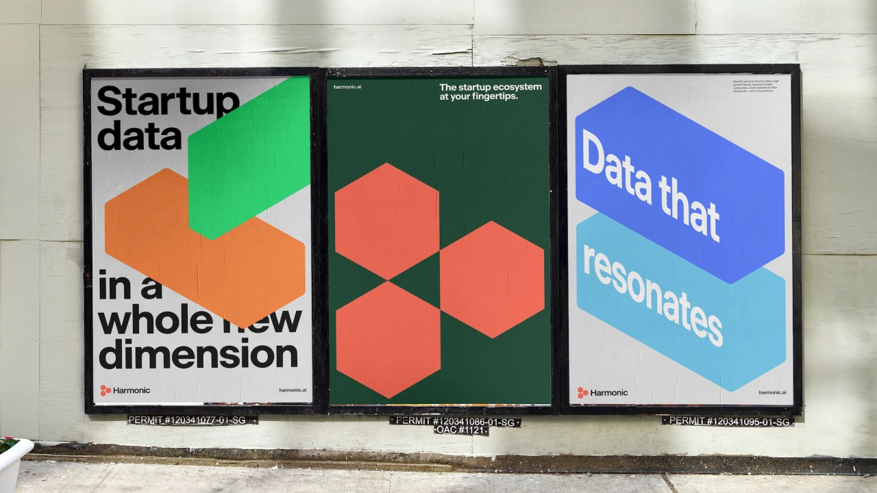
These often use "chopped-and-screwed 3D data bars" that draw from the Harmonic icon and look. The studio continues, "In a market driven by numbers/data-in-flux, the 3D data bars are designed to extend to a 3D infographic system."
Altogether, these brand elements forge a "multi-dimensional" visual language centred on a symbol that acts as "an armature for messaging," as Fay puts it. The graphic motif also acts as a layout strategy for Harmonics content across all touchpoints.
Editor's Picks





Trending






Latest Jobs
Midweight Designer at All Purpose
Full-time·London·£30k–38k
Account Manager at BUILDHOLLYWOOD
Full-time·London·£34k–£38k
Growth Strategist (Ecommerce) at Tribe
Full-time·Exeter / London·£50k + Bonuses
Principal Software Engineer at BBC Media Tech
Full-time·Glasgow·Up to £83,790
Graphic Designer at Crux Product Design
Full-time·Bristol·Up to £36k
Design Lead at Madeo
Full-time·New York City·$85k–$120k