12 great typefaces created by graphic design students
When it comes to typefaces, every graphic designer struggles with choosing the right one for their projects. But if you can't find the typography you need, how do you complete your vision? For many, the solution is to create a unique set of fonts, something that no one has dreamed up before.
Image courtesy of Shillington. All other images courtesy of Shillington and its students.
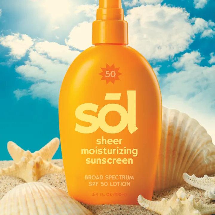
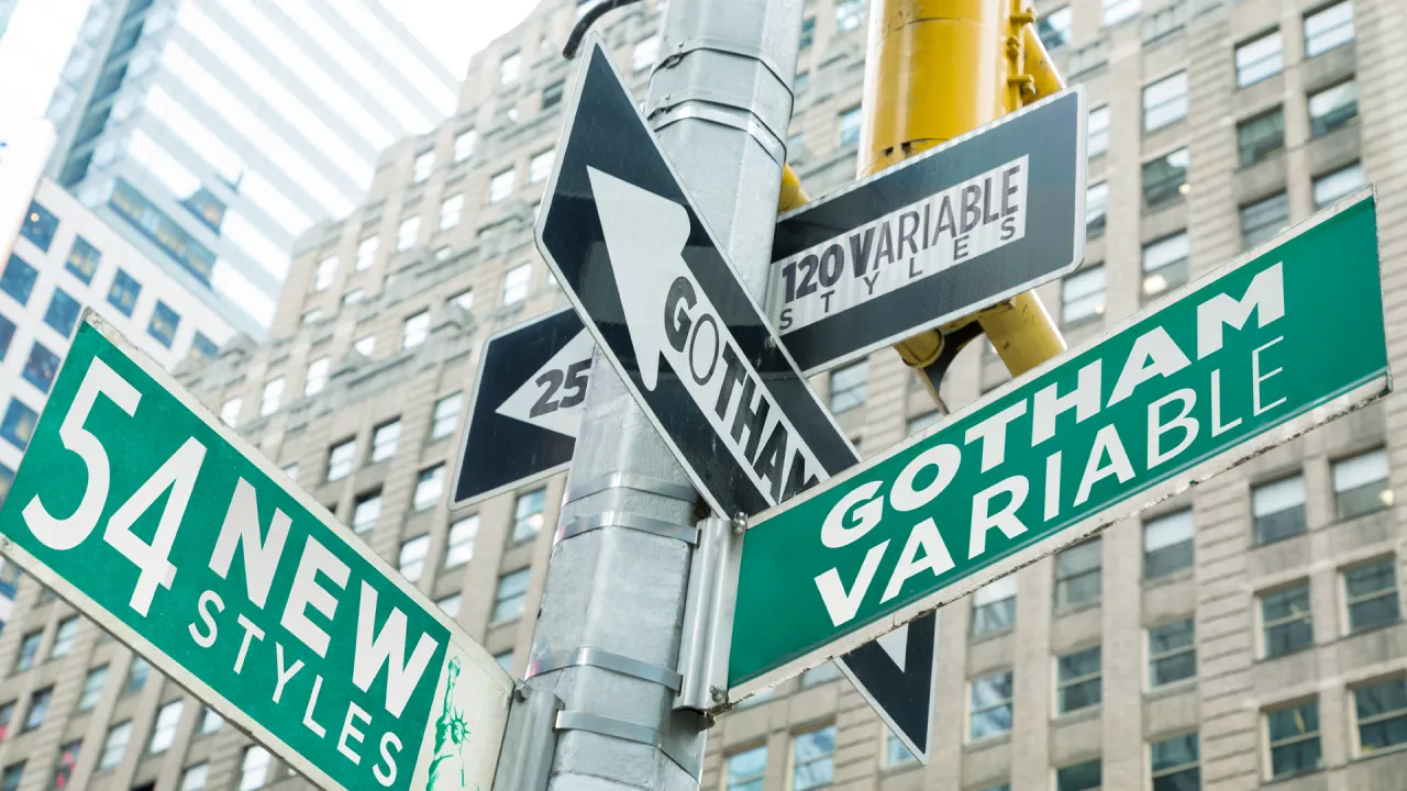
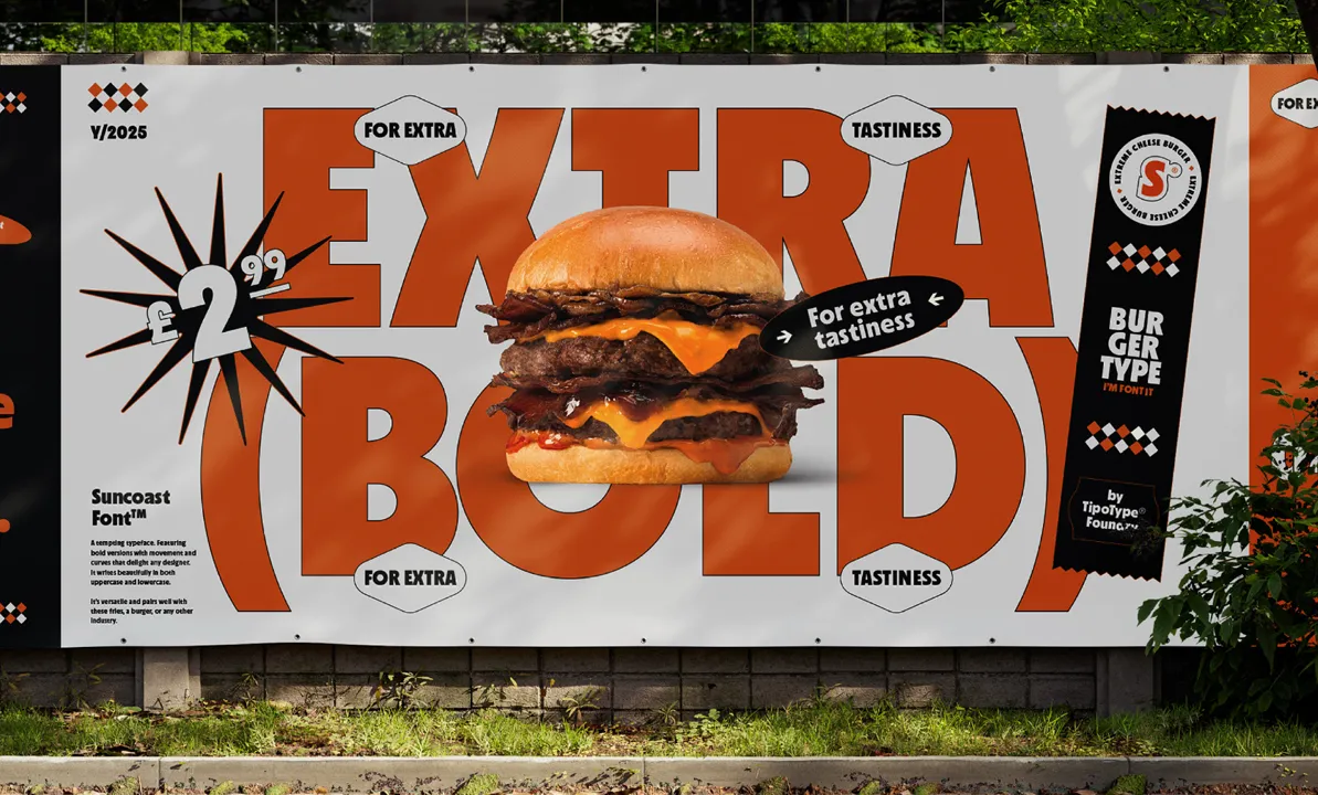
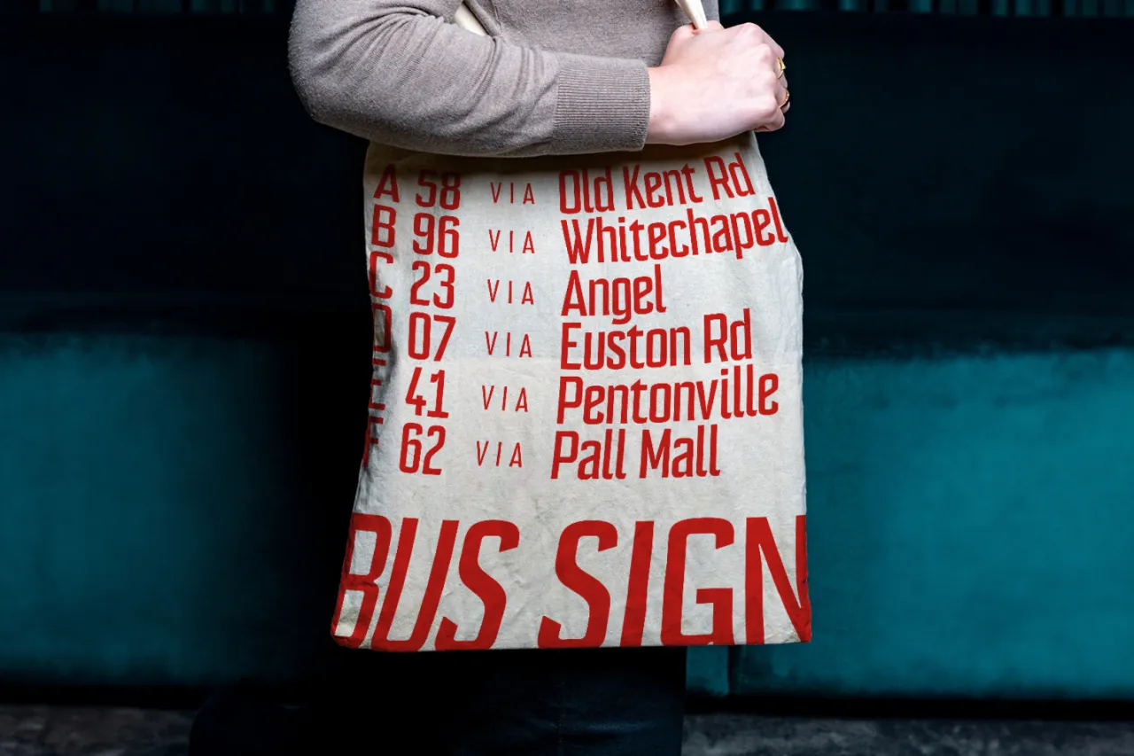
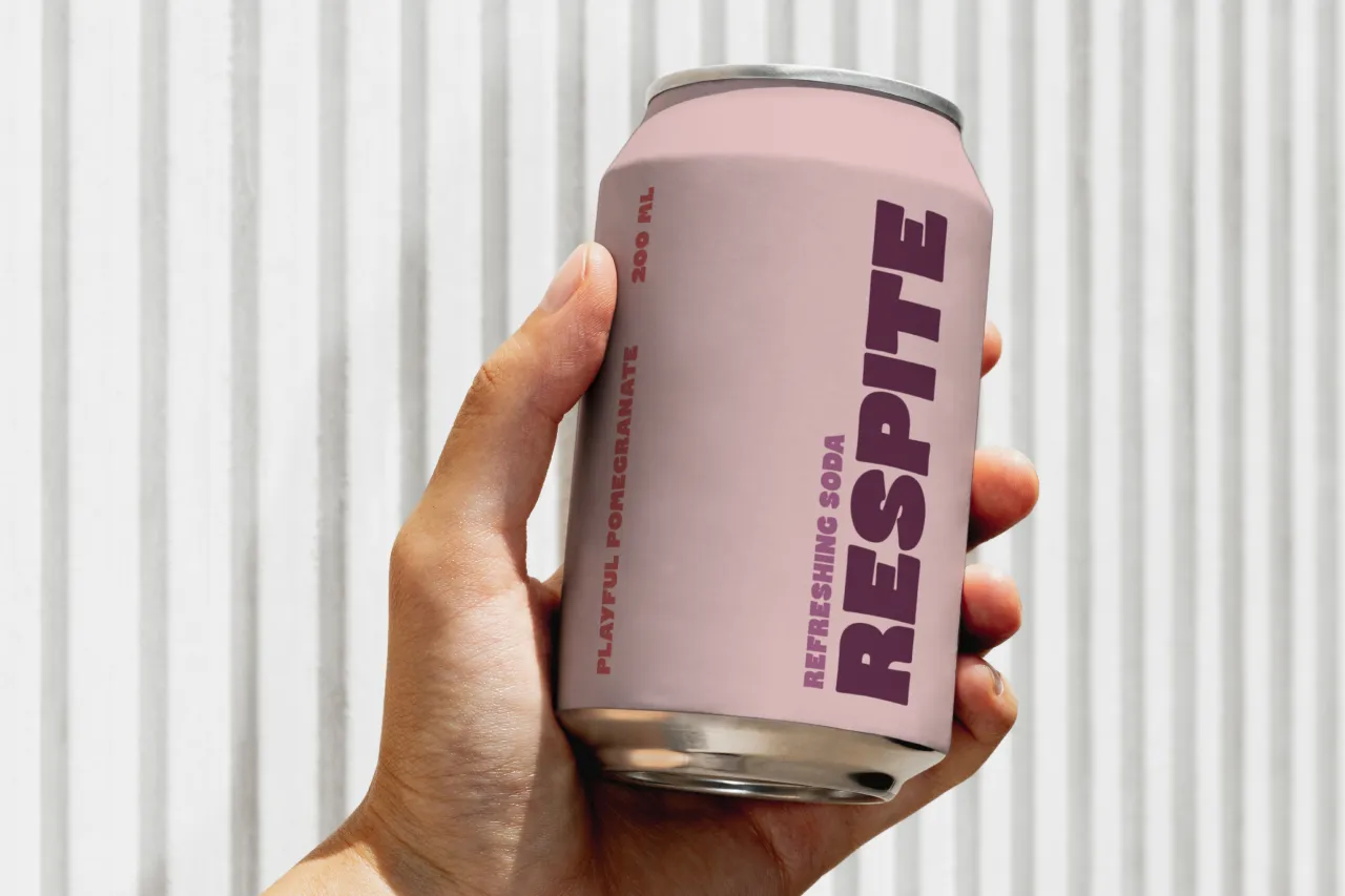
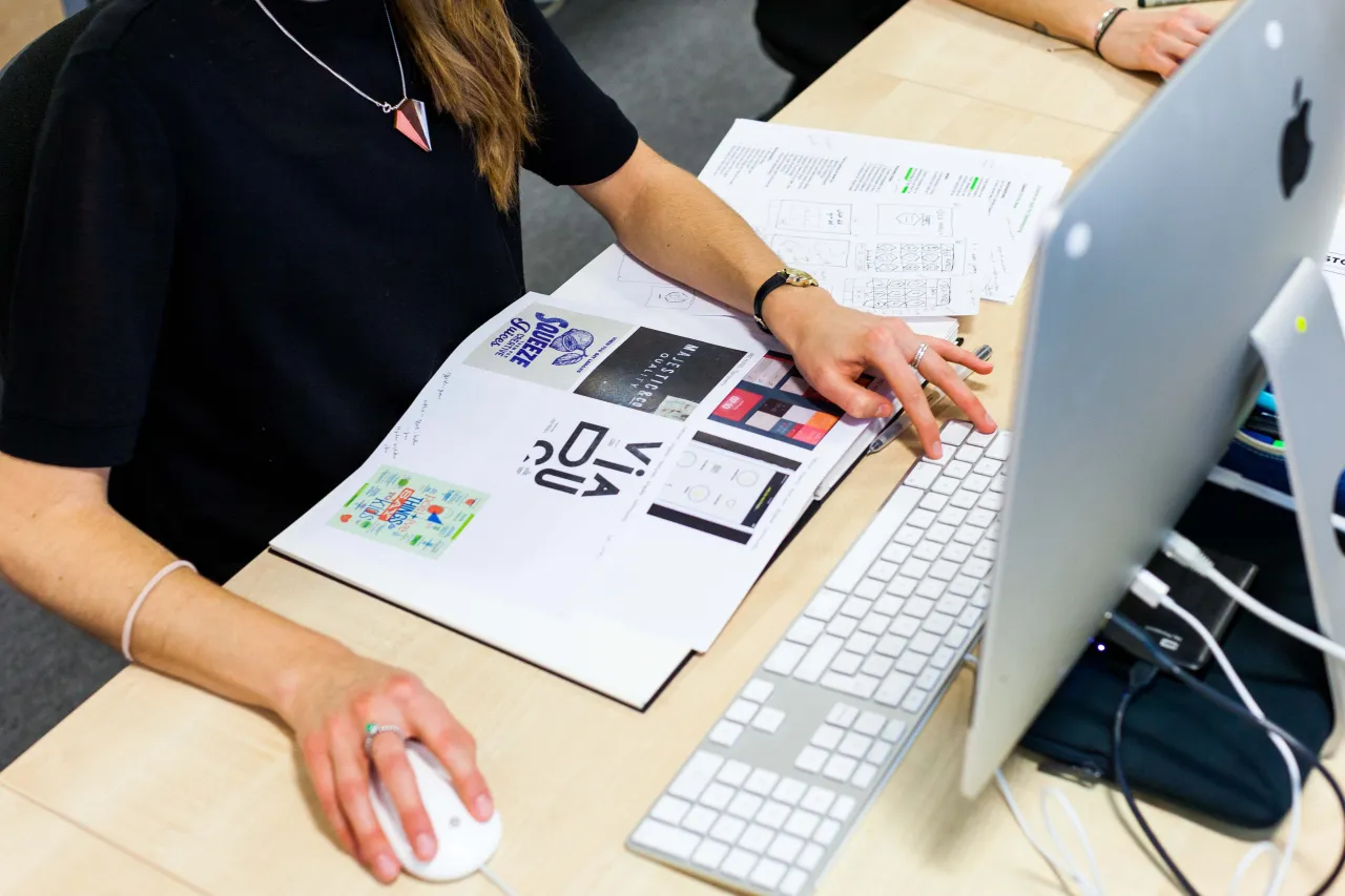
This is what we regularly challenge our students with at Shillington. We set them the task of crafting one or more fonts, taking into account weights, styles, condensations, widths, slants and everything they might need to create a bespoke typeface that fits a specific brief. For a little inspiration, we've sifted through a wealth of recent work to bring you 12 great typefaces created by our graphic design students. See what you think.
1. Miguel Lugtu
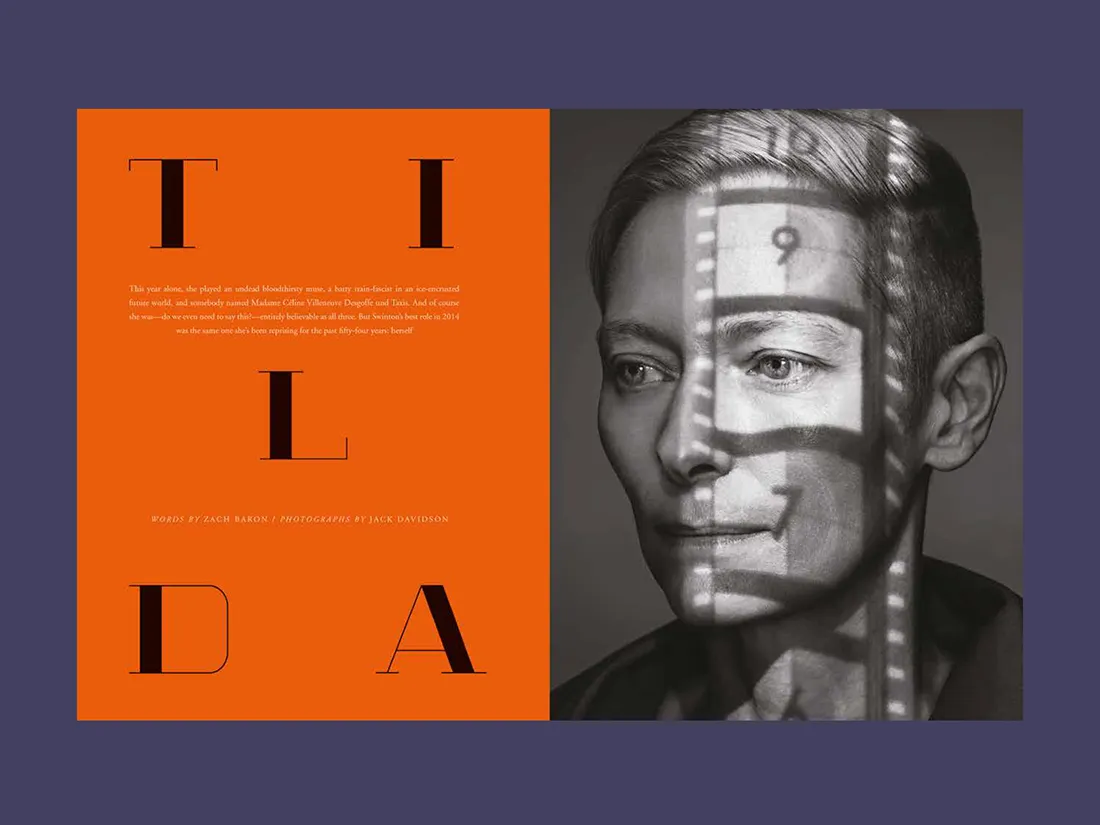
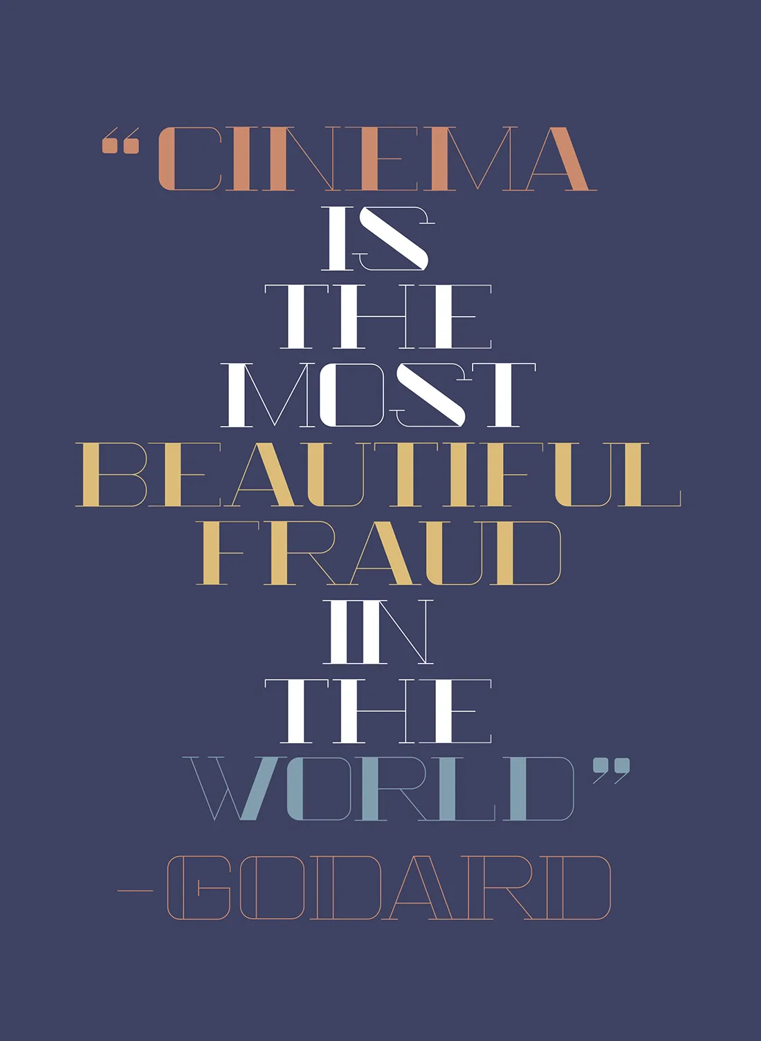
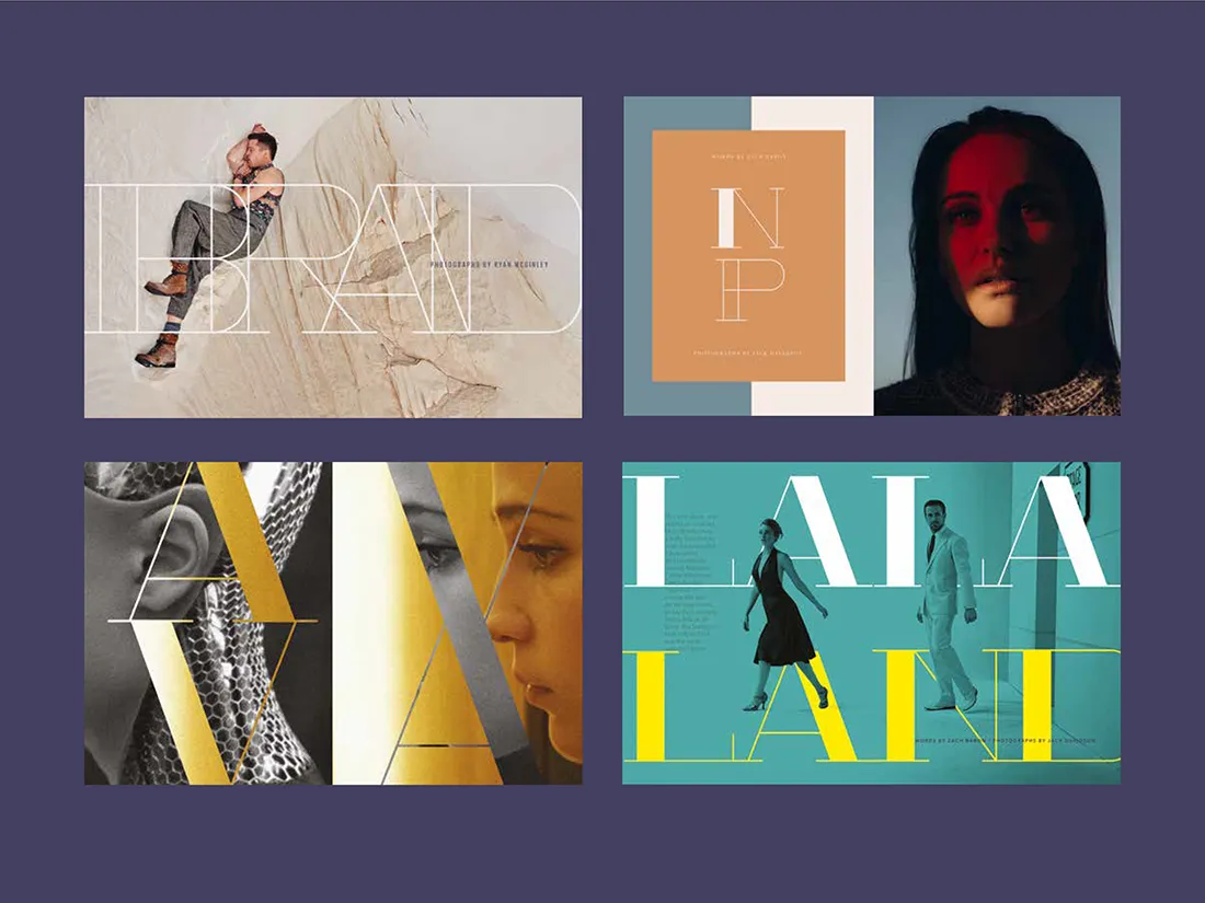
When faced with the challenge to design his own display typeface based on a specific era, Miguel Lugtu chose Art Deco and created Cinema – a vintage styled typeface with contrasting thin and thick lines. He was apparently inspired by the movie La La Land and themes of Old Hollywood, and was so successful he became a finalist in the AGDA Student Awards in 2017.
2. Tom Noon
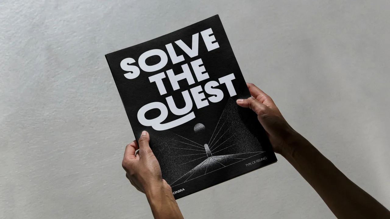
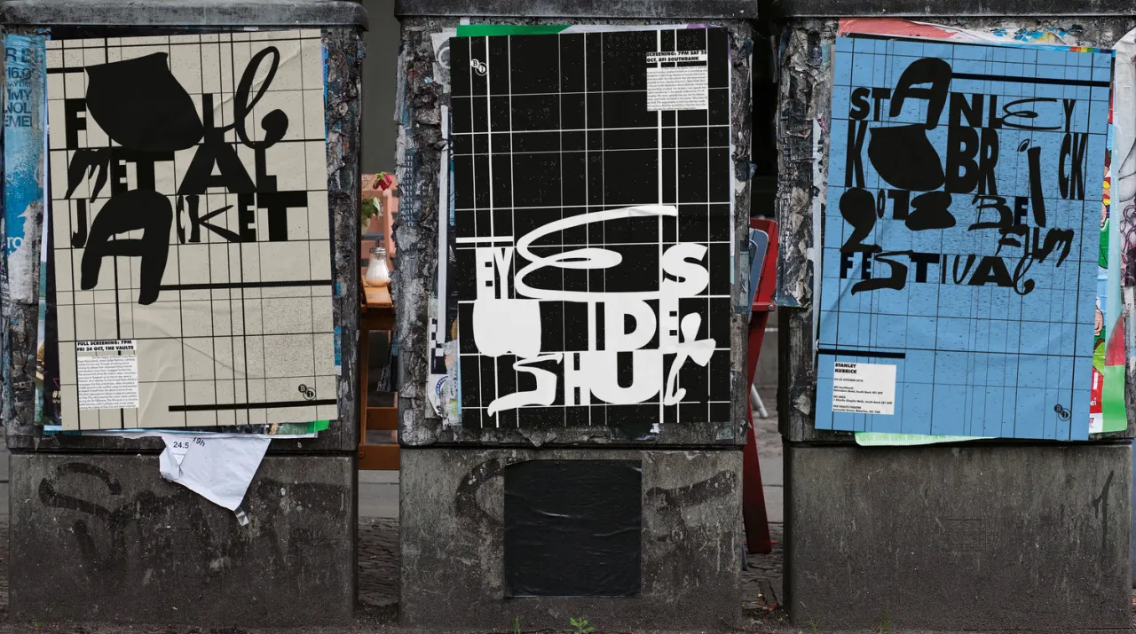
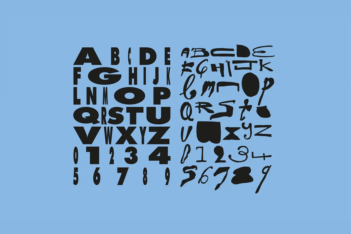
For the BFI Film Festival, designer Tom Noon created a fictional brochure focusing on the work of Stanley Kubrick. For such a great theme, Tom had to design his own typeface, taking inspiration from the iconic film director's back-catalogue, ranging from gloriously unpredictable SciFi to all-out, chaotic horror.
3. Marcus Parrott
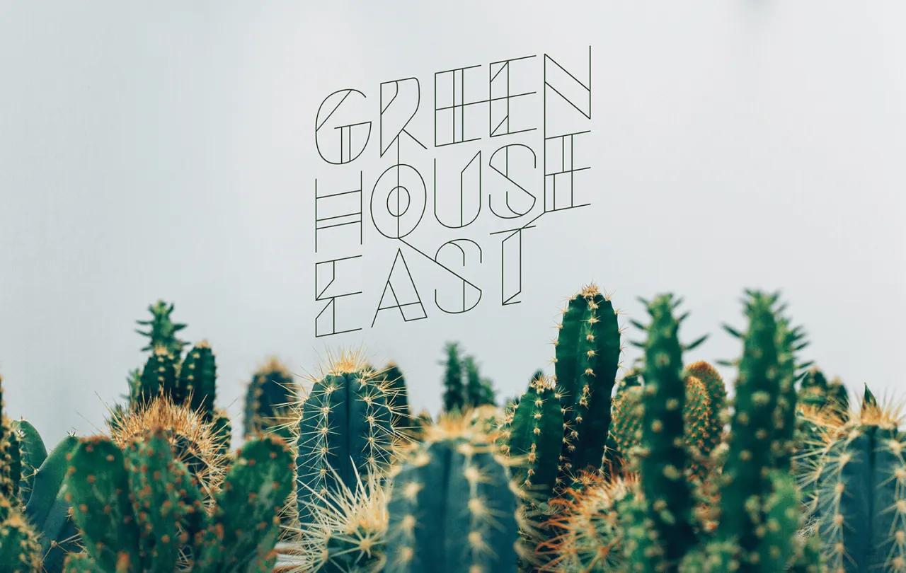
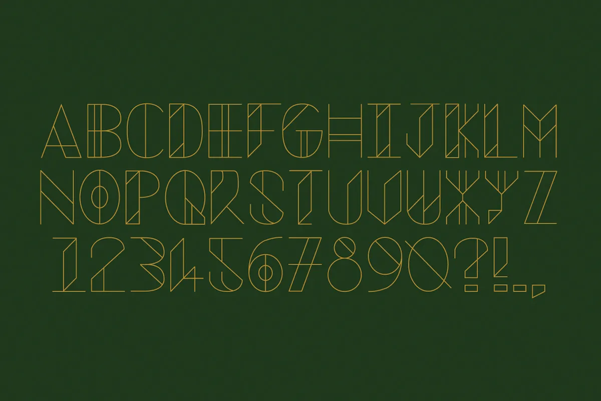
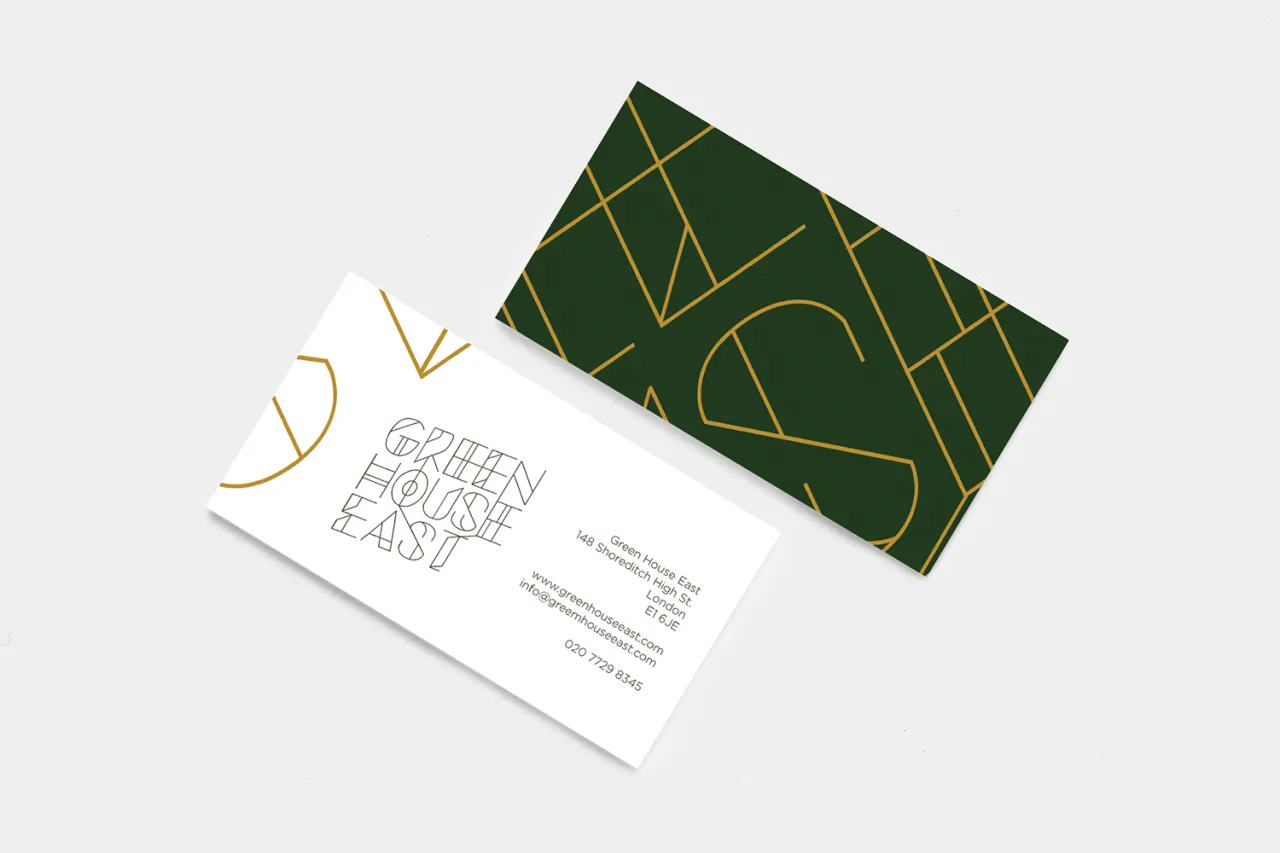
Marcus Parrott created an identity for a small, independent garden centre in East London. Part of the brand exercise involved designing a bespoke typeface, no doubt inspired by prickly cacti. The sharp lines and extra details perfectly suited the subject.
4. Andy Jacobs
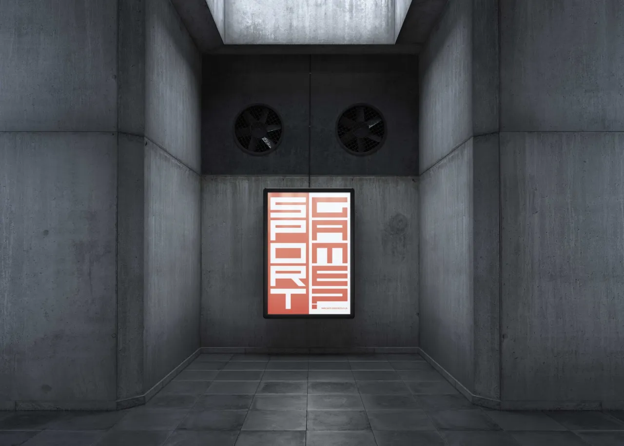
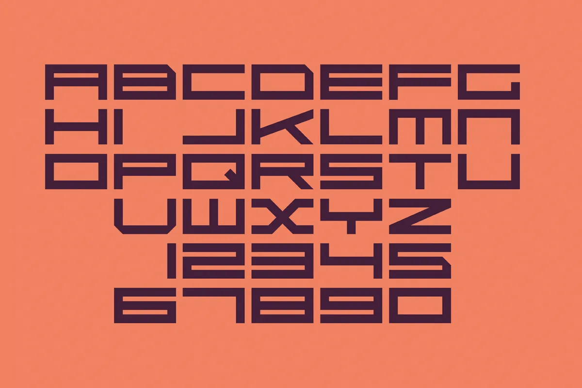
The student brief for Andy Jacobs was to come up with a poster campaign to publicise a darts-based sporting event at the Olympic Park in Stratford, London. Andy came up with an identity and fresh typeface that mimicked the speed and point system of the game.
5. Tom Holding
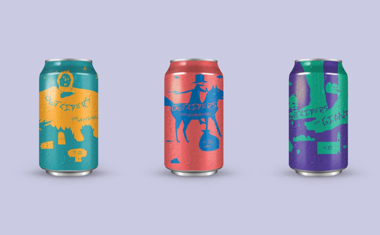
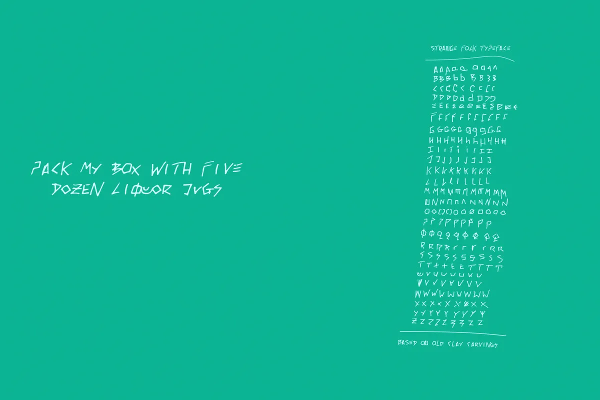
"People don't want different. We are the Outciders," reads the rather quirky strapline for an oddball cider brewery based in Devon.
It's a fictional brand by Tom Holding who decided to come up with a visual identity for the drinks firm, along with a bespoke typography. "Outciders make a variety of flavourful ciders inspired by folklore and legend," explains Tom. This is probably why his unique typeface is wild and hand-drawn.
6. Biz Weegberg
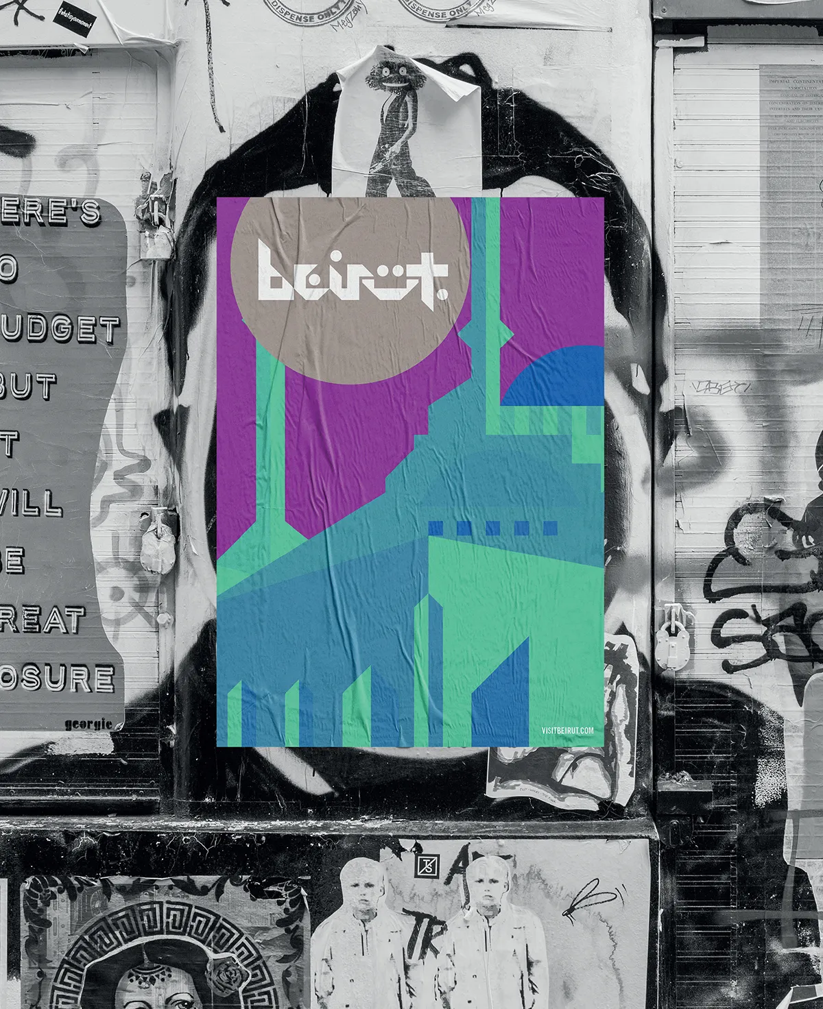
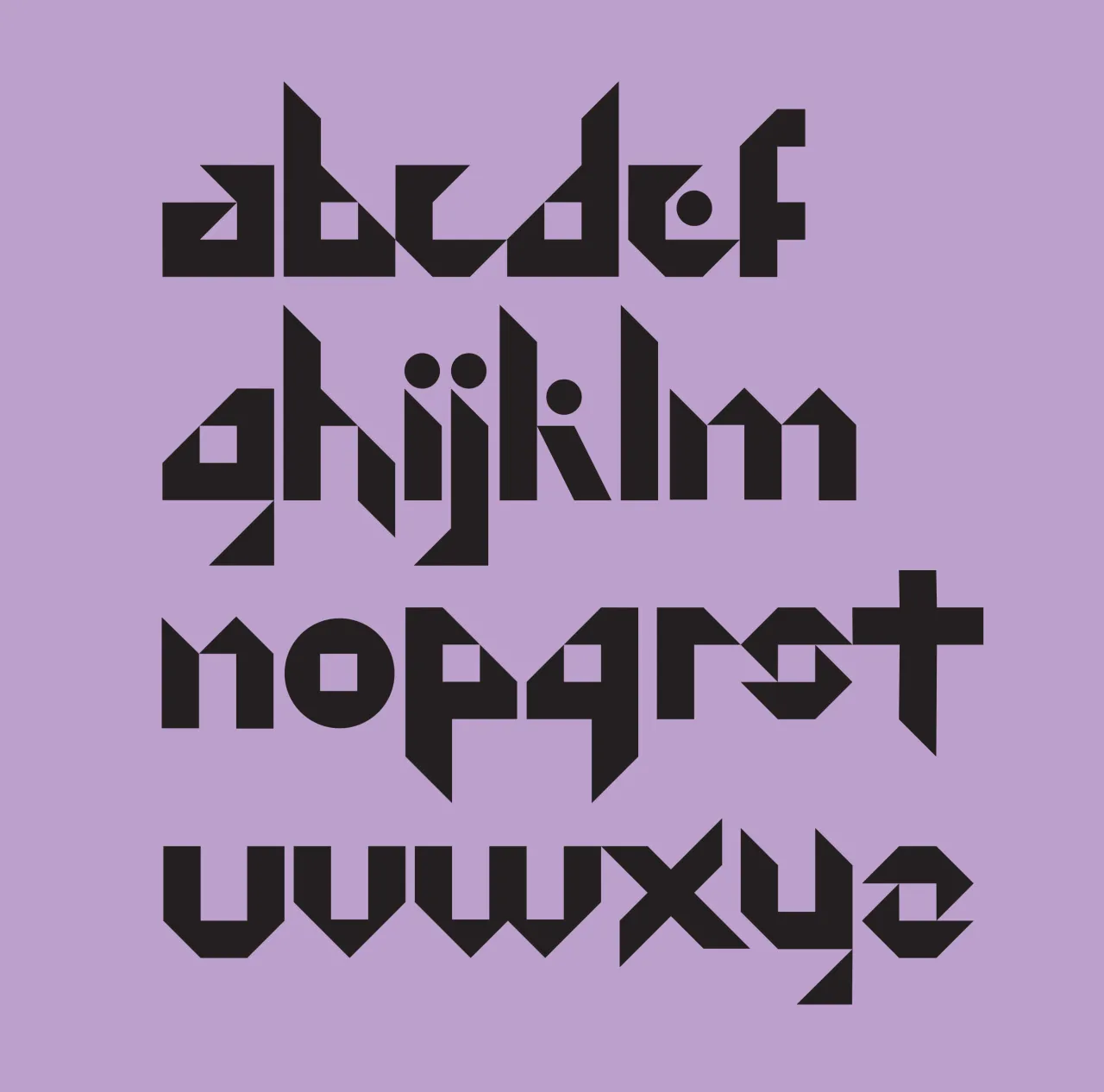
Biz Weegberg is all about colourful words. Which is why we're happy to show you the clever typeface she crafted for her fictional identity system on Beirut. Reflecting the language, religion and cultural aspects of Lebanon's capital city, the typeface fits together in a modular system.
7. Daniel Kan
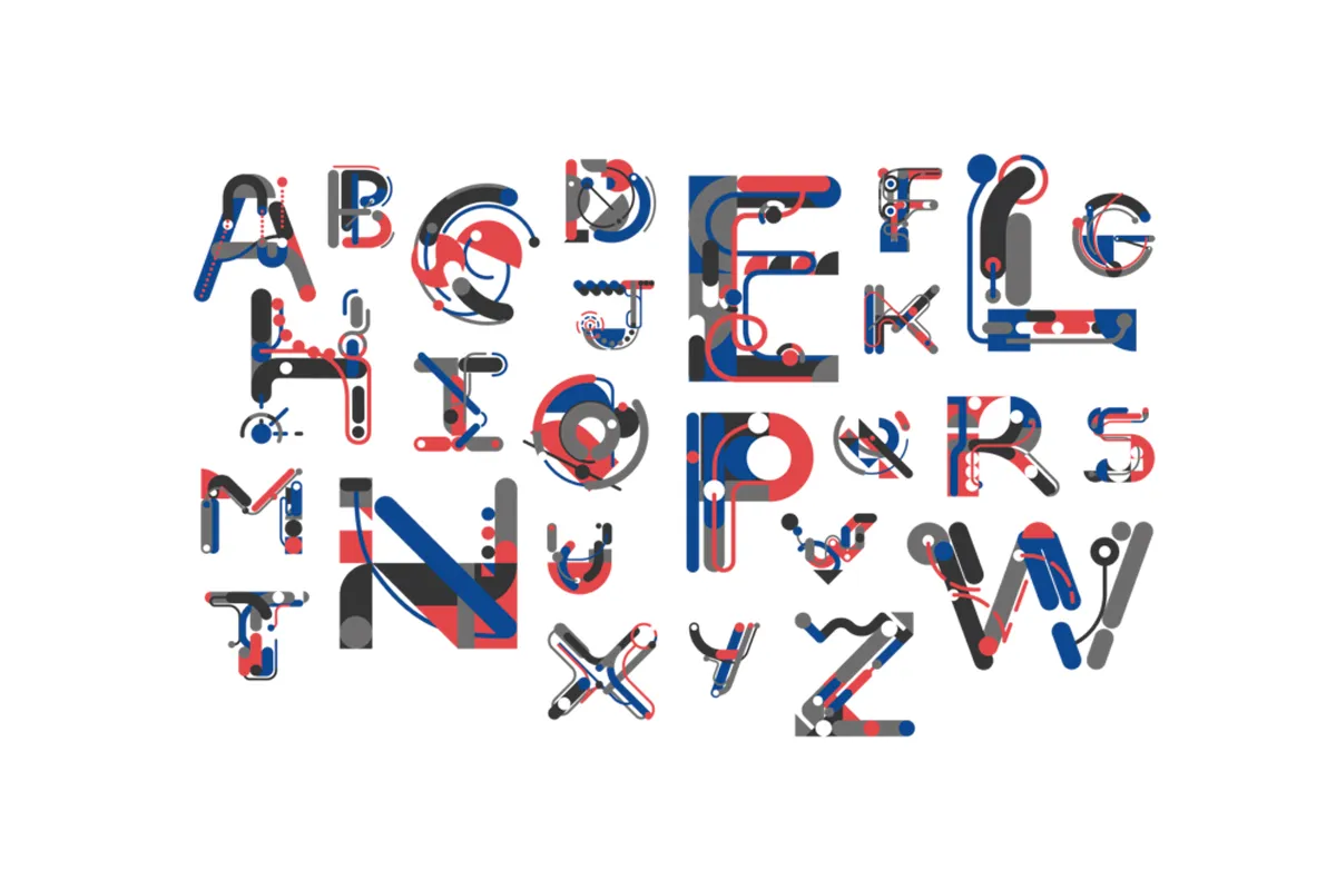
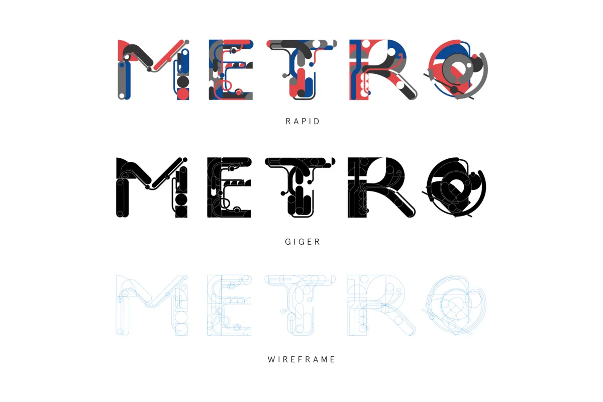
Jump aboard the Metro typeface by Daniel Kan. Designed to be optimistic, nostalgic and dynamic, it's an interesting arrangement of fonts, taking full inspiration from the underground lines and tracks that serve some of the world's busiest cities every day.
8. Georgina Keenan
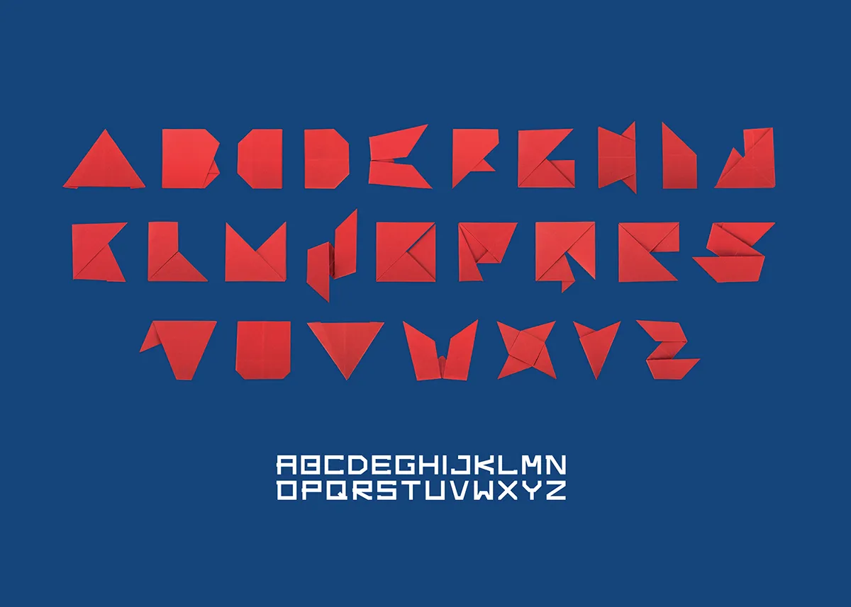
There's a lot of talent behind Georgina Keenan's Handmade typeface. Created for a poster for her chosen movie, Kubo and the Two Strings, the alphabet was entirely made from original origami to mimic the animated film's use of folded paper. Beautiful work.
9. Inigo Ropner
This beautiful custom typeface by Inigo Ropner is based on a classic gothic script style, brought to life from his sketchpad. We love the traditional angles and slants, harking back to a time when lettering really was a work of art.
10. Mark Osmond
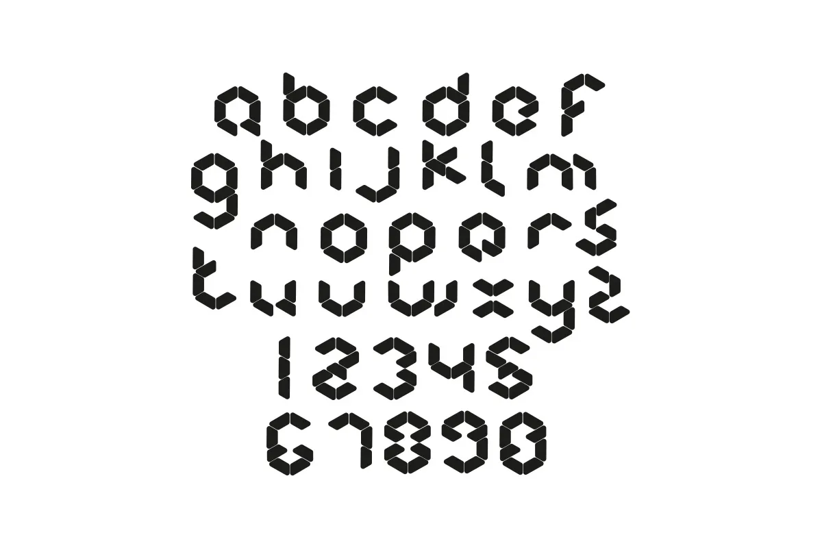
For Mark Osmond's latest work, he crafted a HUB typeface for a fictional app designed to encourage tenants to pool online food purchases. The type consists of hexagonal elements that refer to the shape's tessellation properties and elements coming together.
11. Ray Wong
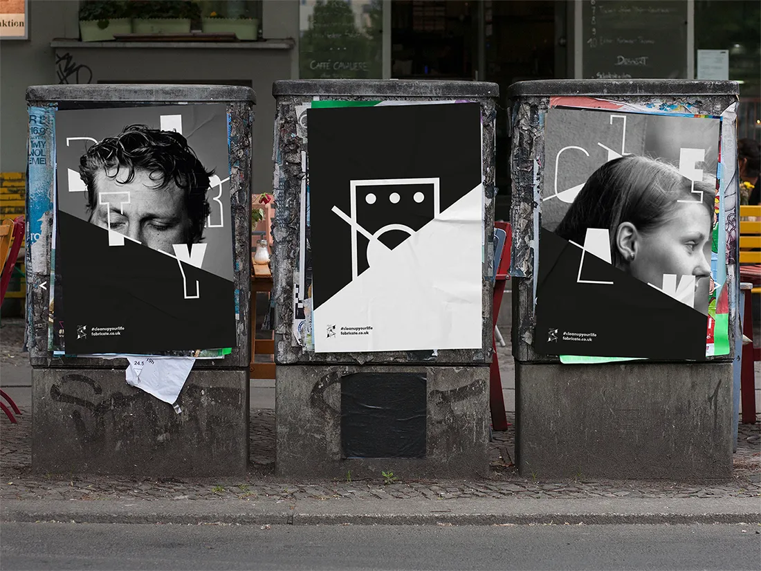
We're getting into a spin about Fabricate, a brand identity designed by Ray Wong for a pretend laundrette and art cafe in East London. The contemporary vibe hopes to inspire a young and trendy audience, and features a beautifully modern typeface with satisfying black and white shapes and lines.
12. Martina Schenker
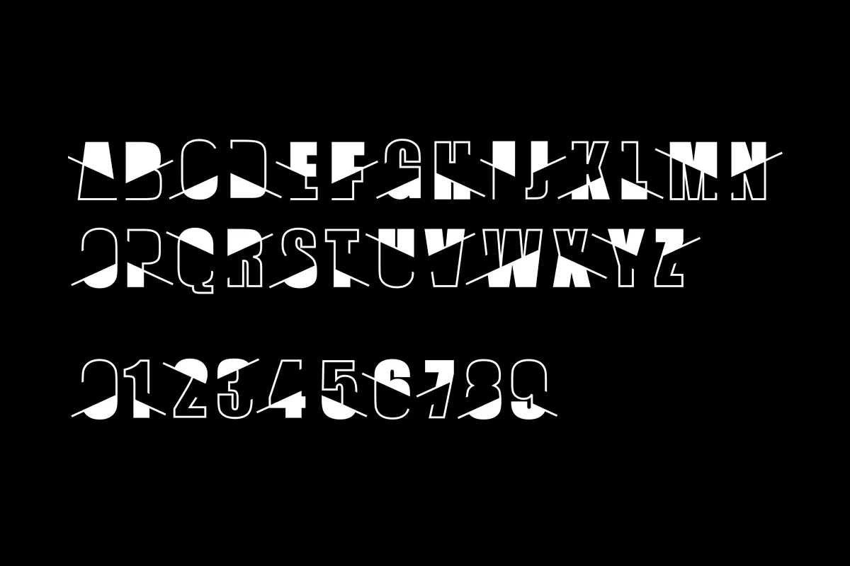
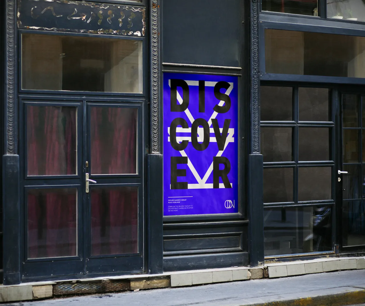
For Martina Schenker's recent student brief, she decided to craft an identity for Camden, taking big cues from the area's rich cultural heritage. As part of the branding exercise, she had to create a bespoke typeface that then rolled out to a poster series, app and student flags. Bold, confident and clear, it's a typeface that certainly gets attention.
Editor's Picks





Trending






Latest Jobs
Mid-Senior Designer at Something Familiar
Full-time·Bristol·£32k–£40k
Brand Strategist at DNCO
Full-time·London·£45k-£60k
Talent Agent & Producer at The Jacky Winter Group
Full-time·Los Angeles·$70k-$85k
Senior Operations Manager at BIG Partnership
Full-time·Glasgow·£45k–£50k
Art Director at SPOKE
Full-time·London·£55k-65k
Creative Project Manager at Analogue
Full-time·Leeds·£28k–£35k