Top 20 fonts that will be popular with designers in 2019
Choosing the right font is often one of the most important parts of the design process. A thoughtfully chosen typeface can be the foundation stone that makes a design come together, and give it that cool, contemporary look and feel, while still maintaining clarity and readability.
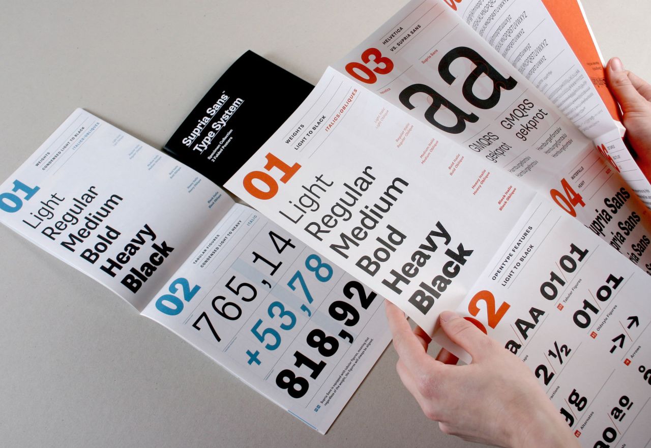
Supria Sans by Hannes von Döhren
In this article, we look at 20 typefaces that are exciting creatives right now, from our students at Shillington to the wider creative industries, and which look likely to make a big impact in 2019. Some are brand new, others established classics, but all of them have the potential to make your design truly sing.
1. Euclid
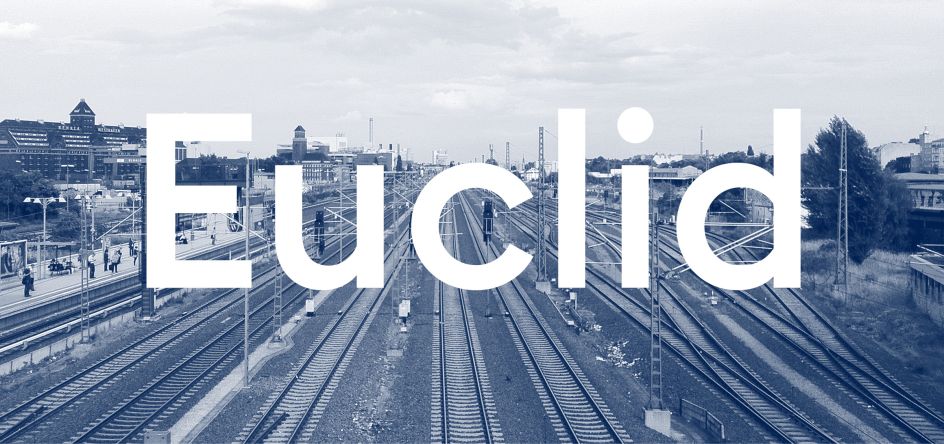
Designed by the Swiss Typefaces Design Team and sold purely through their own website, Euclid is billed as the ‘ultimate geometric’. Constructed from elementary shapes and monolinear lines, it’s a rigorously functional typeface that’s extremely minimalist, but at the same time, quite astonishingly beautiful.
2. Brandon Grotesque
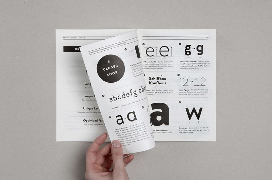
Looking for a geometric sans-serif that’s a little less austere than Euclid? Designed by Hannes von Döhren and inspired by hand-lettered advertisements of the 1920s and 1930s, Brandon Grotesque has a real sense of a warmth and humanity to it. Yet at the same time, it's optically corrected, geometric forms (seen for example in the acutely sharp angles of the "A", "V", "W" and "Z") offer a very high degree of clarity and legibility.
3. GT Haptik
 created a legend around a mythical creature called Mohm, featuring GT Haptik.](https://www.creativeboom.com/upload/articles/8d/8d8bdcb974a8d235b1f41bf23545d970e5c0f5a6_944.jpg)
For the identity of Typojanchi 2017, a typographic Biennale, Ordinary People created a legend around a mythical creature called Mohm, featuring GT Haptik.
GT Haptik is a monolinear geometric grotesque typeface designed by Reto Moser and Tobias Rechsteiner with an intriguing twist: its uppercase letters and numbers are designed to be read blindfolded, just by touching them (ie, haptic). It’s available in seven weights and 21 styles, and included with each style are alternate characters, as well as proportional and tabular figures.
4. Tiempos
](https://www.creativeboom.com/upload/articles/38/3836c474336ddc2ea670e22d3773e6a19156c88e_944.png)
Designed by Oak
Beginning life as an optimisation of Galaxie Copernicus for a Spanish newspaper redesign, Tiempos eventually evolved into a standalone family in its own right. Tiempos Text is perfect for body copy, with its shorter cap-height, ascenders and descenders allowing for tighter line spacing without sacrificing legibility. Tiempos Headline allows a great deal of flexibility, to prevent text looking too ungainly at large sizes, while Tiempos Fine, which was designed specifically for National Geographic, offers a refined and elegant cut of Tiempos Headline for extra crispness.
5. Konop
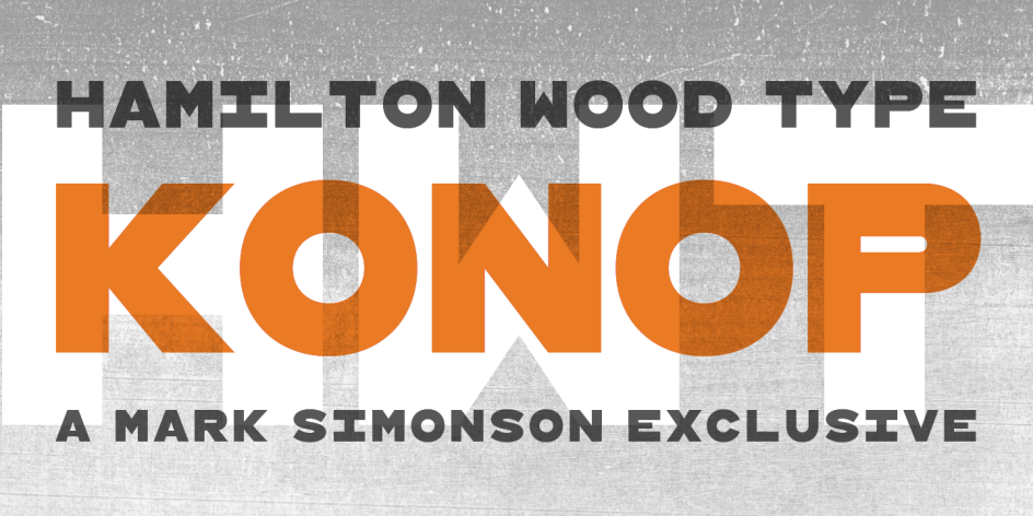
Here’s something you don’t see every day: a monospaced (fixed-width) gothic typeface that’s completely square. Designed by Mark Simonson, its style is reminiscent of gothic wood types but more geometric. This makes for charmingly different characters that align perfectly, even when used at different sizes.
6. Colfax
](https://www.creativeboom.com/upload/articles/86/8661608a655c360410d181bcde0d22173d9f8a9f_944.jpeg)
You Are But You Are Not by Kolar Aparna and artist Beatrice Catanzaro. Curated and produced by Lungomare. Source: non-linear.com
A sans-serif family from Process Type Foundry based on the concept of ‘implied geometry’, Colfax’s letterforms feature circles that are nearly but not quite perfect. Named after a street in designer Eric Olson’s hometown of Minneapolis, this is a workmanlike typeface that’s stylish but in a quite down-to-earth and unpretentious way.
7. Alright Sans
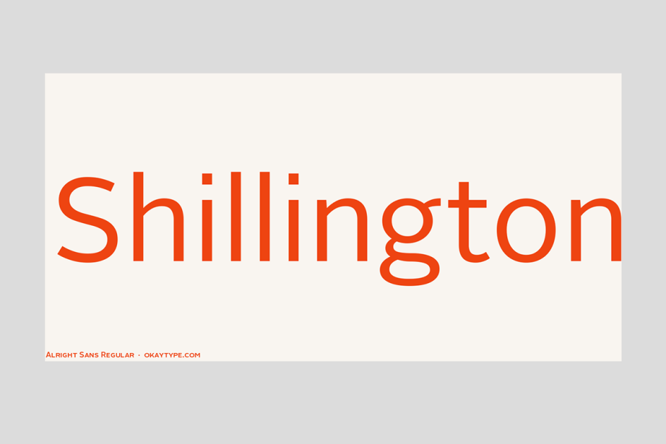
As the colloquial name suggests, Alright Sans is another unpretentious, modern sans-serif that strikes an enticing balance between austere-serious and warm-friendly. With its open structure, shorter-than-normal capitals and large x-height, this versatile font works very well across all kinds of media, in both large and small sizes.
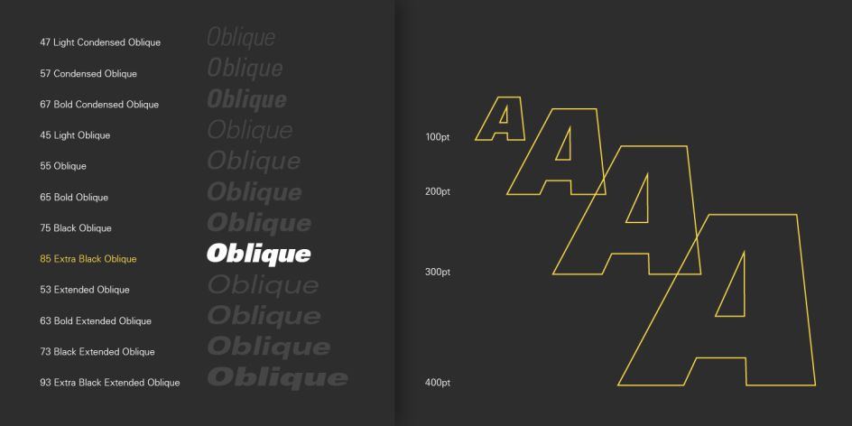
8. Supria Sans
Another stylish font from Hannes von Döhren, Supria Sans takes the utilitarian clarity of Swiss-type design and gives it the subtle curves and fine detailing it needs to feel playful and fun. As well as the upright version, the family also contains a calligraphic italic style and a more reduced oblique style for each weight.
9. Burgess
While Times New Roman was widely believed to have been drawn for the British newspaper The Times in 1931 by Victor Lardent and Stanley Morison, some type historians believe it was based on an earlier work by the American industrial designer William Starling Burgess. To celebrate their fifth anniversary, Colophon Foundry recreated Burgess’s typeface, based on mid-century Photostat cuts of Times New Roman Bold and Bold Italic, and distributed it digitally in Open-Type (.OTF) format. This transitional serif typeface is available in two weights, regular and bold, each with matching italics.
10. Adelle
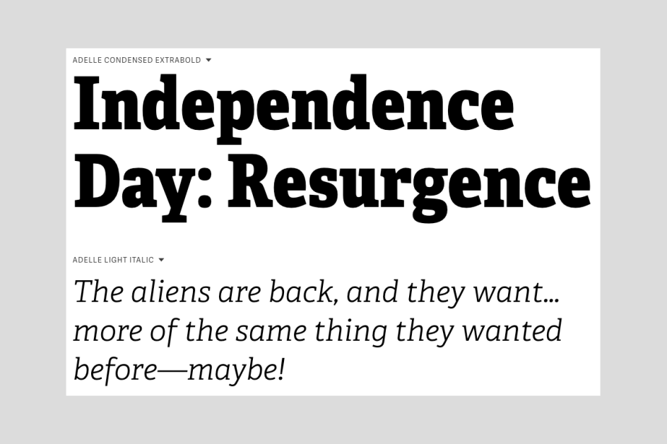
Adelle is a slab serif created for intensive editorial use, although it’s flexible enough to be considered truly multipurpose, especially on the web. Most significantly, its unobtrusive appearance and darker colour allow it to work well in continuous text, even within unforgiving environments.
11. Mabry
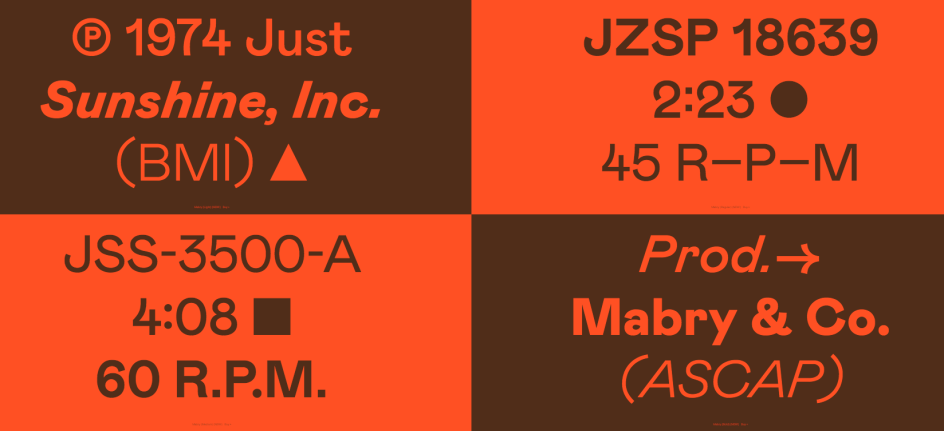
Based on a typeface originally commissioned for LA clothing brand Nasty Gal, Mabry takes inspiration from both 19th-century grotesques and early 20th-century geometric sans-serifs. The result is a pleasing hybrid that is at once both orderly and mischievous.
12. Cooper BT

Designed by Oswald Bruce Cooper and released by the Barnhart Brothers & Spindler type foundry in 1922, Cooper is a truly classic typeface. Expanded by Bitstream into a complete series of round-edged text faces, this is a font whose popularity we foresee continuing strongly throughout 2019.
13. Graphik
](https://www.creativeboom.com/upload/articles/52/52b51f2bd0b11626dab3e33cc2ecf0b85a898a24_944.jpeg)
Brand identity for Como
Originally created by Christian Schwartz in 2009 and inspired by mid-century Modernist design, Graphik has become something of an instant classic. With a rational grid composed of nine weights in eight different widths, this font is designed for maximum flexibility in communication. The purposeful plainness and wide range of widths allow it to perform as both a central design element and in a supporting role; in editorial design, corporate branding, video and broadcast design, websites, apps, and user interfaces.
14. GT Super
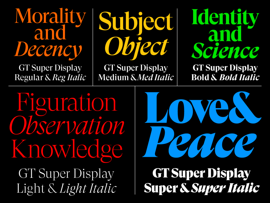
Inspired by display serif typefaces from the 1970s and 80s such as Trooper Roman, GT Super was designed by Noël Leu, with help from Mirco Schiavone & Reto Moser, and released in 2018 through Grilli Type. It takes the expressive and idiosyncratic nature of calligraphic motions and translates them into stable, typographic shapes, to create a typeface that’s both authoritative and impactful.
15. Cotoris
Cotoris is a beautiful glyphic sans serif that includes ligatures and small capital for advanced typography. It's particularly useful where a graceful and feminine design touch is required. Published by Dharma Type, which was founded by director and type designer Ryoichi Tsunekawa in 2005.
16. Self Modern
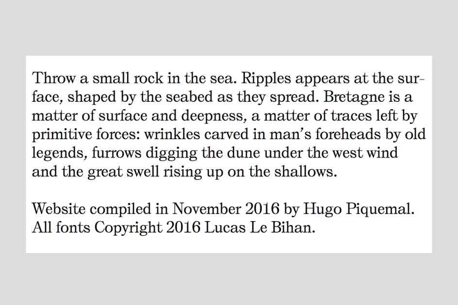
French typographer Lucas Le Bihan is known for going the extra mile to create truly breathtaking fonts, and Self Modern, released through his Bretagne foundry, is no exception. This beautiful serif typeface is available in text, regular and italic styles.
17. GT America
 used moody watercolors and photography with contemporary materials and typography, including GT America.](https://www.creativeboom.com/upload/articles/ad/ad9a65a4acb286822eed5569869f619e275a4983_944.jpg)
Strömma Arkipelag is a newly-designed set of residences located between the inner city and outer archipelago of Stockholm. To capture the contrast of the city and nature Twenty-five Art House used moody watercolors and photography with contemporary materials and typography, including GT America.
GT America positions itself as the missing link between 19th century American Gothics and 20th-century European Neo-Grotesk typefaces. Designed by Noël Leu and Seb McLauchlan, it takes the best design features from both traditions and applies them to widths and weights to ensure they function optimally. It’s available in 84 styles.
18. Univers
A neo-grotesque sans-serif designed by Adrian Frutiger and released by Deberny & Peignot in 1957, the appeal of Univers remains strong over six decades later. That’s a testimony to how its designer imposed strict discipline across the series, from light to dark, extra condensed to extended. As a result, any version of Univers may be mixed within a word with any other, without sacrificing visual uniformity.
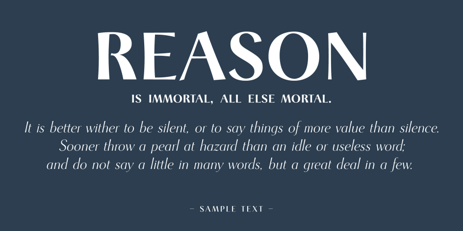
19. Pitch
](https://www.creativeboom.com/upload/articles/4d/4da58407f98df7acf95acc01644af2d967f9bf38_944.jpg)
Tea & Glory, designed by Socio Design
Pitch is nothing less than a love letter to the typewriter, an analogue anachronism that’s nonetheless been idolised by the younger generations, for whom it represents an enticing bridge to the past. This monospaced slab serif, designed by Kris Sowersby and published through Klim Type Foundry, is available in five weights with matching italics.
20. Akkurat
Designed by Laurenz Brunner and released through the Lineto type foundry, Akkurat is a sans-serif typeface that has long been popular amongst print designers. But recently it’s started to be used on the web too, and we’re not surprised. After all, this clever retooling of a 19th century grotesque provides oodles of character and expressiveness but remains beautifully readable at a range of sizes.
Further Information
This article was written by Anthony Wood, who is the Managing Director of Shillington. With 15 years of experience in design and a long stint of freelancing in Sydney and London, he relished the challenge of joining the international design school in New York City. He likes to write about design, entrepreneurship and learning.


](https://www.creativeboom.com/upload/articles/7a/7a527d53fefe4f354e8489365e89db422567f281_732.jpg)
. In use by [Garbett](https://garbett.com.au/) for Career Trackers](https://www.creativeboom.com/upload/articles/0f/0f4e193ba9164073646e67421eb37b4b26986c67_732.png)
 using <a href="https://www.ohnotype.co/fonts/obviously" target="_blank">Obviously</a> by Oh No Type Co., Art Director, Brand & Creative—Spotify](https://www.creativeboom.com/upload/articles/6e/6ed31eddc26fa563f213fc76d6993dab9231ffe4_732.jpg)