Mono Moment: Slanted's helpful reference guide to magical monospaced fonts
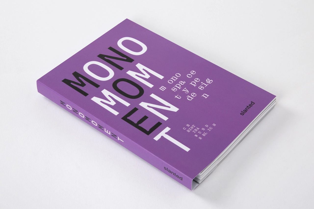
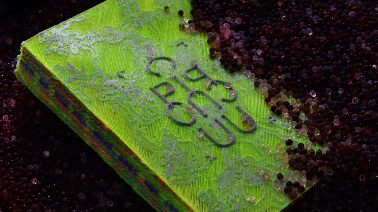
Monospaced fonts are not just fascinating; they're everywhere we look. In design, art, coding – even on our identification documents. A new book published by Slanted celebrates these hardworking fonts and offers a source of inspiration for graphic designers and typographers looking for a helpful reference guide.
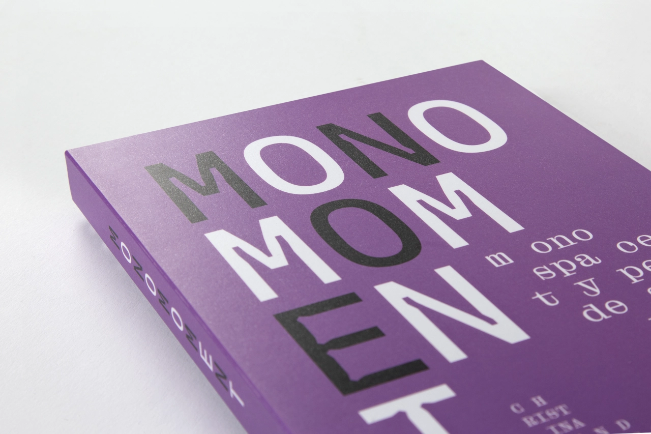
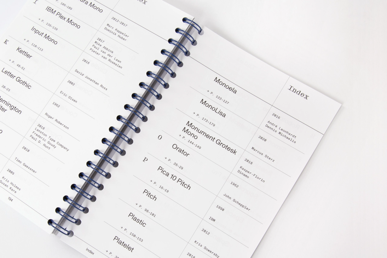
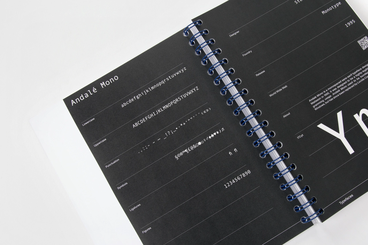
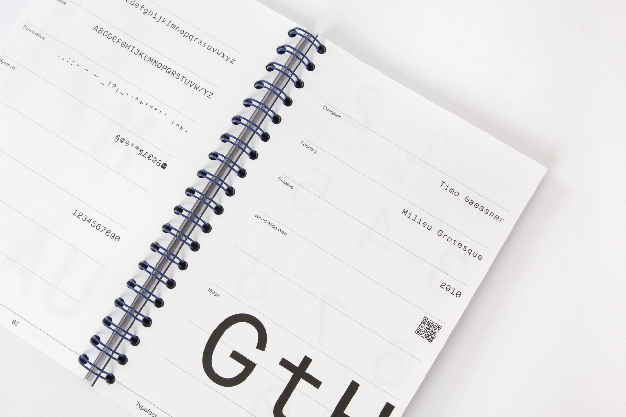
Mono Moment takes a closer look at the typefaces defined by their fixed equal width for all characters, with every letter and number occupying the same space horizontally and vertically. We're talking dreamy Aperçu Mono and classic Courier, lush GT Pressura and gentle Source Code Pro, sexy Suisse Int’l Mono and a whole lot more. Space Mono is a personal favourite, but Maison Mono gets our vote, too.
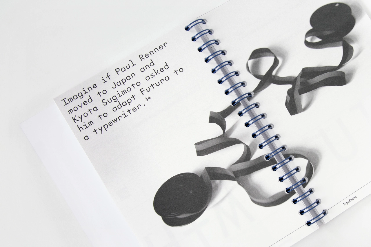
"Friedrich Nietzsche was probably one of the first to feel the aesthetic appeal of monospaced typefaces," says Slanted. "Since he started writing with a typewriter, typefaces and punctuation have been important to him. In the meantime, we encounter monospaced typefaces regularly in everyday life. If you take a closer look, you will encounter non-proportional typefaces more often than expected."
As classic proportional typefaces with harmoniously balanced spaces with variable widths between their characters, the widths are not set proportional. That's why monospaced typefaces are also named non-proportional. What exactly is the attraction of these typefaces, which are customary on typewriters and for typesetting computer code? And why have they gone beyond their original purpose? They're straightforward and easy to read, perfect for web design and making things clear for people to understand quickly. Versatile and stylish, they can also add a nostalgic flair to any design, making anything appear friendly as it sparks up that warm familiarity of simpler times.
Slanted puts it down to a massive increase in typeface production over the last three decades. "Almost every well-developed font family also has a mono or semi-mono cut," adds Slanted. "When searching for the word 'monospace' on the web, countless entries can be found in addition to the results such as 'I am looking for a beautiful monospaced font' and 'Top Ten Monospace Fonts' or 'Best Monospace Fonts for Coding'. At a time when it has never been easier to design and publish typefaces, this book provides a good orientation to monospace."
If you'd like to get your hands on Mono Moment, it's published by Slanted Publishers in Germany and is available to order from www.slanted.de.
Editor's Picks





Trending



Latest Jobs
Client Success & Growth Director at Revolution Growth
Full-time·Manchester·£60k-£70k
Senior Creative Lead at Random Studio
Full-time·Amsterdam / Paris·€90k-€110k
Talent Agent & Producer at The Jacky Winter Group
Full-time·Los Angeles·$70k-$85k
Senior 2D Motion Designer at Art&Graft
Full-time·London·£50k-£65k
Project Manager at A Practice for Everyday Life
Full-time·London·£37k-£46k
Design Director, Opinion at The New York Times
Full-time·New York·$160k–$180k







. In use by [Garbett](https://garbett.com.au/) for Career Trackers](https://media.creativeboom.com/514ca61a-e599-4ae7-bed3-a107421ce0f3/conversions/e8ba48815e7898e3d263f3452e50572efdb4fd9a-medium.webp)