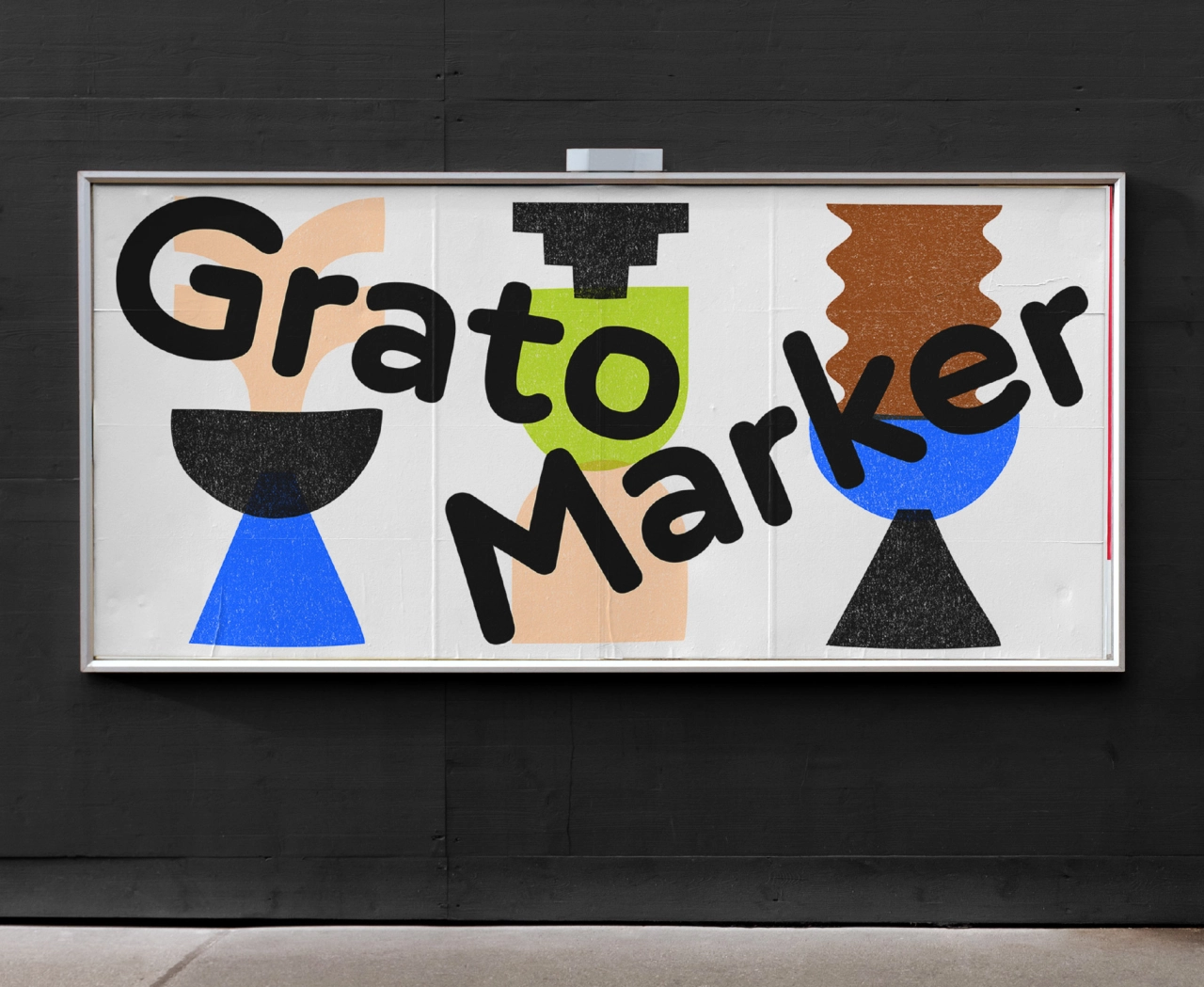
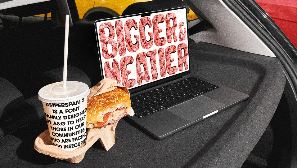
Grato & Gratimo by TypeMates make a system of typefaces joined by geometry
Designers Jakob Runge and Mona Franz have unveiled Grato and Gratimo, two new typefaces united by geometry and pleasing minimalism but differing in genre and function. Published through German foundry, TypeMates, there are four type families to play with, organised into two subfamilies.
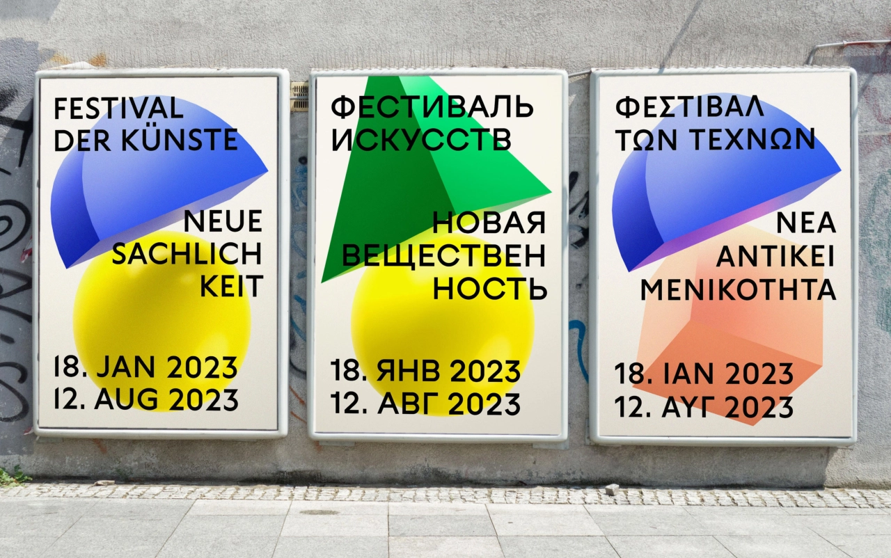
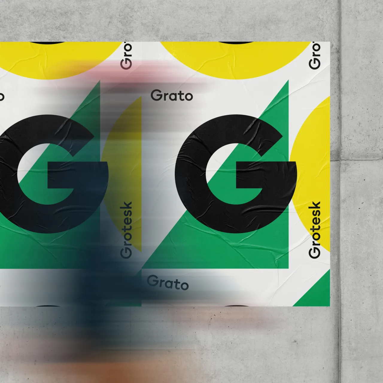
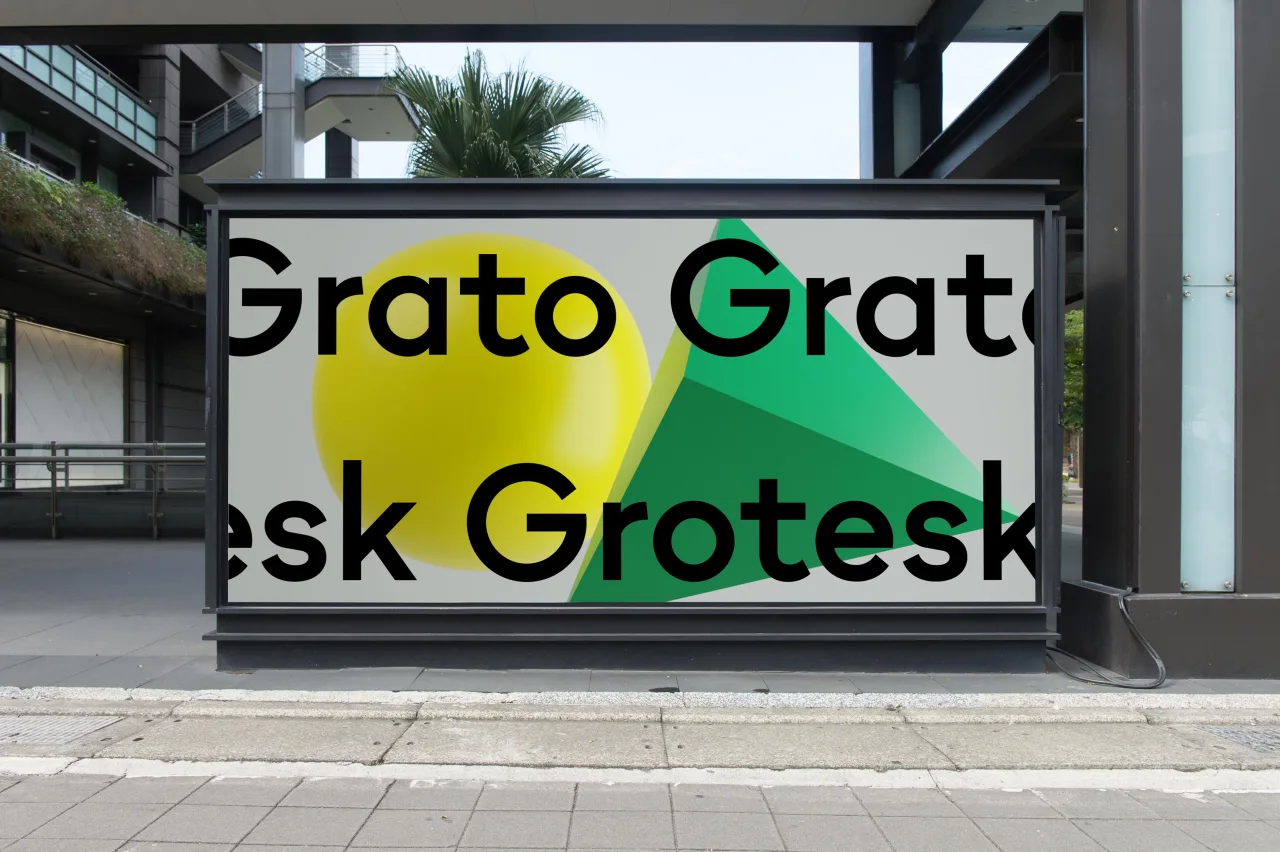
Grato is the starting point for the series, available in two different styles: Grotesk and Classic. Looking first at Grotesk, it's a modernist, resolute typeface with flat apexes and straightforward angled terminals, offering a clean and contemporary aesthetic that, although cool, retains warmth and character; the latter being the humanist voice of the geometric suite.
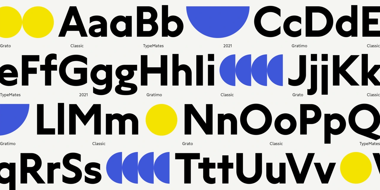
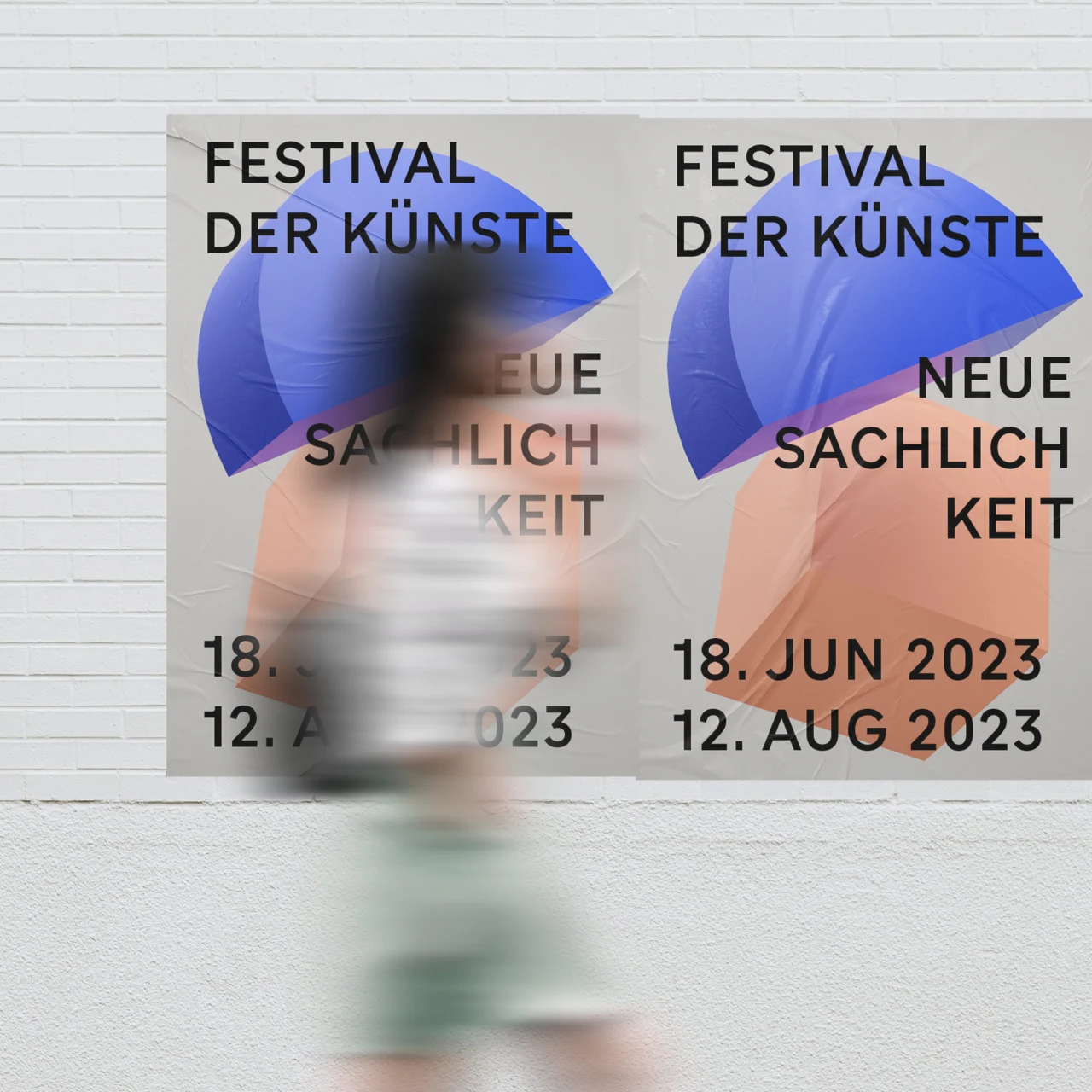
"Grato Grotesk ignores most calligraphic conventions, and is shaped by pure forms, low stroke modulation and square dots that contrast with almost perfect circles," explains Jakob Runge, who is also a co-founder of TypeMates. "It takes that core and pursues the industrial logic of early German geometric typefaces. The result is a typeface of quirks and clarity, a substantial family for identity and editorial work."
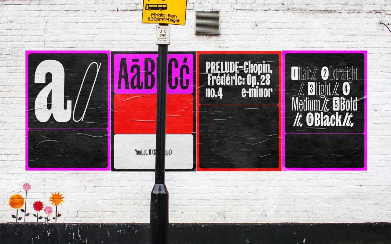
Grato Classic, meanwhile, is timeless with sharply cut terminals and apexes, giving a luxurious, pure feel to identity and editorial work. "This version is shaped by pure forms, low stroke modulation and square dots that contrast with almost perfect circles," adds Runge. "Grato Classic takes that core and pursues the classical proportions and calligraphic detailing of early British geometric typefaces."
Grato
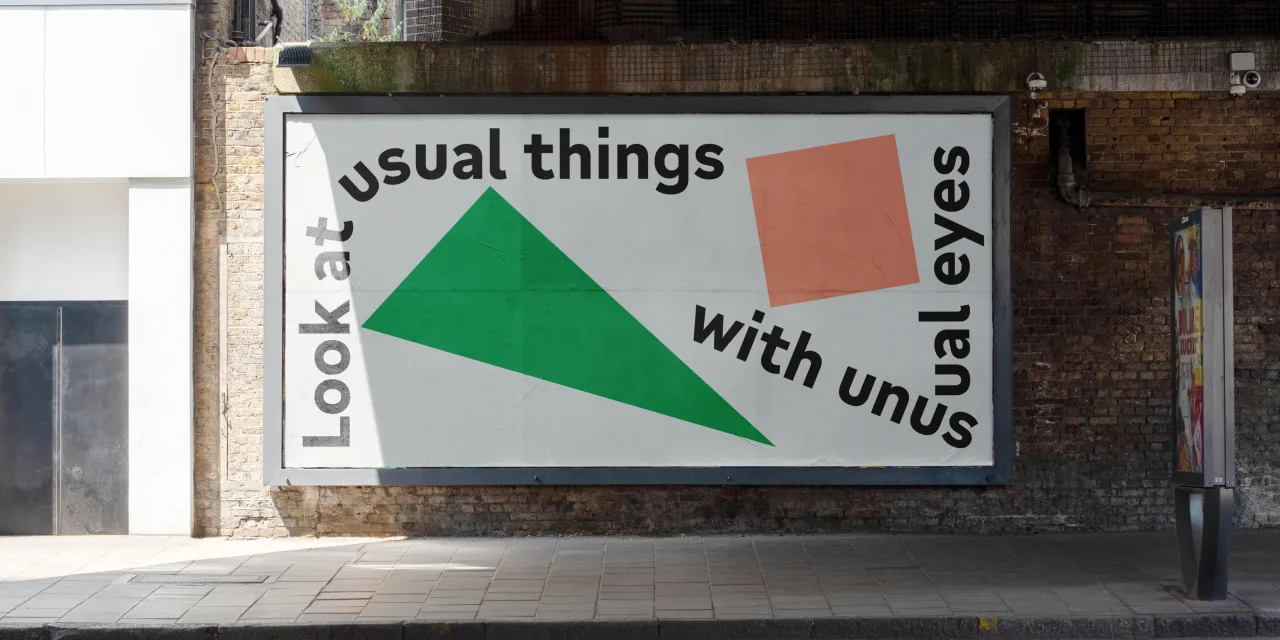
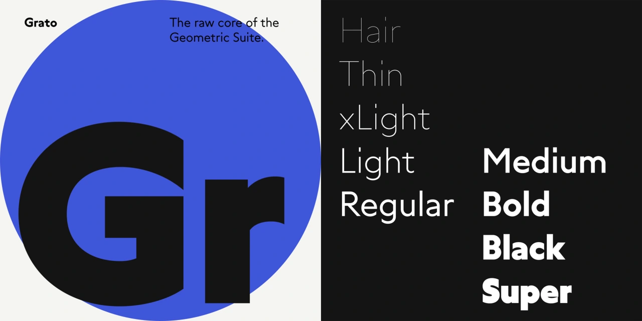
Both are available in nine weights, from fine Hairlines to super heavy Blacks. A nice touch is that the Grotesk's weight gradation allows you to maintain stroke weight while doubling type sizes – "just use the next lighter weight for the larger size," says Runge. While the Classic is available in two optical sizes. "If you need less geometry and more legibility, Gratimo Classic is fine-tuned for text and interface design," says Runge.
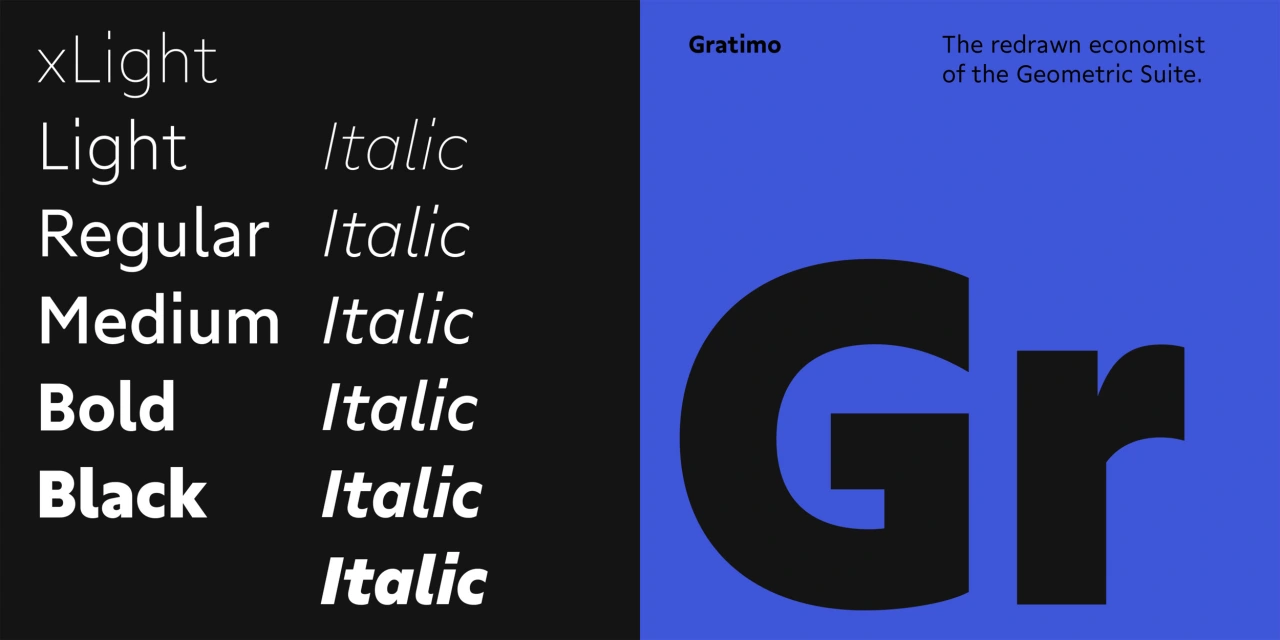
Elsewhere, Jakob Runge collaborated with freelancer designer Mona Franz to create Gratimo Grotesk and Gratimo Classic, giving us fresh modernist geometric typefaces that are "engineered for reading".
Gratimo
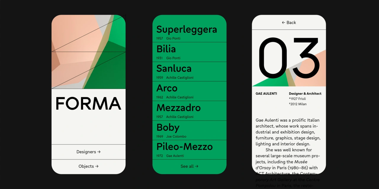
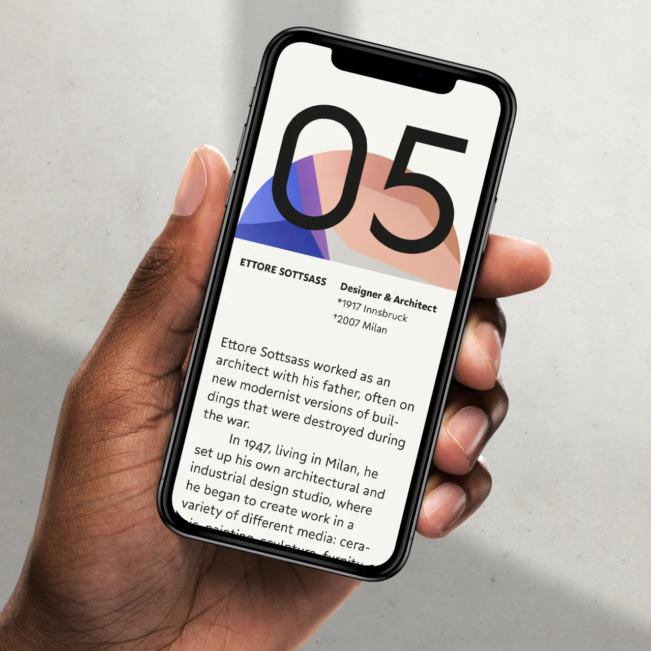
The Classic version is a powerful sans workhorse that combines "elementary shapes and precise construction". It's a utilitarian family, purpose-built for everyday use. "Where Grato Classic revels in pure geometry, Gratimo Classic has a practical focus," Runge continues. "With a robust x-height, open apertures and generous spacing, it's more restrained forms were the result of Grato being redrawn for reading. The result is a space saving typeface that draws on the humanist geometric types of Johnston and Gill to make something new."
Gratimo is available in six weights, from Thin to sturdy Black. "For greater distinction, its matching italics have some cursive character shapes, but give an oblique impression," says Runge. Discover more about Grato and Gratimo at typemates.com.
Editor's Picks





Trending






Latest Jobs
Senior 2D Motion Designer at Art&Graft
Full-time·London·£50k-£65k
Head of design at Cog Design
Full-time·London·£55K
Principal Software Engineer at BBC Media Tech
Full-time·Glasgow·Up to £83,790
Senior Digital Designer at 3800
Full-time·Sheffield·£40k-60k
Senior Brand Designer at Analogue
Full-time·Leeds·£38k-£45k
Client Success & Growth Director at Revolution Growth
Full-time·Manchester·£60k-£70k