The biggest trends in graphic design for 2022, as predicted by leading creatives
In normal times, things in the design world don't change that quickly. So, for example, the 2010s trend for geometric, minimal logos wasn't just restricted to a single year but persisted throughout the decade.
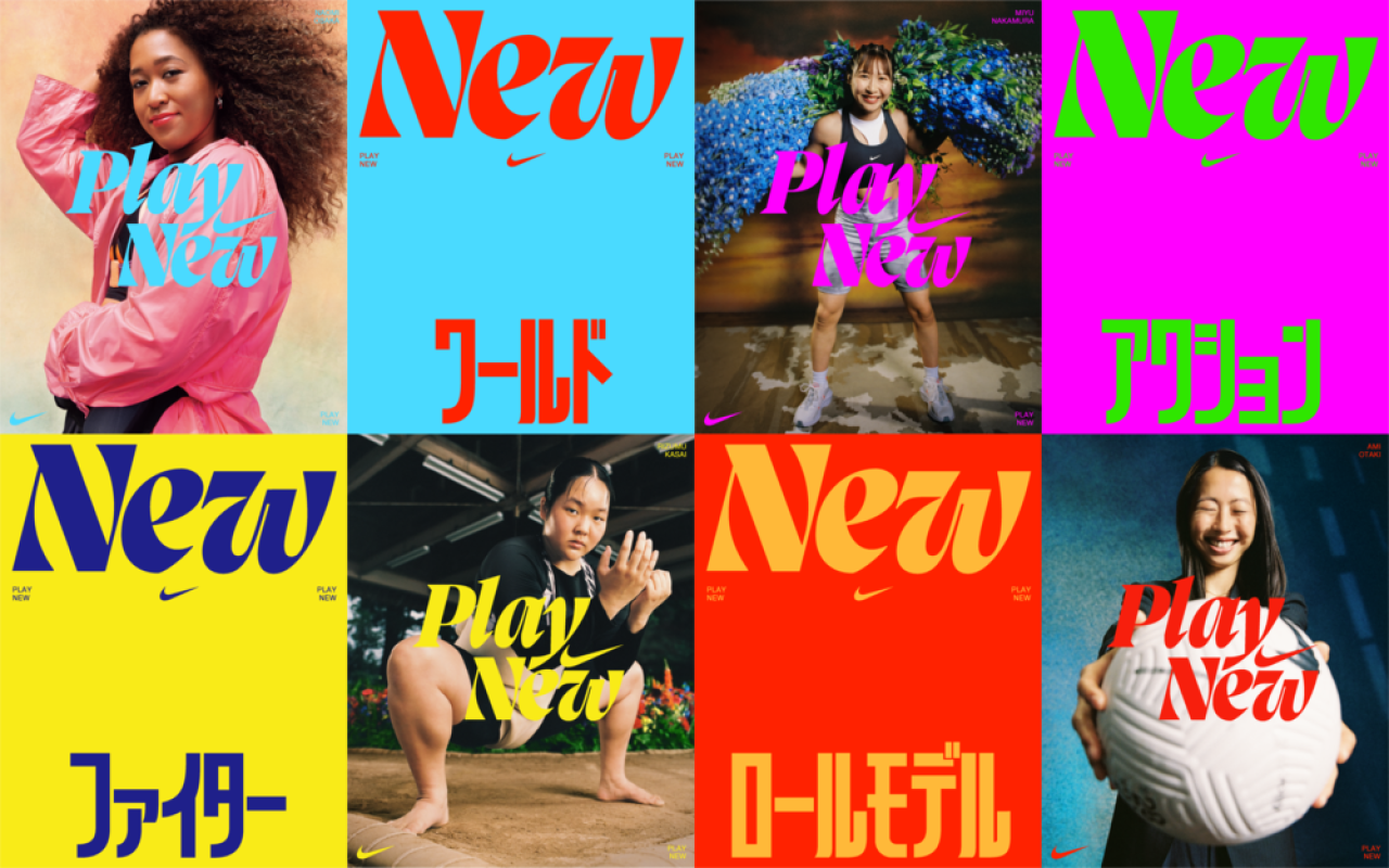
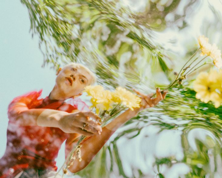
Play New for Nike by Wieden+Kennedy
However, what we're experiencing in general terms is a very long way from 'normal times'. And all that chaos and uncertainty is moving many aspects of design in radically different directions; sometimes so quickly, we barely notice it happening.
With that in mind, we've brought together leading voices in the design world to help us make sense of what's happening and what's likely to happen over the next 12 months. Read on, and discover ten trends likely to impact your creative work in 2022.
Trend 1: Brands in motion
Whether you're walking past a digital billboard, scrolling through a website, or navigating an app, we see more and more motion design at the moment. And most people in the profession believe this can only be a good thing.
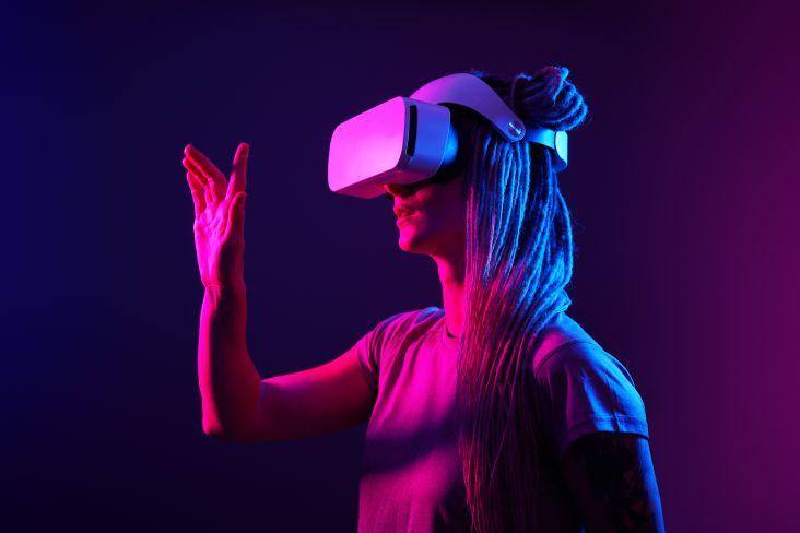
"It feels like static graphics aren't cutting it nowadays – it's move it or lose it!" says Martin Widdowfield, creative director at Robot Food. "With the constant introduction of fresh and innovative digital platforms and the rise of virtual reality, brands are finding new ways of living online. This has opened up new possibilities of engaging consumers through motion and animation, and opportunities to better the way we approach storytelling."
And this trend is even influencing static materials, such as packaging, he points out. "QR codes were all but dead until the pandemic, but now people have that behavioural understanding of 'scan for information'," adds Martin. "What that means for AR, and how its relationship with packaging could evolve, is exciting. I think there will be a sharp rise in innovations to extend the movement of a brand online to the shelves; can the ever-popular unboxing experience be digitised, for instance?"
But why is motion so important anyway? Mitch Paone, partner and creative director at DIA Studio, explains. "On a superficial level, a static image can't compete with a looping gif. On a deeper level, movement creates identity, just like how we can identify a salsa dancer versus a hip-hop dancer. The dancer could be the same, but their motion tells the story.
"A brand can now have own-able choreography, or a behaviour, that provides tremendous personality, all enabled by the screen," he adds. "This shift has significant implications on the design industry. Design and motion are fused. To make relevant work, designers need to develop a rich understanding of movement, rhythm, and time combined with skills in motion software on top of all the traditional design skills."
Work for Mailchimp by DIA
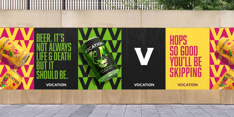
Vocation by Robot Food
DIA Studio followed exactly this approach when it recently refreshed MailChimp's branding. "We focused on bringing it to life through motion," Mitch explains. "The existing identity, led by an expressive library of hand-drawn illustrations and a yellow and black palette, was great for print and out-of-home advertising but was not scalable for digital assets like video, digital advertising, social media, etc."
The refreshed work draws inspiration from MailChimp's mascot Freddie, providing personality through a graphic line, playful colour palette, and a memorable bouncy motion behaviour. "The updated system is highly expressive and functional simultaneously," says Mitch. "A suite of motion-based toolkits accompany traditional brand guidelines to empower MailChimp's teams, so implementation is simple and remains consistent across all platforms."
Trend 2: The new Wild West
Think back five years, and design was dominated by a minimalist, geometric look. And yet, in a world that's been torn apart by the pandemic and economic crises, that utopian aesthetic seems ever more outdated. Instead, Julius Colwyn, associate director of Space Doctors, points to a move in the opposite direction.
"The trend is all about a living, energised chaos," he explains. "It comes as a reaction to an increasingly harmonious, consistent graphic style defined by too many brands and businesses. There is a growing space for something jagged, something raw, something real – jarring collage, sharp contrasts, powerful neon, and irregular frames."
Inspired by the wild west of the early internet, this approach looks to move away from harmony and towards a joyful clash. "This is the space of acid green and terminal fonts, screen grabs and digital artefacts as fundamental elements of design," says Julius. "These are designs from new skills in the age of the creator economy, so this energy is not wholeheartedly the rampant neon chaos of the internet 1.0. It's a refined version of digital chaos shaped by digital natives."
Universal Favourite's maximalist identity for new Gen-Z beauty brand, Youthforia
Trend 3: Breaking down (design) borders
It's quickly become a cliche, but only because it's true. As Ali Ozden, design director at Universal Favourite notes: "Whilst the global pandemic hasn't been fun for anyone, it's forced us all to think and work in new ways, and has given us opportunities to work internationally: either for an international client or collaboration with international talent."
And it's this breaking down of online borders that he sees as the most exciting prospect for the design world in 2022. "It's opening up opportunities to collaborate with talent that you could only dream of working with, on that client that you've always wanted to work for," he enthuses.
"For us at Universal Favourite, that's meant working with clients from Korea to the US and collaborating with designers and artists from New Zealand to Berlin. The most exciting part of that is the sharing of experiences and skills, helping to foster more creative outcomes that can shape culture as we come out of the pandemic to a different world."
Trend 4: A shift away from self-indulgence
There was a time when every other talk at a design conference was about how you should be maximising your income; by either upping your freelance rates or founding your own startup. Since March 2020, though, people's priorities have shifted.
As Natalie Redford, creative strategist at Robot Food, says: "There's been a marked move away from 'hustle culture' and the material things that have validated us in the past, toward measuring success by how happy you actually are. Self-care and self-prioritisation are in the spotlight."
Perhaps, as a result, she muses, we'll see more eclecticism in design. "Does a clean and stripped back style fit a notion of pleasure and self-indulgence? Does 'more, more, more' fit a rejection of overconsumption? Maybe we'll see more real and unrefined aesthetics. Maybe a craving for simpler, happy times could see nostalgic looks grow and evolve. Or, maybe indulgence will become more accessible as aspirations become simpler."
Whether next year will be a positive one, of course, remains to be seen. As Samantha Barbagiovanni, design director at ThoughtMatter, puts it: "Summer of love? Partying? Celebrating a post-pandemic world? Safe to say the crystal ball was a bit foggy on that one. However, 2022 will embrace more sensorial, diverse and emotionally fulfilling experiences of wonderment we've lacked in our safe yet confining homes with the occasional, semi-risky steps into what now feels like the 'old world'. Our senses are ready for stimulation."
Ellen Munro, creative director at BrandOpus, shares the same sense of cautious optimism. "In a world full of seriousness, we are seeing brands move towards a more upbeat and light-hearted look and feel. On a deeper level, we see an uprise in brands anchoring their meaning and messaging around positivity and joyfulness."
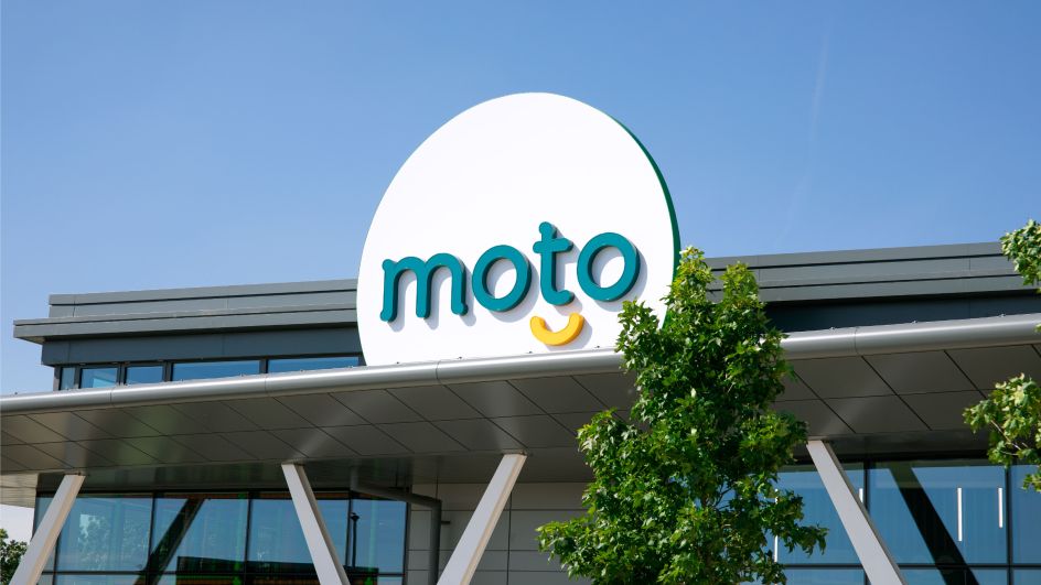
Moto by Brand Opus
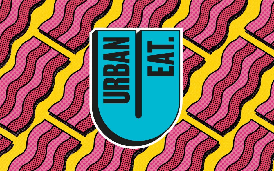
Urban Eat by Robot Food
It's a trend she jumped on board with herself when BrandOpus recent partnered with Moto, the UK's largest motorway service area network, to transform the UK's rest stop experience. "Its brand overhaul injects a good old dose of enjoyment into the every day through the 'Smile': a warm and inviting distinctive asset that can flex across the brand's entire ecosystem," she explains. "We aimed to flip the switch by driving feeling over function – engaging customers on a much more emotional level – to ensure the motorway service station provider becomes an active choice for resting and relaxing first."
Trend 5: Back to the 1990s
The 1980s were so culturally significant. We've been immersed in nostalgia for them for decades now. But it's finally the turn of their successor, believes June Frange, design director at CPB London, at least in terms of design influences.
"I'm calling this trend '90s MTV nostalgia," he says. "Retro idents, green screen and meme aesthetics." It's something CPB have channelled in their recent work for Ballantine's whisky. "The early internet aesthetic has been around for a while," he adds, "with its reach fanned more so by TikTok filters and lo-fi DIY content influencers. For this project, we've taken inspiration in '90s MTV idents, bringing back a feeling of couch surfing nostalgia of home entertainment, for our mainly millennial audience."
Pandora by Anomaly London
Trend 6: Maximalism goes big
If, as we've mentioned, minimalism is on the wane, it stands to reason that its opposite, maximalism, should be on the rise. And Clara Mulligan, head of design at Anomaly London, confirms it.
"There is a visual renaissance happening, after years of graphic sameness brought on by previously limiting functional requirements of living in a digital space," she says. "Now, there's a clear desire for a more opulent approach. We're in a maximalist era where visceral narratives and thrilling visual experiences are replacing the flat, geometric, austere brand systems, trumping modularity with distinctiveness. But what's most interesting is that these maximalist worlds aren't just frivolous treatments, but rooted in history and strategy."
Molly Rowan-Hamilton, strategy director at BrandOpus, paints a similar picture. "We're seeing brands moving to monochromic, bold palettes to create a punchier, more ownable look and feel," she says. "For brands that have been synonymous with one colour, there's a chance to switch things up, even if it's just to grab attention momentarily. For example, Tiffany & Co. replaced its 'Tiffany Blue' with a fresh 'Tiffany Yellow' as a way of signalling a step change to connect with a younger audience and shake its reputation as being dusty and old fashioned."
Another example of this trend is BrandOpus' work on Pipers Crisps, using monochromatic colour on shelf to break through and stand out from the crowd. "Vibrant and energetic, bright colours were chosen to echo the crisp brand's bold personality and flavour," she explains.
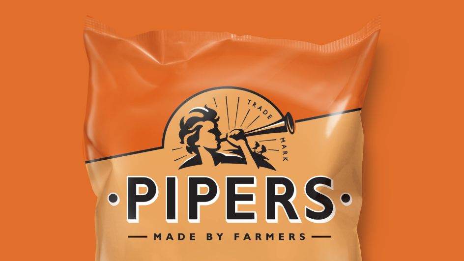
Pipers by Brand Opus
Killing Eve by Pentagram
Trend 7: Typography gets more vibrant and playful
Chris Algar, a senior designer at Design Bridge London, believes 2022 will be a big year for type. "We'll see typographic styles tapping into really exaggerated characterful letterforms, dialling up the contrast between flowing lines and sharp angular shapes," he predicts.
The trend for motion design we referred to above will also influence type, he adds. "Title sequences viewed across streaming platforms during lockdown will have most certainly inspired designers, from people binge-watching Killing Eve to more recently Squid Game. Both take very different approaches to typography but are linked through their captivating movement and amplified personalities."
Colours and vibrancy will also play a strong role within the typographic trends for 2022, Chris believes, citing the recent Nike' Play New' campaign. "It celebrates the character of the typography with wonderful flowing forms whilst providing a contemporary twist through vivid colours and sharp contrasting shapes."
Trend 8: Creative crossovers: the merging of design, fashion and brand
Design, branding and fashion are all changing, and in some cases starting to merge together. Just like when Apple bought Beats by Dre, brands are finding they can partner their way into being cool; or at least being cool-adjacent.
"With so many brands exploring how they can live off-pack and come to life in several imaginative ways, we're seeing them turn notably to streetwear," says Molly Rowan-Hamilton, strategy director at BrandOpus. "With Panera's 'soup' swimwear, Pizza Hut's 'tastewear' and Carbone's new fashion label, Our Lady of Rocco, restaurants can create a bomber jacket and sell it for over $500."
Along similar lines, BrandOpus worked with the American food group Oscar Mayer on its recent 'street meats' collection, which has a 13-piece capsule collection that draws inspiration from the beloved Hotdogger uniforms. "This streetwear collection is yet another way in which the brand is bringing to life its core belief: 'never square' – a celebration of its iconic rhomboid logo."
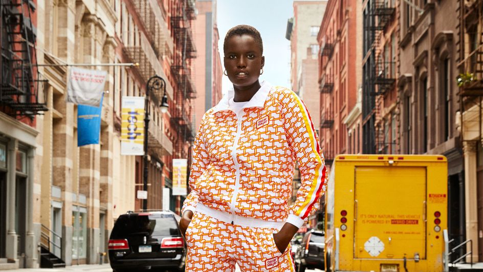
Oscar Mayer by Brand Opus
Trend 9: Environment action matched with eco-aesthetics
Just in case you hadn't noticed, there's a lot of talk about the environment right now. And in many ways, the design industry is ahead of the curve.
“Consumers can now spot greenwashing from a mile away, so brands are having to do more than use the colour green to show they’re putting the planet first," says Matthew Gilpin, design director at Free The Birds. "Not only that but with the Government introducing an Extended Producer Responsibility scheme coming into effect April 2022, brands are under increasing pressure to use more sustainable materials in their packaging or risk additional taxes for not complying."
And that needs to be reflected aesthetically, too. "The challenge will be for designers and packaging technologists to choose materials and finishes that are sustainable, recyclable and have the lowest carbon impact possible to meet consumer expectations, brand ethos and environmental standards – whilst still creating a strong visual impact. Metallic foil manufacturers have already made strides in making their products biodegradable. Water-based inks are gaining greater use, but it is no good using them on virgin paper and then applying a soft-touch laminate, as this would negate their eco-benefits. The key is how these processes are used in an intelligent way. That will be the difference between something that appears green, and those which are truly sustainable."
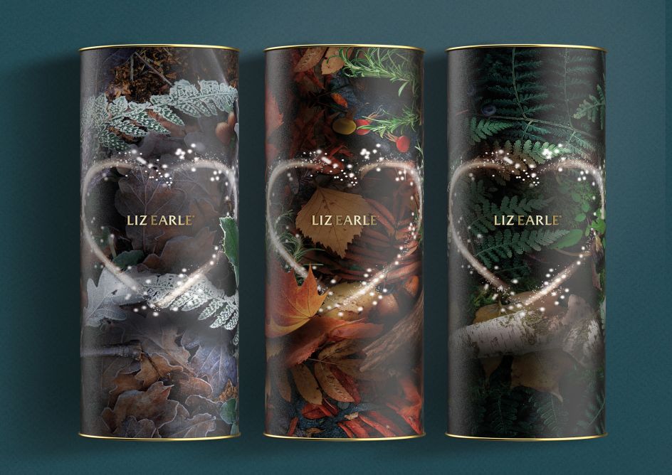
Liz Earle by Free The Birds
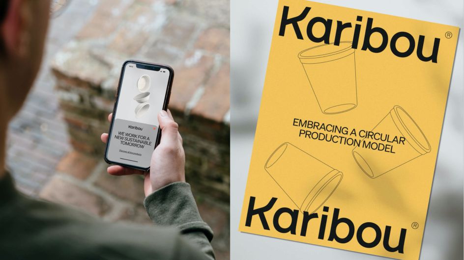
Karibou by Firma
But this all has to be done subtly and thoughtfully, or consumers will see right through it. As Anton Pinyol, co-founder and creative director at Firma, explains: "Design for sustainability-focused brands used to be full of clichés in terms of colours, textures, typography and visuals. Greenish colours, textured materials, brushes, plants and hands that are holding the world. Modern brands, though, are moving beyond to embrace a radically new attitude full of digital language and bold identity."
Samantha Barbagiovanni, design director at ThoughtMatter, adds: "Sustainability and reconnecting with nature is certainly here to stay, with perhaps a greater emphasis on how Mother Nature's medicine can empower our well-being, alongside her environment. We will begin to heal our Covid traumas on a deeper level. Brands and institutions within this space will recognise this influence and approach design with education, introspection and immersion in mind."
Trend 10: Unapologetic realism and subversive design
Last year, we predicted that nostalgia would greatly influence design in 2021 and was pretty much on the money. But things will be different next year, believes Samantha Barbagiovanni. "If 2021 was defined by an air of cautious optimism, 2022 would be defined by unapologetic realism," she predicts. "We had hopes for 2021 that had just begun to come to the surface, but this year these trends, plus a few more, will see their full potential as we are more mentally, physically, and socially prepared."
In other words, "2022 will no longer be a yearning for the past; rather a dire desire to bring to fruition our untapped potential and pathways revealed while being in a state of quarantine and reflection for longer than we anticipated. A new wave of entrepreneurs will emerge as individuals and communities come together for a stronger, fine-tuned purpose supported wholeheartedly by value-driven design."
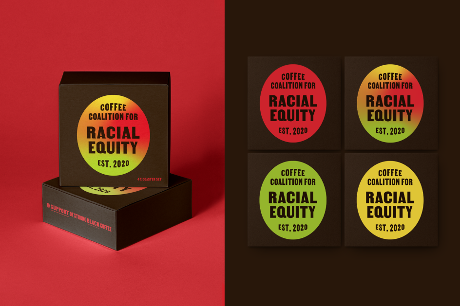
Coffee Coalition for Racial Equity by ThoughtMatter
And as we all look to an uncertain future, one thing's for sure: sticking to the old ways, unthinkingly, is no longer an option. Wednesday Krus, design director at ThoughtMatter, believes 2022 will instead be about subversion. "Much like Brutalism was a disruptive reaction to the over-designed, over-analysed designs of the generation before – a style born to evoke bold reactions – 2022 will move from disrupting to transforming," she predicts.
So what does that mean in practice? "Subversive design asks for an action and demands participation. It begs you to question your own practice as a designer or as a user. It also steps away from dark patterns, aggressive persuasion and dishonest branding. It will no longer cut it to design with the intent of contesting or rejecting popular opinion."
"This new trend will use design to destroy design: to knock down the systems of power that have been built and crafted across history to benefit the few while suppressing and weakening the many. Contrarianism is now the consensus, and consensus flattens ideas. Subversion sets them free."
Editor's Picks


Trending


](https://www.creativeboom.com/upload/articles/90/908fdb6378db1e95d12595416f54e6336d5e80b8_732.jpg)
Podcasts


Editor's Picks
Further Reading
 unites vegans and meat lovers with tasty new identity for a plant-based food startup](https://www.creativeboom.com/upload/articles/fe/fe52890414f664bcc985e763dd2a52e863cee31c_732.jpg)