50 essential terms every graphic designer should know by heart
Graphic designers have their own language. It's true. Margins, kerning, letterpress, ascenders and descenders – these technical words are just a hint of what to expect if you work in this creative field. But there's a lot to remember.

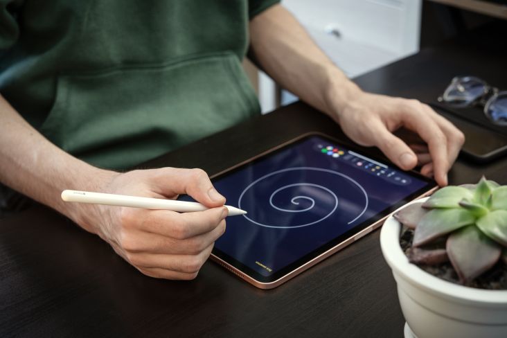
Image licensed via Adobe Stock
If you're starting in graphic design, or you need a quick refresh, we've put together the following essential terms every graphic designer should know by heart. And for all those non-designers out there, this resource should prove especially helpful too.
1. Typography
Typography is the technique and art of arranging type to make written language readable, legible and appealing when displayed on print or on-screen. It can range from the creation or modification of custom type packages to the finer details involved in choosing typefaces, point sizes, line lengths and spacing.
2. Serif Type
In typography, Serif is a small line attached to the end of a letter, or indeed a symbol.
3. Sans Serif Type
Sans Serif is a typeface without any serifs and comes from the French word 'sans', meaning 'without'.
4. Slab Serif Type
A Slab Serif is a type of serif typeface characterised by thick, heavy serifs. They were especially popular during the 19th century.
5. Script Type
A Script type is what you'd expect – it's a typeface based on handwriting.
6. Display Type
Intended for large-scale headings and designed to make an impact, Display type is often used on posters, billboards and logos.
7. Logomark
A Logomark, or logo, is a single piece of type bearing two or more uncombined letters, a syllable, or a word.
8. Hierarchy
Hierarchy in typography helps to organise and give an order to text elements in your design. It helps a reader to understand the order of things.
9. Kerning
Sticking to the theme of typography, Kerning is where you adjust the space between pairs of letters.
10. Leading
Leading is line-spacing and refers to the distance between the baselines of successive lines of type.
11. Tracking
Tracking, otherwise known as letter-spacing, is not to be confused with Kerning. It refers to a uniform adjustment to the spacing of a word or paragraph affecting its density and texture.
12. Alignment
In typography, Alignment – also known as Range – is the setting of text or an image relative to a page, column or tab.
13. X-Height
The X-Height refers to the actual height of the lowercase x within an individual font. This measurement affects the proportions of font and determines legibility. As a general rule, the bigger the X-Height, the better the readability.
14. Cap Height
Cap Height is the height of a capital letter above the Baseline for a particular typeface.
15. Ascenders & Descenders
An Ascender is an upward vertical stroke which you'll find on the part of a lowercase letter that extends above a typeface's X-Height. And a Descender is part of a letter that extends below the Baseline.
16. Widows & Orphans
In typesetting, Widows and Orphans refer to the singular word or line of text that is disconnected to the main body of a paragraph. Orphans are the single word sitting on its own line at the end of a paragraph. Widows are paragraph-ending lines that fall at the start of the following page or column. It's the job of an excellent graphic designer to avoid these from appearing.
17. Placeholder Text
Placeholder Text, also known as Filler Text, Dummy Text or Lorem Ipsum, is a temporary text that is random or generated for testing purposes. It is used when the original text is unavailable, often to show others where it will sit, once the final copy is supplied.
18. Body Copy
Body Copy is simply the main text that people read. These are the sentences and paragraphs that make up the main content of any publication or website.
19. Palette
A Palette is a colour scheme, something that comprises a choice of colours to be used in design for a range of media.
20. Pantone (PMS)
The Pantone Matching System, or PMS, is a standardised colour system for printing, courtesy of Pantone, that provides design inspiration, colour specification and printing accuracy.
21. CMYK
CMYK is the colour mode used when designing for print. It refers to the four inks used in the majority of colour printing: cyan, magenta, yellow, and key (black).
22. RGB
RGB is the colour mode used when designing for digital applications. Red, green and blue light is mixed together in different amounts to create a broad and vibrant range of colours.
23. Gradient
Gradients are a gradual blend of different colours or shades from the same hue.
24. Resolution
Resolution is the number of units that occupy a linear inch in an image. You can measure it in terms of PPI, or 'pixels per inch' on a screen. In printing, it's referred to as DPI, which means 'dots per inch'.
25. Saturation
Saturation is pretty straightforward – it defines the intensity and brilliance of a colour.
26. Contrast
Contrast refers to the arrangement of opposite elements and how they create visual interest or drama. These elements could be light versus dark or rough versus smooth textures.
27. Stock Photo
A Stock Photo is an image that is often licensed for specific uses via stock agencies.
28. Thumbnail
Thumbnails are rough sketches created to explore layouts and the possibilities within a design. These are sorted in the early stages of the process and help to generate options before work is moved to the computer.
29. Grid
A Grid is an underlying system of columns and guides – both horizontal and vertical – used to provide structure to a design.
30. Margin
A Margin is an area between the main content and the edge of the page. This space ensures that important content like body copy sits comfortably, and does not risk being cut off during the printing process.
31. Scale
Scale relates to the relative size of an object, or different objects, within a design. Subtle scale can aid in creating hierarchy, while dramatic scale can add impact to a design.
32. White Space
Despite its name, white space does not need to be white – it can be any colour, texture or pattern. It is the clear area between design elements that provides ‘visual breathing room’.
33. Texture
Texture refers to an actual surface of something, but in graphic design, it relates to the visual appearance of a design. Rich, layered graphics – for example – can create visual texture, adding a seemingly tactile feel.
34. Foiling
Foiling or Foil Stamping is a heat-pressing printing process where the metallic or pigmented foil is applied onto a solid surface by pressing a heated die onto the foil.
35. Letterpress
One of the oldest types of printing processes, Letterpress is a technique of 'relief printing' using a printing press to apply a direct impression of an inked, raised surface against sheets or a continuous roll of paper.
36. Embossing & Debossing
Embossing and Debossing are the processes of creating either raised or recessed relief images and designs in mainly paper and card. So, for instance, an embossed design lifts the paper, while a debossed design is sunken into its surface.
37. Moodboard
A Moodboard is a tool used by designers to collect visual references for a project. It can be used for inspiration or as a way to help communicate a concept.
38. Mockup
A Mockup takes a flat design and digitally transforms it into a 3D representation of the project. This helps to give an idea of how the final design will appear.
39. Bleed
Bleed is a term used in printing to describe images on a document that extend beyond the trim edge, leaving no margin. When this is the case, the design must be printed in a larger format before being trimmed.
40. Creep
Creep, or Shingling, refers to the inside margin of a book or magazine. Depending on the type of binding used, the inside margin may need to be made larger to avoid important parts of the content disappearing.
41. Hard Return / Soft Return
Both Hard Return and Soft Return describe the act of moving to the next line of text. A hard return creates a new paragraph while a soft return drops the text down, while remaining in the existing paragraph.
42. Quick Keys / Shortcuts
Exactly what it says on the tin – Quick Keys relate to shortcuts on your computer's keyboard.
43. DPI / PPI
DPI and PPI are acronyms for dots per inch and pixels per inch – both describe the resolution of an image.
44. Crop Marks
Sometimes referred to as trim marks, Crop Marks indicate to a printer where the paper should be trimmed.
45. Pilcrow
A Pilcrow is a symbol used to mark a new paragraph – it looks like this ¶.
46. Ragged Edges
Ragged Edges refer to the shape formed by uneven line endings within body copy. Through the act of kerning and tracking, these edges get cleaned up.
47. Printer's Proof
A Printer’s Proof is a mock-up or print sample of a design you view and sign-off before continuing to the final print run.
48. Masthead
A Masthead is the title design of a publication found on the cover of a newspaper or magazine.
49. Vector
Vector is a shape or line created using mathematical equations to allow for infinite scalability, without the loss of quality.
50. Style Guide
A Style Guide outlines the correct set of standards for the branding of a publication or organisation.
Further Information
This article was written by Sarah McHugh, who is the Director of Shillington, United Kingdom. An award-winning graphic designer, she has worked in both large and small design studios over the last 14 years. Sarah has extensive experience in book design and has a particular interest in print and material processes.


, featuring some of his own top picks](https://www.creativeboom.com/upload/articles/fb/fb68ac17f1e5572502d7ebf1c53fb086d5cbd4cd_732.jpg)