14 fonts to fall in love with: trending typefaces that designers adore
It's Valentine's Day this week, a celebration of love, passion and obsession. And if there's one obsession that designers feel truly passionate about, it's typography. But while font choice may be deeply personal, that doesn't mean you can't play the field once in a while.
 using GT Pressura](https://www.creativeboom.com/upload/articles/15/15bb446bc7e18a26703746b660313a843ed655e5_1280.jpg)
Design and Illustrations by Giovani Flores using GT Pressura
After all, passions ebb and flow; similarly, designers' love affairs with fonts can sometimes be fleeting – like short, intense affairs that come and go. On the other hand, you'll often meet a typeface that truly lasts the distance, like Roboto – the marrying type. And really, don't we ultimately all want to settle down with a solid, reliable typeface that can support and comfort us throughout all our years of designing?
To help you find your perfect match, we're always keen to find out which typefaces leading creatives are most in love with, so we can share them with the rest of you. To celebrate Valentine's Day, then, we asked the community for the fonts they adore the most in 2023. We share the highlights below: 14 fonts for February 14th.
Or course, these choices are all subjective, but even if you don't like the fonts themselves, they all come from excellent foundries. So if you're still looking for your perfect typeface match, make sure to click through the links and see what else these fantastic sources have to offer. Plus, for more brilliant providers, see these 18 highly respected type foundries that remain fiercely independent.
1. Irregardless by Ohno Type
Irregardless is a sans-serif typeface with a fresh, legible and highly original look, created by James Edmondson of Ohno Type. To see how dynamic it looks in action, check out this inventive video he created to promote it on launch.
We'd love to be able to share the thinking behind this unusual font, but James isn't altogether clear about how it came about. "Some projects are a clear-cut path," he explains. "Irregardless exists at the other end of the spectrum. I have no idea where it came from, and for much of the time I spent working on it, I had no idea where it was going. It was an exercise in fighting my impulses and drawing habits to create something that felt new and uncomfortable."
Released in May 2021, it's one of many fun and original typefaces from Ohno Type, which James launched in 2018. As well as creating fonts, the foundry is committed to making Ohno a positive force in the graphic and type design community. That includes talking to students, giving lectures, offering occasional free critiques, and free educational content.
Irregardless by Ohno Type
2. NaN Tragedy by NaN
NaN Tragedy is an original typeface created by J.B Morizot of NaN in text, italic and display styles. Its makers describe it as the "chimaera child of two epochs. Its structure and energy are inheriting the pace of a monacal scribe while its geometrical detail treatment lies in the atom accelerator at CERN."
If that's a little obtuse for you, then what they're driving at is the idea of oppositions lying in the same body: "Classical but contemporary. Unconventional but functional. Energetic and lively but sturdy. Extravagant but evident and simple."
NaN Tragedy Text combines the functionality of a text typeface with unconventional shapes, an economic approach and optical corrections to display features, such as an exaggerated calligraphic contrast axis. NaN Tragedy Display, meanwhile, is a more compact and contrasted design, pushing finesse and character further for tight and impactful headlines.
First released in 2019, it's one of many great typefaces designed by NaN, a graphic design and typeface design studio based in Berlin and Sydney. "Together with our wonderful rag-tag team of collaborators, crew and clients, we explore the relationship type has with code and technology – delivering projects with purpose," they say.
Nan Tragedy by NaN
3. Everett by TYPE.WELTKERN
Everett is a sans-serif font with a minimalist design. Its symmetrical structure is balanced with an organic drawing and a particular digital flavour. Strong typographic details add a high tension while keeping reading comfortable, striking a good balance between being graphic and fluid.
Low ascenders and descenders allow designers to set texts with tight line spacing, resulting in economising space. The fonts are fully equipped with various stylistic sets, ligatures and case-sensitive forms, among other features. The weights variation from Hairline to Super with corresponding italics form a coherent and versatile family, making it suitable for book design, poster design, branding, signage systems and more.
Everett originally emerged during Nolan Paparelli's studies at ECAL (University of Art & Design Lausanne) in 2015 and was inspired by the work of the American photographer Daniel Everett. As Nolan developed the typeface, it quickly became more personal and evolved into the designer's own take on the grotesque genre. It was finally launched to the public in March 2021.
It's among the premium typefaces offered by TYPE.WELTKERN, a Swiss type foundry established in 2021 by Nizar Kazan. The company's main goal is to value font creators and to better distribute the revenue share of the objects, books and fonts they produce and publish. Their type designers, it's claimed, receive a much better percentage of license sales than on average.
Everett by TYPE.WELTKERN
4. Rainer by Vectro Type
Rainer is a geometric sans-serif typeface with a modern and stylish look. It is a true workhorse for tight headlines and anything that screams 'big typesetting'. The font is compressed, with closed apertures, a fairly large x-height, short ascenders and even shorter descenders. The overall design is mostly subtle, with infrequent outbursts of lavish peculiarities. Rainer comprises 12 styles in six weights (Hairline to Bold) in Upright and Slanted and comes with extended language support, plus all kinds of arrows and some carefully selected symbols.
The font was designed by Philipp Neumeyer and released by Vectro Type, a typeface design studio based in Portland, Oregon, that offers retail fonts, bespoke typeface design, and font production services. Founded in 2021 by Travis Kochel and Lizy Gershenzon, they're known for exploring intersections of technology, utility, and playfulness.
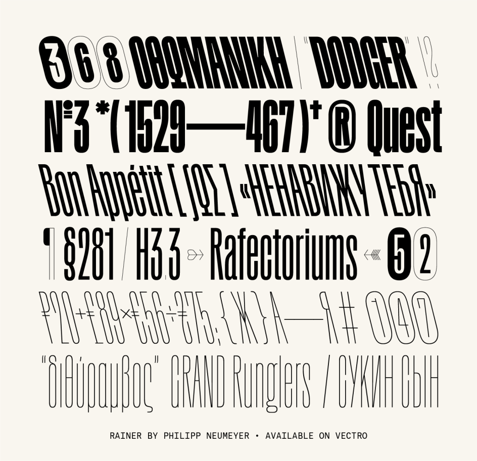
Rainer by Vectro Type
5. Iskry by Laic
Iskry is a serif typeface with a unique and quirky character. This is a strongly contrasted, edgy, blazing serif typeface suitable for display purposes on screens and in print. The serifs and the terminals are sharp, and the axis of the letters is varied. This, plus a large x‑height, makes it suitable for typesetting both short paragraphs and large headlines.
It was created in January 2020 by Laic, a graphic design studio based in Warsaw, Poland, that specialises in typography and type design. "Iskry means Sparks in Polish," they explain. "Sparks are something small that sets off with a sudden warmth or brightness but also tiny pieces of luminous material."
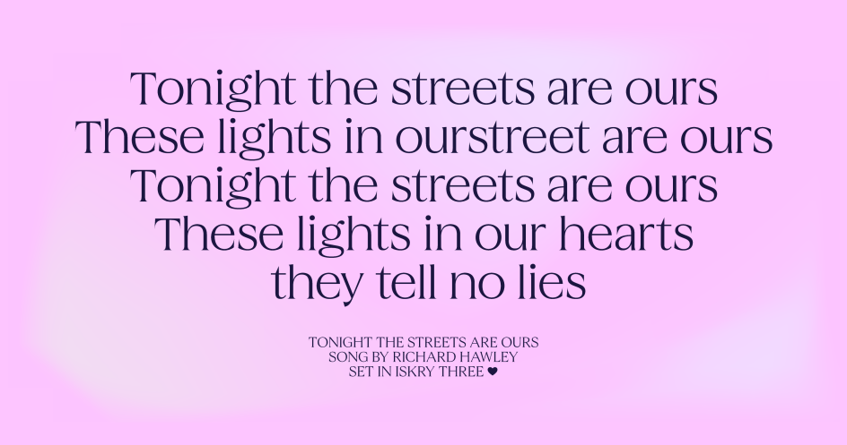
Iskry by Laic
6. Queens by Kilotype
First published in 2019, Queens is a display typeface with a classic and elegant design, inspired by the Bodonis & Didots, but renouncing their rigid mannerist construction in favour of playfulness. A design intended for 20 points plus, it comes replete with a range of features and typographic intricacies.
Available in three distinct widths (Compressed, Condensed, and Standard), Queens is designed with the idea that diversity and quirk are to be embraced and that expectations of rhythm need to be broken in order to flourish. In that light, the typeface unifies a backwards-leaning 'a' with the alternating stress angles of 'e' and 'o', while the 't' sits on the baseline, swapping its traditional tail for a monumental serif. Flaring strokes are tapered, resulting in an italic 'f' that contrasts a delicate teardrop terminal with the sharpness of a knife.
Queens was created by Kilotype, a German foundry that was established in 2017 and promised extensive language support and high production standards with every typeface. In addition to their font catalogue, they develop custom solutions for commercial and institutional clients.
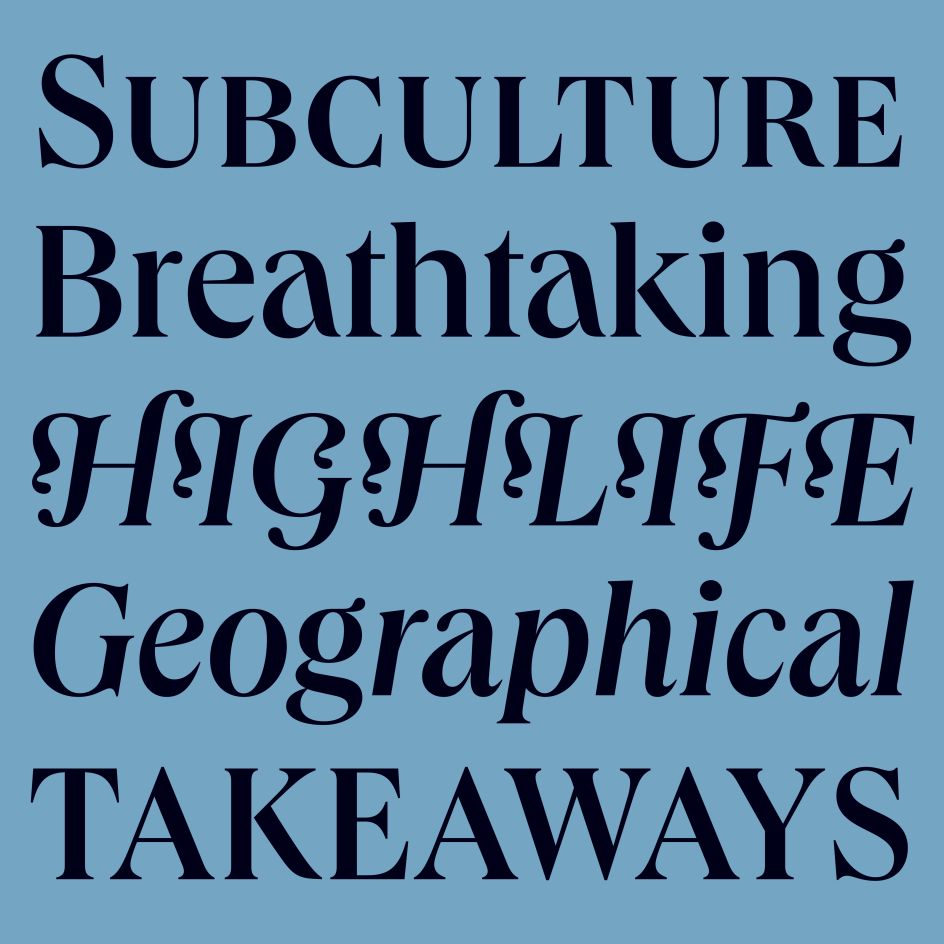
Queens by Kilotype
7. Dazzed by Displaay
Dazzed is a sans-serif typeface with narrow proportions, which began life as a bespoke typeface for a cinematic project proposal, and combines several styles in one font. First released in July 2019, it evokes the comic, grotesque and dramatic in its 'a', 'e', 'c' and 'g', while there's a sense of action and sci-fi in its 't', 'f', 'r', where the terminals are cut off, contrasting with the classical forms in other letters. Dots are rounded for accents, leading to better recognition, while italics are set at 18° (with lower degrees available on request).
Dazed was created by Displaay, an independent graphic design and typeface design studio established in 2016 and based in Prague, Czech Republic. Inspired by moments of imperfection and spontaneous irregularities, the foundry focuses on retail and custom fonts and aims to develop distinctive typefaces that are missing from the market.
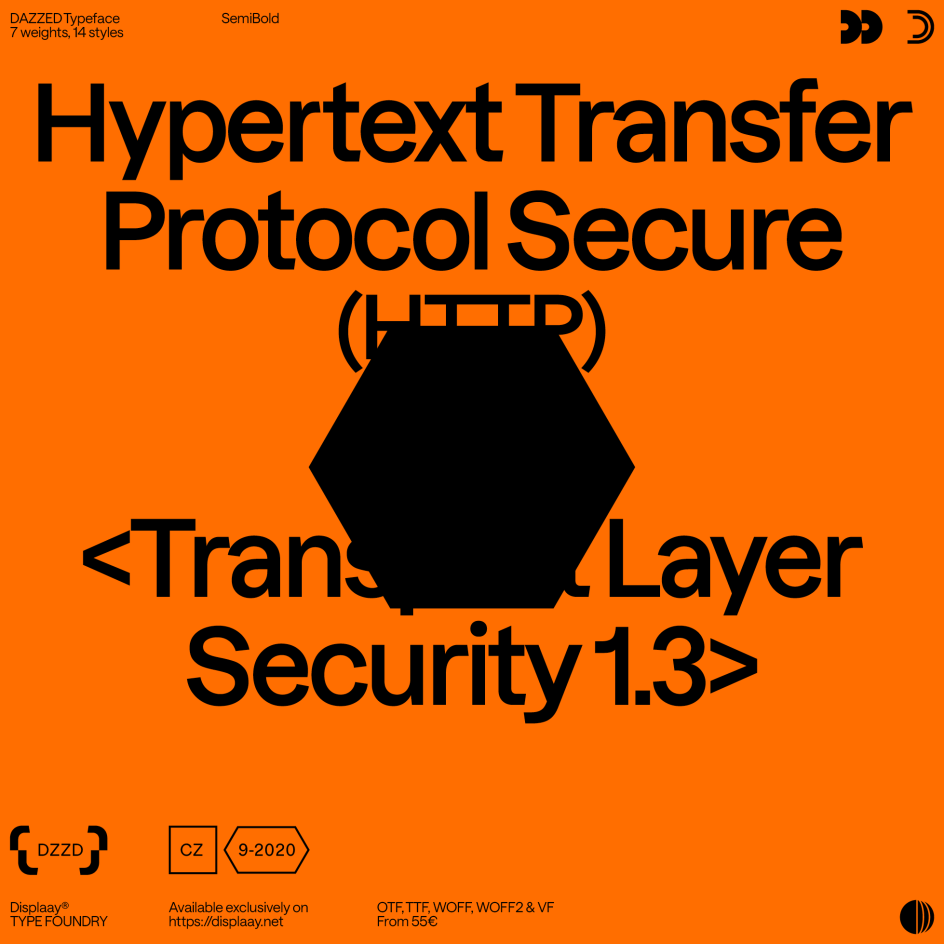
Dazzed by Displaay
8. Urbanist by Corey Hu
Urbanist is a low-contrast, geometric sans-serif inspired by modernist design. It was created by Corey Hu, a typeface designer based in the United States, in 2020. Constructed from elementary shapes, Urbanist's neutrality makes it a versatile display font for print and digital alike. It's currently available as a variable font with axes for tuning weight (100-900) and italics (0-1).
9. Humane by Rajesh Rajput
Here's a free font that's definitely worth downloading. Humane is a super-condensed, sans-serif typeface with multi-language support and a warm and friendly character.
It was created by Rajesh Rajput, a typeface designer based in India, and has seven weights, from thin to bold. It's suitable as a display font for headlines, titles, logos and more. "This typeface is dedicated to all human beings," says Rajesh. "Life is not fair to anyone, and everyone is facing their situation. Still, there is love and compassion. So hang on and enjoy whatever you've got.
Humane by Rajesh Rajput
10. Roboto by Christian Robertson
Roboto is a sans-serif typeface designed by Christian Robertson as the system font for Android in 2011. Google Fonts released it in 2011 to provide a clean, modern look for mobile and web interfaces.
Featuring a geometric design with a humanistic feel, Roboto is used widely across many different platforms, from websites to mobile apps, and has become one of the most popular typefaces on Google Fonts. "Roboto has a dual nature," Christian explains. "It has a mechanical skeleton, and the forms are largely geometric. At the same time, the font features friendly and open curves. While some grotesks distort their letterforms to force a rigid rhythm, Roboto doesn't compromise, allowing letters to be settled into their natural width."
Christian is currently an interface designer at Google working on Android. He also designs type through his foundry, Betatype.
11. Pastiche Grotesque by Order
Pastiche Grotesque is a sans-serif typeface designed by Order, a design studio based in San Francisco (see our exclusive interview with founder Jesse Reed to learn more). Released in December 2021, it features a unique and playful design with exaggerated curves and a quirky personality. In that light, it's well-suited for headline and display text and a good choice for projects requiring a touch of humour and personality.
Its creators describe the fonts as "type design fanfiction looking at late 19th century Gothics through the lens of mid-20th century Neo-grotesques. It hypothesises what a Neo-grotesque might look like if lower-contrast forefathers like Akzidenz or Venus didn't exist. How the Neo-grotesque genre – represented by the likes of Helvetica, AG Book, or Unica – might change if they retained the higher contrast found in early Gothics derived from Clarendon/Egyptiennes, where someone had simply lopped the serifs off."
Pastiche Grotesque by Order
12. Frame by Commercial
Originally designed for the cycling brand Rapha by Paul Barnes, assisted by Dan Milne and Thomas Bouillet, Frame is inspired by the work of William Caslon I and, in particular, his Great Primer (cut in 1734), a face that owes much to the Dutch masters of the 17th century. Coming in four weights, it has separate versions for text and headlines and is also available as a variable font with axes for weight and optical size.
The family has a large x-height and reduced descenders. Its serifs are simple in structure, with minimal tapering and an overall sharpness reflected in the sharp lines of ball terminals. The italic has both the steepness and regularity of angle seen in some of Caslon's work, making it characterful without being distracting.
It's one of many fantastic fonts from Commercial, a joint venture between Paul Barnes and Christian Schwartz based in London and New York. The pair have been collaborating since 2004 on various typeface projects, most notably the award-winning Guardian Egyptian. The company publishes retail fonts developed by the two, their staff, and outside collaborators.
Frame by Commercial
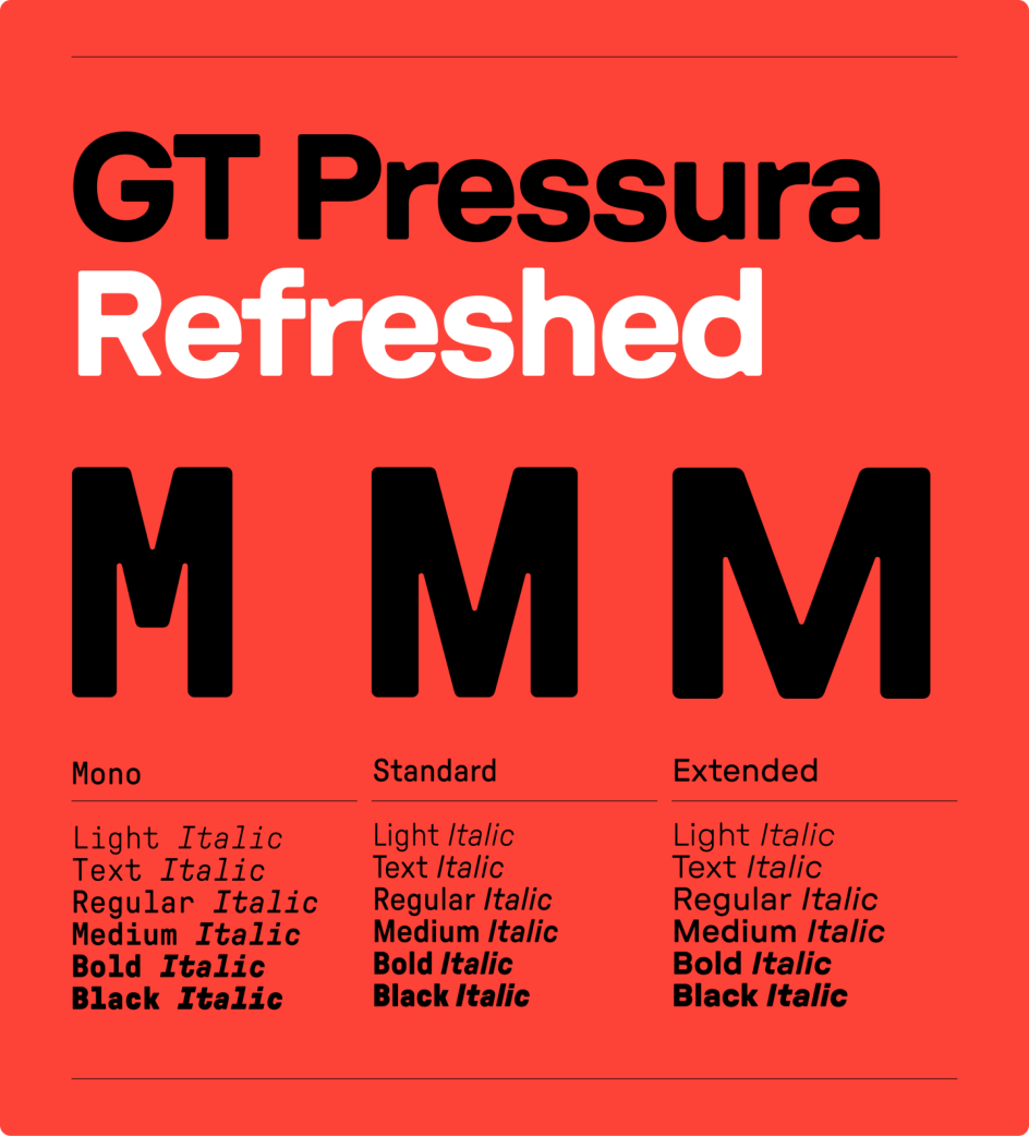
13. GT Pressura by Grilli Type
GT Pressura is a condensed, rounded, sans-serif typeface designed by Grilli Type, a Swiss type foundry. The typeface features a clean, modern design inspired by Swiss design typography and is well-suited for use in a wide range of design projects, from branding to web design.
The font was first released in 2012, cyrillics were added in 2017, and now a 2022 refresh adds three new weights and an entirely new width to the typeface. It all adds up to a versatile typeface that is both functional and aesthetically pleasing and is a great choice for designers looking for a minimalist, modern sans-serif.
Noël Leu and Thierry Blancpain founded Grilli Type in Switzerland in late 2009 as a collaborative avenue for working with other designers. The studio now numbers eight, with colleagues dispersed across the globe. And as they say: "Just because we're Swiss doesn't mean we're neutral. We make type with a point of view, type that conveys meaning beyond the words it spells out. What matters to us is this: What story does a typeface tell? What kind of personality does it have?"
GT Pressura by Grilli Type
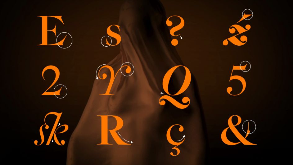
14. Epicene by Klim
First released in September 2021, Epicene Text and Epicene Display are baroque typefaces inspired by the work of two 18th-century maestros who were arch-rivals: JF. Rosart and J.M. Fleischmann. Its exaggerated details add rigour at small sizes and vigour at large sizes.
The culmination of a ten-year study on Baroque fonts, ornamentation and removing the gender binary from visual language, Epicene essentially reconciles the two men's work. However, its historical basis doesn't stop it from being a workable font for the 21st century, as designer Kris Sowersby explains: "While attentive to history, Epicene is not a revival typeface. It is an experiment in modernising Baroque letterforms without muzzling their ornamental idiosyncrasy nor falling into the trap of gender codifications. It's a firm statement that fonts have no gender."
Overall, then, this is a thoughtful and inventive approach to type that's typical of Klim, a type foundry based in New Zealand. And that's no accident. "Our foundational ethos is 'a thing well made'," they explain. "Our typefaces combine historical knowledge with rigorous contemporary craft."
Epicene by Klim


](https://www.creativeboom.com/upload/articles/90/908fdb6378db1e95d12595416f54e6336d5e80b8_732.jpg)


. In use by [Garbett](https://garbett.com.au/) for Career Trackers](https://www.creativeboom.com/upload/articles/0f/0f4e193ba9164073646e67421eb37b4b26986c67_732.png)
 using <a href="https://www.ohnotype.co/fonts/obviously" target="_blank">Obviously</a> by Oh No Type Co., Art Director, Brand & Creative—Spotify](https://www.creativeboom.com/upload/articles/6e/6ed31eddc26fa563f213fc76d6993dab9231ffe4_732.jpg)