We Are Queer Britain: M&C Saatchi and Queer Britain launch the UK's first LGBT+ museum
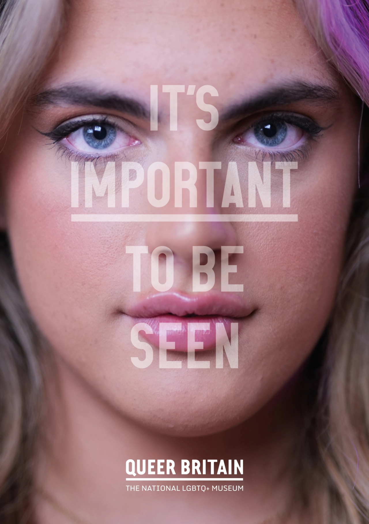
M&C Saatchi London has collaborated with Queer Britain to help launch the UK's first LGBT+ museum at Granary Square, Kings Cross. Running with the title The Place To Be Seen, the campaign leans into the importance of visibility for LGBT+ people, culture and history.
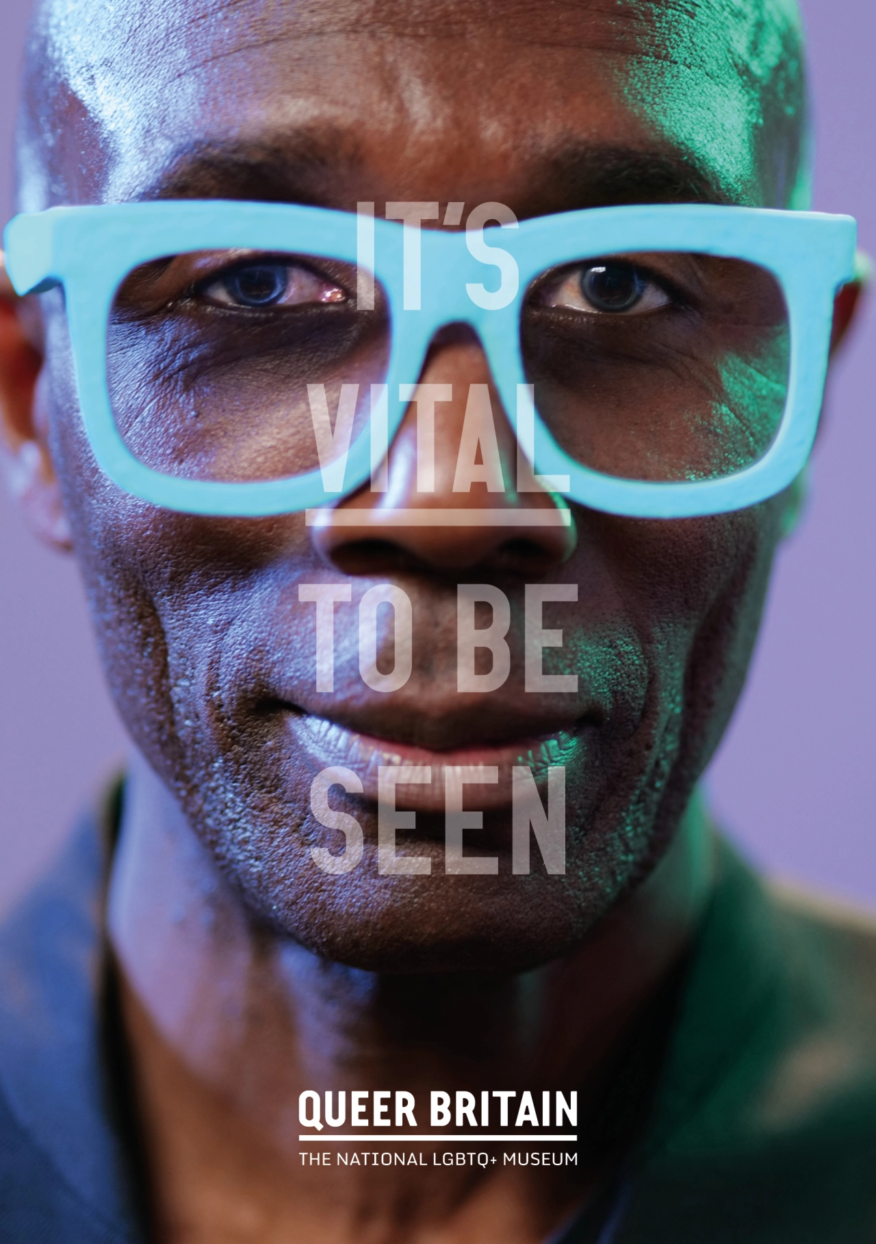
Opening today with the inaugural exhibition 'We Are Queer Britain', the show includes artefacts such as Oscar Wilde's prison cell door, the stage outfit that Years and Years' Olly Alexander came out in, and a rainbow Hijab.
Meanwhile, the collaboration between M&C Saatchi and Queer Britain represents the latest development in the studio's longstanding partnership with the charity. Having nurtured Queer Britain for the past four years as it prepares to open this landmark physical presence, M&C Saatchi has provided office space and strategic brand support for the fledgling museum. It also helped build Queer Britain's photographic archive through a partnership with Getty Images and aided its fundraising efforts through initiatives such as the launch of the Madame F wine range.
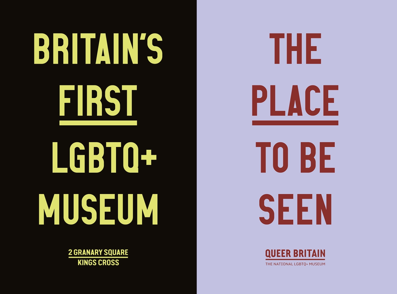
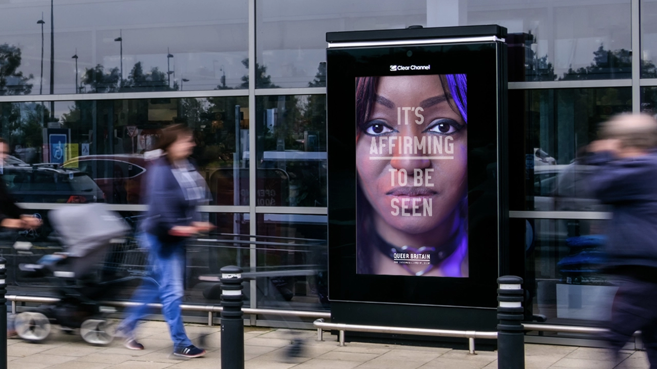
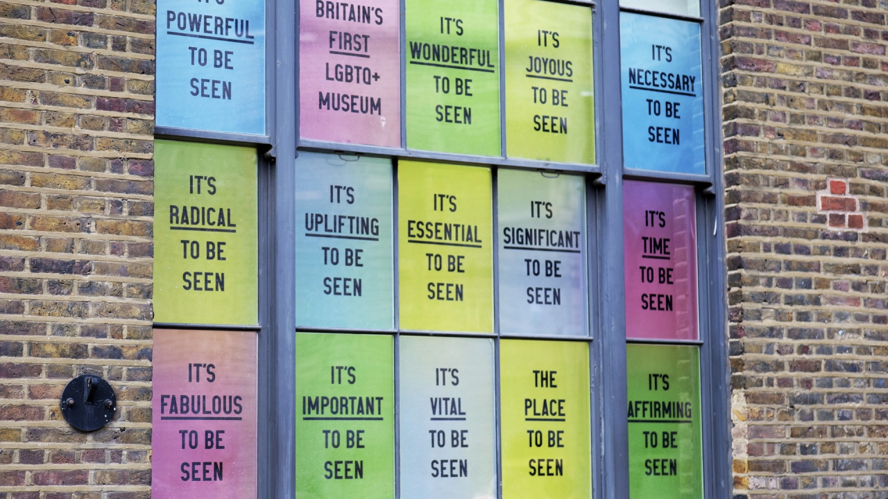
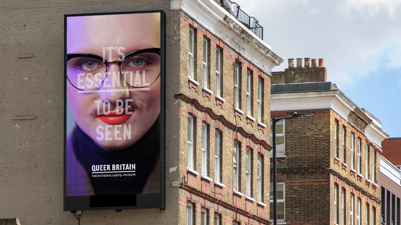
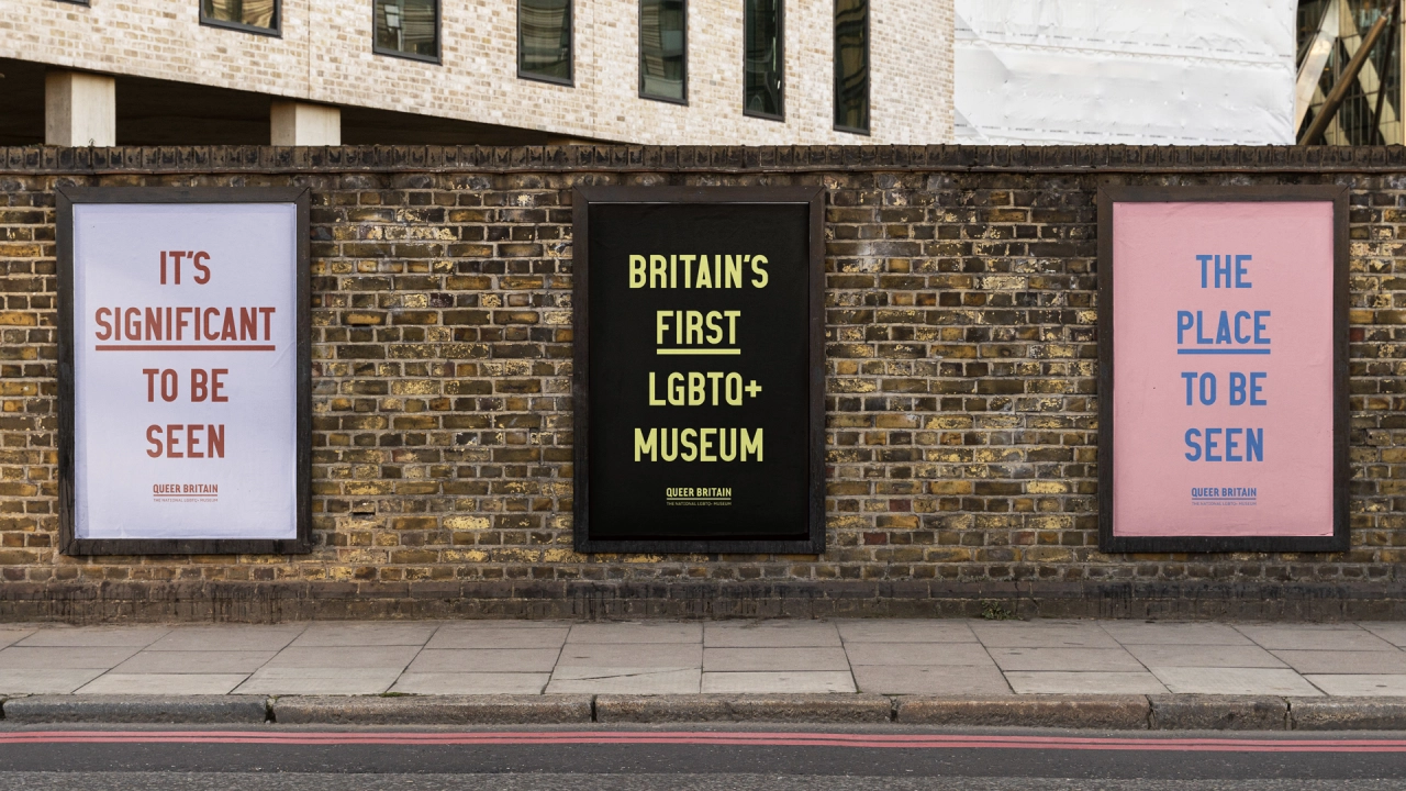
With The Place To Be Seen, though, M&S Saatchi has highlighted how important it is for members of the LGBT+ community to be visible. It's achieved this with unmissable promotion, which runs across out-of-home, digital and social channels.
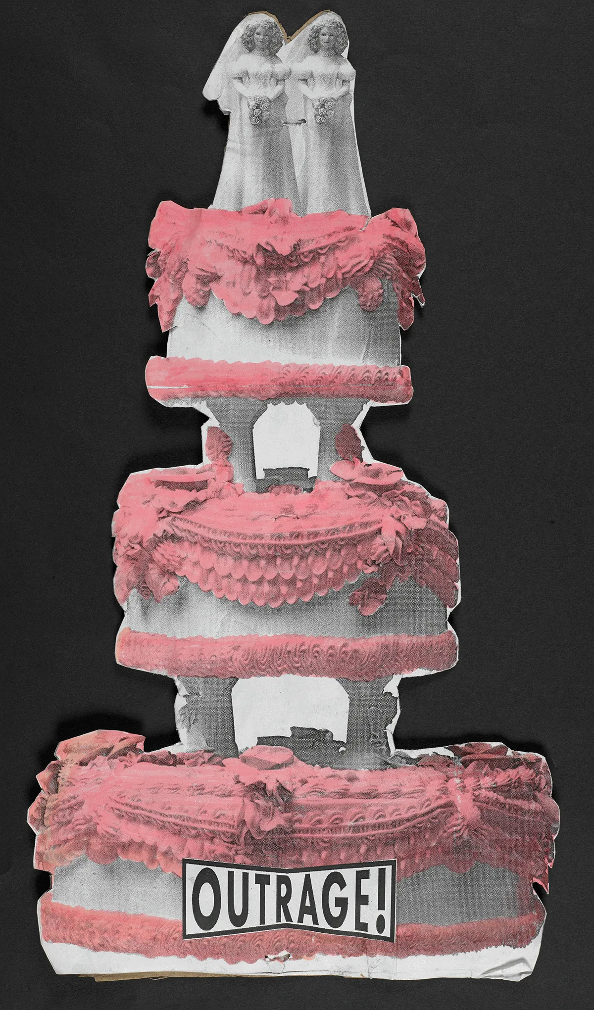
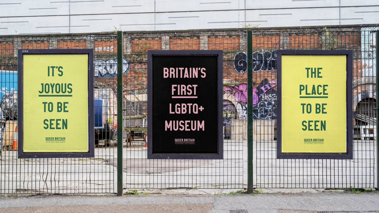
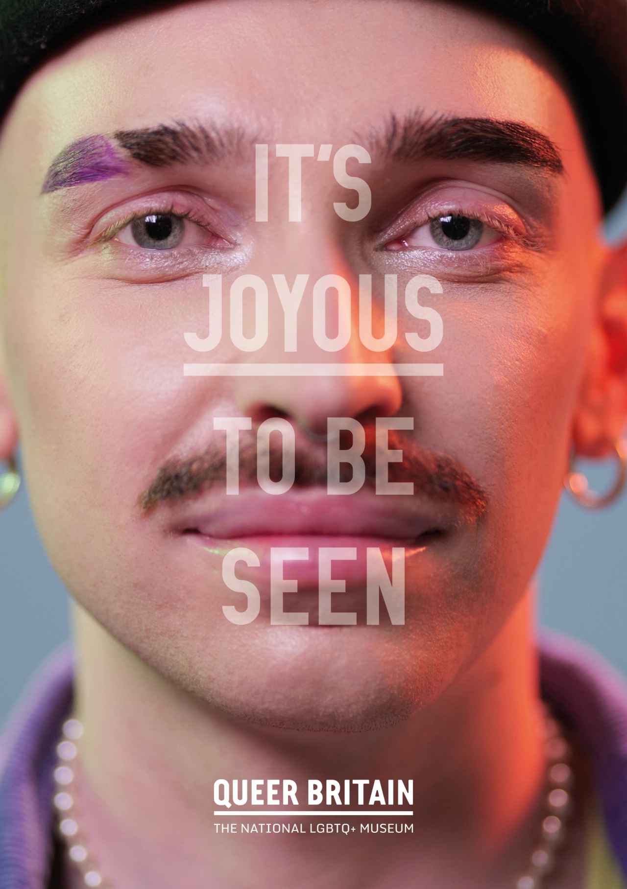
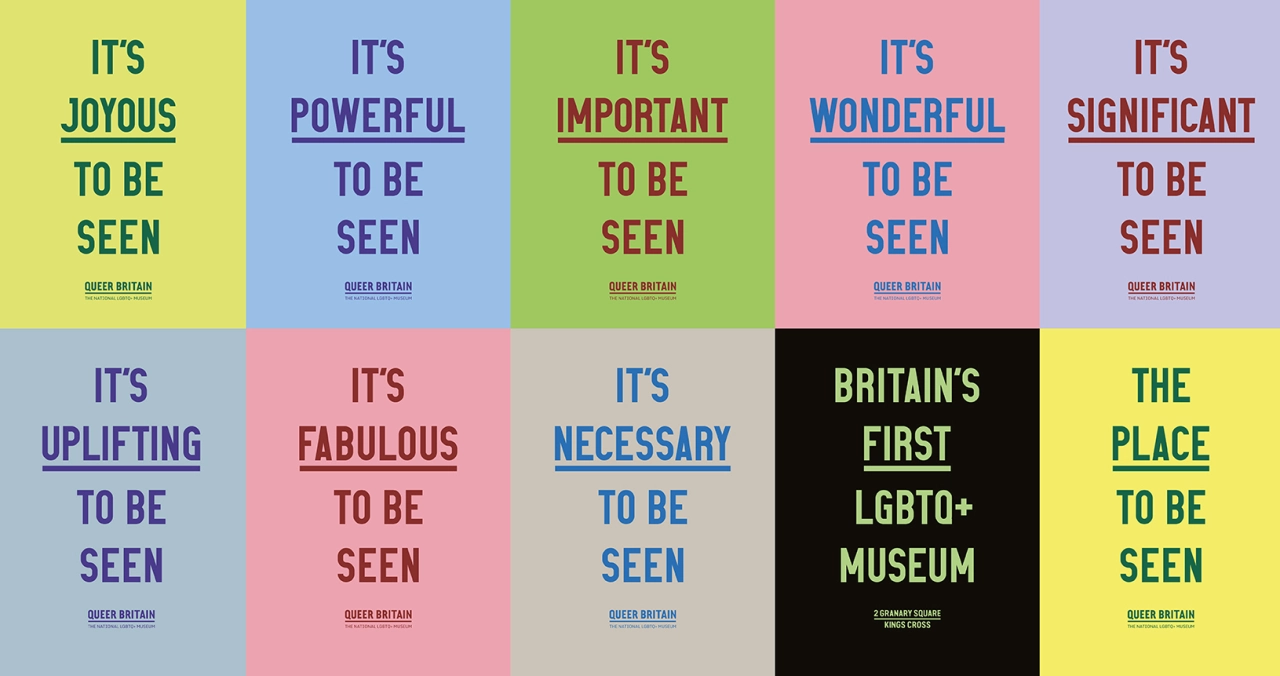
Unlike graphics which have come to promote LGBT+ members, the campaign does not rely on the colours of the rainbow to get its message across. Instead, in honour of the 50th anniversary of the UK's first Pride March, it references protest placards for a strong typographic solution. This acknowledges both the power and importance of visibility and acts as a nod towards the joy of self-worth and self-acceptance it can help promote.
Ben Golik, chief creative officer at M&C Saatchi London, said: "Most museums are places people go to see things. But this is a museum where queer people go to be seen. Our campaign champions the visibility of queer culture, history and people made possible at Britain's first LGBT+ museum. It's about visibility, validation and valuing the community's stories."
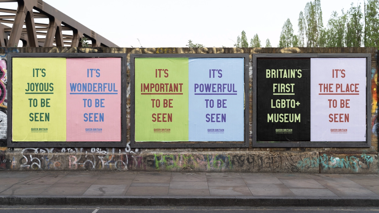
On why they were so keen to avoid rainbow colourways and stripes, Ben reveals: "While visibility is always welcomed, simply applying these can do both brands and audiences a disservice. The queer community over-indexes on its appreciation of creativity, and we were determined to honour that expectation.
"Taking our cue from the 50th anniversary of the UK's first ever Gay Pride Rally, held in London in 1972, the campaign typography was inspired by placards to recognise that Pride is first and foremost a protest and political event, as well as a celebration of community, acceptance and self-expression."
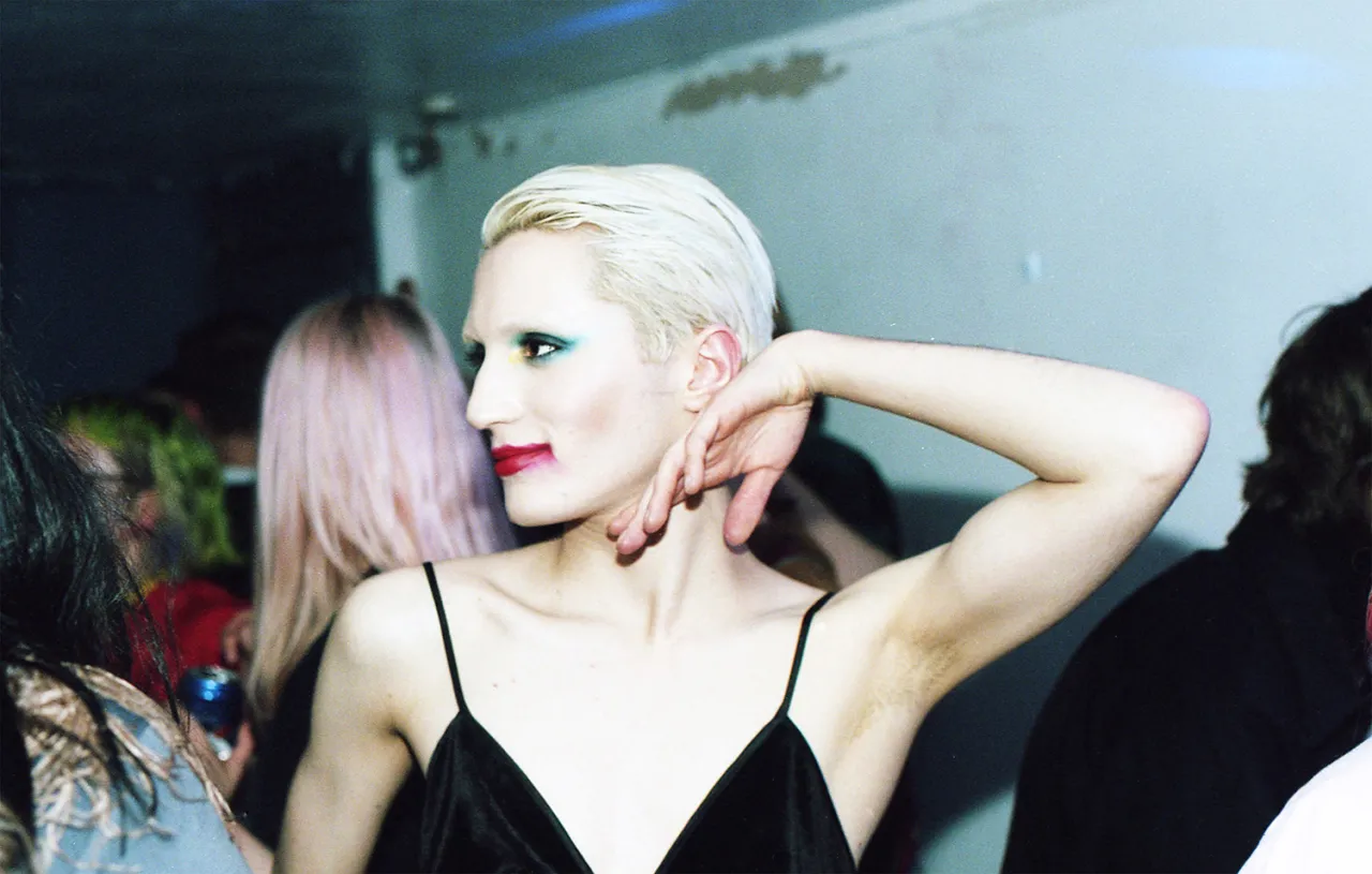
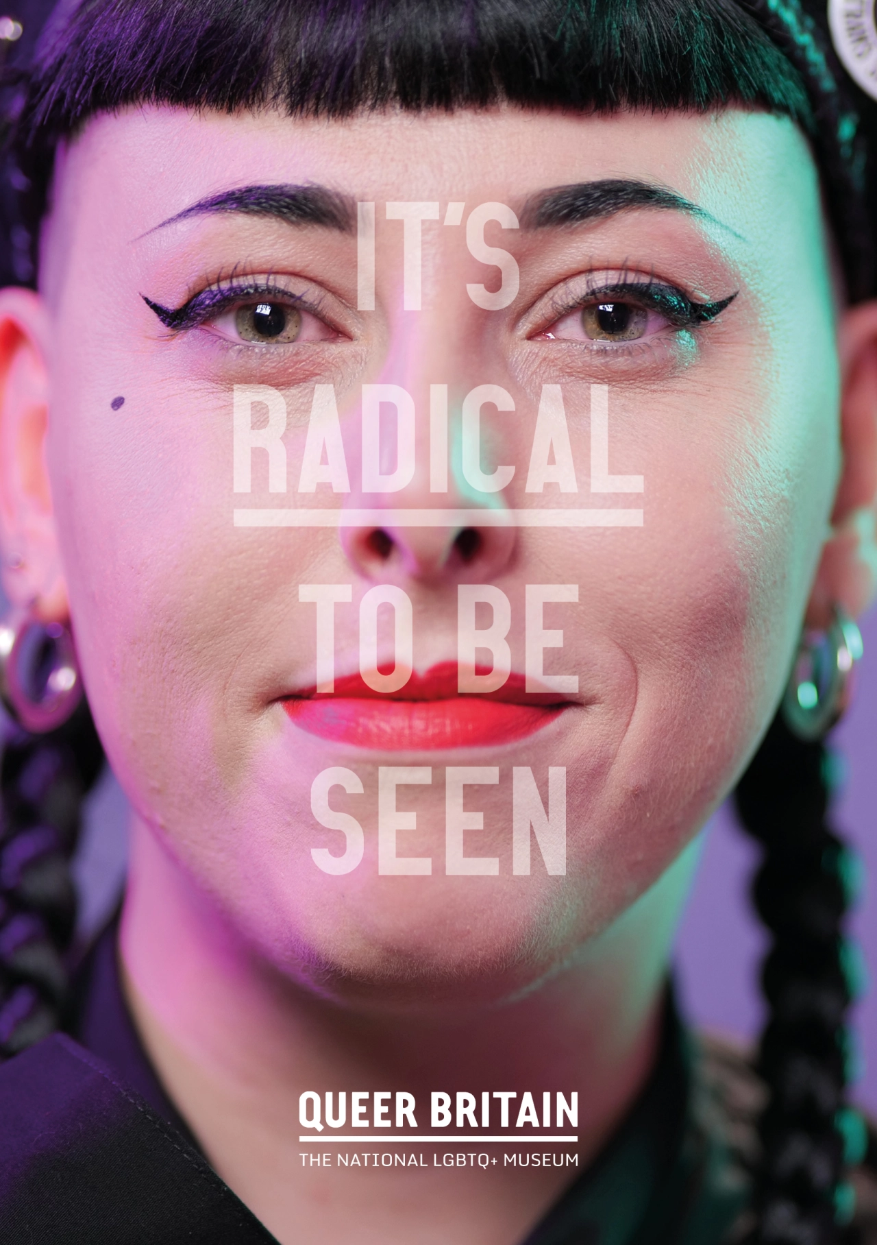
In terms of the campaign's core message of being seen, Ben adds that the arresting portrait photography it contains represents a range of sexualities, gender identities, ethnicities and ages. "Each sitter holds the viewer's gaze with confidence, defiance and pride. Determined to be seen. These portrait photographs will directly engage with viewers on poster sites across London."
Joseph Galliano, co-founder and director of Queer Britain, adds, "Without M&C Saatchi, Queer Britain would not have come so far, so fast. The passion, support and generous creativity they have shared have been nothing short of inspiring. They are forever in the walls, forever our family. This launch campaign is stunning and beautifully articulated a core idea about us that we could never have done alone."
The museum's opening comes at a troubling time for the LGBT+ community. Despite advances in visibility and acceptance, homophobic hate crimes have increased in Britain. According to UK government numbers on police-recorded hate crimes, offences have increased by 324% in the years leading up to 2021.
Meanwhile, hate crimes toward transgender people skyrocketed by 789%. Factor in a recent Galop report in Hate Crime finds that just one in eight LGBT+ victims report hate crimes to police, and clearly, the need for visibility has never been more necessary.
Golik explains, "The need for visibility remains vital, and having a permanent physical space for queer people and allies is an important step forward. Plus, having proud queer faces on posters across London means the launch campaign itself supports the museum's own objectives."
Supporting Queer Britain and M&C Saatchi throughout this campaign is Clear Channel, which is acting as the media partner to support with outdoor space across London. As for the street posters, these have been provided through Jack Agency, and the social and digital content has been sourced through partner networks, including prominent influencers and corporate supporters.
As for the long-form and social film content, this was created with the new queer production company WendyVision and award-winning queer filmmaker Darius Shu. Today's launch campaign has also been enhanced by its own art commission, Seen at Queer Britain, a project by queer portrait photographer Amy Maidment that captures visitors on the historic opening day.
Editor's Picks





Trending


Latest Jobs
Lead Product Designer, Growth at Monzo
Full-time·London·£90,000 – £120,000
Head of Production at Art&Graft
Full-time·London·£80,000 – £95,000
Junior Motion Designer at Project Slingshot
Full-time·Remote·£30,000 – £35,000
Junior Creative Designer & Visual Researcher at Hollywood Secret Service
Full-time·Brighton·£26,000 – £28,000
Director, Creative Technology at Code and Theory
Full-time·New York·$160,000 – $225,000
Junior Graphic Designer at GIG Health
Full-time·Farringdon, London·£27,000 – £32,000