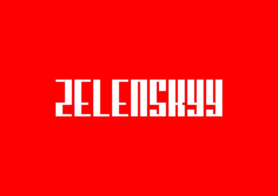
Zelenskyy is a new display typeface by Felix Winter responding to the conflict in Ukraine
Graphic designer Felix Winter has released a new display typeface titled Zelenskyy, responding to the ongoing crisis in Ukraine. The family takes inspiration from the wired fence situated on the border between Russia and Ukraine, acting as a metaphor for division and conflict.
A graduate in Graphic Design at Solent University, Felix Winter is currently studying a Master's in Visual Communication at the same establishment where this project unfolded. "I am obsessed with typography, how letters are formed, how they are structured, and the endless possibilities within letterforms," Felix tells Creative Boom. "I take inspiration from design books and observing lettering around me, both in the shops and on the streets."
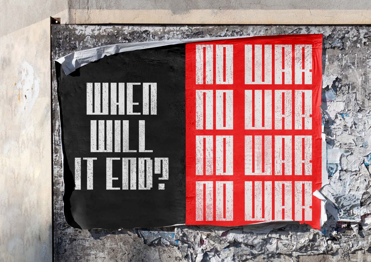
Like any of us, Felix feels helpless at seeing events unfold in Eastern Europe and wanted to do something to support Ukraine. The display typeface titled Zelenskyy is the result and takes direct inspiration from the divided border that separates Russia and Ukraine. "Fences are symbolic of the geographic division between the countries, a topic at the core of the conflict," explains Felix. "The individual letters are bold and dynamic, amplifying the cause and statements it could use."
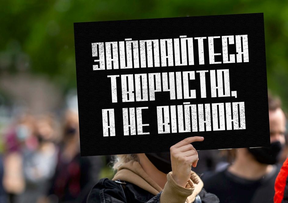
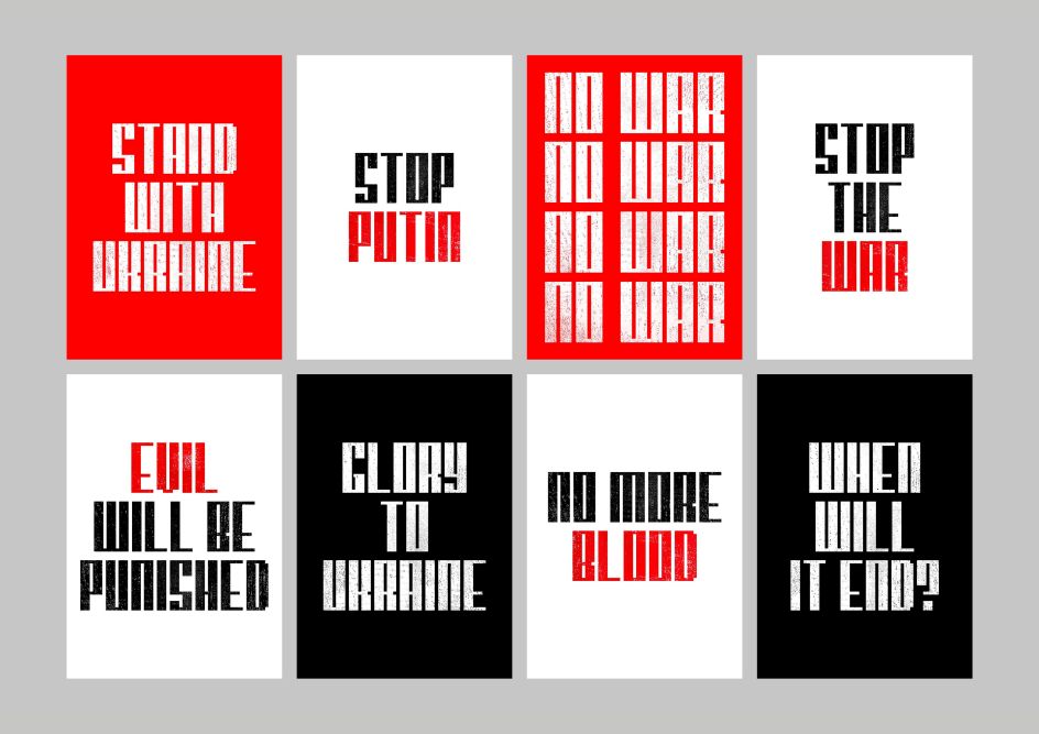
Felix hopes his typeface will be used for protest banners and anything else that might help others to voice their opposition to the conflict. As such, he has created a series of posters as examples, using the typeface to create bold statements, with the textured letters paying homage to traditional letterpress. "The aim of the typeface is not for a slick, refined, polished set of letters," he says. "The typeface needed to be robust and raw and capture a moment in time. The red, black and white colour palette makes the work more memorable and amplifies the written statements."
The poster designs use phrases developed over social media during the past few months and some of the powerful phrases President Zelenskyy has been famous for saying during recent press conferences. For the purpose of the project, Felix wanted the work itself to be as accessible as possible, so the designs have been made available through GumRoad, where people can pay as little or as much as they would like, where 100% of all sales go towards UNICEF, a charity that is at the heart of crisis gathering vital supplies for vulnerable children in Ukraine.
"The typeface also needed to be culturally accessible, so the letterforms were also designed in Ukrainian and the posters," adds Felix. "The result is a bold and robust response to the ongoing crisis, displaying the power of typography and how digital media make resources more accessible."
Editor's Picks


Trending


](https://www.creativeboom.com/upload/articles/90/908fdb6378db1e95d12595416f54e6336d5e80b8_732.jpg)
Podcasts


Editor's Picks
Further Reading