Provencal style with English edge: Folc wine's new design
Created to rival wines made in Provence, Folc's new bottle and brand design is a combination of "fitting in and standing out".
Historically, the UK has not been renowned for its winemaking, thanks to its colder climate creating less-than-ideal grape-growing conditions. But husband-and-wife duo Elisha and Tom Cannon didn't let the weather get them down and set out to create a rosé to rival those made in Provence.
The Cannons founded Folc in 2019, and now, five years later, they've become England's leading rosé brand. They put the success of Folc down to a combination of the finest grapes from the South East of England with world-class winemaking, resulting in a balanced and refreshing homegrown rosé.
Despite the product's success, the founders struggled with the design, experimenting with four different bottle designs in as many years. Folc was connected with London-based studio Regular Practice through AUFI (Ask Us For Ideas), which matches ambitious businesses with inspiring creative agencies.
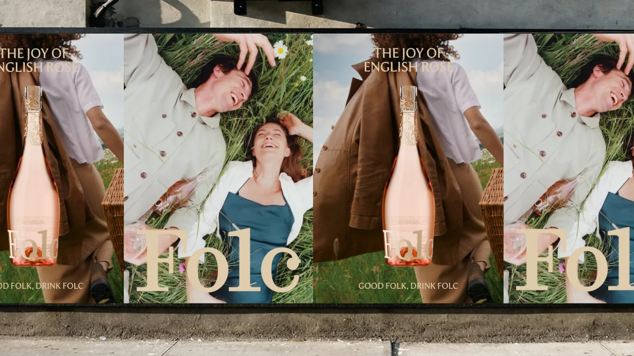
Regular Practice strategy director Ed Little describes the excitement about working with a brand that could rival, if not exceed, the best of Provence and defines Folc as "a Provencal style rosé with an English edge". He adds: "It's an interesting brief because you have a clear competitor set to learn from, using it as the base to layer our unique English character on top."
Identifying Folc's problems was the first port of call, the most obvious being the structural design of the bottle. Since the founders had tried various bottle designs to no avail – each ranging in price and manufacturer – Regular Practice saw an opportunity to define the benchmark English rosé silhouette once and for all.
Folc's new bottle is fully screen printed, which Regular Practice creative director Kristoffer Sølling says is unusual for wine. He explains that it's "something that's fairly novel and pioneering for both rosé and Folc, positioning them as bold and novel, like their wine."
In addition, the base of the bottle is fuller, designed to reflect the wine's characterful taste profile with more body and flavour than the thinner Provencal bottles. Sølling also notes the big masthead logo at the bottom and the inclusion of playful illustrations near the spout of the bottle.
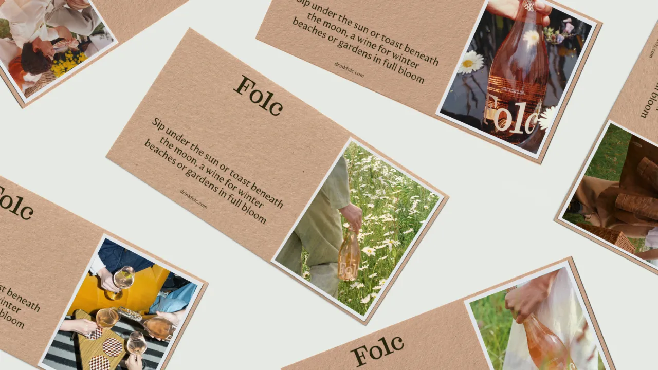
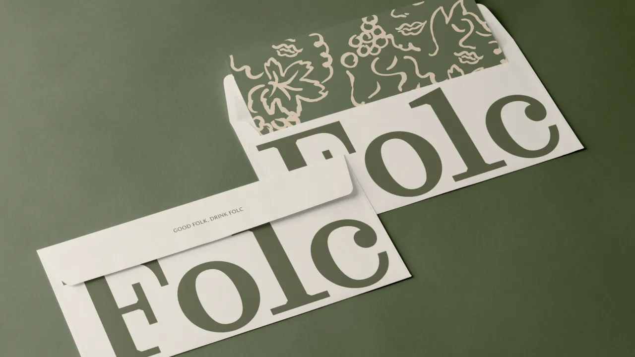
The second problem that Regular Practice noticed was etymological, as people didn't understand the meaning behind the name Folc. Little reveals that the old English spelling of 'folk' refers to 'people'. This meaning is now communicated through the brand phrase "good folk drink Folc".
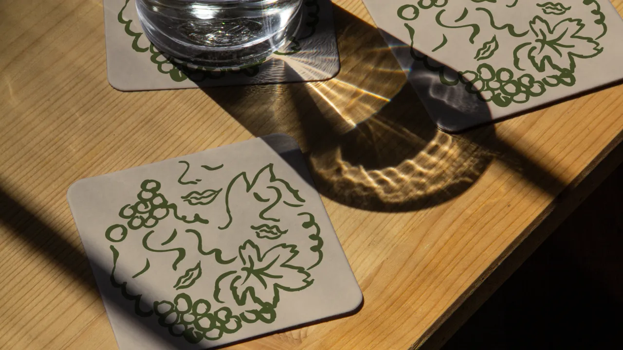
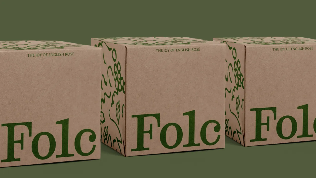
The studio also worked with illustration artist Olga Prader to create a range of folklore-inspired illustrations that broadly decorate both the bottle and the brand world. "We wanted to illustrate the 'joy of togetherness', harking back to folktales and legend using Olga's art, which is synonymous with whimsical storytelling and emotional depth", says Little.
Both the brand phrase and the illustrations seek to build brand equity into the Folc name and its meaning.
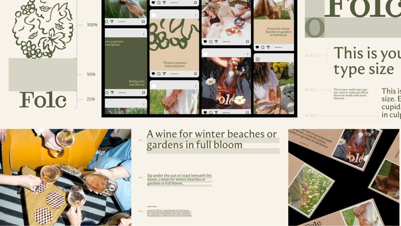
For the Folc wordmark, Regular Practice opted for a contemporary take on a classic design to add depth and character, introducing "diagonal notches to infuse a slightly engineered feel", according to Sølling. He says this provides "a striking balance to the softer, more traditional details", creating a deliberate contrast and "harmonious interplay" between the old and the new.
Folc's primary typeface is now Moulin, sourced from the Commercial Type Foundry and designed by Sandrine Nugue. Sølling says, "We were particularly drawn to the rhythm and sculptural feel of the letterforms, and the way it harmonises with our wordmark creates a captivating tension between old and new.
"This delicate balance not only enhances readability but also adds a unique visual character to our brand identity."

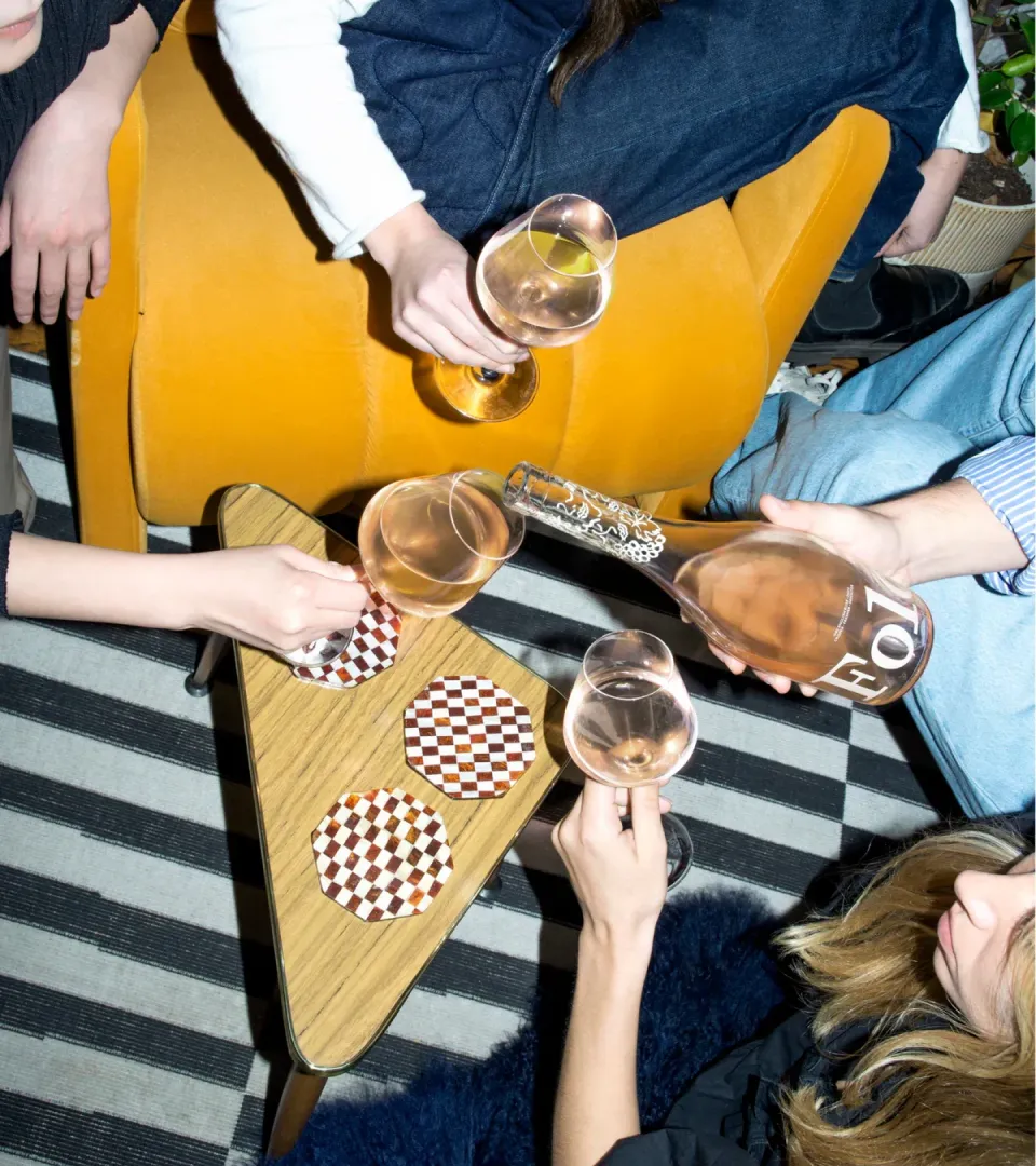
He goes on to describe Folc's art direction as "British, joyful, and ethereal", shot to encapsulate the "joy of togetherness" in the British countryside. The photography epitomises a quintessentially British summer, conveying "a folky yet natural and free-spirited atmosphere", Sølling adds.
Folc's bottle and brand design is a culmination of the best of Provence with a distinctive English edge. Its defining and differentiating features are its slightly more voluptuous, full-bodied bottle, its bold and powerful logo mark, and its earthy English colour palette, which includes hues not formerly associated with the category.
"Ultimately, it's a combination of fitting in and standing out", says Little.
Editor's Picks





Trending




Latest Jobs
Account/Client Manager at Represent
Full-time·London·£35,000 – £40,000
Staff Producer, Studio Central at DoorDash
Full-time·San Francisco·$176,800 – $260,000
Visual Development Artist - Feature at Sony Pictures Animation
Full-time·Los Angeles·$53.37 – $83.75 per hour
Multidisciplinary Designer at Formation Games
Full-time·London·£40,000 – £50,000
Executive Producer, Brand Creative at Mercury
Full-time·San Francisco·$189,400 – $236,700
Growth Marketing Lead at Anthropic
Full-time·San Francisco·$320,000 – $400,000