Pentagram designs identity for Pienso, a tech firm seeking to democratise AI
Pienso is seeking to make AI more accessible for ordinary companies. Now a new visual identity crafted by Pentagram is helping them pursue this mission.
Say the word AI to creatives, and for many of us, the impulse is to stick our fingers in our ears, go "lalalalala" and hope it all goes away. But whatever your views of artificial intelligence, the idea that this is just some short-lived fad we can safely ignore is becoming increasingly untenable.
For instance, as I write this, Microsoft has signed a deal to reverse the closure of a major nuclear reactor at Three Mile Island, Pennsylvania, purely to power its AI ambitions. This is just one example of how serious the world of business is about going down the AI rabbit hole. It's certainly no flash in the pan.
So, it's no longer a question of whether we pursue AI but whether it's kept in the hands of a very powerful few or properly democratised. One of the new entrants to the sector working hard on the latter is Pienso, a platform that lets users build and deploy models without having to write code.
Now, Pienso has recently teamed up with the iconic design studio Pentagram to help spread this message worldwide.
Who is Pienso for?
So what's Pienso all about? Well, many companies are currently struggling with AI implementation due to challenges in data management, security and computational resources. Pienso's platform makes things easier by guiding them through annotating and labelling training data for AI models. This system can be deployed in the cloud or on-premises and integrates with popular enterprise systems.
The company was founded by Karthik Dinakar and Birago Jones, who were influenced by the Bauhaus-inspired design and computing discourse at the MIT Media Lab. Understanding Modernism as a way of thinking, rather than just a design aesthetic, has profoundly shaped Pienso's approach.
In today's digital context, this meant incorporating cognitive design, UI, and UX alongside computer engineering, not just to create something beautiful but to forge something genuinely helpful and culturally significant. Their solution was to build an intuitive, design-led platform with accessible AI tools that empower both experts and novices.
Brand concept
Pienso asked Pentagram to create a compelling, modern design language that embodies its unique approach to tackling fundamental issues through AI.

In response, Pentagram created a new brand persona and tone of voice centred on the "Optimistic Navigator"; representing hope, confidence and forward momentum.
This idea serves as a metaphor for users who explore the complexities of AI with optimism, leveraging Pienso's unique expertise to learn new skills that foster creativity and independence while maintaining a focus on safety, privacy and data integrity.
Graphics and logo
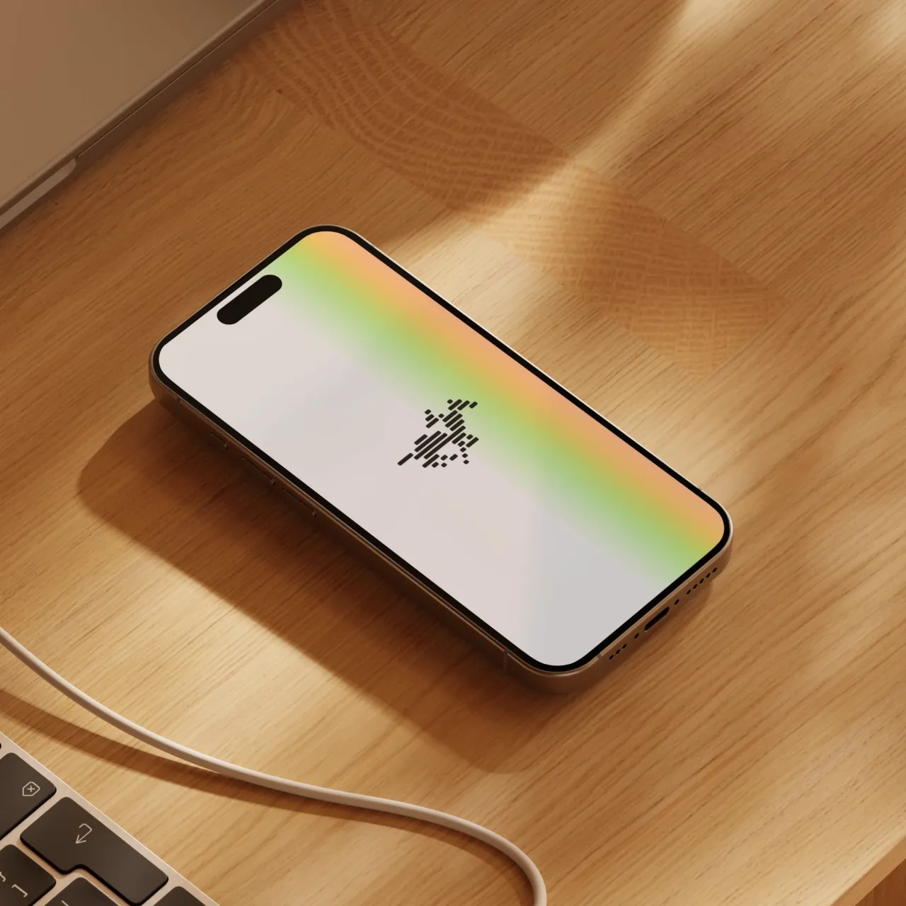
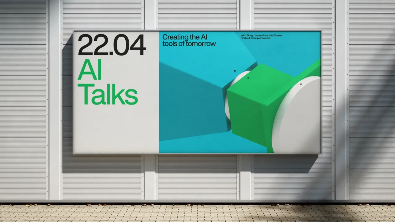
The team created a stripped-back identity that makes Pienso's features easy to grasp through striking, colourful elements that engage the audience and communicate the learning-through-play nature of Pienso's product.
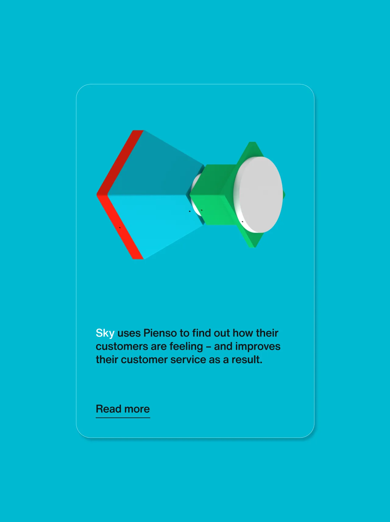
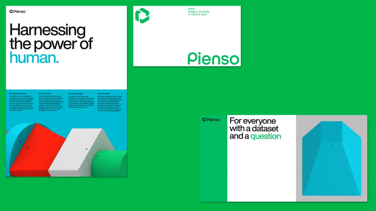
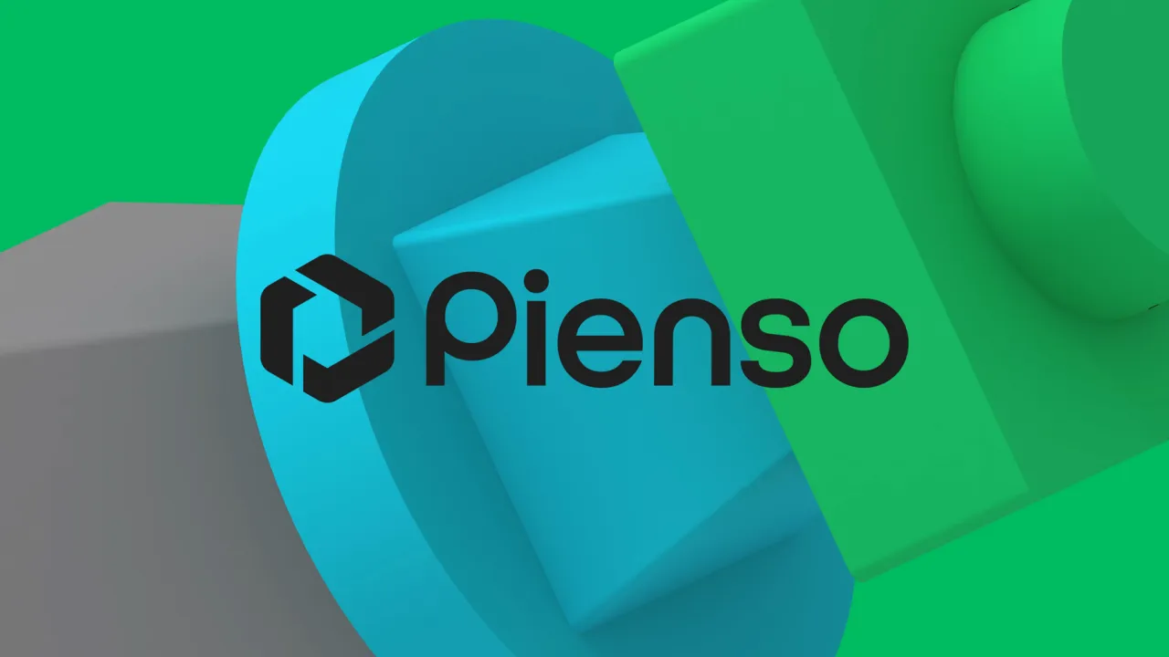
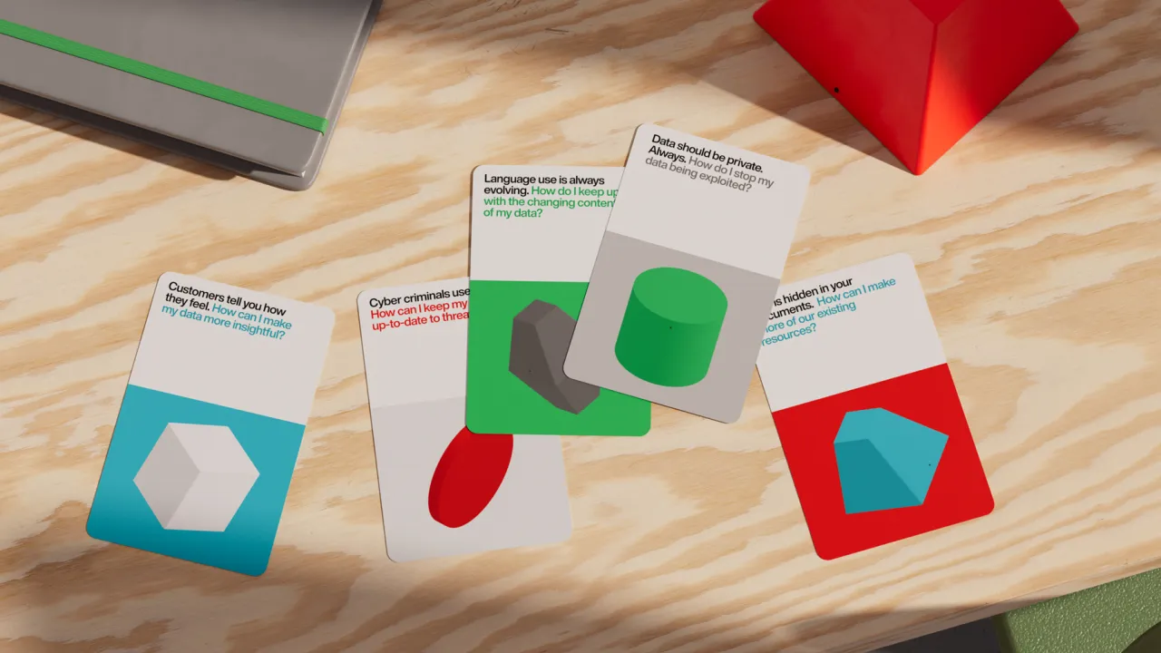
Pienso's user-friendly features are represented as simple geometric blocks in vibrant brand colours. These blocks can be displayed in a variety of combinations, highlighting their interchangeable, modular nature.
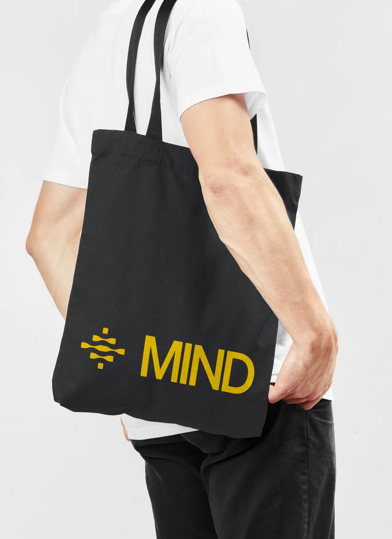
The platform's existing logo, consisting of three aligned prisms, was retained but updated to be more cohesive and to create alignment with both the form language of the coloured blocks and the new, bespoke wordmark. All three elements communicate approachability, balanced but purposeful playfulness, and a level of design sophistication reminiscent of mid-century design craft.
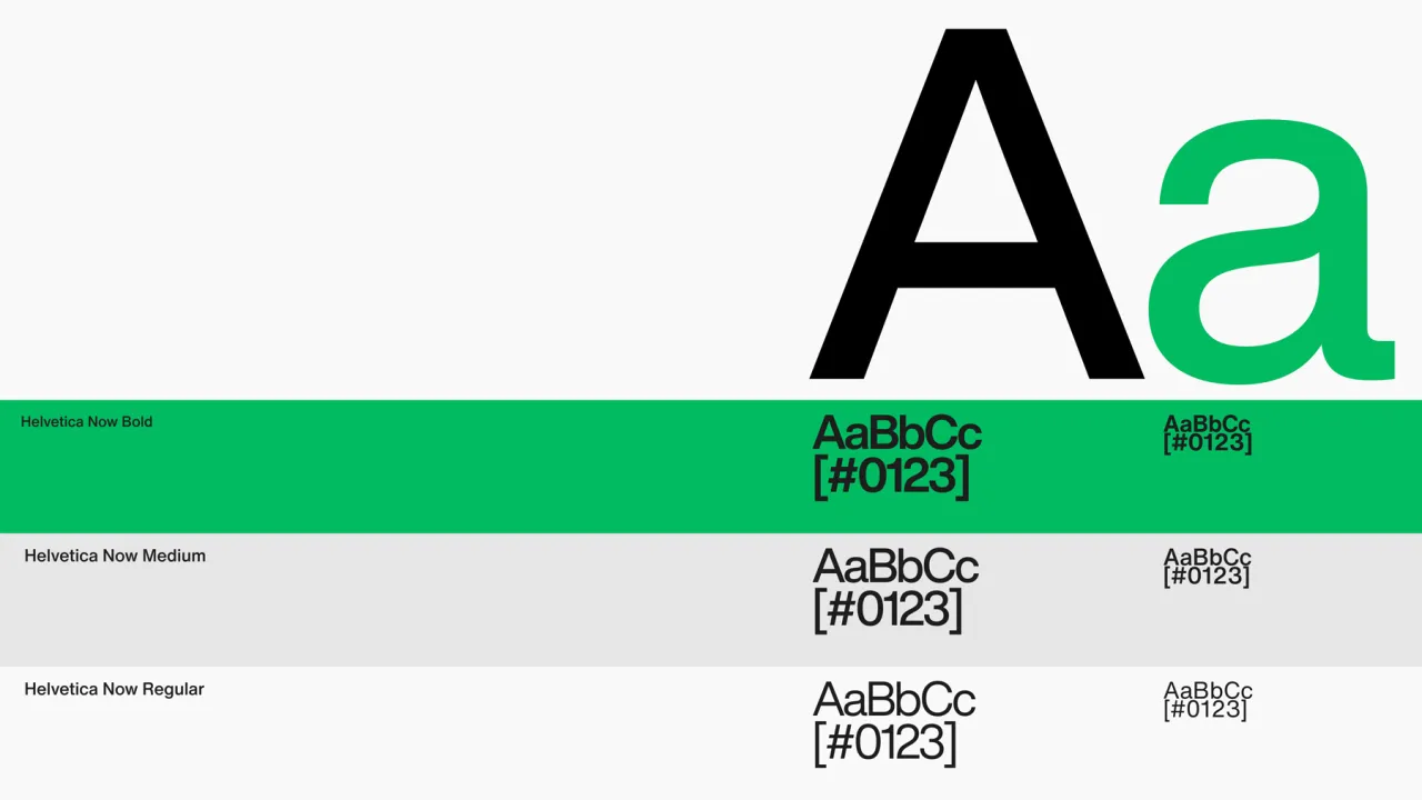
The new typographic system, meanwhile, uses Helvetica Now, an updated version of the modernist staple.
Colour palette and website
The colour palette, inspired by the vibrancy of Murial Cooper and Jaqueline Casey's work at MIT, uses black and white to create focus in contrast to bold, articulating blocks of bright colour. Both palettes balance their referential legacy with a directness and freshness relevant to Pienso's forward-looking vision.
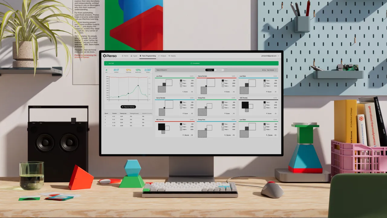
Pentagram also designed a compelling, easy-to-navigate, new website for Pienso, built by web design studio Commerce-UI. To demystify Pienso's technology, it was important to showcase real-life use cases, using branded diagrams and extracted product visualisation throughout the case studies.
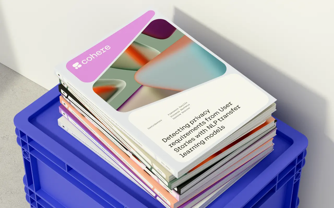
The Pentagram team also created an imagined 'Pienso workshop'. This fictional space grounds the vibrant blocks in a realistic, tangible environment. The idea is to bring texture to brand communications through a library of rendered images and forward a narrative of tactile interaction and emergent exploration.
Reimagining AI
Overall, Pentagram's tone of voice and design system represent Pienso's empowerment of individuals rather than catering to the incumbent big tech zeitgeist. In this way, the new identity reimagines AI as a tool of control and purpose, creating a bridge to an AI-powered future accessible to everyone.
In short, this refreshed visual identity brilliantly conveys Pienso's philosophy and the historical and academic influences on its design approach. This all adds up to a cohesive visual identity well suited for today's landscape of bleeding-edge AI development.
Editor's Picks





Trending


Latest Jobs
Multidisciplinary Designer / Photographer at Boomkat
Full-time·Manchester·£42,000 – £48,000
Verbal Identity Fellow at Interbrand
Full-time·New York·$30 per hour
Junior Graphic Designer at GIG Health
Full-time·Farringdon, London·£27,000 – £32,000
Content Executive at V&A
Full-time·London·£32,000
Senior Consultant, Strategy at Interbrand
Full-time·New York·$100,000 – $125,000
Motion Design Lead at Huge
Full-time·United States·$108,000 – $142,000