Octavo Redux: The much revered International Journal of Typography to be brought back to life
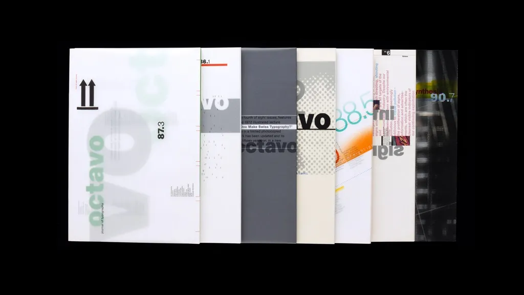
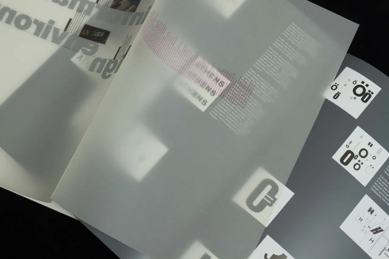
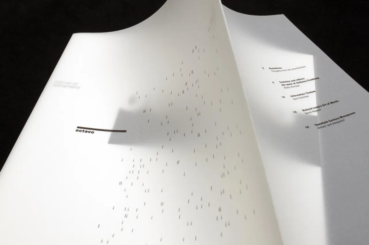
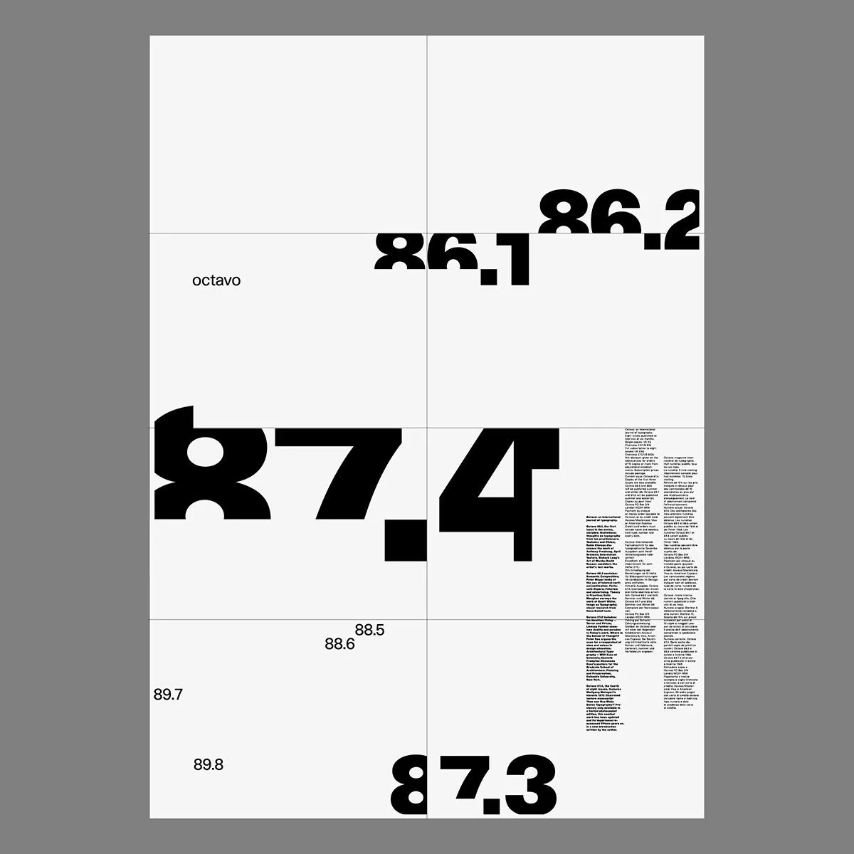
During the 1980s and early 1990s, the publication of eight issues of Octavo, International Journal of Typography, was an important act of graphic authorship. Since then, the legendary journal – which was designed by creative studio 8vo – has acquired mythic status and original copies have long been (almost) impossible to find. Until now, that is.
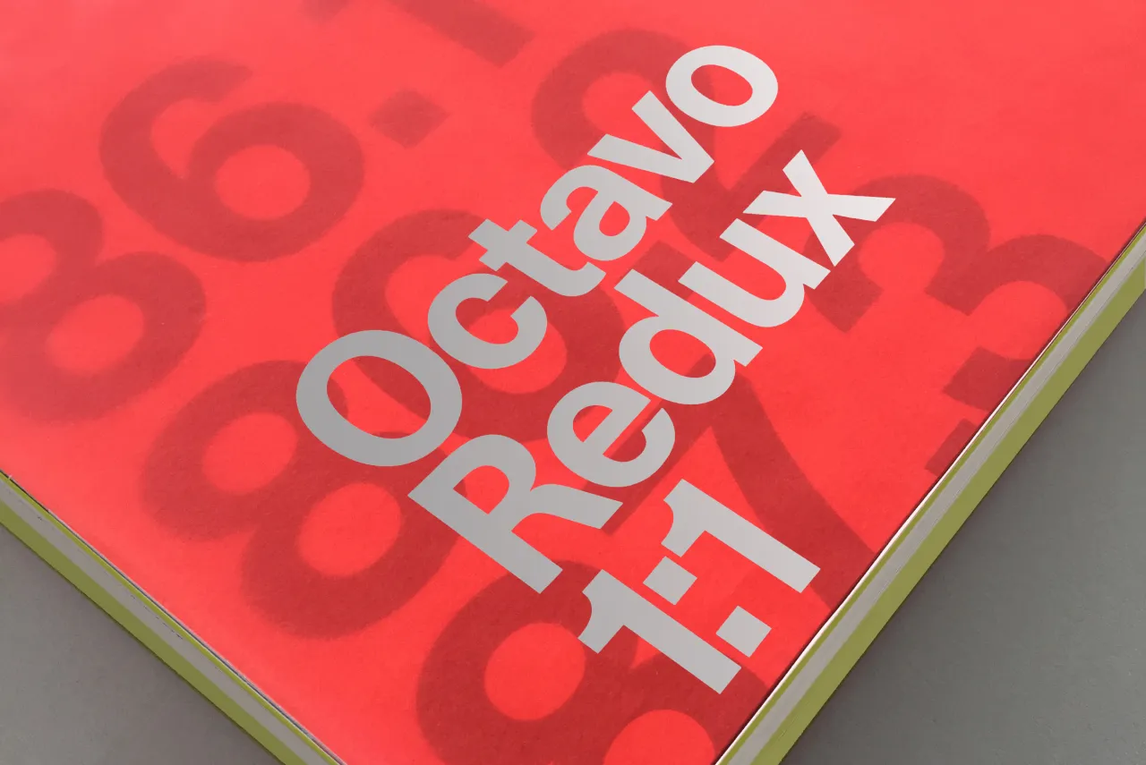
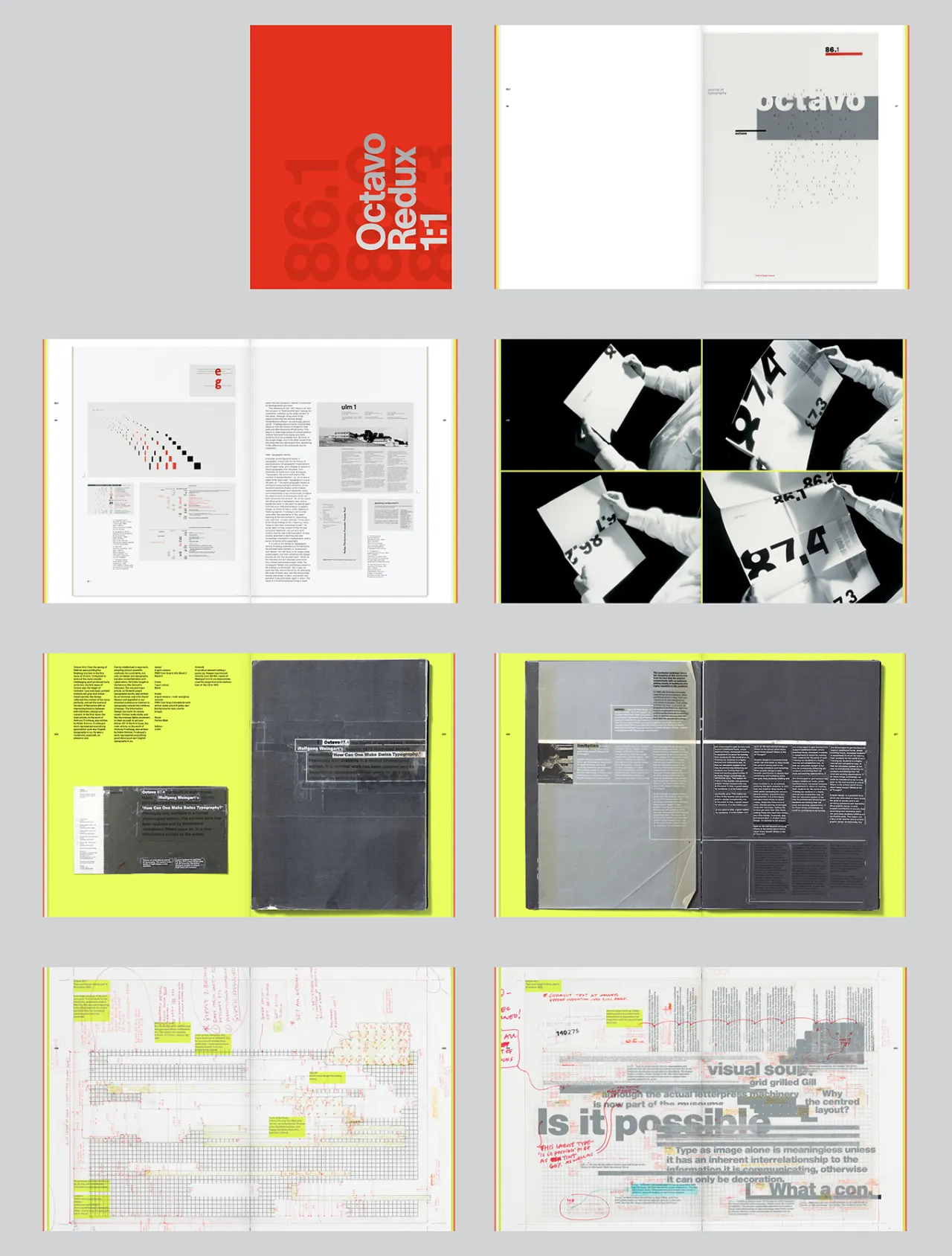
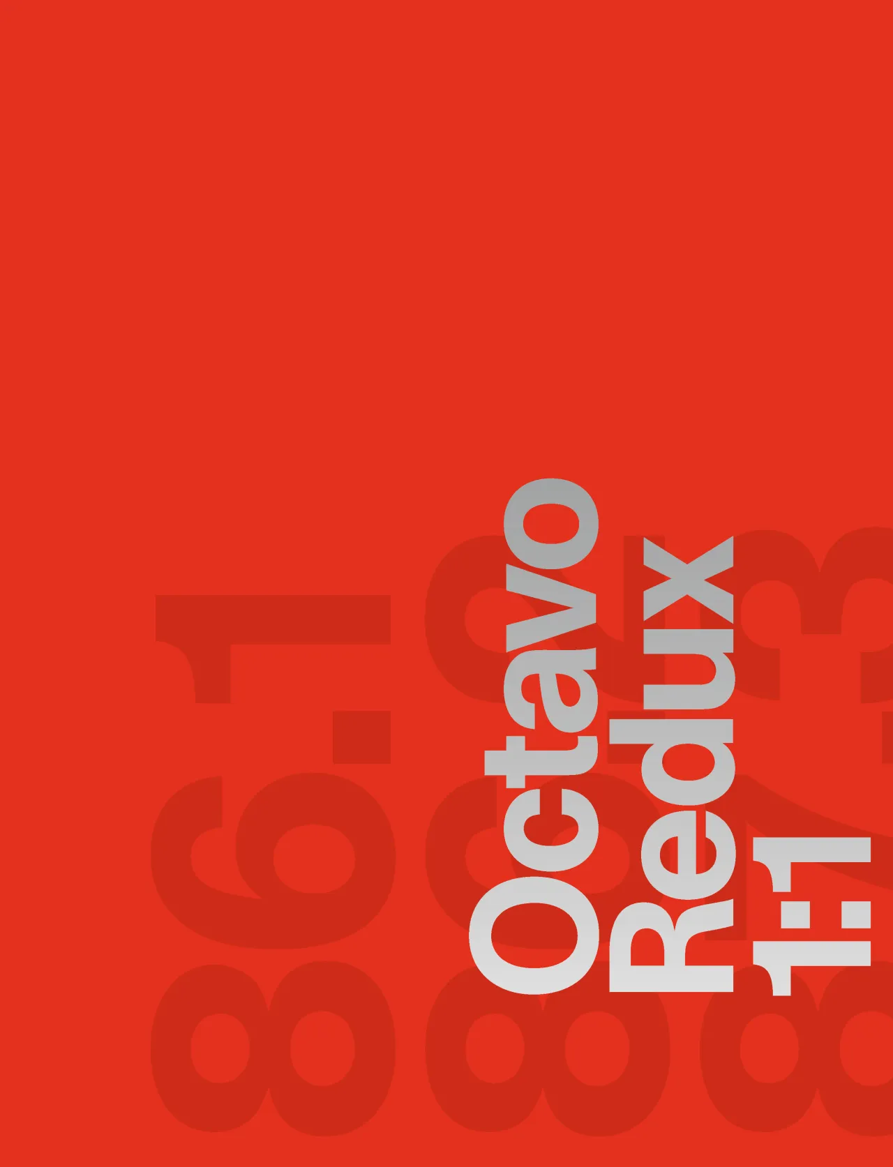
With your support (there's a current Kickstarter campaign), it will soon be possible to see and own all eight issues, and enjoy them in a proposed new book entitled Octavo Redux. Designed and edited by two of Octavo's original makers, Mark Holt and Hamish Muir, it will resuscitate the incredible type unicorn.
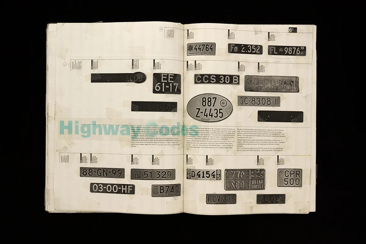
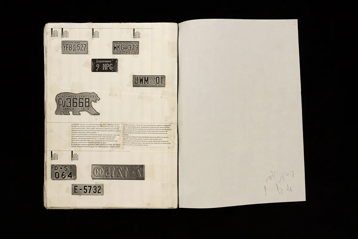
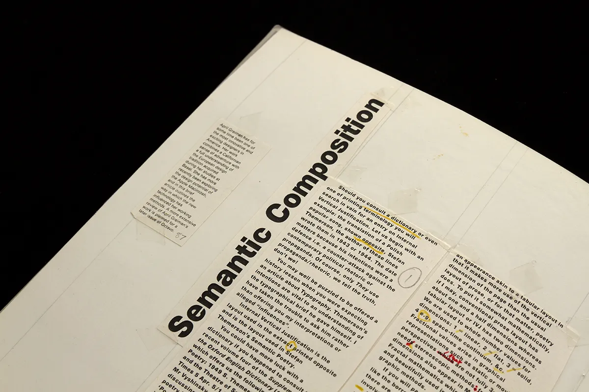
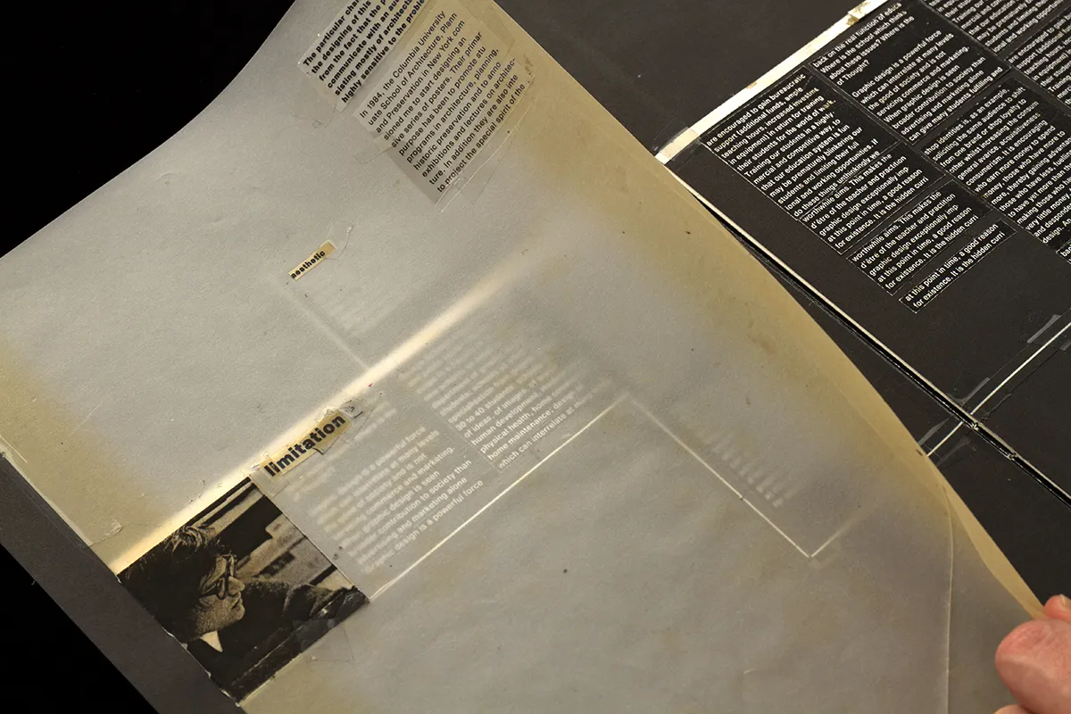
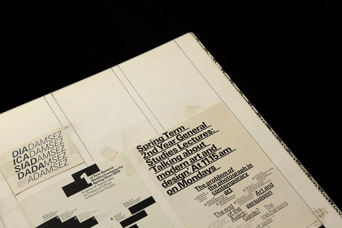
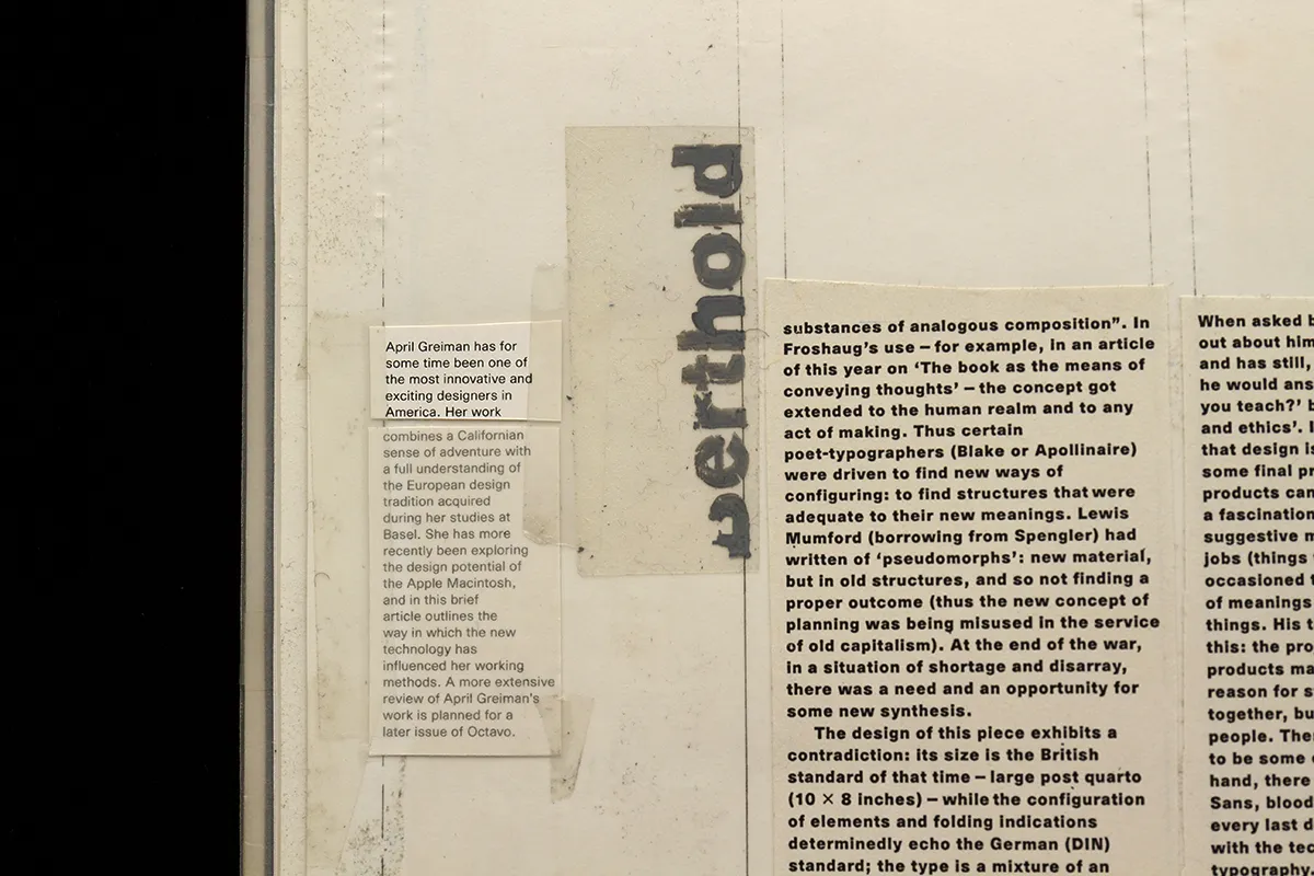
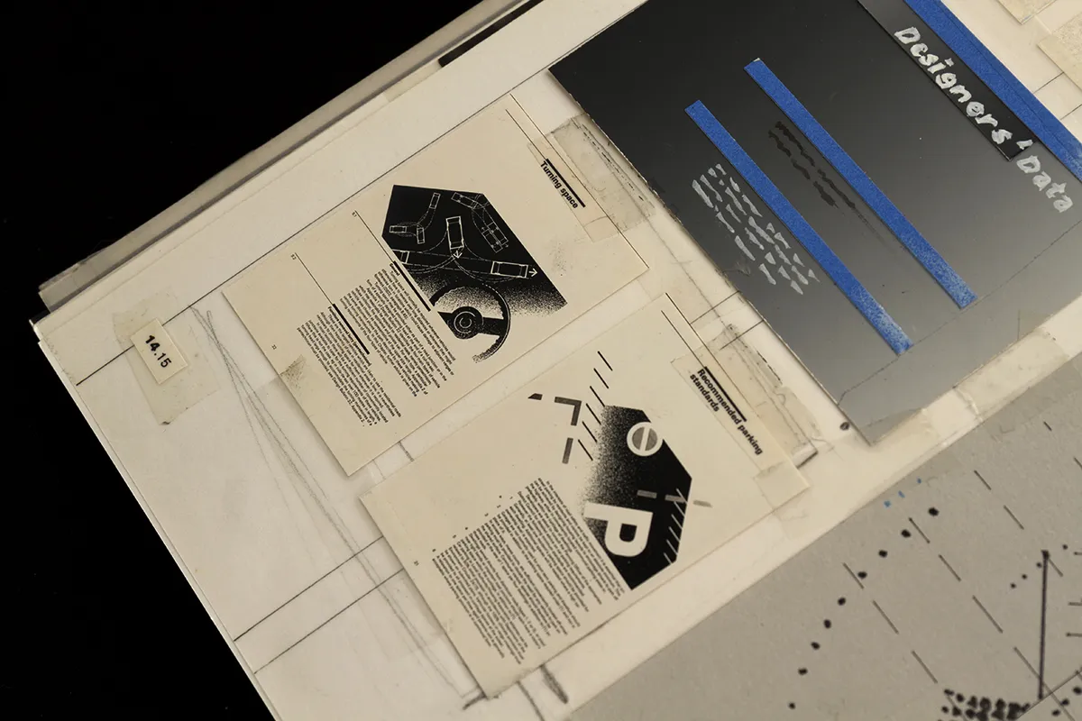
Within its 384 pages, Octavo Redux will feature all the covers and spreads from each original printed issue of Octavo, reproduced at actual size (1:1). Providing essential insight into the pre-computer design process – when 'discussions' with typesetters were conducted via bike messengers, red pen, highlight parkers and Tipp-Ex. In the words of Holt and Muir: "Octavo Redux is as close as you can get to the originals without holding them in your hands."
As described over on Kickstarter: "Octavo, International Journal of Typography, was a ground-breaking event in the evolution of graphic design. It was a stinging riposte by a group of British designers to the complacency and traditionalism of the UK graphic design scene. It was a maverick gesture that challenged the prevailing graphic formalism of the '80s and '90s.
"It sought, above everything else, to foreground typography as a solution in itself. It did this at a time when illustration was the dominant mode of graphic expression. And if all eight issues of Octavo prove anything, they prove that typography can be as expressive as image."
Editor's Picks





Trending






Latest Jobs
Brand Designer at Adfin
Full-time·London·£30k–£50k
Senior Designer at Definition
Contract·London·£45k–£50k
Senior 3D Motion Designer at Art&Graft
Full-time·London·£50k-£65k
Midweight Designer at All Purpose
Full-time·London·£30k–38k
Talent Agent & Producer at The Jacky Winter Group
Full-time·Los Angeles·$70k-$85k
Client Partner at Halo
Full-time·Bristol·£30k–£36k




](https://media.creativeboom.com/848c7454-6436-4690-a126-4bcde970cb6f/conversions/94e91622c73efe036399758c791a000b3fa27ccd-medium.webp)