Introducing TypeNotes, a new magazine dedicated to typography, design and those who love them
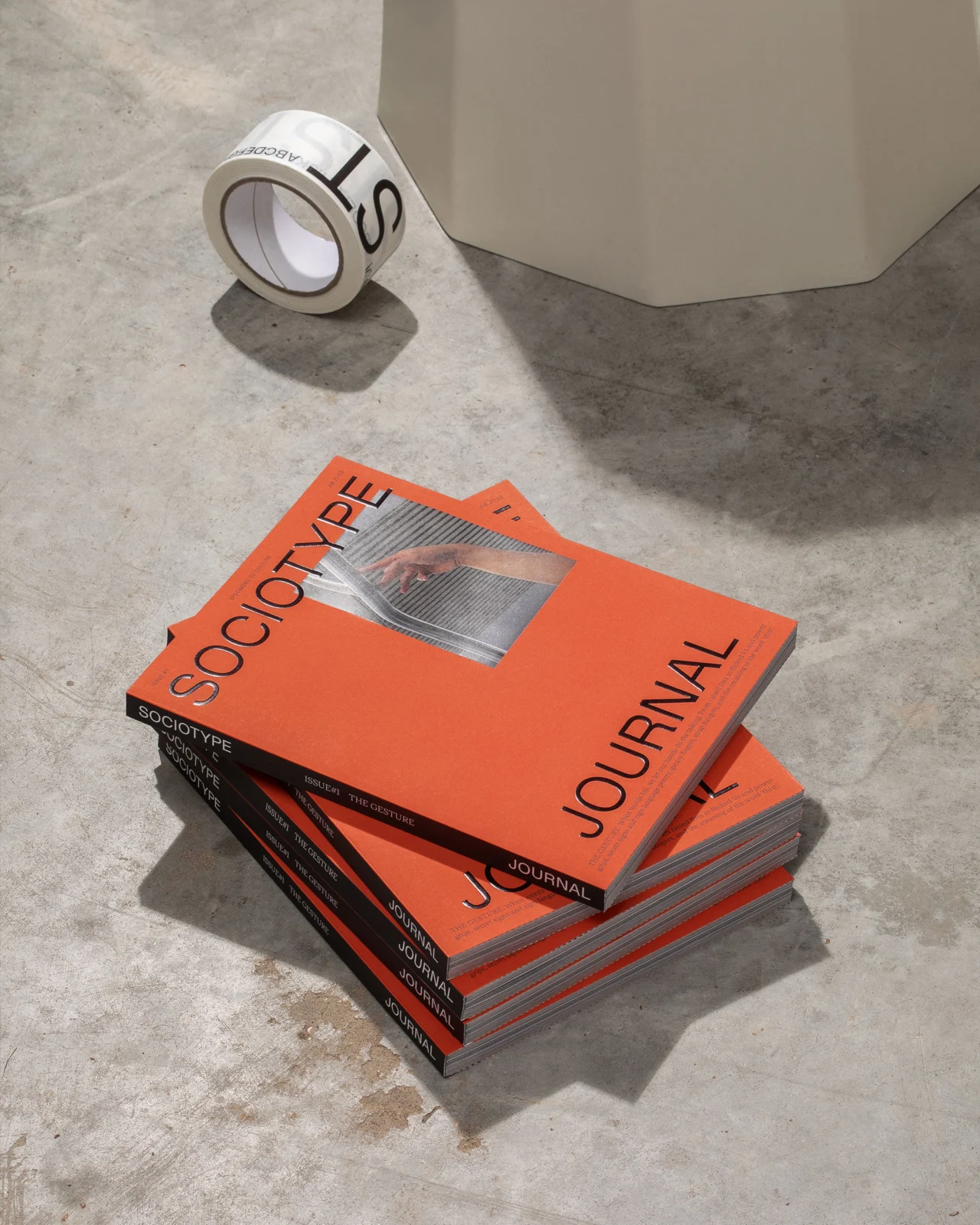
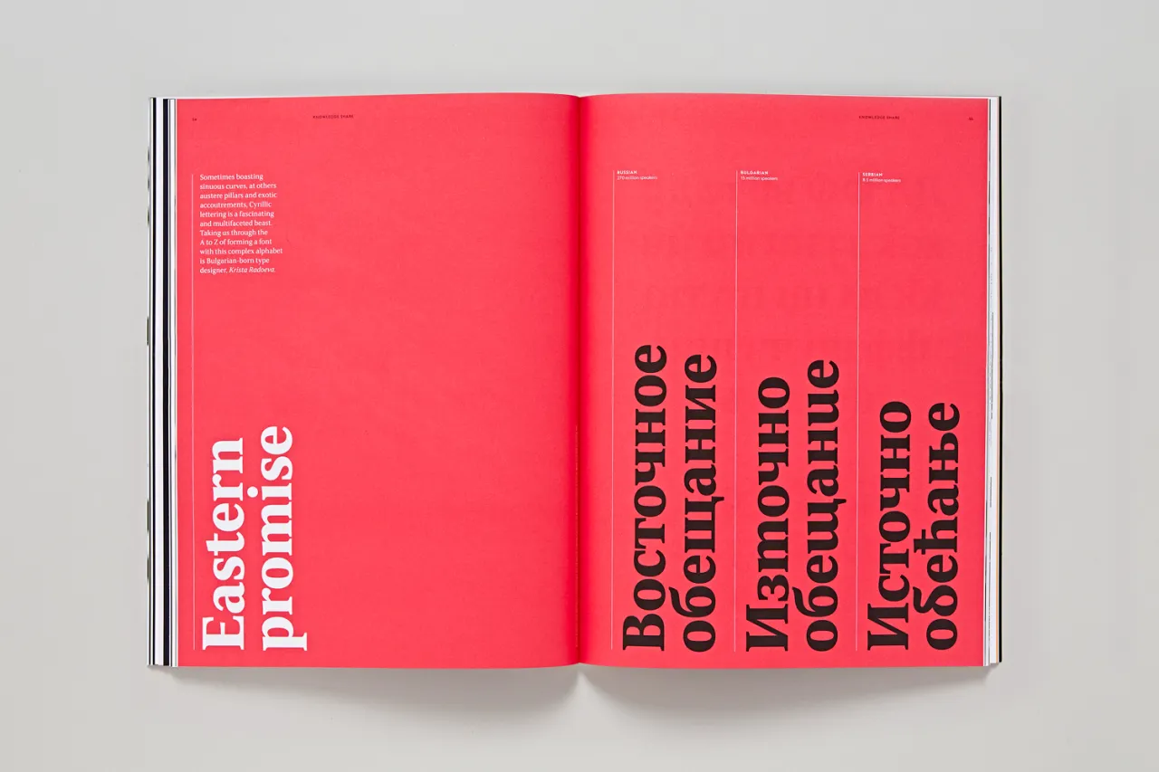
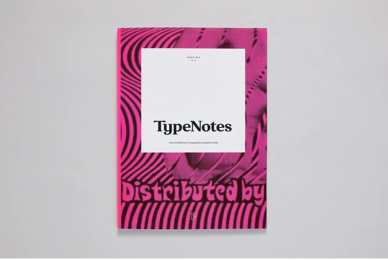
Simultaneously dispelling the notion that typography is just for design geeks while also catering for font fanatics, TypeNotes is a new print magazine that pays a loving tribute to letterforms.
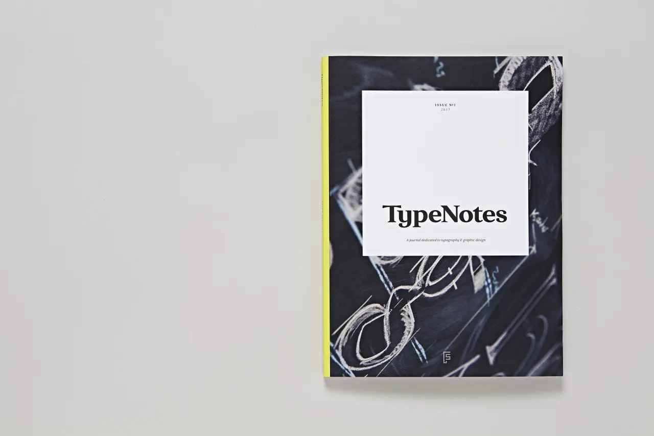
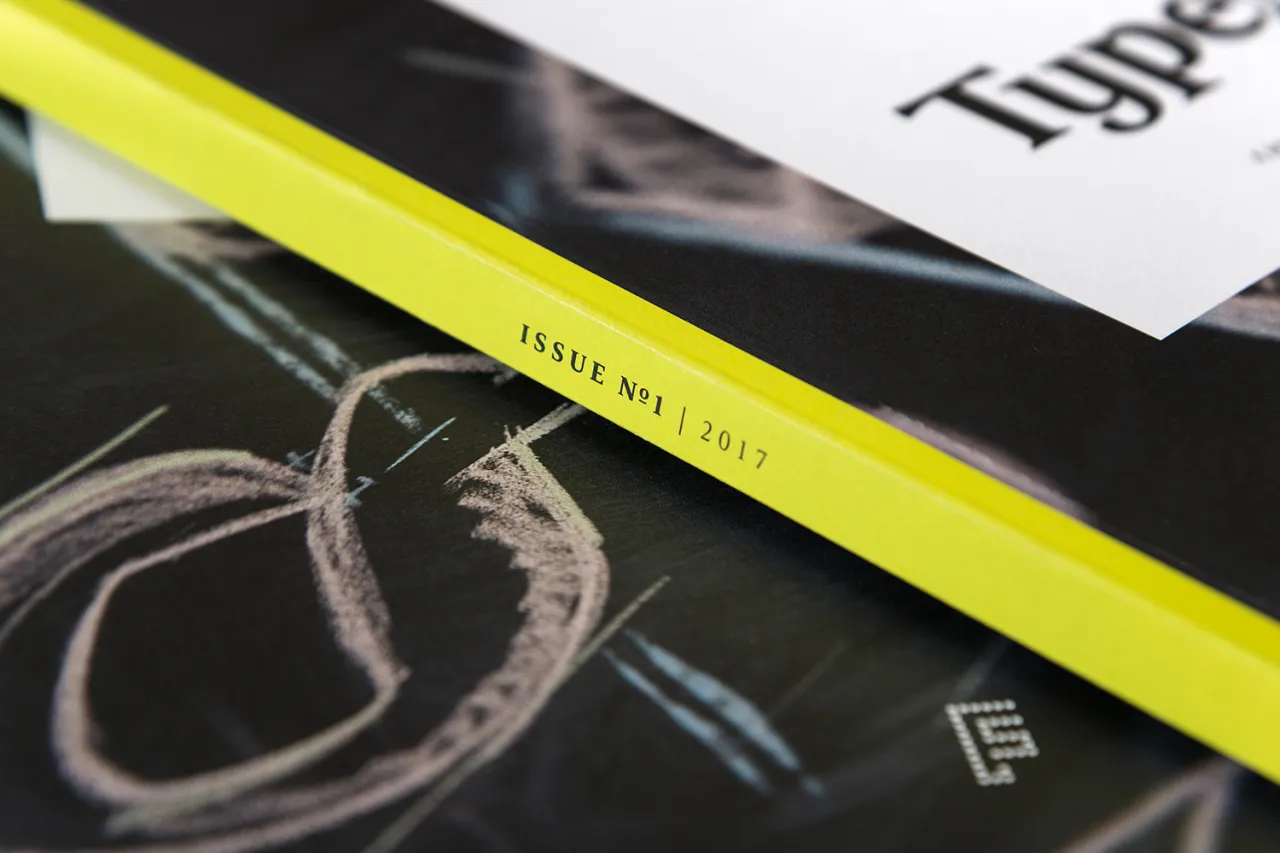
The inaugural issue of the publication from London-based type foundry Fontsmith is launched to celebrate the company's love of type and the craft behind making it, as well as marking the studio's 20th birthday this year.
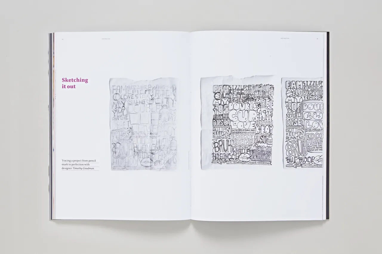
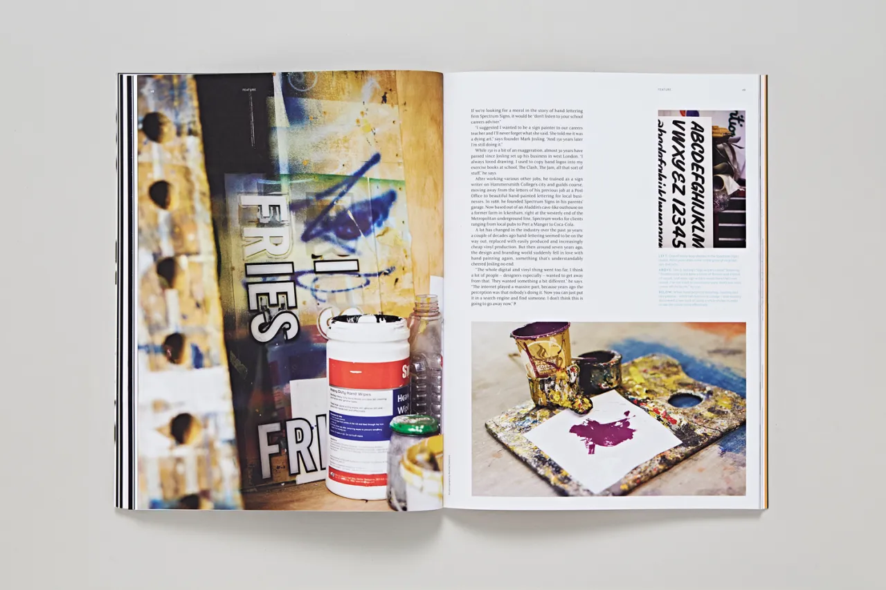
The publication explores all things type-based from a passionate and knowledgeable standpoint, drawing on the foundry’s in-house expertise as well as voices from across the creative industries worldwide.
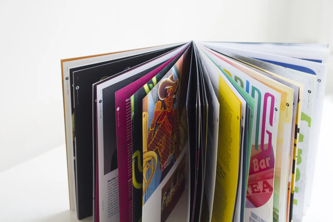
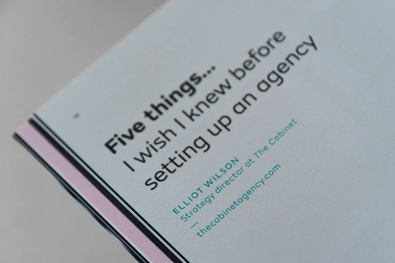
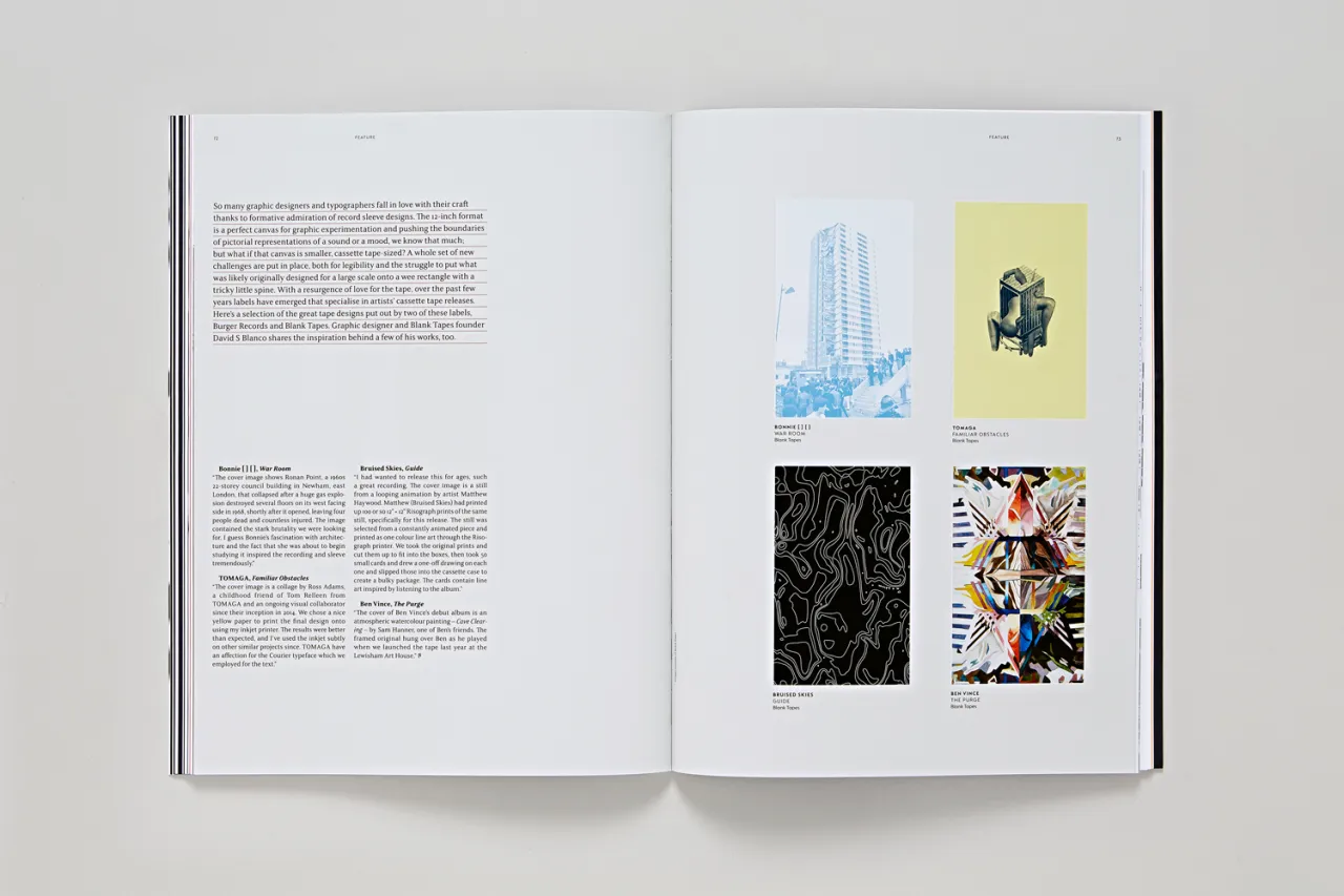
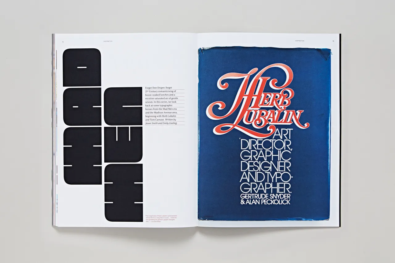
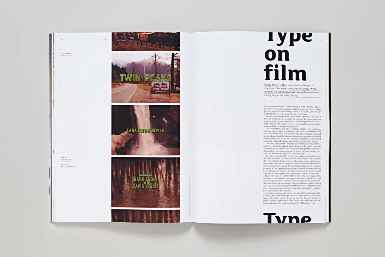
The TypeNotes team has worked with Lance Wyman, APFEL, Craig Oldham, Hey Studio and Why Not Associates on this first issue. Features include an in-depth exploration of type in film and television, how ad-land uses lettering to sell and persuade, an exploration of the legacy of Herb Lubalin and Tom Carnase, icon designs through the ages, designing for cassette tapes, how typographers create optical illusions, photo essays, and so much more.
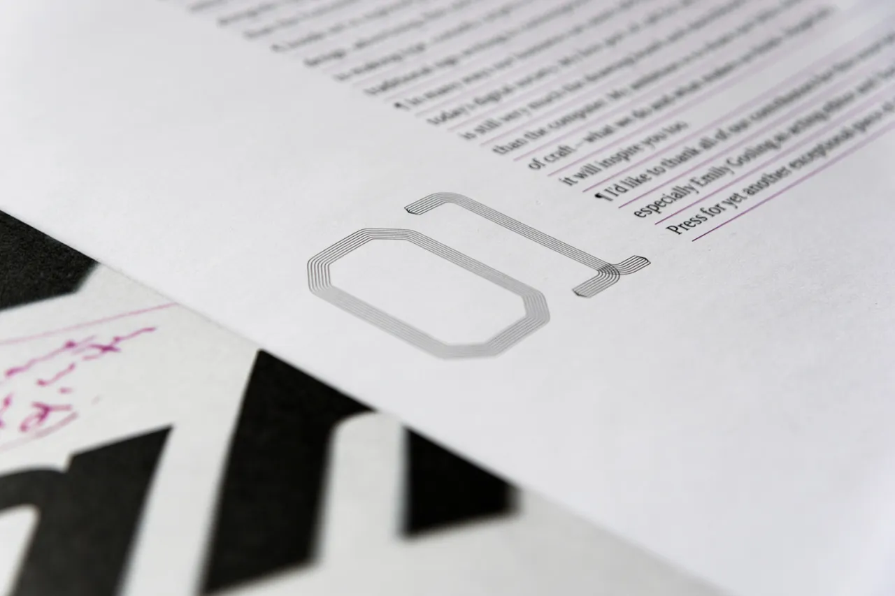
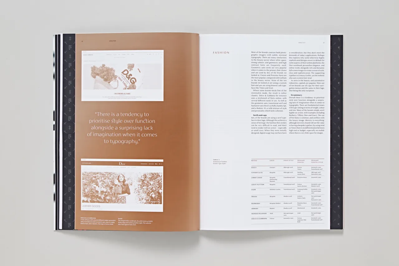
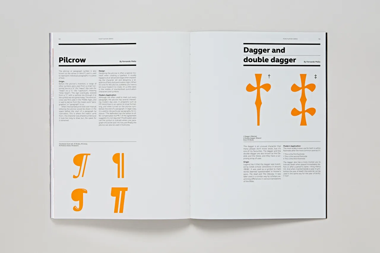
Delving into the minutiae of drawing type, the magazine also offers an in-depth look at type design best practice and the intricacies of drawing more unusual punctuation points – Fontsmith’s designers revel in the peculiar little pilcrow, and pine for a time when designers get to indulge in daggers and double daggers. Elsewhere, a specially created pullout explores how best to design for luxury clients, and examines how different high-end brands use their fonts (some, Fontsmith found, do so fabulously – some default to Arial.)
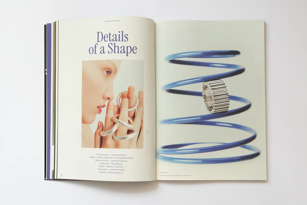
TypeNotes was designed by The Counter Press, a small studio that specialises in thoughtful, typographically focused design. The concept was based around the idea of a traditional ruled notebook, with subtle nuances that hint at tradition and craft but with a distinctly contemporary feel. Among the Fontsmith fonts used throughout TypeNotes are FS Sally, FS Maja, FS Siena, FS Lucas, FS Elliot and FS Silas Slab, and the magazine is printed on Fedrigoni paper.
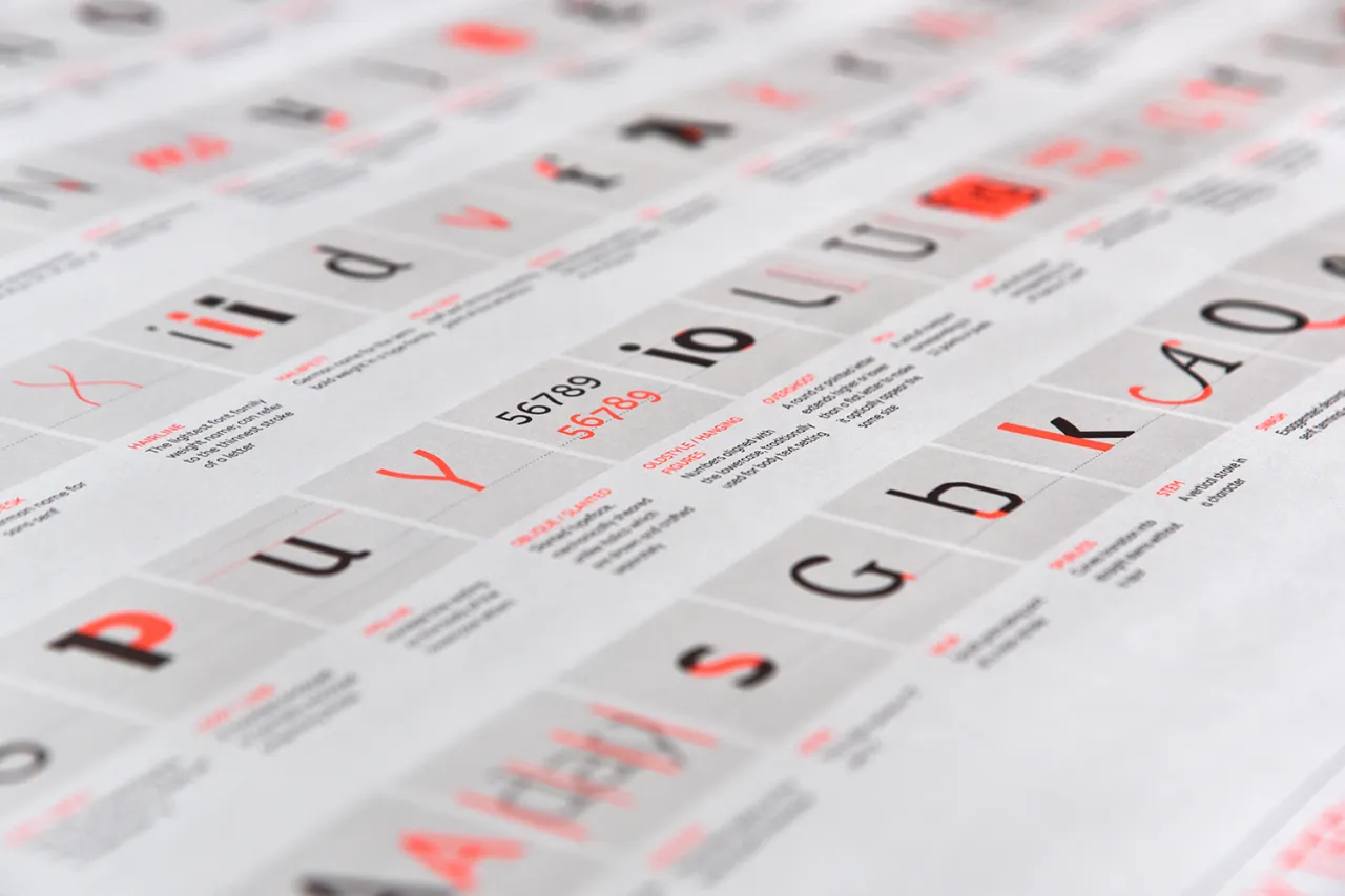
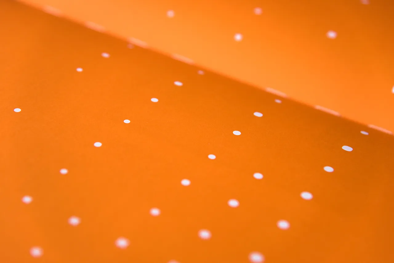
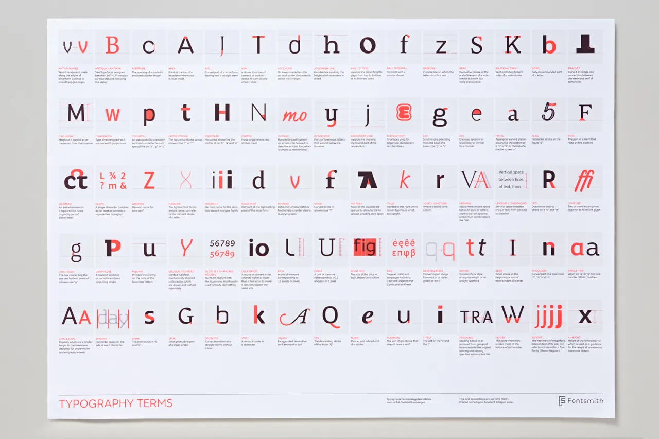
The magazine is printed in a limited-edition run of 3,000 copies, and each issue comes with a free typographic terms poster designed by Exeter-based studio Believe In. Acting editor Emily Gosling is a London-based design and arts journalist, a writer here at Creative Boom and an editor at AIGA Eye on Design. She was previously deputy editor at It's Nice That and reporter at Design Week.
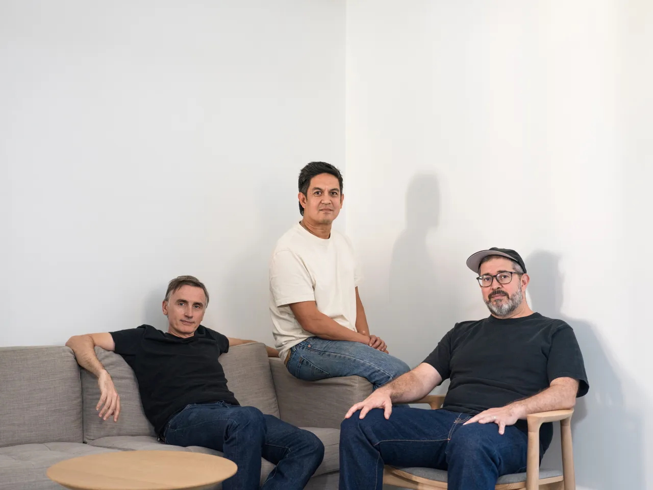
Jason Smith, Fontsmith founder and creative director, says: "TypeNotes is a collection of ideas about type and design that we hope will be something to keep and collect – a beautiful thing to hold in your hands, something you can sit and read and take in at a slower pace.
"In many ways our business can seem old fashioned in today’s digital society. My first port of call for any new project is still very much the drawing board and sketchbook rather than the computer. My ambition is to share our little world of craft – what we do and what makes us think. Hopefully it will inspire you too."
Editor's Picks





Trending






Latest Jobs
Senior Creative Lead at Random Studio
Full-time·Amsterdam / Paris·€90k-€110k
Midweight Editor at Earworm
Full-time·Bristol·£28k-£32k
Agent & Producer at The Jacky Winter Group
Full-time·London·£35k–£40k
Senior Digital Designer at 3800
Full-time·Sheffield·£40k-60k
Senior Graphic Designer at MoMA Retail
Full-time·New York·$72k-$80k
Digital Marketing Executive at Arise
Full-time·Sheffield·From £23,750




](https://media.creativeboom.com/848c7454-6436-4690-a126-4bcde970cb6f/conversions/94e91622c73efe036399758c791a000b3fa27ccd-medium.webp)