Pentagram and Nomad create new branding for London's Natural History Museum
Britain's Natural History Museum is a popular visitor centre, but as it approached its 150th birthday, it wanted to be more than that. Pentagram's Marina Willer and Nomad's Stuart Watson explain how they helped them realise a new vision.
Fun fact: London's Natural History Museum was the UK's most-visited indoor attraction in 2021 and 2022. If you haven't been, you really should if you get the chance.
Not only is it a beautiful building in its own right, it houses over 80 million items, including specimens collected by Charles Darwin, a huge collection of dinosaur skeletons and one of the largest specimens of blue whales ever displayed. The organisation also produces popular touring exhibitions and is recognised globally as the pre-eminent centre of research into natural history.
As the Natural History Museum approached its 150th birthday, it needed an identity to engage existing and new audiences in everything it does, from research to entertainment, education and activism.
Marina Willer and her team at Pentagram and design agency Nomad joined forces to deliver this bold ambition. After winning the creative pitch against 270 agencies, they worked to interpret the brand strategy developed by Heavenly.
"Pentagram and Nomad have collaborated many times on projects with Angus Hyland, Jon Marshall and more lately with Marina Willer," explains Stuart Watson of Nomad. "We complement each other well, and each agency brings something unique to the table. This is by far the biggest collaboration to date."
Central concept
"We used the brand strategy developed by Heavenly as a starting point, alongside the museum's business strategy," recalls Pentagram partner Marina Willer. "We realised that the brand identity needed to express that the planet is now more than ever at its core and that it needed to be a language that activates audiences to be inspired by the museum to advocate change.
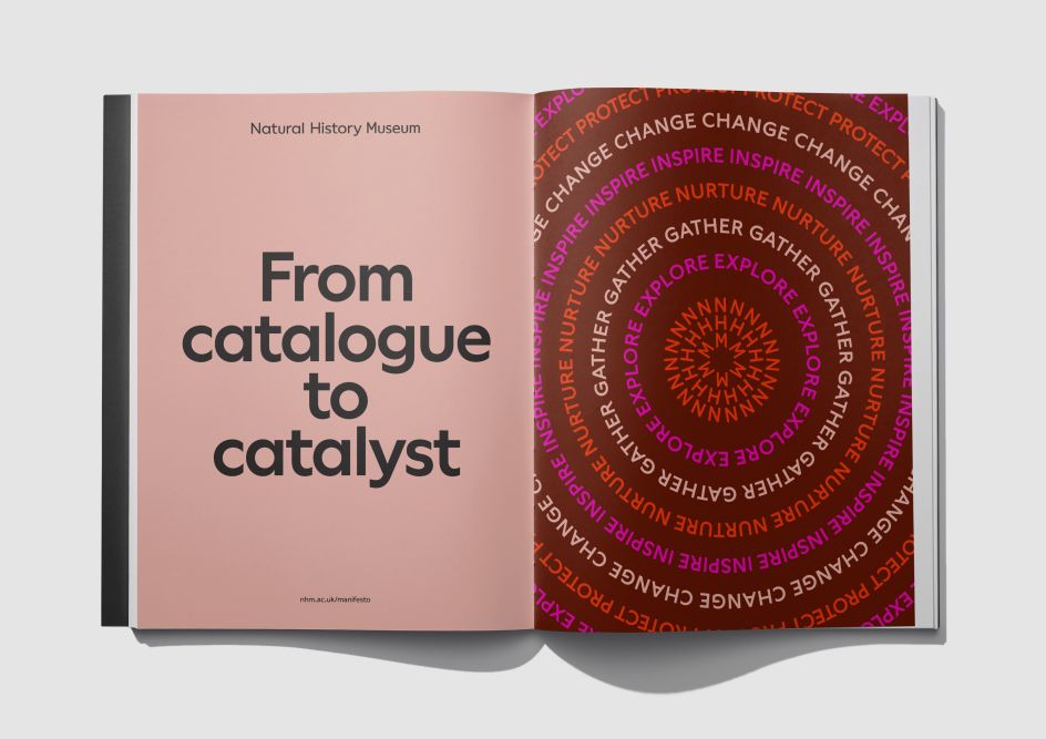
"The central idea we proposed – the "move from passive catalogue to inspiring catalyst" – perfectly summarised what the brand needed to instigate."
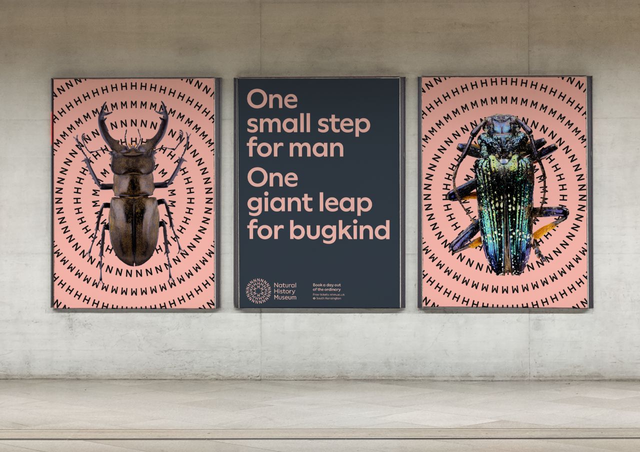
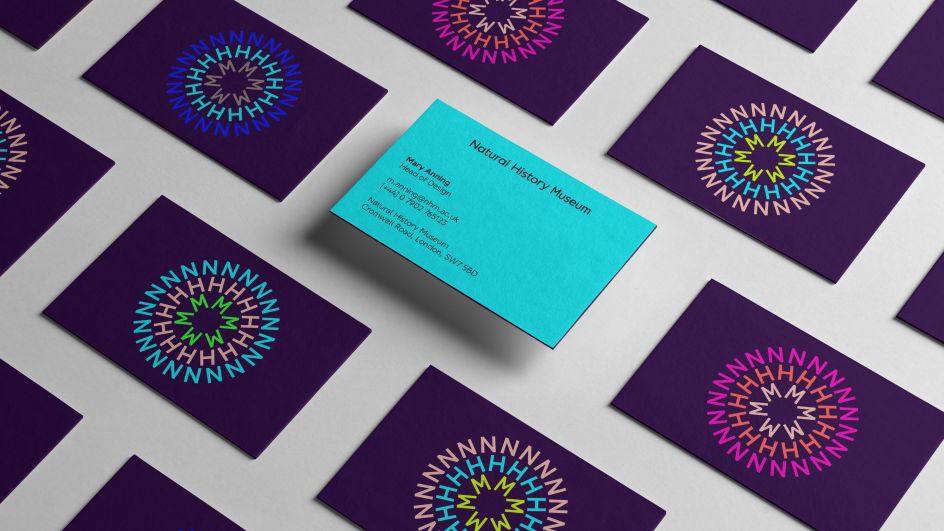
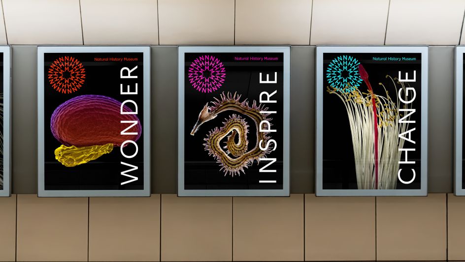
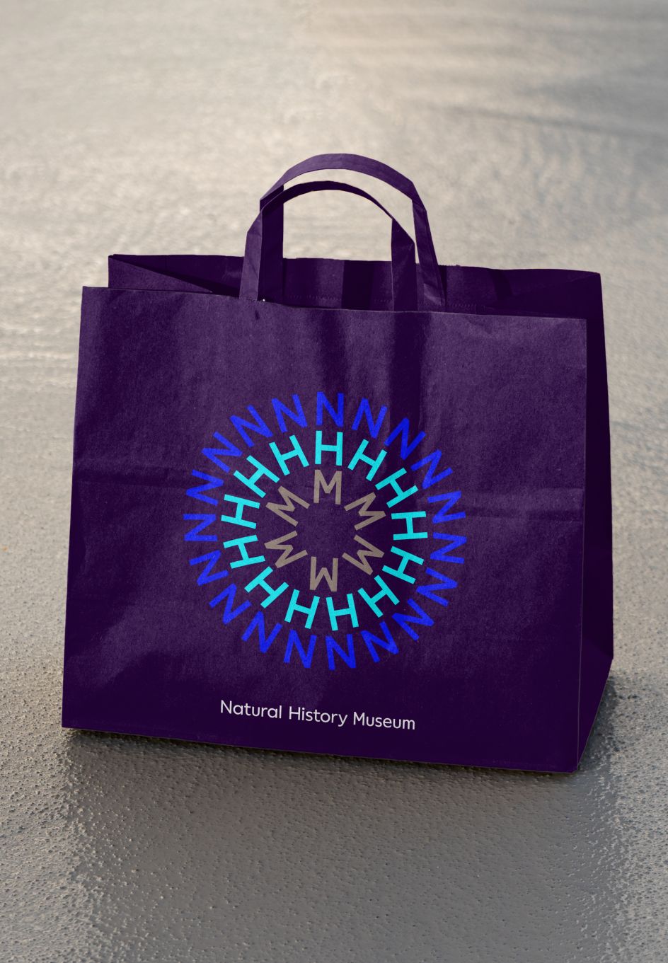
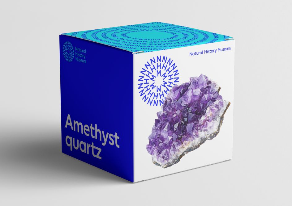
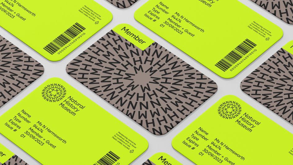
At the centre of the new branding is a symbol that makes reference to planet Earth and the universal connection between everything in nature. It features a circular formation of NHM, representing the energy of a ripple effect, which pulsates from the centre to form a three-colour sunburst. It's a shape born from nature, embodying the collective energy and positivity that reflects the museum's mission to become an agent for change.
"We were hugely inspired by all the visits to the museum locations and its many activities," recalls Stuart. "The outcome is a symbol that is circular to convey the interconnection of nature. The symbol moves and pulsates to create change; it's responsive to sound and can be seen as a dandelion or a school of fish, or a fossil: it's really open to interpretation. Put simply, it's about the circularity of the planet, all the way down to spirals in microscopic living things."
Brand logic and colour palette
The team also defined the brand logic with the symbol working in combination for all of the museum sites, including South Kensington, Tring and Harwell. The initials NHM can connect to the long-form name in different compositions for various museum locations and parts of the offer.
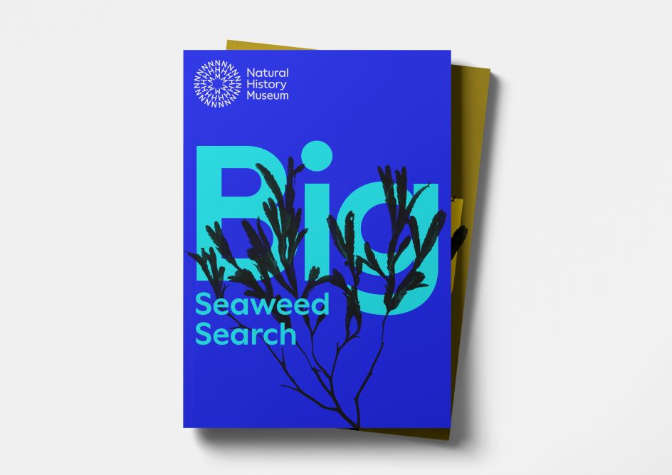
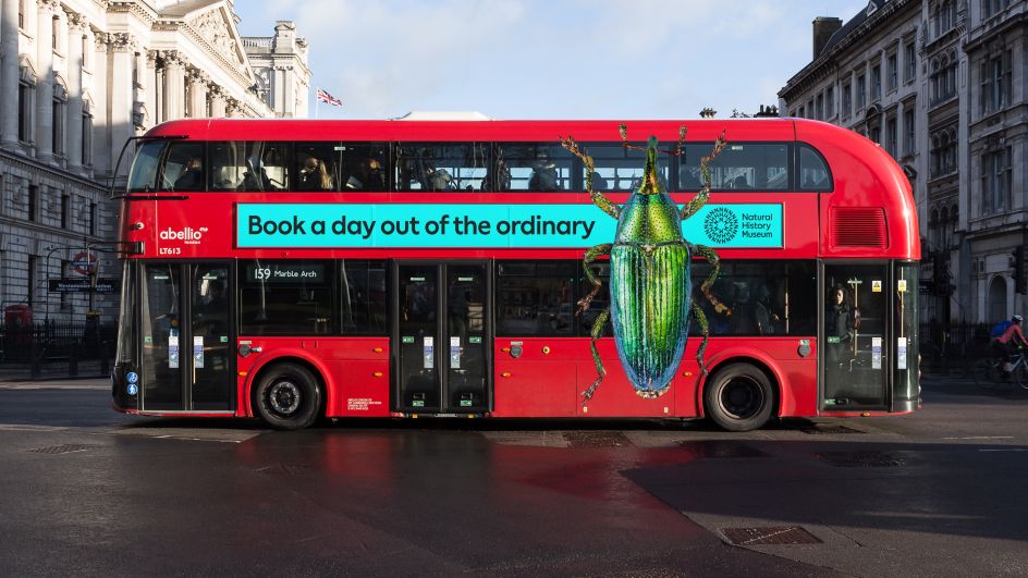
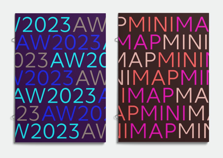
The brand palette has a broad and energetic combination of colours to reflect the diversity in nature and life. It invites audiences of all backgrounds and origins to participate and enjoy its activities. "The colour palette conveys the immense diversity of nature as well as the diversity of audiences that the museum aims to reach," notes Marina. "The colour combinations are vibrant and optimistic but can also be calm and authoritative. The many combinations allow the museum to flex between its multiple activities and voices."
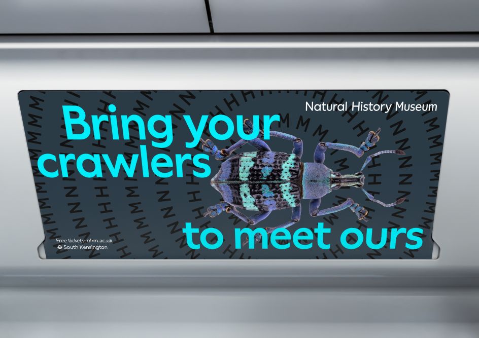
Circular patterns and Word Rings have a strong connection to the symbol. They can be static or moving and visually represent a catalyst. They can move, grow, expand, change form and communicate, creating an instantly recognisable element that brings colour and energy. Word Rings feature contextual words in circles and can be used only with images or as text.

For easy creation of Patterns and Word Rings, the team created Generator with the help of developer Mat Hil. Generator is a tool that can be used to design both static and motion outputs through coding, making it easy for all designers working with the brand to keep consistency as well as flexibility.
Typography and Motion
A new custom typeface created by Displaay Type Foundry is friendly, straightforward and confident, reflecting a brand that is accessible and inclusive.
"The identity needed to be accessible, friendly and democratic," explains Stuart. "It also needed to work in uppercase on the symbol as well as in mixed case for text, headlines and even the word mark itself.
"The new typeface NHM Wallop, a custom version of Displaay's Wallop, is right on all those dimensions. It also is timeless and will not go out of fashion. This is important as the museum is for everyone and should not feel trendy, but contemporary and approachable."
Motion features strongly throughout the identity, taking inspiration from nature and bringing the museum's brand to life. When applied to the new logo, the movement helps it become instantly recognisable. Full of energy, dynamism and momentum, the motion channels four nature-inspired routes: Ripple, Grow, Pulsate and Orbit. A series of sound-reactive animations also add a joyful and expressive element and celebrate the creatures everyone loves.
"It was such an honour to be chosen for this project and a great experience to work with the team at the Natural History Museum," says Marina. "The climate crisis means that we're at a critical time, and encouraging the next generation to become advocates for the planet is more important than ever. We hope our new brand identity will help many more people engage with the vital work that the museum does."
Editor's Picks


Trending


Podcasts


Editor's Picks
Further Reading